Embed Size (px)
Citation preview
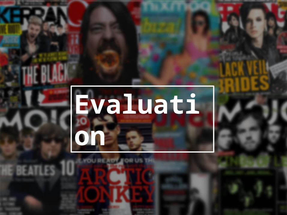
Evaluation

In what ways does your media product use, develop or challenge forms and conventions in real media products?
As part of my pre-production I researched existing magazines which helped me understand the conventions in which they use.
Masthead-title
Cover line
Main image
Featured imagesPuff
Lead story
Issue number
Barcode
Cover line

In what ways does your media product use, develop or challenge forms and conventions in real media products?
The first convention I used in my media magazine was the masthead. It is a general
convention so the reader knows which magazine it is which is mainly portrayed in a bold, capital font so it stands out against the
background. I challenged this convention due to the fact that I used a serif font because it is usually sans serif, but I like the idea of it being
different so it will be easier for people to memorise.
My research showed that every music magazine includes a masthead at the top of the page running left to right as it is in order
and it is easier to read and readers will automatically look there for the name. I chose the colour red because it is gender neutral and
it also compliments my colour scheme. I overlapped the model over the masthead
because it shows that they are the main focus for the magazine as they are also featured in the double page spread. I have challenged
the typical convention with a full stop as I have found that a high number don’t use them.
In what ways does your media product use, develop or challenge forms and conventions in real media products?
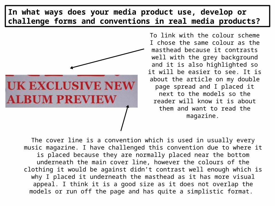
To link with the colour scheme I chose the same colour as the masthead because it contrasts well with the grey background
and it is also highlighted so it will be easier to see. It is about the article on my double
page spread and I placed it next to the models so the reader will know it is about
them and want to read the magazine.
The cover line is a convention which is used in usually every music magazine. I have challenged this convention due to where it is placed because they are normally placed near the bottom underneath the main cover line, however the colours of the clothing it would be against didn’t contrast well enough which is why I placed it underneath the
masthead as it has more visual appeal. I think it is a good size as it does not overlap the models or run off the page and has quite a simplistic format.
In what ways does your media product use, develop or challenge forms and conventions in real media products?
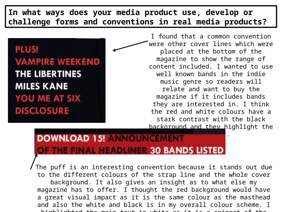
I found that a common convention were other cover lines which were placed at the
bottom of the magazine to show the range of content included. I wanted to use well known
bands in the indie music genre so readers will relate and want to buy the magazine if it includes bands they are interested in. I think
the red and white colours have a stark contrast with the black background and they
highlight the bands names.
The puff is an interesting convention because it stands out due to the different colours of the strap line and the whole cover background. It also gives an insight as to what
else my magazine has to offer. I thought the red background would have a great visual impact as it is the same colour as the masthead and also the white and black is
in my overall colour scheme. I highlighted the main text in white as it is a snippet of the main article.
In what ways does your media product use, develop or challenge forms and conventions in real media products?
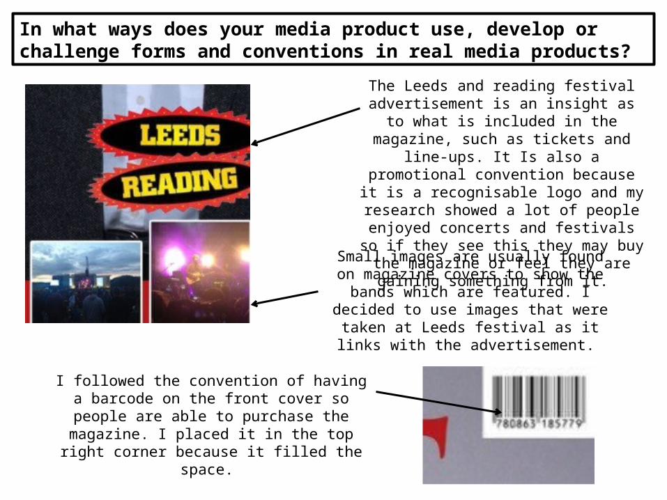
The Leeds and reading festival advertisement is an insight as to what is included in the magazine, such as tickets
and line-ups. It Is also a promotional convention because it is a recognisable logo
and my research showed a lot of people enjoyed concerts and festivals so if they see this they may buy the magazine or feel they
are gaining something from it.
Small images are usually found on magazine covers to show the bands which are featured. I decided to use images that were taken at Leeds festival as it links with
the advertisement.
I followed the convention of having a barcode on the front cover so people are able to
purchase the magazine. I placed it in the top right corner because it filled the space.

In what ways does your media product use, develop or challenge forms and conventions in real media products?
For the main image I used a medium close up of my models looking directly at the
camera as I have found that it is a popular convention due to the fact readers
connecting with the band and will be more likely to buy the magazine. I went with a
simple image to represent a realistic style.
The lead story is placed to the left hand side of the page so the white would contrast with
the black. In some ways I challenged this convention because it isn't placed in the middle because the white wouldn’t be as noticeable. I decided to place it there as it
compliments the main image and also informs readers that they are called The
Split if they are not familiar with their music. I think the size of the text is effective in addition to the name as it stands out to
readers of music magazines as they may think a band have split up when in fact its
just their name.

In what ways does your media product use, develop or challenge forms and conventions in real media products?
A convention which I found interesting particularly with
Kerrang contents pages is to feature one main image which is next to the column as it breaks
them up but also is more appealing to the reader because it looks as though there isn’t as much writing. The colours in the image also link with the colour scheme due to the white, black and grey featured. I included another convention which is
smaller images which breaks up the text in the columns but also shows an insight as to what the
article includes.

In what ways does your media product use, develop or challenge forms and conventions in real media products?
I followed the convention of organising the text in columns. I chose to have 2 columns because I included a lot of information as it is a monthly magazine. The columns give a sophisticated
and simple layout which is what I was aiming for. Having the 2 columns separate breaks up the
text.
I decided to use an ‘F’ which is in the same font as my
masthead because It makes the magazine more recognisable if
it is on every page.
In what ways does your media product use, develop or challenge forms and conventions in real media products?
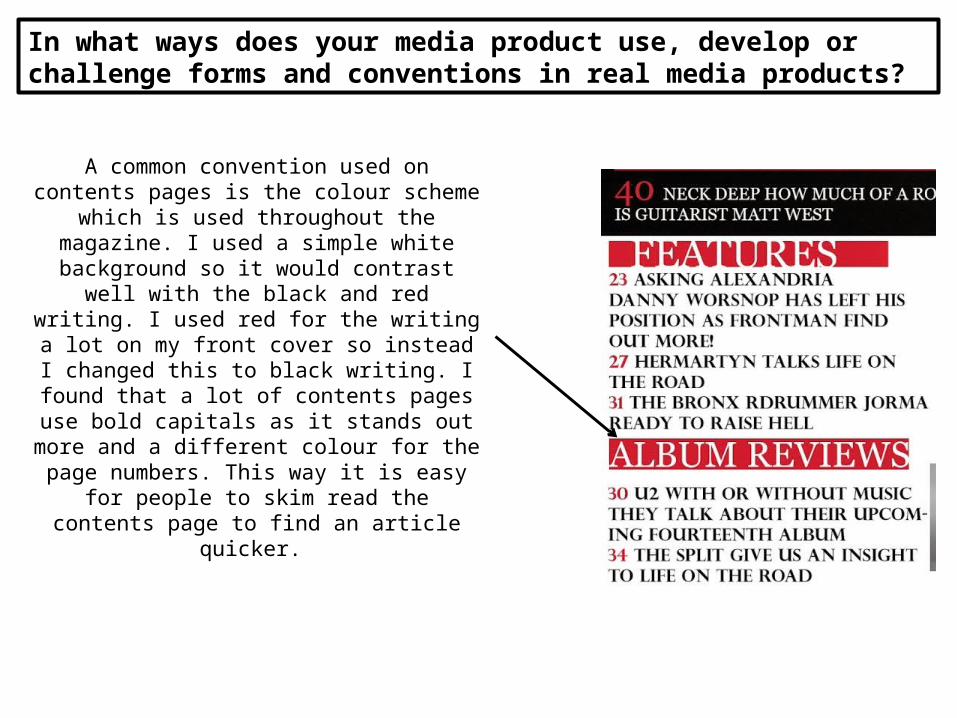
A common convention used on contents pages is the colour scheme which is used throughout
the magazine. I used a simple white background so it would contrast well with the black and red
writing. I used red for the writing a lot on my front cover so instead I changed this to black
writing. I found that a lot of contents pages use bold capitals as it stands out more and a
different colour for the page numbers. This way it is easy for people to skim read the contents
page to find an article quicker.
In what ways does your media product use, develop or challenge forms and conventions in real media products?
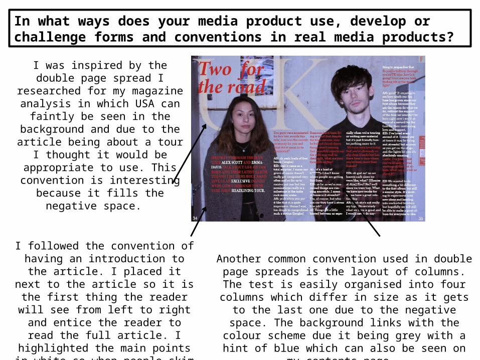
I was inspired by the double page spread I researched for my
magazine analysis in which USA can faintly be seen in the
background and due to the article being about a tour I thought it would
be appropriate to use. This convention is interesting because it
fills the negative space.
I followed the convention of having an introduction to the article. I placed it
next to the article so it is the first thing the reader will see from left to right
and entice the reader to read the full article. I highlighted the main points in white so when people skim read it will give them n idea of what is included.
Another common convention used in double page spreads is the layout of columns. The test is easily organised into four columns which differ in size as it gets to the last one due to the negative space. The
background links with the colour scheme due it being grey with a hint of blue which can also be seen on my
contents page.

In what ways does your media product use, develop or challenge forms and conventions in real media products?
I used a serif font for the title as this is a common convention as it differs from the smaller text. I felt that it had an
interesting effect due to it being in italics which looks aesthetically pleasing. I chose the same colour red as the
masthead to show the house style.
The interview of the band follows the usual convention of having the questions and answers in different colours which contrast with each other. Using this technique makes it less confusing for the reader to identify the
questions and answers. I highlighted them so if people don’t want to read a specific answer they can skip to the next one and find what they are looking
for.
In what ways does your media product use, develop or challenge forms and conventions in real media products?
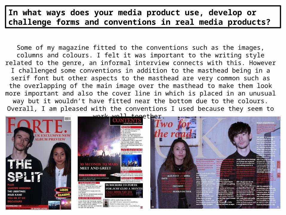
Some of my magazine fitted to the conventions such as the images, columns and colours. I felt it was important to the writing style related to the genre, an informal interview connects with this. However I challenged some conventions in addition to the masthead being in a serif font but
other aspects to the masthead are very common such as the overlapping of the main image over the masthead to make them look more important and also the cover line in which is placed in an unusual way but it wouldn’t have fitted near the bottom due to the colours. Overall, I am pleased
with the conventions I used because they seem to work well together.