Embed Size (px)
Citation preview
EVALUATION: QUESTION 1
In what ways does your media product use, develop or challenge forms and conventions of real media products?
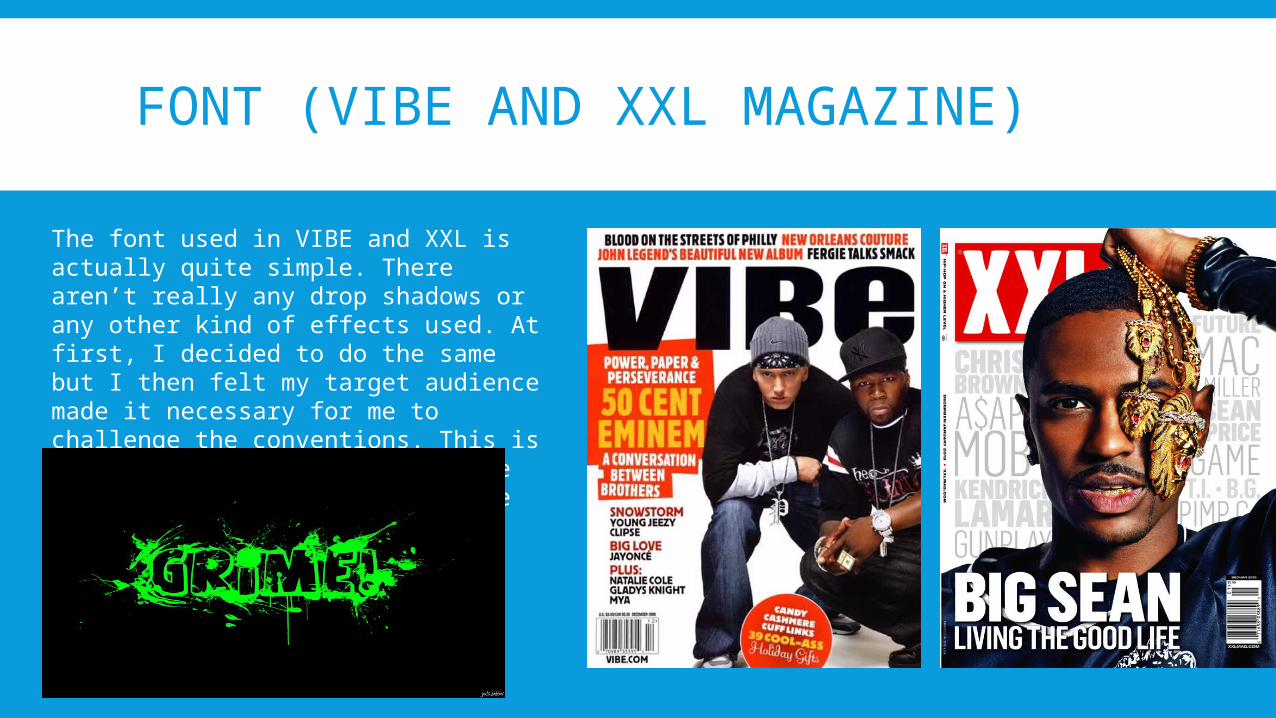
FONT (VIBE AND XXL MAGAZINE)
The font used in VIBE and XXL is actually quite simple. There aren’t really any drop shadows or any other kind of effects used. At first, I decided to do the same but I then felt my target audience made it necessary for me to challenge the conventions. This is due to the fact that my magazine also consists of the grime genre
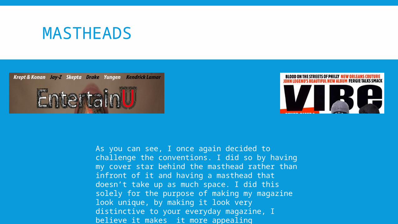
MASTHEADS
As you can see, I once again decided to challenge the conventions. I did so by having my cover star behind the masthead rather than infront of it and having a masthead that doesn’t take up as much space. I did this solely for the purpose of making my magazine look unique, by making it look very distinctive to your everyday magazine, I believe it makes it more appealing
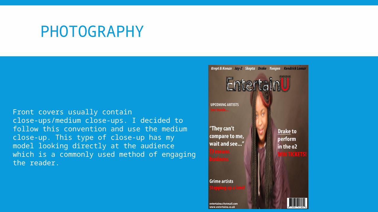
PHOTOGRAPHY
Front covers usually contain close-ups/medium close-ups. I decided to follow this convention and use the medium close-up. This type of close-up has my model looking directly at the audience which is a commonly used method of engaging the reader.
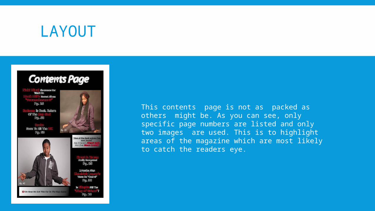
LAYOUT
This contents page is not as packed as others might be. As you can see, only specific page numbers are listed and only two images are used. This is to highlight areas of the magazine which are most likely to catch the readers eye.
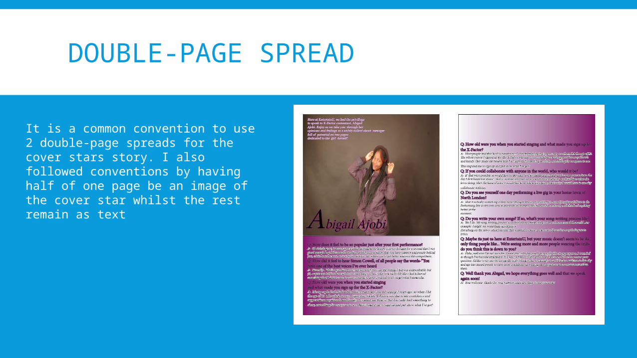
DOUBLE-PAGE SPREAD
It is a common convention to use 2 double-page spreads for the cover stars story. I also followed conventions by having half of one page be an image of the cover star whilst the rest remain as text
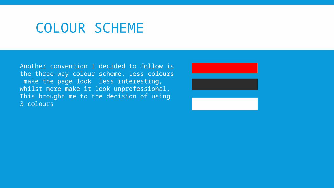
COLOUR SCHEME
Another convention I decided to follow is the three-way colour scheme. Less colours make the page look less interesting, whilst more make it look unprofessional. This brought me to the decision of using 3 colours