Embed Size (px)
Citation preview

Evaluation Part Two

Section A My poster is very simple; I tried to keep the poster simple so that it didn’t feel over crowded/confusing. I have used a simple colour palette of red, white and black this is done on many posters the colours I have used are especially found on horror posters. I have shown my serial killer (Francesca) on the front of the cover, I don’t think this would be obvious to the viewer. It is suggested that she is the killer via my tag line “I've saved more lives than I've taken" which is said by Francesca in our trailer. The poster on top t is from the film The Vow, I think that my poster has similar conventions and lay out to the poster on the right. Both posters have a female character as the main image, neither poster show clearly whether the girls are the final girl or the serial killer. However they do both suggest they are the serial killers, my poster suggests this via the tag line whereas The Vow’s suggests it via the use of red lipstick which usually represents blood or evil. They both also use red titles which has been done to make them stand out against the black backgrounds.
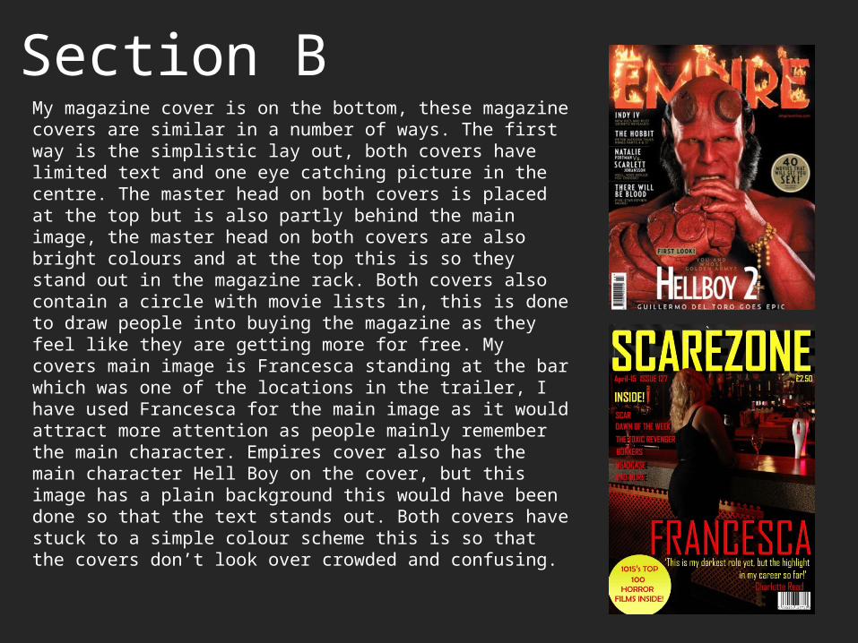
Section BMy magazine cover is on the bottom, these magazine covers are similar in a number of ways. The first way is the simplistic lay out, both covers have limited text and one eye catching picture in the centre. The master head on both covers is placed at the top but is also partly behind the main image, the master head on both covers are also bright colours and at the top this is so they stand out in the magazine rack. Both covers also contain a circle with movie lists in, this is done to draw people into buying the magazine as they feel like they are getting more for free. My covers main image is Francesca standing at the bar which was one of the locations in the trailer, I have used Francesca for the main image as it would attract more attention as people mainly remember the main character. Empires cover also has the main character Hell Boy on the cover, but this image has a plain background this would have been done so that the text stands out. Both covers have stuck to a simple colour scheme this is so that the covers don’t look over crowded and confusing.
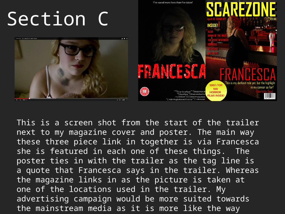
Section C
This is a screen shot from the start of the trailer next to my magazine cover and poster. The main way these three piece link in together is via Francesca she is featured in each one of these things. The poster ties in with the trailer as the tag line is a quote that Francesca says in the trailer. Whereas the magazine links in as the picture is taken at one of the locations used in the trailer. My advertising campaign would be more suited towards the mainstream media as it is more like the way empire would advertise.