Embed Size (px)
Citation preview

Evaluation 2
How effective is the combination of your main product and ancillary texts

Poster Genre
My poster is quite stereotypical for the
horror genre in that it utilises low-key, a
close-up for the main image, and a blood-
like font. Thomas Schatz talked about the
benefits of having a clearly defined genre in
his book 'Hollywood Genre' he states genre
is the 'most effective means for
understanding, analyzing and appreciating
the cinema'. You can't convey a lot of
information in a poster, this is why I chose
to use generic iconography so I can give out
as much information with very few words.

Poster ImageI chose to have our severed head prop from
our trailer to show the level of body horror
and special effects of the film. I have the
image at a canted angle to add to the
creepiness of the poster, plus the head looks
more limp and lifeless at this angle. I used
a close-up for the main image because it's
unnerving being very close to someone let
alone a severed head. I chose a spotlight for
the lighting on my image because it's iconic
of the horror genre and it clearly shows the
head but it still blends in with the
background.

Poster Title
The title 'Suicide Pact' on my poster is written in a red, sans serif font, with an effect to
look like it's dripping. I chose to have my font the colour red because it connotes danger
and combined with the dripping effect makes it look like the title is written in blood.
Sans serif fonts are generally thought of as more modern, which is why I chose to use it
for my title, since all the characters are young, modern teenagers.

Magazine Cover Mise-en-scene
I tried to include multiple aspects from the horror genre on my magazine cover so it
would catch the attention of horror fans if it was for example on a shelf in a shop. I
have the coverlines on top of knifes because it means they need to be an interesting
shape to fit, plus the red font colour represents blood and makes the knife look like it has
been used as a weapon.

Magazine Cover Image
For my cover Image I had our trailer's main antagonist looking directly at the camera. In
photoshop I made the area around his eyes darker to make him look more sinister. I also
had the actor look directly at the camera, breaking the fourth wall and drawing the
audience in, which is unsettling.
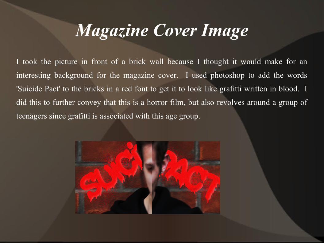
Magazine Cover Image
I took the picture in front of a brick wall because I thought it would make for an
interesting background for the magazine cover. I used photoshop to add the words
'Suicide Pact' to the bricks in a red font to get it to look like grafitti written in blood. I
did this to further convey that this is a horror film, but also revolves around a group of
teenagers since grafitti is associated with this age group.