Embed Size (px)
Citation preview
Question 1- In what ways does your media product use develop or challenge forms and conventions of real media products. • The music magazine which I have created for my media product uses many of the main
conventions of real media products including mastheads, main images, secondary images, tag lines, puffs and many more. Each of these conventions serve a purpose in encouraging and persuading my target audience to purchase and read my magazine as they have been designed to suit my target audience in particular from the audience research that I carried out. My music magazine challenges other RnB music magazines as there are not many of this genre available and those that are tend to be of an online format whereas mine will be a physical published copy available to purchase in stores. However, when acknowledging the importance of the media I have included web links for my magazine page as there would be an online version that viewers could also use. This is advertised throughout my magazine to maximise publicity and awareness. My magazine develops other forms and conventions of existing magazines such as the colour schemes of reds, blacks and whites which I have found is a typical colour scheme for a lot of magazines of this genre. Due to this, I decided to use this as my own colour scheme as it clearly works well with the target audience and is professional. However, I decided to incorporate gold into my front cover and DPS as they featured the same model and I liked the connotations of royalty and luxury that it reflected. I also found that gold was a very popular colour for RnB CD’S and music videos when doing research and so thought this would work well.
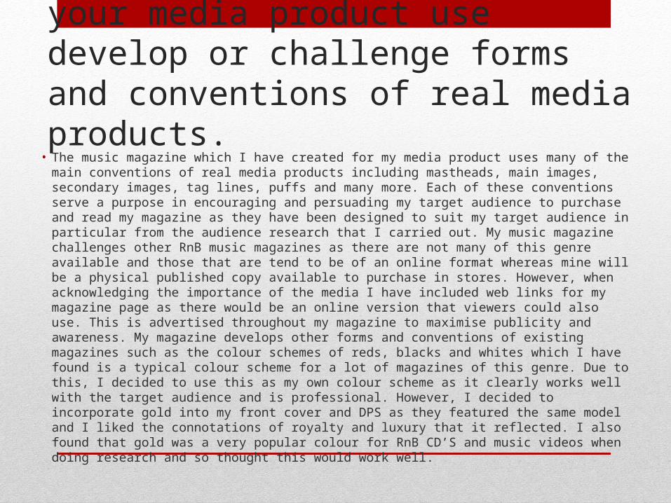
For my front cover I decided to copy the layout of the RnB magazine on the left. This included the placement
and sizing of the cover lines and positioning of the masthead and main image. I felt like this layout created a good balance between text and image and so did not appear empty or overcrowded. I have also developed
the strapline convention in that I felt it linked well with my magazine and was a good feature to include as it
makes the magazine appear more authentic. I also developed the use of the banners at the top and bottom
of the page as it was a common feature of RnB magazines and allowed me to add artists names and
more information for the reader.
Features that I changed in regards to the existing product was the plain background which I changed to a faded blend of grey and gold. I used this as somewhat of a colour tie in with the gold from the models cap. I chose this colour in particular as it connoted success and wealth which I feel my target audience would be interested in. I chose this cap as the leather from the black cap photographed well appearing expensive and again the gold tied well with my idea of the gold background. Other elements such as the black and white jacket were chosen because they linked with the black and white of my cover lines. The dark and light colours contrast well and make the model appear mysterious which I wanted to create. My model can also be seen wearing a gold ring which was used again as an indicator of wealth and because it is a stereotypical item of jewelry worn by rap artists and helped to remain authentic. This pose in particular was used to create a self confident and somewhat egotistical representation of my model to demonstrate his masculinity. All of these elements help to develop stereotypical conventions of rap magazines and therefore make my work more authentic and true to the genre.
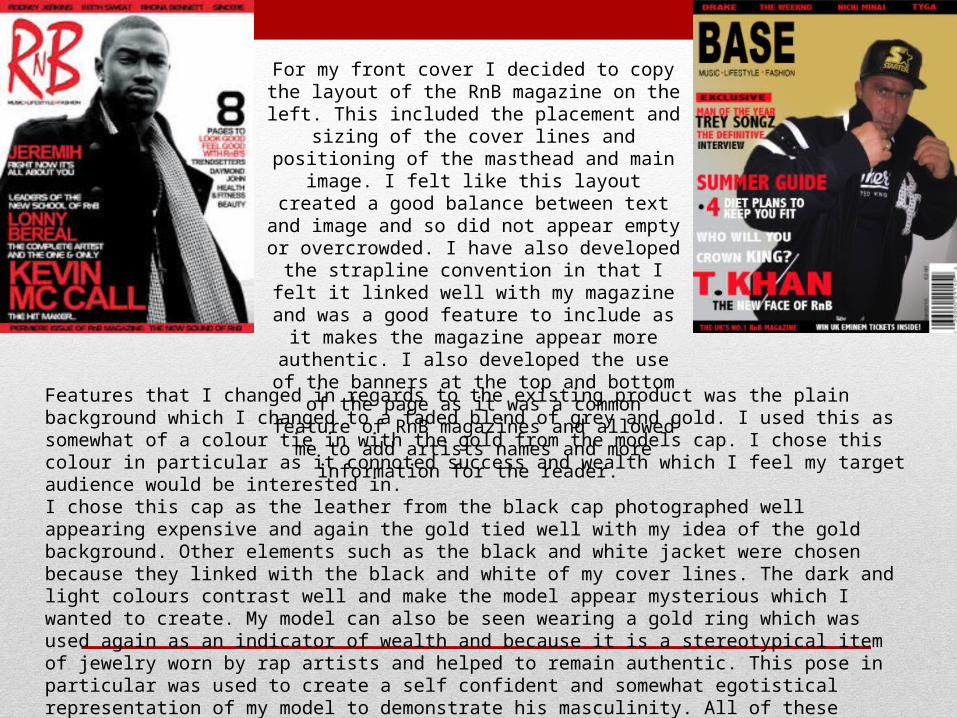
Here is a comparison of my original work alongside my inspirational piece. As you can see, I copied a lot of conventions from these piece as I felt that it was a great layout for a contents page. However, I did make a few changes. I decided to use a red, black and white colour scheme as opposed to
the greys and blacks of the inspirational piece. I felt like this was too dark to get across the right feel to my magazine. I decided on red as it connoted a sense of danger which is stereotypically associated with the
street lifestyle and was also more visually pleasing to look at, in my opinion.I also changed the angle of the image as I felt a shot from behind created a good tone from the magazine and gave the model a sense of street status. This jacket was also chosen because the detail on the back
highlighted stereotypical ‘street’ areas of America which links to my genre and is somewhere that this kind of lifestyle and music is very popular- as seen in many films. The detailing also depicted wealth from the
intricate detailing and also the lion heads connote power and strength that links to the hegemonic masculinity of my model.
Conventions that I kept were the layout of the title, which I felt was creative and something I hadn’t seen before. I used this as I think it would attract my target audience. I also liked the use of the large letter
behind the image as somewhat of a background as it made the magazine appear established and professional.
The fonts were another feature that I kept similar as I liked the variety and consistency of how they changed depending on what they
indicated, i.e all page numbers were in the same font and all page titles. I feel like the
fonts were relevant to my genre while being legible and professional. This layout was a good choice I believe as it does not appear
over crowded or empty.
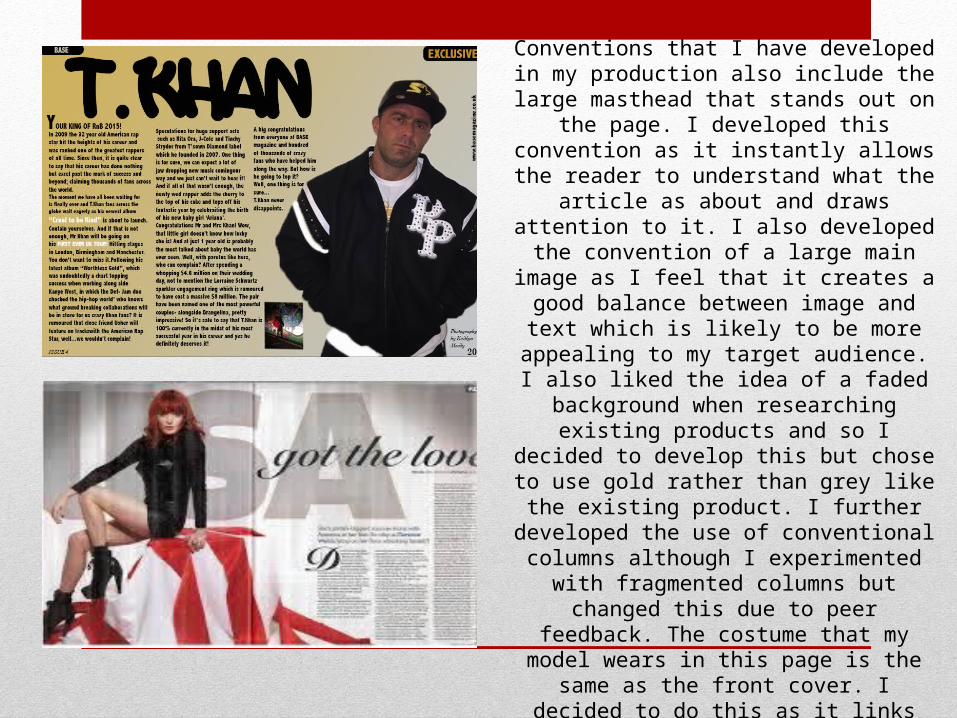
Conventions that I have developed in my production also include the large masthead that
stands out on the page. I developed this convention as it instantly allows the reader to
understand what the article as about and draws attention to it. I also developed the convention of a large main image as I feel that it creates a good balance between image and text which is likely to be more appealing to my target audience. I also
liked the idea of a faded background when researching existing products and so I decided to
develop this but chose to use gold rather than grey like the existing product. I further developed the
use of conventional columns although I experimented with fragmented columns but
changed this due to peer feedback. The costume that my model wears in this page is the same as
the front cover. I decided to do this as it links the two pages together, especially with the main
colour of both pages being gold. This was so that this page can easily be identified as the main
selling point of the magazine. This pose was used to demonstrate a confident and laid back attitude from my model. The fact he has his hands in his
pockets connotes that he is confident with himself which is something a lot of men hope to achieve.

Question 2- How do your media products represent particular social groups? • Given that the majority of my target audience are males around 18-25,
it is likely that the social grade of this reader ship will range from C2-E as a lot of them are still of a young age and so will not be in top
occupation positions in their careers yet. Or could still be in education such as college or university in which case they would fall into social grade E. The advertisements and images that I have used throughout
my magazine tend to portray this social group as laid back with a sporting nature. the costume of my model and the props that he is using and the graffiti background of some of the images help to
connote this idea of my target audience. For example, the basket ball prop that is visible in some of my secondary images portrays the
athletic nature of the social group and the graffiti walls in the background, along with the costume of my model indicate the
stereotypical raw nature of my target audience.
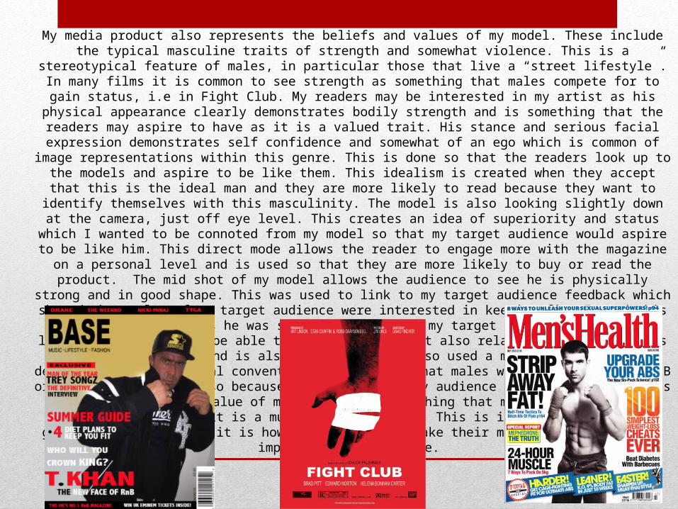
My media product also represents the beliefs and values of my model. These include the typical masculine traits of strength and somewhat violence. This is a stereotypical feature of males, in particular those that live a “street lifestyle”. In many films
it is common to see strength as something that males compete for to gain status, i.e in Fight Club. My readers may be interested in my artist as his physical appearance clearly demonstrates bodily strength and is something that the readers may aspire to have as it is a valued trait. His stance and serious facial expression demonstrates self confidence and somewhat of an ego which is common of image representations within this genre. This is done so that the readers look up to the models and aspire to be like them. This idealism is created when they accept that this is the ideal man and they are more likely to
read because they want to identify themselves with this masculinity. The model is also looking slightly down at the camera, just off eye level. This creates an idea of superiority and status which I wanted to be connoted from my model so that my target audience would aspire to be like him. This direct mode allows the reader to engage more with the magazine on a personal level and is used so that they are more likely to buy or read the product. The mid shot of my model allows the audience to see he is physically strong and in good shape. This was used to link to my target audience feedback which
showed that a lot of my target audience were interested in keeping fit. I used this model in particular as he was slightly older than my target audience so was more likely that they would be able to look up to him but also relate as he demonstrates the
same interests and is also still young. I also used a male as I wanted to develop the stereotypical conventions that showed that males were more common in RnB or rap magazines and also because the majority of my audience were male. My products
also highlight the value of music which is something that my readers would be interested in, given it is a music genre magazine. This is important in this rap genre in particular as it is how a lot of people make their money and so is highly
important in their life.
Question 3 - What type of media institution my distribute your media product and why?
• Bauer, a magazine institution which distributes other products such as Mojo and Kerrang. Bauer is currently Europe’s largest and most successful privately owned publishing group. The company publishes over 300
magazines in 15 countries. The existing magazine which I have researched, VIBE, is currently distributed by intermediate partners which is private equity. They distribute their magazine through their online page which
allows their target audience to browse through some of the articles contained in the magazine. It is also distributed in other areas ranging from local shops to supermarkets and has been done this way since it was
first produced by Quincy Jones in 1993. Although vibe Is distributed by intermediate partners, I feel like Bauer would be a better choice for my own magazine because it would be more likely to help my magazine reach
mass media scales rather than a small scale audience like a lot of existing RnB magazines. • I believe that there is a gap in the market for my magazine of my chosen RnB genre because there are not
many existing products of its kind that are actual magazines rather than online articles.• So because BAUER is a very successful distributing company they would have a bigger budget to use on
expenses to make my magazine the best it could possibly be to attract more readers, e.g. more freebies and better features.
• To distribute my magazine I would have them sold in local shops and supermarkets so that they would be easily available to my target audience. I would also advertise through social media to maximise publicity and
awareness given that a lot of my target audience have access to the internet. • Other institutions that would be available would be companies such as Future. A company that has been ranked
the sixth largest media corporation in the UK and published over 180 magazines in a variety of fields. The reason for this institution not being as suitable is for the fact that it does not specialise in music magazines but
focuses more on gaming and software.
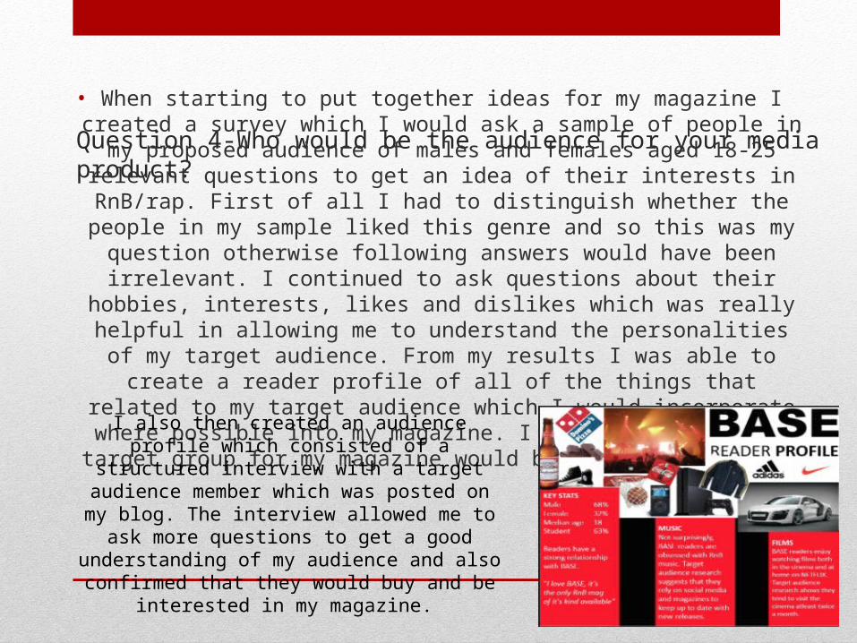
Question 4-Who would be the audience for your media product? • When starting to put together ideas for my magazine I created a survey which I would ask a sample of people in my proposed audience of males and females aged
18-25 relevant questions to get an idea of their interests in RnB/rap. First of all I had to distinguish whether the people in my sample liked this genre and so this was my
question otherwise following answers would have been irrelevant. I continued to ask questions about their hobbies, interests, likes and dislikes which was really helpful
in allowing me to understand the personalities of my target audience. From my results I was able to create a reader profile of all of the things that related to my target audience which I would incorporate where possible into my magazine. I found that the best target group for my magazine would be males aged 18-25.
I also then created an audience profile which consisted of a structured interview with a target audience member which was posted on my blog. The interview allowed me to ask more questions to get a good understanding
of my audience and also confirmed that they would buy and be interested in my magazine.
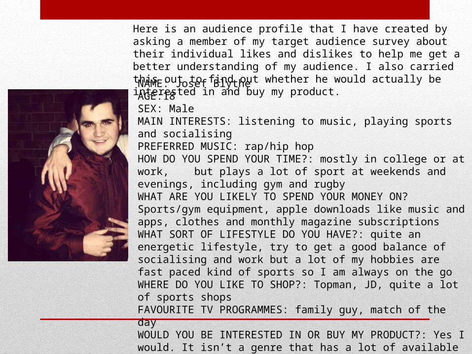
Here is an audience profile that I have created by asking a member of my target audience survey about their individual likes and dislikes to help me get a better understanding of my audience. I also carried this out to find out whether he would actually be interested in and buy my product.
NAME: Josef BlytheAGE:18SEX: MaleMAIN INTERESTS: listening to music, playing sports and socialisingPREFERRED MUSIC: rap/hip hopHOW DO YOU SPEND YOUR TIME?: mostly in college or at work, but plays a lot of sport at weekends and evenings, including gym and rugbyWHAT ARE YOU LIKELY TO SPEND YOUR MONEY ON? Sports/gym equipment, apple downloads like music and apps, clothes and monthly magazine subscriptionsWHAT SORT OF LIFESTYLE DO YOU HAVE?: quite an energetic lifestyle, try to get a good balance of socialising and work but a lot of my hobbies are fast paced kind of sports so I am always on the goWHERE DO YOU LIKE TO SHOP?: Topman, JD, quite a lot of sports shopsFAVOURITE TV PROGRAMMES: family guy, match of the dayWOULD YOU BE INTERESTED IN OR BUY MY PRODUCT?: Yes I would. It isn’t a genre that has a lot of available magazines and so is quite unique with its own specific target audience. It would be good for people like me who have a love of fitness and music.
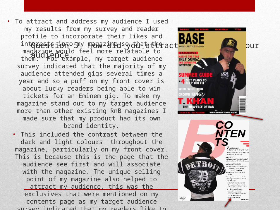
Question 5- How did you attract and address your audience. • To attract and address my audience I used my results from my
survey and reader profile to incorporate their likes and interests into my magazine so that the magazine would feel more relatable to them. For example, my target audience
survey indicated that the majority of my audience attended gigs several times a year and so a puff on my front cover is about lucky readers being able to win tickets for an Eminem gig. To make my magazine stand out to my target audience
more than other existing RnB magazines I made sure that my product had its own brand identity.
• This included the contrast between the dark and light colours throughout the magazine, particularly on my front cover. This is because this is the page that the audience see first and will associate with the magazine. The unique selling point of my
magazine also helped to attract my audience, this was the exclusives that were mentioned on my contents page as my target audience survey indicated that my readers like to see
exclusive images and interviews.
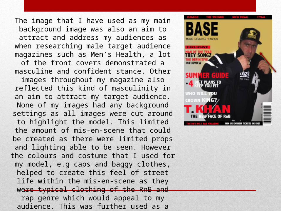
The image that I have used as my main background image was also an aim to attract and address my audiences as
when researching male target audience magazines such as Men’s Health, a lot of the front covers demonstrated a
masculine and confident stance. Other images throughout my magazine also reflected this kind of masculinity in an aim to attract my target audience. None of my images had any background settings as all images were cut around to highlight the model. This limited the amount of mis-en-
scene that could be created as there were limited props and lighting able to be seen. However the colours and costume
that I used for my model, e.g caps and baggy clothes, helped to create this feel of street life within the mis-en-scene as they were typical clothing of the RnB and rap genre which would appeal to my audience. This was further used as a page in regards to fashion that was mentioned on my contents page as my reader profile
survey indicated that they were interested in clothing.
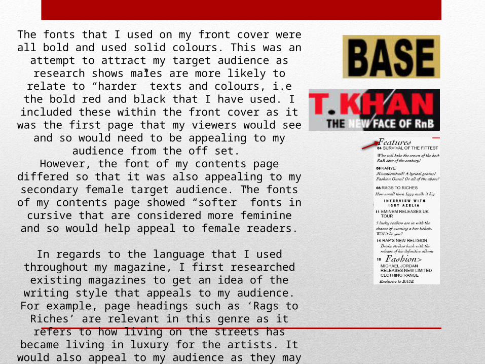
The fonts that I used on my front cover were all bold and used solid colours. This was an attempt to attract my target audience as
research shows males are more likely to relate to “harder” texts and colours, i.e the bold red and black that I have used. I included these within the front cover as it was the first page that my viewers would see and so would need to be appealing to my audience from
the off set. However, the font of my contents page differed so that it was also appealing to my secondary female target audience. The fonts of
my contents page showed “softer” fonts in cursive that are considered more feminine and so would help appeal to female
readers.
In regards to the language that I used throughout my magazine, I first researched existing magazines to get an idea of the writing style that appeals to my audience. For example, page headings such as ‘Rags to Riches’ are relevant in this genre as it refers to
how living on the streets has became living in luxury for the artists. It would also appeal to my audience as they may aspire to do the same one day. The language is informal in an attempt to
create a strong reader-writer bond so that the readers feel comfortable and like they can relate to the magazine. This was a
common feature that I found of existing products.
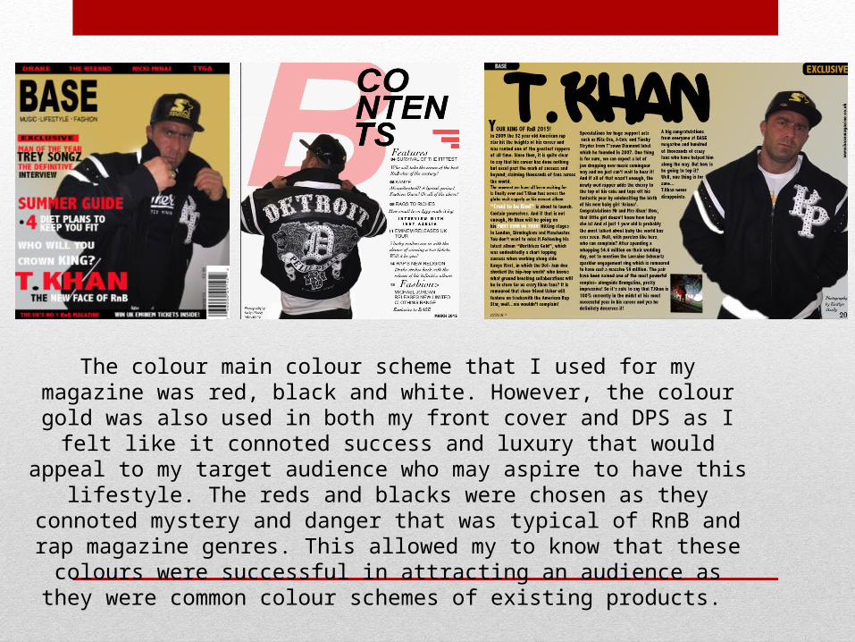
The colour main colour scheme that I used for my magazine was red, black and white. However, the colour gold was also used in both my front cover and DPS as I felt like it connoted success and luxury that would appeal to my target audience who may aspire to have this lifestyle. The reds and blacks were chosen as they connoted mystery and danger that was typical of RnB and rap magazine genres. This allowed my to know that these colours were successful in attracting an audience as they were
common colour schemes of existing products.

Question 6-What have you learnt about technologies through the process of constructing this product?
• While constructing my magazine I have learnt new skills on Photoshop that I was unfamiliar with in the past such as blending options and different textures you could apply to text and layers. This included the gradient
tool that I used on my front cover to create the gold-grey fade and reflected a scale of success. I also experimented with the opacity tool when creating my water colour background ‘B’. I made this feature less
opaque so that it was not too bold and did not over power the page. • I also learned about different lighting options that you could add to images to create different effects which
I experimented with in my own images, e.g. the back lighting I used which helped to create the mysterious tone to my secondary images.
• Another new topic which I learned about were the different shot angles that an image could be taken from to portray levels of power and dominance in an image. This was used in my sub images on my double page spread in which the camera was positioned at a low angle to portray authority and status of the model.
• Other devices and softwares which I used to create my blog were Dafont- a website that allowed be to browse a selection of creative fonts relevant to my Rap/RnB genre and download to the computer to use in my magazine. Blogger- a program that allowed me to post all of my updates onto the internet and keep up
to date on time management. Imac- the hardware that allowed me to use all of the programs such as Photoshop. A Canon camera- the equipment that I took my images with for good quality. Prezi- an online
program allowing me to make more media rich presentations in a fun and interactive. Slideshare- a presentation software site that helped me embed powerpoint slides onto my blog instead of block texts.
Soundcloud- a audio software that allowed me to create voice recordings to make my post more media rich.
Question 7- Looking back at your preliminary task, what do you feel you have learned in the progression from it to the full product. • Looking back at my preliminary task I feel like my product has improved in many ways such as improving the
professionalism of my work from researching existing conventions of magazines and how real products use them successfully. This has helped my work look more like an established product as it has demonstrated the
use of popular conventions. • Another progression that I have made is the quality and content of my images making sure they are relevant
and interesting to my audience. • Overall, my skills on programs such as Photoshop have been allowed to develop through experimenting more
and gaining a better understanding of the tools which has allowed my work to progress. For example, how to create effects on text unlike the word art that I had used within my preliminary task. How to remove
backgrounds from images and cut around white space to make images and text over lap. These are all features that I struggled with in my preliminary task but was able to improve in my finished product.
• I have also learned about how theories such as colour theory and the study of semiotics can help in. These studies allow me to know what colours are likely to appeal most to my audiences and what effect I can create
from certain images or text.
• Extended research has also allowed me to further understand my target audience and so I can now successfully add in cover lines and advertisements that I know that they would be interested in which would help boost
sales.


![[Slideshare]alkaff mosquesession(draft as on 6june 2011) (1)](https://img.pdfslide.us/doc/110x75/55a184e11a28ab6c688b4629/slidesharealkaff-mosquesessiondraft-as-on-6june-2011-1.jpg)


![[Slideshare] tadzkirah-may-2015 -muhammad-as-awaited-prophert-(10-may-2015)](https://img.pdfslide.us/doc/110x75/55a95bf41a28abdc4d8b4832/slideshare-tadzkirah-may-2015-muhammad-as-awaited-prophert-10-may-2015.jpg)
![[Slideshare] tadzkirah-february-2013-be-grateful-as-muslims(aali'imran-3-v-164]](https://img.pdfslide.us/doc/110x75/54c183c84a79595c6b8b456b/slideshare-tadzkirah-february-2013-be-grateful-as-muslimsaaliimran-3-v-164.jpg)