Embed Size (px)
Citation preview
MEDIA PRINT PRODUCTS
EVALUATION
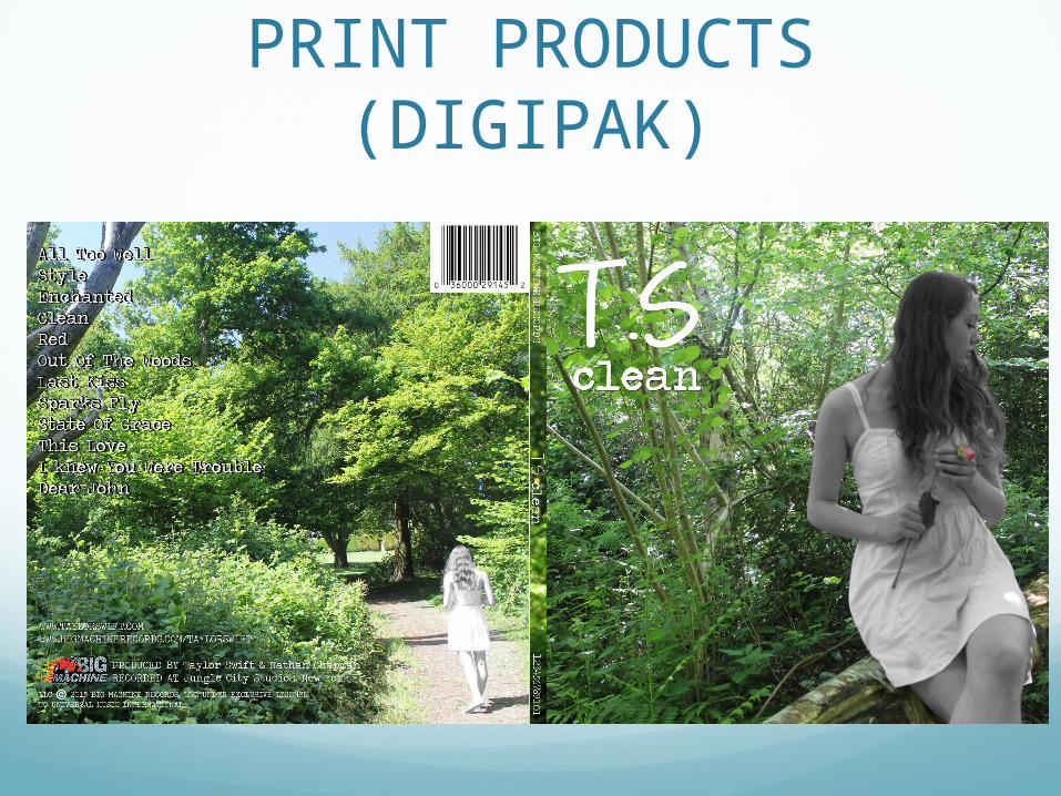
PRINT PRODUCTS(DIGIPAK)
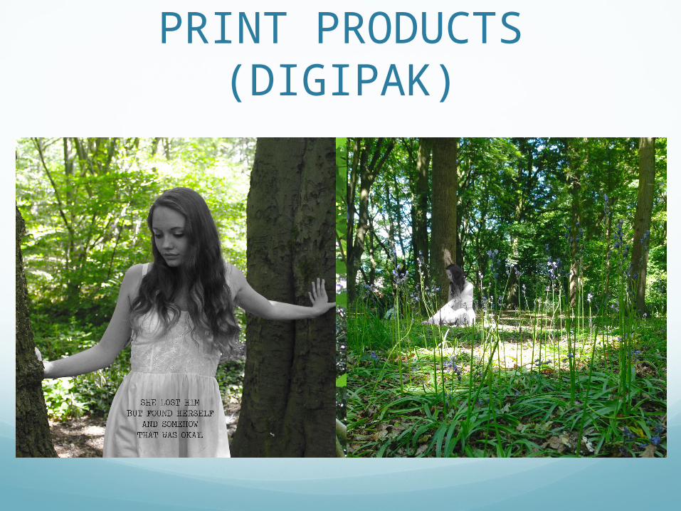
PRINT PRODUCTS(DIGIPAK)
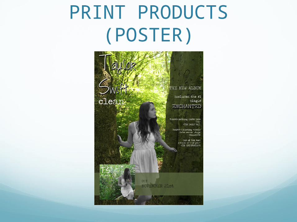
PRINT PRODUCTS(POSTER)
‘Just from looking at the digipak and advert, what genre do you think the album consists
of?’
I asked this question because I wanted to know if it was easy to identify the genre, which is actually pop.
The majority of people answered ‘pop’ which Is the answer I was hoping to get. Some people however said that they thought the genre was ‘country’. This was probably due to the use of a forest set and also because Taylor Swift is known for doing country music.
‘Does the effect of the black and white girl against a bright forest work well? If you
could, explain how’
All of the people who answered my questionnaire answered ‘yes’.
A lot of them said that it worked because of the contrast between the bright, exposure effect and the black and white effect on Louisa. They also said that they got a melancholic and personal theme from the products, which closely resembles the song ‘clean’ itself.
‘How could I Improve the print products?’
These are some of the responses I received:
• ‘Change the ‘t.s’ to Taylor Swift so the artist is more recognizable’
• ‘It’s slightly difficult to see the tracklistings’
• ‘Change the font of ‘t.s’ so it is more obvious that the genre is pop’
• ‘Add more information in the green box on the poster. Maybe a bonus track etc.’
• ‘Perhaps include some social media links’
I will take these responses into account whilst making my final draft of my print products.
However, I may not change the ‘t.s’ because I put it like that because Taylor Swift is so well known, her full name doesn't’t have to be used for people to recognize her. I also used the font shown so it looks like swift has written it herself, hinting at a personal theme.