Embed Size (px)
Citation preview
In what way does your media product use, develop or challenge forms and conventions of
real media products?
EVALUATION
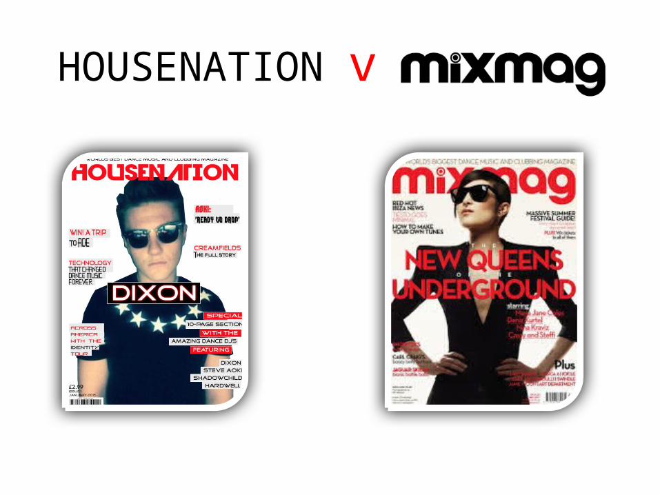
HOUSENATION v
MASTHEAD
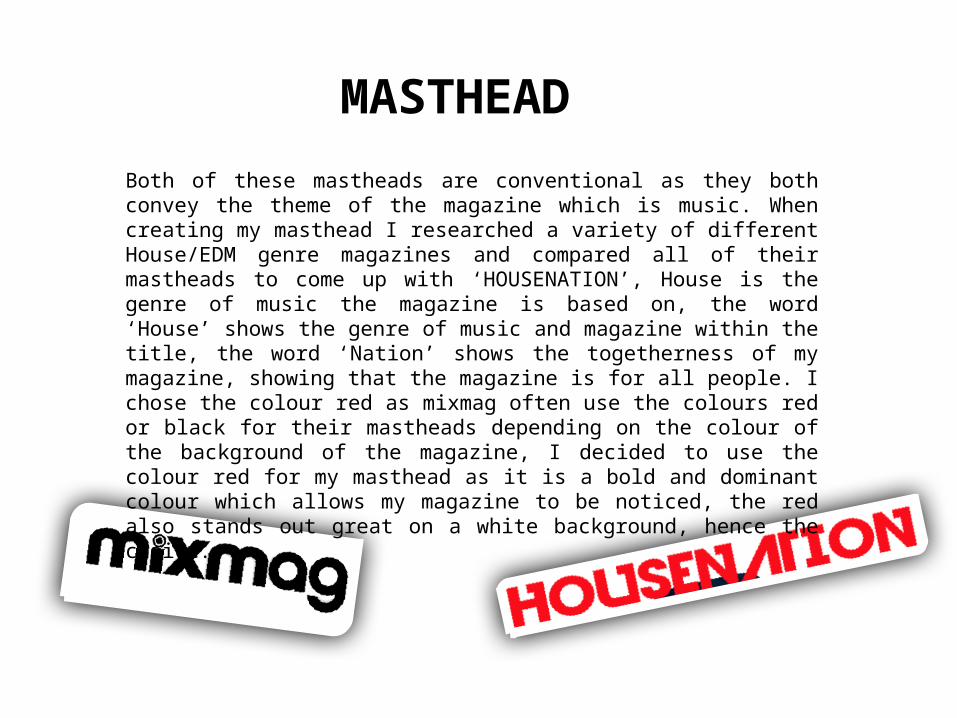
Both of these mastheads are conventional as they both convey the theme of the magazine which is music. When creating my masthead I researched a variety of different House/EDM genre magazines and compared all of their mastheads to come up with ‘HOUSENATION’, House is the genre of music the magazine is based on, the word ‘House’ shows the genre of music and magazine within the title, the word ‘Nation’ shows the togetherness of my magazine, showing that the magazine is for all people. I chose the colour red as mixmag often use the colours red or black for their mastheads depending on the colour of the background of the magazine, I decided to use the colour red for my masthead as it is a bold and dominant colour which allows my magazine to be noticed, the red also stands out great on a white background, hence the choice.
Mise En Scene
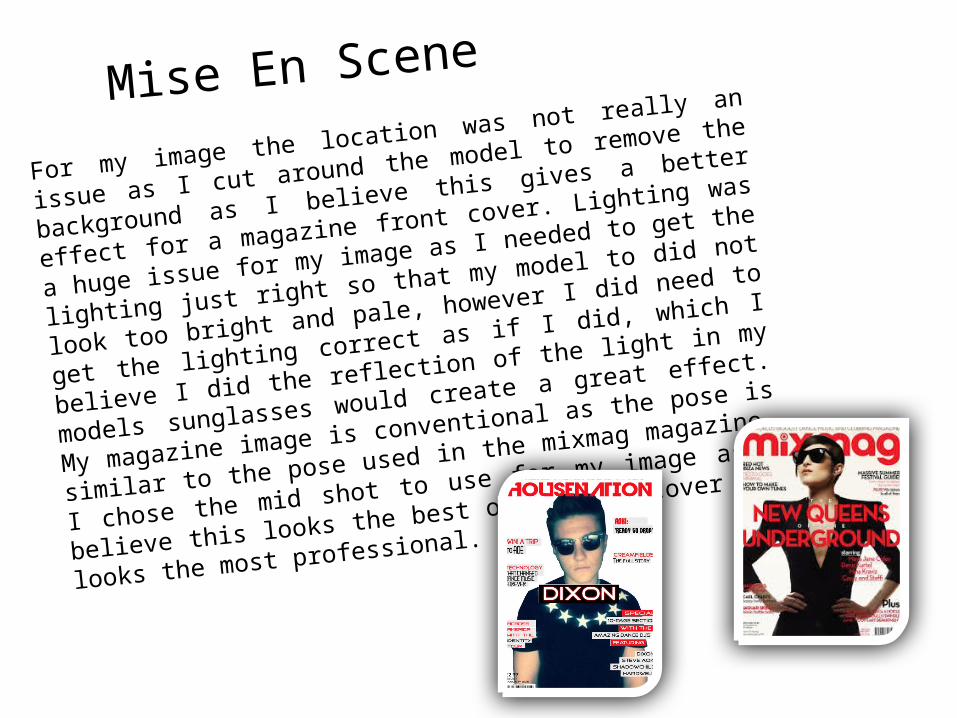
For my image the location was not really an issue as I cut around
the model to remove the background as I believe this gives a
better effect for a magazine front cover. Lighting was a huge issue
for my image as I needed to get the lighting just right so that my
model to did not look too bright and pale, however I did need to
get the lighting correct as if I did, which I believe I did the
reflection of the light in my models sunglasses would create a
great effect. My magazine image is conventional as the pose is
similar to the pose used in the mixmag magazine, I chose the mid
shot to use for my image as I believe this looks the best on a front
cover and looks the most professional.
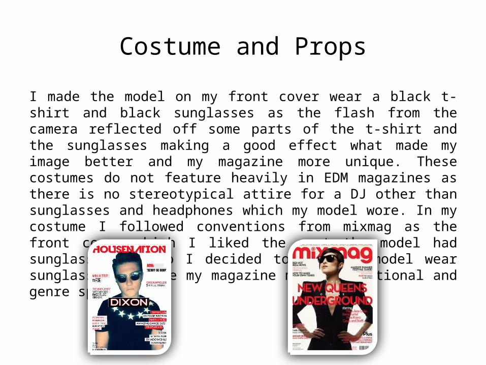
Costume and Props
I made the model on my front cover wear a black t-shirt and black sunglasses as the flash from the camera reflected off some parts of the t-shirt and the sunglasses making a good effect what made my image better and my magazine more unique. These costumes do not feature heavily in EDM magazines as there is no stereotypical attire for a DJ other than sunglasses and headphones which my model wore. In my costume I followed conventions from mixmag as the front cover which I liked the most the model had sunglasses on, so I decided to make my model wear sunglasses to make my magazine more conventional and genre specific.
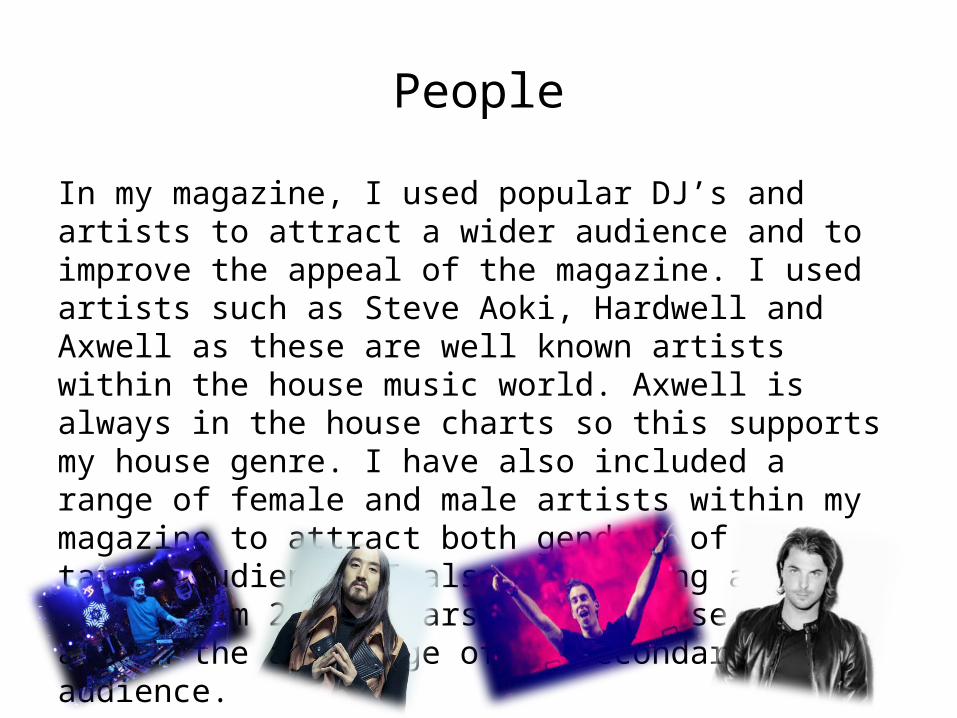
People
In my magazine, I used popular DJ’s and artists to attract a wider audience and to improve the appeal of the magazine. I used artists such as Steve Aoki, Hardwell and Axwell as these are well known artists within the house music world. Axwell is always in the house charts so this supports my house genre. I have also included a range of female and male artists within my magazine to attract both genders of my target audience. I also used young artists aging from 20-30 years old as these people are in the age range of my secondary audience.
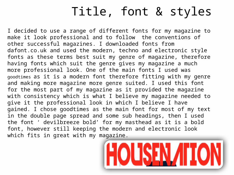
Title, font & styles
I decided to use a range of different fonts for my magazine to make it look professional and to follow the conventions of other successful magazines. I downloaded fonts from dafont.co.uk and used the modern, techno and electronic style fonts as these terms best suit my genre of magazine, therefore having fonts which suit the genre gives my magazine a much more professional look. One of the main fonts I used was goodtimes as it is a modern font therefore fitting with my genre and making more magazine more genre suited. I used this font for the most part of my magazine as it provided the magazine with consistency which is what I believe my magazine needed to give it the professional look in which I believe I have gained. I chose goodtimes as the main font for most of my text in the double page spread and some sub headings, then I used the font ‘ devilbreeze bold’ for my masthead as it is a bold font, however still keeping the modern and electronic look which fits in great with my magazine.
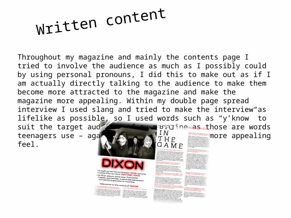
Written content
Throughout my magazine and mainly the contents page I tried to involve the audience as much as I possibly could by using personal pronouns, I did this to make out as if I am actually directly talking to the audience to make them become more attracted to the magazine and make the magazine more appealing. Within my double page spread interview I used slang and tried to make the interview as lifelike as possible, so I used words such as “y’know” to suit the target audience of my magazine as those are words teenagers use – again giving the magazine a more appealing feel.
How is the genre reflected
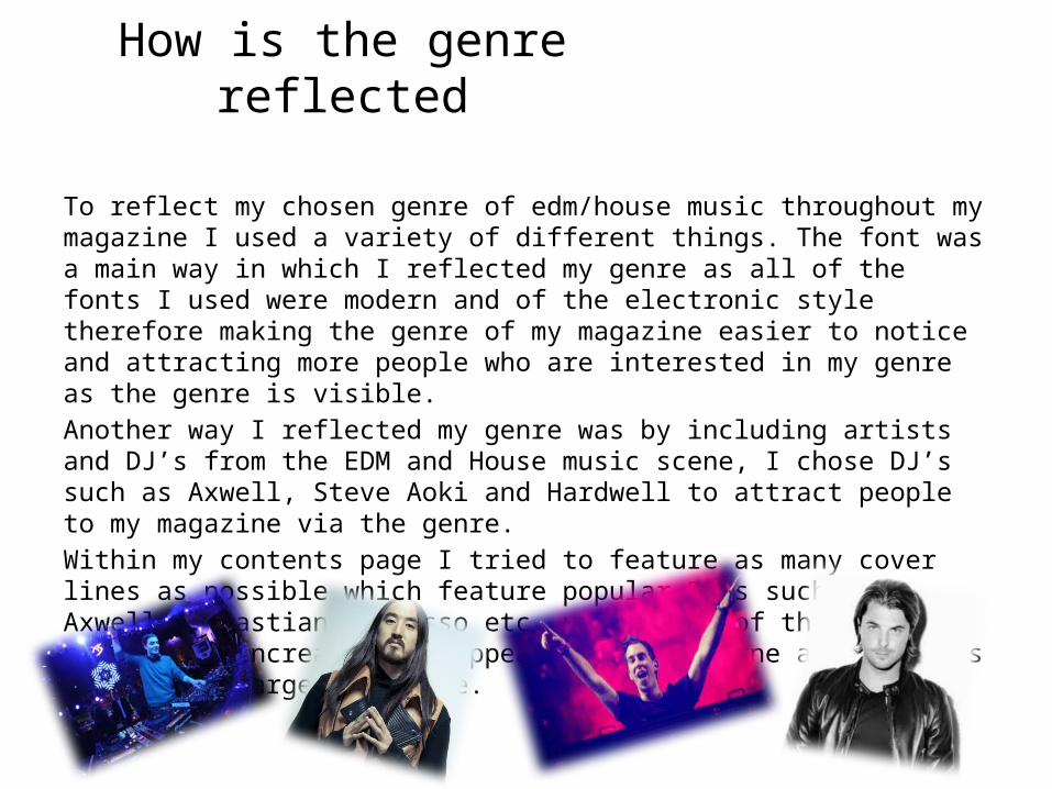
To reflect my chosen genre of edm/house music throughout my magazine I used a variety of different things. The font was a main way in which I reflected my genre as all of the fonts I used were modern and of the electronic style therefore making the genre of my magazine easier to notice and attracting more people who are interested in my genre as the genre is visible.Another way I reflected my genre was by including artists and DJ’s from the EDM and House music scene, I chose DJ’s such as Axwell, Steve Aoki and Hardwell to attract people to my magazine via the genre. Within my contents page I tried to feature as many cover lines as possible which feature popular DJ’s such as Axwell, Sebastian Ingrosso etc. using DJ’s of this popularity increases the appeal of my magazine and attracts more of my target audience.
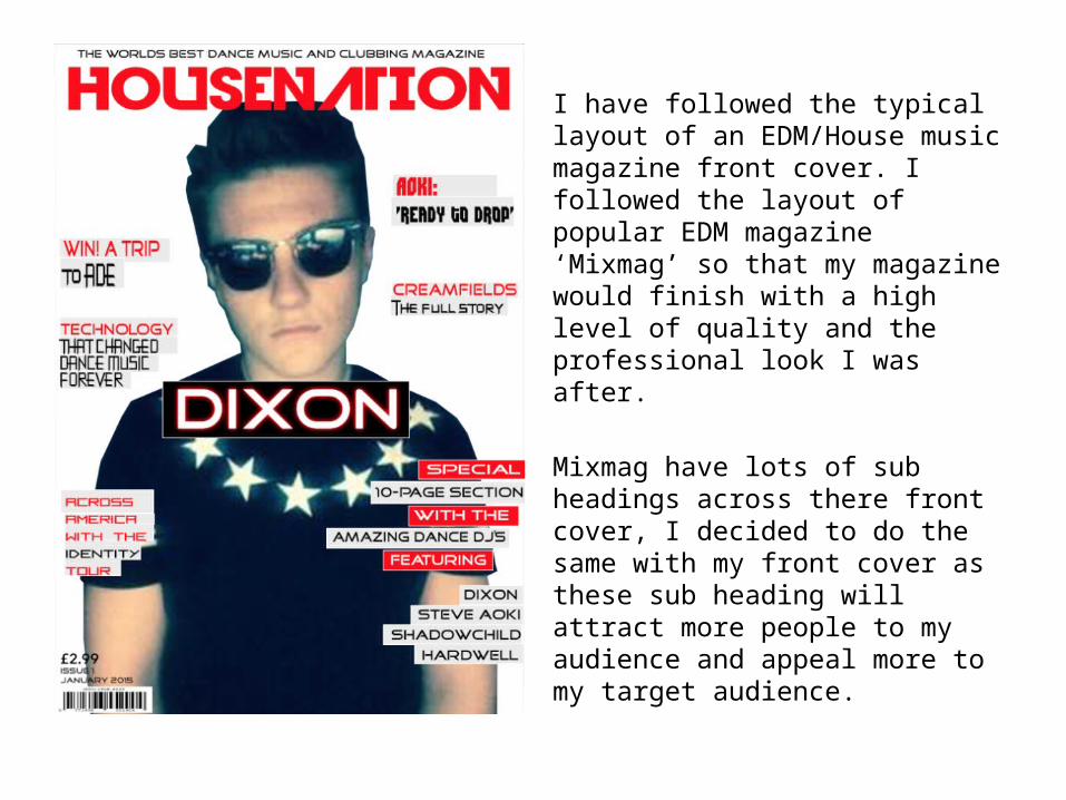
I have followed the typical layout of an EDM/House music magazine front cover. I followed the layout of popular EDM magazine ‘Mixmag’ so that my magazine would finish with a high level of quality and the professional look I was after.
Mixmag have lots of sub headings across there front cover, I decided to do the same with my front cover as these sub heading will attract more people to my audience and appeal more to my target audience.
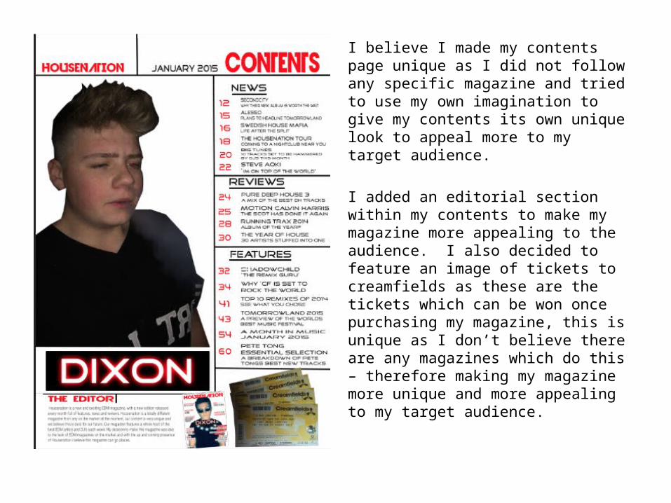
I believe I made my contents page unique as I did not follow any specific magazine and tried to use my own imagination to give my contents its own unique look to appeal more to my target audience.
I added an editorial section within my contents to make my magazine more appealing to the audience. I also decided to feature an image of tickets to creamfields as these are the tickets which can be won once purchasing my magazine, this is unique as I don’t believe there are any magazines which do this – therefore making my magazine more unique and more appealing to my target audience.
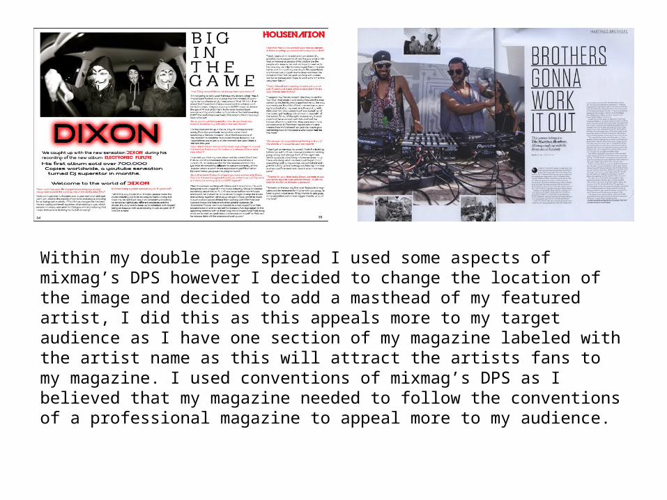
Within my double page spread I used some aspects of mixmag’s DPS however I decided to change the location of the image and decided to add a masthead of my featured artist, I did this as this appeals more to my target audience as I have one section of my magazine labeled with the artist name as this will attract the artists fans to my magazine. I used conventions of mixmag’s DPS as I believed that my magazine needed to follow the conventions of a professional magazine to appeal more to my audience.