Embed Size (px)
Citation preview
HOW EFFECTIVE IS THE COMBINATION OF YOUR MAIN PRODUCT AND ANCILLARY TEXTS?Evaluation – Question 2
In order to promote the film, I have created a trailer, which is the main product, as well as a film poster and magazine cover. These three items make up the marketing campaign for the film. All three need to work together in order to promote the film and convey the information needed in order to create a 'buzz'. The cover and poster should mirror the trailer as that encapsulate the film the most out of the three different marketing methods. The magazine cover is likely to be the least similar to the trailer as it will have the magazine's brand throughout the cover rather than the film's.
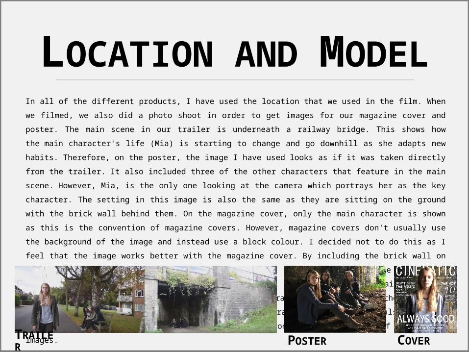
LOCATION AND MODELIn all of the different products, I have used the location that we used in the film. When we filmed, we also did a photo shoot in order to get images for our magazine cover and poster. The main scene in our trailer is underneath a railway bridge. This shows how the main character's life (Mia) is starting to change and go downhill as she adapts new habits. Therefore, on the poster, the image I have used looks as if it was taken directly from the trailer. It also included three of the other characters that feature in the main scene. However, Mia, is the only one looking at the camera which portrays her as the key character. The setting in this image is also the same as they are sitting on the ground with the brick wall behind them. On the magazine cover, only the main character is shown as this is the convention of magazine covers. However, magazine covers don't usually use the background of the image and instead use a block colour. I decided not to do this as I feel that the image works better with the magazine cover. By including the brick wall on the cover the film is portrayed more accurately. It also suggests that the article is focusing on the film, not just the star on the cover. Also, including the main character on the front cover implies that she is the main character in the film to the audience. Therefore, all of the products show who the main character is clearly and also they all have a very similar look with the use of the location in the background of all of the images.
TRAILER
POSTER
COVER
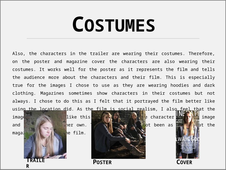
COSTUMESAlso, the characters in the trailer are wearing their costumes. Therefore, on the poster and magazine cover the characters are also wearing their costumes. It works well for the poster as it represents the film and tells the audience more about the characters and their film. This is especially true for the images I chose to use as they are wearing hoodies and dark clothing. Magazines sometimes show characters in their costumes but not always. I chose to do this as I felt that it portrayed the film better like using the location did. As the film is social realism, I also feel that the image worked better like this than cutting out the character from the image and placing her on her own. This would've also not been as clear that the magazine linked to the film.
TRAILER
POSTER
COVER
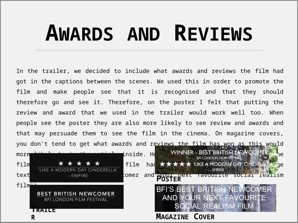
AWARDS AND REVIEWSIn the trailer, we decided to include what awards and reviews the film had got in the captions between the scenes. We used this in order to promote the film and make people see that it is recognised and that they should therefore go and see it. Therefore, on the poster I felt that putting the review and award that we used in the trailer would work well too. When people see the poster they are also more likely to see review and awards and that may persuade them to see the film in the cinema. On magazine covers, you don't tend to get what awards and reviews the film has won as this would more likely be in the article inside. However, since I wanted to promote the film, I included that the film had won an award in the anchorage text ('BFI's Best British Newcomer and your next favourite social realism film').
TRAILER
POSTER
MAGAZINE COVER
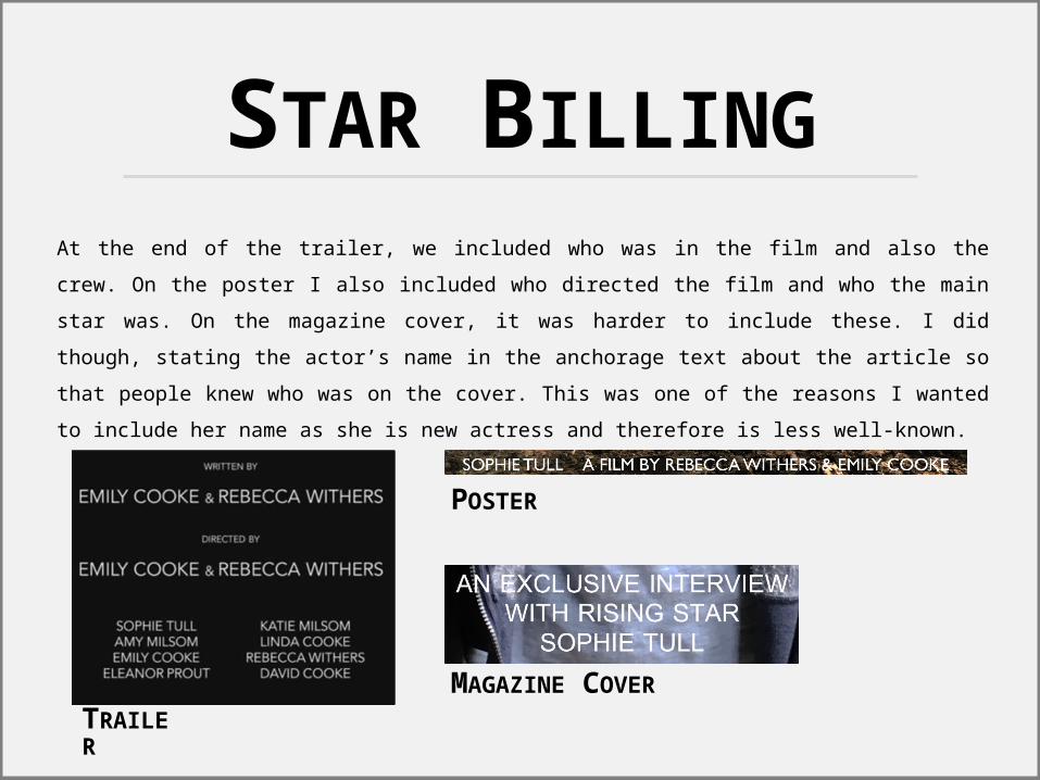
STAR BILLINGAt the end of the trailer, we included who was in the film and also the crew. On the poster I also included who directed the film and who the main star was. On the magazine cover, it was harder to include these. I did though, stating the actor’s name in the anchorage text about the article so that people knew who was on the cover. This was one of the reasons I wanted to include her name as she is new actress and therefore is less well-known.
TRAILER
POSTER
MAGAZINE COVER
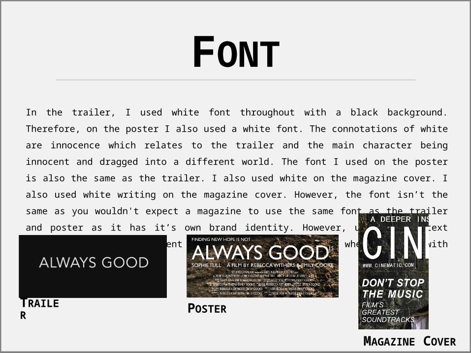
FONTIn the trailer, I used white font throughout with a black background. Therefore, on the poster I also used a white font. The connotations of white are innocence which relates to the trailer and the main character being innocent and dragged into a different world. The font I used on the poster is also the same as the trailer. I also used white on the magazine cover. I also used white writing on the magazine cover. However, the font isn’t the same as you wouldn't expect a magazine to use the same font as the trailer and poster as it has it’s own brand identity. However, using white text linked all of the different products still, especially when combined with similar images.
TRAILER
POSTER
MAGAZINE COVER
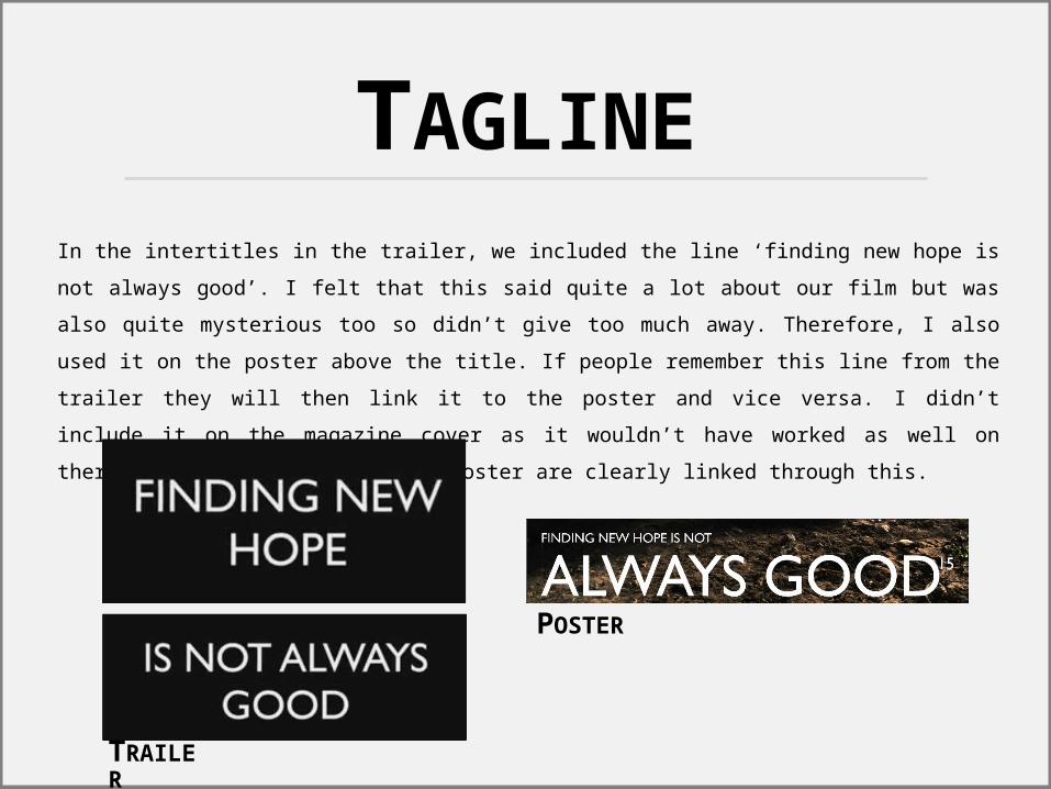
TAGLINEIn the intertitles in the trailer, we included the line ‘finding new hope is not always good’. I felt that this said quite a lot about our film but was also quite mysterious too so didn’t give too much away. Therefore, I also used it on the poster above the title. If people remember this line from the trailer they will then link it to the poster and vice versa. I didn’t include it on the magazine cover as it wouldn’t have worked as well on there. However, the trailer and poster are clearly linked through this.
TRAILER
POSTER
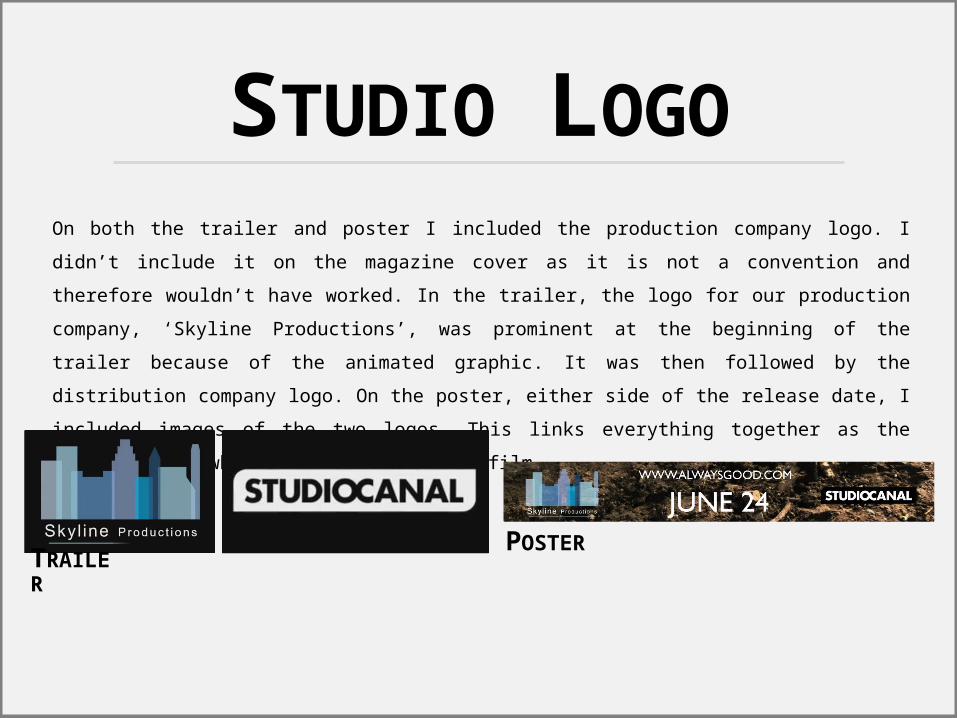
STUDIO LOGOOn both the trailer and poster I included the production company logo. I didn’t include it on the magazine cover as it is not a convention and therefore wouldn’t have worked. In the trailer, the logo for our production company, ‘Skyline Productions’, was prominent at the beginning of the trailer because of the animated graphic. It was then followed by the distribution company logo. On the poster, either side of the release date, I included images of the two logos. This links everything together as the audience know what studio produced the film.
TRAILER
POSTER
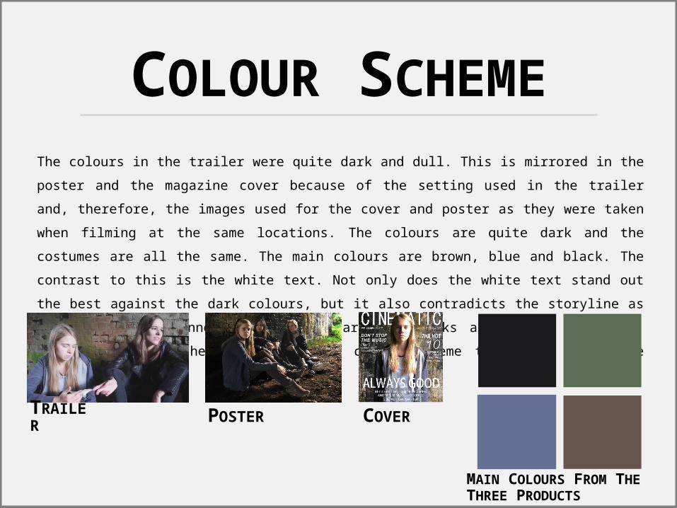
COLOUR SCHEMEThe colours in the trailer were quite dark and dull. This is mirrored in the poster and the magazine cover because of the setting used in the trailer and, therefore, the images used for the cover and poster as they were taken when filming at the same locations. The colours are quite dark and the costumes are all the same. The main colours are brown, blue and black. The contrast to this is the white text. Not only does the white text stand out the best against the dark colours, but it also contradicts the storyline as white represents innocence and the narrative looks at illegal behaviour. Therefore, using the same image and colour scheme throughout links the products clearly.
TRAILER
POSTER
COVER
MAIN COLOURS FROM THE THREE PRODUCTS
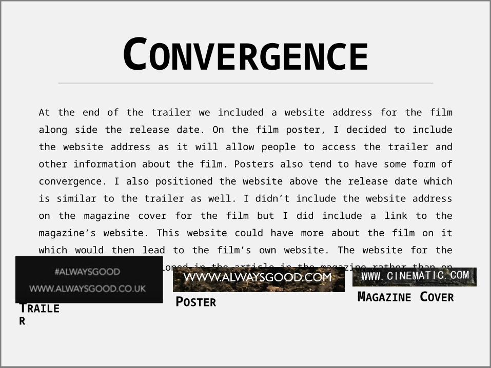
CONVERGENCEAt the end of the trailer we included a website address for the film along side the release date. On the film poster, I decided to include the website address as it will allow people to access the trailer and other information about the film. Posters also tend to have some form of convergence. I also positioned the website above the release date which is similar to the trailer as well. I didn’t include the website address on the magazine cover for the film but I did include a link to the magazine’s website. This website could have more about the film on it which would then lead to the film’s own website. The website for the film may also be mentioned in the article in the magazine rather than on the cover.
TRAILER
POSTER
MAGAZINE COVER
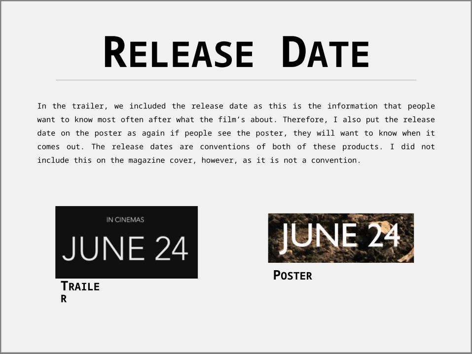
RELEASE DATEIn the trailer, we included the release date as this is the information that people want to know most often after what the film’s about. Therefore, I also put the release date on the poster as again if people see the poster, they will want to know when it comes out. The release dates are conventions of both of these products. I did not include this on the magazine cover, however, as it is not a convention.
TRAILER
POSTER
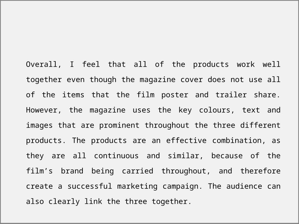
Overall, I feel that all of the products work well together even though the magazine cover does not use all of the items that the film poster and trailer share. However, the magazine uses the key colours, text and images that are prominent throughout the three different products. The products are an effective combination, as they are all continuous and similar, because of the film’s brand being carried throughout, and therefore create a successful marketing campaign. The audience can also clearly link the three together.

![Evaluation [2]](https://img.pdfslide.us/doc/110x75/5499401ab4795902178b4570/evaluation-2-5584a82e204e6.jpg)