Embed Size (px)
Citation preview
Evaluation Task 1:In what way does your media product use, develop or
challenge forms and conventions of real media products?
Media Forms Media forms our the shape of the media product.
Eg. A music video or newspaper.The media form will determine the medium that
the product is produced in, eg. Music videos are made in film or video.
There are also other things to think about like length of the product, music videos are about 3-5 minutes but blockbuster films can tend to be at least 2 hours long.
Media Conventions:Conventions are the established features and style of a
media form. The conventions of a pop video would be high key
lighting, bright colours, lots of close ups of the artist.Convention are used to satisfy the audience to prevent
disappointment.Producers our using tried and tested formulas that is
known to be successful I will be looking at R and B rap videos and what
conventions they have used and how I have used them in my own music video.
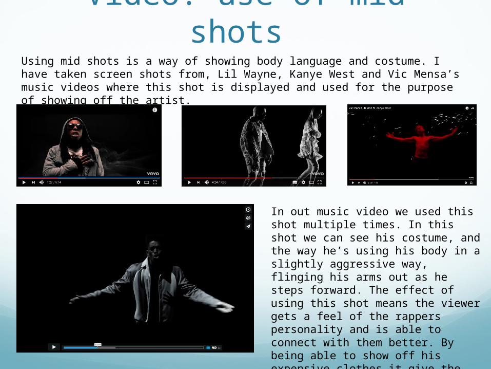
Video: use of mid shots Using mid shots is a way of showing body language and costume. I have taken screen shots from, Lil Wayne, Kanye West and Vic Mensa’s music videos where this shot is displayed and used for the purpose of showing off the artist.
In out music video we used this shot multiple times. In this shot we can see his costume, and the way he’s using his body in a slightly aggressive way, flinging his arms out as he steps forward. The effect of using this shot means the viewer gets a feel of the rappers personality and is able to connect with them better. By being able to show off his expensive clothes it give the video that high fashion, glossy look.
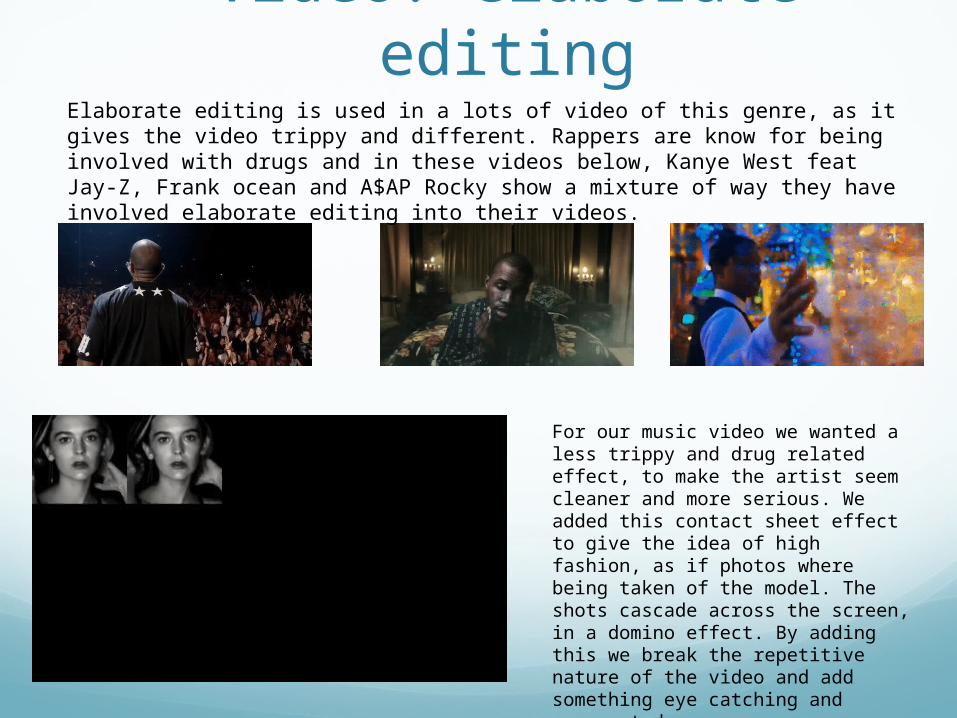
Video: elaborate editingElaborate editing is used in a lots of video of this genre, as it gives the video trippy and different. Rappers are know for being involved with drugs and in these videos below, Kanye West feat Jay-Z, Frank ocean and A$AP Rocky show a mixture of way they have involved elaborate editing into their videos.
For our music video we wanted a less trippy and drug related effect, to make the artist seem cleaner and more serious. We added this contact sheet effect to give the idea of high fashion, as if photos where being taken of the model. The shots cascade across the screen, in a domino effect. By adding this we break the repetitive nature of the video and add something eye catching and unexpected.
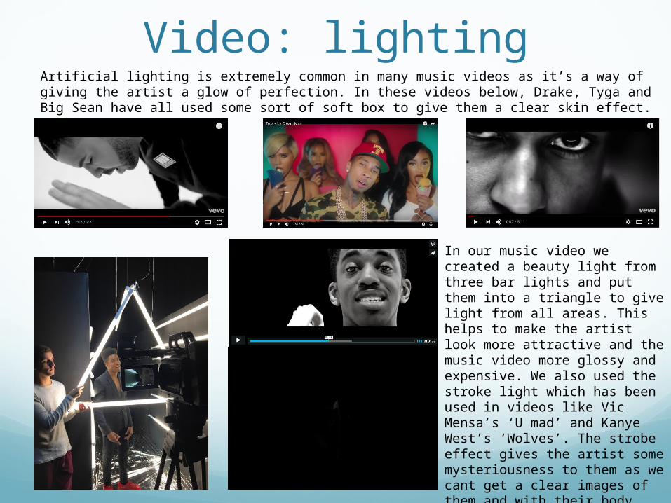
Video: lightingArtificial lighting is extremely common in many music videos as it’s a way of giving the artist a glow of perfection. In these videos below, Drake, Tyga and Big Sean have all used some sort of soft box to give them a clear skin effect.
In our music video we created a beauty light from three bar lights and put them into a triangle to give light from all areas. This helps to make the artist look more attractive and the music video more glossy and expensive. We also used the stroke light which has been used in videos like Vic Mensa’s ‘U mad’ and Kanye West’s ‘Wolves’. The strobe effect gives the artist some mysteriousness to them as we cant get a clear images of them and with their body language it can help their movements look for aggressive.
Video: costume, hair and makeup
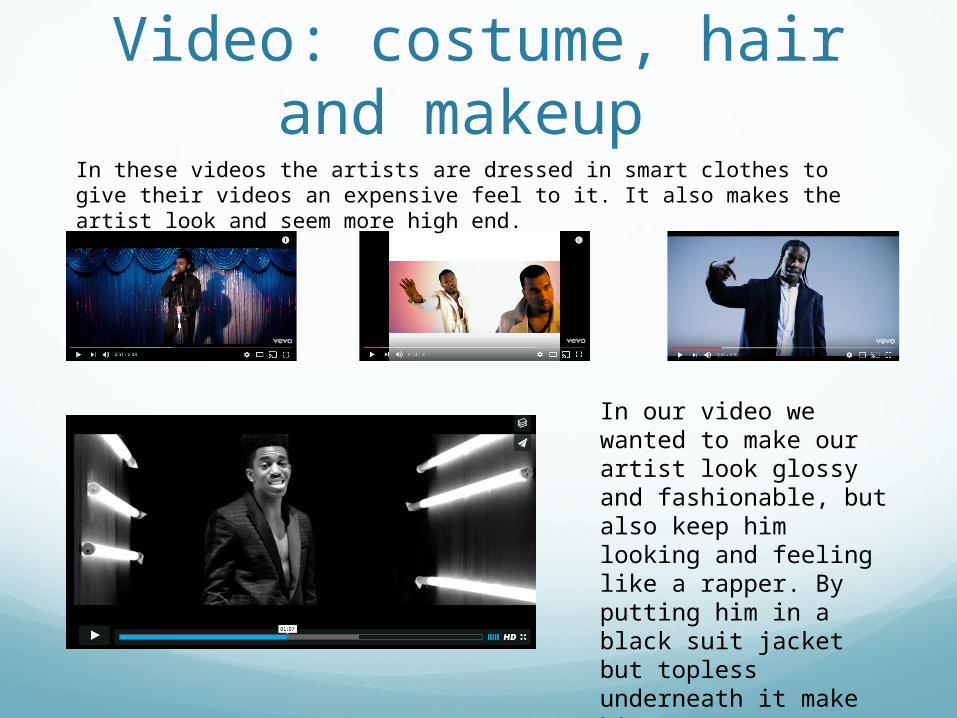
In these videos the artists are dressed in smart clothes to give their videos an expensive feel to it. It also makes the artist look and seem more high end.
In our video we wanted to make our artist look glossy and fashionable, but also keep him looking and feeling like a rapper. By putting him in a black suit jacket but topless underneath it make him seem more sexy and R and B like.
Video: colour
This helps our artist to keep up his image as being expensive and high fashion. We could have enhanced the colors to make them stronger but we didn’t want our artist to come across too much like pop but more serious and more high-end.
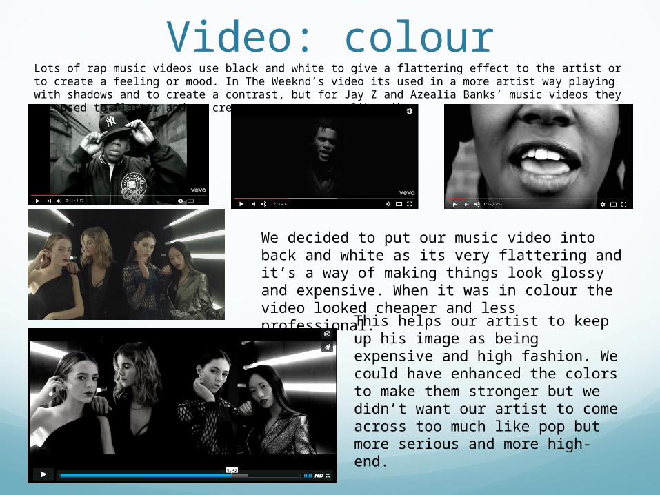
Lots of rap music videos use black and white to give a flattering effect to the artist or to create a feeling or mood. In The Weeknd’s video its used in a more artist way playing with shadows and to create a contrast, but for Jay Z and Azealia Banks’ music videos they are used to flatter and to create a more street like vibe.
We decided to put our music video into back and white as its very flattering and it’s a way of making things look glossy and expensive. When it was in colour the video looked cheaper and less professional.
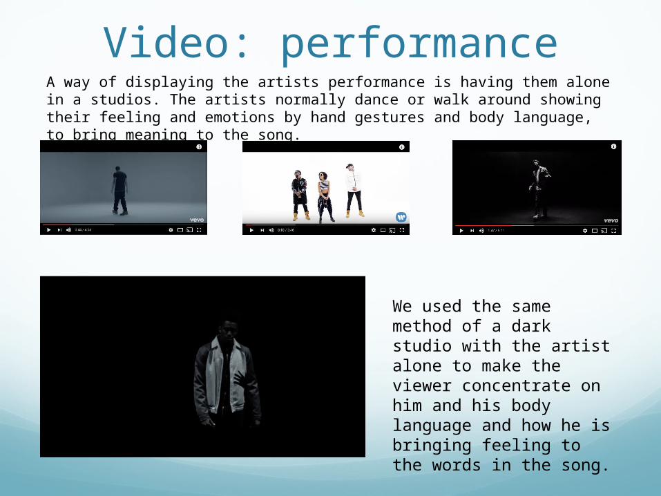
Video: performanceA way of displaying the artists performance is having them alone in a studios. The artists normally dance or walk around showing their feeling and emotions by hand gestures and body language, to bring meaning to the song.
We used the same method of a dark studio with the artist alone to make the viewer concentrate on him and his body language and how he is bringing feeling to the words in the song.
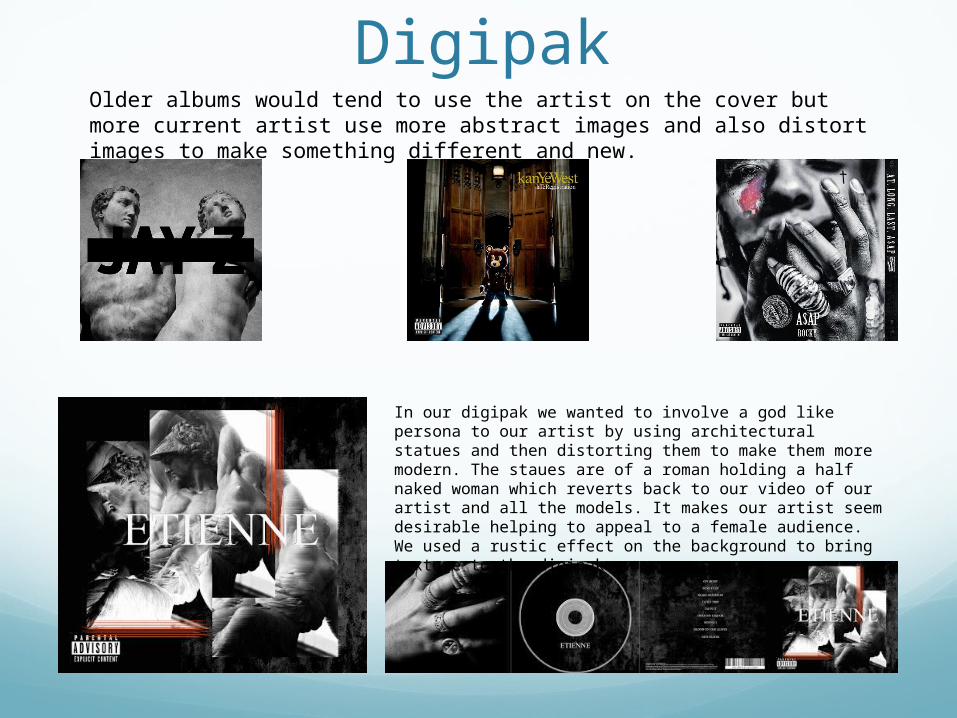
Digipak Older albums would tend to use the artist on the cover but more current artist use more abstract images and also distort images to make something different and new.
In our digipak we wanted to involve a god like persona to our artist by using architectural statues and then distorting them to make them more modern. The staues are of a roman holding a half naked woman which reverts back to our video of our artist and all the models. It makes our artist seem desirable helping to appeal to a female audience. We used a rustic effect on the background to bring texture to the digipak.
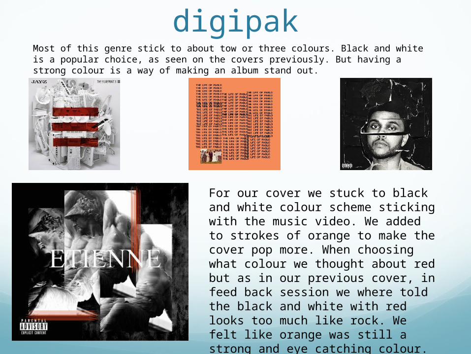
digipakMost of this genre stick to about tow or three colours. Black and white is a popular choice, as seen on the covers previously. But having a strong colour is a way of making an album stand out.
For our cover we stuck to black and white colour scheme sticking with the music video. We added to strokes of orange to make the cover pop more. When choosing what colour we thought about red but as in our previous cover, in feed back session we where told the black and white with red looks too much like rock. We felt like orange was still a strong and eye catching colour.
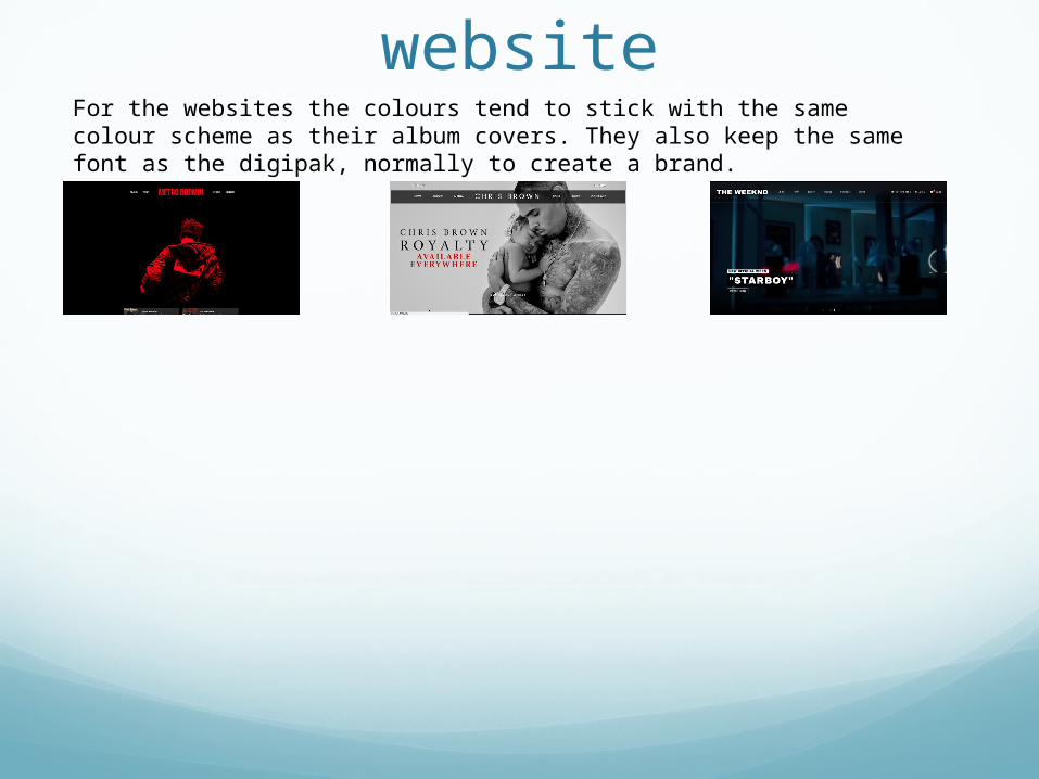
websiteFor the websites the colours tend to stick with the same colour scheme as their album covers. They also keep the same font as the digipak, normally to create a brand.


![Evaluation[1] (1)](https://img.pdfslide.us/doc/110x75/5561971bd8b42a71658b580b/evaluation1-1-55849ad7bf915.jpg)
![Evaluation [1]](https://img.pdfslide.us/doc/110x75/55cf8fa6550346703b9e6ad7/evaluation-1-56476fe25d659.jpg)