Embed Size (px)
Citation preview

Engaging Responsive Design
How to Optimize Emails for All Devices Using Media Queries
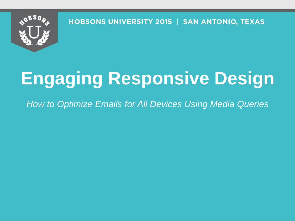
What is responsive design?
Why does responsive design matter?
How do I implement responsive design?
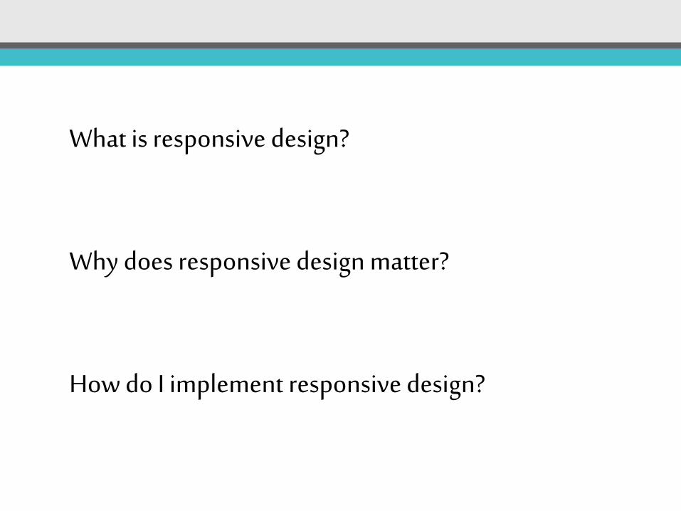
What is responsive design?
What is fluid, or liquid design?
What is adaptive design?
Fluid widths at multiple viewports/breakpoints
Full width of single viewport Maintain 100% width
Fixed & Fluid widths at multiple viewports/breakpoints
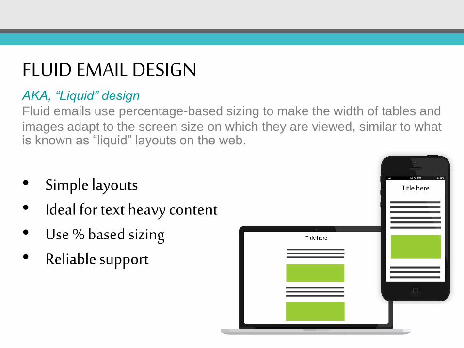
FLUID EMAIL DESIGN AKA, “Liquid” design
Fluid emails use percentage-based sizing to make the width of tables and
images adapt to the screen size on which they are viewed, similar to what is known as “liquid” layouts on the web.
• Simple layouts • Ideal for text heavy content • Use % based sizing • Reliable support
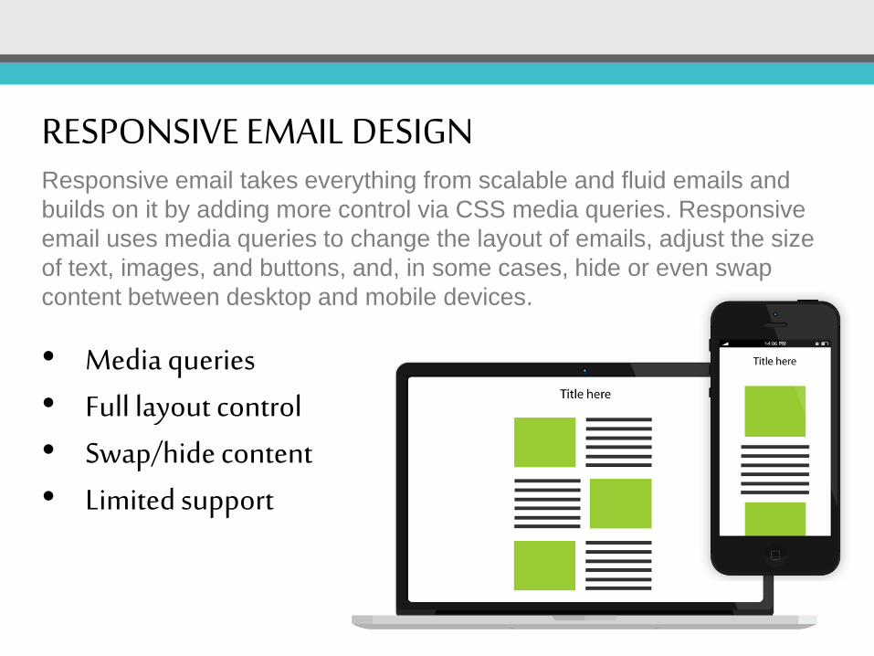
RESPONSIVE EMAIL DESIGN Responsive email takes everything from scalable and fluid emails and
builds on it by adding more control via CSS media queries. Responsive
email uses media queries to change the layout of emails, adjust the size
of text, images, and buttons, and, in some cases, hide or even swap
content between desktop and mobile devices.
• Media queries • Full layout control • Swap/hide content • Limited support
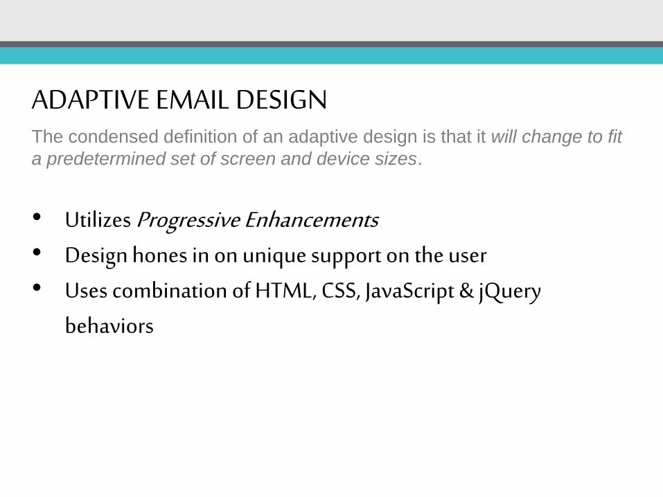
ADAPTIVE EMAIL DESIGN The condensed definition of an adaptive design is that it will change to fit
a predetermined set of screen and device sizes.
• Utilizes Progressive Enhancements • Design hones in on unique support on the user • Uses combination of HTML, CSS, JavaScript & jQuery
behaviors
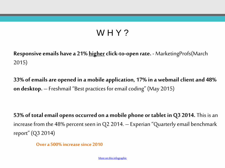
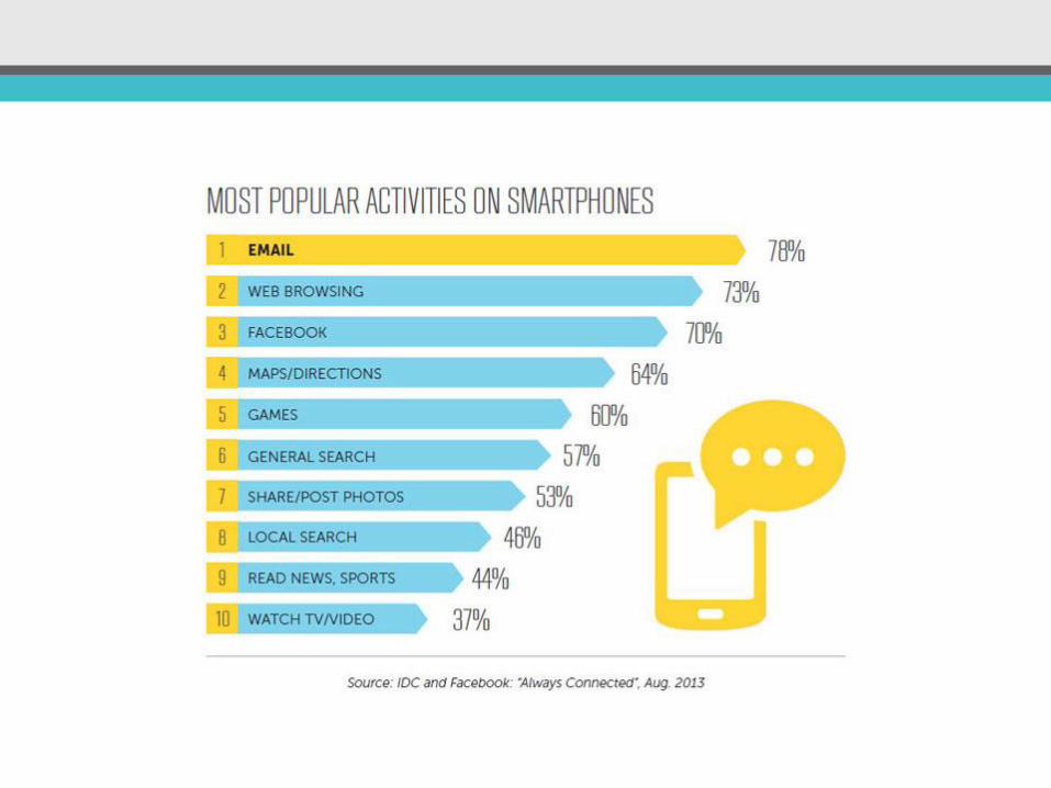
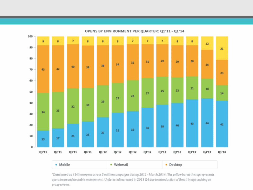
53% of total email opens occurred on a mobile phone or tablet in Q3 2014. This is an increase from the 48% percent seen in Q2 2014. – Experian “Quarterly email benchmark report” (Q3 2014)
More on this infographic
W H Y ?
Responsive emails have a 21% higher click-to-open rate. - MarketingProfs(March 2015)
33% of emails are opened in a mobile application, 17% in a webmail client and 48% on desktop. – Freshmail “Best practices for email coding” (May 2015)
Over a 500% increase since 2010
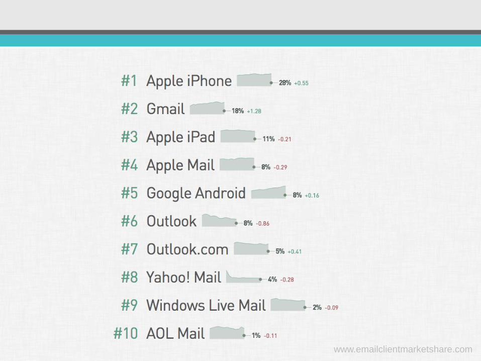
www.emailclientmarketshare.com
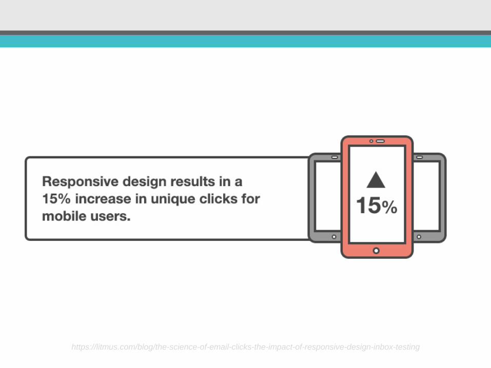
https://litmus.com/blog/the-science-of-email-clicks-the-impact-of-responsive-design-inbox-testing
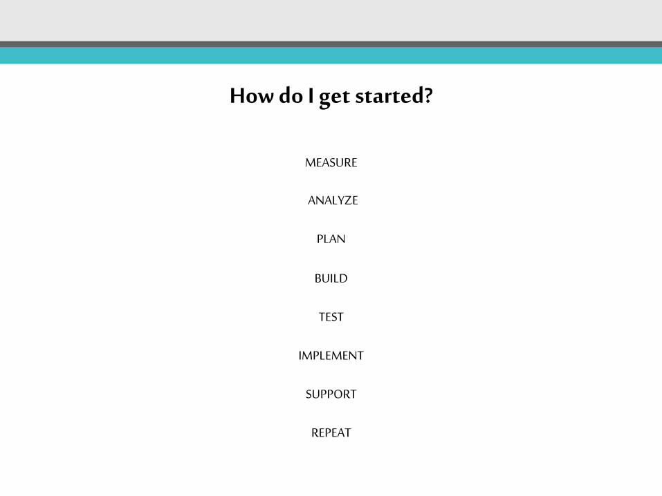
How do I get started?
MEASURE
ANALYZE
PLAN
BUILD
TEST
IMPLEMENT
SUPPORT
REPEAT
…LETS BUILD SOMETHING
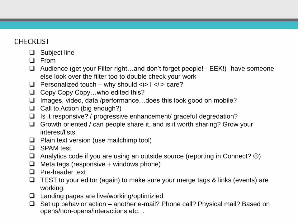
CHECKLIST Subject line
From
Audience (get your Filter right…and don’t forget people! - EEK!)- have someone
else look over the filter too to double check your work
Personalized touch – why should <i> I </i> care?
Copy Copy Copy…who edited this?
Images, video, data /performance…does this look good on mobile?
Call to Action (big enough?)
Is it responsive? / progressive enhancement/ graceful degredation?
Growth oriented / can people share it, and is it worth sharing? Grow your
interest/lists
Plain text version (use mailchimp tool)
SPAM test
Analytics code if you are using an outside source (reporting in Connect? )
Meta tags (responsive + windows phone)
Pre-header text
TEST to your editor (again) to make sure your merge tags & links (events) are
working.
Landing pages are live/working/optimizied
Set up behavior action – another e-mail? Phone call? Physical mail? Based on opens/non-opens/interactions etc…
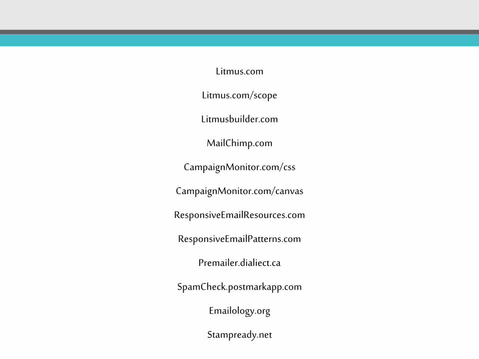
Litmus.com
Litmus.com/scope
Litmusbuilder.com
MailChimp.com
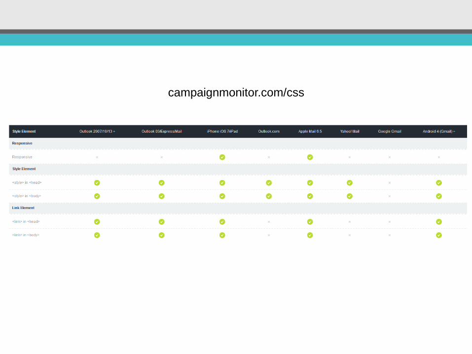
CampaignMonitor.com/css
CampaignMonitor.com/canvas
ResponsiveEmailResources.com
ResponsiveEmailPatterns.com
Premailer.dialiect.ca
SpamCheck.postmarkapp.com
Emailology.org
Stampready.net
Questions?
![Evaluating Spatial-Keyword Queries on Streaming …amr/papers/gis18.evalskq.pdfqueries in big data systems that optimize their performance for fast data, e.g., [19, 37, 40, 41]. This](https://img.pdfslide.us/doc/110x75/5f03df927e708231d40b302b/evaluating-spatial-keyword-queries-on-streaming-amrpapersgis18-queries-in-big.jpg)
![Pronto: A Software-Defined Networking based System for ... · of SDN to optimize the performance of analytical queries on distributed data stores [6], which analyzes and shows the](https://img.pdfslide.us/doc/110x75/5f03df917e708231d40b3023/pronto-a-software-deined-networking-based-system-for-of-sdn-to-optimize-the.jpg)


![Students Writing Emails to Faculty: An Examination …..."employ visual anonymity strategically [and] to optimize their self-presentation" (Duthler, 2006, para. 16). If students can,](https://img.pdfslide.us/doc/110x75/5ecc9d9d8730b33d276a8035/students-writing-emails-to-faculty-an-examination-employ-visual-anonymity.jpg)