Embed Size (px)
Citation preview
eLearning-related
Visual Design Trends
What Non-Designers
Need To Know
Session Speaker: Bianca Woods
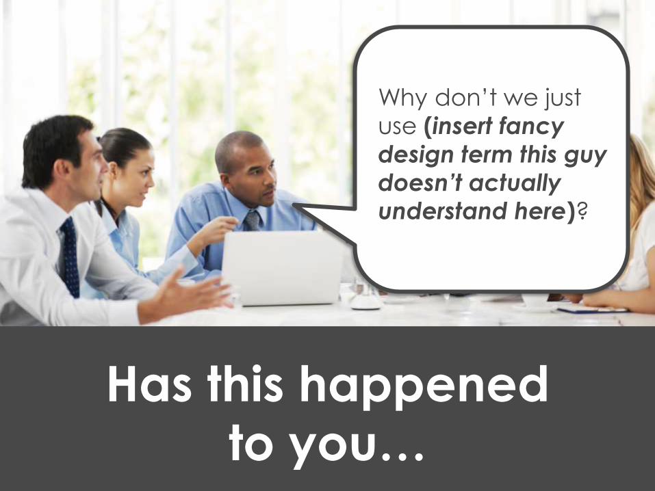
Has this happened
to you…
Why don’t we just
use (insert fancy
design term this guy
doesn’t actually understand here)?
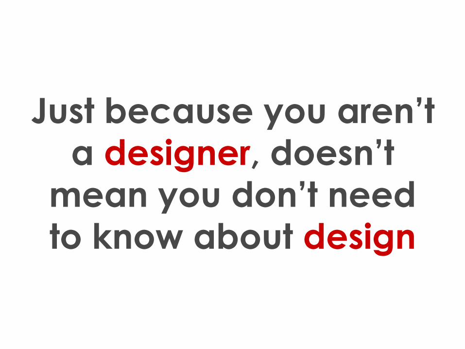
Just because you aren’t
a designer, doesn’t
mean you don’t need
to know about design
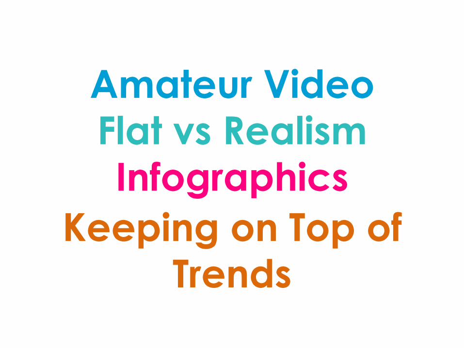
Amateur Video
Flat vs Realism
Infographics
Keeping on Top of
Trends
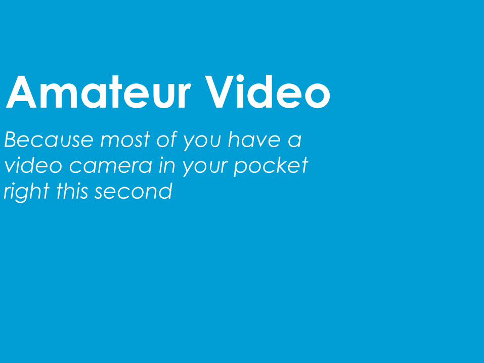
Amateur VideoBecause most of you have a
video camera in your pocket
right this second
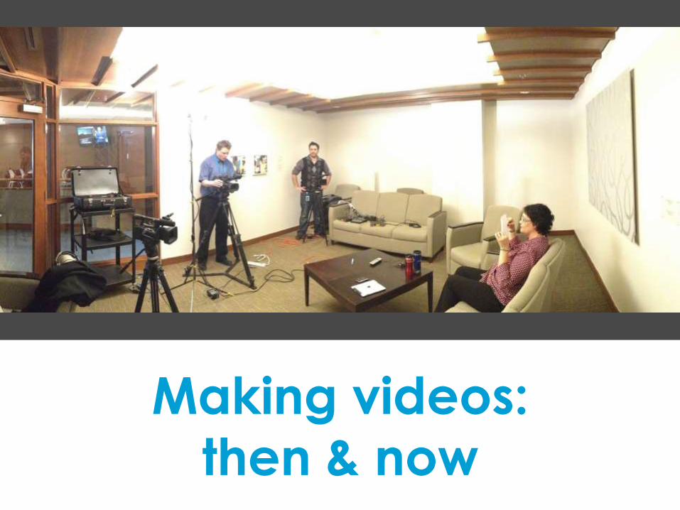
Making videos:
then & now
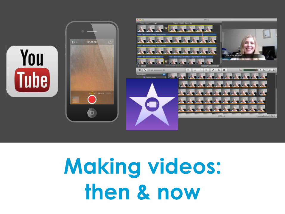
Making videos:
then & now
So why does this matter
if you’re in L&D?
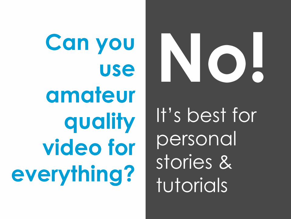
Can you
use
amateur
quality
video for
everything?
No!It’s best for
personal
stories &
tutorials
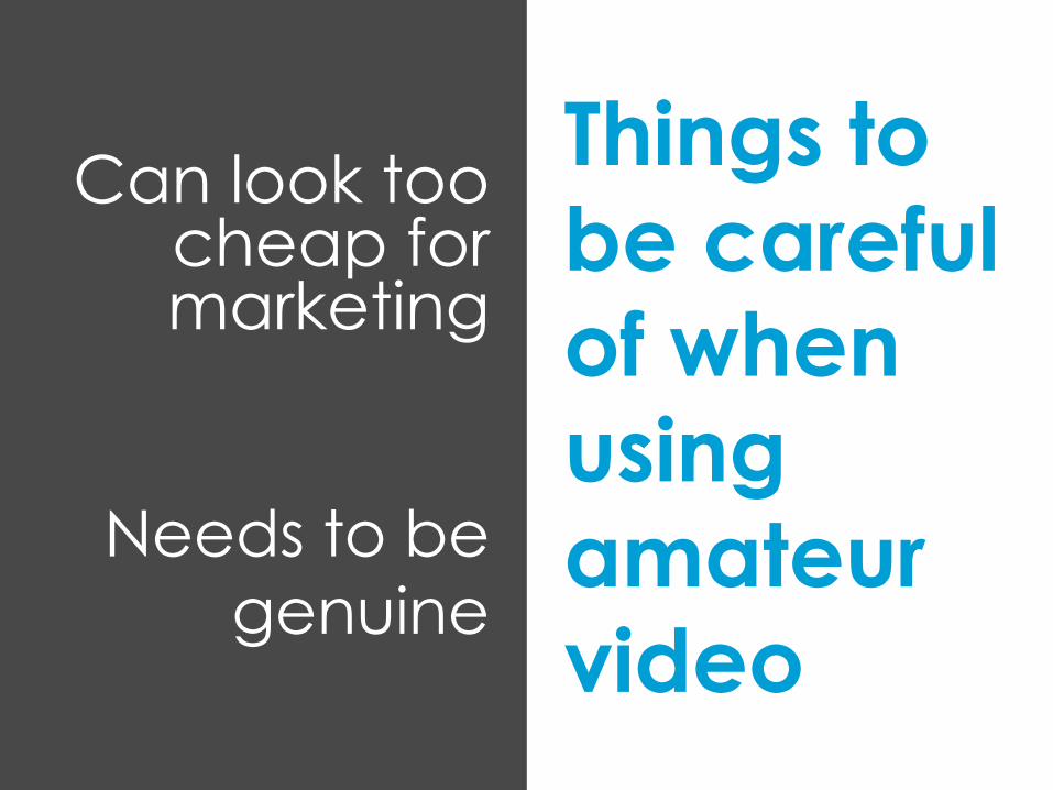
Things to
be careful
of when
using
amateur
video
Needs to be
genuine
Can look too cheap for marketing
Don’t skimp on…
sound
Don’t skimp on…
good lighting
Don’t skimp on…
camera steadiness
Don’t skimp on…
storytelling
Don’t skimp on…
editing
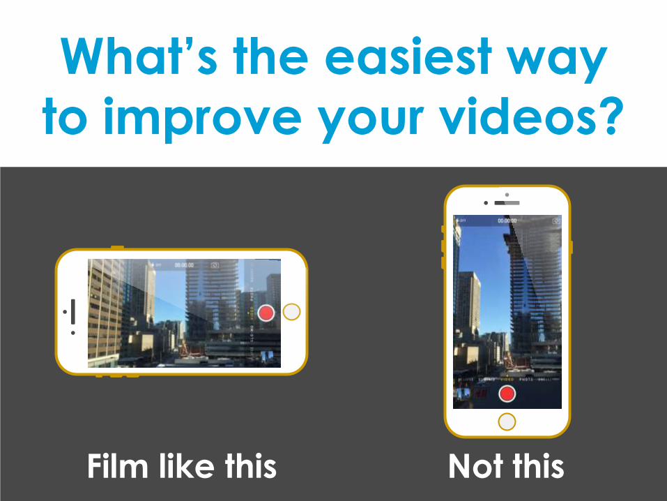
What’s the easiest way
to improve your videos?
Film like this Not this
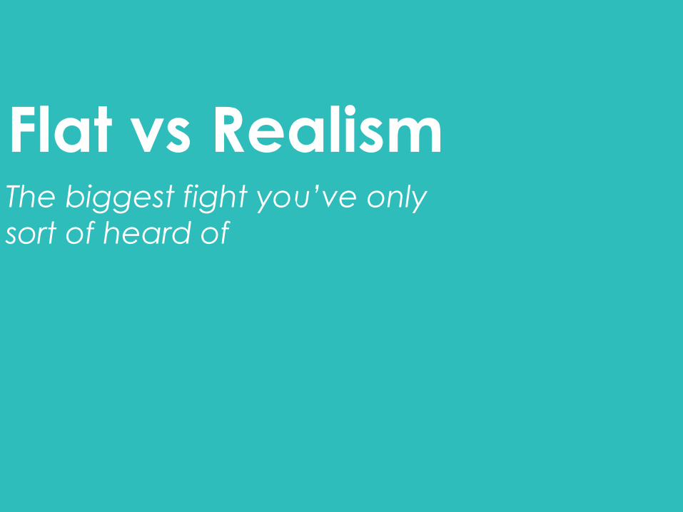
Flat vs RealismThe biggest fight you’ve only
sort of heard of
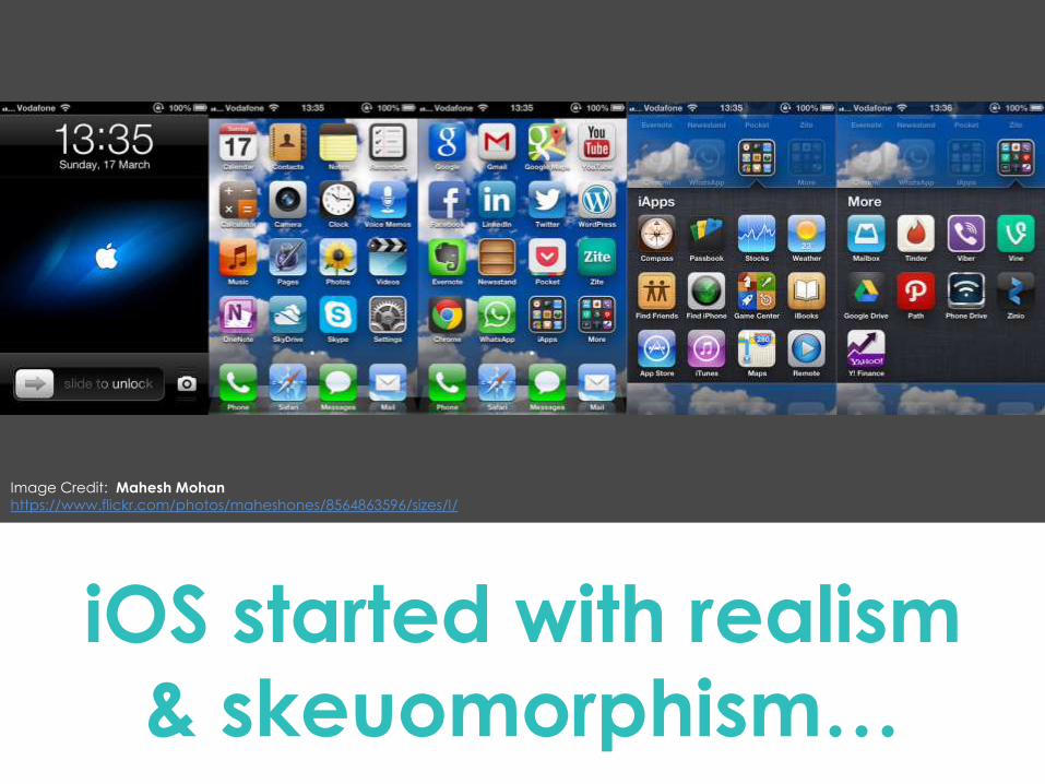
iOS started with realism
& skeuomorphism…
Image Credit: Mahesh Mohan
https://www.flickr.com/photos/maheshones/8564863596/sizes/l/
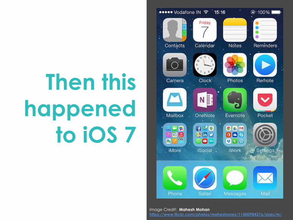
Then this
happened
to iOS 7
Image Credit: Mahesh Mohan
https://www.flickr.com/photos/maheshones/11400984316/sizes/m/
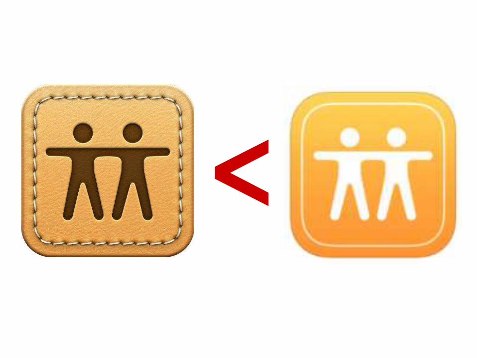
<
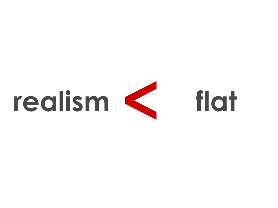
<realism flat
=

So why does this matter
if you’re in L&D?
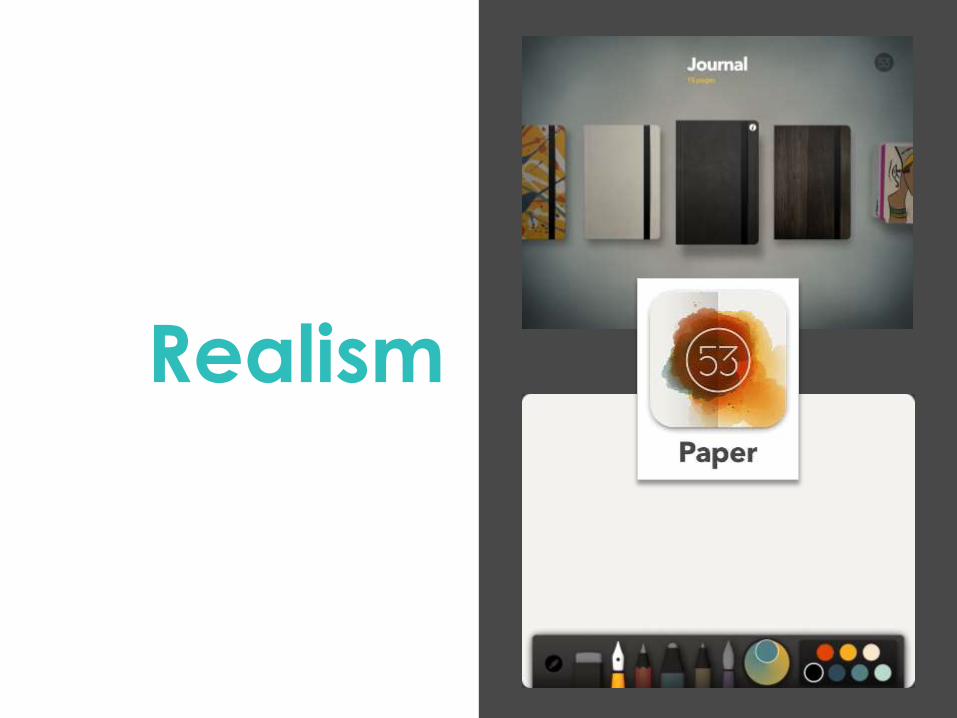
Realism
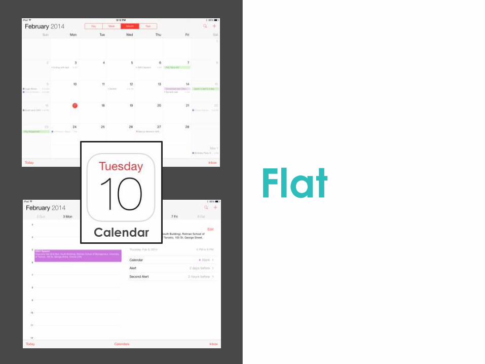
FlatCalendar
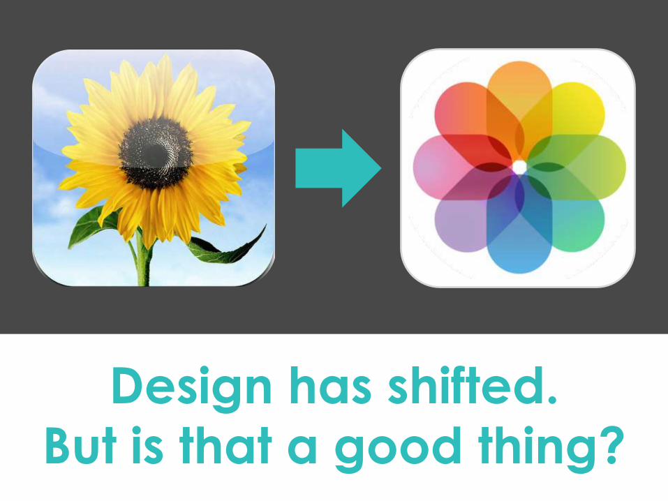
Design has shifted.
But is that a good thing?
That’s some
good
looking pie!
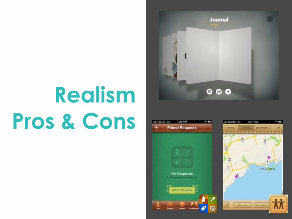
Realism
Pros & Cons
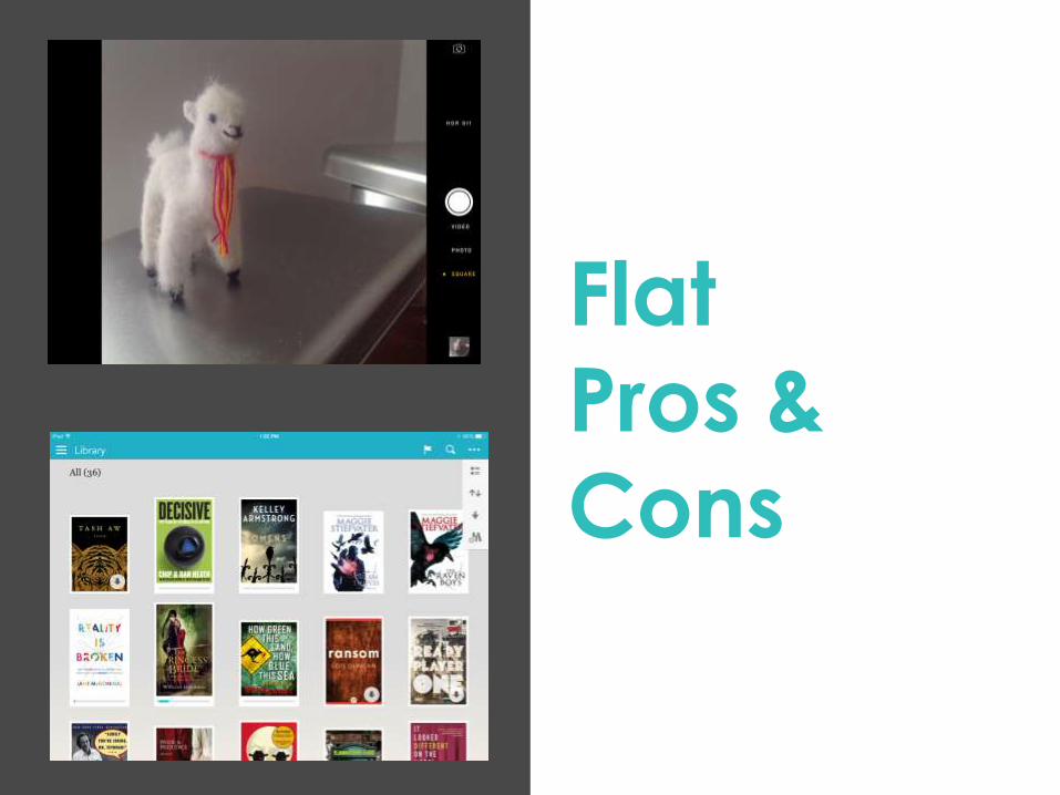
Flat
Pros &
Cons
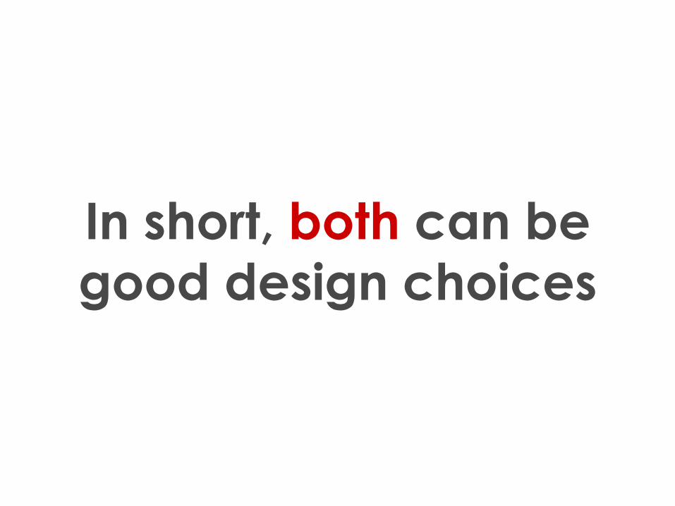
In short, both can be
good design choices
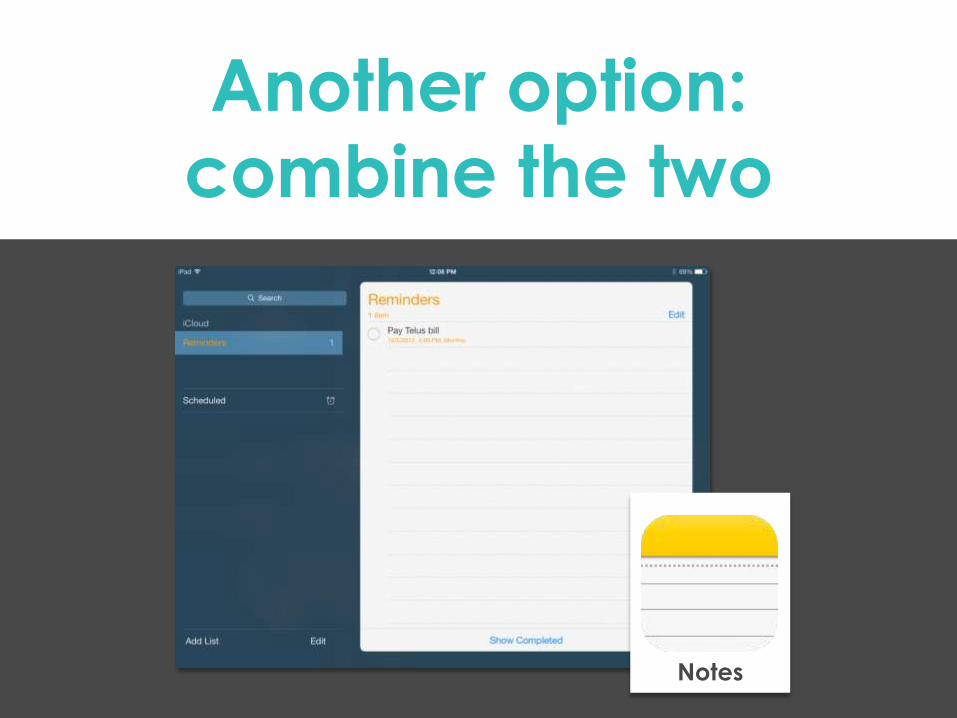
Another option:
combine the two
Notes
InfographicsDoes making it into a
pretty picture
automatically make it
better?

So why does this matter
if you’re in L&D?
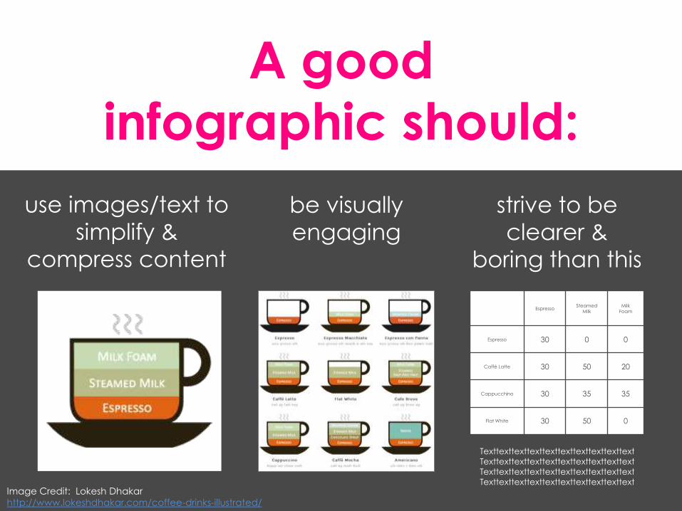
A good
infographic should:
be visually
engaging
EspressoSteamed
MilkMilk
Foam
Espresso 30 0 0
Caffé Latte 30 50 20
Cappucchino 30 35 35
Flat White 30 50 0
Texttexttexttexttexttexttexttexttexttext
Texttexttexttexttexttexttexttexttexttext
Texttexttexttexttexttexttexttexttexttext
Texttexttexttexttexttexttexttexttexttext
strive to be
clearer &
boring than this
use images/text to
simplify &
compress content
Image Credit: Lokesh Dhakar
http://www.lokeshdhakar.com/coffee-drinks-illustrated/
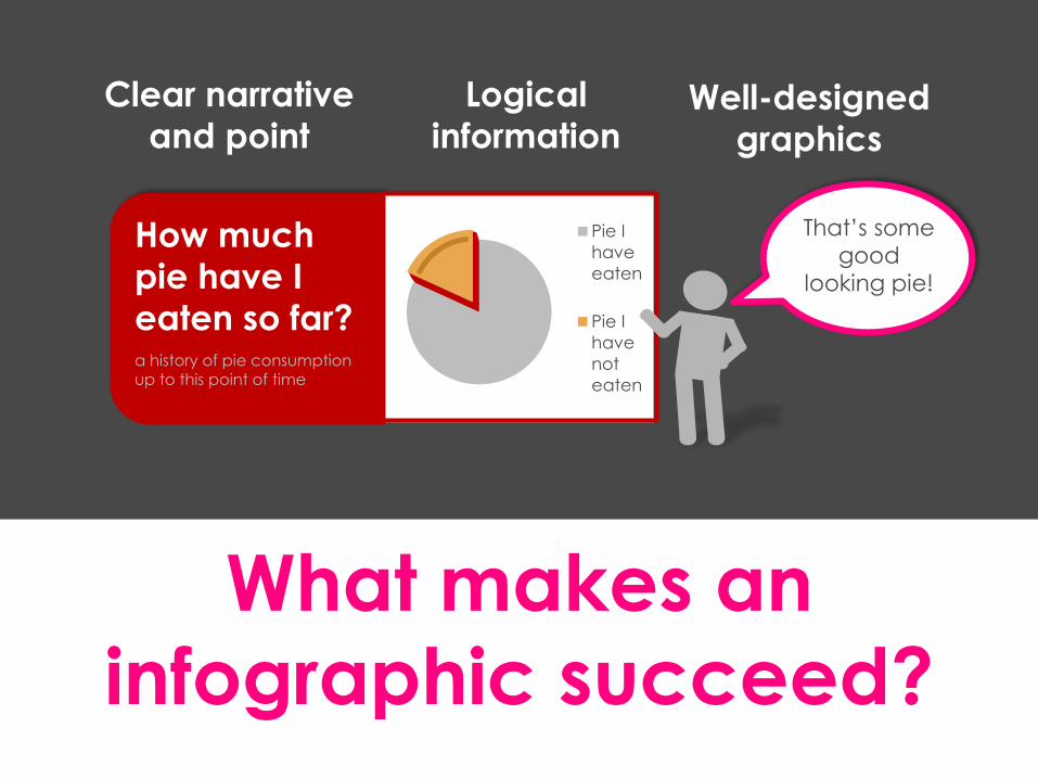
What makes an
infographic succeed?
Pie I
have
eaten
Pie I
have
not
eaten
How much
pie have I
eaten so far?a history of pie consumption up to this point of time
Logical
informationWell-designed
graphics
Clear narrative
and point
That’s some
good
looking pie!
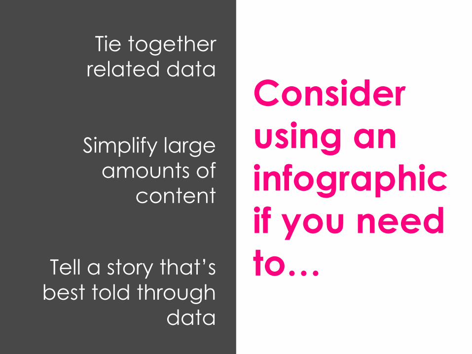
Consider
using an
infographic
if you need
to…
Tie together
related data
Simplify large
amounts of
content
Tell a story that’s
best told through
data
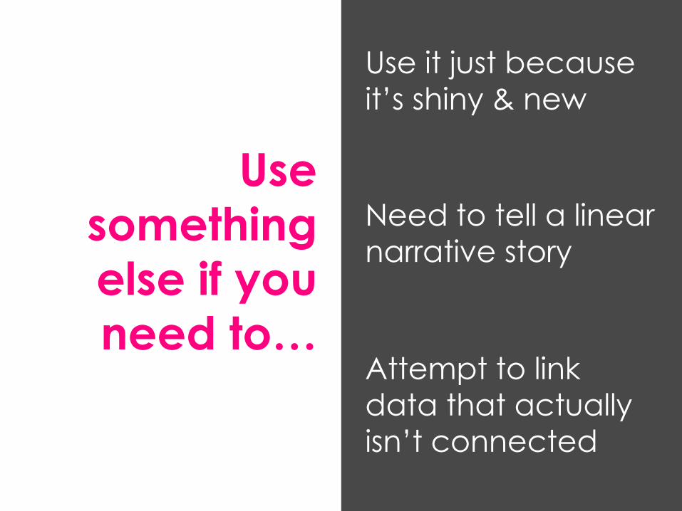
Use
something
else if you
need to…
Use it just because
it’s shiny & new
Need to tell a linear
narrative story
Attempt to link
data that actually
isn’t connected
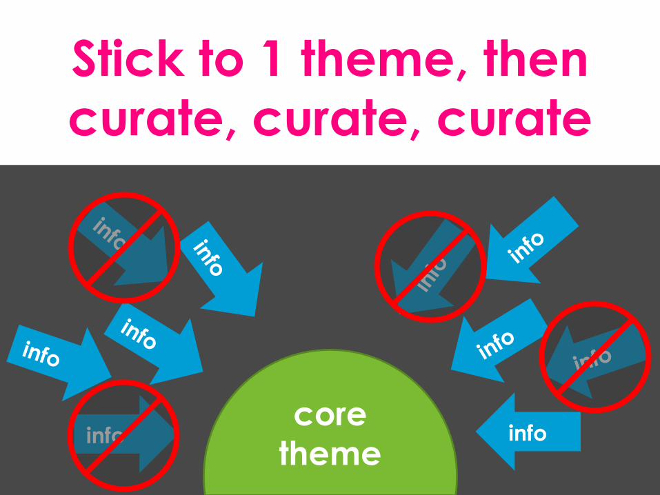
Stick to 1 theme, then
curate, curate, curate
core
themeinfo info
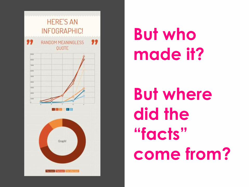
But who
made it?
But where
did the
“facts”
come from?
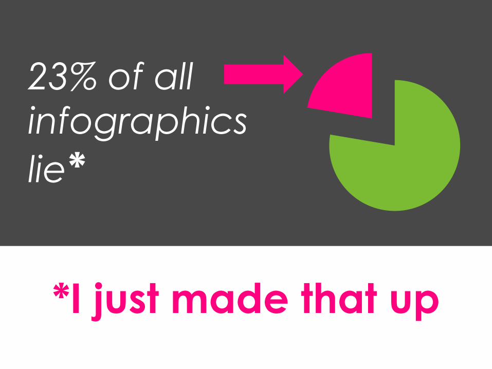
*I just made that up
23% of all
infographics
lie*
Keeping On Top Of
Future TrendsWhat, you mean trends actually
change over time?! ;)
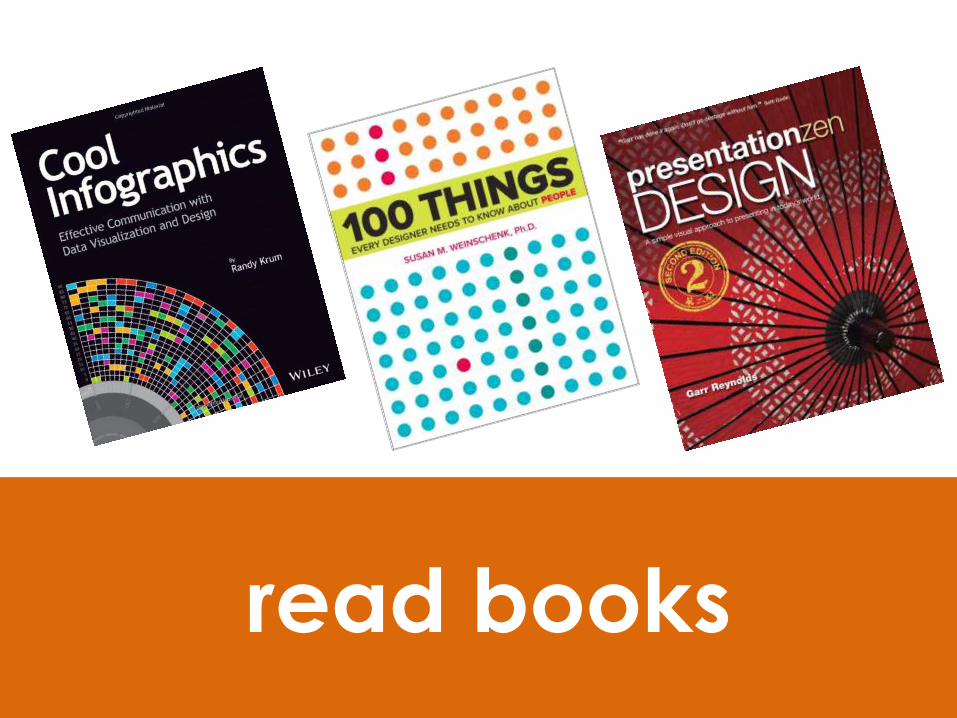
read books
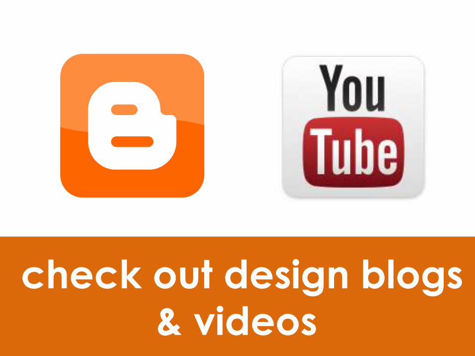
check out design blogs
& videos
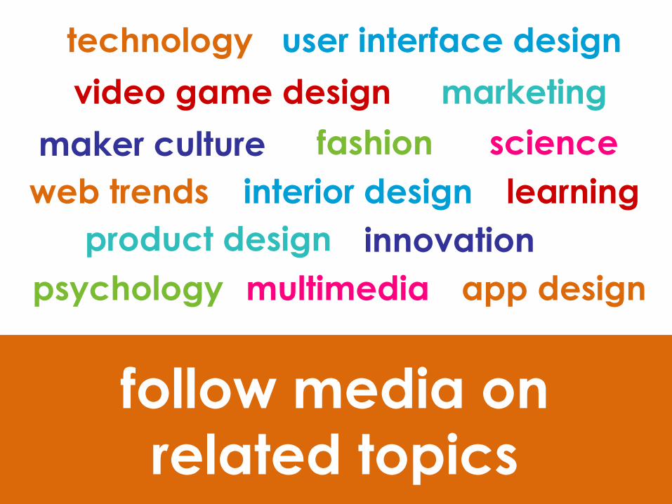
follow media on
related topics
technology
innovation
web trends
user interface design
product design
marketing
fashion
app designmultimedia
video game design
interior design
maker culture
learning
psychology
science

become friends
with designers
Your relationship
with design….
Additional Resources
http://biancawoods.weebly.com/design-
trends-2014.html
http://e-geeking.blogspot.ca/
@eGeeking