Embed Size (px)
Citation preview
Horror Film Covers
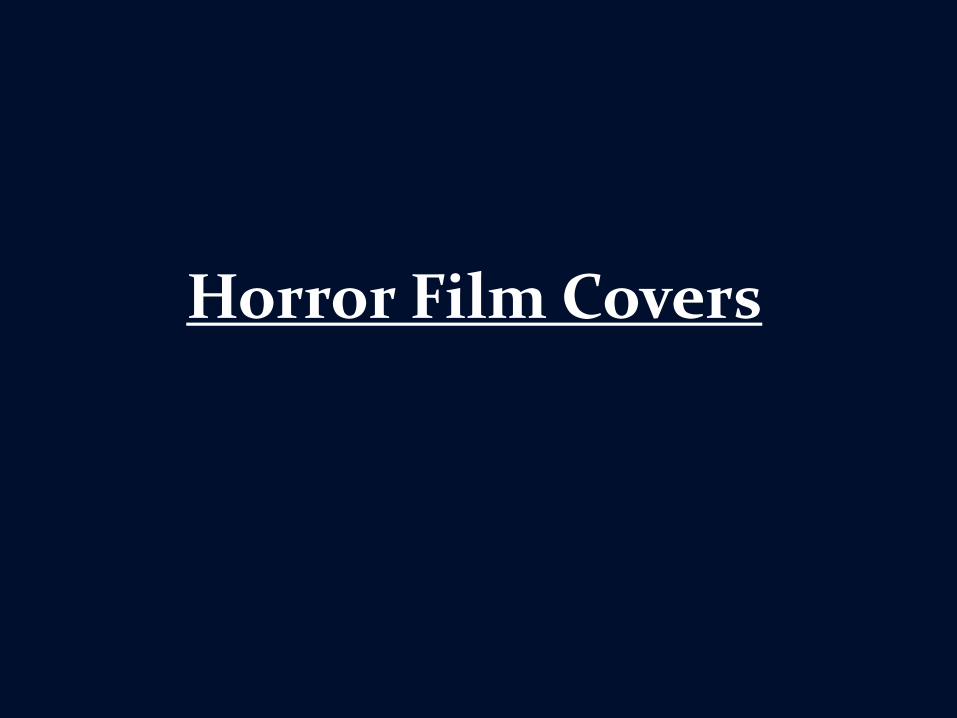
The Town that dreaded sundown
Use of dark colours
A more stylised font used for the title etc.
Main antagonist on the front
Use of light colours like red (blood) and orange (fire)
Knife (weapon)
Almost ‘empty’ background - skull
Title at the centre bottom of the cover
Antagonist (main character) in the centre middle of the cover
Use of the colour white – to contrast against darker colours
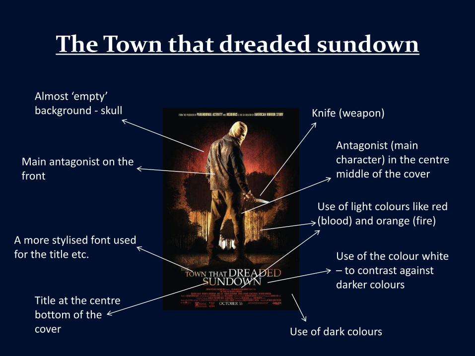
Deliver us from evil
Use of the colour red (blood)
Use of the colour black
Religious symbols (crucifix)
Main character
Disordered room -setting
More stylised font
Title in the centre of the cover
Main character at the top of the cover
Use of the colour white – to contrast against darker colours
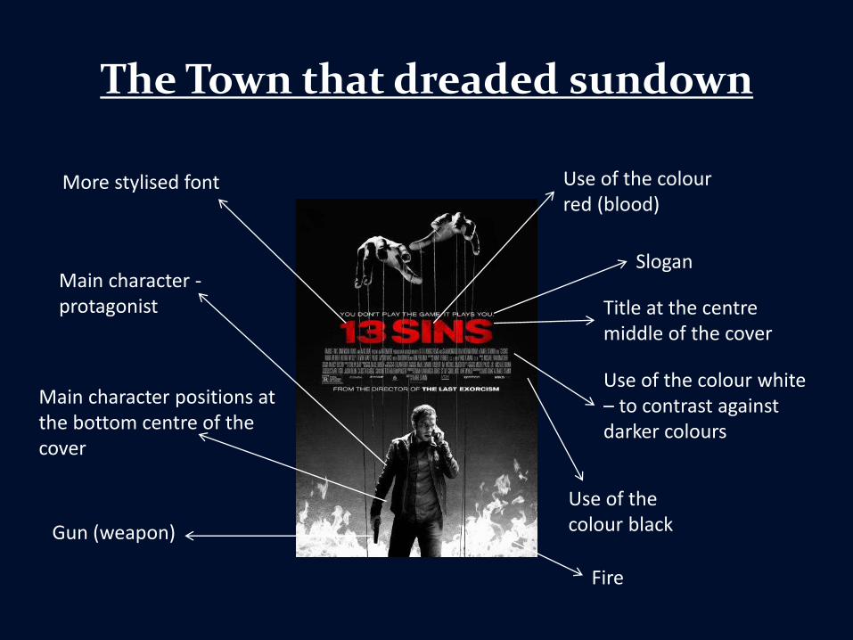
The Town that dreaded sundown
Use of the colour red (blood)
Use of the colour white – to contrast against darker colours
Use of the colour black
Main character -protagonist
Main character positions at the bottom centre of the cover
More stylised font
Title at the centre middle of the cover
Gun (weapon)
Fire
Slogan
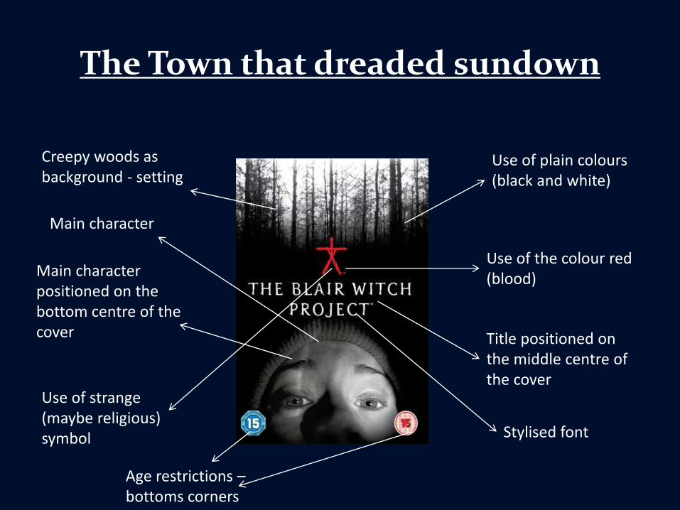
The Town that dreaded sundown
Use of plain colours (black and white)
Use of the colour red (blood)
Main character
Main character positioned on the bottom centre of the cover Title positioned on
the middle centre of the cover
Creepy woods as background - setting
Use of strange (maybe religious) symbol Stylised font
Age restrictions –bottoms corners
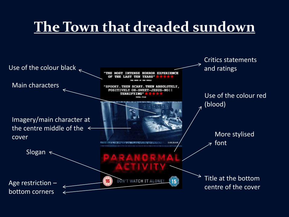
The Town that dreaded sundown
Use of the colour red (blood)
More stylised font
Title at the bottom centre of the cover
Use of the colour black
Main characters
Imagery/main character at the centre middle of the cover
Slogan
Critics statements and ratings
Age restriction –bottom corners
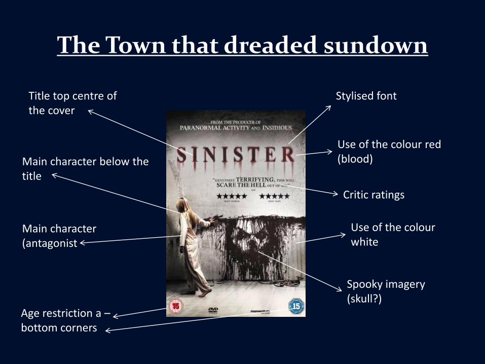
The Town that dreaded sundown
Stylised font
Use of the colour red (blood)
Critic ratings
Main character (antagonist
Use of the colour white
Spooky imagery (skull?)
Age restriction a –bottom corners
Title top centre of the cover
Main character below the title
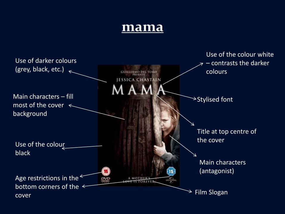
mama
Use of the colour white – contrasts the darker colours
Use of darker colours (grey, black, etc.)
Age restrictions in the bottom corners of the cover
Stylised font
Title at top centre of the cover
Main characters (antagonist)
Main characters – fill most of the cover background
Film Slogan
Use of the colour black

American Psycho
Extensive use of the colour white
Stylised font
Film slogan
Main character Title middle centre of the cover
Main character in the background of the whole cover
Age restriction in the corner of he cover
Mask – hidden nature
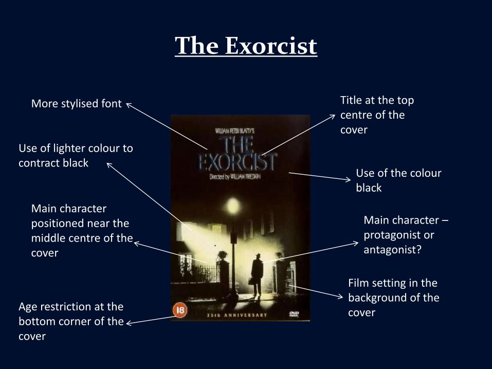
The Exorcist
Title at the top centre of the cover
Age restriction at the bottom corner of the cover
Use of the colour black
Use of lighter colour to contract black
Main character –protagonist or antagonist?
Main character positioned near the middle centre of the cover
Film setting in the background of the cover
More stylised font
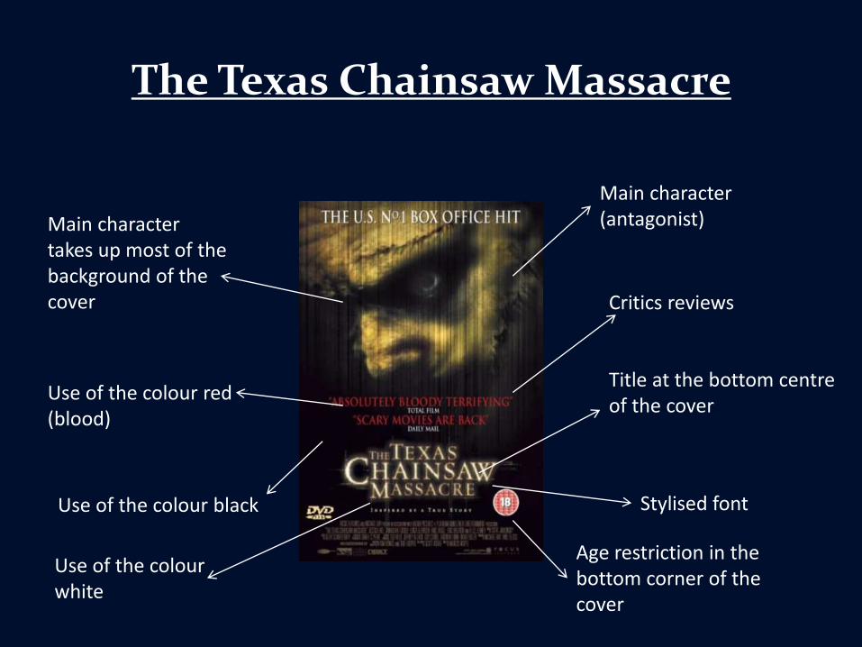
The Texas Chainsaw Massacre
Stylised font
Title at the bottom centre of the cover
Critics reviews
Main character (antagonist)Main character
takes up most of the background of the cover
Use of the colour red (blood)
Use of the colour white
Use of the colour black
Age restriction in the bottom corner of the cover
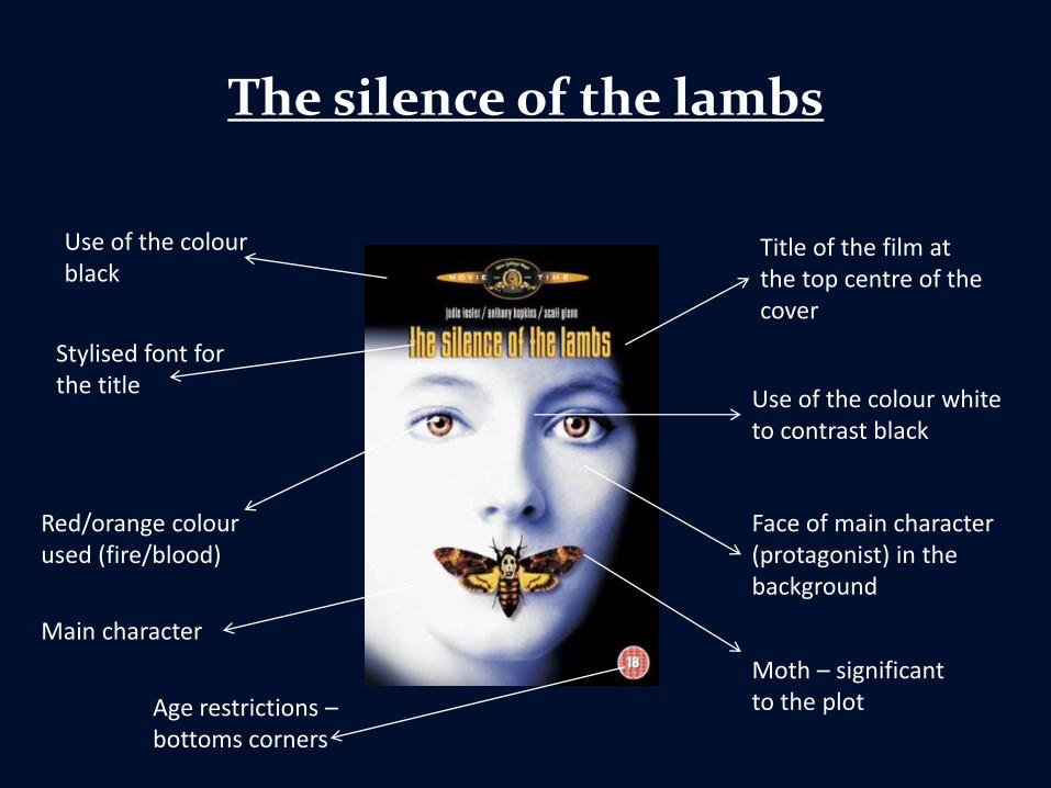
The silence of the lambs
Title of the film at the top centre of the cover
Use of the colour white to contrast black
Main character
Face of main character (protagonist) in the background
Use of the colour black
Age restrictions –bottoms corners
Red/orange colour used (fire/blood)
Stylised font for the title
Moth – significant to the plot
![18B [c#6629] DVD DVD PDF 17B DVD DVD PDF ä&b) 1997 2004 ... · 18B [c#6629] DVD DVD PDF 17B DVD DVD PDF ä&b) 1997 2004 2010 1984-1985 2001 2002 2006 2009](https://img.pdfslide.us/doc/110x75/5c670dce09d3f2c14e8cf09a/18b-c6629-dvd-dvd-pdf-17b-dvd-dvd-pdf-aeb-1997-2004-18b-c6629-dvd.jpg)