Embed Size (px)
Citation preview
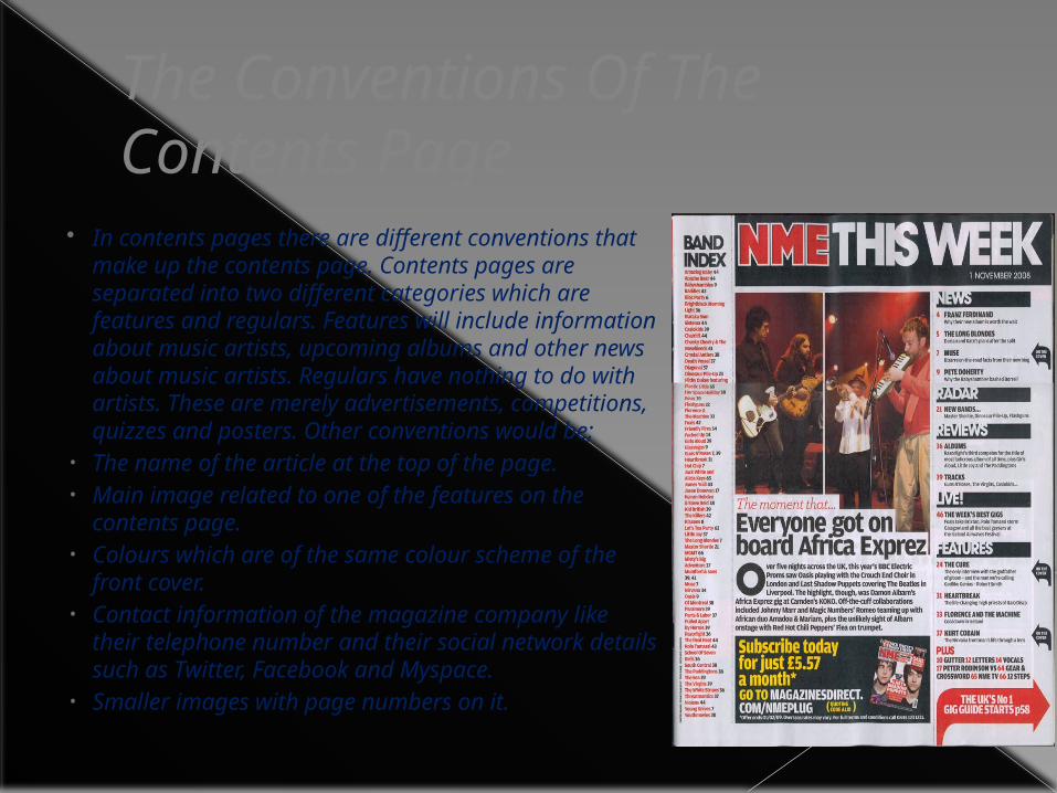
The Conventions Of The Contents Page
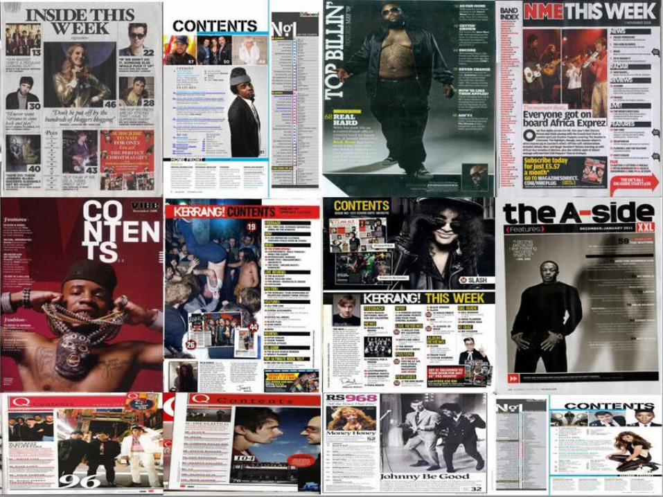
In contents pages there are different conventions that make up the contents page. Contents pages are separated into two different categories which are features and regulars. Features will include information about music artists, upcoming albums and other news about music artists. Regulars have nothing to do with artists. These are merely advertisements, competitions, quizzes and posters. Other conventions would be;
• The name of the article at the top of the page.• Main image related to one of the features on the
contents page.• Colours which are of the same colour scheme of the
front cover.• Contact information of the magazine company like their
telephone number and their social network details such as Twitter, Facebook and Myspace.
• Smaller images with page numbers on it.
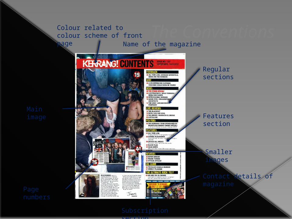
The ConventionsName of the magazine
Page numbers
Colour related to colour scheme of front page
Contact details of magazine
Subscription section
Features sectionMain image
Regular sections
Smaller images
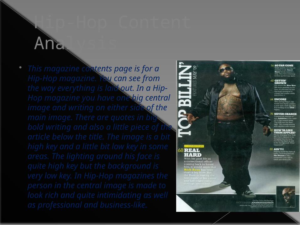
Hip-Hop Content Analysis
This magazine contents page is for a Hip-Hop magazine. You can see from the way everything is laid out. In a Hip-Hop magazine you have one big central image and writing on either side of the main image. There are quotes in big bold writing and also a little piece of the article below the title. The image is a bit high key and a little bit low key in some areas. The lighting around his face is quite high key but the background is very low key. In Hip-Hop magazines the person in the central image is made to look rich and quite intimidating as well as professional and business-like.
Rock Contents Analysis
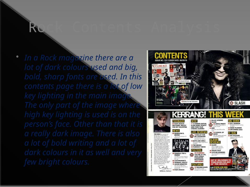
In a Rock magazine there are a lot of dark colours used and big, bold, sharp fonts are used. In this contents page there is a lot of low key lighting in the main image. The only part of the image where high key lighting is used is on the person’s face. Other than that it is a really dark image. There is also a lot of bold writing and a lot of dark colours in it as well and very few bright colours.
Pop Content Analysis
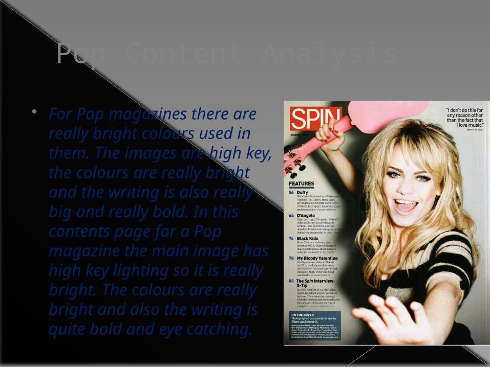
For Pop magazines there are really bright colours used in them. The images are high key, the colours are really bright and the writing is also really big and really bold. In this contents page for a Pop magazine the main image has high key lighting so it is really bright. The colours are really bright and also the writing is quite bold and eye catching.