Embed Size (px)
Citation preview
DIGIPAK ADVERTS
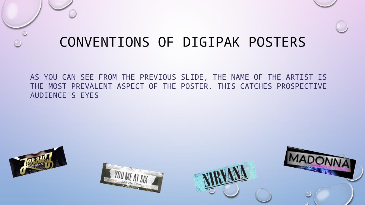
CONVENTIONS OF DIGIPAK POSTERS
AS YOU CAN SEE FROM THE PREVIOUS SLIDE, THE NAME OF THE ARTIST IS THE MOST PREVALENT ASPECT OF THE POSTER. THIS CATCHES PROSPECTIVE AUDIENCE'S EYES
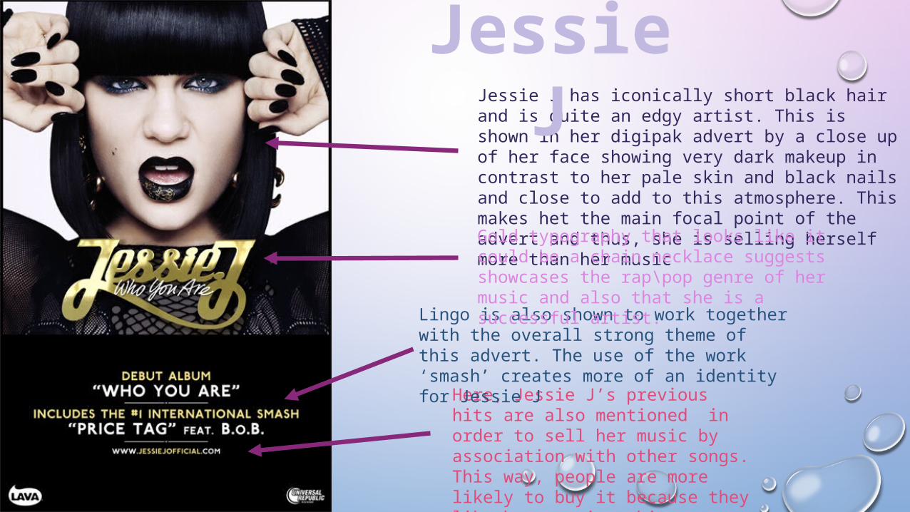
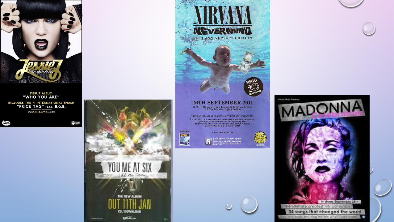
Jessie J has iconically short black hair and is quite an edgy artist. This is shown in her digipak advert by a close up of her face showing very dark makeup in contrast to her pale skin and black nails and close to add to this atmosphere. This makes het the main focal point of the advert and thus, she is selling herself more than her music
Jessie J
Here, Jessie J’s previous hits are also mentioned in order to sell her music by association with other songs. This way, people are more likely to buy it because they like her previous hit.
Lingo is also shown to work together with the overall strong theme of this advert. The use of the work ‘smash’ creates more of an identity for Jessie J
Gold typography that looks like it could be a chain necklace suggests showcases the rap\pop genre of her music and also that she is a successful artist.
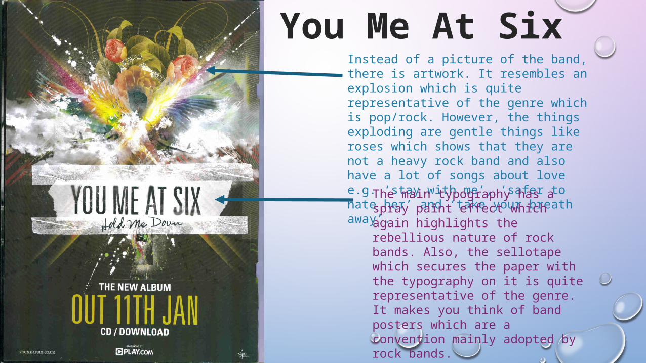
You Me At SixInstead of a picture of the band, there is artwork. It resembles an explosion which is quite representative of the genre which is pop/rock. However, the things exploding are gentle things like roses which shows that they are not a heavy rock band and also have a lot of songs about love e.g. ‘stay with me’, ‘safer to hate her’ and ‘take your breath away’.
The main typography has a spray paint effect which again highlights the rebellious nature of rock bands. Also, the sellotape which secures the paper with the typography on it is quite representative of the genre. It makes you think of band posters which are a convention mainly adopted by rock bands.
Nirvana
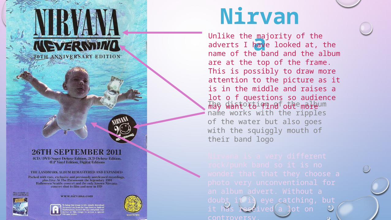
Nirvana is a very different rock/punk band so it is no wonder that that they choose a photo very unconventional for an album advert. Without a doubt it is eye catching, but it has received a lot on controversy.
The distortion of the album name works with the ripples of the water but also goes with the squiggly mouth of their band logo
Unlike the majority of the adverts I have looked at, the name of the band and the album are at the top of the frame. This is possibly to draw more attention to the picture as it is in the middle and raises a lot o f questions so audience may want to find out more