Embed Size (px)
Citation preview

Research: DigipacksFor my second ancillary task, I have decided to create a digipack for my band’s new album. Before creating my product, I researched and analysed some of the most popular album covers from the past five years in 2013, according to Complex.

fun. - Some Nights
Some Nights was released in 2012 by fun. and was photographed by Nacho Alegre and Lindsey Byrnes. The album cover is extremely simple, with just the title of the album and an image – not even the artist’s name is on the front.

The top of the front cover has the title of the album, Some Nights, and nothing else. This is a fairly unconventional album cover since usually it would have at least the artist’s name but would usually be bigger than the album name. I think that breaking these conventions helps to convey the unusualness and confusion of the songs.
The photo used on the front cover is very interesting. Complex describes the cover as the perfect visual capsule of the album’s existential confusion and everything-on-the-line party attitude. The photo is not very clear and is very mysterious, and is slightly eerie and dark because of the slightly disturbing colours and worrying-looking person sitting with their head downwards. The person has something in their hand that they are about to set alight with a lighter. The photo is also slightly poor quality, perhaps implying that the photo is a memory or a dream.Overall, despite the cover not being particularly detailed, this cover is filled with different mysteries and connotations that perfectly reflect the mood of the album.

The album name is repeated on the back cover but is considerably smaller.
The album tracks are all listed. They are formatted into two columns.
The artist name is on the back cover but is bigger than the album name.
The artist and album names are repeated on the spine of the CD.
The record label is also on the spine.
The spine is identical on both sides.
There is a barcode on the back of the album for retailers to scan when selling physical copies.
Terms and conditions from the Record Label.
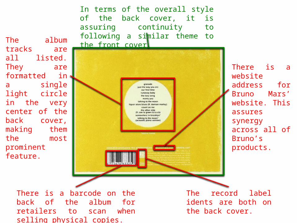
In terms of the overall style of the back cover, it is assuring continuity to following a similar theme to the front cover.

Bruno Mars – Doo-Wops and Hooligans
Doo-Wops and Hooligans was released in 2010 by Bruno Mars. Although this was Mars’ debut album, he was fairly well-known because of his global debut single, Just The Way You Are. The cover’s artwork was directed by Nick Malvone Bilardello.

The artist’s name is larger than the album name but is not the most prominent thing on the cover. The typography is fairly wacky and childish, which may be symbolic of Mars’ cheeky attitude and the overall mood of the album. You wouldn’t see a font like this on Some Nights!
The album name is fairly tiny but because it is placed so near to the much more obvious artist name, it is still easy to spot.
There is little else on the front cover as it is mainly filled with the long winding path left behind a black jet flying off into the distance. This path could be representative of Bruno Mars’ successful future career in the music industry.
A really lovely yellow colour is used on the front cover. This colour has connotations of happiness, self-confidence and hope.
There is a silhouette of who can only be assumed to be Bruno Mars. This reveals humility in the wake of so much success.
In terms of the overall style of the back cover, it is assuring continuity to following a similar theme to the front cover.
The album tracks are all listed. They are formatted in a single light circle in the very center of the back cover, making them the most prominent feature.
There is a barcode on the back of the album for retailers to scan when selling physical copies.
There is a website address for Bruno Mars’ website. This assures synergy across all of Bruno’s products.
The record label idents are both on the back cover.

Adele - 21
21 was released in 2011 by Adele. The digipack was photographed by Lauren Dukoff. It was Adele’s first full album, but Adele released an 8-song EP at the beginning of 2009.

The main focus of the front cover is the picture of Adele. The photo is lit beautifully, and alongside her make-up makes Adele come across as a visual role model for teenage girls and young adults – the main target audience of pop music. Using a photo of the artist also helps the audience link the album to the artist by promoting her.
The album name is the same size as the artist’s name. The only thing that differentiates it is the fact that it is a different colour (light green). It also uses the same typography. This is reflective of Adele’s modest personality and her attitude towards life in the sense of being able to live with what you get, as is reflected from the songs on her album.
Adele’s name is written in clear, white letters. The white contrasts particularly well with the black, making it a very obvious component of the front cover.

There is a barcode on the back of the album for retailers to scan when selling physical copies.
The album tracks are all listed. They are listed in one clear column, using a bright white colour that contrasts nicely with the black background.
There is another photo of the artist on the back cover as well. This helps the audience to create a connection between the album and the artist.
The record label ident is on the back cover. Record label rights