Embed Size (px)
Citation preview
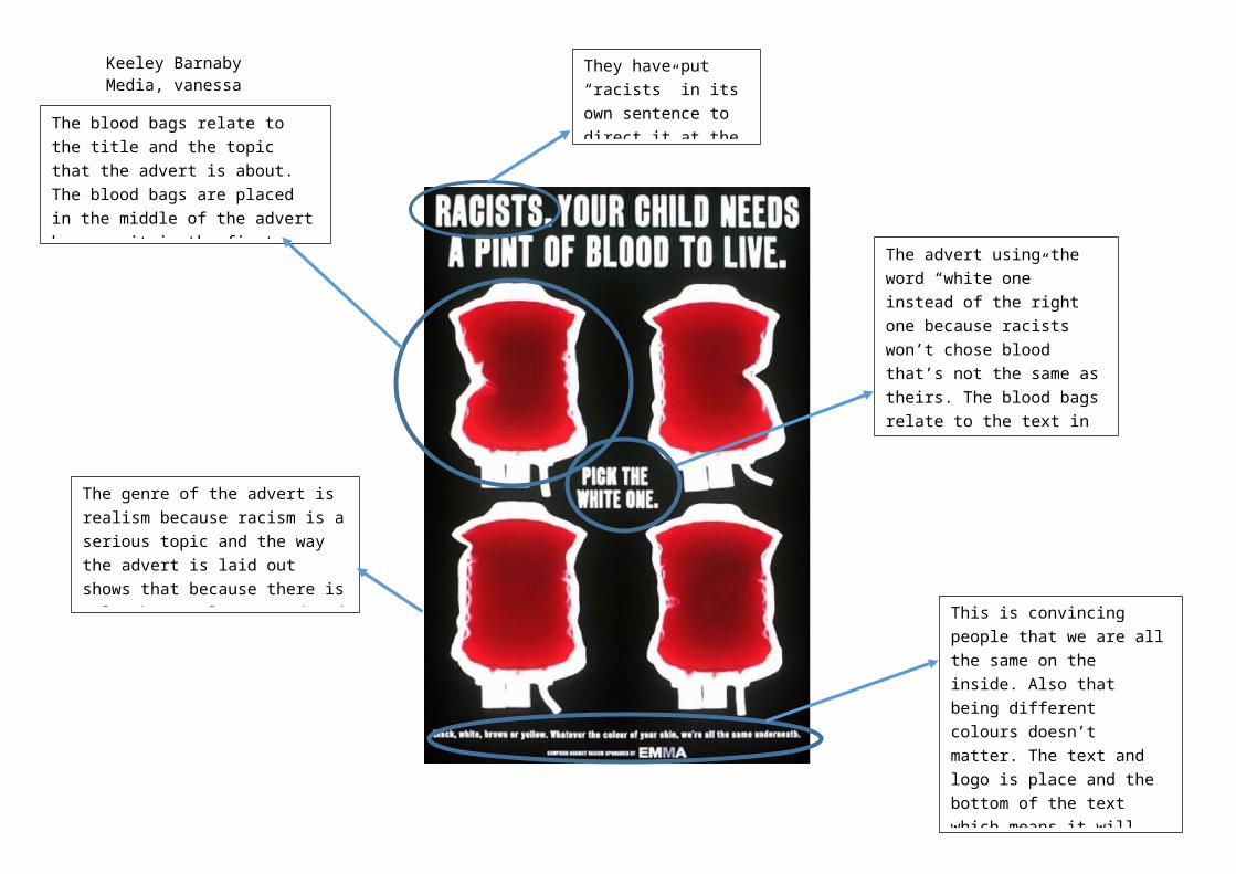
Keeley BarnabyMedia, vanessa
They have put “racists” in its own sentence to direct it at the racist people.The blood bags relate to the title and
the topic that the advert is about. The blood bags are placed in the middle of the advert because it is the first thing you see on the advert because they are bright red.
The advert using the word “white one” instead of the right one because racists won’t chose blood that’s not the same as theirs. The blood bags relate to the text in the middle because the audience is being asked which blood bag has a white person’s blood in it.
This is convincing people that we are all the same on the inside. Also that being different colours doesn’t matter. The text and logo is place and the bottom of the text which means it will not catch the audience’s eye. The logo is not clear to see which makes it hard for the audience to identify the charity behind the advert.
The genre of the advert is realism because racism is a serious topic and the way the advert is laid out shows that because there is only three colours used and they text is all in bold. The style is modernism
Keeley BarnabyMedia, vanessa
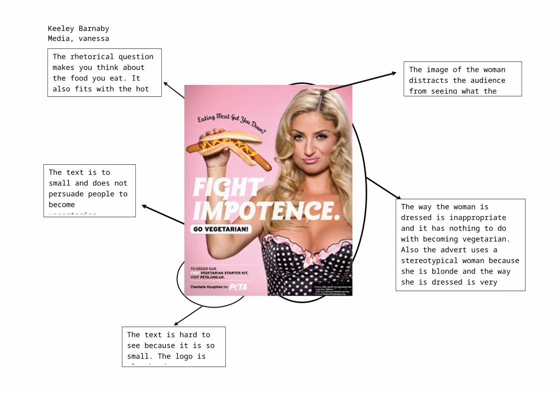
The rhetorical question makes you think about the food you eat. It also fits with the hot dog because it is wilting downwards.
The text is hard to see because it is so small. The logo is also hard to see because
The way the woman is dressed is inappropriate and it has nothing to do with becoming vegetarian. Also the advert uses a stereotypical woman because she is blonde and the way she is dressed is very sexual.
The text is to small and does not persuade people to become vegertarian.
The image of the woman distracts the audience from seeing what the advert is about.
Keeley BarnabyMedia, vanessa
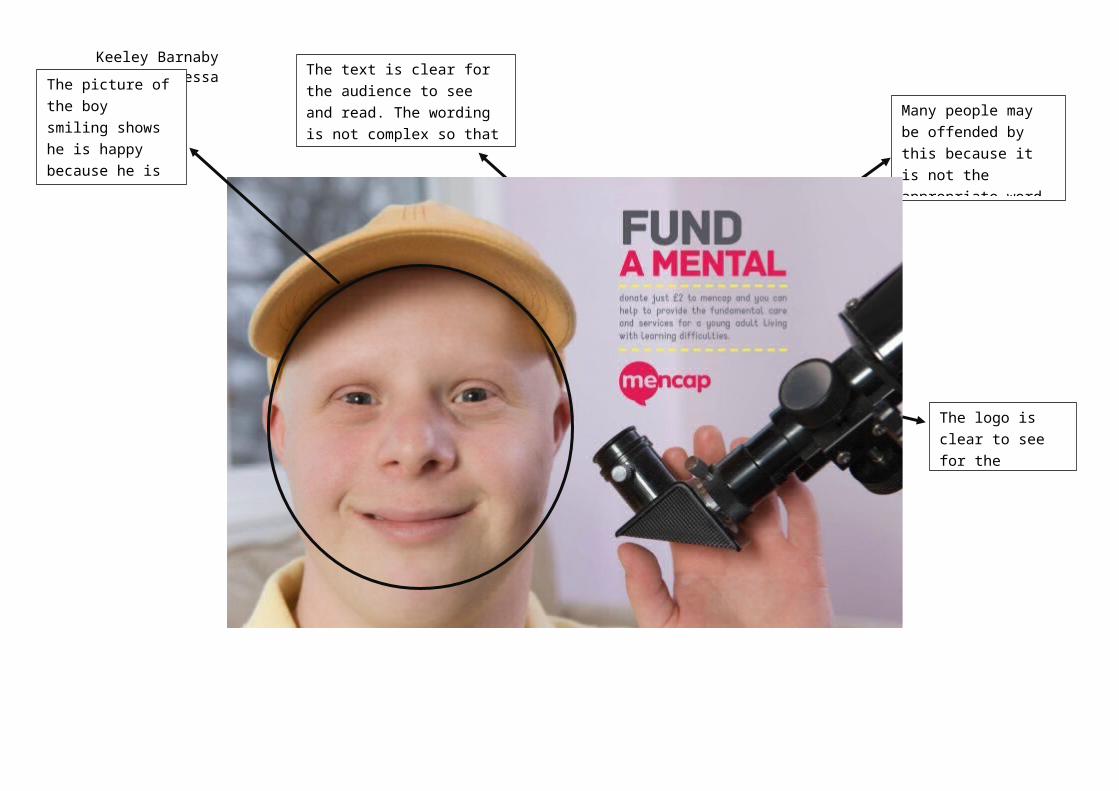
Many people may be offended by this because it is not the appropriate word for someone with learning difficulties.
The logo is clear to see for the audience to see.
The text is clear for the audience to see and read. The wording is not complex so that the audience can understand it.
The picture of the boy smiling shows he is happy because he is getting helped and it relates to the test.