Embed Size (px)
Citation preview
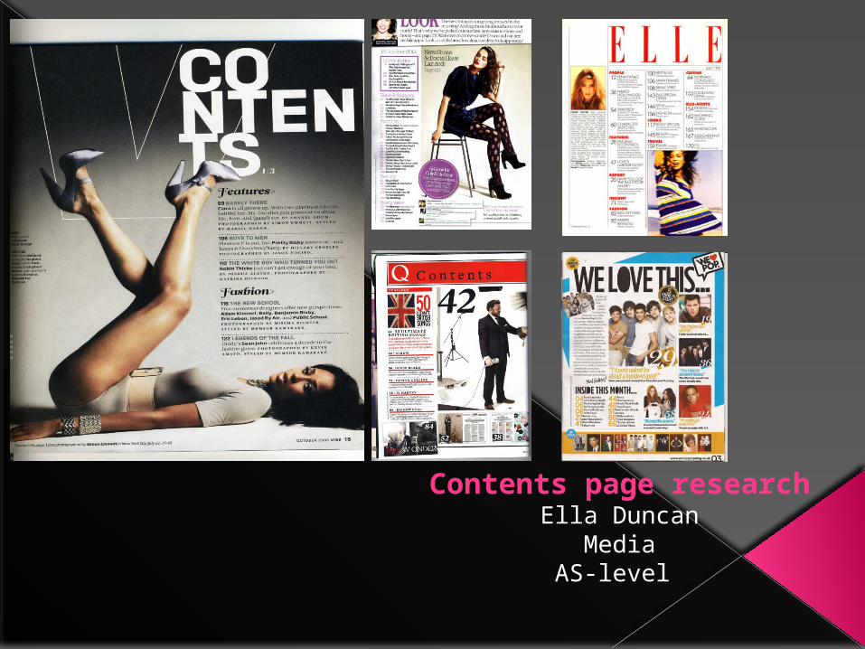
Contents page researchElla Duncan
MediaAS-level
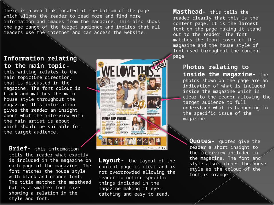
Masthead- this tells the reader clearly that this is the content page. It is the largest font on the page making it stand out to the reader. The font matches the front cover of the magazine and the house style of font used throughout the content page
Photos relating to inside the magazine- The photos shown on the page are an indication of what is included inside the magazine which is clear to the reader allowing the target audience to full understand what is happening in the specific issue of the magazine.
Information relating to the main topic- this writing relates to the main topic(One direction) that is discussed in the magazine. The font colour is black and matches the main house style throughout the magazine. This information gives the reader an insight about what the interview with the main artist is about which should be suitable for the target audience.
Brief- this information tells the reader what exactly is included in the magazine on each page of the magazine. The font matches the house style with black and orange font. The title matched the masthead but is a smaller font size showing a relation in the style and font.
Layout- the layout of the content page is clear and is not overcrowded allowing the reader to notice specific things included in the magazine making it eye-catching and easy to read.
Quotes- quotes give the reader a short insight to the interview included in the magazine. The font and style also matches the house style as the colour of the font is orange.
There is a web link located at the bottom of the page which allows the reader to read more and find more information and images from the magazine. This also shows the age range of the target audience and implies that all readers use the internet and can access the website.
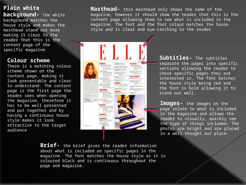
Plain white background- the white background matches the house style and makes the masthead stand out more making it clear to the reader that this is the content page of the specific magazine
Masthead- this masthead only shows the name of the magazine, however it should show the reader that this is the content page allowing them to see what is included in the magazine. The font and the font colour matches the house style and is clear and eye-catching to the reader
Subtitles- The subtitles separate the pages into specific sections allowing the reader to chose specific pages they are interested in. The font matches the house style being red and the font is bold allowing it to stand out well.
Images- the images on the page relate to what is included in the magazine and allows the reader to visually, quickly see the type of things included. The photos are bright and are placed in a well thought out place.
Brief- the brief gives the reader information about what is included on specific pages in the magazine. The font matches the house style as it is coloured black and is continuous throughout the page and magazine.
Colour schemeThere is a matching colour scheme shown on the content page, making it look presentable and clear to understand. The content page is the first page the reader sees when opening the magazine, therefore it has to be well presented and put together and by having a continuous house style makes it look attractive to the target audience