Embed Size (px)
Citation preview

Ancillary Feedback SummaryBY AMY-JANE WILSON

Ancillary Products

Poster- Question 1
From this feedback I can tell that the colour scheme that I have used is conventional and works well within my poster. The colour scheme that I have chosen also connects both of my ancillary's together

Question 2
After this feedback I have found out that all of the fonts I have used are conventional and work well together. However the colour of the slogan is something that has been said could be improved
Question 3
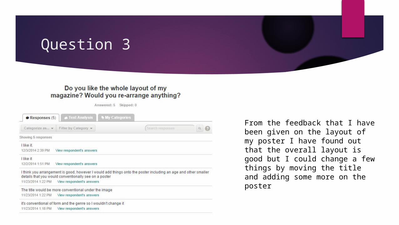
From the feedback that I have been given on the layout of my poster I have found out that the overall layout is good but I could change a few things by moving the title and adding some more on the poster

Question 4
From the feedback from the poster I realise that the photograph on the poster is one of the best things about my poster and makes it very effective

Magazine- Question 1
This shows me that my magazine isn’t very bad and it is average but this helps me as it shows me that there is room for improvement within my magazine.

Question 2
The image I feel is one of the most positive and effective things on my magazine. This is due to the fact that I have used conventional lighting and the fact that it clearly relates to the main title

Question 3
My colour scheme is something that is also effective and my feedback says that the colour scheme is conventional. However It has been suggested that the grey isn’t as conventional so I may consider taking this out

Question 4
The layout for the magazine is also seen as conventional however it has been suggested that I could add some more cover lines and change he barcode position

Question 5
The fonts that I have used on my magazine are conventional and some of my feedback is very enthusiastic about this element. It has been said that someone is not keen on the italic font used so I may consider changing this

Question 6
The main improvements that have been suggested is that I could add more cover lines and just change a small amount of the colour scheme