Embed Size (px)
Citation preview
Evaluation Question 1
By Matt Jary
In what ways does your media product use, develop or challenge forms and conventions of real media products?
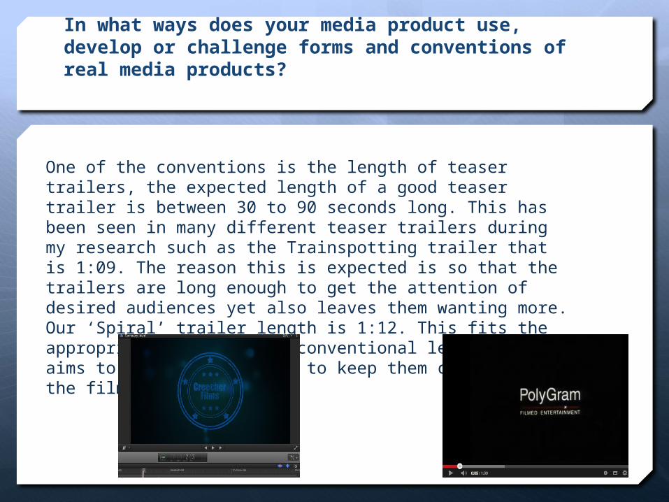
One of the conventions is the length of teaser trailers, the expected length of a good teaser trailer is between 30 to 90 seconds long. This has been seen in many different teaser trailers during my research such as the Trainspotting trailer that is 1:09. The reason this is expected is so that the trailers are long enough to get the attention of desired audiences yet also leaves them wanting more.Our ‘Spiral’ trailer length is 1:12. This fits the appropriate and expected conventional length and aims to attract audiences to keep them curious about the film.
Editing Style
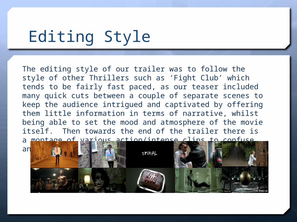
The editing style of our trailer was to follow the style of other Thrillers such as ‘Fight Club’ which tends to be fairly fast paced, as our teaser included many quick cuts between a couple of separate scenes to keep the audience intrigued and captivated by offering them little information in terms of narrative, whilst being able to set the mood and atmosphere of the movie itself. Then towards the end of the trailer there is a montage of various action/intense clips to confuse and hook the audience in.
Use of Sound
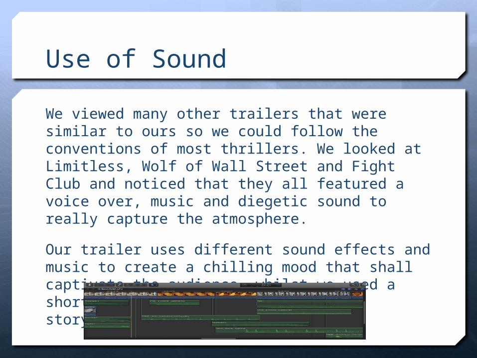
We viewed many other trailers that were similar to ours so we could follow the conventions of most thrillers. We looked at Limitless, Wolf of Wall Street and Fight Club and noticed that they all featured a voice over, music and diegetic sound to really capture the atmosphere.
Our trailer uses different sound effects and music to create a chilling mood that shall captivate the audience, whilst we used a short voice over to develop a basic storyline for people to grasp.
Text/Graphics Elements
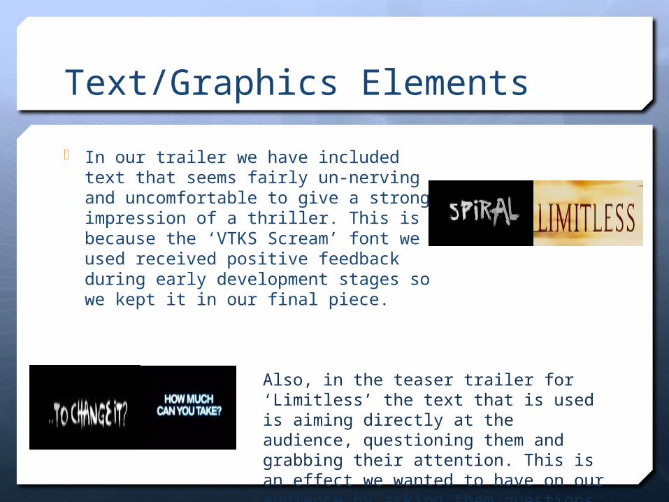
In our trailer we have included text that seems fairly un-nerving and uncomfortable to give a strong impression of a thriller. This is because the ‘VTKS Scream’ font we used received positive feedback during early development stages so we kept it in our final piece.
Also, in the teaser trailer for ‘Limitless’ the text that is used is aiming directly at the audience, questioning them and grabbing their attention. This is an effect we wanted to have on our audience by asking them questions with our text.
Poster
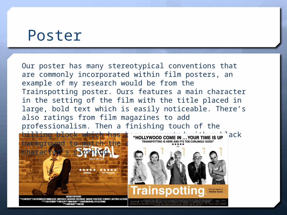
Our poster has many stereotypical conventions that are commonly incorporated within film posters, an example of my research would be from the Trainspotting poster. Ours features a main character in the setting of the film with the title placed in large, bold text which is easily noticeable. There’s also ratings from film magazines to add professionalism. Then a finishing touch of the billing block which has been separated with a black background to match the dark colour of the character’s clothing.
Magazine
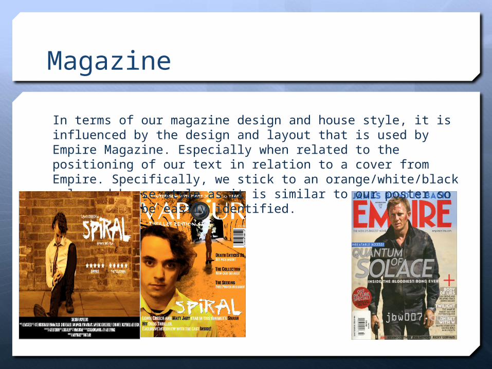
In terms of our magazine design and house style, it is influenced by the design and layout that is used by Empire Magazine. Especially when related to the positioning of our text in relation to a cover from Empire. Specifically, we stick to an orange/white/black coloured house style as it is similar to our poster so that it can be easily identified.