Embed Size (px)
Citation preview
Q7: Looking Back At Your Preliminary Task, What Would You Feel
You Have Learnt In The Progression Of It From The Full Product?
By Alice Venard
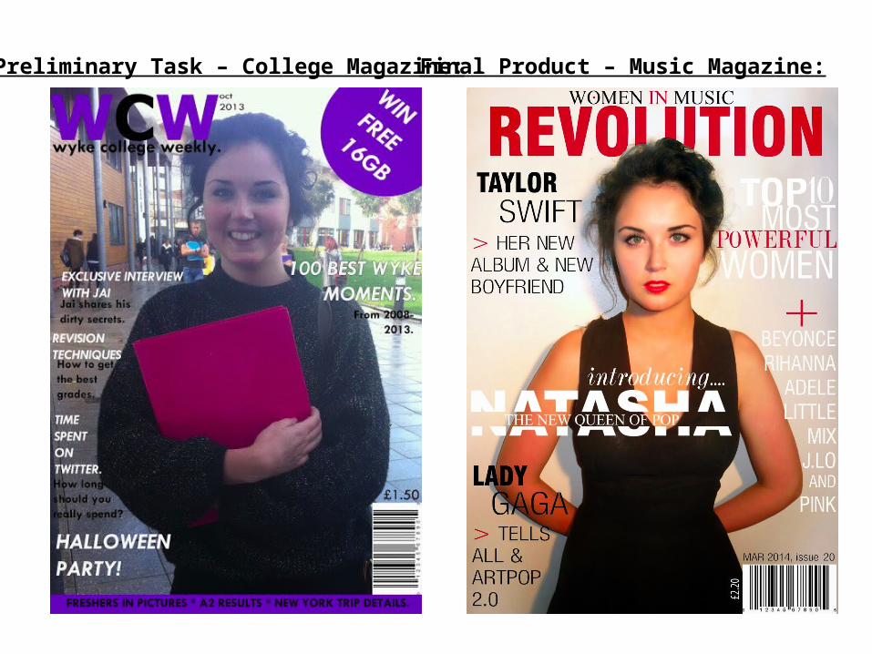
Preliminary Task – College Magazine: Final Product – Music Magazine:
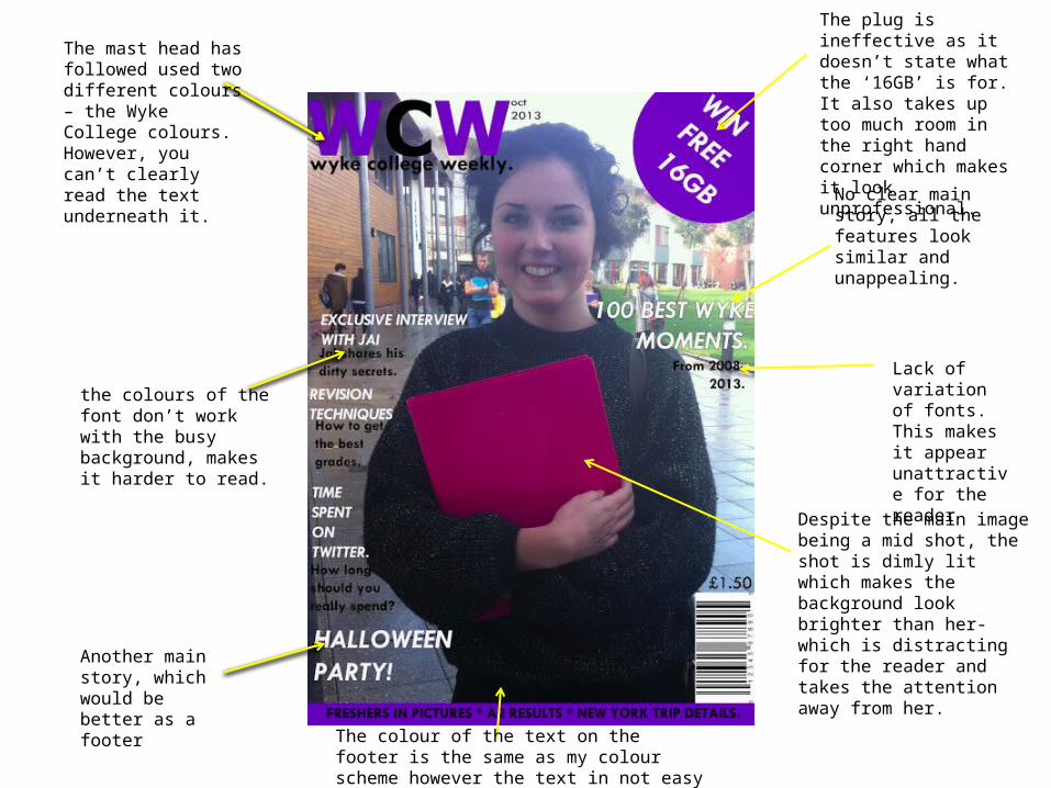
No clear main story, all the features look similar and unappealing.
Lack of variation of fonts. This makes it appear unattractive for the reader
Despite the main image being a mid shot, the shot is dimly lit which makes the background look brighter than her- which is distracting for the reader and takes the attention away from her.
The plug is ineffective as it doesn’t state what the ‘16GB’ is for. It also takes up too much room in the right hand corner which makes it look unprofessional.
The colour of the text on the footer is the same as my colour scheme however the text in not easy to read.
Another main story, which would be better as a footer
the colours of the font don’t work with the busy background, makes it harder to read.
The mast head has followed used two different colours – the Wyke College colours. However, you can’t clearly read the text underneath it.
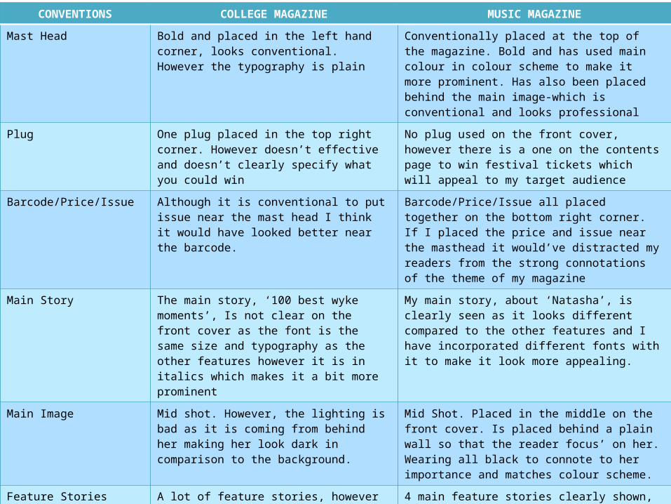
CONVENTIONS COLLEGE MAGAZINE MUSIC MAGAZINE
Mast Head Bold and placed in the left hand corner, looks conventional. However the typography is plain
Conventionally placed at the top of the magazine. Bold and has used main colour in colour scheme to make it more prominent. Has also been placed behind the main image-which is conventional and looks professional
Plug One plug placed in the top right corner. However doesn’t effective and doesn’t clearly specify what you could win
No plug used on the front cover, however there is a one on the contents page to win festival tickets which will appeal to my target audience
Barcode/Price/Issue Although it is conventional to put issue near the mast head I think it would have looked better near the barcode.
Barcode/Price/Issue all placed together on the bottom right corner. If I placed the price and issue near the masthead it would’ve distracted my readers from the strong connotations of the theme of my magazine
Main Story The main story, ‘100 best wyke moments’, Is not clear on the front cover as the font is the same size and typography as the other features however it is in italics which makes it a bit more prominent
My main story, about ‘Natasha’, is clearly seen as it looks different compared to the other features and I have incorporated different fonts with it to make it look more appealing.
Main Image Mid shot. However, the lighting is bad as it is coming from behind her making her look dark in comparison to the background.
Mid Shot. Placed in the middle on the front cover. Is placed behind a plain wall so that the reader focus’ on her. Wearing all black to connote to her importance and matches colour scheme.
Feature Stories A lot of feature stories, however they all look unappealing due to the typography.
4 main feature stories clearly shown, used different fonts and colours. Also included a ‘+’ with a list of other artists
Colour Scheme Black, White, Purple – Wyke colours. Unoriginal compared to other students college magazine. The purple didn’t look inviting
Black, White and Cadmium Red – conventional 3 colour scheme. Appeals to target audience as cadmium red isn’t too feminine, which will appeal to males.
Footer/Skyline Used a footer, box in purple and text in black- hard to read.
Not used a footer, but used a ‘women in music’ theme which was the ideology of this issue of the magazine
Overall Layout Is conventional, but visually it looks plain and unappealing.
Conventional, but looks a lot more appealing for the reader by the use of colours and typography.
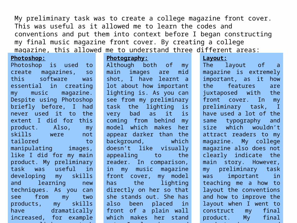
My preliminary task was to create a college magazine front cover. This was useful as it allowed me to learn the codes and conventions and put them into context before I began constructing my final music magazine front cover. By creating a college magazine, this allowed me to understand three different areas:
Photoshop:Photoshop is used to create magazines, so this software was essential in creating my music magazine. Despite using Photoshop briefly before, I had never used it to the extent I did for this product. Also, my skills were not tailored to manipulating images, like I did for my main product. My preliminary task was useful in developing my skills and learning new techniques. As you can see from my two products, my skills have dramatically increased, for example my preliminary task main image doesn’t looked editing and I’ve used it as it is whereas my final product appears to have flawless skin, dramatic make-up and dark hair.
Photography:Although both of my main images are mid shot, I have learnt a lot about how important lighting is. As you can see from my preliminary task the lighting is very bad as it is coming from behind my model which makes her appear darker than the background, which doesn’t like visually appealing to the reader. In comparison, in my music magazine front cover, my model has the lighting directly on her so that she stands out. She has also been placed in front of a plain wall which makes her stand out. I also increased the brightness and the contrast on my final product to make her stand out and so that my product looks professional.
Layout:The layout of a magazine is extremely important, as it how the features are juxtaposed with the front cover. In my preliminary task, I have used a lot of the same typography and size which wouldn’t attract readers to my magazine. My college magazine also does not clearly indicate the main story. However, my preliminary task was important in teaching me a how to layout the conventions and how to improve the layout when I went to construct my final product. My final product is a good representation of how I have learnt to use the codes and conventions and applied them to this product.
Overall, I believe that the preliminary task enabled me to learn codes and
conventions, which are fundamental aspects when creating a magazine. It also
helped me develop my skills in photography and using Photoshop.
Therefore, I believe that I have vastly improved since creating my preliminary
task to my final product.