Visualizing pattern from
cross risk factors scenario information

About me…
Sai-Ming(Simon) LawMajored in Math at KSU, Georgia2nd Year, Master’s in Applied StatisticsPassed: Exam P and FMInterned w/ Pacific Life Insurance Co.
(Summer 2012)
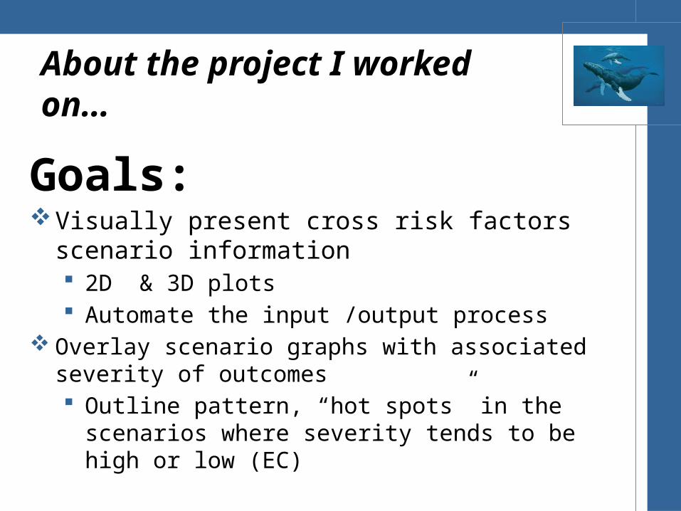
Goals: Visually present cross risk factors scenario information
2D & 3D plots Automate the input /output process
Overlay scenario graphs with associated severity of outcomes Outline pattern, “hot spots” in the scenarios where severity
tends to be high or low (EC)
About the project I worked on…

About this talk…
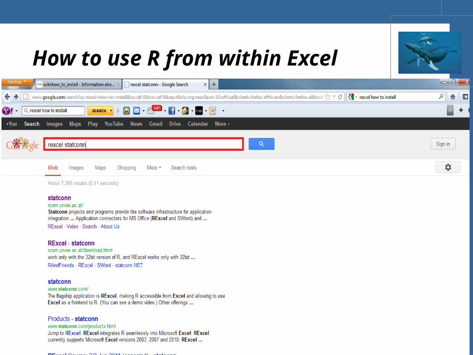
How to use R from within Excel
How to automate the input/output process
How to use R from within Excel

How to use R from within Excel
Install RExcel• http://
homepage.univie.ac.at/erich.neuwirth/php/rcomwiki/doku.php?id=wiki:how_to_install
Enable Macro and Developer Ribbon
Go to C:\Program Files (x86)\RExcel\xls
Run the Macro, RExcelAddinAutoInstall
Check References, RExcelVBAlib, in a Macro Window
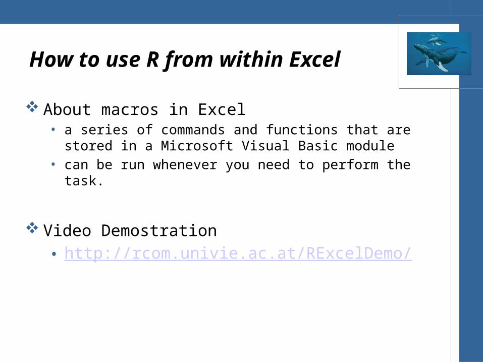
How to use R from within Excel
About macros in Excel• a series of commands and functions that are stored in a Microsoft
Visual Basic module • can be run whenever you need to perform the task.
Video Demostration • http://rcom.univie.ac.at/RExcelDemo/

How to automate the input/output process
Goals: Visually present cross risk factor scenario information
2D & 3D plots Automate the input /output process
Overlay scenario graphs with associated severity of outcomes Outline pattern, “hot spots” in the scenarios where severity
tends to be high or low (EC)

How to automate the input/output process
Tasks:1. Read in Scenario Information ( a big data set)
Excel Visual Basic Application Error Checking
2. Manipulate the data R
3. Apply bucketing algorithm
4. Summarize data
5. Create Plot
6. Transport plots R Excel
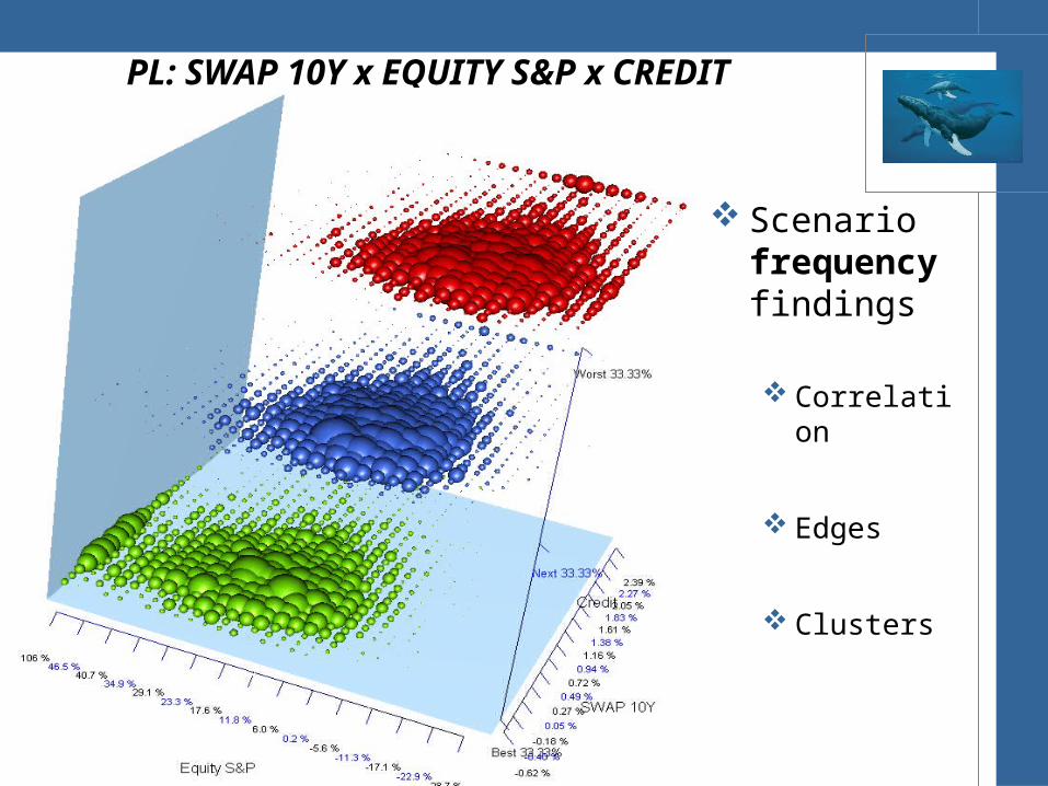
PL: SWAP 10Y x EQUITY S&P x CREDIT
Scenario frequency findings
Correlation
Edges
Clusters
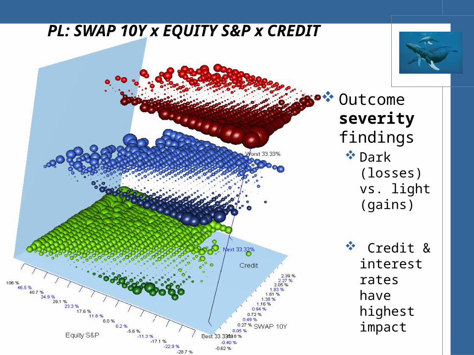
Outcome severity findings Dark (losses)
vs. light (gains)
Credit & interest rates have highest impact
PL’s “perfect storm” scenario
PL: SWAP 10Y x EQUITY S&P x CREDIT
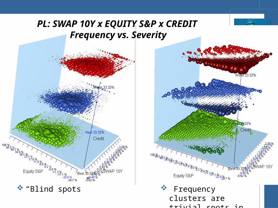
PL: SWAP 10Y x EQUITY S&P x CREDIT Frequency vs. Severity
“Blind spots” Frequency clusters are trivial spots in severity

IIP: SWAP 10Y x SWAP 1Y x CREDIT Frequency vs. Severity
Credit dominates SWAP rates have high correlation

Special Thanks…
Dr. Feldman
Benson Chen

Q & A …
Recommended
![The visrock user manual · crystal (see e.g. [Pag03]). Reticulography: Visualizing latticeirregularities inacrystal by monitoringthe distortion of a rectangular grid pattern in X-ray](https://img.pdfslide.us/doc/110x75/5f50b4d281d487515e27b825/the-visrock-user-crystal-see-eg-pag03-reticulography-visualizing-latticeirregularities.jpg)

![Road Traffic Accident Scenario, Pattern and Forecasting in ...Ahsan et al. [7] showed the car accident scenario in Bangladesh during the pe-riod 19982009. About 7 percent of these](https://img.pdfslide.us/doc/110x75/5fd4d69daaf0ba59ef6dfc28/road-traffic-accident-scenario-pattern-and-forecasting-in-ahsan-et-al-7.jpg)
![A Structured Method for Identifying and Visualizing Scenarios · tent but su ciently diverse plausible futures, called scenarios [Schoemaker (1993)]. Speci cally, scenario planning](https://img.pdfslide.us/doc/110x75/5f62f263756fe02daf6b19ed/a-structured-method-for-identifying-and-visualizing-scenarios-tent-but-su-ciently.jpg)