PNNL-21160
Prepared for the U.S. Department of Energy under Contract DE-AC05-76RL01830
User’s Guide to the Energy Charting and Metrics Tool (ECAM) DJ Taasevigen W Koran February 2012


PNNL-21160
User’s Guide to the Energy Charting and Metrics Tool (ECAM)
D Taasevigen W Koran February 2012 Prepared for U.S. Department of Energy Under Contract DE-AC05-76RL01830 Pacific Northwest National Laboratory Richland, Washington 99352

iii
Executive Summary
The intent of this user guide is to provide a brief description of the functionality of the Energy
Charting and Metrics (ECAM) tool, including the expanded building re-tuning functionality
developed for Pacific Northwest National laboratory (PNNL). This document describes the
tool’s general functions and features, and offers detailed instructions for PNNL building re-
tuning charts, a feature in ECAM intended to help building owners and operators look at trend
data (recommended 15-minute time intervals) in a series of charts (both time series and scatter)
to analyze air-handler, zone, and central plant information gathered from a building automation
system (BAS).

iv

v
CONTENTS Executive Summary .......................................................................................................................... iii
1.0 Introduction ................................................................................................................................ 1
1.1 Quick Start ......................................................................................................................... 1
1.2 Installation .......................................................................................................................... 2
Excel 2003: ......................................................................................................................... 2
Excel 2007/2010:................................................................................................................ 2
1.3 Using the Tool to Create Metrics and Charts ..................................................................... 3
1.3.1 Tool Notes ............................................................................................................... 4
2.0 Menu Items for Preprocessing of Data ....................................................................................... 5
2.1 Select Data ......................................................................................................................... 5
2.2 Definition of Points ............................................................................................................ 8
2.3 Create Schedules .............................................................................................................. 10
2.4 Input Dates for Comparison of Pre and Post .................................................................... 13
3.0 Menu Items to Create Time Series Charts ................................................................................ 15
3.1 Point(s) History Chart ...................................................................................................... 15
3.2 Load Profile by Daytype .................................................................................................. 18
3.3 Load Profile by Month-Year ............................................................................................ 19
3.4 Load Profile by Date Range (Pre/Post) ............................................................................ 20
3.5 Load Profile by Year ........................................................................................................ 20
3.6 Load Profile by Day ......................................................................................................... 21
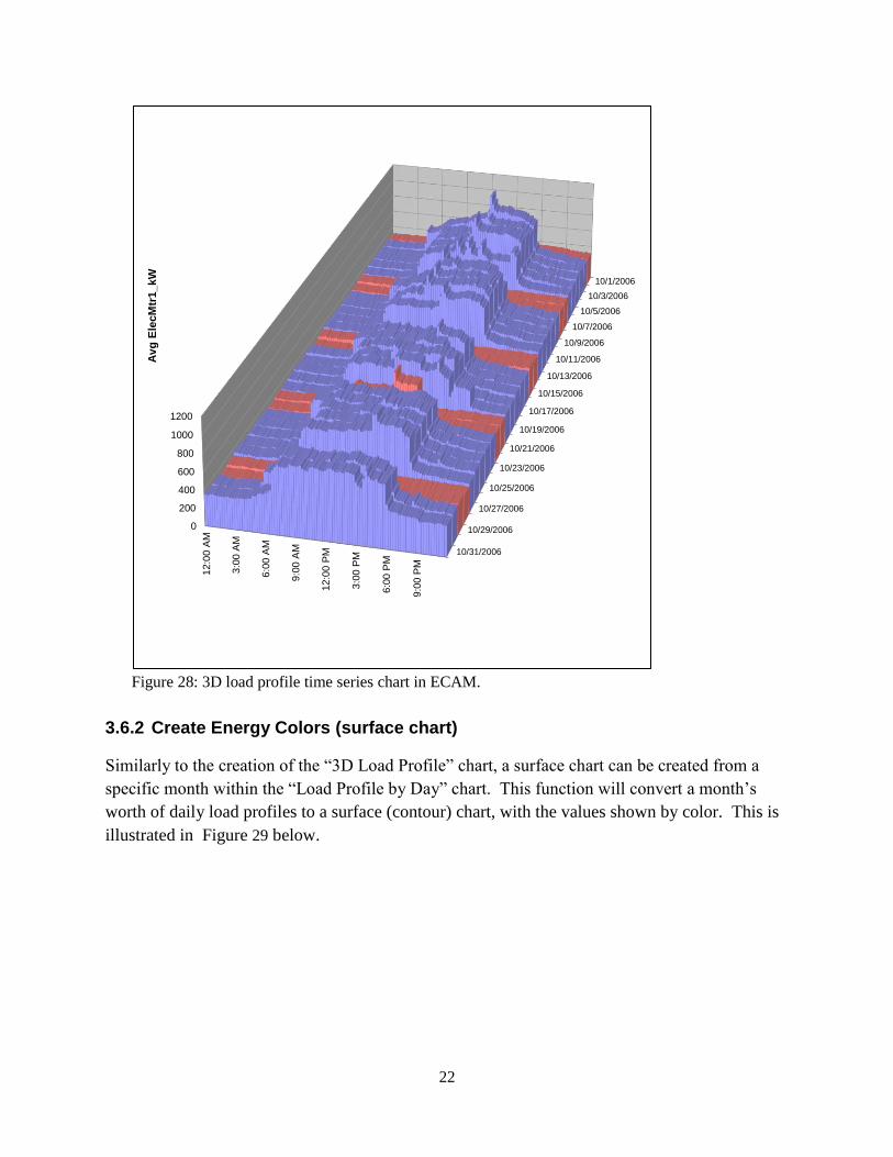
3.6.1 Create 3d Load Profile .......................................................................................... 21
3.6.2 Create Energy Colors (surface chart) .................................................................... 22
3.6.3 Load Profile Calendar ........................................................................................... 23
4.0 Load Profile as Box Plots ......................................................................................................... 25
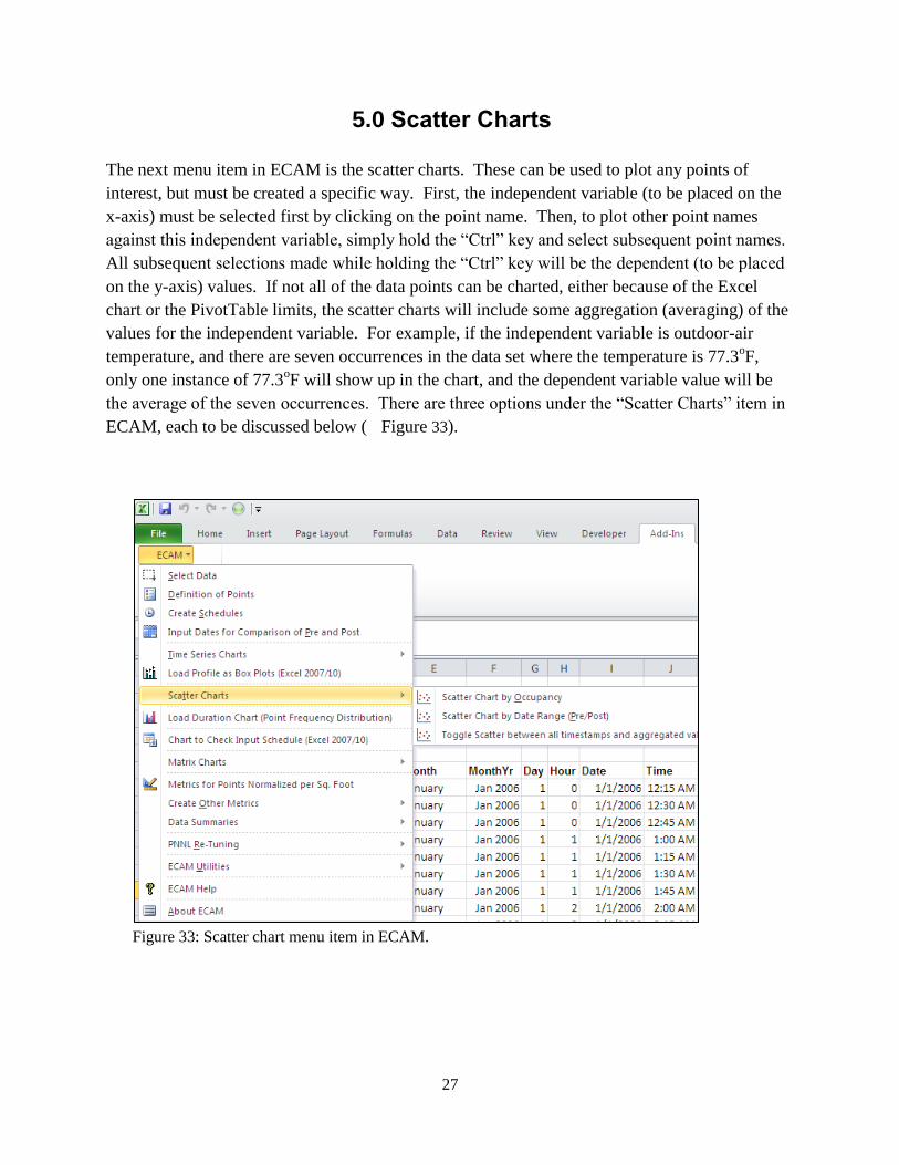
5.0 Scatter Charts ............................................................................................................................ 27
5.1.1 Scatter Chart by Occupancy .................................................................................. 28
5.1.2 Scatter Chart by Date Range (Pre/Post) ................................................................ 29
5.1.3 Toggle Scatter between all Timestamps and Aggregated Values ......................... 30
6.0 Load Duration Chart (Point Frequency Distribution) ............................................................... 33
7.0 Chart to Check Input Schedule (Excel 2007/10) ...................................................................... 37
8.0 Matrix Charts ............................................................................................................................ 39
9.0 Menu Items to Create Metrics and Summaries ......................................................................... 41
9.1 Metrics for Points Normalized per Sq. Foot ..................................................................... 41
9.2 Create other Metrics ......................................................................................................... 41
9.2.1 Daytype and Occupancy Metrics .......................................................................... 41
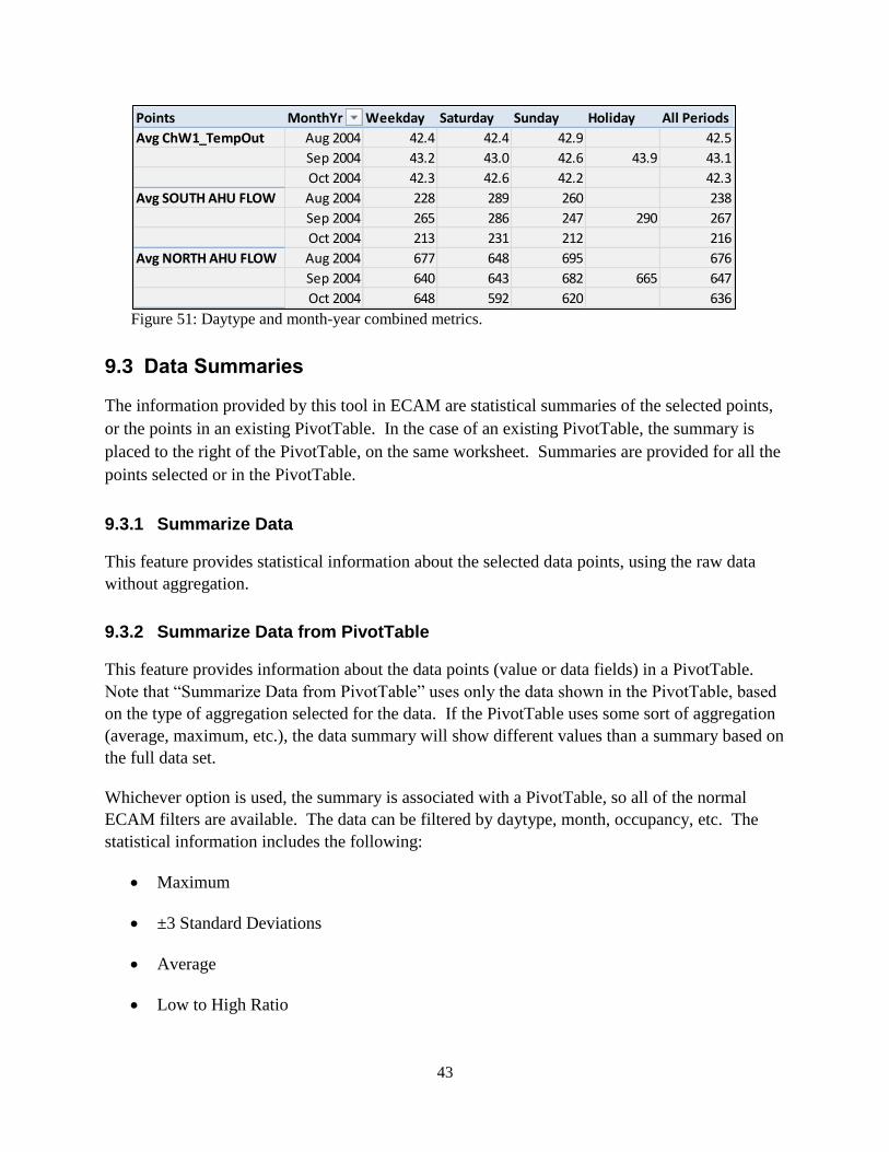
9.2.2 Occupancy and Month-Year Combined Metrics ................................................... 42
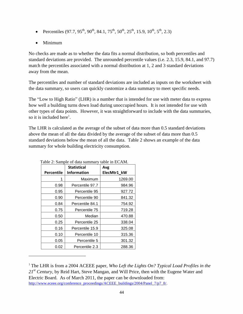
9.2.3 Daytype and Month-Year Combined Metrics ....................................................... 42

vi
9.3 Data Summaries ............................................................................................................... 43
9.3.1 Summarize Data .................................................................................................... 43
9.3.2 Summarize Data from PivotTable ......................................................................... 43
10.0 PNNL Re-tuning ....................................................................................................................... 47
10.1 Central Plant Charts ......................................................................................................... 47
10.2 Air-Handling Unit (AHU) Charts..................................................................................... 54
10.3 AHU Scatter Charts .......................................................................................................... 57
10.4 Zone Charts ...................................................................................................................... 58
10.5 Zones Common (compare zones on one chart) ................................................................ 61
11.0 ECAM Utilities ......................................................................................................................... 63
11.1 Convert Table format to ECAM List format .................................................................... 63
11.2 Create Bin Data from Temperatures ................................................................................ 65
11.3 New Data was added to “Data” worksheet ...................................................................... 65
11.4 Copy Worksheet and Update ECAM Chart Source ......................................................... 66
12.0 ECAM Help .............................................................................................................................. 67
13.0 Known Issues and Reminders ................................................................................................... 69
The following is a list of reminders when using the tool: ........................................................ 69

vii
FIGURES Figure 1: ECAM top-level items. ........................................................................................................ 3
Figure 2: Select data from the raw data sheet. .................................................................................... 5
Figure 3: ECAM's timestamp definition window. .............................................................................. 6
Figure 4: Selecting the range of cells that contain data in ECAM. ..................................................... 6
Figure 5: Selecting if the ambient temperature data is included in ECAM. ....................................... 7
Figure 6: New ECAM workbook generated after completing the first menu item, “Select Data.” .... 7
Figure 7: Entering building information in ECAM's “Definition of Points” menu item. ................... 8
Figure 8: ECAM's Definition of Points window. ................................................................................ 8
Figure 9: Refreshing the “Subsystems” to bring up the proper components. ..................................... 9
Figure 10: “Definition of Points” window after successfully "mapping" the outdoor-air
temperature. ...................................................................................................................... 9
Figure 11: First window for inputting the building schedule information. ...................................... 11
Figure 12: Inputting week schedules in the scheduling option for ECAM. ...................................... 12
Figure 13: Inputting annual schedules in ECAM. ............................................................................. 12
Figure 14: Updated ECAM workbook with building schedule input and points mapped. ............... 13
Figure 15: Entering a start date for an energy project. ...................................................................... 13
Figure 16: Entering an end date for an energy project. ..................................................................... 14
Figure 17: Time series charts in ECAM. .......................................................................................... 15
Figure 18: Point selection for time series charts in ECAM. ............................................................. 16
Figure 19: Whole building consumption point history chart in ECAM. ........................................... 16
Figure 20: Using the PivotTable functions in ECAM. ...................................................................... 17
Figure 21: Point history chart for only one month of data. ............................................................... 17
Figure 22: Point history chart for a 3-day period on May. ................................................................ 18
Figure 23: Load profile by daytype time series chart in ECAM. ...................................................... 19
Figure 24: Load profile by month-year time series chart in ECAM. ................................................ 19
Figure 25: Load profile by date range (pre/post) time series chart in ECAM. ................................. 20
Figure 26: Load profile by year time series chart in ECAM. ............................................................ 20
Figure 27: Load profile by day time series chart in ECAM for one month. ..................................... 21
Figure 28: 3d load profile time series chart in ECAM. ..................................................................... 22
Figure 29: Energy density (surface chart) created from the “Load Profile by Day” chart in ECAM.23
Figure 30: Load profile calendar created from the load profile by day chart in ECAM. .................. 23
Figure 31: Load profile as box plots in ECAM, comparing only weekdays. .................................... 25
Figure 32: Load profile as box plots showing inconsistent overnight behavior. .............................. 26
Figure 33: Scatter chart menu item in ECAM. ................................................................................. 27
Figure 34: Scatter chart by occupancy and equipment startup/shutdown. ........................................ 28
Figure 35: Scatter chart showing only the "Occ" period from Figure 34. ........................................ 29
Figure 36: Scatter chart for outdoor-air damper position versus outdoor-air temperature. .............. 29
Figure 37: Scatter chart by date range in ECAM. ............................................................................. 30

viii
Figure 38: Toggle scatter between all timestamps and aggregated values in ECAM. ...................... 31
Figure 39: Point selection when creating a load duration chart in ECAM. ...................................... 33
Figure 40: Input parameter for the load duration chart in ECAM. ................................................... 34
Figure 41: Example of table created using the load duration chart option in ECAM. ...................... 34
Figure 42: Load duration chart created for total hours at temperature bins by month. ..................... 35
Figure 43: Created table for hours vs. occupancy, for outdoor temperature. .................................... 35
Figure 44: Load duration chart for total hours at specific temperature bins for occupancy. ............ 36
Figure 45: Chart to check input schedule in ECAM. ........................................................................ 37
Figure 46: Matrix charts option in ECAM. ....................................................................................... 39
Figure 47: Matrix charts option for box plot load profiles for weekdays, for each month of the
year. ................................................................................................................................. 40
Figure 48: Metrics for points normalized per square foot. ................................................................ 41
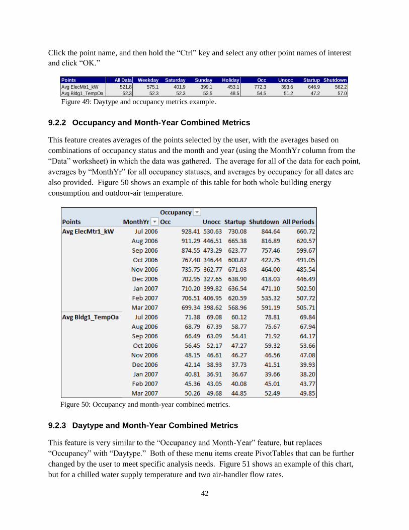
Figure 49: Daytype and occupancy metrics example. ...................................................................... 42
Figure 50: Occupancy and month-year combined metrics. .............................................................. 42
Figure 51: Daytype and month-year combined metrics. ................................................................... 43
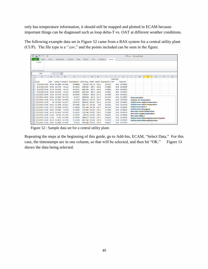
Figure 52 : Sample data set for a central utility plant. ...................................................................... 49
Figure 53: Selecting the data in ECAM. ........................................................................................... 50
Figure 54: Initial window for mapping points. ................................................................................. 51
Figure 55: Mapping points window after outdoor-air temperature is correctly mapped. ................. 51
Figure 56: Central plant charts when all points are mapped correctly. ............................................. 52
Figure 57: Central plant charts without hot water distribution. ........................................................ 53
Figure 58: Creating a point history chart for data not included in central plant charts. .................... 53
Figure 59: Point history chart for differential pressure and set point................................................ 54
Figure 60: Example data set for an air-handling unit. ....................................................................... 56
Figure 61: Air-handler charts in ECAM under the PNNL Re-Tuning option. ................................. 57
Figure 62: Example of AHU scatter charts in the PNNL Re-Tuning feature of ECAM. ................. 58
Figure 63: Example data set for zones from a BAS. ......................................................................... 60
Figure 64: A typical zone chart using the PNNL Re-Tuning feature in ECAM. .............................. 60
Figure 65: Zones common chart in ECAM's PNNL re-tuning feature. ............................................ 61
Figure 66: ECAM Utilities. ............................................................................................................... 63
Figure 67: Utility company data example. ........................................................................................ 64
Figure 68: Utility company data after ECAM has converted it. ....................................................... 65

ix
Tables Table 1: Additional points created by ECAM after mapping all points............................................ 10
Table 2: Sample of data summary table in ECAM. .......................................................................... 44

1
1.0 Introduction
The Energy Charting and Metrics (ECAM) tool is intended to facilitate the examination of the
utility interval data and the trend data from the building automation system (BAS). In addition to
being easy-to-use, this tool is also flexible. Key features of ECAM include:
Pre-processing of data to attach schedule and day-type information to time-series
data;
Filtering data by day-type, occupancy schedule, binned weather data, month/year,
pre/post, etc.;
Normalization of data based on user-entered information;
Creation of standard charts for the points selected by the user;
Calculation of normalized metrics for the points selected by the user; and
Creation of standard building re-tuning charts using trend data from the BAS.
The user’s original data is not modified in the process of using ECAM, but is copied into a new
workbook automatically. The tool makes extensive use of Excel
PivotTables to facilitate
summarization and filtering of the data. It goes beyond normal PivotTables and PivotCharts,
however, by automating the creation of scatter charts based on PivotTable data.
This document describes the tool’s general functions and features, and offers detailed
instructions for PNNL building re-tuning charts, a feature in ECAM intended to help building
owners and operators look at trend data (recommended 15-minute time intervals) in a series of
charts (both time series and scatter) to analyze air-handler, zone, and central plant information
gathered using a BAS.
1.1 Quick Start This tool was developed using Microsoft Excel™ 2007 and 2010, and has had limited testing to
confirm that it is functional with Excel 2003. There are some charts, however, that will only
work with Excel 2007/2010.
ECAM requires continuous, uniform interval data. Change-of-value data, or data with different
parameters stored at different time intervals, must be pre-processed before using it with ECAM.
The basic charting of data will work with non-uniform timestamps, but if there are multiple
points from the BAS, all with different timestamps, then some pre-processing must be done.
One tool designed to assist and automate such pre-processing is the Universal Translator (UT),
available at www.utonline.org. The UT is a program that assists in processing and merging data
that has non-uniform time intervals or data that are stored in multiple files. The UT interpolates
data that is not uniform to form a uniform data series. The user guide that describes how to
merge data with UT can be found at http://www.pnl.gov/buildingretuning/ecam.stm.

2
1.2 Installation
ECAM is an Excel Add-In. First, download the add-in file, and save the tool file in your chosen
location. Please note that Microsoft Add-Ins are installed, by default, in a common location,
such as “Documents and Settings” folder. It can, however, be saved to any location.
To install the application, open Excel and perform the following steps:
Excel 2003:
Go to Tools, Add-Ins, and Browse to the location where the file was saved. Select the
filename, and click OK. “ECAM” will be in the list of Add-Ins. There will also be a
Menu called ECAM in the Excel Toolbar.
Excel 2007/2010:
Click on the Office Button, and then click “Excel Options.” Click on “Add-Ins” on the
left side of the window. At the bottom of the subsequent window, make sure that “Excel
Add-Ins” is visible in the drop-down next to “Manage.” Click the adjacent “Go…”
button. Then Browse to the location where the file was saved. Select the filename, and
click OK. “ECAM” will be in the list of Add-Ins. An ECAM menu will be available
under the Add-Ins menu.
3
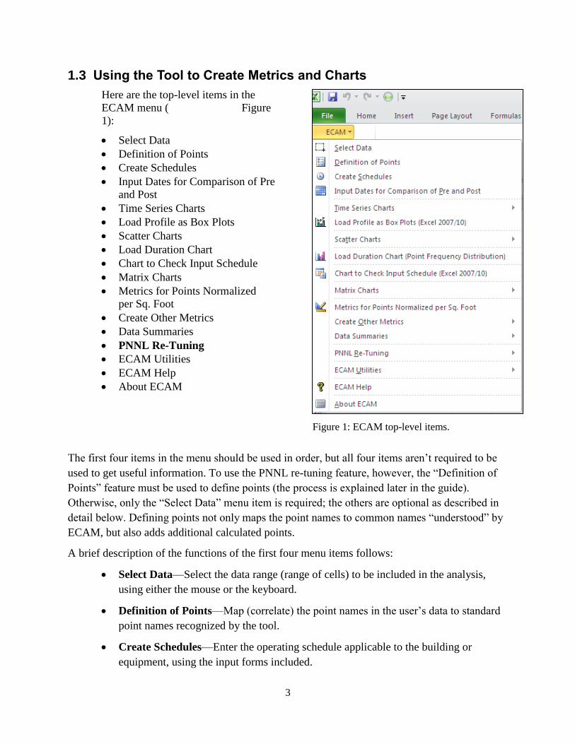
1.3 Using the Tool to Create Metrics and Charts
Here are the top-level items in the
ECAM menu ( Figure
1):
Select Data
Definition of Points
Create Schedules
Input Dates for Comparison of Pre
and Post
Time Series Charts
Load Profile as Box Plots
Scatter Charts
Load Duration Chart
Chart to Check Input Schedule
Matrix Charts
Metrics for Points Normalized
per Sq. Foot
Create Other Metrics
Data Summaries
PNNL Re-Tuning
ECAM Utilities
ECAM Help
About ECAM
Figure 1: ECAM top-level items.
The first four items in the menu should be used in order, but all four items aren’t required to be
used to get useful information. To use the PNNL re-tuning feature, however, the “Definition of
Points” feature must be used to define points (the process is explained later in the guide).
Otherwise, only the “Select Data” menu item is required; the others are optional as described in
detail below. Defining points not only maps the point names to common names “understood” by
ECAM, but also adds additional calculated points.
A brief description of the functions of the first four menu items follows:
Select Data—Select the data range (range of cells) to be included in the analysis,
using either the mouse or the keyboard.
Definition of Points—Map (correlate) the point names in the user’s data to standard
point names recognized by the tool.
Create Schedules—Enter the operating schedule applicable to the building or
equipment, using the input forms included.

4
Input Dates for Comparison of Pre and Post—If there is an energy project to be
evaluated, input the date when the energy project started and the date it was
completed.
Everything after “Select Data” is optional, but issues may arise depending upon what subsequent
menu item(s) are used. For example, if the user does not enter a schedule, but does create
metrics, then the fields for metrics that are dependent upon occupancy will show “NA.”
Similarly, if data for comparison of “pre” and “post” is not input before trying to create a “load
profile by date range,” the chart will only show a single line with a series name of “(blank).”
Other complications may also exist, although not all of the tool’s capabilities have been
exhaustively tested without using all of the first four menu items.
When using the application to create metrics and charts, the workbook created by the tool must
be the active (visible) workbook. Using the metrics and charts menu items (steps 5 to 8 above)
will add new worksheets to the active workbook. Repeated use of the same or related menu items
will overwrite prior work because the worksheet names are not changed. To avoid losing work,
the user should change the names of any tool-created worksheets that they wish to save, prior to
creating a related metric or chart. This is especially important if any new formulas or
customization has been added.
When creating metrics or charts, select just the point name(s) to be included; do not select the
data.
1.3.1 Tool Notes
All Excel
formatting and other customization options should be available. Scatter charts
require that the point name to be used for the independent value (to be placed on the X-axis) be
selected first. Do not drag the mouse or use the “Shift” key to select subsequent point names.
Use the “Ctrl” key to select the second and subsequent point names for the dependent values.
Important: Do not enter any data or information in the cells directly below the PivotTables.
5
2.0 Menu Items for Preprocessing of Data
As mentioned above, ECAM cannot generate useful charts from data that has non-uniform or
multiple timestamps. There is one menu item that is for preprocessing in ECAM, but this is only
to take the data and convert it to a form that ECAM recognizes. ECAM will recognize raw data
files in Excel as either in “*.csv” or “*.xls”, “*.xlsx” (for 2010 users). So before continuing,
make sure the raw data file is in one of these formats.
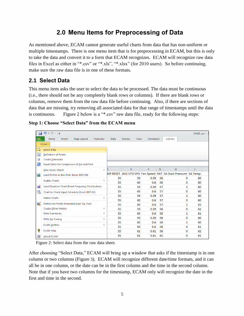
2.1 Select Data
This menu item asks the user to select the data to be processed. The data must be continuous
(i.e., there should not be any completely blank rows or columns). If there are blank rows or
columns, remove them from the raw data file before continuing. Also, if there are sections of
data that are missing, try removing all associated data for that range of timestamps until the data
is continuous. Figure 2 below is a “*.csv” raw data file, ready for the following steps:
Step 1: Choose “Select Data” from the ECAM menu
Figure 2: Select data from the raw data sheet.
After choosing “Select Data,” ECAM will bring up a window that asks if the timestamp is in one
column or two columns (Figure 3). ECAM will recognize different date/time formats, and it can
all be in one column, or the date can be in the first column and the time in the second column.
Note that if you have two columns for the timestamp, ECAM only will recognize the date in the
first and time in the second.
6
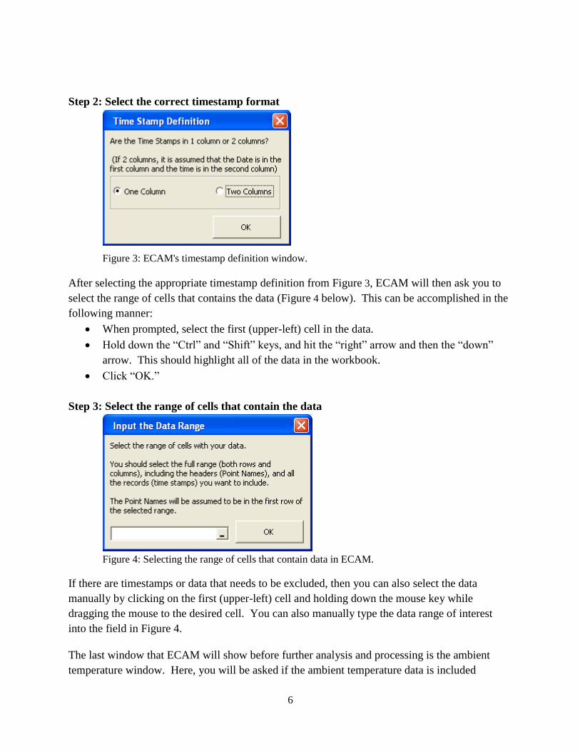
Step 2: Select the correct timestamp format
Figure 3: ECAM's timestamp definition window.
After selecting the appropriate timestamp definition from Figure 3, ECAM will then ask you to
select the range of cells that contains the data (Figure 4 below). This can be accomplished in the
following manner:
When prompted, select the first (upper-left) cell in the data.
Hold down the “Ctrl” and “Shift” keys, and hit the “right” arrow and then the “down”
arrow. This should highlight all of the data in the workbook.
Click “OK.”
Step 3: Select the range of cells that contain the data
Figure 4: Selecting the range of cells that contain data in ECAM.
If there are timestamps or data that needs to be excluded, then you can also select the data
manually by clicking on the first (upper-left) cell and holding down the mouse key while
dragging the mouse to the desired cell. You can also manually type the data range of interest
into the field in Figure 4.
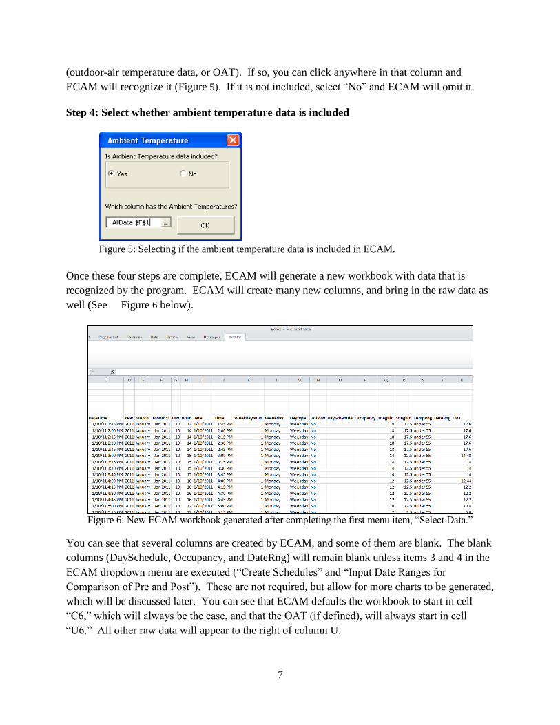
The last window that ECAM will show before further analysis and processing is the ambient
temperature window. Here, you will be asked if the ambient temperature data is included
7
(outdoor-air temperature data, or OAT). If so, you can click anywhere in that column and
ECAM will recognize it (Figure 5). If it is not included, select “No” and ECAM will omit it.
Step 4: Select whether ambient temperature data is included
Figure 5: Selecting if the ambient temperature data is included in ECAM.
Once these four steps are complete, ECAM will generate a new workbook with data that is
recognized by the program. ECAM will create many new columns, and bring in the raw data as
well (See Figure 6 below).
Figure 6: New ECAM workbook generated after completing the first menu item, “Select Data.”
You can see that several columns are created by ECAM, and some of them are blank. The blank
columns (DaySchedule, Occupancy, and DateRng) will remain blank unless items 3 and 4 in the
ECAM dropdown menu are executed (“Create Schedules” and “Input Date Ranges for
Comparison of Pre and Post”). These are not required, but allow for more charts to be generated,
which will be discussed later. You can see that ECAM defaults the workbook to start in cell
“C6,” which will always be the case, and that the OAT (if defined), will always start in cell
“U6.” All other raw data will appear to the right of column U.
8
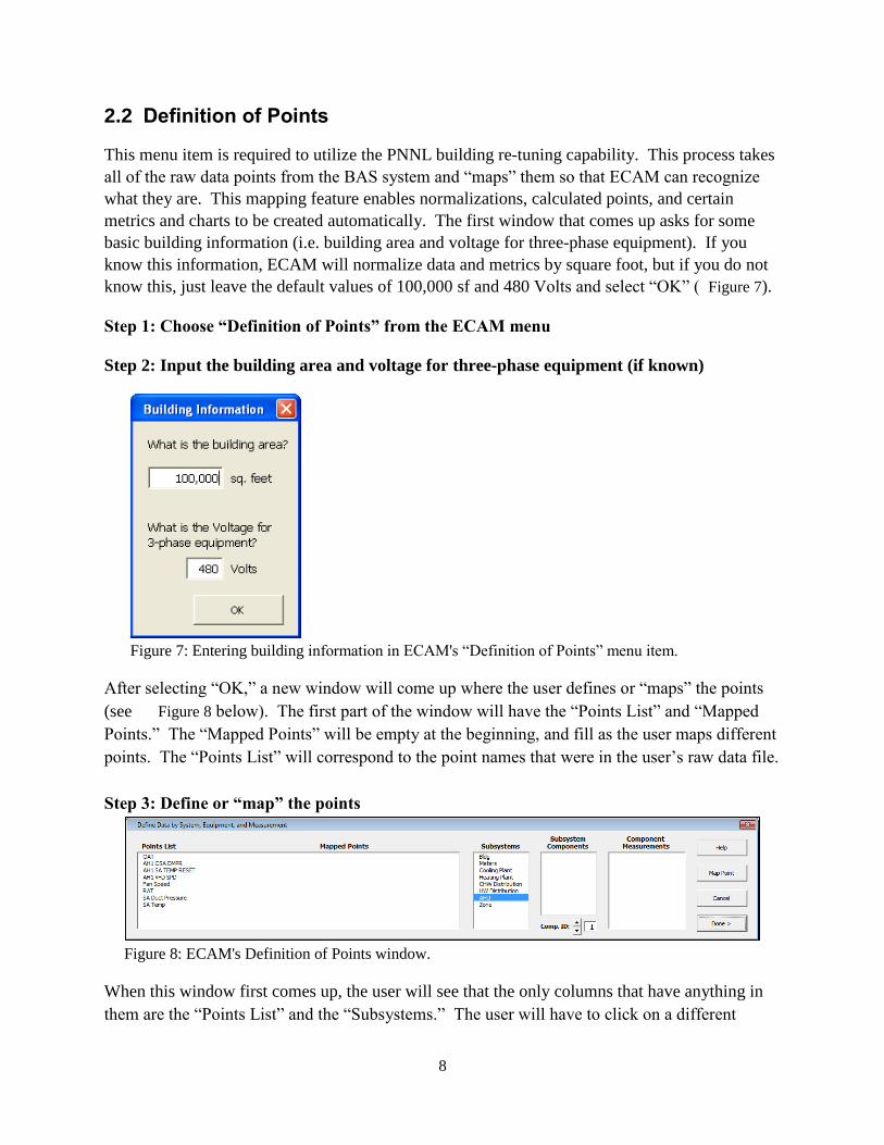
2.2 Definition of Points
This menu item is required to utilize the PNNL building re-tuning capability. This process takes
all of the raw data points from the BAS system and “maps” them so that ECAM can recognize
what they are. This mapping feature enables normalizations, calculated points, and certain
metrics and charts to be created automatically. The first window that comes up asks for some
basic building information (i.e. building area and voltage for three-phase equipment). If you
know this information, ECAM will normalize data and metrics by square foot, but if you do not
know this, just leave the default values of 100,000 sf and 480 Volts and select “OK” ( Figure 7).
Step 1: Choose “Definition of Points” from the ECAM menu
Step 2: Input the building area and voltage for three-phase equipment (if known)
Figure 7: Entering building information in ECAM's “Definition of Points” menu item.
After selecting “OK,” a new window will come up where the user defines or “maps” the points
(see Figure 8 below). The first part of the window will have the “Points List” and “Mapped
Points.” The “Mapped Points” will be empty at the beginning, and fill as the user maps different
points. The “Points List” will correspond to the point names that were in the user’s raw data file.
Step 3: Define or “map” the points
Figure 8: ECAM's Definition of Points window.
When this window first comes up, the user will see that the only columns that have anything in
them are the “Points List” and the “Subsystems.” The user will have to click on a different
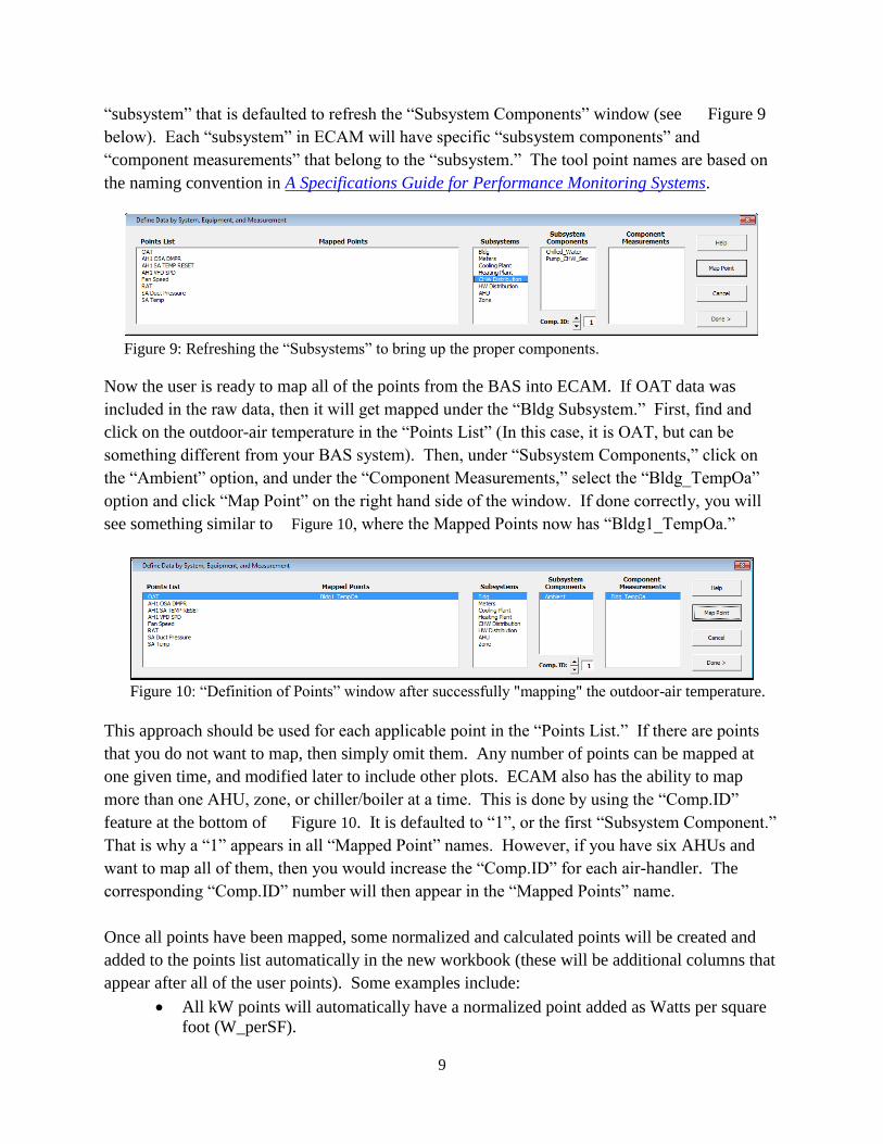
9
“subsystem” that is defaulted to refresh the “Subsystem Components” window (see Figure 9
below). Each “subsystem” in ECAM will have specific “subsystem components” and
“component measurements” that belong to the “subsystem.” The tool point names are based on
the naming convention in A Specifications Guide for Performance Monitoring Systems.
Figure 9: Refreshing the “Subsystems” to bring up the proper components.
Now the user is ready to map all of the points from the BAS into ECAM. If OAT data was
included in the raw data, then it will get mapped under the “Bldg Subsystem.” First, find and
click on the outdoor-air temperature in the “Points List” (In this case, it is OAT, but can be
something different from your BAS system). Then, under “Subsystem Components,” click on
the “Ambient” option, and under the “Component Measurements,” select the “Bldg_TempOa”
option and click “Map Point” on the right hand side of the window. If done correctly, you will
see something similar to Figure 10, where the Mapped Points now has “Bldg1_TempOa.”
Figure 10: “Definition of Points” window after successfully "mapping" the outdoor-air temperature.
This approach should be used for each applicable point in the “Points List.” If there are points
that you do not want to map, then simply omit them. Any number of points can be mapped at
one given time, and modified later to include other plots. ECAM also has the ability to map
more than one AHU, zone, or chiller/boiler at a time. This is done by using the “Comp.ID”
feature at the bottom of Figure 10. It is defaulted to “1”, or the first “Subsystem Component.”
That is why a “1” appears in all “Mapped Point” names. However, if you have six AHUs and
want to map all of them, then you would increase the “Comp.ID” for each air-handler. The
corresponding “Comp.ID” number will then appear in the “Mapped Points” name.
Once all points have been mapped, some normalized and calculated points will be created and
added to the points list automatically in the new workbook (these will be additional columns that
appear after all of the user points). Some examples include:
All kW points will automatically have a normalized point added as Watts per square
foot (W_perSF).
10
All CFM points will automatically have a normalized point added as cfm per square
foot (cfm_perSF).
If a set of chilled water temperatures and the associated flow are available, the
cooling capacity (tons) of that chiller or chilled water loop will be calculated.
Table 1 below offers a detailed list of the additional points created by ECAM.
Table 1: Additional points created by ECAM after mapping all points.
Point Type Normalized or calculated point
kW Watts per square foot (W_perSF)
kW Equipment status (only if a status point is not available)
>3% of max= “On”
<=3% of max= “Off”
Amps Equipment status (only if a status point is not available,
and kW is not available)
>3% of max= “On”
<=3% of max= “Off”
CFM cfm per square foot (cfm_perSF)
gpm, Tin, Tout Cooling capacity (tons)
kW, tons kW_perTon
gpm, tons gpm_perTon
2.3 Create Schedules
This is the third item in the ECAM drop down menu, and it is optional. If the operating schedule
of the building is known, it should be input, as there are some powerful scatter plots in ECAM
that can show a comparison of occupied and unoccupied electricity consumption. However, if
no schedule is input, then the daytype will always be assumed to be occupied “Occ.” To create a
schedule that has a 24-hour operation schedule, select 12:00 AM as the start time and 11:59 PM
stop time. To create a schedule that is always unoccupied “Unocc,” select 12:00 AM as the start
time and 12:00 AM as the stop time. When selecting the option from the drop down menu, the
window seen in Figure 11 will appear. Under “Schedule Name,” there are 10 different
schedule options. This gives the user the ability to have 10 different types of schedules. The
user should re-name the schedule to identify what type of day it corresponds to. For example, if
the building had an occupancy schedule of Monday through Friday 8:00 AM to 5:00 PM,
Saturday 10:00 AM to 3:00 PM, closed on Sundays and Holidays, then the user should set up
three different schedules. The first one would be named something like “Weekdays,” or “Mon-
Fri.” This will help the user identify what schedule corresponds to which day, in case changes
need to be made in the future. The “Main Occupancy” should be specified to match that of the
11
building occupancy for each daytype (Mon-Fri, etc.). The “Typical Startup/Shutdown” options
will only be used if there is a clearly defined building warm-up/shut-down time. If unknown,
just leave the defaulted values of 12:00 PM. Figure 11 shows what the window may look like
filled in for the scenario described above.
Figure 11: First window for inputting the building schedule information.
Once the information is entered correctly for the building schedule, select the “Week Schedules”
button at the bottom right of the window. This will bring up a new window that will allow you
to select the schedule type for each day of the week specifically. The “Schedule Name” button
have five drop down options: All Year, Quarter A, Quarter B, Quarter C, and Quarter D, along
with five “Sch.#” options. This allows the user to input multiple schedules based on the time of
the year. For this exercise, we will select the “All Year” option and then choose the appropriate
schedule for each day of the week (See Figure 12). You will see the name of the daytype
schedule that you input in the previous window now appears by each day in the schedule. If you
have multiple schedules you want to input, select the “Next Week Sched,” otherwise select the
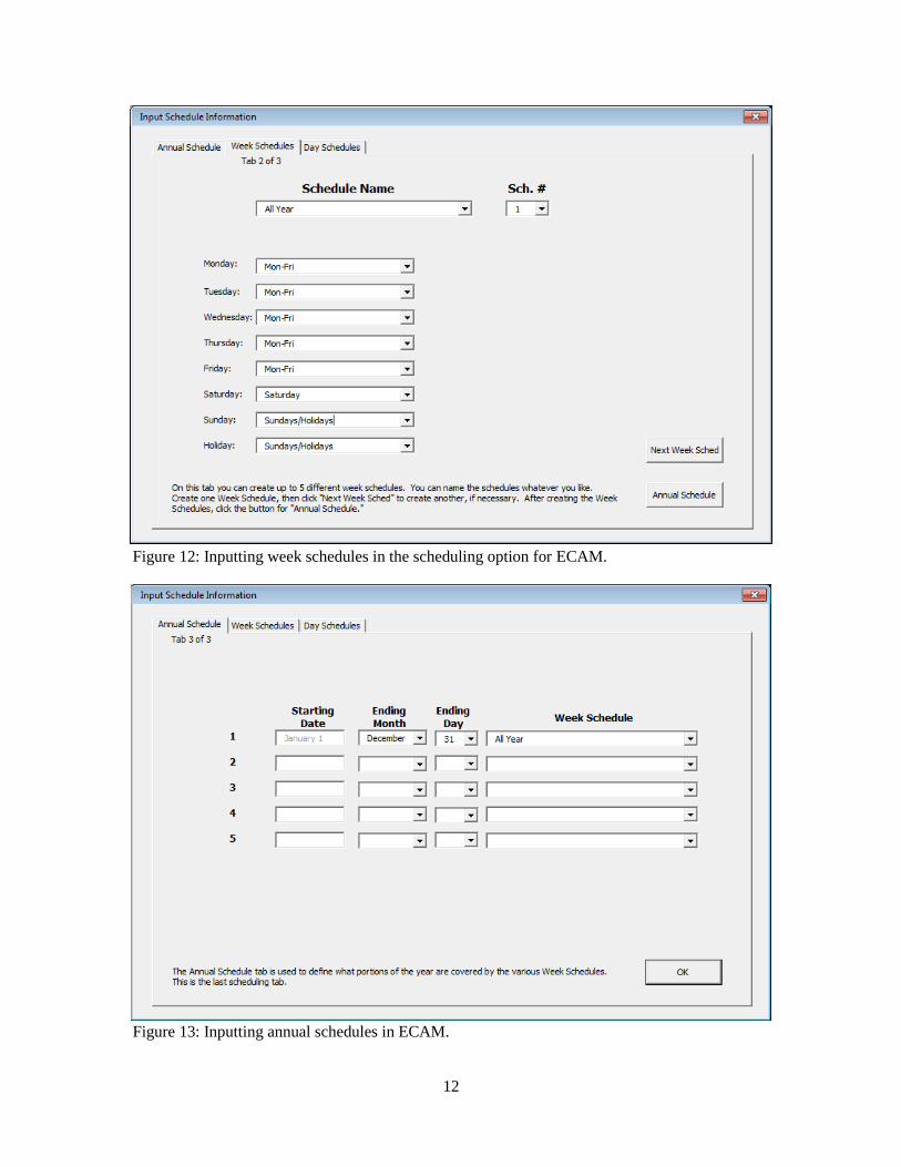
“Annual Schedule” button. The third and final window that comes up for scheduling is for the
“Annual Schedule.” The annual schedule is defaulted to January 1st, but the user can choose the
ending month and day for each schedule they have input in the previous screens. For this
example, we will choose the entire year for the schedule and click “OK” (see Figure 13 below).
12
Figure 12: Inputting week schedules in the scheduling option for ECAM.
Figure 13: Inputting annual schedules in ECAM.
13
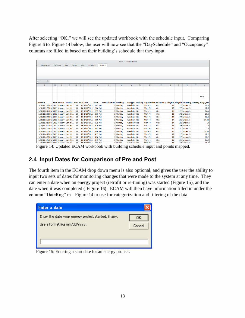
After selecting “OK,” we will see the updated workbook with the schedule input. Comparing
Figure 6 to Figure 14 below, the user will now see that the “DaySchedule” and “Occupancy”
columns are filled in based on their building’s schedule that they input.
Figure 14: Updated ECAM workbook with building schedule input and points mapped.
2.4 Input Dates for Comparison of Pre and Post
The fourth item in the ECAM drop down menu is also optional, and gives the user the ability to
input two sets of dates for monitoring changes that were made to the system at any time. They
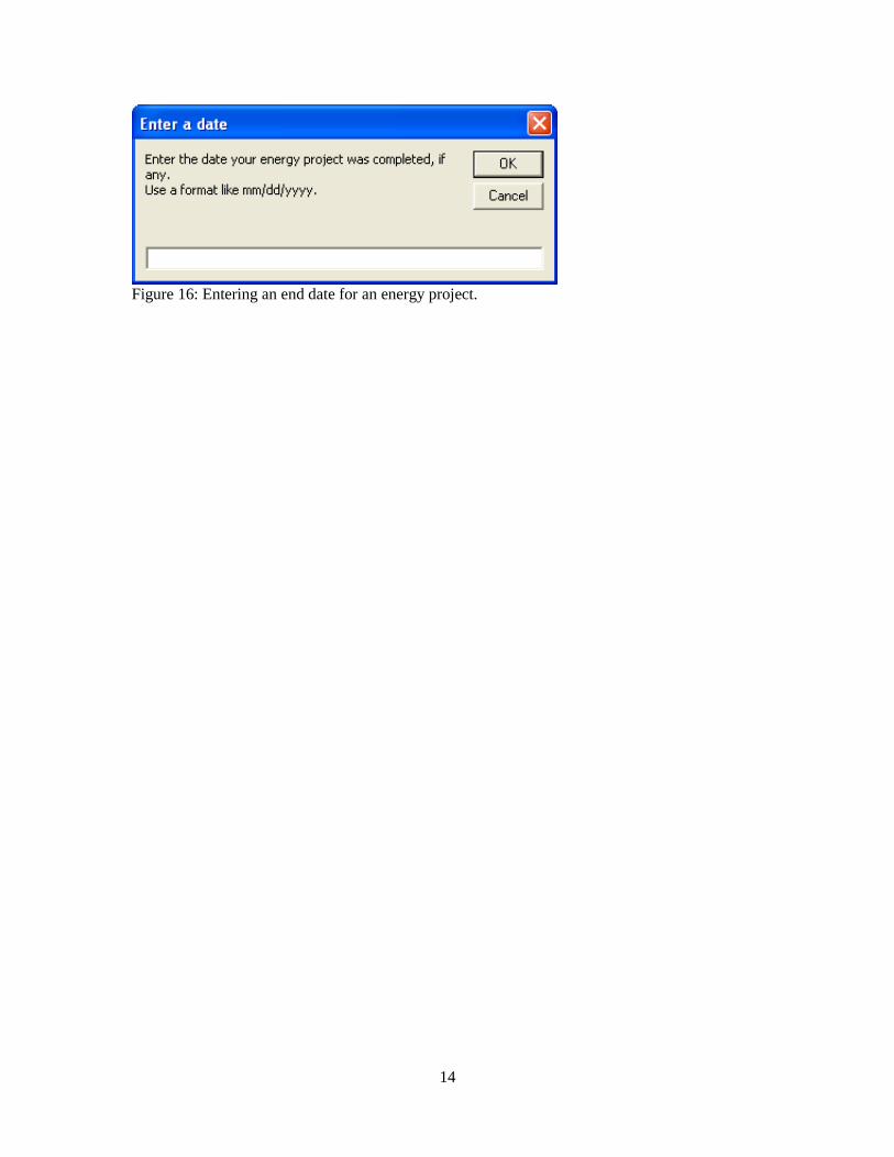
can enter a date when an energy project (retrofit or re-tuning) was started (Figure 15), and the
date when it was completed ( Figure 16). ECAM will then have information filled in under the
column “DateRng” in Figure 14 to use for categorization and filtering of the data.
Figure 15: Entering a start date for an energy project.
14
Figure 16: Entering an end date for an energy project.
15
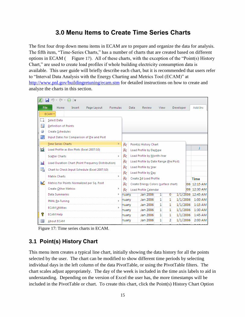
3.0 Menu Items to Create Time Series Charts
The first four drop down menu items in ECAM are to prepare and organize the data for analysis.
The fifth item, “Time-Series Charts,” has a number of charts that are created based on different
options in ECAM ( Figure 17). All of these charts, with the exception of the “Point(s) History
Chart,” are used to create load profiles if whole building electricity consumption data is
available. This user guide will briefly describe each chart, but it is recommended that users refer
to “Interval Data Analysis with the Energy Charting and Metrics Tool (ECAM)” at
http://www.pnl.gov/buildingretuning/ecam.stm for detailed instructions on how to create and
analyze the charts in this section.
Figure 17: Time series charts in ECAM.
3.1 Point(s) History Chart
This menu item creates a typical line chart, initially showing the data history for all the points
selected by the user. The chart can be modified to show different time periods by selecting
individual days in the left column of the data PivotTable, or using the PivotTable filters. The
chart scales adjust appropriately. The day of the week is included in the time axis labels to aid in
understanding. Depending on the version of Excel the user has, the more timestamps will be
included in the PivotTable or chart. To create this chart, click the Point(s) History Chart Option
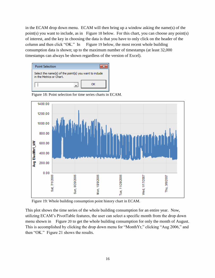
16
in the ECAM drop down menu. ECAM will then bring up a window asking the name(s) of the
point(s) you want to include, as in Figure 18 below. For this chart, you can choose any point(s)
of interest, and the key in choosing the data is that you have to only click on the header of the
column and then click “OK.” In Figure 19 below, the most recent whole building
consumption data is shown; up to the maximum number of timestamps (at least 32,000
timestamps can always be shown regardless of the version of Excel).
Figure 18: Point selection for time series charts in ECAM.
Figure 19: Whole building consumption point history chart in ECAM.
This plot shows the time series of the whole building consumption for an entire year. Now,
utilizing ECAM’s PivotTable features, the user can select a specific month from the drop down
menu shown in Figure 20 to get the whole building consumption for only the month of August.
This is accomplished by clicking the drop down menu for “MonthYr,” clicking “Aug 2006,” and
then “OK.” Figure 21 shows the results.
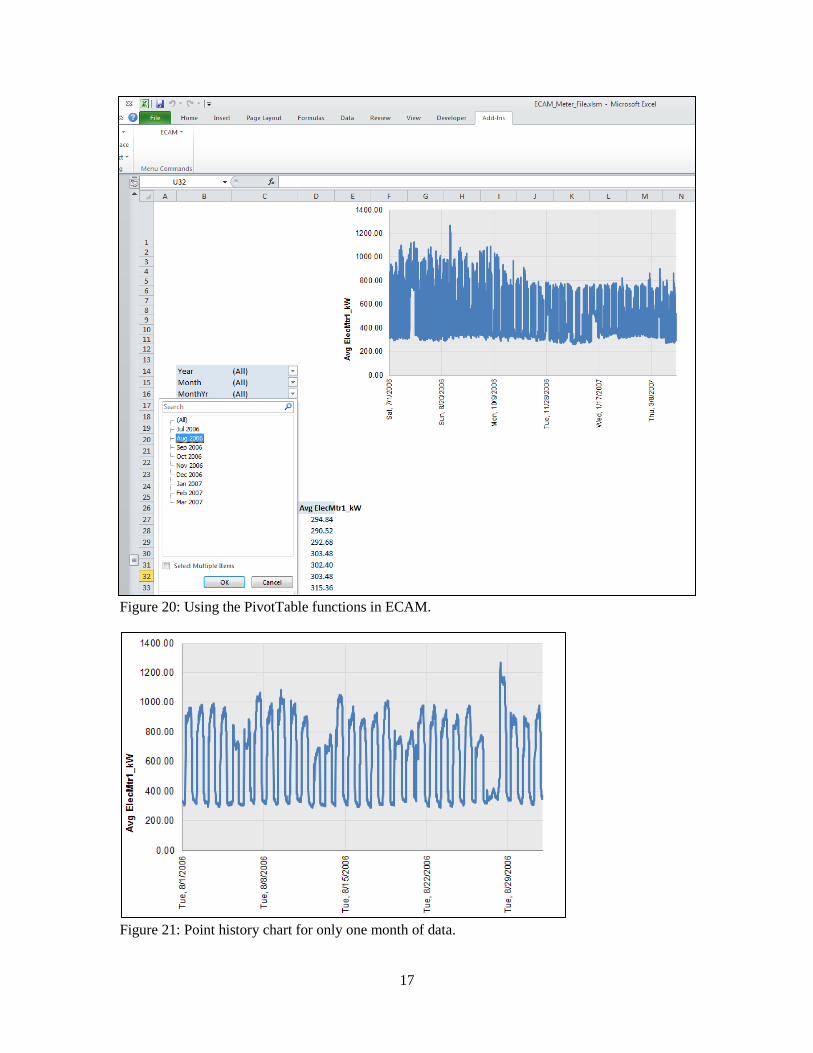
17
Figure 20: Using the PivotTable functions in ECAM.
Figure 21: Point history chart for only one month of data.
18
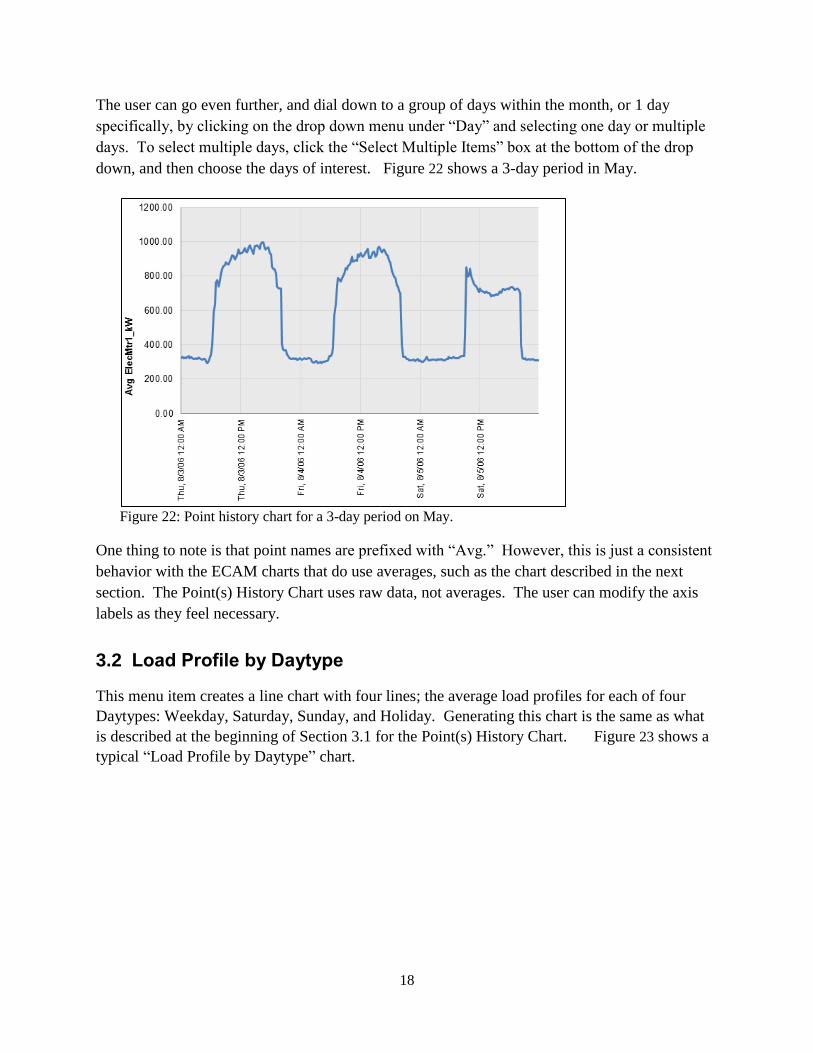
The user can go even further, and dial down to a group of days within the month, or 1 day
specifically, by clicking on the drop down menu under “Day” and selecting one day or multiple
days. To select multiple days, click the “Select Multiple Items” box at the bottom of the drop
down, and then choose the days of interest. Figure 22 shows a 3-day period in May.
Figure 22: Point history chart for a 3-day period on May.
One thing to note is that point names are prefixed with “Avg.” However, this is just a consistent
behavior with the ECAM charts that do use averages, such as the chart described in the next
section. The Point(s) History Chart uses raw data, not averages. The user can modify the axis
labels as they feel necessary.
3.2 Load Profile by Daytype
This menu item creates a line chart with four lines; the average load profiles for each of four
Daytypes: Weekday, Saturday, Sunday, and Holiday. Generating this chart is the same as what
is described at the beginning of Section 3.1 for the Point(s) History Chart. Figure 23 shows a
typical “Load Profile by Daytype” chart.
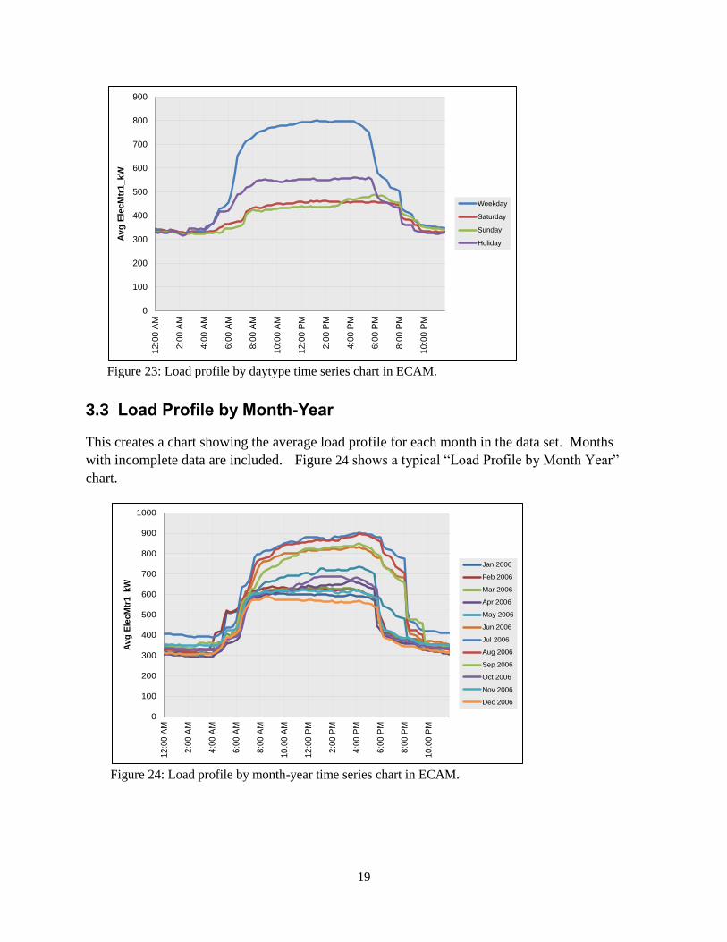
19
Figure 23: Load profile by daytype time series chart in ECAM.
3.3 Load Profile by Month-Year
This creates a chart showing the average load profile for each month in the data set. Months
with incomplete data are included. Figure 24 shows a typical “Load Profile by Month Year”
chart.
Figure 24: Load profile by month-year time series chart in ECAM.
0
100
200
300
400
500
600
700
800
900
12
:00
AM
2:0
0 A
M
4:0
0 A
M
6:0
0 A
M
8:0
0 A
M
10
:00
AM
12
:00
PM
2:0
0 P
M
4:0
0 P
M
6:0
0 P
M
8:0
0 P
M
10
:00
PM
Av
g E
lecM
tr1_kW
Weekday
Saturday
Sunday
Holiday
0
100
200
300
400
500
600
700
800
900
1000
12
:00
AM
2:0
0 A
M
4:0
0 A
M
6:0
0 A
M
8:0
0 A
M
10
:00
AM
12
:00
PM
2:0
0 P
M
4:0
0 P
M
6:0
0 P
M
8:0
0 P
M
10
:00
PM
Av
g E
lecM
tr1_kW
Jan 2006
Feb 2006
Mar 2006
Apr 2006
May 2006
Jun 2006
Jul 2006
Aug 2006
Sep 2006
Oct 2006
Nov 2006
Dec 2006
20
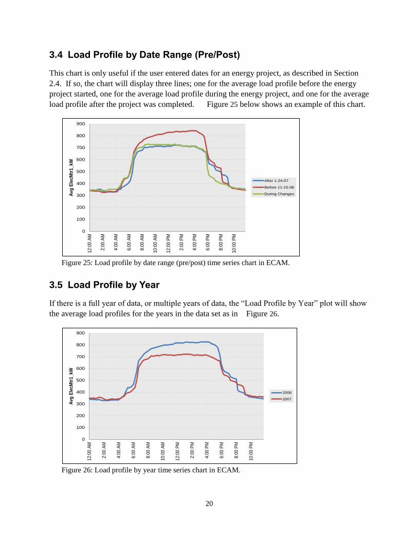
3.4 Load Profile by Date Range (Pre/Post)
This chart is only useful if the user entered dates for an energy project, as described in Section
2.4. If so, the chart will display three lines; one for the average load profile before the energy
project started, one for the average load profile during the energy project, and one for the average
load profile after the project was completed. Figure 25 below shows an example of this chart.
Figure 25: Load profile by date range (pre/post) time series chart in ECAM.
3.5 Load Profile by Year
If there is a full year of data, or multiple years of data, the “Load Profile by Year” plot will show
the average load profiles for the years in the data set as in Figure 26.
Figure 26: Load profile by year time series chart in ECAM.
0
100
200
300
400
500
600
700
800
900
12
:00
AM
2:0
0 A
M
4:0
0 A
M
6:0
0 A
M
8:0
0 A
M
10
:00
AM
12
:00
PM
2:0
0 P
M
4:0
0 P
M
6:0
0 P
M
8:0
0 P
M
10
:00
PM
Av
g E
lecM
tr1_kW
After 1-24-07
Before 11-15-06
During Changes
0
100
200
300
400
500
600
700
800
900
12
:00
AM
2:0
0 A
M
4:0
0 A
M
6:0
0 A
M
8:0
0 A
M
10
:00
AM
12
:00
PM
2:0
0 P
M
4:0
0 P
M
6:0
0 P
M
8:0
0 P
M
10
:00
PM
Av
g E
lecM
tr1
_k
W
2006
2007
21
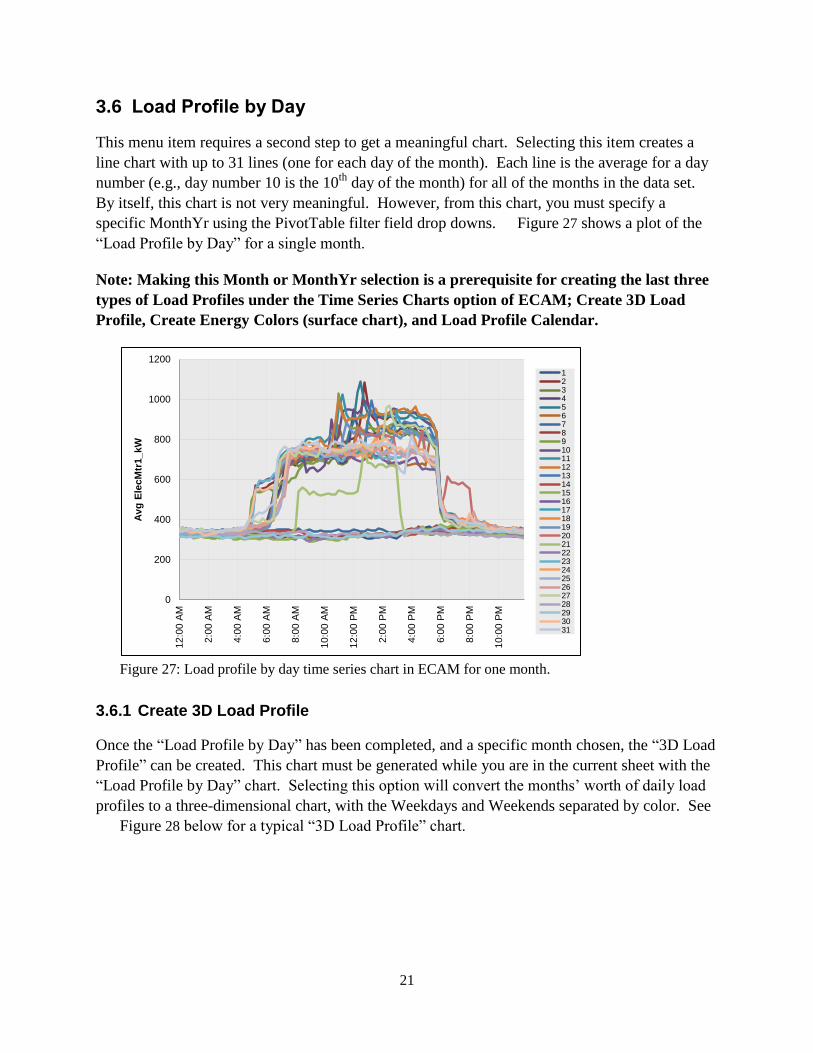
3.6 Load Profile by Day
This menu item requires a second step to get a meaningful chart. Selecting this item creates a
line chart with up to 31 lines (one for each day of the month). Each line is the average for a day
number (e.g., day number 10 is the 10th
day of the month) for all of the months in the data set.
By itself, this chart is not very meaningful. However, from this chart, you must specify a
specific MonthYr using the PivotTable filter field drop downs. Figure 27 shows a plot of the
“Load Profile by Day” for a single month.
Note: Making this Month or MonthYr selection is a prerequisite for creating the last three
types of Load Profiles under the Time Series Charts option of ECAM; Create 3D Load
Profile, Create Energy Colors (surface chart), and Load Profile Calendar.
Figure 27: Load profile by day time series chart in ECAM for one month.
3.6.1 Create 3D Load Profile
Once the “Load Profile by Day” has been completed, and a specific month chosen, the “3D Load
Profile” can be created. This chart must be generated while you are in the current sheet with the
“Load Profile by Day” chart. Selecting this option will convert the months’ worth of daily load
profiles to a three-dimensional chart, with the Weekdays and Weekends separated by color. See
Figure 28 below for a typical “3D Load Profile” chart.
0
200
400
600
800
1000
1200
12
:00
AM
2:0
0 A
M
4:0
0 A
M
6:0
0 A
M
8:0
0 A
M
10
:00
AM
12
:00
PM
2:0
0 P
M
4:0
0 P
M
6:0
0 P
M
8:0
0 P
M
10
:00
PM
Av
g E
lecM
tr1_kW
12345678910111213141516171819202122232425262728293031
22
Figure 28: 3D load profile time series chart in ECAM.
3.6.2 Create Energy Colors (surface chart)
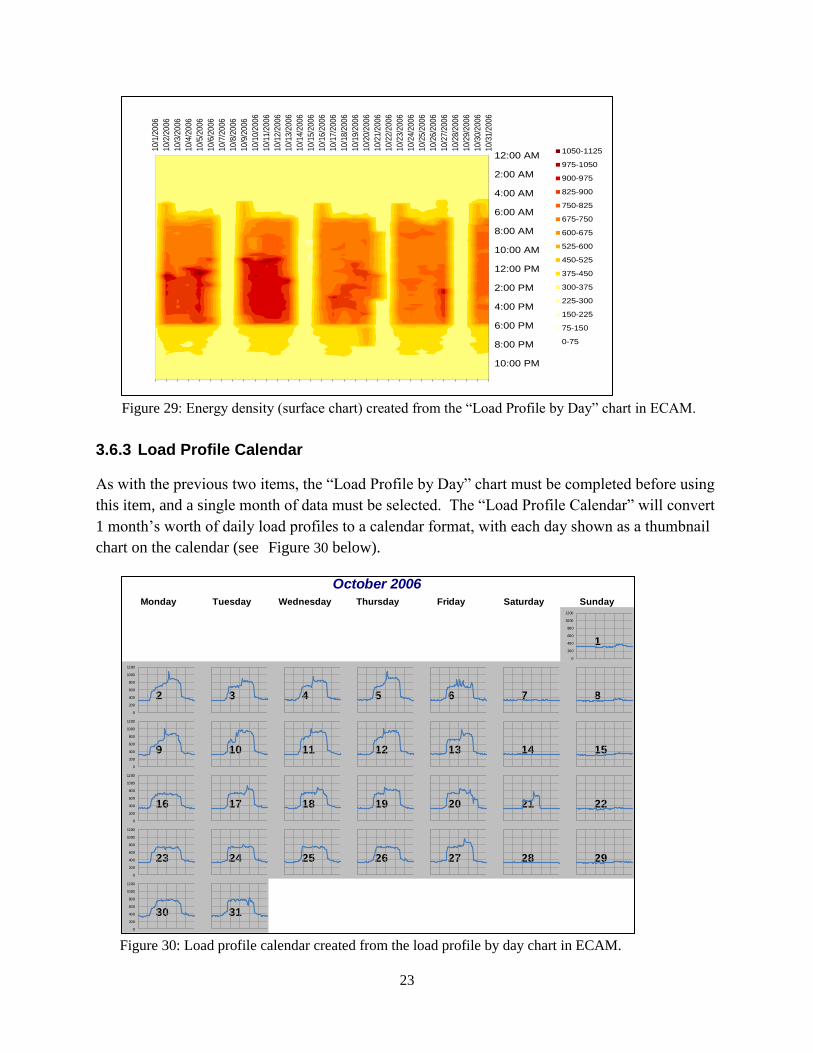
Similarly to the creation of the “3D Load Profile” chart, a surface chart can be created from a
specific month within the “Load Profile by Day” chart. This function will convert a month’s
worth of daily load profiles to a surface (contour) chart, with the values shown by color. This is
illustrated in Figure 29 below.
10/1/2006
10/3/2006
10/5/2006
10/7/2006
10/9/2006
10/11/2006
10/13/2006
10/15/2006
10/17/2006
10/19/2006
10/21/2006
10/23/2006
10/25/2006
10/27/2006
10/29/2006
10/31/2006
0
200
400
600
800
1000
1200
12:0
0 A
M
3:0
0 A
M
6:0
0 A
M
9:0
0 A
M
12:0
0 P
M
3:0
0 P
M
6:0
0 P
M
9:0
0 P
M
Av
g E
lecM
tr1
_k
W
23
Figure 29: Energy density (surface chart) created from the “Load Profile by Day” chart in ECAM.
3.6.3 Load Profile Calendar
As with the previous two items, the “Load Profile by Day” chart must be completed before using
this item, and a single month of data must be selected. The “Load Profile Calendar” will convert
1 month’s worth of daily load profiles to a calendar format, with each day shown as a thumbnail
chart on the calendar (see Figure 30 below).
Figure 30: Load profile calendar created from the load profile by day chart in ECAM.
10/1
/20
06
10/2
/20
06
10/3
/20
06
10/4
/20
06
10/5
/20
06
10/6
/20
06
10/7
/20
06
10/8
/20
06
10/9
/20
06
10/1
0/2
006
10/1
1/2
006
10/1
2/2
006
10/1
3/2
006
10/1
4/2
006
10/1
5/2
006
10/1
6/2
006
10/1
7/2
006
10/1
8/2
006
10/1
9/2
006
10/2
0/2
006
10/2
1/2
006
10/2
2/2
006
10/2
3/2
006
10/2
4/2
006
10/2
5/2
006
10/2
6/2
006
10/2
7/2
006
10/2
8/2
006
10/2
9/2
006
10/3
0/2
006
10/3
1/2
006
12:00 AM
2:00 AM
4:00 AM
6:00 AM
8:00 AM
10:00 AM
12:00 PM
2:00 PM
4:00 PM
6:00 PM
8:00 PM
10:00 PM
1050-1125
975-1050
900-975
825-900
750-825
675-750
600-675
525-600
450-525
375-450
300-375
225-300
150-225
75-150
0-75
October 2006Monday Tuesday Wednesday Thursday Friday Saturday Sunday
1
2 3 4 5 6 7 8
9 10 11 12 13 14 15
16 17 18 19 20 21 22
23 24 25 26 27 28 29
30 31
0
200
400
600
800
1000
1200
0
200
400
600
800
1000
1200
0
200
400
600
800
1000
1200
0
200
400
600
800
1000
1200
0
200
400
600
800
1000
1200
0
200
400
600
800
1000
1200
0
200
400
600
800
1000
1200
0
200
400
600
800
1000
1200
0
200
400
600
800
1000
1200
0
200
400
600
800
1000
1200
0
200
400
600
800
1000
1200
0
200
400
600
800
1000
1200
0
200
400
600
800
1000
1200
0
200
400
600
800
1000
1200
0
200
400
600
800
1000
1200
0
200
400
600
800
1000
1200
0
200
400
600
800
1000
1200
0
200
400
600
800
1000
1200
0
200
400
600
800
1000
1200
0
200
400
600
800
1000
1200
0
200
400
600
800
1000
1200
0
200
400
600
800
1000
1200
0
200
400
600
800
1000
1200
0
200
400
600
800
1000
1200
0
200
400
600
800
1000
1200
0
200
400
600
800
1000
1200
0
200
400
600
800
1000
1200
0
200
400
600
800
1000
1200
0
200
400
600
800
1000
1200
0
200
400
600
800
1000
1200
0
200
400
600
800
1000
1200

24
25
4.0 Load Profile as Box Plots
Box plots, or box and whisker plots, are commonly used to provide statistical summaries of data.
These charts make it easy to tell whether operation is consistent (regular) or inconsistent
(irregular). To make these types of comparisons, however, the days should be filtered for similar
daytypes, so that weekends and weekdays are not compared. The ECAM implementation of box
plots for load profiles uses a percentile implementation of the box plot to better show the
common range of the data, as well as the full range. Typical box plots use the data values at the
25th
percentile, the 75th
percentile, and the minimum and maximum. Other box plot designs use
the value above and below the 25th
and 75th
percentiles by a distance equal to 1.5 times the
interquartile range, where the interquartile range is the difference between the 75th
and 25th
percentile values. The ECAM “Load Profile as Box Plots” uses the 5th
, 25th
, 75th
, and 95th
percentiles, plus minimum, maximum, median, and mean. Figure 31 shows the “Load Profile as
Box Plots” in ECAM filtered only to show weekdays using the PivotTable. Figure 31 shows
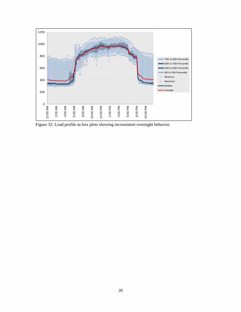
very consistent overnight demand, but an example of a building that has very inconsistent
overnight demand can be seen in Figure 32. This function of ECAM can only be utilized in
Excel 2007/2010.
Figure 31: Load profile as box plots in ECAM, comparing only weekdays.
0
200
400
600
800
1000
1200
12
:00
AM
2:0
0 A
M
4:0
0 A
M
6:0
0 A
M
8:0
0 A
M
10
:00
AM
12
:00
PM
2:0
0 P
M
4:0
0 P
M
6:0
0 P
M
8:0
0 P
M
10
:00
PM
75th to 95th Percentile
50th to 75th Percentile
25th to 50th Percentile
5th to 25th Percentile
Minimum
Maximum
Median
Average
26
Figure 32: Load profile as box plots showing inconsistent overnight behavior.
0
200
400
600
800
1000
1200
12
:00
AM
2:0
0 A
M
4:0
0 A
M
6:0
0 A
M
8:0
0 A
M
10
:00
AM
12
:00
PM
2:0
0 P
M
4:0
0 P
M
6:0
0 P
M
8:0
0 P
M
10
:00
PM
75th to 95th Percentile
50th to 75th Percentile
25th to 50th Percentile
5th to 25th Percentile
Minimum
Maximum
Median
Average

27
5.0 Scatter Charts
The next menu item in ECAM is the scatter charts. These can be used to plot any points of
interest, but must be created a specific way. First, the independent variable (to be placed on the
x-axis) must be selected first by clicking on the point name. Then, to plot other point names
against this independent variable, simply hold the “Ctrl” key and select subsequent point names.
All subsequent selections made while holding the “Ctrl” key will be the dependent (to be placed
on the y-axis) values. If not all of the data points can be charted, either because of the Excel
chart or the PivotTable limits, the scatter charts will include some aggregation (averaging) of the
values for the independent variable. For example, if the independent variable is outdoor-air
temperature, and there are seven occurrences in the data set where the temperature is 77.3oF,
only one instance of 77.3oF will show up in the chart, and the dependent variable value will be
the average of the seven occurrences. There are three options under the “Scatter Charts” item in
ECAM, each to be discussed below ( Figure 33).
Figure 33: Scatter chart menu item in ECAM.
28
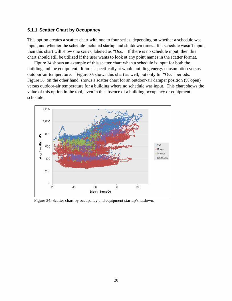
5.1.1 Scatter Chart by Occupancy
This option creates a scatter chart with one to four series, depending on whether a schedule was
input, and whether the schedule included startup and shutdown times. If a schedule wasn’t input,
then this chart will show one series, labeled as “Occ.” If there is no schedule input, then this
chart should still be utilized if the user wants to look at any point names in the scatter format.
Figure 34 shows an example of this scatter chart when a schedule is input for both the
building and the equipment. It looks specifically at whole building energy consumption versus
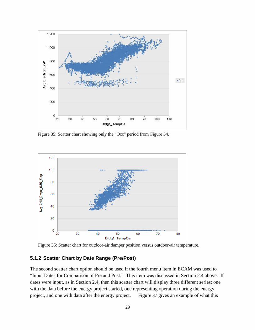
outdoor-air temperature. Figure 35 shows this chart as well, but only for “Occ” periods.
Figure 36, on the other hand, shows a scatter chart for an outdoor-air damper position (% open)
versus outdoor-air temperature for a building where no schedule was input. This chart shows the
value of this option in the tool, even in the absence of a building occupancy or equipment
schedule.
Figure 34: Scatter chart by occupancy and equipment startup/shutdown.
29
Figure 35: Scatter chart showing only the "Occ" period from Figure 34.
Figure 36: Scatter chart for outdoor-air damper position versus outdoor-air temperature.
5.1.2 Scatter Chart by Date Range (Pre/Post)
The second scatter chart option should be used if the fourth menu item in ECAM was used to
“Input Dates for Comparison of Pre and Post.” This item was discussed in Section 2.4 above. If
dates were input, as in Section 2.4, then this scatter chart will display three different series: one
with the data before the energy project started, one representing operation during the energy
project, and one with data after the energy project. Figure 37 gives an example of what this
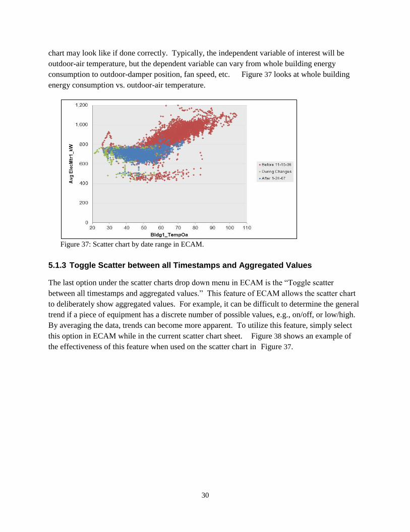
30
chart may look like if done correctly. Typically, the independent variable of interest will be
outdoor-air temperature, but the dependent variable can vary from whole building energy
consumption to outdoor-damper position, fan speed, etc. Figure 37 looks at whole building
energy consumption vs. outdoor-air temperature.
Figure 37: Scatter chart by date range in ECAM.
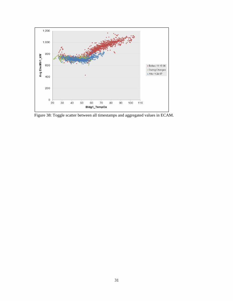
5.1.3 Toggle Scatter between all Timestamps and Aggregated Values
The last option under the scatter charts drop down menu in ECAM is the “Toggle scatter
between all timestamps and aggregated values.” This feature of ECAM allows the scatter chart
to deliberately show aggregated values. For example, it can be difficult to determine the general
trend if a piece of equipment has a discrete number of possible values, e.g., on/off, or low/high.
By averaging the data, trends can become more apparent. To utilize this feature, simply select
this option in ECAM while in the current scatter chart sheet. Figure 38 shows an example of
the effectiveness of this feature when used on the scatter chart in Figure 37.
31
Figure 38: Toggle scatter between all timestamps and aggregated values in ECAM.

32
33
6.0 Load Duration Chart (Point Frequency Distribution)
This feature in ECAM makes it easy to create histograms describing the time duration of the
selected point. The chart, and accompanying table, provides the number of hours at various
binned values. This can be used to get equipment load-hours or temperature bin- hours, for
example. If a second, categorical variable is chosen, then joint frequency bins can be created as
well. For example, temperature bins by month, or joint frequency bins of humidity and
temperature can be created. Similarly, a joint frequency table of load-hours and occupancy could
be created. It is important to note that this feature will group the values of the selected point in
ECAM. All other PivotTables and associated metrics and charts, even existing ones, that use this
point in anything other than a value field will be affected. (If the point is used in another
PivotTable in a Report Filter/PageField, Column Label/ColumnField, or Row Label/RowField,
referring to Excel 2007/2003 terminology, it will reflect the grouping created for the Load
Duration Chart). Therefore, it is usually best to create the chart table, get the information
needed, copy the information as values to a new worksheet, and then ungroup the variable.
Creating a joint frequency table is similar to a scatter chart. Select the main variable, then hold
down the “Ctrl” key and select the categorical variable. To create a chart and table of
temperature bins by month, click the menu item for “Load Duration Chart”, and ECAM will
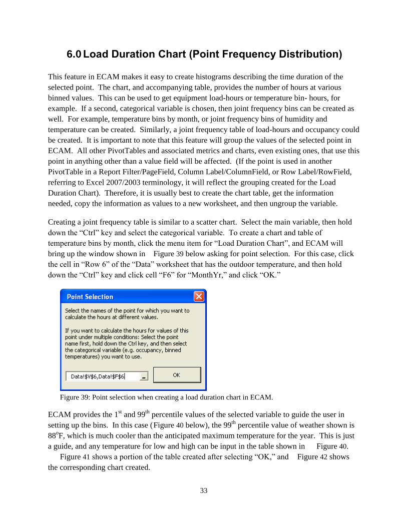
bring up the window shown in Figure 39 below asking for point selection. For this case, click
the cell in “Row 6” of the “Data” worksheet that has the outdoor temperature, and then hold
down the “Ctrl” key and click cell “F6” for “MonthYr,” and click “OK.”
Figure 39: Point selection when creating a load duration chart in ECAM.
ECAM provides the 1st and 99
th percentile values of the selected variable to guide the user in
setting up the bins. In this case ( Figure 40 below), the 99th
percentile value of weather shown is
88oF, which is much cooler than the anticipated maximum temperature for the year. This is just
a guide, and any temperature for low and high can be input in the table shown in Figure 40.
Figure 41 shows a portion of the table created after selecting “OK,” and Figure 42 shows
the corresponding chart created.
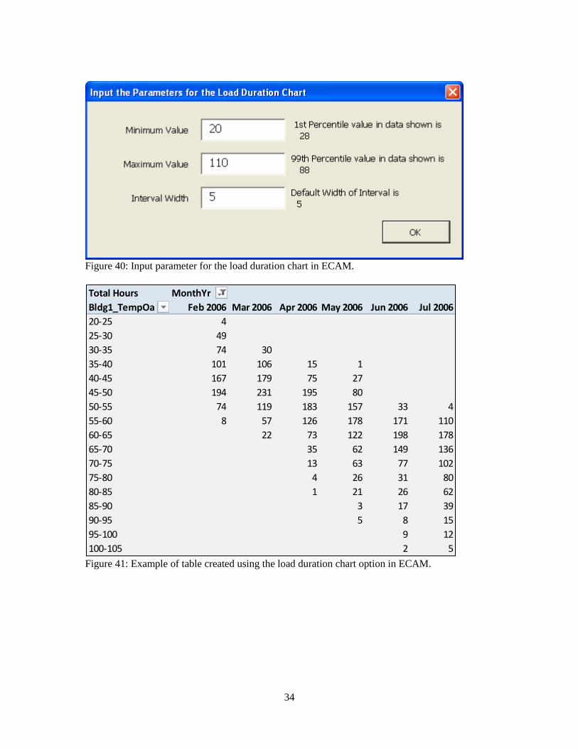
34
Figure 40: Input parameter for the load duration chart in ECAM.
Figure 41: Example of table created using the load duration chart option in ECAM.
Total Hours MonthYr
Bldg1_TempOa Feb 2006 Mar 2006 Apr 2006 May 2006 Jun 2006 Jul 2006
20-25 4
25-30 49
30-35 74 30
35-40 101 106 15 1
40-45 167 179 75 27
45-50 194 231 195 80
50-55 74 119 183 157 33 4
55-60 8 57 126 178 171 110
60-65 22 73 122 198 178
65-70 35 62 149 136
70-75 13 63 77 102
75-80 4 26 31 80
80-85 1 21 26 62
85-90 3 17 39
90-95 5 8 15
95-100 9 12
100-105 2 5
35
Figure 42: Load duration chart created for total hours at temperature bins by month.
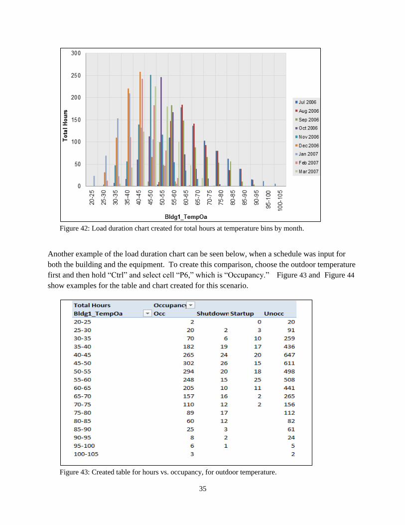
Another example of the load duration chart can be seen below, when a schedule was input for
both the building and the equipment. To create this comparison, choose the outdoor temperature
first and then hold “Ctrl” and select cell “P6,” which is “Occupancy.” Figure 43 and Figure 44
show examples for the table and chart created for this scenario.
Figure 43: Created table for hours vs. occupancy, for outdoor temperature.
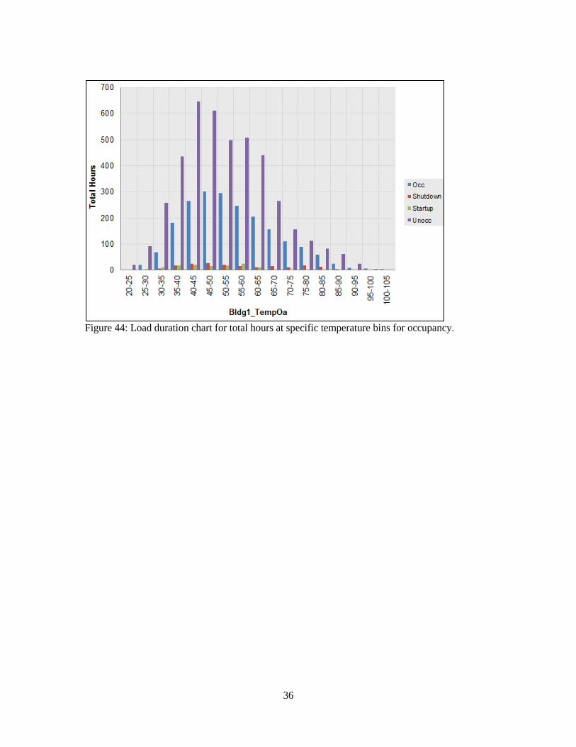
36
Figure 44: Load duration chart for total hours at specific temperature bins for occupancy.
37
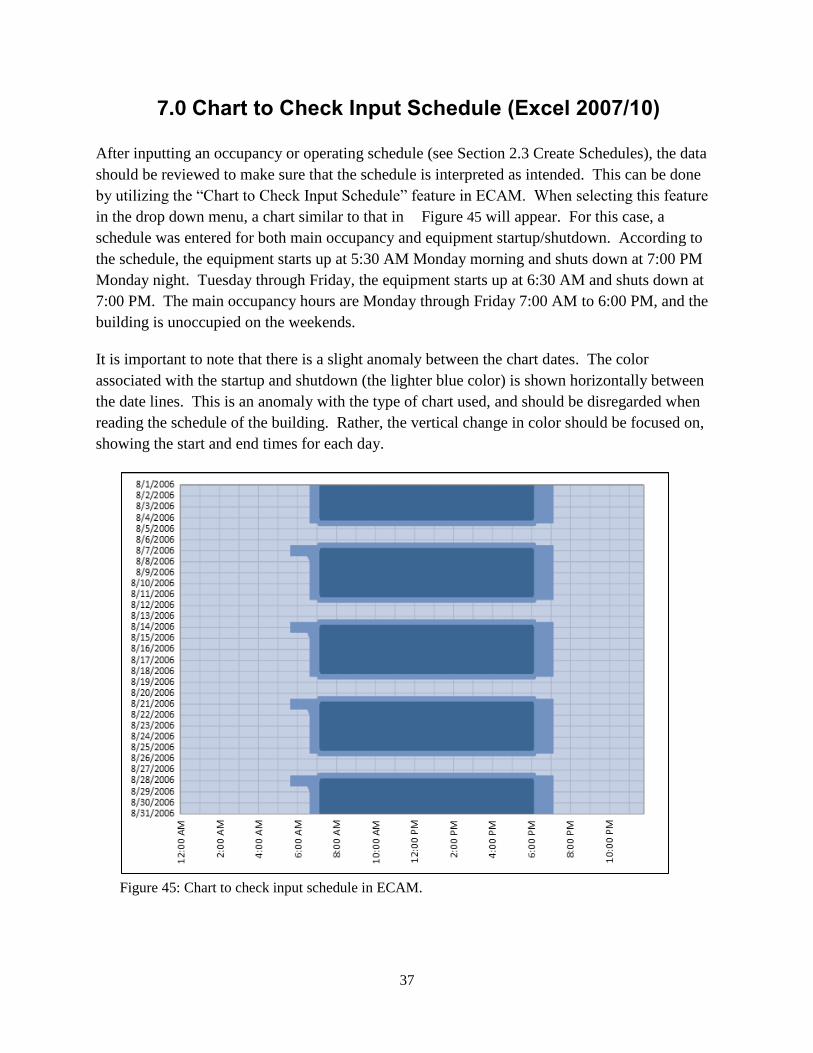
7.0 Chart to Check Input Schedule (Excel 2007/10)
After inputting an occupancy or operating schedule (see Section 2.3 Create Schedules), the data
should be reviewed to make sure that the schedule is interpreted as intended. This can be done
by utilizing the “Chart to Check Input Schedule” feature in ECAM. When selecting this feature
in the drop down menu, a chart similar to that in Figure 45 will appear. For this case, a
schedule was entered for both main occupancy and equipment startup/shutdown. According to
the schedule, the equipment starts up at 5:30 AM Monday morning and shuts down at 7:00 PM
Monday night. Tuesday through Friday, the equipment starts up at 6:30 AM and shuts down at
7:00 PM. The main occupancy hours are Monday through Friday 7:00 AM to 6:00 PM, and the
building is unoccupied on the weekends.
It is important to note that there is a slight anomaly between the chart dates. The color
associated with the startup and shutdown (the lighter blue color) is shown horizontally between
the date lines. This is an anomaly with the type of chart used, and should be disregarded when
reading the schedule of the building. Rather, the vertical change in color should be focused on,
showing the start and end times for each day.
Figure 45: Chart to check input schedule in ECAM.

38
39
8.0 Matrix Charts
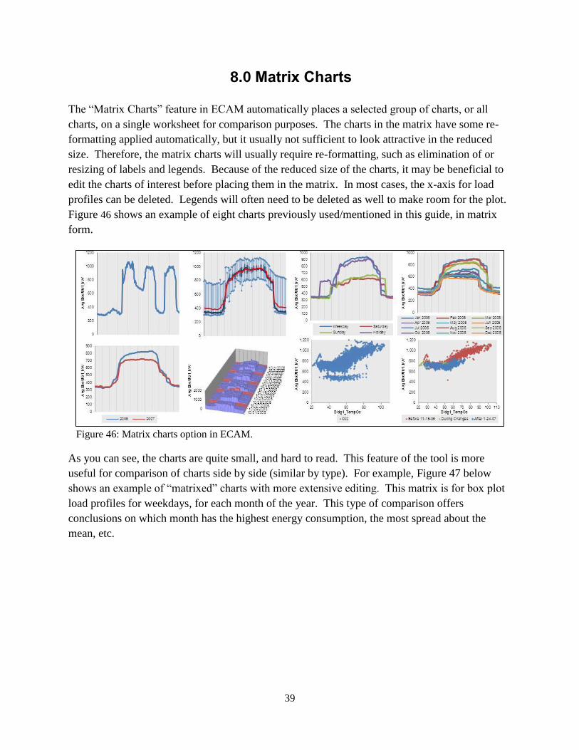
The “Matrix Charts” feature in ECAM automatically places a selected group of charts, or all
charts, on a single worksheet for comparison purposes. The charts in the matrix have some re-
formatting applied automatically, but it usually not sufficient to look attractive in the reduced
size. Therefore, the matrix charts will usually require re-formatting, such as elimination of or
resizing of labels and legends. Because of the reduced size of the charts, it may be beneficial to
edit the charts of interest before placing them in the matrix. In most cases, the x-axis for load
profiles can be deleted. Legends will often need to be deleted as well to make room for the plot.
Figure 46 shows an example of eight charts previously used/mentioned in this guide, in matrix
form.
Figure 46: Matrix charts option in ECAM.
As you can see, the charts are quite small, and hard to read. This feature of the tool is more
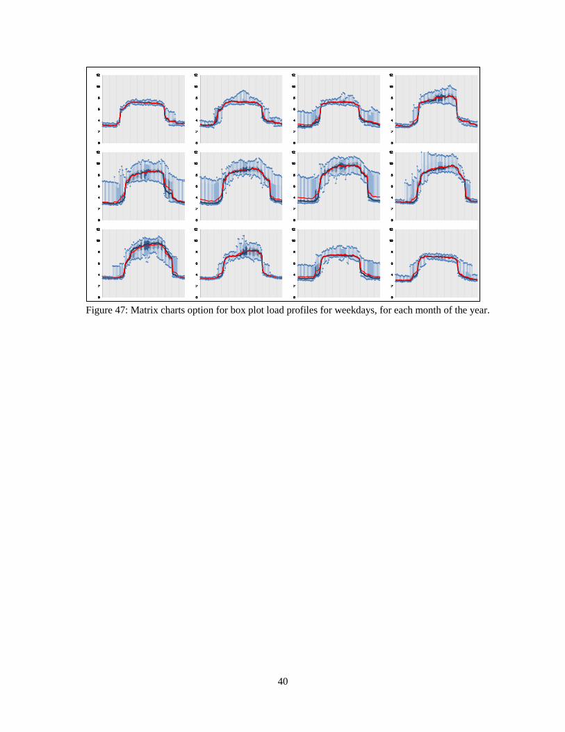
useful for comparison of charts side by side (similar by type). For example, Figure 47 below
shows an example of “matrixed” charts with more extensive editing. This matrix is for box plot
load profiles for weekdays, for each month of the year. This type of comparison offers
conclusions on which month has the highest energy consumption, the most spread about the
mean, etc.
40
Figure 47: Matrix charts option for box plot load profiles for weekdays, for each month of the year.

41
9.0 Menu Items to Create Metrics and Summaries
The next three menu items in ECAM deal with creating metrics and summaries from the data
imported into ECAM.
9.1 Metrics for Points Normalized per Sq. Foot
This “Metrics for Points Normalized per Sq. Foot” menu item will create metrics for all points
that can be converted to watts per square foot (W/sf) values. Any points that are in kW will be
converted to W/sf after the user enters the building size as part of the point definition process.
The metrics that are created are average W/sf by daytype (Weekday, Saturday, Sunday) and
occupancy (Occ and Unocc). Figure 48 shows an example of these metrics for whole building
energy consumption.
Figure 48: Metrics for points normalized per square foot.
9.2 Create other Metrics
This section describes the following menu items, daytype and occupancy metrics, occupancy and
month-year combined metrics and daytype and month-year combined metrics.
9.2.1 Daytype and Occupancy Metrics
This menu item allows the user to pick the points they want to summarize as metrics. The
selected points will be averaged separately by “Daytype and Occupancy”, and placed in a table.
The average of all the data for each point is also provided. Figure 49 shows an example of
whole building energy consumption and outdoor-air temperature as the points chosen to
summarize. Choosing point names is the same as that specified in creating scatter charts section.
42
Click the point name, and then hold the “Ctrl” key and select any other point names of interest
and click “OK.”
Figure 49: Daytype and occupancy metrics example.
9.2.2 Occupancy and Month-Year Combined Metrics
This feature creates averages of the points selected by the user, with the averages based on
combinations of occupancy status and the month and year (using the MonthYr column from the
“Data” worksheet) in which the data was gathered. The average for all of the data for each point,
averages by “MonthYr” for all occupancy statuses, and averages by occupancy for all dates are
also provided. Figure 50 shows an example of this table for both whole building energy
consumption and outdoor-air temperature.
Figure 50: Occupancy and month-year combined metrics.
9.2.3 Daytype and Month-Year Combined Metrics
This feature is very similar to the “Occupancy and Month-Year” feature, but replaces
“Occupancy” with “Daytype.” Both of these menu items create PivotTables that can be further
changed by the user to meet specific analysis needs. Figure 51 shows an example of this chart,
but for a chilled water supply temperature and two air-handler flow rates.
Points All Data Weekday Saturday Sunday Holiday Occ Unocc Startup Shutdown
Avg ElecMtr1_kW 521.8 575.1 401.9 399.1 453.1 772.3 393.6 646.9 562.2
Avg Bldg1_TempOa 52.3 52.3 52.3 53.5 48.5 54.5 51.2 47.2 57.0
43
Figure 51: Daytype and month-year combined metrics.
9.3 Data Summaries
The information provided by this tool in ECAM are statistical summaries of the selected points,
or the points in an existing PivotTable. In the case of an existing PivotTable, the summary is
placed to the right of the PivotTable, on the same worksheet. Summaries are provided for all the
points selected or in the PivotTable.
9.3.1 Summarize Data
This feature provides statistical information about the selected data points, using the raw data
without aggregation.
9.3.2 Summarize Data from PivotTable
This feature provides information about the data points (value or data fields) in a PivotTable.
Note that “Summarize Data from PivotTable” uses only the data shown in the PivotTable, based
on the type of aggregation selected for the data. If the PivotTable uses some sort of aggregation
(average, maximum, etc.), the data summary will show different values than a summary based on
the full data set.
Whichever option is used, the summary is associated with a PivotTable, so all of the normal
ECAM filters are available. The data can be filtered by daytype, month, occupancy, etc. The
statistical information includes the following:
Maximum
±3 Standard Deviations
Average
Low to High Ratio
Points MonthYr Weekday Saturday Sunday Holiday All Periods
Avg ChW1_TempOut Aug 2004 42.4 42.4 42.9 42.5
Sep 2004 43.2 43.0 42.6 43.9 43.1
Oct 2004 42.3 42.6 42.2 42.3
Avg SOUTH AHU FLOW Aug 2004 228 289 260 238
Sep 2004 265 286 247 290 267
Oct 2004 213 231 212 216
Avg NORTH AHU FLOW Aug 2004 677 648 695 676
Sep 2004 640 643 682 665 647
Oct 2004 648 592 620 636
44
Percentiles (97.7, 95th
, 90th
, 84.1, 75th
, 50th
, 25th
, 15.9, 10th
, 5th
, 2.3)
Minimum
No checks are made as to whether the data fits a normal distribution, so both percentiles and
standard deviations are provided. The unrounded percentile values (i.e. 2.3, 15.9, 84.1, and 97.7)
match the percentiles associated with a normal distribution at 1, 2 and 3 standard deviations
away from the mean.
The percentiles and number of standard deviations are included as inputs on the worksheet with
the data summary, so users can quickly customize a data summary to meet specific needs.
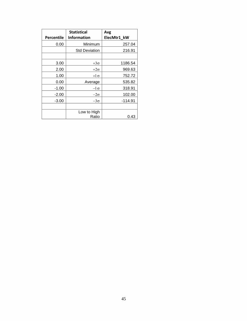
The “Low to High Ratio” (LHR) is a number that is intended for use with meter data to express
how well a building turns down load during unoccupied hours. It is not intended for use with
other types of data points. However, it was straightforward to include with the data summaries,
so it is included here1.
The LHR is calculated as the average of the subset of data more than 0.5 standard deviations
above the mean of all the data divided by the average of the subset of data more than 0.5
standard deviations below the mean of all the data. Table 2 shows an example of the data
summary for whole building electricity consumption.
Table 2: Sample of data summary table in ECAM.
Percentile Statistical Information
Avg ElecMtr1_kW
1 Maximum 1269.00
0.98 Percentile 97.7 984.96
0.95 Percentile 95 927.72
0.90 Percentile 90 841.32
0.84 Percentile 84.1 754.92
0.75 Percentile 75 719.28
0.50 Median 470.88
0.25 Percentile 25 338.04
0.16 Percentile 15.9 325.08
0.10 Percentile 10 315.36
0.05 Percentile 5 301.32
0.02 Percentile 2.3 288.36
1 The LHR is from a 2004 ACEEE paper, Who Left the Lights On? Typical Load Profiles in the
21st Century, by Reid Hart, Steve Mangan, and Will Price, then with the Eugene Water and
Electric Board. As of March 2011, the paper can be downloaded from: http://www.eceee.org/conference_proceedings/ACEEE_buildings/2004/Panel_7/p7_8/.
45
Percentile Statistical Information
Avg ElecMtr1_kW
0.00 Minimum 257.04
Std Deviation 216.91
3.00 1186.54
2.00 969.63
1.00 752.72
0.00 Average 535.82
-1.00 318.91
-2.00 102.00
-3.00 -114.91
Low to High
Ratio 0.43

46

47
10.0 PNNL Building Re-tuning Charts
The building re-tuning menu items are designed to support the PNNL building re-tuning process1
by automatically creating charts that allow identification of building operational problems. To
successfully use the building re-tuning menu items, the raw data has to be mapped to predefined
point names using the “Definition of Points” menu item (described in Section 2.2 above). After
the points are properly defined, the creation of the building re-tuning charts is completely
automated. The only action required by the user is to select the appropriate menu item(s) in the
“PNNL re-tuning” drop down menu.
Selection of each menu item creates a separate worksheet (with the related charts) for each
relevant building re-tuning focus areas. For example, if there are five air-handling units (AHUs),
five worksheets will be created, one for each AHU. All charts on a single worksheet change
together as the user selects various filters. For example, the data history charts will all use the
same date/time range per the selections in the PivotTable on the worksheet containing the charts.
If any points associated with a particular re-tuning chart are not available, or not mapped using
the “Definition of Points” feature, those points will not be charted. If all points for a particular
chart are missing, then an empty chart will result, or a chart that only has partial information (for
example, the outdoor-air temperature).
10.1 Central Plant Charts
To identify operational problems and make corrections/adjustments to the physical plant
operations, the points that should be collected (recommended 15-minute intervals, no greater
than 60-minute intervals) with the building automation system (BAS) include:
Outdoor-air temperature (OAT)
Chilled water (CHW) supply temperature
Chilled water return temperature
Chilled water set point
Hot water (HW) supply temperature
Hot water return temperature
Hot water set point
1 www.pnnl.gov/buildingretuning
http://buildingefficiency.labworks.org/publications/PNWD-SA-8654.pdf odd layout?

48
Condenser water supply temperature
Condenser water return temperature
Condenser water set point
Each chiller load (current)
Each pump status (if there are multiple pumps record all of them)
Each chiller status
Chilled water flow (gpm)
Chilled water differential pressure
Chilled water differential pressure set point
Cooling tower fan speed
Cooling tower fan speed set point
Cooling tower fan status
CHW and HW delta-T (this can be simply calculated by taking the difference
between the supply and return temperatures for the hot water and chilled water
loops, respectively).
The following time-series charts will be created by ECAM, depending on the availability of the
relevant points mapped in ECAM:
CHW supply temperature, CHW return temperature, delta-T, and OAT vs. time
HW supply temperature, HW return temperature, delta-T, and OAT vs. time
CHW flow and OAT vs. time.
It is important to note that ECAM will not create charts automatically for certain parts of the
system, like the cooling tower or condenser. These points should still be mapped in ECAM,
because the use of the point history chart (discussed in Section 3.1) will allow the user to still
plot these points and compare them to other system charts such as chilled water or hot water.
Another note to the user: All of the points listed above are not required for the PNNL building
re-tuning feature in ECAM. However, as the number of points collected increases, the
information available to the user during the re-tuning of the system also increases. If the BAS
49
only has temperature information, it should still be mapped and plotted in ECAM because
important things can be diagnosed such as loop delta-T vs. OAT at different weather conditions.
The following example data set in Figure 52 came from a BAS system for a central utility plant
(CUP). The file type is a “.csv,” and the points included can be seen in the figure.
Figure 52 : Sample data set for a central utility plant.
Repeating the steps at the beginning of this guide, go to Add-Ins, ECAM, “Select Data.” For this
case, the timestamps are in one column, so that will be selected, and then hit “OK.” Figure 53
shows the data being selected.
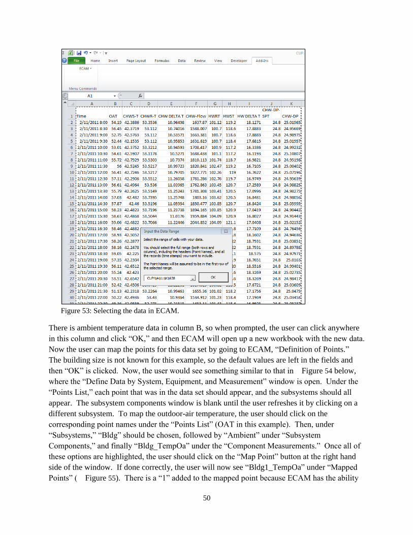
50
Figure 53: Selecting the data in ECAM.
There is ambient temperature data in column B, so when prompted, the user can click anywhere
in this column and click “OK,” and then ECAM will open up a new workbook with the new data.
Now the user can map the points for this data set by going to ECAM, “Definition of Points.”
The building size is not known for this example, so the default values are left in the fields and
then “OK” is clicked. Now, the user would see something similar to that in Figure 54 below,
where the “Define Data by System, Equipment, and Measurement” window is open. Under the
“Points List,” each point that was in the data set should appear, and the subsystems should all
appear. The subsystem components window is blank until the user refreshes it by clicking on a
different subsystem. To map the outdoor-air temperature, the user should click on the
corresponding point names under the “Points List” (OAT in this example). Then, under
“Subsystems,” “Bldg” should be chosen, followed by “Ambient” under “Subsystem
Components,” and finally “Bldg_TempOa” under the “Component Measurements.” Once all of
these options are highlighted, the user should click on the “Map Point” button at the right hand
side of the window. If done correctly, the user will now see “Bldg1_TempOa” under “Mapped
Points” ( Figure 55). There is a “1” added to the mapped point because ECAM has the ability
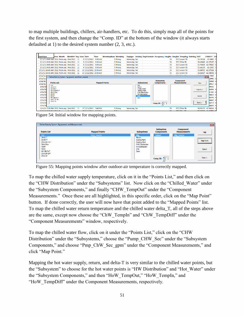
51
to map multiple buildings, chillers, air-handlers, etc. To do this, simply map all of the points for
the first system, and then change the “Comp. ID” at the bottom of the window (it always starts
defaulted at 1) to the desired system number (2, 3, etc.).
Figure 54: Initial window for mapping points.
Figure 55: Mapping points window after outdoor-air temperature is correctly mapped.
To map the chilled water supply temperature, click on it in the “Points List,” and then click on
the “CHW Distribution” under the “Subsystems” list. Now click on the “Chilled_Water” under
the “Subsystem Components,” and finally “CHW_TempOut” under the “Component
Measurements.” Once these are all highlighted, in this specific order, click on the “Map Point”
button. If done correctly, the user will now have that point added to the “Mapped Points” list.
To map the chilled water return temperature and the chilled water delta_T, all of the steps above
are the same, except now choose the “ChW_TempIn” and “ChW_TempDiff” under the
“Component Measurements” window, respectively.
To map the chilled water flow, click on it under the “Points List,” click on the “CHW
Distribution” under the “Subsystems,” choose the “Pump_CHW_Sec” under the “Subsystem
Components,” and choose “Pmp_ChW_Sec_gpm” under the “Component Measurements,” and
click “Map Point.”
Mapping the hot water supply, return, and delta-T is very similar to the chilled water points, but
the “Subsystem” to choose for the hot water points is “HW Distribution” and “Hot_Water” under
the “Subsystem Components,” and then “HoW_TempOut,” “HoW_TempIn,” and
“HoW_TempDiff” under the Component Measurements, respectively.
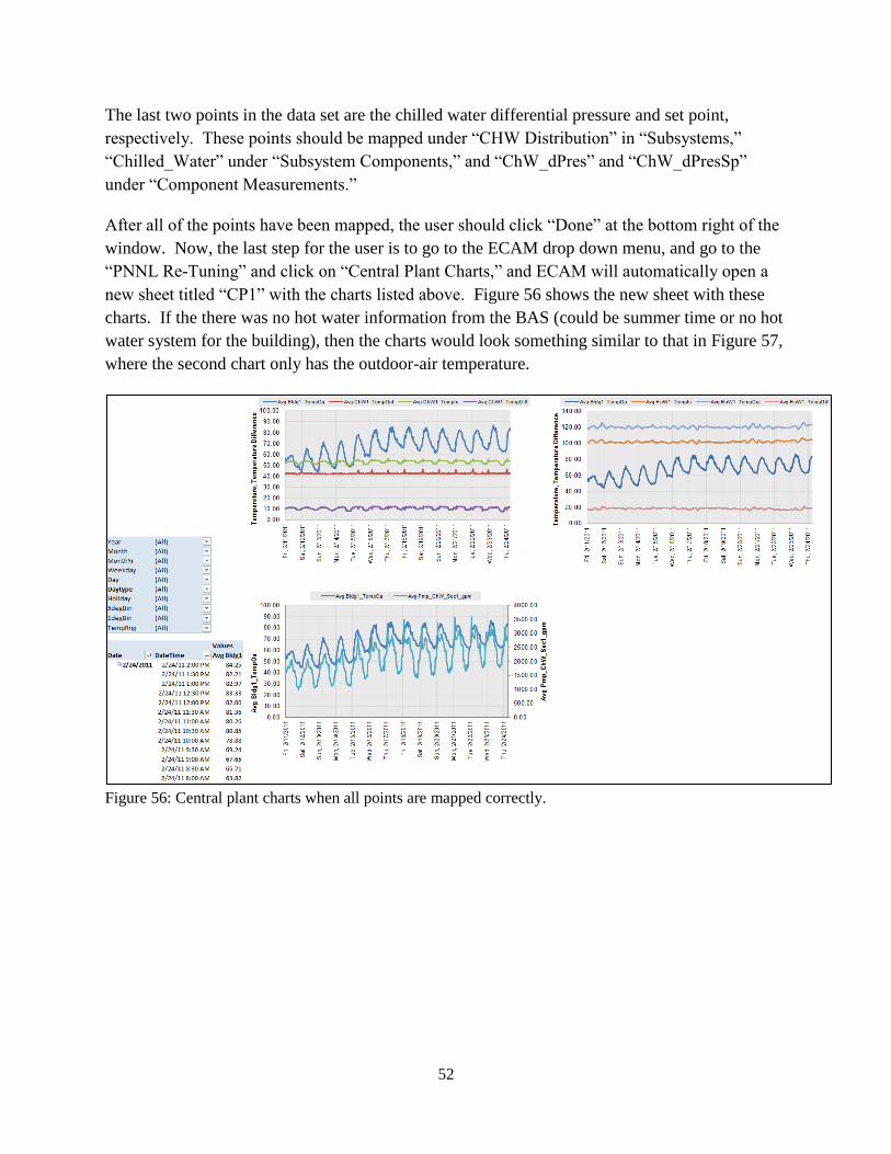
52
The last two points in the data set are the chilled water differential pressure and set point,
respectively. These points should be mapped under “CHW Distribution” in “Subsystems,”
“Chilled_Water” under “Subsystem Components,” and “ChW_dPres” and “ChW_dPresSp”
under “Component Measurements.”
After all of the points have been mapped, the user should click “Done” at the bottom right of the
window. Now, the last step for the user is to go to the ECAM drop down menu, and go to the
“PNNL Re-Tuning” and click on “Central Plant Charts,” and ECAM will automatically open a
new sheet titled “CP1” with the charts listed above. Figure 56 shows the new sheet with these
charts. If the there was no hot water information from the BAS (could be summer time or no hot
water system for the building), then the charts would look something similar to that in Figure 57,
where the second chart only has the outdoor-air temperature.
Figure 56: Central plant charts when all points are mapped correctly.
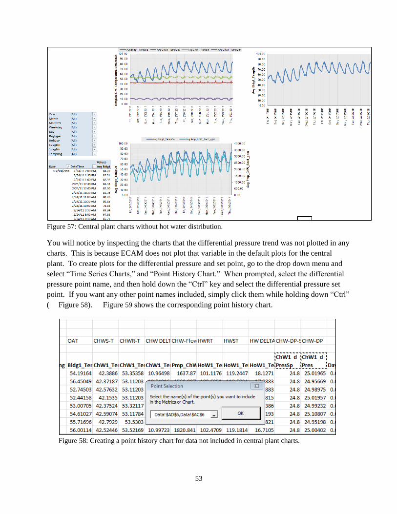
53
Figure 57: Central plant charts without hot water distribution.
You will notice by inspecting the charts that the differential pressure trend was not plotted in any
charts. This is because ECAM does not plot that variable in the default plots for the central
plant. To create plots for the differential pressure and set point, go to the drop down menu and
select “Time Series Charts,” and “Point History Chart.” When prompted, select the differential
pressure point name, and then hold down the “Ctrl” key and select the differential pressure set
point. If you want any other point names included, simply click them while holding down “Ctrl”
( Figure 58). Figure 59 shows the corresponding point history chart.
Figure 58: Creating a point history chart for data not included in central plant charts.
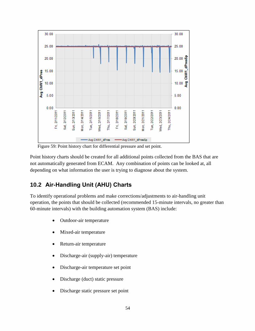
54
Figure 59: Point history chart for differential pressure and set point.
Point history charts should be created for all additional points collected from the BAS that are
not automatically generated from ECAM. Any combination of points can be looked at, all
depending on what information the user is trying to diagnose about the system.
10.2 Air-Handling Unit (AHU) Charts
To identify operational problems and make corrections/adjustments to air-handling unit
operation, the points that should be collected (recommended 15-minute intervals, no greater than
60-minute intervals) with the building automation system (BAS) include:
Outdoor-air temperature
Mixed-air temperature
Return-air temperature
Discharge-air (supply-air) temperature
Discharge-air temperature set point
Discharge (duct) static pressure
Discharge static pressure set point

55
Return-air damper position
Outdoor-air damper position
Exhaust-air damper position
Fan status
Fan Speed (on both supply and return fans, feedback or command)
Cooling coil valve command
Heating coil valve command
The following time-series charts will be created by ECAM, depending on the availability of the
relevant points mapped in ECAM:
Outdoor-air, return-air, mixed-air, and discharge-air temperatures vs. time
Discharge-air temperature and discharge-air temperature set point vs. time
Outdoor damper position vs. time
Outdoor- and return-air temperatures, damper position signal(s) vs. time
Outdoor damper position, cooling coil and heating coil valve commands vs. time
Outdoor- and return-air damper position signals vs. time
Discharge (duct) static pressure and set point vs. time
Supply fan speed, discharge static pressure vs. time
Return fan speed and status vs. time
Supply fan speed, return fan speed vs. time
The following example is for an air-handling unit with data trend using a BAS. The point names
that are included in the example are listed in Figure 60 below. You can see that columns M, N,
and O contain supply fan status, command, and speed. The status is listed as an “On” or “Off”
value. It should be noted that ECAM will not plot points that have “On” or “Off” as their status.
These should be converted to On=1 and Off=0 prior to importing into ECAM.
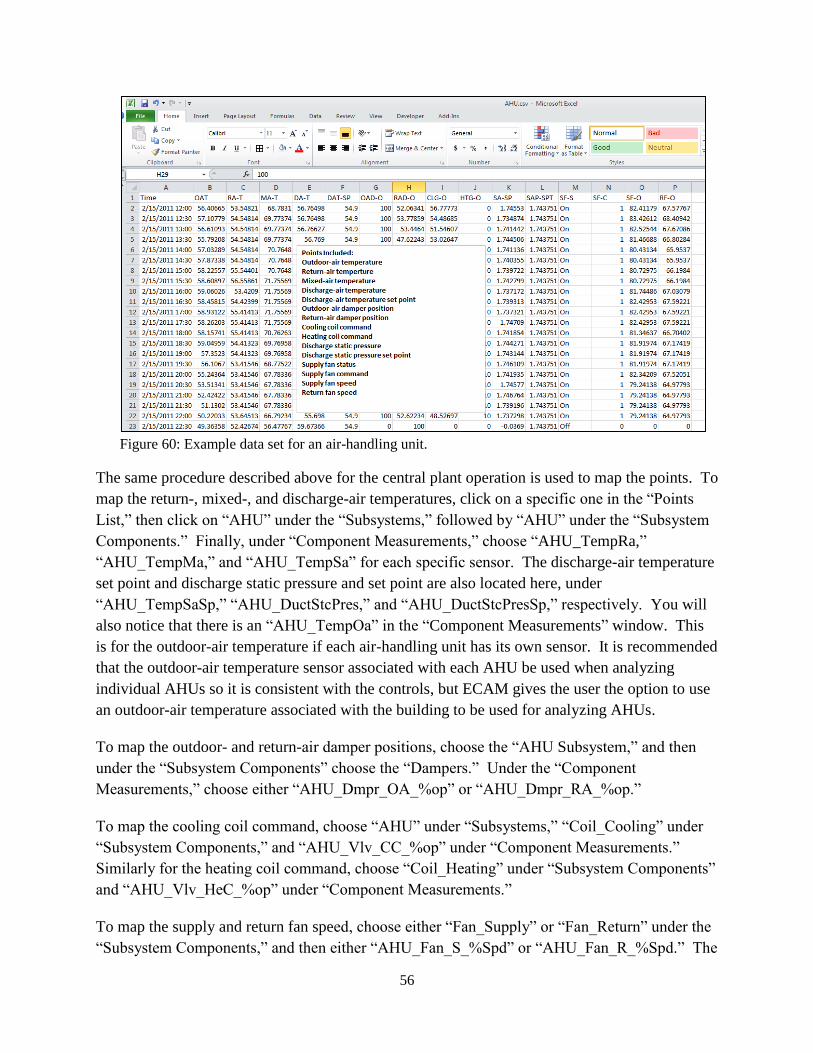
56
Figure 60: Example data set for an air-handling unit.
The same procedure described above for the central plant operation is used to map the points. To
map the return-, mixed-, and discharge-air temperatures, click on a specific one in the “Points
List,” then click on “AHU” under the “Subsystems,” followed by “AHU” under the “Subsystem
Components.” Finally, under “Component Measurements,” choose “AHU_TempRa,”
“AHU_TempMa,” and “AHU_TempSa” for each specific sensor. The discharge-air temperature
set point and discharge static pressure and set point are also located here, under
“AHU_TempSaSp,” “AHU_DuctStcPres,” and “AHU_DuctStcPresSp,” respectively. You will
also notice that there is an “AHU_TempOa” in the “Component Measurements” window. This
is for the outdoor-air temperature if each air-handling unit has its own sensor. It is recommended
that the outdoor-air temperature sensor associated with each AHU be used when analyzing
individual AHUs so it is consistent with the controls, but ECAM gives the user the option to use
an outdoor-air temperature associated with the building to be used for analyzing AHUs.
To map the outdoor- and return-air damper positions, choose the “AHU Subsystem,” and then
under the “Subsystem Components” choose the “Dampers.” Under the “Component
Measurements,” choose either “AHU_Dmpr_OA_%op” or “AHU_Dmpr_RA_%op.”
To map the cooling coil command, choose “AHU” under “Subsystems,” “Coil_Cooling” under
“Subsystem Components,” and “AHU_Vlv_CC_%op” under “Component Measurements.”
Similarly for the heating coil command, choose “Coil_Heating” under “Subsystem Components”
and “AHU_Vlv_HeC_%op” under “Component Measurements.”
To map the supply and return fan speed, choose either “Fan_Supply” or “Fan_Return” under the
“Subsystem Components,” and then either “AHU_Fan_S_%Spd” or “AHU_Fan_R_%Spd.” The
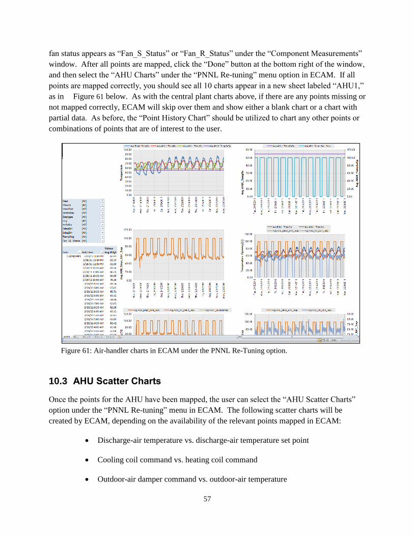
57
fan status appears as “Fan_S_Status” or “Fan_R_Status” under the “Component Measurements”
window. After all points are mapped, click the “Done” button at the bottom right of the window,
and then select the “AHU Charts” under the “PNNL Re-tuning” menu option in ECAM. If all
points are mapped correctly, you should see all 10 charts appear in a new sheet labeled “AHU1,”
as in Figure 61 below. As with the central plant charts above, if there are any points missing or
not mapped correctly, ECAM will skip over them and show either a blank chart or a chart with
partial data. As before, the “Point History Chart” should be utilized to chart any other points or
combinations of points that are of interest to the user.
Figure 61: Air-handler charts in ECAM under the PNNL Re-Tuning option.
10.3 AHU Scatter Charts
Once the points for the AHU have been mapped, the user can select the “AHU Scatter Charts”
option under the “PNNL Re-tuning” menu in ECAM. The following scatter charts will be
created by ECAM, depending on the availability of the relevant points mapped in ECAM:
Discharge-air temperature vs. discharge-air temperature set point
Cooling coil command vs. heating coil command
Outdoor-air damper command vs. outdoor-air temperature
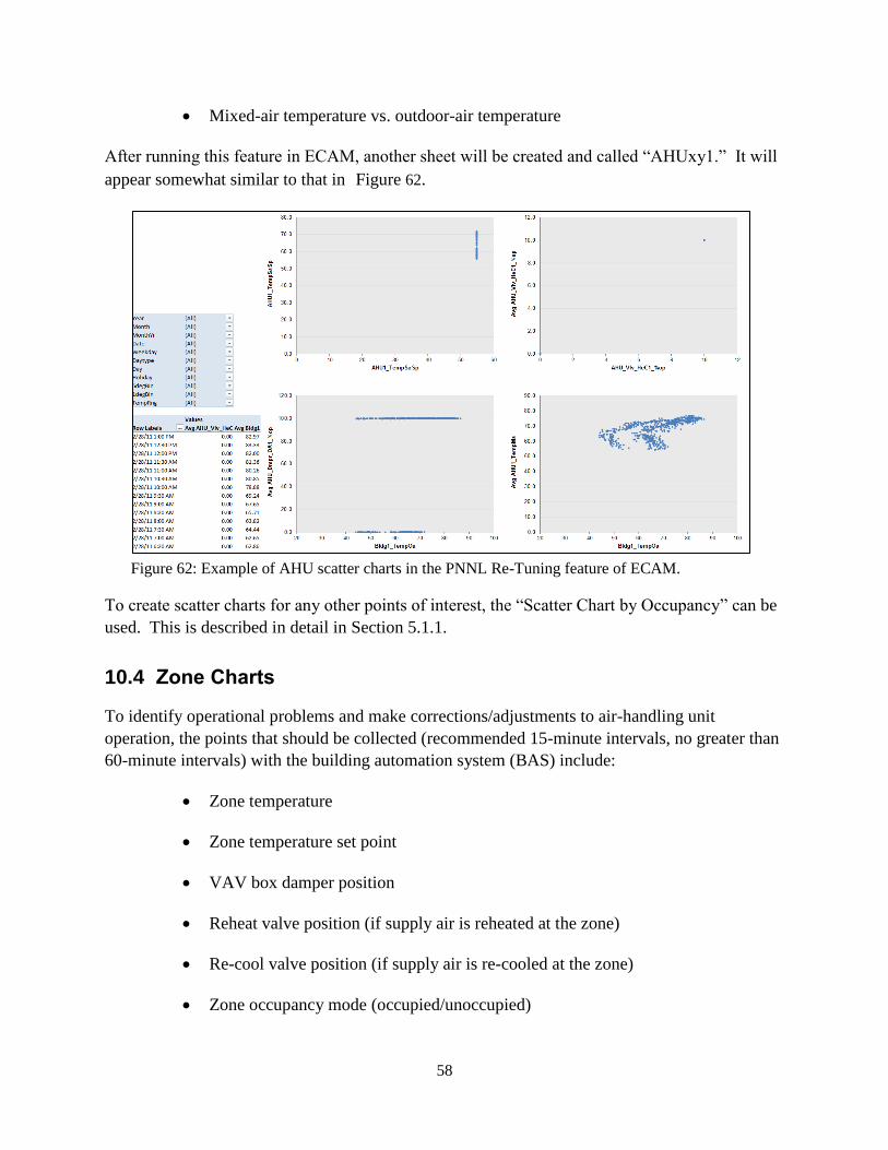
58
Mixed-air temperature vs. outdoor-air temperature
After running this feature in ECAM, another sheet will be created and called “AHUxy1.” It will
appear somewhat similar to that in Figure 62.
Figure 62: Example of AHU scatter charts in the PNNL Re-Tuning feature of ECAM.
To create scatter charts for any other points of interest, the “Scatter Chart by Occupancy” can be
used. This is described in detail in Section 5.1.1.
10.4 Zone Charts
To identify operational problems and make corrections/adjustments to air-handling unit
operation, the points that should be collected (recommended 15-minute intervals, no greater than
60-minute intervals) with the building automation system (BAS) include:
Zone temperature
Zone temperature set point
VAV box damper position
Reheat valve position (if supply air is reheated at the zone)
Re-cool valve position (if supply air is re-cooled at the zone)
Zone occupancy mode (occupied/unoccupied)

59
Zone CFM
Zone CFM set point
Zone discharge-air temperature
Fan status, or fan command (for fan powered boxes only)
The following time-series charts will be created by ECAM, depending on the availability of the
relevant points mapped in ECAM:
VAV box damper position, reheat valve position, and zone temperature vs. time
It is important to note that each zone will be charted on a separate worksheet, so the “CompID”
will need to be indexed for each zone that is mapped in ECAM. Figure 63 below shows an
example data set for zones from a BAS. When mapping the points for the zone charts, click on
the “Zone” “Subsystem.” There are only two options for the “Subsystem Components,” either
“Terminal” or “Zone.” If you click on “Terminal,” you will find VAV box damper position
(Z_Tl_Dmpr_%op) and reheat valve position (Z_Tl_Rht%) under the “Component
Measurements” window. If you click on “Zone,” you will find zone temperature (Z_Temp),
zone temperature set point (Z_TempSP), and zone occupancy mode (Z_Occ_Status).
Note that there are not any component measurements in the zone subsystem for zone CFM, zone
CFM set point, or zone discharge-air temperature. These points can be included in ECAM, but
will have to be plotted using standard excel plotting tools if more information is needed for any
particular zone. The zone occupancy can be plotted using a “Point History Chart” in ECAM.
Figure 64 shows a typical zone plot created in ECAM using the PNNL Re-tuning feature
“Zone Charts.”
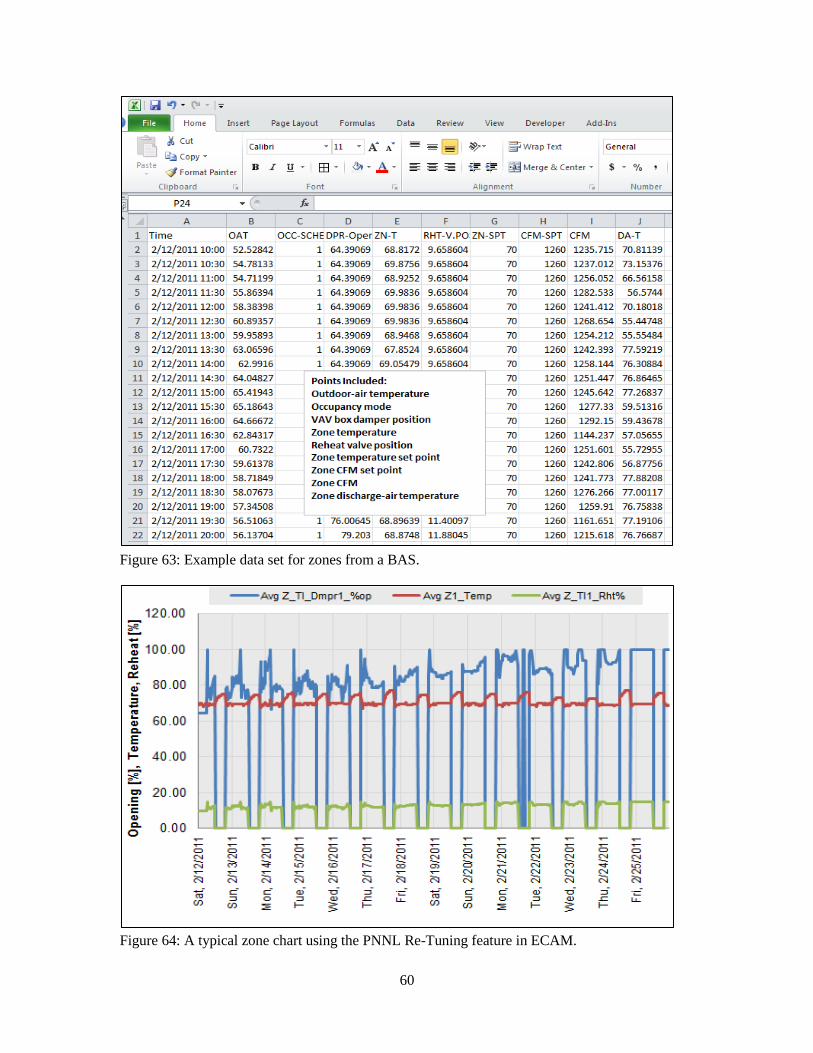
60
Figure 63: Example data set for zones from a BAS.
Figure 64: A typical zone chart using the PNNL Re-Tuning feature in ECAM.
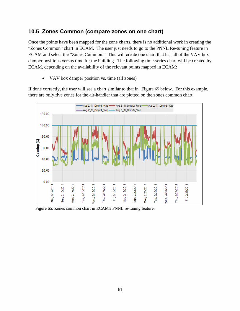
61
10.5 Zones Common (compare zones on one chart)
Once the points have been mapped for the zone charts, there is no additional work in creating the
“Zones Common” chart in ECAM. The user just needs to go to the PNNL Re-tuning feature in
ECAM and select the “Zones Common.” This will create one chart that has all of the VAV box
damper positions versus time for the building. The following time-series chart will be created by
ECAM, depending on the availability of the relevant points mapped in ECAM:
VAV box damper position vs. time (all zones)
If done correctly, the user will see a chart similar to that in Figure 65 below. For this example,
there are only five zones for the air-handler that are plotted on the zones common chart.
Figure 65: Zones common chart in ECAM's PNNL re-tuning feature.

62
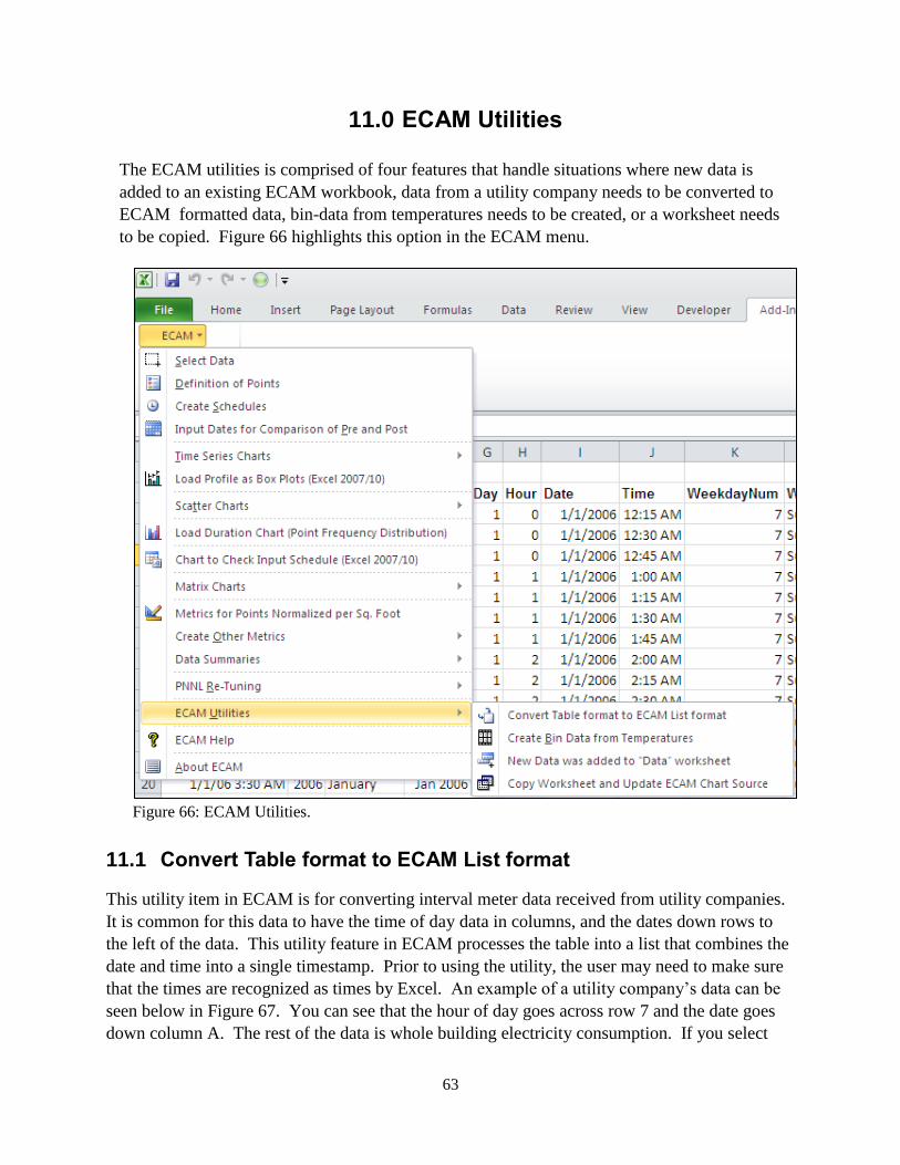
63
11.0 ECAM Utilities
The ECAM utilities is comprised of four features that handle situations where new data is
added to an existing ECAM workbook, data from a utility company needs to be converted to
ECAM formatted data, bin-data from temperatures needs to be created, or a worksheet needs
to be copied. Figure 66 highlights this option in the ECAM menu.
Figure 66: ECAM Utilities.
11.1 Convert Table format to ECAM List format
This utility item in ECAM is for converting interval meter data received from utility companies.
It is common for this data to have the time of day data in columns, and the dates down rows to
the left of the data. This utility feature in ECAM processes the table into a list that combines the
date and time into a single timestamp. Prior to using the utility, the user may need to make sure
that the times are recognized as times by Excel. An example of a utility company’s data can be
seen below in Figure 67. You can see that the hour of day goes across row 7 and the date goes
down column A. The rest of the data is whole building electricity consumption. If you select
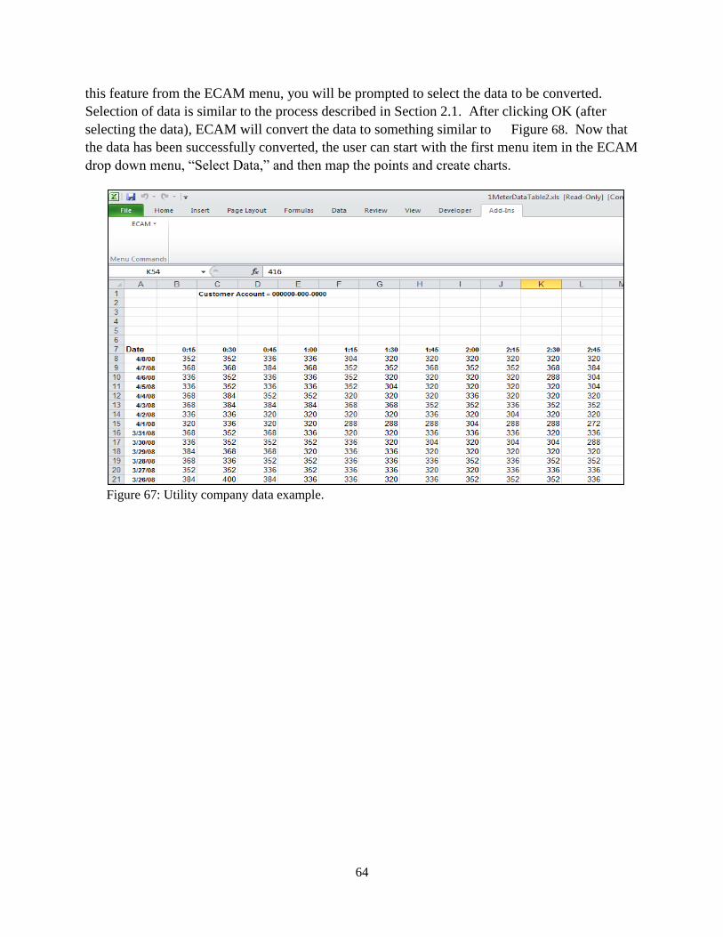
64
this feature from the ECAM menu, you will be prompted to select the data to be converted.
Selection of data is similar to the process described in Section 2.1. After clicking OK (after
selecting the data), ECAM will convert the data to something similar to Figure 68. Now that
the data has been successfully converted, the user can start with the first menu item in the ECAM
drop down menu, “Select Data,” and then map the points and create charts.
Figure 67: Utility company data example.
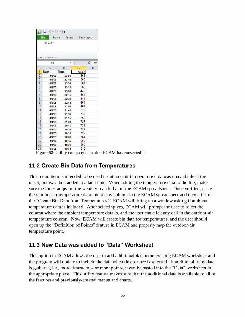
65
Figure 68: Utility company data after ECAM has converted it.
11.2 Create Bin Data from Temperatures
This menu item is intended to be used if outdoor-air temperature data was unavailable at the
onset, but was then added at a later date. When adding the temperature data to the file, make
sure the timestamps for the weather match that of the ECAM spreadsheet. Once verified, paste
the outdoor-air temperature data into a new column in the ECAM spreadsheet and then click on
the “Create Bin Data from Temperatures.” ECAM will bring up a window asking if ambient
temperature data is included. After selecting yes, ECAM will prompt the user to select the
column where the ambient temperature data is, and the user can click any cell in the outdoor-air
temperature column. Now, ECAM will create bin data for temperatures, and the user should
open up the “Definition of Points” feature in ECAM and properly map the outdoor-air
temperature point.
11.3 New Data was added to “Data” Worksheet
This option in ECAM allows the user to add additional data to an existing ECAM worksheet and
the program will update to include the data when this feature is selected. If additional trend data
is gathered, i.e., more timestamps or more points, it can be pasted into the “Data” worksheet in
the appropriate place. This utility feature makes sure that the additional data is available to all of
the features and previously-created menus and charts.

66
11.4 Copy Worksheet and Update ECAM Chart Source
It is often useful to copy a worksheet and chart so that the chart can be displayed with various
filters applied using the PivotTable PageFields. ECAM provides many possibilities, but a single
chart is limited to one category separate from the independent and dependent variables. A built-
in ECAM chart can show average load profiles by daytype, or average load profiles by month,
but it can be useful to show load profiles by daytype for different months. This is easy to do
with the PivotTable PageFields, but it uses the same chart. The user cannot look at two different
months at the same time. This utility feature of ECAM allows the user to do that.
To keep the chart for 1 month and create a second chart for a second month, the user needs to
simply click on this feature in ECAM while in the chart of interest. After the copy has been
made, the user can select the new month or filter of interest and re-name the sheet to identify that
the two charts are comparisons of the same chart type, but for different months, etc.
Another possibility for making a copy is that the user can change the default name of the
worksheet created by ECAM, and then run the specific chart again from the menu item. Then
the user could choose the filter of interest and compare the two charts. Either way works fine,
but the built-in feature in ECAM is quicker and more efficient for making copies of charts.
It should be noted that if the user simply right clicks on the sheet and creates a copy manually
that the linkage between most ECAM charts and PivotTables is broken. This menu item is
necessary because it maintains the linkages between the charts and PivotTables.
Another note is that this utility works for most chart types, but is not necessary, and will not
work properly for “Load Profiles as Box Plots.” For this chart type, just copy the worksheet
normally, and then click OK if any message questions pop up regarding an existing defined
name.

67
12.0 ECAM Help
The ECAM help tool has an “ECAM In-tool Guidance” feature that provides users with guidance
and context for all of the primary ECAM features. Example charts are also available to give
users an idea of what the output for each of the charting functions should look like. Users can
reference the “ECAM In-tool Guidance” feature while also working in ECAM. In addition to the
“ECAM In-tool Guidance,” there are a series of video tutorials available at the California
Commissioning Collaborative website (http://www.cacx.org/PIER/ecam/) that cover the most
common ECAM features and functions.

68

69
13.0 Known Issues and Reminders
The following list summarizes known issues of this tool:
Closing the “Input the Data Range” selection box using the “X” instead of the OK
button will result in an error message. No other problems should result.
In defining the points, when first opening the form, the user needs to de-select and then
re-select a choice under “Subsystems” to get the next list of “Subsystem Components”
to show up.
Input schedules are “remembered” by the application. The schedules, however, don’t
show up in the “Input Schedule Information” form if the workbook is saved and re-
opened.
In Excel 2003, the toolbar menu disappears if a chart is selected. Click on the
worksheet, and the menu will reappear.
For most metrics and charts, number of digits displayed is not adjusted for the number
of significant digits.
Calendar charts fail with an inapplicable message box if “Select Multiple Items” is
checked for selecting “Month” or “MonthYr,” even if only a single item is selected.
“Create 3D Load Profile,” “Create Energy Colors,” and “Load Profile Calendar” will
all fail if a “Load Profile by Day” is not created first, and a single “Month” or
“MonthYr” is selected.
The following is a list of reminders when using the tool:
One important note regarding the automated charting is that the user should not put
anything in cells directly below the PivotTables.
The name should be changed for any tool-created worksheets that you wish to save,
prior to creating a related metric or chart. Otherwise the work may be lost, because a
new worksheet will overwrite any prior worksheet with the same name.
Some of the filter drop downs for metrics pages and PivotTables are redundant for
certain procedures. For example, a typical metrics table shows the average value of
the selected parameter(s) for the following categories: All Periods, Weekdays,
Saturdays, Sundays, Occupied, and Unoccupied. The filter selections, however,
include Daytype, Weekday, and Occupancy. Use of these selections will just result in
an error value for the categories that filter to an empty set when using the drop down

70
(e.g., selecting Weekday of “Wednesday” will result in “N.A.” values for Saturday
and Sunday).
Run “Load Profile by day,” and select a single “Month” or “MonthYr” prior to
creating a “3D Load Profile,” “Energy Colors,” or “Load Profile Calendar.”

71
Recommended