Hi, I’m Dominikus and I will present our work ‘The Streams of Our Lives: Visualizing Listening Histories in Context’. This was a project I did together with Frederik Seiffert, Michael Sedlmair and Sebastian Boring.
THE STREAMSOF OUR LIVES
> DOMINIKUS BAURFREDERIK SEIFFERTMICHAEL SEDLMAIRSEBASTIAN BORING
UNIVERSITY OFMUNICH (LMU)GERMANY
VISUALIZING LISTENING HISTORIES IN CONTEXT
http://www.flickr.com/photos/natita2/2565850315/
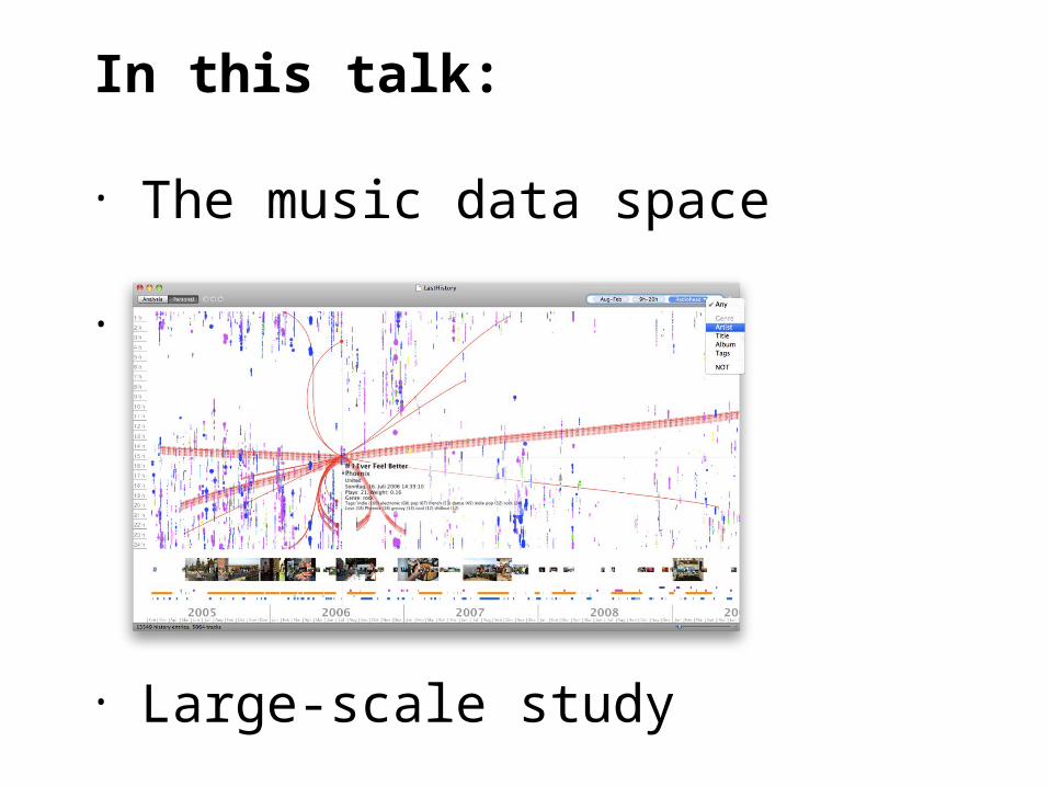
In this talk you will hear about the data space of music listening histories, see LastHistory, a tool for visualizing this information plus contextual data and finally, hear what we learned about aesthetics and user appreciation and what you can take away from our large-scale online study.
In this talk:
• The music data space
•
• Large-scale study

An abundance of online services gives us the chance to log almost all aspects of our lives:

Nike Plus captures your running behavior and helps with exercising.

You can use wakoopa to track what software you use on your computer and how much time you waste on the internet.

And this new trend seems to have no boundaries. You can track everything. Really… everything.

One of the older services available is Last.fm. While they initially tracked a person’s music consumption to provide suitable recommendations in their webradio, the resulting listening histories have become a use case on their own.

But once all this data has been collected, making sense of it is hard, especially as last.fm only provides chronologically sorted lists. Fortunately, they also have an API that let all kinds of statistical and graphical tools appear.
Fan-made tools like Last.fm Explorer or LastGraph but also Last.fm’s own “playground” tools give users an entertaining but ultimately superficial overview of their own listening habits. So, in this case study we present

LastHistory, a casual infovis tool for analyzing and reminiscing in one’s own listening history. Several thousand people downloaded it and we received lots of feedback which I’ll be coming to in just a minute.

First, let me talk a little bit about the data space’s characteristics that we are talking about here. To be able to provide a suitable visualization of this information we first have to be clear about the attributes of the visualized data.
The spaceof music data1.

A term that I’ve mentioned several times now is listening history. In our understanding an ideal listening history describes all songs that a person has listened to, possibly in their lifetime. What’s important here is that
Listening history (noun)
A complete chronological collection of musical items…

Each song is a pre-existing piece of music that has attributes such as artist, title, etc.
...Each song:(1) pre-existing piece of
music...

And second, each song has been heard by the owner of the history at least in parts.
…(2) has been heard at least partially

From the perspective of infovis, listening histories are multivariate time series. We can of course interpret it as univariate and time-centric,
Listening history (data type)
Multivariate time series data

as each section of time either contains music or it does not and can then start to extract e.g., listening sessions
as each section of time either contains music or it does not and can then start to extract e.g., listening sessions
Time

But much more insight can be gained once we go beyond this binary classification.
Listening SessionListening Session
Time

So, the first thing we can do about that is put the songs into the musical hierarchy of albums, artists and genres. While this classification is not perfect and oftentimes the topic of heated debates, at least it’s widely-known among all music listeners. One more step to overcome the downsides of a strict hierarchy is adding user-generated keywords into the mix…
Listening SessionListening Session
Time
Genre
Sub-Genre
Artists
Albums
Songs
……

… that can become a stand-in for any number of different hierarchies or classifications. Ok, so once we have mapped the space of ideal music listening into this neat format we’re good to go building a visualization on top of it, but, unfortunately, the real world is messy…
Listening SessionListening Session
Time
Genre
Sub-Genre
Artists
Albums
Songs
Tags
……

Last.fm provides the so-called “audioscrobbler”, a software that’s running in the background and tracking all music files that are played on the computer. This procedure comes with its own limitations as the resulting listening histories
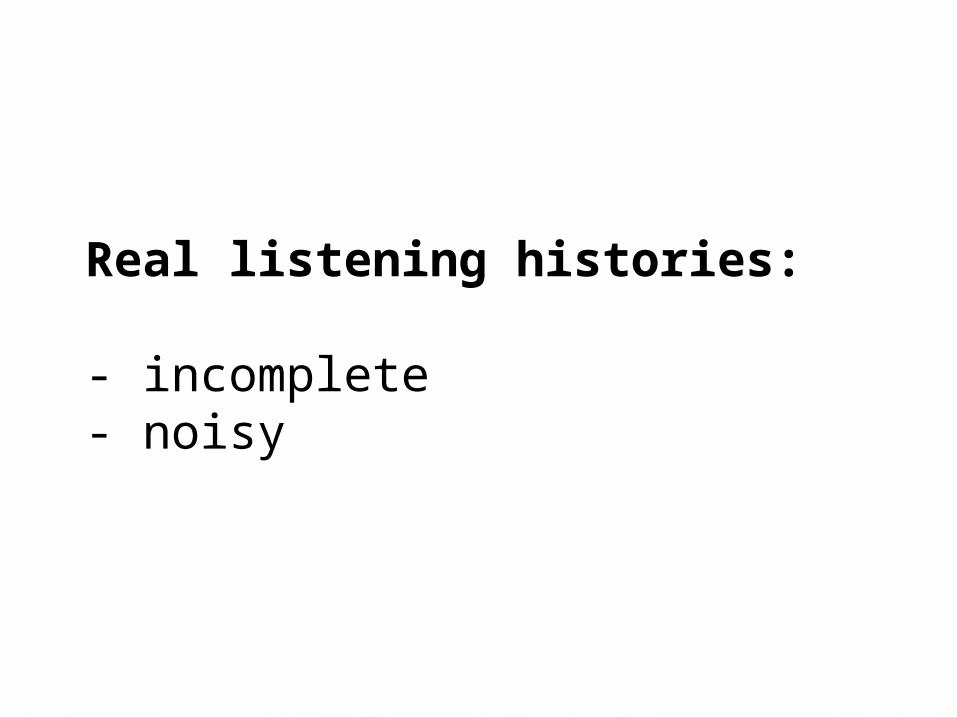
Real listening histories:
- incomplete- noisy

Real listening histories:
- incomplete- noisy

One common source is that the listener is using non-supported hardware for listening

Another that music comes from other sources like when shopping or being at a friend’s place.

Real listening histories:
- incomplete- noisy

The user might leave the computer while the music keeps on playing…

Or someone else is using the computer while the audioscrobbler is still running.

So much for the data space and its attributes. Next, we have to think about who our users are and what they want to do. All lifelogging applications are first of all about
UserRequirements2.

Stroking your ego. It’s about learning about yourself, understanding what you did, maybe finding patterns that you were not aware of and remembering the past.

We defined two larger types of tasks that should be possible with one’s listening history: First, the rather impersonal analysis where
Lifelogging modes
Analysis Personal

First, the rather impersonal analysis where users are looking for patterns within the data. The nice thing about that is that all possible insights are hidden within the data, which means that people who haven’t “created” the listening history are able to understand what’s going on (or at least see the patterns). Still, these insights can only be on an abstract level – we see which songs are repeated are popular but don’t know why.

To dive into the actual, underlying reasons we have to ask the creators of the data themselves, as they might be aware what intentions they had when picking a certain song. In this personal mode, a user’s memories form the second, complementary data source. The only thing is, we somehow have to reach the memories that the user’s have about a certain period in their lives and using songs with timestamps is not the best way to do it.
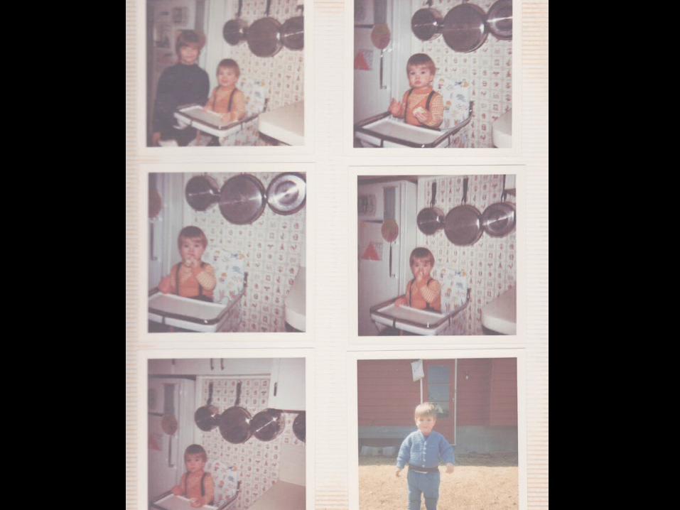
Much better memory triggers are photos or other actively created items. Therefore, to make sense of histories in this personal mode, adding such contextual information can be really helpful.

Ok, so with these two use cases of analysis and personal mode in mind, let’s look at related work from this area.
RelatedWork
3.

Understanding how people listen to music is the domain of music psychologists and music sociologists. They have uncovered fascinating aspects about human behavior in this regard but of course nothing about how to visualize that.
.

The concept of the timeline is common in Infovis, and for personal information it has been repeatedly applied in projects like LifeLines (for medical data), and PostHistory or TheMail (for email archives).
LifeLines2 [1] PostHistory [2]
TheMail [3]

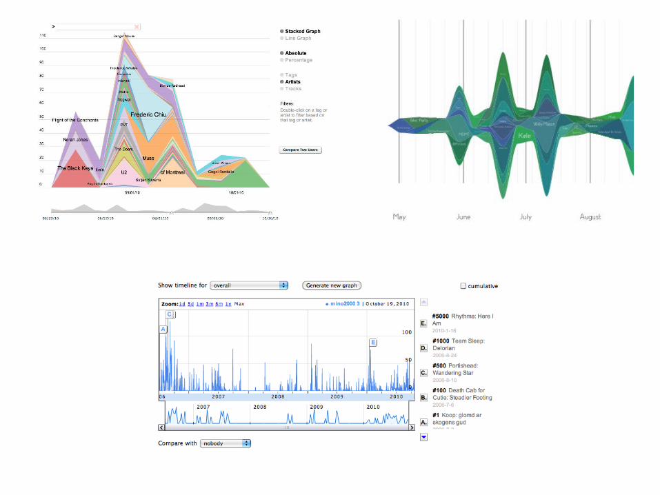
Two projects visualize listening histories: The Stacked or Streamgraphs by Byron and Wattenberg show overviews of prominent artists in listening histories. In our own former work, Pulling Strings from a Tangle, we presented two playful visualizations for this type of data, but they, too, could only paint an abstract picture of it.
Strings & Tangle [5]
Stacked Graphs [4]

So, when we went about designing our own tool, LastHistory, we wanted to create something that allowed gaining an overview of a listening history, but also explore it in detail. Finally, we wanted to integrate contextual information as memory triggers.
LastHistory4.

For our design requirements: We had non-infovis experts as users. So we decided to keep the interface as “non-threatening” as possible and make more complex tasks not obligatory.Second, the tasks that users try to fulfill with the tool were nice to have, but not vital to them. So it was important to give them an immediate benefit and keep from frustrating them. Finally, we had to work with missing and imperfect data and users should be aware of this fact and not blame the visualization.
Design requirements
Non-expert users
Non-vital tasks
Missing and imperfect data

With these considerations we arrived at the final version of LastHistory and I’ll try to give you a quick rundown of it.

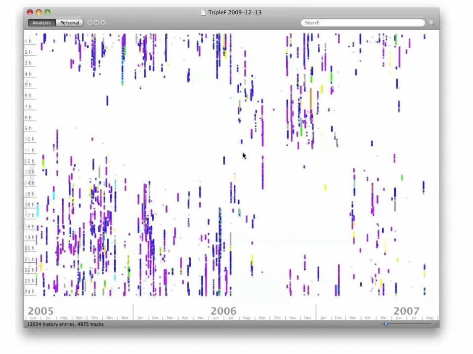
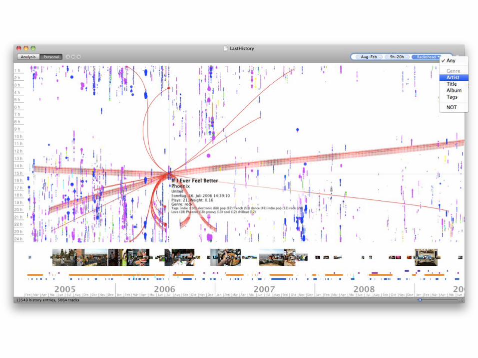
The largest part of the application is taken up with a 2D timeline: all songs are represented as small circles and mapped horizontally to the day and vertically to the time of day of their timestamps. This way, we can easily see daily rhythms,

Like at what time this user went to bed.

And here’s another example: A user who gets up at the same time everyday and listens to music first thing in the morning. The great thing about this mapping is that users have an immediate benefit even without interacting with the visualization.

Each song’s genre is color-coded, so the user gets an immediate overview over the variety of songs. We’re of course restricted in the number of colors we can use to keep them distinguishable.
classical
jazz
funk
hip-hop
electronic
rock
metal
unknown/other

We also separated the whole interaction into two modes, ‘analysis’ and ‘personal’. The main difference is that the personal mode also displays photos and calendar entries from the user’s computer to provide context and make it easier to remember what happened at what time and understanding the listening decisions. Users can simply switch between the two modes with the button in the upper left corner.
Two usage modes:
Analysis Personal

Beyond static visualization, users can navigate within the visualization by panning, triggered by dragging with the mouse
X Video of Pan
One-dimensional zooming by using the mouse’s zoom wheel or the slider in the lower right corner allows them to focus on certain sections of the history.
X Video of Zoom

Hovering over a song shows a box with user-generated keywords from last.fm, but more prominently: connects this song with all other instances of it throughout the history. So, users can easily see when they listened to this one song.
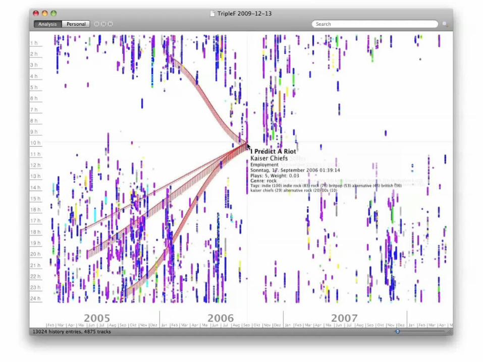
Preceding and succeeding repeated songs are also highlighted, so sequences such as albums or other predefined playlists are automatically highlighted.

Finally, in the upper right corner of the application, there’s a textbox for filtering where users can enter freeform terms. It’s possible to enter song or album titles or artist names to filter all other songs.

But the filter box can also be used for temporal queries by entering dates, or periods of time, so users can, for example, see all songs that they listened to in autumn before noon.

Having finished implementing LastHistory we wanted to find out how well our considerations had worked and if people would actually find it useful.
Reception5.

First, we gave LastHistory to four participants in a lab study and let them play around with it for an hour. They analyzed their own listening history in combination with photos and calendar entries and told our experimenter what they were able to find out and what they liked or disliked about the application.
4 participants in lab study
Histories at least 3.5 years
Avg. 45,000 songs
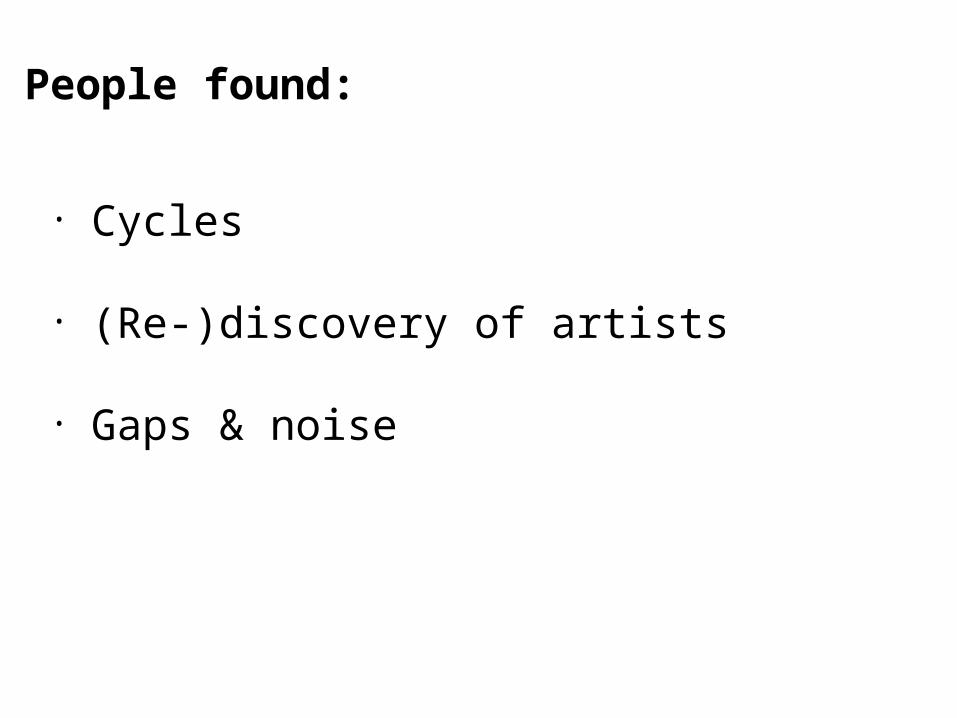
Results were insights about daily and other rhythms: One participant stopped listening to music during the week when she started working. A few noted how artists were rediscovered after going to a concert or them releasing a new album. And gaps and noise could also be seen and identified thanks to photos: Three participants found time periods empty where they were on vacation.
• Cycles
• (Re-)discovery of artists
• Gaps & noise
People found:

But much more interesting than these case studies was the feedback we received in the wild: We made LastHistory available for download and it was quickly picked up by blogs like Life Hacker or Newsweek’s website, which gave us a lot of attention.
“LastHistory … creates a spectacular visualization of your audio timeline.”
“If you're a music junkie who loves the statistics that Last.fm gives you, you'll love how LastHistory extends that even further.”
newsweek.com
lifehacker.com

In the end, about 5.000 people downloaded the application. We included a link to an online questionnaire that was shown after users had spent some time with the application and at the time of writing the paper, 243 people had filled out that form which was a valuable source of information for us.
5,000 downloads
243 filled-out questionnaires

Our users were predominantly male (95.1% to 4.9%) and most of them (56%) had a background in academia or technology. Age range was 16 to 67 years, with an average of 27.2 years.
Gender: 95.1% male, 4.9% female
Background: 56% academia/technology
Avg. age: 27.2 years

Regarding the available data, almost all users had their own listening histories available (97.1%), but only about one third (37%) photos and 18.5% calendars.
Listening history: 97.1%
Photos: 37%
Calendars: 18.5%
Data available:

This, of course, led to a dominance of the analysis mode over the personal mode: 75.7% found it useful, while only 51.8% said that about the personal mode. But when you only ask people who had
Analysis mode was useful:75.7%
Personal mode was useful:51.8%

Photos and calendars available they reach about the same rating.
Analysis mode was useful:75.7%
Personal mode was useful(people with photos + calendars):75.8%
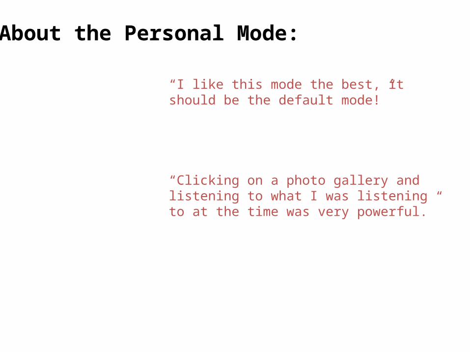
Insights that people gained also represented that: While some said about it: ‘I like this mode the best, it should be the default mode’, or ‘clicking on a photo gallery and listening to what I was listening to at the time was very powerful’ others complained about the missing data.
“I like this mode the best, it should be the default mode!”
“Clicking on a photo gallery and listening to what I was listening to at the time was very powerful.”
About the Personal Mode:

The analysis mode was more open for all users, and insights were mostly based on time and musical taste. One user found ‘I rarely listen to music between the hours of 9-11 a.m., even on weekends’ and another one noted his commuting pattern. A third one said she found ‘those ruts where you get stuck in listening to one particular song.’ Finally, users were also aware of the imperfect data.
“I rarely listen to music between the hours of 9-11 a.m., even on weekends.”
“I noted the … commuting pattern.”
About the Analysis Mode:
“Those ruts where you get stuck in listening to one particular song.”
“I listened to music for 4 straight days!”

But the most important finding for us was: People actually wanted something like LastHistory! The positive feedback just blew us away and we were very happy that people liked it. And even though the application wasn’t completely trivial, around 75% of our users found it easy to learn.
It worked!

And with that, I want to talk a little bit about what we learned and where to go from here.
Beyondmusic
6.

First, of course, our greatest fear as Infovis researchers is that our work is labeled as ‘pretty pictures’. But if you can build a pretty visualization without sacrificing functionality or making reading it more difficult why not do it? Users always prefer an aesthetically pleasing application to a dull one. And yes, even expert users. Thinking about users …
If you have to do it anyway,why not make it pretty?

One new aspect that this very personal data type let us do was integrate a non-tangible data type into the visualization: the user’s memory. Depending on the use case, this can be a powerful source for understanding and learning. Providing suitable memory triggers is essential here.

Finally, lifelogging won’t go away and it will probably only get worse. Especially as all media consumption becomes digital (even books!) tracking every little aspect of reading, watching and listening will become commonplace.
The age of lifelogging is upon us.
The concepts that we used in LastHistory would of course also work for these other media and we could basically add all the data streams we could think of to the timeline. But I think what’s more in this regard is that people (1) actually want something like that and (2) that information visualization can help them for understanding their behavior and reminiscing. That means that their data is no longer only useful to companies and governments: These visualizations can give the data back to their creators. And we as visualization researchers and practitioners are the people to build those tools.

Thank you!
> DOMINIKUS BAURFREDERIK SEIFFERTMICHAEL SEDLMAIRSEBASTIAN BORING UNIVERSITY OF MUNICH, GERMANY
Download LastHistory (open source) at: http://www.frederikseiffert.de/lasthistory
[email protected]: @dominikus

Image credits:Dear Diary: http://www.flickr.com/photos/hippie/2475835909/Nike Plus: http://www.flickr.com/photos/irisheyes/327069125/Last.fm Logo: http://www.flickr.com/photos/dekuwa/3383948292/sizes/o/in/photostream/Audio cassette: http://www.flickr.com/photos/steve-maw/4234388137/Notebook scribbles: http://www.flickr.com/photos/cherryboppy/4812211497/Messy Pudding Kid: http://www.flickr.com/photos/ripizzo/2310929170/Empty computer: http://www.flickr.com/photos/nycgraeme/2287826242/sizes/l/Grammophone: http://www.flickr.com/photos/jenik/2861494379/sizes/l/Shopping Cart: http://www.flickr.com/photos/spijker/3273982099/sizes/l/Computer cat: http://www.flickr.com/photos/kevinsteele/1507196484/sizes/l/Photo Girl: http://www.flickr.com/photos/blythe_d/1451273161/sizes/o/Scientists: http://www.flickr.com/photos/marsdd/2986989396/sizes/o/Reading girl: http://www.flickr.com/photos/12392252@N03/2482835894/Old photos: http://www.flickr.com/photos/soaringhorse/419617753/Gallery reception: http://www.flickr.com/photos/bricolage108/319671818/Light at the end of the tunnel: http://www.flickr.com/photos/mercedesdayanara/881056652/
Papers:[1] Taowei Wang et al.: Aligning Temporal Data by Sentinel Events: Discovering Patterns in Electronic
Health Records, CHI 2008[2] Viegas et al.: Digital Artifacts for remembering and storytelling: Posthistory and social network
fragments, HICSS-37, 2004[3] Viegas et al.: Visualizing email content: portraying relationships from conversational histories,
CHI 2006[4] Byron et al.: Stacked graphs–geometry & aesthetics, InfoVis 2008[5] Baur et al.: Pulling Strings from a Tangle: Visualizing a Personal Music Listening History, IUI 2009
Recommended