The Art of Colors
There are two color systems
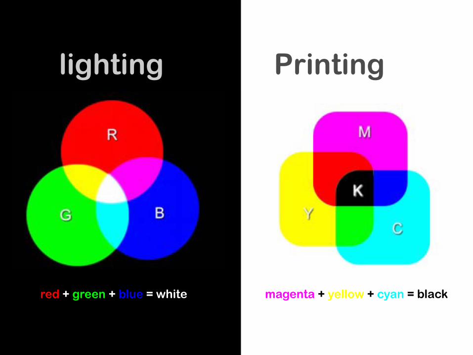
lighting Printing
red + green + blue = white magenta + yellow + cyan = black
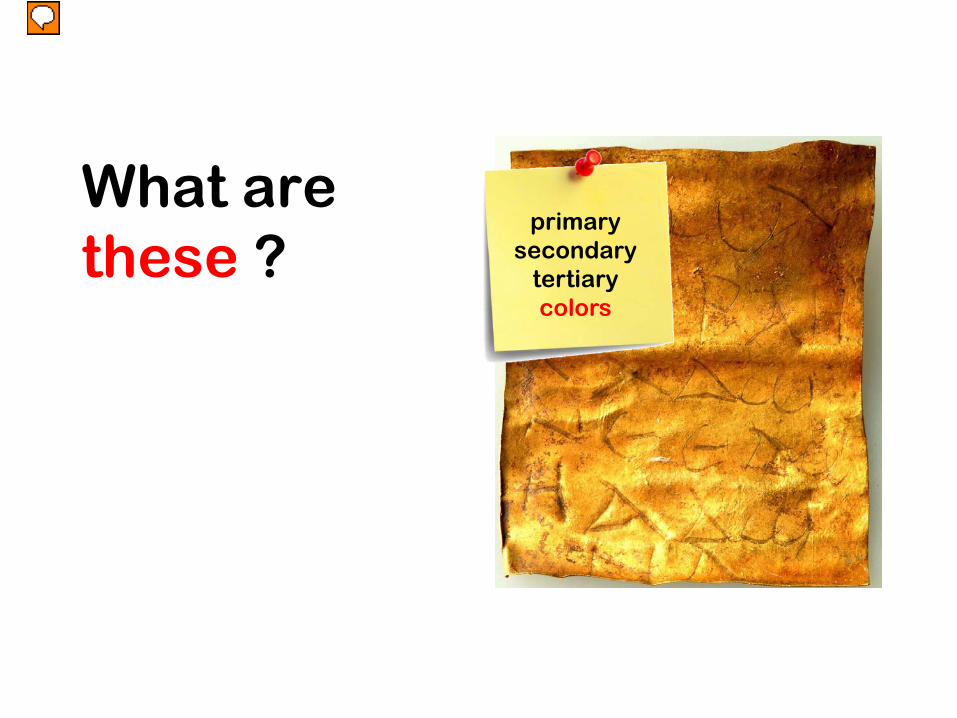
What are these ?
primarysecondary
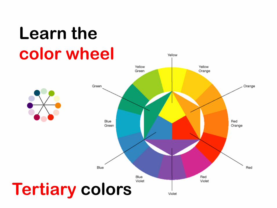
tertiarycolors
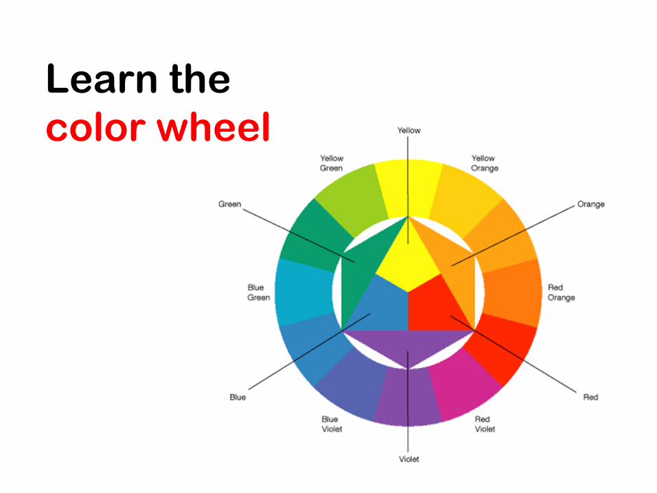
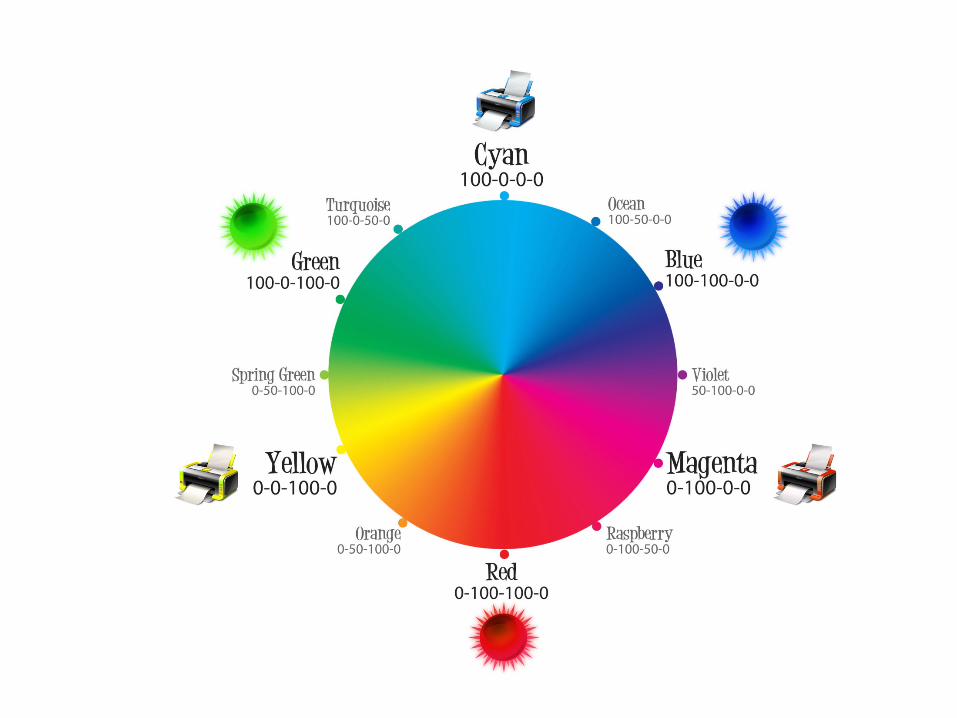
Learn the color wheel
Learn the color wheel
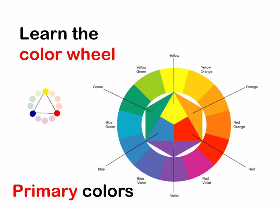
Primary colors
Learn the color wheel
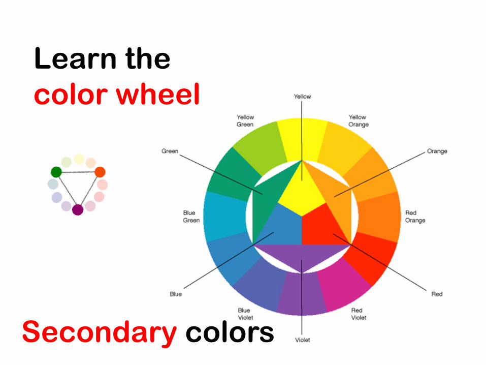
Secondary colors
Learn the color wheel
Tertiary colors
Color Values
Color Values are the lights and darks of a color you create by using black and white (‘neutral’) with a color . This makes hundreds of more colors from the basic 12 colors of wheel .
• White + Color = Tint
• Color + Black = Shade
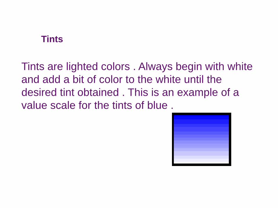
Tints
Tints are lighted colors . Always begin with white and add a bit of color to the white until the desired tint obtained . This is an example of a value scale for the tints of blue .
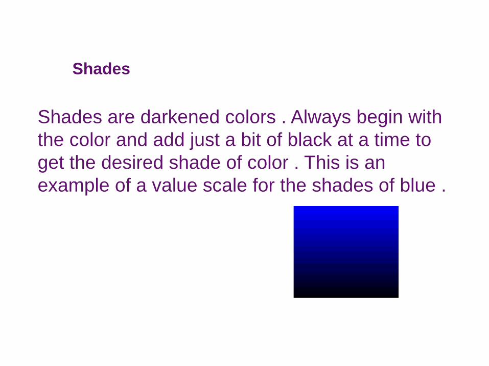
Shades
Shades are darkened colors . Always begin with the color and add just a bit of black at a time to get the desired shade of color . This is an example of a value scale for the shades of blue .
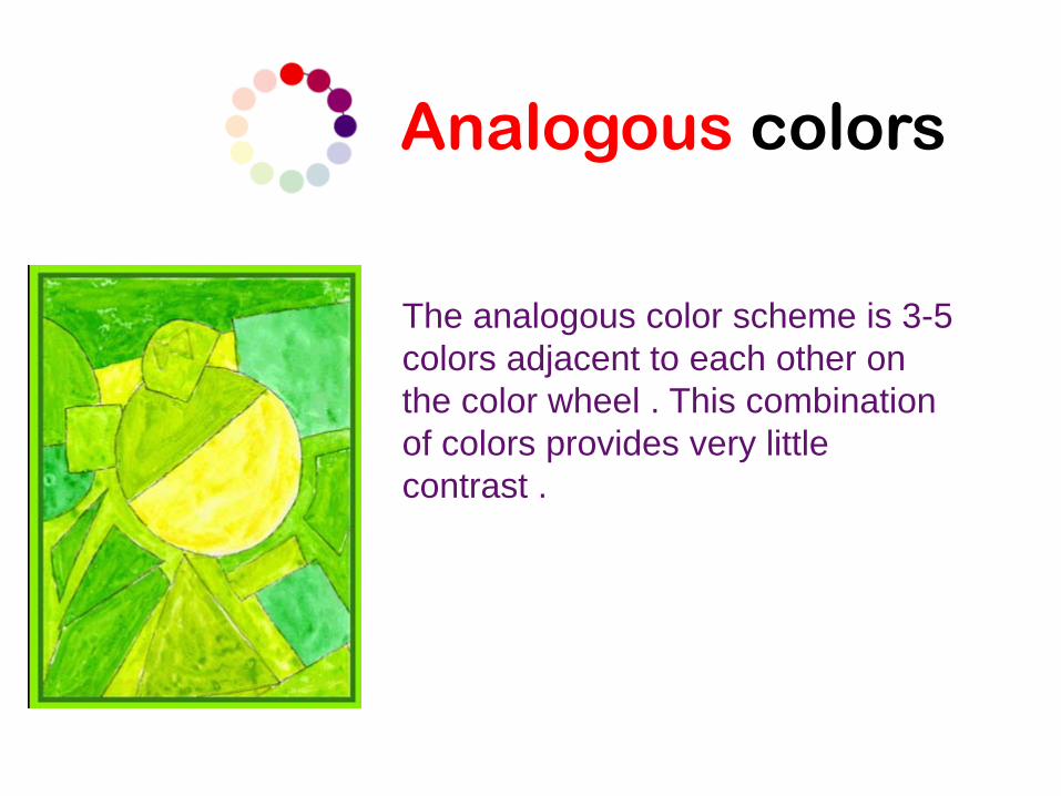
Analogous colors
The analogous color scheme is 3-5 colors adjacent to each other on the color wheel . This combination of colors provides very little contrast .
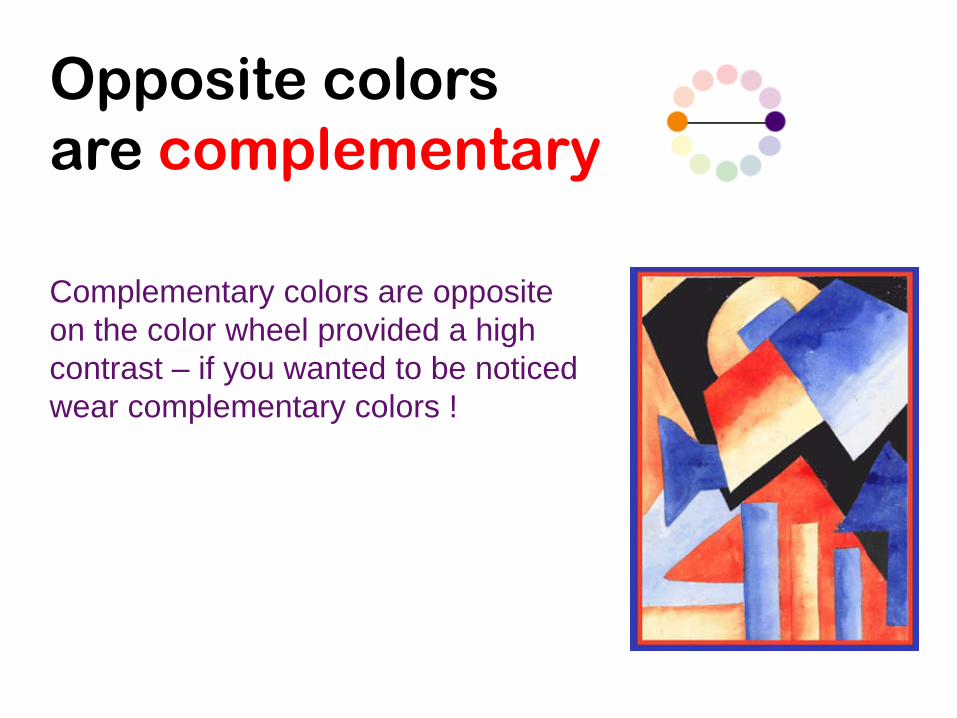
Opposite colors are complementary
Complementary colors are opposite on the color wheel provided a high contrast – if you wanted to be noticed wear complementary colors !
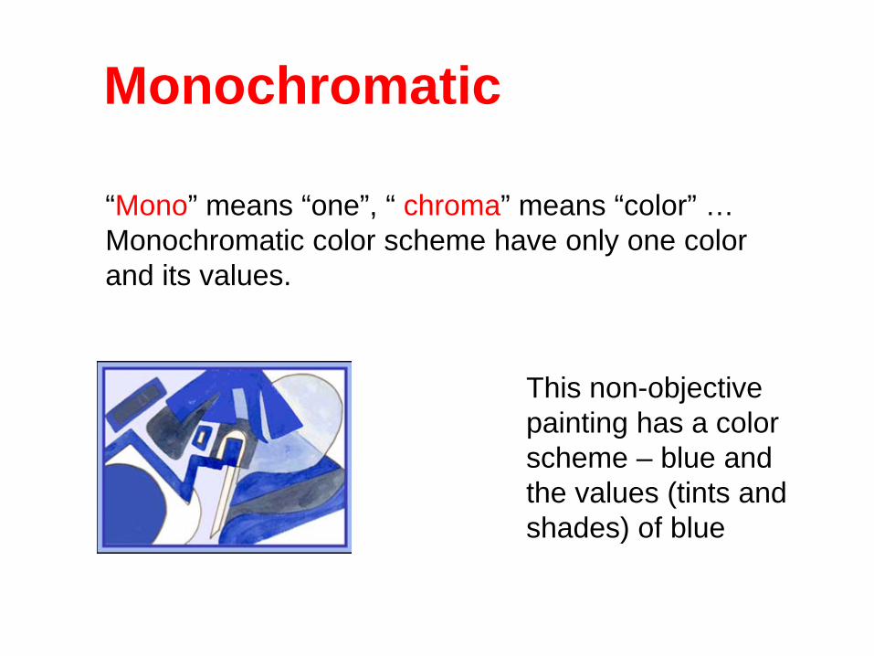
Monochromatic
This non-objective painting has a color scheme – blue and the values (tints and shades) of blue
“Mono” means “one”, “ chroma” means “color” … Monochromatic color scheme have only one color and its values.
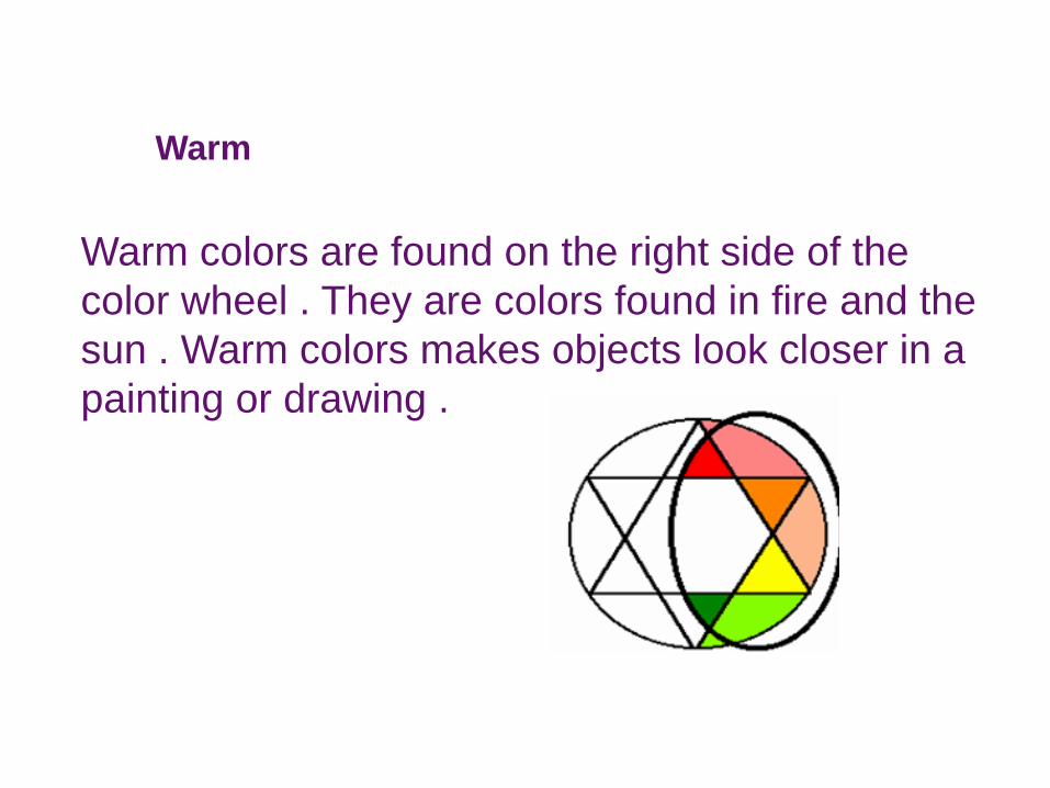
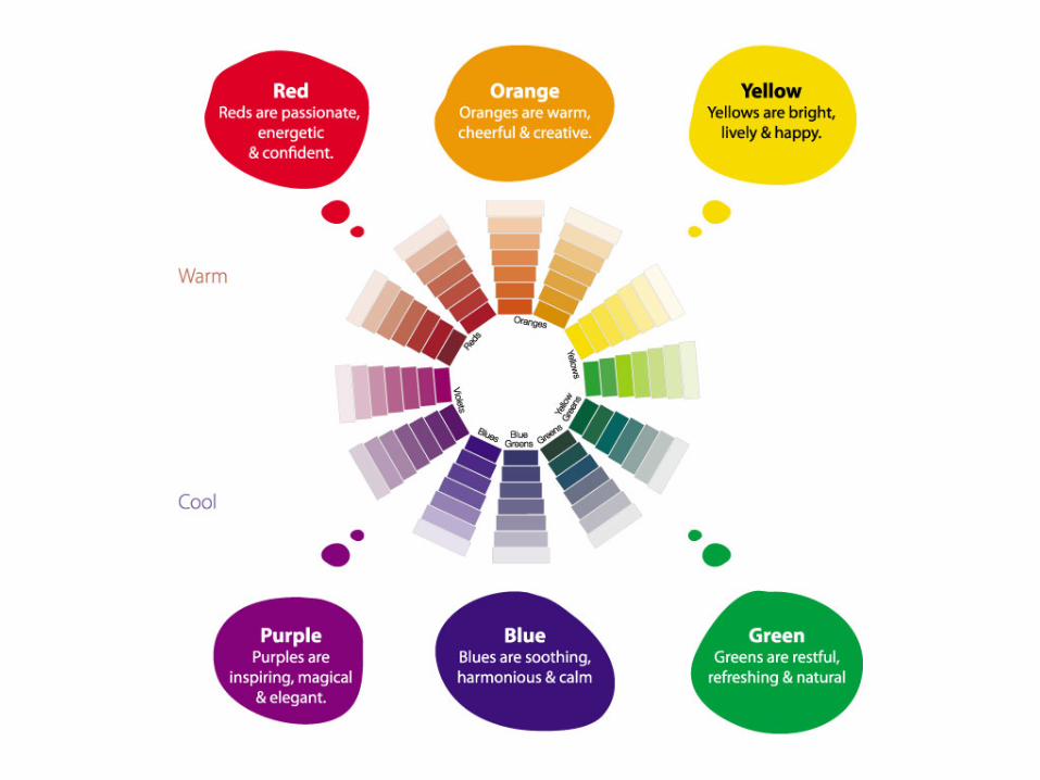
Warm
Warm colors are found on the right side of the color wheel . They are colors found in fire and the sun . Warm colors makes objects look closer in a painting or drawing .
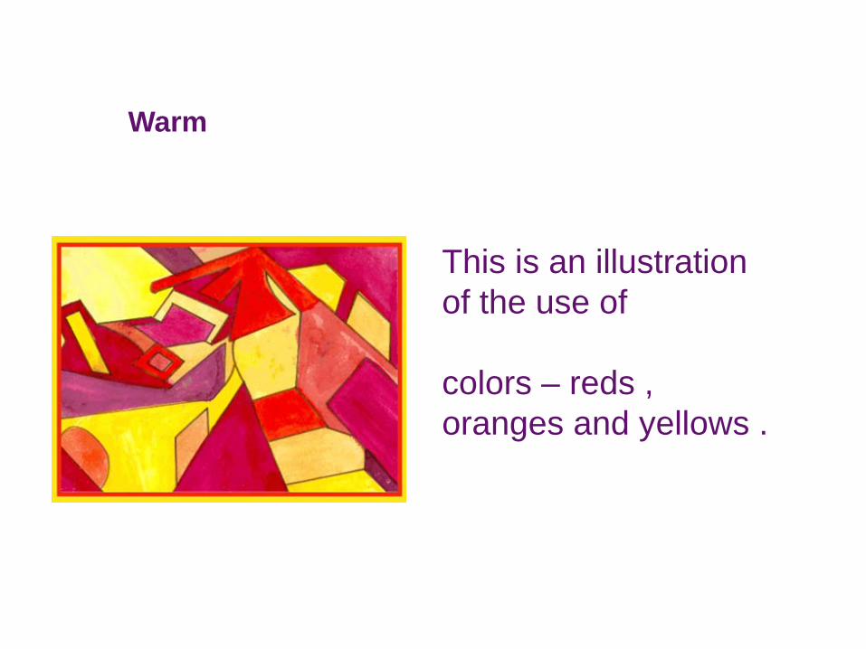
This is an illustration of the use of Warmcolors – reds , oranges and yellows .
Warm
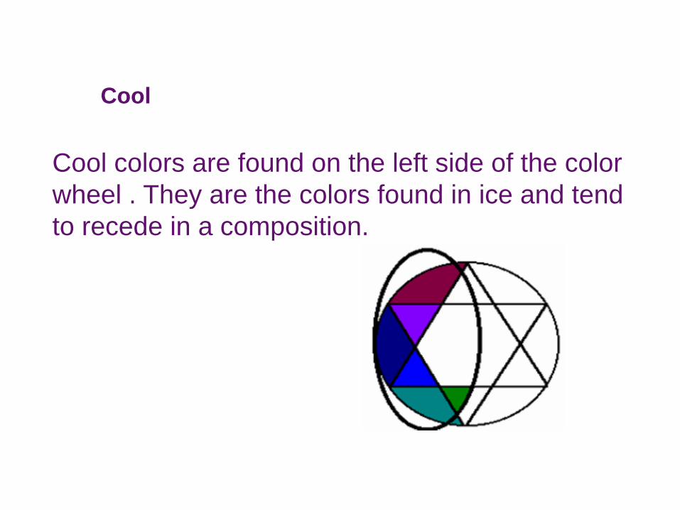
Cool
Cool colors are found on the left side of the color wheel . They are the colors found in ice and tend to recede in a composition.
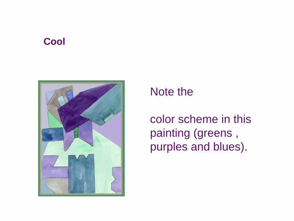
Note the Coolcolor scheme in this painting (greens , purples and blues).
Cool
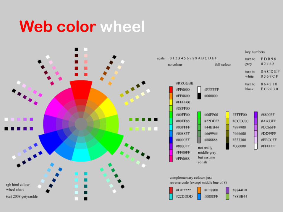
Web color wheel
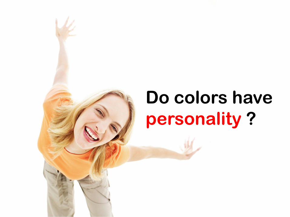
Do colors have personality ?
© Edward Burtynsky
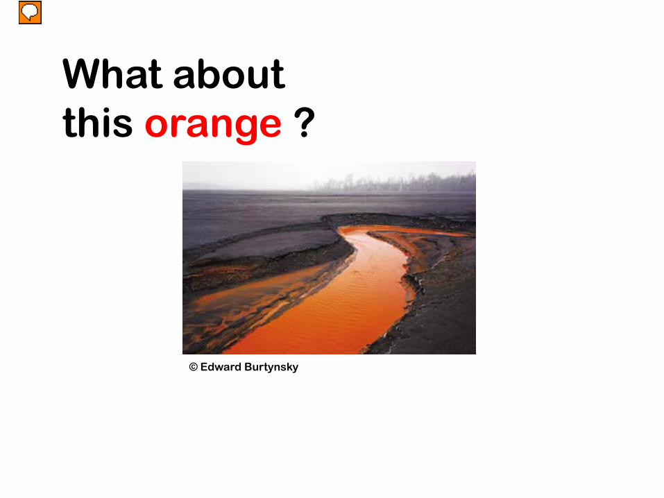
What about this orange ?
© Philip-Lorca diCorcia
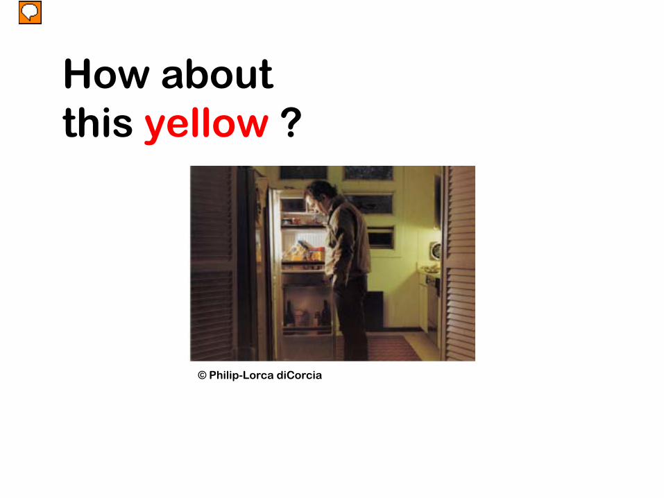
How about this yellow ?
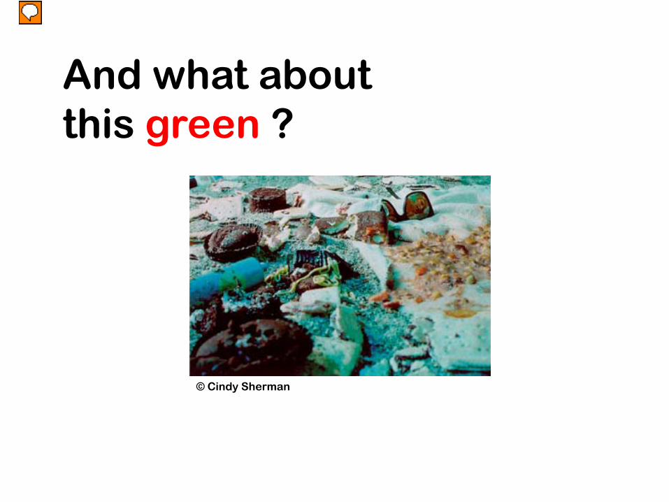
© Cindy Sherman
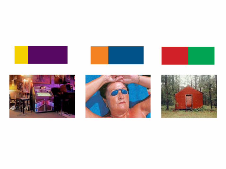
And what about this green ?

It’s aboutrelationships
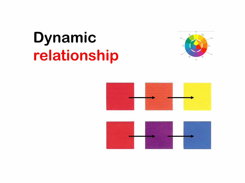
Dynamicrelationship
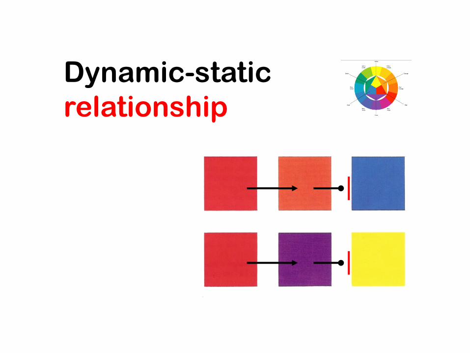
Dynamic-staticrelationship
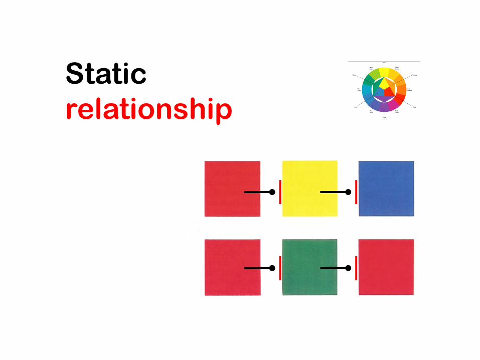
Staticrelationship

It’s a matter of contrast

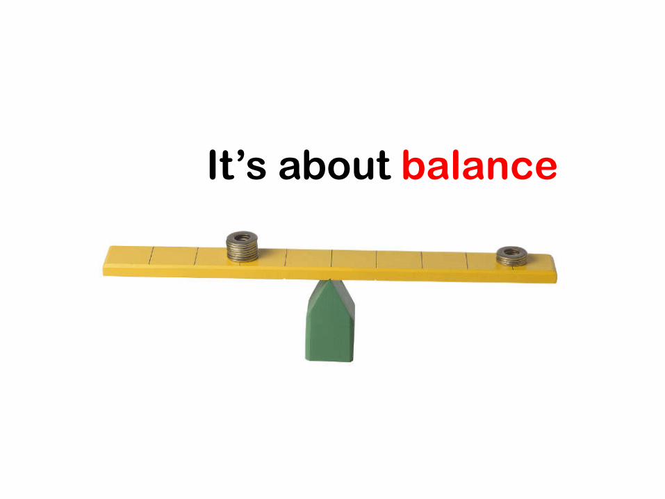
It’s about balance

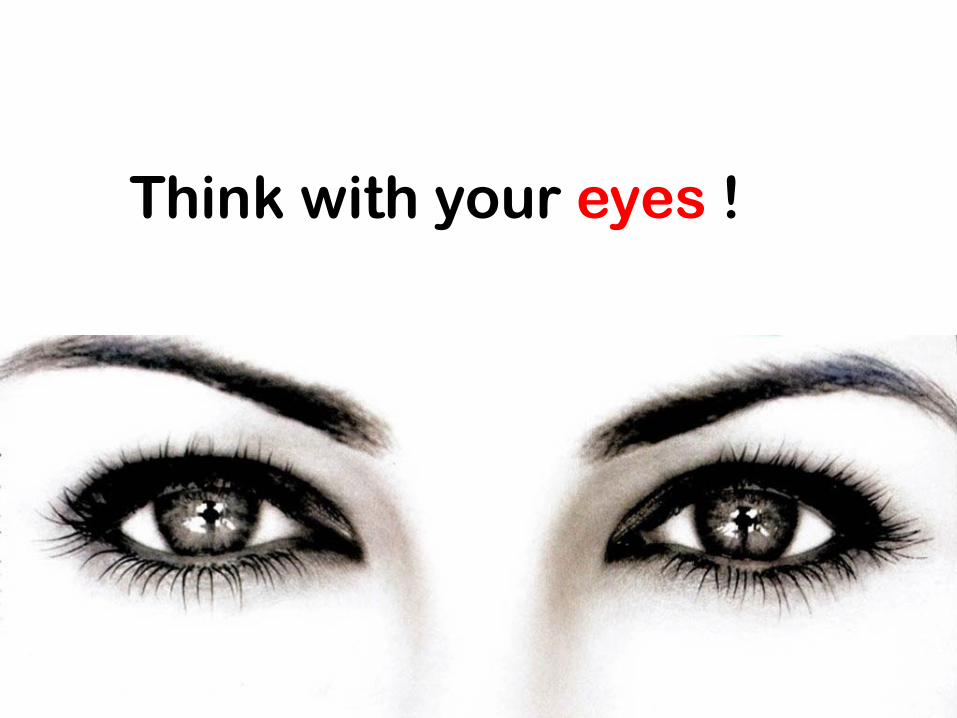
Think with your eyes !

Color palettetips & tools
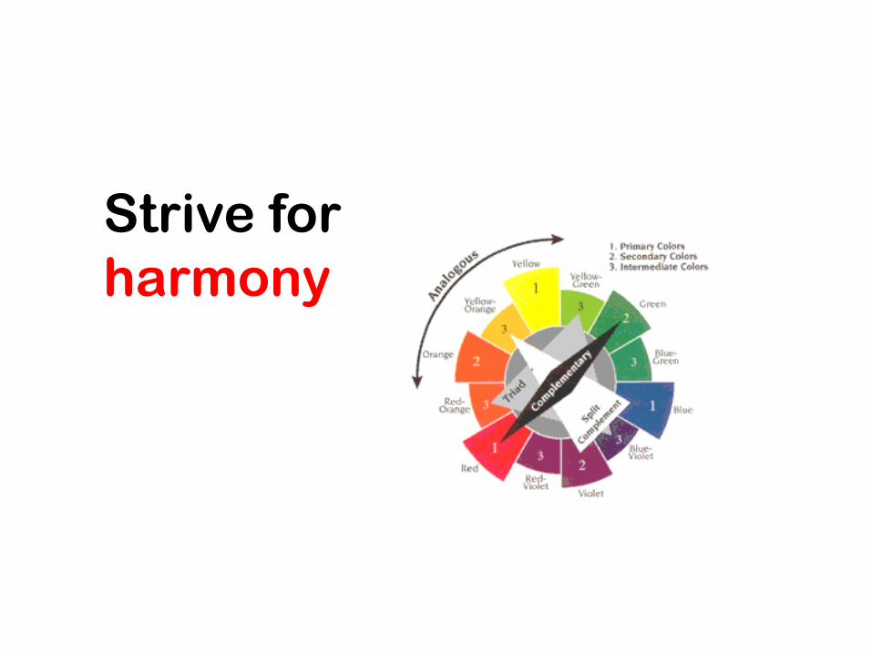
Strive for harmony
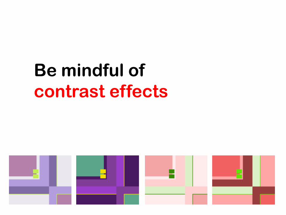
Be mindful of contrast effects
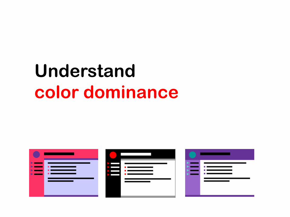
Understand color dominance
Ensure text readabilitythrough contrast
• Avoid the use of textures and pattern for backgrounds behind texts
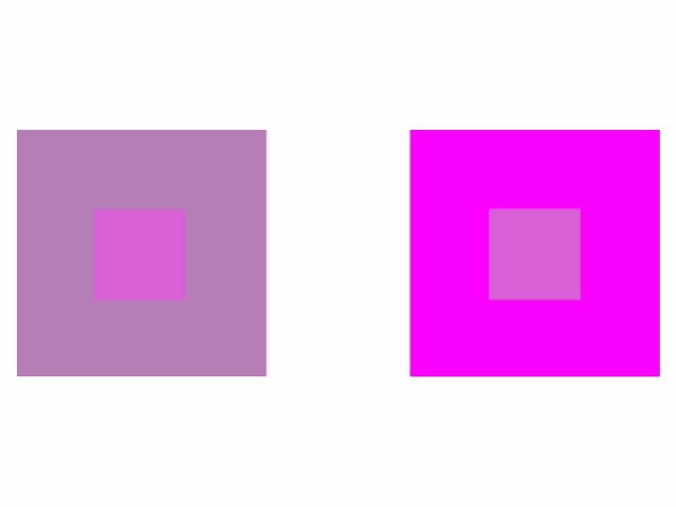
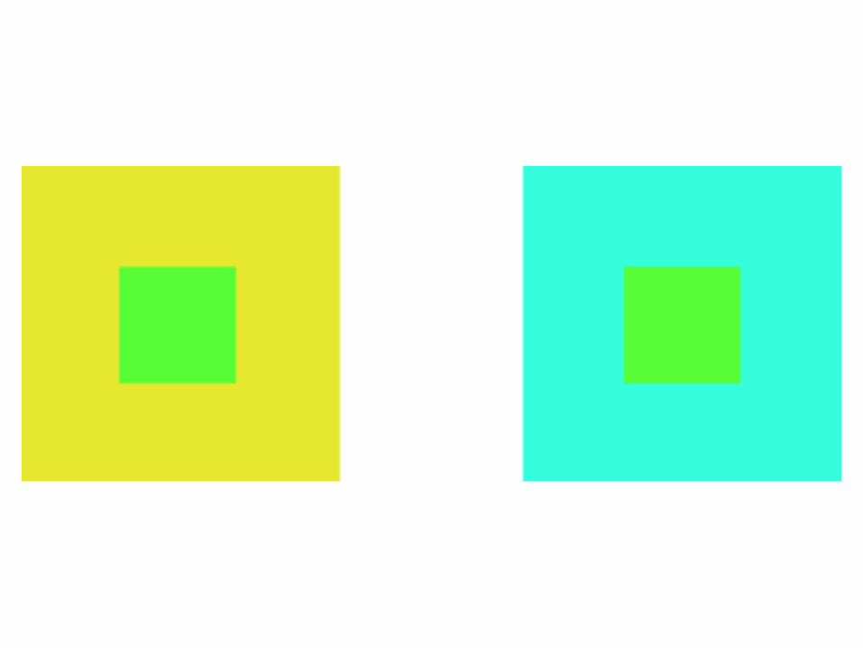
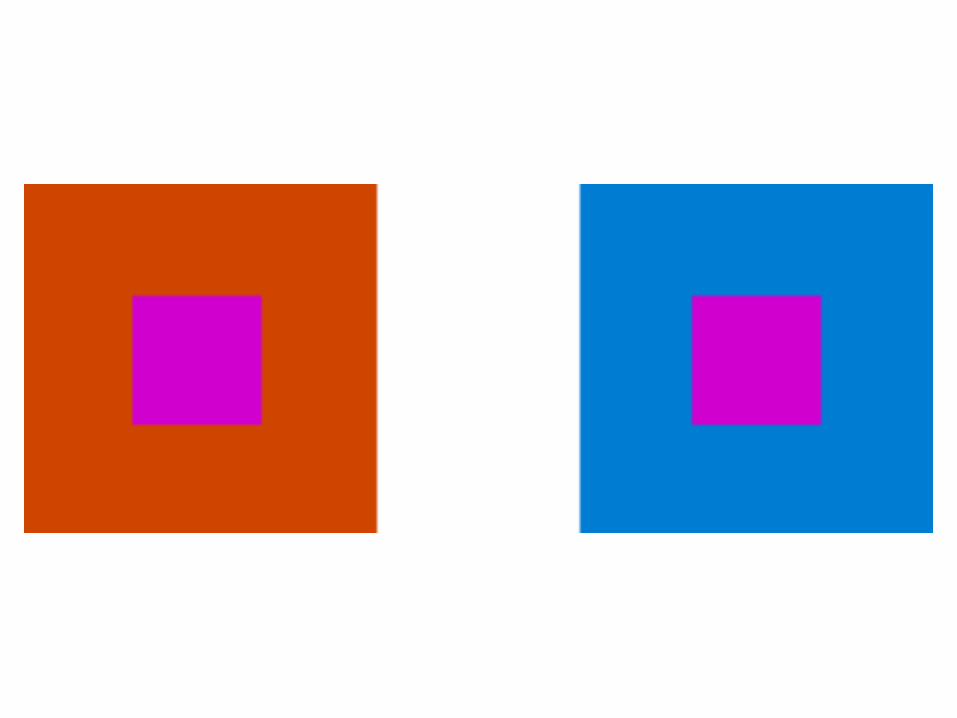
• Avoid contrasts that cause eye fatigue
• Avoid color combinations that cause illusions when positioned together
Enhance user experience
• Establish conventions and use color consistently
• Use color both to support users’ tasks and for branding
• Use color to enhance aesthetic appeal and user satisfaction
Use color for identification, grouping, and emphasis
• Relate visual elements
• Demarcate different areas
• Highlight important task-related information
Use color associations in expressing state information
• Be consistent with job-related color associations
• Learn about cultural color associations
Indicate availability using color or value
• For links
• For controls
• For icons
• For windows
Recommended