Statistical Graphs andCalculationsThis chapter describes how to input statistical data into lists, andhow to calculate the mean, maximum and other statistical values. Italso tells you how to perform regression calculations.
1. Before Performing Statistical Calculations2. Statistical Calculation Examples3. Calculating and Graphing Single-Variable Statistical Data4. Calculating and Graphing Paired-Variable Statistical Data5. Manual Graphing6. Performing Statistical Calculations
Chapter
7
Important!• This chapter contains a number of graph screen shots. In each case, new data
values were input in order to highlight the particular characteristics of the graphbeing drawn. Note that when you try to draw a similar graph, the unit uses datavalues that you have input using the List function. Because of this, the graphsthat appears on the screen when you perform a graphing operation will prob-ably differ somewhat from those shown in this manual.
96
Chapter 7 Statistical Graphs and Calculations
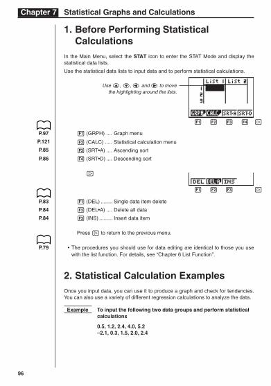
1. Before Performing StatisticalCalculations
In the Main Menu, select the STAT icon to enter the STAT Mode and display thestatistical data lists.
Use the statistical data lists to input data and to perform statistical calculations.
1 (GRPH) .... Graph menu
2 (CALC) ..... Statistical calculation menu
3 (SRT•A) .... Ascending sort
4 (SRT•D) .... Descending sort
[
1 (DEL) ........ Single data item delete
2 (DEL•A) .... Delete all data
3 (INS) ......... Insert data item
Press [ to return to the previous menu.
• The procedures you should use for data editing are identical to those you usewith the list function. For details, see “Chapter 6 List Function”.
2. Statistical Calculation ExamplesOnce you input data, you can use it to produce a graph and check for tendencies.You can also use a variety of different regression calculations to analyze the data.
Example To input the following two data groups and perform statisticalcalculations
0.5, 1.2, 2.4, 4.0, 5.2–2.1, 0.3, 1.5, 2.0, 2.4
1 2 3 4 [
1 2 3 4 [
P.83
P.84
P.84
P.79
Use f, c, d and e to movethe highlighting around the lists.
P.97
P.121
P.85
P.86
97
Statistical Graphs and Calculations Chapter 7
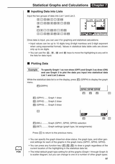
kkkkk Inputting Data into Lists
Input the two groups of data into List 1 and List 2.
a.fwb.cw
c.ewewf.cw
e
-c.bwa.dw
b.fwcwc.ew
Once data is input, you can use it for graphing and statistical calculations.
• Input values can be up to 10 digits long (9-digit mantissa and 2-digit exponentwhen using exponential format). Values in statistical data table cells are shownonly up to six digits.
• You can use the f, c, d and e keys to move the highlighting to any cell inthe lists for data input.
kkkkk Plotting Data
Example To specify Graph 1 as non-draw (OFF) and Graph 3 as draw (ON)and use Graph 3 to plot the data you input into statistical dataList 1 and List 2 above
While the statistical data list is on the display, press 1 (GRPH) to display the graphmenu.
1(GRPH)
1 (GPH1) ..... Graph 1 draw
2 (GPH2) ..... Graph 2 draw
3 (GPH3) ..... Graph 3 draw
[
1(SEL) ......... Graph (GPH1, GPH2, GPH3) selection
4(SET) ......... Graph settings (graph type, list assignments)
Press [ to return to the previous menu.
• You can specify the graph draw/non-draw status, the graph type, and other gen-eral settings for each of the graphs in the graph menu (GPH1, GPH2, GPH3).
• You can press any function key (1,2,3) to draw a graph regardless of thecurrent location of the highlighting in the statistical data list.
• The initial default graph type setting for all the graphs (Graph 1 through Graph 3)is scatter diagram, but you can change to one of a number of other graph types.
P.99
1 2 3 4 [
1 2 3 4 [
98
Chapter 7 Statistical Graphs and Calculations
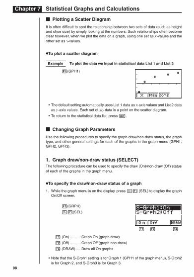
kkkkk Plotting a Scatter Diagram
It is often difficult to spot the relationship between two sets of data (such as heightand shoe size) by simply looking at the numbers. Such relationships often becomeclear however, when we plot the data on a graph, using one set as x-values and theother set as y-values.
uuuuuTo plot a scatter diagram
Example To plot the data we input in statistical data List 1 and List 2
1(GPH1)
• The default setting automatically uses List 1 data as x-axis values and List 2 dataas y-axis values. Each set of x/y data is a point on the scatter diagram.
• To return to the statistical data list, press Q.
kkkkk Changing Graph Parameters
Use the following procedures to specify the graph draw/non-draw status, the graphtype, and other general settings for each of the graphs in the graph menu (GPH1,GPH2, GPH3).
1. Graph draw/non-draw status (SELECT)The following procedure can be used to specify the draw (On)/non-draw (Off) statusof each of the graphs in the graph menu.
uuuuuTo specify the draw/non-draw status of a graph
1. While the graph menu is on the display, press [1 (SEL) to display the graphOn/Off screen.
1(GRPH)
[1(SEL)
1 (On) .......... Graph On (graph draw)
2 (Off) .......... Graph Off (graph non-draw)
4 (DRAW) .... Draw all On graphs
• Note that the S-Grph1 setting is for Graph 1 (GPH1 of the graph menu), S-Grph2is for Graph 2, and S-Grph3 is for Graph 3.
1 2 3 4
99
Statistical Graphs and Calculations Chapter 7
2. Use f and c to move the highlighting to the graph whose draw (On)/non-draw(Off) status you want to change and press 1 (On) or 2 (Off).
3. To return to the graph menu, press Q.
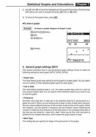
uuuuuTo draw a graph
Example To draw a scatter diagram of Graph 3 only
1(GRPH)[1(SEL)
2(Off)
cc1(On)
4(DRAW)
2. General graph settings (SET)This section describes how to use the general graph settings screen to make thefollowing settings for each graph (GPH1, GPH2, GPH3).
• Graph Type
The initial default graph type setting for all the graphs is scatter graph. You can selectone of a variety of other statistical graph types for each graph.
• List or Data
The initial default statistical data is List 1 for single-variable data, and List 1 and List2 for paired-variable data. You can specify which statistical data list you want to useto draw the graph.
• Frequency
Normally, each data item or data pair in the statistical data list is represented on agraph as a point. When you are working with a large number of data items however,this can cause problems because of the number of plot points on the graph. Whenthis happens, you can specify a frequency list that contains values indicating thenumber of instances (the frequency) of the data items in the corresponding cells ofthe lists you are using for x-data and y-data. Once you do this, only one point isplotted for the multiple data items, which makes the graph easier to read.
• Mark Type
This setting lets you specify the shape of the plot points on the graph.
1 2 3 4
100
Chapter 7 Statistical Graphs and Calculations
1 2 3 4
1 2 3 4 [
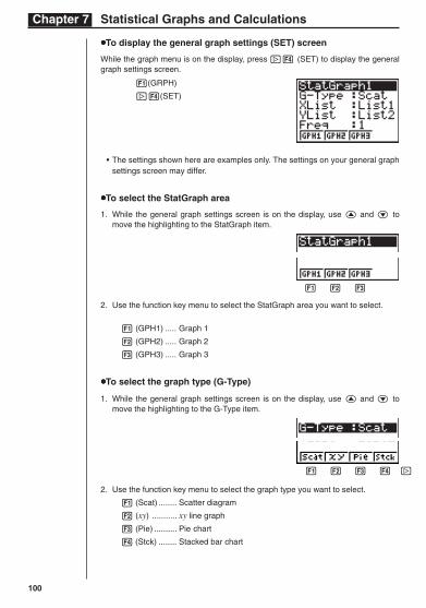
uuuuuTo display the general graph settings (SET) screen
While the graph menu is on the display, press [4 (SET) to display the generalgraph settings screen.
1(GRPH)
[4(SET)
• The settings shown here are examples only. The settings on your general graphsettings screen may differ.
uuuuuTo select the StatGraph area
1. While the general graph settings screen is on the display, use f and c tomove the highlighting to the StatGraph item.
2. Use the function key menu to select the StatGraph area you want to select.
1 (GPH1) ..... Graph 1
2 (GPH2) ..... Graph 2
3 (GPH3) ..... Graph 3
uuuuuTo select the graph type (G-Type)
1. While the general graph settings screen is on the display, use f and c tomove the highlighting to the G-Type item.
2. Use the function key menu to select the graph type you want to select.
1 (Scat) ........ Scatter diagram
2 (xy) ........... xy line graph
3 (Pie) .......... Pie chart
4 (Stck) ........ Stacked bar chart
101
Statistical Graphs and Calculations Chapter 7
1 2 3 4 [
1 2 3 4 [
1 2 3 4 [
1 2 3 4 [
1 2 3 4 [
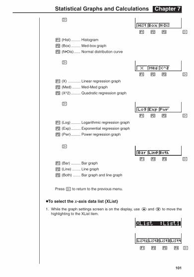
[
1 (Hist) ......... Histogram
2 (Box) ......... Med-box graph
3 (N•Dis) ...... Normal distribution curve
[
1 (X) ............ Linear regression graph
2 (Med) ........ Med-Med graph
3 (X^2) ......... Quadratic regression graph
[
1 (Log) ......... Logarithmic regression graph
2 (Exp) ......... Exponential regression graph
3 (Pwr) ......... Power regression graph
[
1 (Bar) ......... Bar graph
2 (Line) ........ Line graph
3 (Both) ....... Bar graph and line graph
Press [ to return to the previous menu.
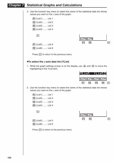
uuuuuTo select the x-axis data list (XList)
1. While the graph settings screen is on the display, use f and c to move thehighlighting to the XList item.
102
Chapter 7 Statistical Graphs and Calculations
2. Use the function key menu to select the name of the statistical data list whosevalues you want on the x-axis of the graph.
1 (List1) ....... List 1
2 (List2) ....... List 2
3 (List3) ....... List 3
4 (List4) ....... List 4
[
1 (List5) ....... List 5
2 (List6) ....... List 6
Press [ to return to the previous menu.
uuuuuTo select the y-axis data list (YList)
1. While the graph settings screen is on the display, use f and c to move thehighlighting to the YList item.
2. Use the function key menu to select the name of the statistical data list whosevalues you want on the y-axis of the graph.
1 (List1) ....... List 1
2 (List2) ....... List 2
3 (List3) ....... List 3
4 (List4) ....... List 4
[
1 (List5) ....... List 5
2 (List6) ....... List 6
Press [ to return to the previous menu.
1 2 3 4 [
1 2 3 4 [
1 2 3 4 [
103
Statistical Graphs and Calculations Chapter 7
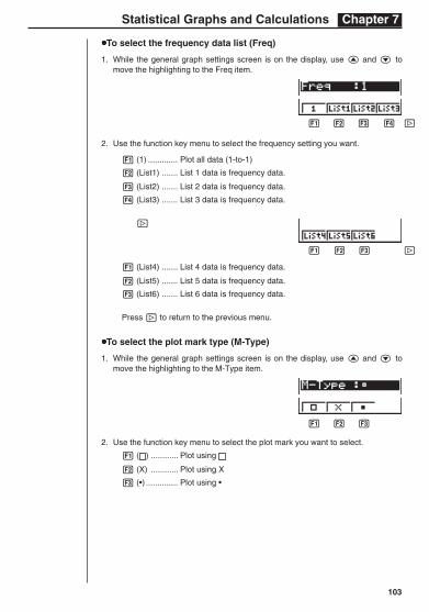
uuuuuTo select the frequency data list (Freq)
1. While the general graph settings screen is on the display, use f and c tomove the highlighting to the Freq item.
2. Use the function key menu to select the frequency setting you want.
1 (1) ............. Plot all data (1-to-1)
2 (List1) ....... List 1 data is frequency data.
3 (List2) ....... List 2 data is frequency data.
4 (List3) ....... List 3 data is frequency data.
[
1 (List4) ....... List 4 data is frequency data.
2 (List5) ....... List 5 data is frequency data.
3 (List6) ....... List 6 data is frequency data.
Press [ to return to the previous menu.
uuuuuTo select the plot mark type (M-Type)
1. While the general graph settings screen is on the display, use f and c tomove the highlighting to the M-Type item.
2. Use the function key menu to select the plot mark you want to select.
1 ( ) ............ Plot using
2 (X) ............ Plot using X
3 (•) .............. Plot using •
1 2 3 4
1 2 3 4 [
1 2 3 4 [
104
Chapter 7 Statistical Graphs and Calculations
1 2 3 4 [
1 2 3 4 [
1 2 3 4 [
1 2 3 4 [
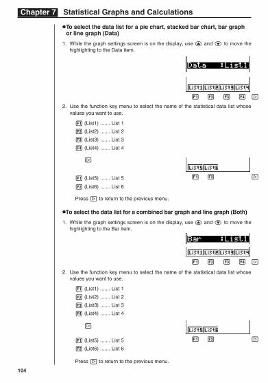
uuuuuTo select the data list for a pie chart, stacked bar chart, bar graphor line graph (Data)
1. While the graph settings screen is on the display, use f and c to move thehighlighting to the Data item.
2. Use the function key menu to select the name of the statistical data list whosevalues you want to use.
1 (List1) ....... List 1
2 (List2) ....... List 2
3 (List3) ....... List 3
4 (List4) ....... List 4
[
1 (List5) ....... List 5
2 (List6) ....... List 6
Press [ to return to the previous menu.
uuuuuTo select the data list for a combined bar graph and line graph (Both)
1. While the graph settings screen is on the display, use f and c to move thehighlighting to the Bar item.
2. Use the function key menu to select the name of the statistical data list whosevalues you want to use.
1 (List1) ....... List 1
2 (List2) ....... List 2
3 (List3) ....... List 3
4 (List4) ....... List 4
[
1 (List5) ....... List 5
2 (List6) ....... List 6
Press [ to return to the previous menu.
105
Statistical Graphs and Calculations Chapter 7
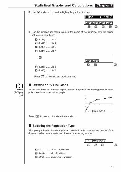
3. Use f and c to move the highlighting to the Line item.
4. Use the function key menu to select the name of the statistical data list whosevalues you want to use.
1 (List1) ....... List 1
2 (List2) ....... List 2
3 (List3) ....... List 3
4 (List4) ....... List 4
[
1 (List5) ....... List 5
2 (List6) ....... List 6
Press [ to return to the previous menu.
kkkkk Drawing an xy Line Graph
Paired data items can be used to plot a scatter diagram. A scatter diagram where thepoints are linked is an xy line graph.
Press Q to return to the statistical data list.
kkkkk Selecting the Regression Type
After you graph statistical data, you can use the function menu at the bottom of thedisplay to select from a variety of different types of regression.
1 (X) ............ Linear regression
2 (Med) ........ Med-Med line
3 (X^2) ......... Quadratic regression
P.100(G-Type)
(xy)
1 2 3 4 [
1 2 3 4 [
1 2 3 4 [
106
Chapter 7 Statistical Graphs and Calculations
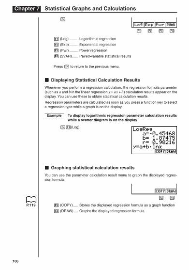
[
1 (Log) ......... Logarithmic regression
2 (Exp) ......... Exponential regression
3 (Pwr) ......... Power regression
4 (2VAR) ...... Paired-variable statistical results
Press [ to return to the previous menu.
kkkkk Displaying Statistical Calculation Results
Whenever you perform a regression calculation, the regression formula parameter(such as a and b in the linear regression y = ax + b) calculation results appear on thedisplay. You can use these to obtain statistical calculation results.
Regression parameters are calculated as soon as you press a function key to selecta regression type while a graph is on the display.
Example To display logarithmic regression parameter calculation resultswhile a scatter diagram is on the display
[1(Log)
kkkkk Graphing statistical calculation results
You can use the parameter calculation result menu to graph the displayed regres-sion formula.
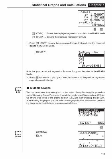
3 (COPY) ..... Stores the displayed regression formula as a graph function
4 (DRAW) .... Graphs the displayed regression formula
P.119
1 2 3 4
1 2 3 4
107
Statistical Graphs and Calculations Chapter 7
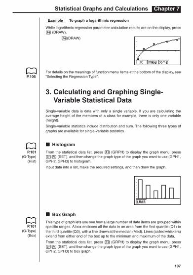
Example To graph a logarithmic regression
While logarithmic regression parameter calculation results are on the display, press4 (DRAW).
4(DRAW)
For details on the meanings of function menu items at the bottom of the display, see“Selecting the Regression Type”.
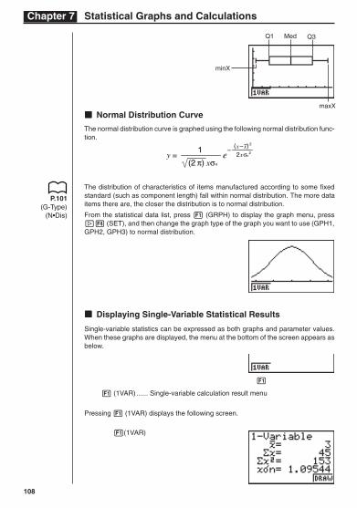
3. Calculating and Graphing Single-Variable Statistical Data
Single-variable data is data with only a single variable. If you are calculating theaverage height of the members of a class for example, there is only one variable(height).
Single-variable statistics include distribution and sum. The following three types ofgraphs are available for single-variable statistics.
kkkkk Histogram
From the statistical data list, press 1 (GRPH) to display the graph menu, press[4 (SET), and then change the graph type of the graph you want to use (GPH1,GPH2, GPH3) to histogram.
Input data into a list, make the required settings, and then draw the graph.
kkkkk Box Graph
This type of graph lets you see how a large number of data items are grouped withinspecific ranges. A box encloses all the data in an area from the first quartile (Q1) tothe third quartile (Q3), with a line drawn at the median (Med). Lines (called whiskers)extend from either end of the box up to the minimum and maximum of the data.
From the statistical data list, press 1 (GRPH) to display the graph menu, press[4 (SET), and then change the graph type of the graph you want to use (GPH1,GPH2, GPH3) to box graph.
P.105
P.101(G-Type)
(Hist)
P.101(G-Type)
(Box)
108
Chapter 7 Statistical Graphs and Calculations
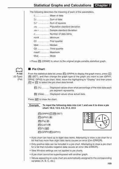
P.101(G-Type)
(N•Dis)
Med Q3
1 2 3 4
Q1
maxX
kkkkk Normal Distribution Curve
The normal distribution curve is graphed using the following normal distribution func-tion.
y =1
(2 π) xσn
e–
2xσn2
(x –x) 2
The distribution of characteristics of items manufactured according to some fixedstandard (such as component length) fall within normal distribution. The more dataitems there are, the closer the distribution is to normal distribution.
From the statistical data list, press 1 (GRPH) to display the graph menu, press[4 (SET), and then change the graph type of the graph you want to use (GPH1,GPH2, GPH3) to normal distribution.
kkkkk Displaying Single-Variable Statistical Results
Single-variable statistics can be expressed as both graphs and parameter values.When these graphs are displayed, the menu at the bottom of the screen appears asbelow.
1 (1VAR) ...... Single-variable calculation result menu
Pressing 1 (1VAR) displays the following screen.
1(1VAR)
minX
109
Statistical Graphs and Calculations Chapter 7
The following describes the meaning of each of the parameters._x ...................... Mean of data
Σx .................... Sum of data
Σx2 .................. Sum of squares
xσn .................. Population standard deviation
xσn-1 ................ Sample standard deviation
n ...................... Number of data items
minX................ Minimum
Q1 ................... First quartile
Med ................. Median
Q3 ................... Third quartile
maxX............... Maximum
Mod ................. Mode
• Press 4 (DRAW) to return to the original single-variable statistical graph.
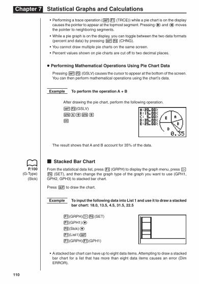
kkkkk Pie Chart
From the statistical data list, press 1 (GRPH) to display the graph menu, press [4 (SET), and then change the graph type of the graph you want to use (GPH1,GPH2, GPH3) to pie chart. Next, move the highlighting to “Display” and then press1 or 2 to select the pie chart data format.
1 (%) ............ Displayed values show what percentage of the total data eachpie segment represents.
2 (Data) ....... Displayed values show actual data.
Press Q to draw the chart.
Example To input the following data into List 1 and use it to draw a piechart: 18.0, 13.5, 4.5, 31.5, 22.5
1(GRPH)[4(SET)
1(GPH1)c
3(Pie)c
1(List1)c
1(%)Q
1(GRPH)1(GPH1)
• A pie chart can have up to eight data items. Attempting to draw a pie chart for alist that has more than eight data items causes an error (Dim ERROR).
• Only positive data can be included in a pie chart. Attempting to draw a pie chartfor a list that includes negative data causes an error (Ma ERROR).
• View Window settings are not applied to pie charts.
• A pie chart cannot be superimposed with another graph.
• Values appearing on a pie chart are automatically assigned to the correspondingvariables (A, B, C, etc.)
P.100(G-Type)
(Pie)
110
Chapter 7 Statistical Graphs and Calculations
• Performing a trace operation (!1 (TRCE)) while a pie chart is on the displaycauses the pointer to appear at the topmost segment. Pressing e and d movesthe pointer to neighboring segments.
• While a pie graph is on the display, you can toggle between the two data formats(percent and data) by pressing !4 (CHNG).
• You cannot draw multiple pie charts on the same screen.
• Percent values shown on pie charts are cut off to two decimal places.
uuuuu Performing Mathematical Operations Using Pie Chart Data
Pressing !3 (GSLV) causes the cursor to appear at the bottom of the screen.You can then perform mathematical operations using the chart’s data.
Example To perform the operation A + B
After drawing the pie chart, perform the following operation.
!3(GSLV)
aA+aB
w
The result shows that A and B account for 35% of the data.
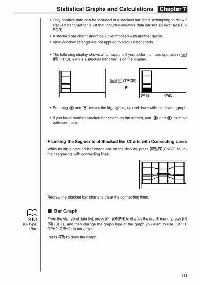
kkkkk Stacked Bar Chart
From the statistical data list, press 1 (GRPH) to display the graph menu, press [4 (SET), and then change the graph type of the graph you want to use (GPH1,GPH2, GPH3) to stacked bar chart.
Press Q to draw the chart.
Example To input the following data into List 1 and use it to draw a stackedbar chart: 18.0, 13.5, 4.5, 31.5, 22.5
1(GRPH)[4(SET)
1(GPH1)c
4(Stck)c
1(List1)Q
1(GRPH)1(GPH1)
• A stacked bar chart can have up to eight data items. Attempting to draw a stackedbar chart for a list that has more than eight data items causes an error (DimERROR).
P.100(G-Type)
(Stck)
111
Statistical Graphs and Calculations Chapter 7
• Only positive data can be included in a stacked bar chart. Attempting to draw astacked bar chart for a list that includes negative data causes an error (Ma ER-ROR).
• A stacked bar chart cannot be superimposed with another graph.
• View Window settings are not applied to stacked bar charts.
• The following display shows what happens if you perform a trace operation (!1 (TRCE)) while a stacked bar chart is on the display.
• Pressing f and c moves the highlighting up and down within the same graph.
• If you have multiple stacked bar charts on the screen, use d and e to movebetween them.
uuuuu Linking the Segments of Stacked Bar Charts with Connecting Lines
While multiple stacked bar charts are on the display, press !4(CNCT) to linktheir segments with connecting lines.
Redraw the stacked bar charts to clear the connecting lines.
kkkkk Bar Graph
From the statistical data list, press 1 (GRPH) to display the graph menu, press [4 (SET), and then change the graph type of the graph you want to use (GPH1,GPH2, GPH3) to bar graph.
Press Q to draw the graph.
P.101(G-Type)
(Bar)
!1(TRCE)
R
112
Chapter 7 Statistical Graphs and Calculations
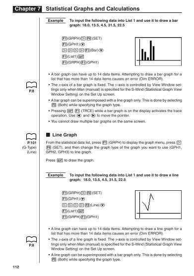
Example To input the following data into List 1 and use it to draw a bargraph: 18.0, 13.5, 4.5, 31.5, 22.5
1(GRPH)[4(SET)
1(GPH1)c
[[[[1(Bar)c
1(List1)Q
1(GRPH)1(GPH1)
• A bar graph can have up to 14 data items. Attempting to draw a bar graph for alist that has more than 14 data items causes an error (Dim ERROR).
• The x-axis of a bar graph is fixed. The y-axis is controlled by View Window set-tings only when Man (manual) is specified for the S-Wind (Statistical Graph ViewWindow Setting) on the Set Up screen.
• A bar graph can be superimposed with a line graph only. This is done by selecting3 (Both) while specifying the graph type.
• Pressing ! 1 (TRCE) while a bar graph is on the display activates the traceoperation. Use d and e to move the pointer.
• You cannot draw multiple bar graphs on the same screen.
kkkkk Line Graph
From the statistical data list, press 1 (GRPH) to display the graph menu, press [4 (SET), and then change the graph type of the graph you want to use (GPH1,GPH2, GPH3) to line graph.
Press Q to draw the graph.
Example To input the following data into List 1 and use it to draw a linegraph: 18.0, 13.5, 4.5, 31.5, 22.5
1(GRPH)[4(SET)
1(GPH1)c
[[[[2(Line)c
1(List1)Q
1(GRPH)1(GPH1)
• A line graph can have up to 14 data items. Attempting to draw a line graph for alist that has more than 14 data items causes an error (Dim ERROR).
• The x-axis of a line graph is fixed. The y-axis is controlled by View Window set-tings only when Man (manual) is specified for the S-Wind (Statistical Graph ViewWindow Setting) on the Set Up screen.
• A line graph can be superimposed with a bar graph only. This is done by selecting3 (Both) while specifying the graph type.
P.8
P.8
P.101(G-Type)
(Line)
113
Statistical Graphs and Calculations Chapter 7
• Pressing ! 1 (TRCE) while a line graph is on the display activates the traceoperation. Use d and e to move the pointer.
• You cannot draw multiple line graphs on the same screen.
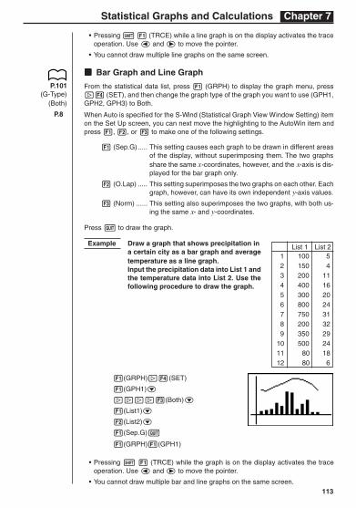
kkkkk Bar Graph and Line Graph
From the statistical data list, press 1 (GRPH) to display the graph menu, press[4 (SET), and then change the graph type of the graph you want to use (GPH1,GPH2, GPH3) to Both.
When Auto is specified for the S-Wind (Statistical Graph View Window Setting) itemon the Set Up screen, you can next move the highlighting to the AutoWin item andpress 1, 2, or 3 to make one of the following settings.
1 (Sep.G) ..... This setting causes each graph to be drawn in different areasof the display, without superimposing them. The two graphsshare the same x-coordinates, however, and the x-axis is dis-played for the bar graph only.
2 (O.Lap) ..... This setting superimposes the two graphs on each other. Eachgraph, however, can have its own independent y-axis values.
3 (Norm) ...... This setting also superimposes the two graphs, with both us-ing the same x- and y-coordinates.
Press Q to draw the graph.
Example Draw a graph that shows precipitation ina certain city as a bar graph and averagetemperature as a line graph.Input the precipitation data into List 1 andthe temperature data into List 2. Use thefollowing procedure to draw the graph.
1(GRPH)[4(SET)
1(GPH1)c
[[[[3(Both)c
1(List1)c
2(List2)c
1(Sep.G)Q
1(GRPH)1(GPH1)
• Pressing ! 1 (TRCE) while the graph is on the display activates the traceoperation. Use d and e to move the pointer.
• You cannot draw multiple bar and line graphs on the same screen.
List 1 List 21 100 52 150 43 200 114 400 165 300 206 800 247 750 318 200 329 350 29
10 500 2411 80 1812 80 6
P.101(G-Type)
(Both)
P.8
114
Chapter 7 Statistical Graphs and Calculations
4. Calculating and Graphing Paired-Variable Statistical Data
Under “Plotting a Scatter Diagram,” we displayed a scatter diagram and then per-formed a logarithmic regression calculation. Let’s use the same procedure to look atthe six regression functions.
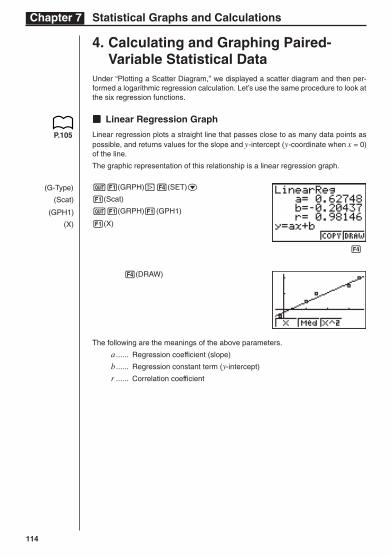
kkkkk Linear Regression Graph
Linear regression plots a straight line that passes close to as many data points aspossible, and returns values for the slope and y-intercept (y-coordinate when x = 0)of the line.
The graphic representation of this relationship is a linear regression graph.
Q1(GRPH)[4(SET)c
1(Scat)
Q1(GRPH)1(GPH1)
1(X)
4(DRAW)
The following are the meanings of the above parameters.
a ...... Regression coefficient (slope)
b ...... Regression constant term (y-intercept)
r ...... Correlation coefficient
(G-Type)
(Scat)
(GPH1)
(X)
P.105
1 2 3 4
115
Statistical Graphs and Calculations Chapter 7
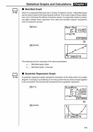
kkkkk Med-Med Graph
When it is suspected that there are a number of extreme values, a Med-Med graphcan be used in place of the least squares method. This is also a type of linear regres-sion, but it minimizes the effects of extreme values. It is especially useful in produc-ing highly reliable linear regression from data that includes irregular fluctuations,such as seasonal surveys.
2(Med)
4(DRAW)
The following are the meanings of the above parameters.
a ...... Med-Med graph slope
b ...... Med-Med graph y-intercept
kkkkk Quadratic Regression Graph
A quadratic regression graph represents connection of the data points of a scatterdiagram. It actually is a scattering of so many points that are close enough togetherto be connected. The formula that represents this is quadratic regression.
3(X^2)
4(DRAW)
P.105
1 2 3 4
1 2 3 4
P.105
116
Chapter 7 Statistical Graphs and Calculations
The following are the meanings of the above parameters.
a ...... Regression second coefficient
b ...... Regression first coefficient
c ...... Regression constant term (y-intercept)
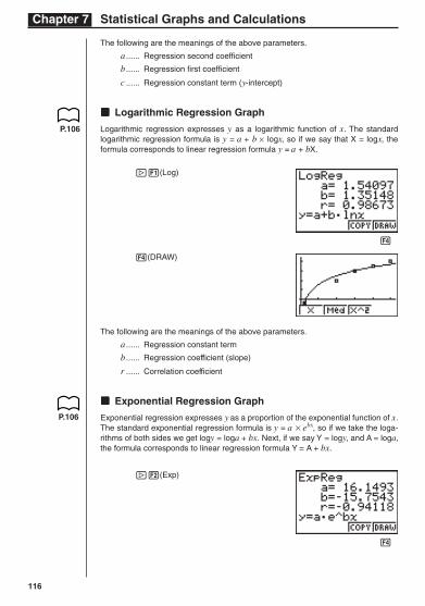
kkkkk Logarithmic Regression Graph
Logarithmic regression expresses y as a logarithmic function of x. The standardlogarithmic regression formula is y = a + b × logx, so if we say that X = logx, theformula corresponds to linear regression formula y = a + bX.
[1(Log)
4(DRAW)
The following are the meanings of the above parameters.
a ...... Regression constant term
b ...... Regression coefficient (slope)
r ...... Correlation coefficient
kkkkk Exponential Regression Graph
Exponential regression expresses y as a proportion of the exponential function of x.The standard exponential regression formula is y = a × ebx, so if we take the loga-rithms of both sides we get logy = loga + bx. Next, if we say Y = logy, and A = loga,the formula corresponds to linear regression formula Y = A + bx.
[2(Exp)
P.106
1 2 3 4
1 2 3 4
P.106
117
Statistical Graphs and Calculations Chapter 7
4(DRAW)
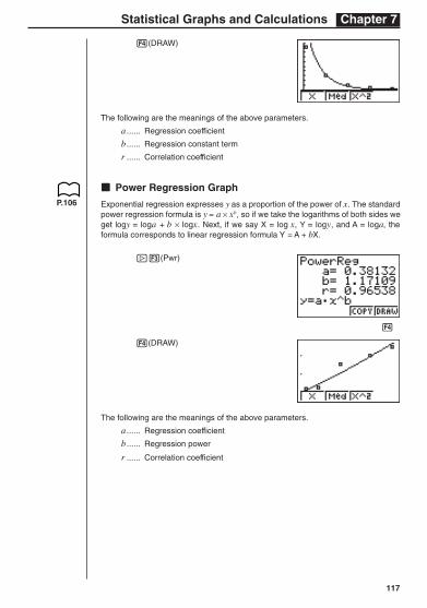
The following are the meanings of the above parameters.
a ...... Regression coefficient
b ...... Regression constant term
r ...... Correlation coefficient
kkkkk Power Regression Graph
Exponential regression expresses y as a proportion of the power of x. The standardpower regression formula is y = a × xb, so if we take the logarithms of both sides weget logy = loga + b × logx. Next, if we say X = log x, Y = logy, and A = loga, theformula corresponds to linear regression formula Y = A + bX.
[3(Pwr)
4(DRAW)
The following are the meanings of the above parameters.
a ...... Regression coefficient
b ...... Regression power
r ...... Correlation coefficient
P.106
1 2 3 4
118
Chapter 7 Statistical Graphs and Calculations
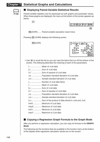
kkkkk Displaying Paired-Variable Statistical Results
Paired-variable statistics can be expressed as both graphs and parameter values.When these graphs are displayed, the menu at the bottom of the screen appears asbelow.
[
4(2VAR) ....... Paired-variable calculation result menu
Pressing 4 (2VAR) displays the following screen.
4(2VAR)
• Use c to scroll the list so you can view the items that run off the bottom of thescreen. The following describes the meaning of each of the parameters.
_x ...................... Mean of xList data
Σx .................... Sum of xList data
Σx2 .................. Sum of squares of xList data
xσn .................. Population standard deviation of xList data
xσn-1 ................ Sample standard deviation of xList data
n ...................... Number of xList data items_y ...................... Mean of yList data
Σy .................... Sum of yList data
Σy2 .................. Sum of squares of yList data
yσn .................. Population standard deviation of yList data
yσn-1 ................ Sample standard deviation of yList data
Σxy .................. Sum of the product of data stored in xList and yList
minX................ Minimum of xList data
maxX............... Maximum of xList data
minY................ Minimum of yList data
maxY............... Maximum of yList data
kkkkk Copying a Regression Graph Formula to the Graph Mode
After you perform a regression calculation, you can copy its formula to the GRAPHMode.
The following are the functions that are available in the function menu at the bottomof the display while regression calculation results are on the screen.
P.106
1 2 3 4
119
Statistical Graphs and Calculations Chapter 7
3 (COPY) ..... Stores the displayed regression formula to the GRAPH Mode
4 (DRAW) .... Graphs the displayed regression formula
1. Press 3 (COPY) to copy the regression formula that produced the displayeddata to the GRAPH Mode.
3(COPY)
Note that you cannot edit regression formulas for graph formulas in the GRAPHMode.
2. Press w to save the copied graph formula and return to the previous regressioncalculation result display.
kkkkk Multiple Graphs
You can draw more than one graph on the same display by using the procedureunder “Changing Graph Parameters” to set the graph draw (On)/non-draw (Off) sta-tus of two or all three of the graphs to draw (On), and then pressing 4 (DRAW).After drawing the graphs, you can select which graph formula to use when perform-ing single-variable statistic or regression calculations.
4(DRAW)
1(X)
P.98
1 2 3 4
P.105
1 2 3 4
120
Chapter 7 Statistical Graphs and Calculations
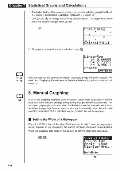
• The text at the top of the screen indicates the currently selected graph (StatGraph1 = Graph 1, StatGraph 2 = Graph 2, StatGraph 3 = Graph 3).
1. Use f and c to change the currently selected graph. The graph name at thetop of the screen changes when you do.
c
2. When graph you want to use is selected, press w.
Now you can use the procedures under “Displaying Single-Variable Statistical Re-sults” and “Displaying Paired-Variable Statistical Results” to perform statistical cal-culations.
5. Manual GraphingIn all of the graphing examples up to this point, values were calculated in accord-ance with View Window settings and graphing was performed automatically. Thisautomatic graphing is performed when the S-Wind item of the View Window is set to“Auto” (auto graphing). You can also produce graphs manually, when the automaticgraphing capabilities of this calculator cannot produce the results you want.
kkkkk Setting the Width of a Histogram
When the S-Wind item of the View Window is set to “Man” (manual graphing), ascreen appears so you can specify the starting point and spacing of histogram bars.
While the statistical data list is on the display, perform the following procedure.
!Z
P.108P.118
P.8
1 2 3 4
121
Statistical Graphs and Calculations Chapter 7
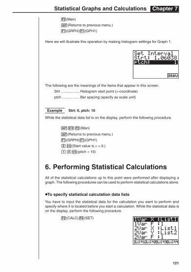
2(Man)
Q(Returns to previous menu.)
1(GRPH)1(GPH1)
Here we will illustrate this operation by making histogram settings for Graph 1.
The following are the meanings of the items that appear in this screen.
Strt .................. Histogram start point (x-coordinate)
ptch ................. Bar spacing (specify as scale unit)
Example Strt: 0, ptch: 10
While the statistical data list is on the display, perform the following procedure.
!Z2(Man)
Q(Returns to previous menu.)
1(GRPH)1(GPH1)
aw(Start value is x = 0.)
baw(pitch = 10)
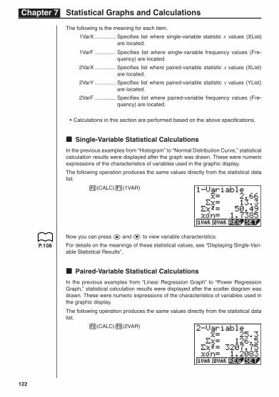
6. Performing Statistical CalculationsAll of the statistical calculations up to this point were performed after displaying agraph. The following procedures can be used to perform statistical calculations alone.
uuuuuTo specify statistical calculation data lists
You have to input the statistical data for the calculation you want to perform andspecify where it is located before you start a calculation. While the statistical data ison the display, perform the following procedure.
2(CALC)4(SET)
122
Chapter 7 Statistical Graphs and Calculations
The following is the meaning for each item.
1VarX .............. Specifies list where single-variable statistic x values (XList)are located.
1VarF .............. Specifies list where single-variable frequency values (Fre-quency) are located.
2VarX .............. Specifies list where paired-variable statistic x values (XList)are located.
2VarY .............. Specifies list where paired-variable statistic y values (YList)are located.
2VarF .............. Specifies list where paired-variable frequency values (Fre-quency) are located.
• Calculations in this section are performed based on the above specifications.
kkkkk Single-Variable Statistical Calculations
In the previous examples from “Histogram” to “Normal Distribution Curve,” statisticalcalculation results were displayed after the graph was drawn. These were numericexpressions of the characteristics of variables used in the graphic display.
The following operation produces the same values directly from the statistical datalist.
2(CALC)1(1VAR)
Now you can press f and c to view variable characteristics.
For details on the meanings of these statistical values, see “Displaying Single-Vari-able Statistical Results”.
kkkkk Paired-Variable Statistical Calculations
In the previous examples from “Linear Regression Graph” to “Power RegressionGraph,” statistical calculation results were displayed after the scatter diagram wasdrawn. These were numeric expressions of the characteristics of variables used inthe graphic display.
The following operation produces the same values directly from the statistical datalist.
2(CALC)2(2VAR)
P.108
123
Statistical Graphs and Calculations Chapter 7
P.118
Now you can press f and c to view variable characteristics.
For details on the meanings of these statistical values, see “Displaying Paired-Vari-able Statistical Results”.
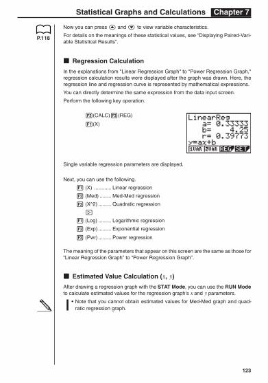
kkkkk Regression Calculation
In the explanations from "Linear Regression Graph" to "Power Regression Graph,"regression calculation results were displayed after the graph was drawn. Here, theregression line and regression curve is represented by mathematical expressions.
You can directly determine the same expression from the data input screen.
Perform the following key operation.
2(CALC)3(REG)
1(X)
Single variable regression parameters are displayed.
Next, you can use the following.
1 (X) ............ Linear regression
2 (Med) ........ Med-Med regression
3 (X^2) ......... Quadratic regression
[
1 (Log) ......... Logarithmic regression
2 (Exp) ......... Exponential regression
3 (Pwr) ......... Power regression
The meaning of the parameters that appear on this screen are the same as those for“Linear Regression Graph” to “Power Regression Graph”.
kkkkk Estimated Value Calculation ( , )
After drawing a regression graph with the STAT Mode, you can use the RUN Modeto calculate estimated values for the regression graph's x and y parameters.
• Note that you cannot obtain estimated values for Med-Med graph and quad-ratic regression graph.
124
Chapter 7 Statistical Graphs and Calculations
(G-Type)
(Scat)
(XList)
(YList)
(Freq)
(M-Type)
(Auto)
(Pwr)
1 2 3 4
Example To perform power regression using the following data andestimate the values of and when xi = 40 and yi = 1000
xi (List 1) yi (List 2)28 2410
30 3033
33 3895
35 449138 5717
1. In the Main Menu, select the STAT icon and enter the STAT Mode.
2. Input data into the list and draw the power regression graph.
1(GRPH)[4(SET)c
1(Scat)c
1(List1)c
2(List2)c
1(1)c
1( )Q
!Z1(Auto)Q1(GRPH)1(GPH1)[
3(Pwr)4(DRAW)
3. In the Main Menu, select the RUN icon and enter the RUN Mode.
4. Press the keys as follows.
ea(value of xi)
K3(STAT)2( )w
The estimated value is displayed for xi = 40.
baaa(value of yi)
1( )w
The estimated value is displayed for yi = 1000.
Recommended