Spatial Statistics in Ecology: Case Studies
Lecture Five

Case Studies
• In this lecture we use the spatial approaches we have learned up till now but ask specific questions ecologists might ask
• This will be done at 5 levels of analysis: the same levels that I introduced during Lecture One
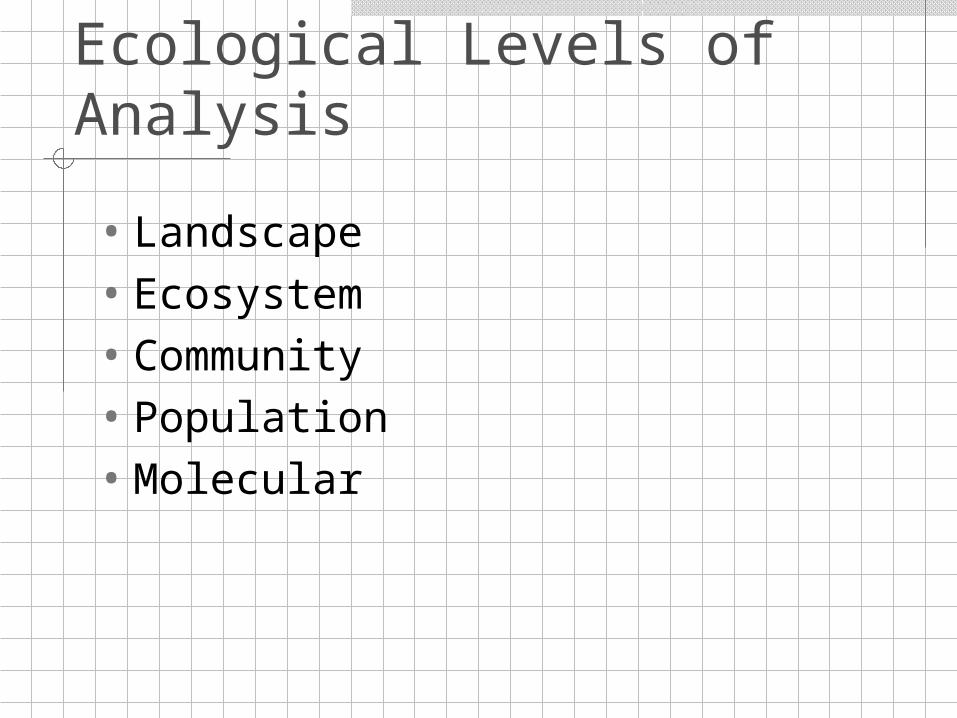
Ecological Levels of Analysis
• Landscape• Ecosystem• Community• Population• Molecular
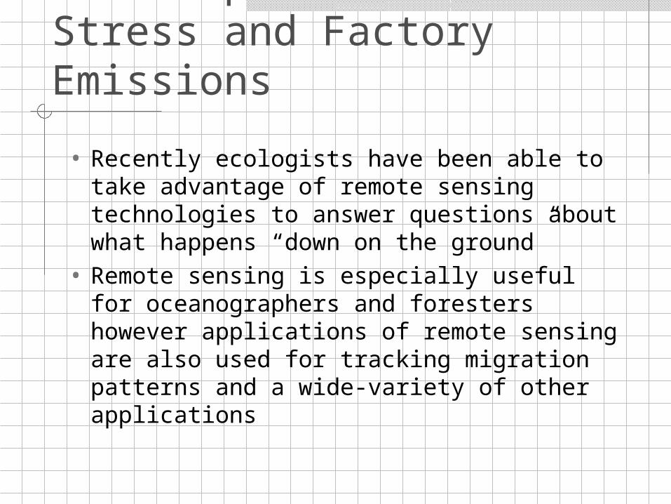
Landscape Level: Plant Stress and Factory Emissions
• Recently ecologists have been able to take advantage of remote sensing technologies to answer questions about what happens “down on the ground”
• Remote sensing is especially useful for oceanographers and foresters however applications of remote sensing are also used for tracking migration patterns and a wide-variety of other applications
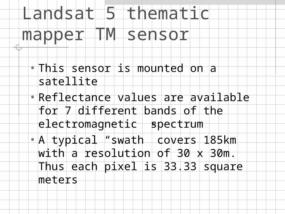
Landsat 5 thematic mapper TM sensor
• This sensor is mounted on a satellite
• Reflectance values are available for 7 different bands of the electromagnetic spectrum
• A typical “swath” covers 185km with a resolution of 30 x 30m. Thus each pixel is 33.33 square meters
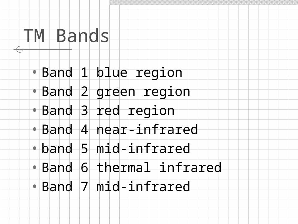
TM Bands
• Band 1 blue region• Band 2 green region• Band 3 red region• Band 4 near-infrared• band 5 mid-infrared• Band 6 thermal infrared• Band 7 mid-infrared
Bands: what can they tell us?
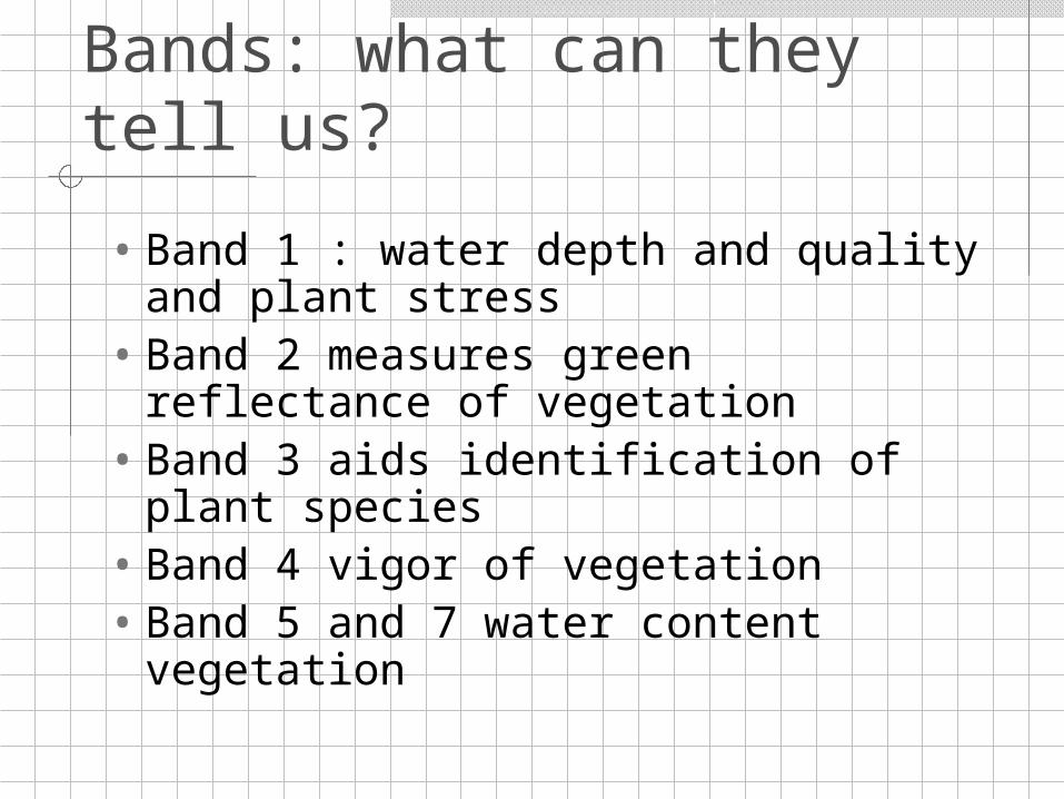
• Band 1 : water depth and quality and plant stress
• Band 2 measures green reflectance of vegetation
• Band 3 aids identification of plant species
• Band 4 vigor of vegetation• Band 5 and 7 water content
vegetation
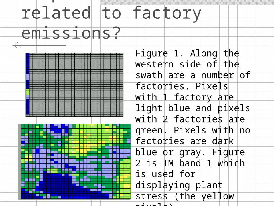
Is plant stress related to factory emissions?
Figure 1. Along the western side of the swath are a number of factories. Pixels with 1 factory are light blue and pixels with 2 factories are green. Pixels with no factories are dark blue or gray. Figure 2 is TM band 1 which is used for displaying plant stress (the yellow pixels).
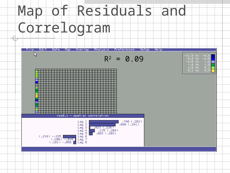
Map of Residuals and Correlogram
R2 = 0.09
Landscape Level: Rainfall patterns
• Rainfall patterns are very important in the Sudan as the area faces some of the most severe population pressures in the region. The intensity of crop cultivation is considerable and coupled with limited rainfall, desertification has spread throughout the country. This data set looks at the spatial variability of precipitation.
• The problem is to describe the spatial variation and make predictions for areas which have no monitoring stations.
Questions
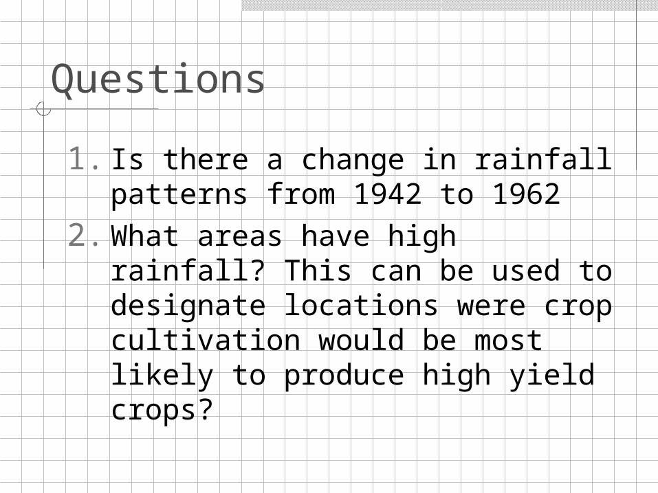
1. Is there a change in rainfall patterns from 1942 to 1962
2. What areas have high rainfall? This can be used to designate locations were crop cultivation would be most likely to produce high yield crops?
Rainfall in Sudan: Change in Rainfall Patterns?
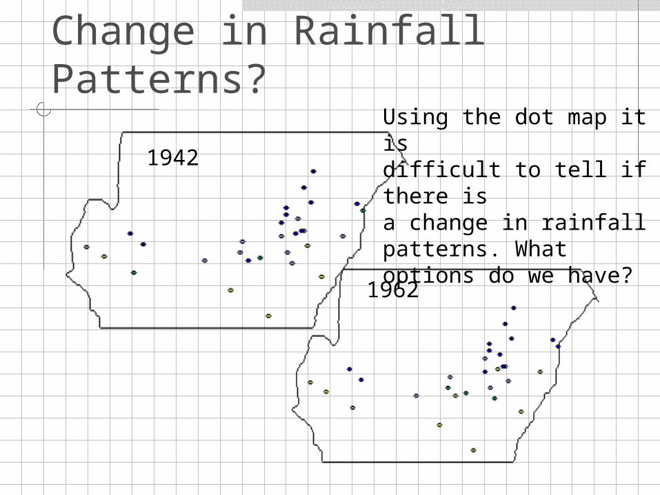
1942
1962
Using the dot map it is difficult to tell if there isa change in rainfall patterns. What options do we have?
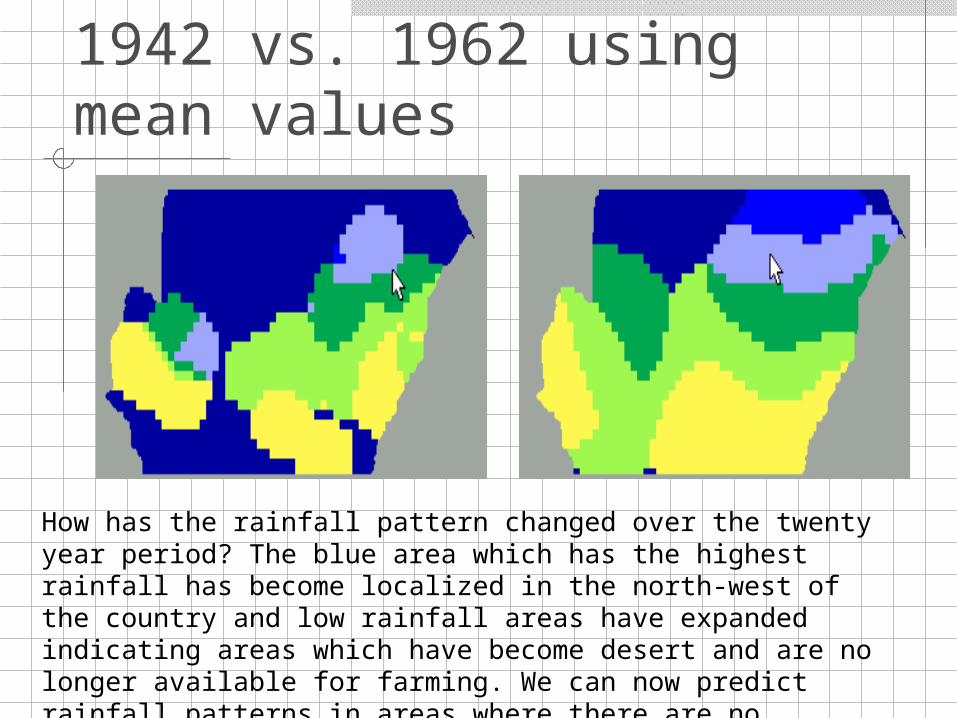
Kernel Estimation: 1942 vs. 1962 using mean values
How has the rainfall pattern changed over the twenty year period? The blue area which has the highest rainfall has become localized in the north-west of the country and low rainfall areas have expanded indicating areas which have become desert and are no longer available for farming. We can now predict rainfall patterns in areas where there are no monitoring stations.
Ecosystem Ecology Level: PCB’s in Soil
This data contains information about pollution levels in soil samples. There are many possible risks from contamination by polychlorinated biphenyl (in this case from incineration from chemical waste). The local ecological society is worried that PCB’s are escaping in the surrounding environment contaminating soil and vegetation. Data from 70 sites within an area of km are included.
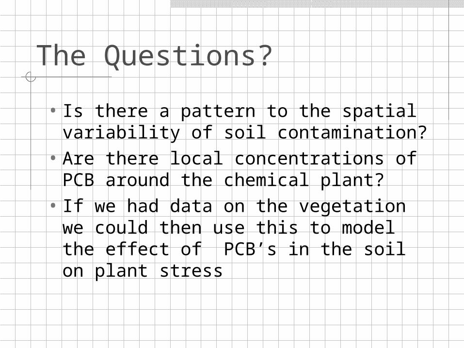
The Questions?
• Is there a pattern to the spatial variability of soil contamination?
• Are there local concentrations of PCB around the chemical plant?
• If we had data on the vegetation we could then use this to model the effect of PCB’s in the soil on plant stress
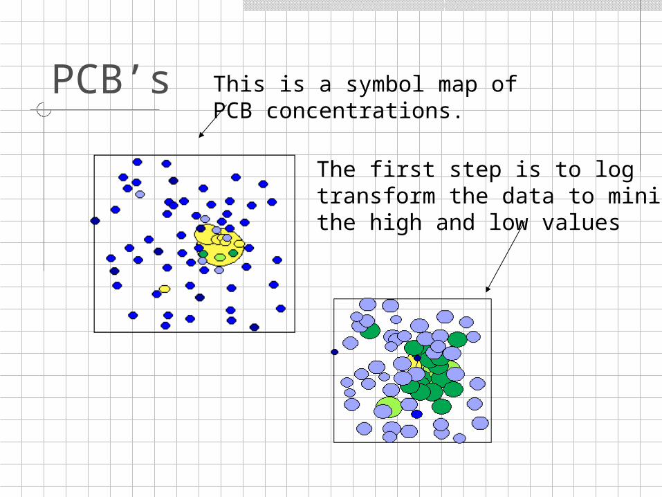
PCB’s This is a symbol map ofPCB concentrations.
The first step is to logtransform the data to minimizethe high and low values
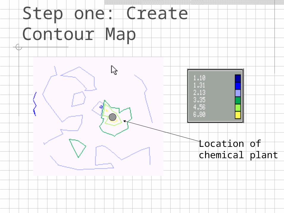
Step one: Create Contour Map
Location of chemical plant
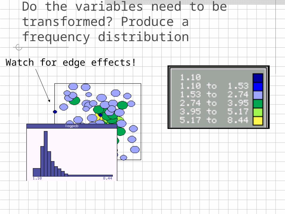
Do the variables need to be transformed? Produce a frequency distribution
Watch for edge effects!
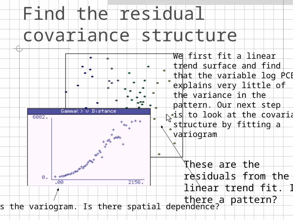
Find the residual covariance structure
We first fit a linear trend surface and findthat the variable log PCBexplains very little of the variance in the pattern. Our next step is to look at the covariancestructure by fitting avariogram
These are the residuals from thelinear trend fit. Isthere a pattern?
This is the variogram. Is there spatial dependence?
Community Level: Distribution of fish along a depth gradient
• In community ecology we are often interested in the distribution of biotic variables (in this case abundance of fish) and how environmental conditions (in this case depth) relate to distribution patterns.
• Can we predict how many individuals there will be in sections of our lake based on depth?
• Are depth and abundance related?• What is the spatial dependence of fish
distribution?
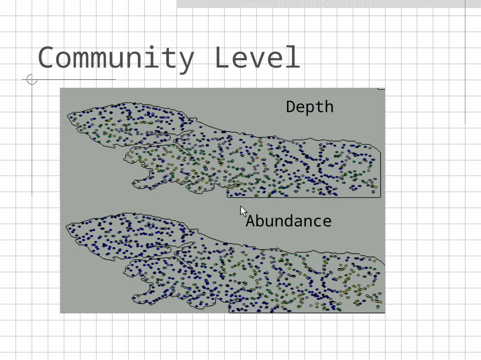
Community Level
Depth
Abundance
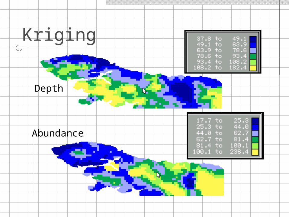
Kriging
Abundance
Depth
Is there a relationship?
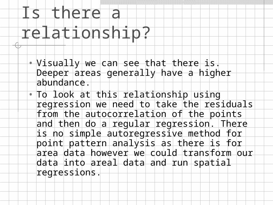
• Visually we can see that there is. Deeper areas generally have a higher abundance.
• To look at this relationship using regression we need to take the residuals from the autocorrelation of the points and then do a regular regression. There is no simple autoregressive method for point pattern analysis as there is for area data however we could transform our data into areal data and run spatial regressions.
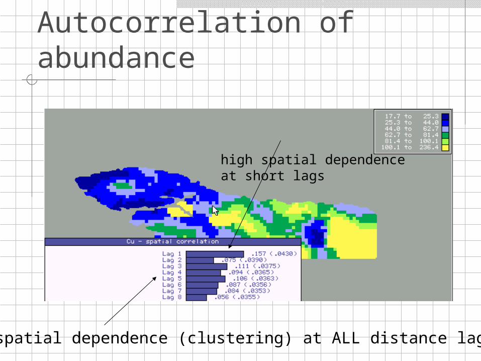
Autocorrelation of abundance
high spatial dependenceat short lags
spatial dependence (clustering) at ALL distance lags
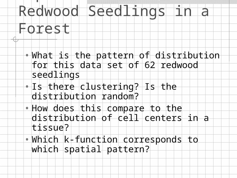
Population Level: Redwood Seedlings in a Forest
• What is the pattern of distribution for this data set of 62 redwood seedlings
• Is there clustering? Is the distribution random?
• How does this compare to the distribution of cell centers in a tissue?
• Which k-function corresponds to which spatial pattern?
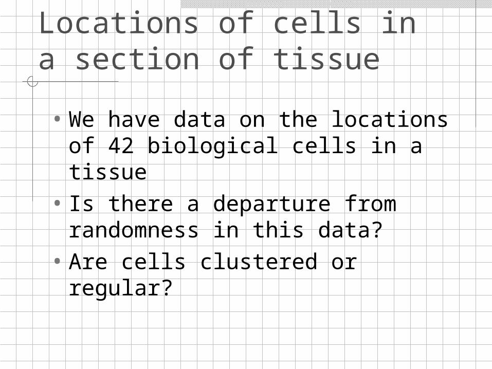
Molecular Level: Locations of cells in a section of tissue
• We have data on the locations of 42 biological cells in a tissue
• Is there a departure from randomness in this data?
• Are cells clustered or regular?
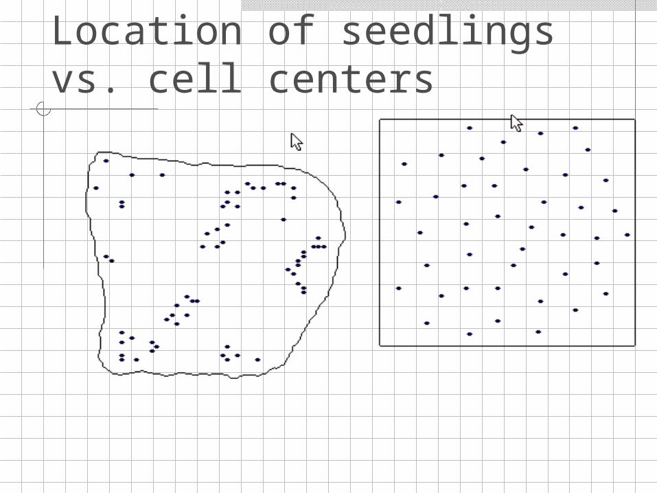
Location of seedlings vs. cell centers
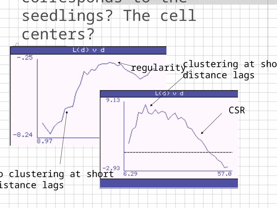
Which K-function corresponds to the seedlings? The cell centers?
clustering at shortdistance lags
CSR
no clustering at shortdistance lags
regularity
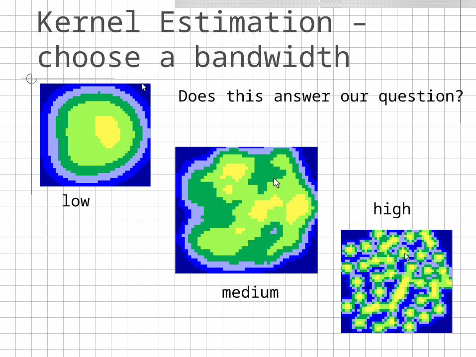
Kernel Estimation – choose a bandwidth
low
medium
high
Does this answer our question?
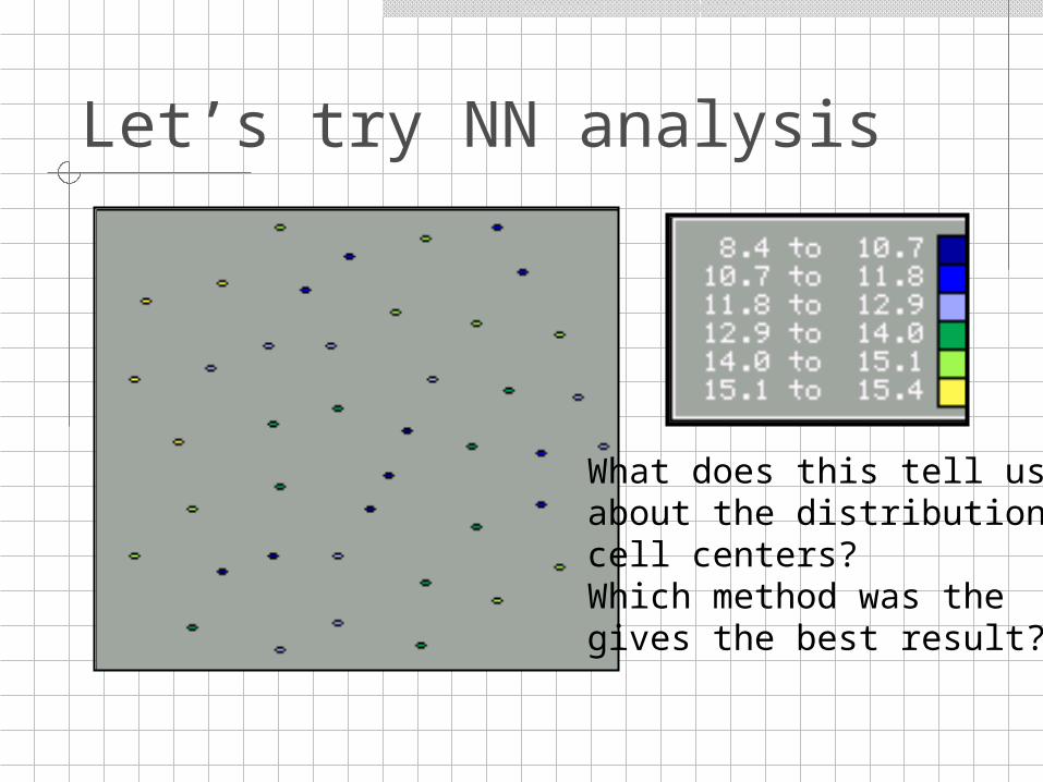
Let’s try NN analysis
What does this tell usabout the distribution ofcell centers?Which method was the gives the best result?
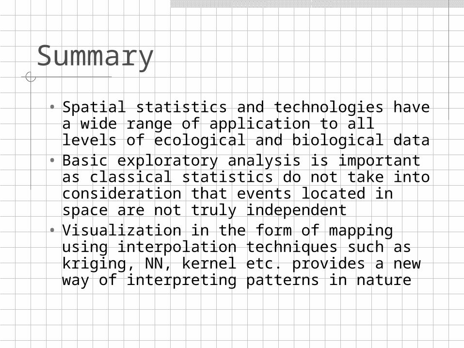
Summary
• Spatial statistics and technologies have a wide range of application to all levels of ecological and biological data
• Basic exploratory analysis is important as classical statistics do not take into consideration that events located in space are not truly independent
• Visualization in the form of mapping using interpolation techniques such as kriging, NN, kernel etc. provides a new way of interpreting patterns in nature
Recommended