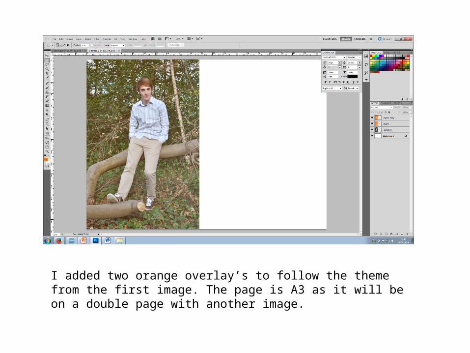
I added two orange overlay’s to follow the theme from the first image. The page is A3 as it will be on a double page with another image.
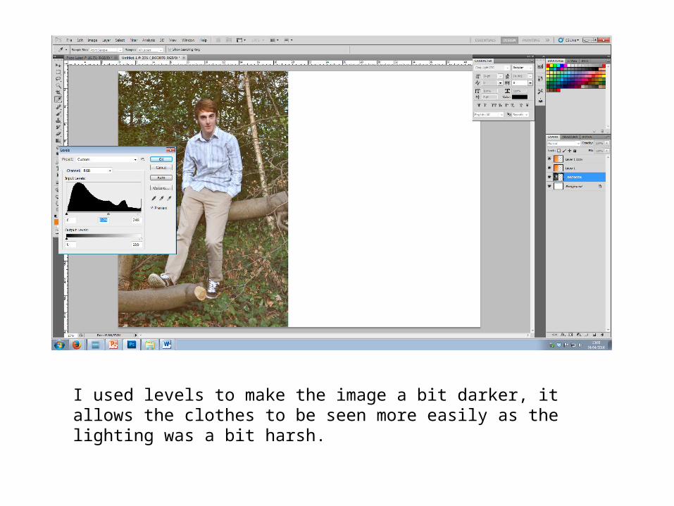
I used levels to make the image a bit darker, it allows the clothes to be seen more easily as the lighting was a bit harsh.
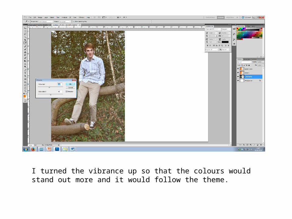
I turned the vibrance up so that the colours would stand out more and it would follow the theme.
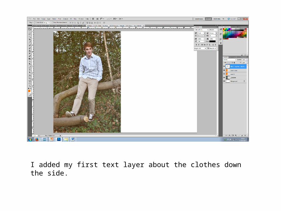
I added my first text layer about the clothes down the side.
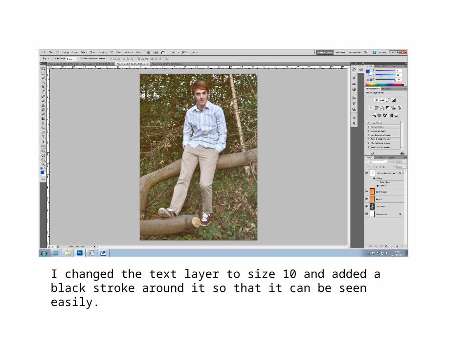
I changed the text layer to size 10 and added a black stroke around it so that it can be seen easily.
Recommended