578The Reading Teacher, 64(8), pp. 578–589 © 2011 International Reading AssociationDOI:10.1598/RT.64.8.3 ISSN: 0034-0561 print / 1936-2714 online
Science Visual Literacy: Learners’ Perceptions and Knowledge of DiagramsErin M. McTigue, Amanda C. Flowers
Constructing meaning from science texts re-lies on comprehending not only the words of science but also the visuals. In our experi-
ence, students often face comprehension challenges with graphics—particularly when reading modern, nonlinear, highly visual texts. The following dialog between Erin (first author) and Charles (all student names are pseudonyms) gives insight into one fourth grader’s confusion with a common science diagram; however, Charles’s misinterpretations are representa-tive of many that we have observed.
Erin (teacher): [referring to water cycle diagram depicted
in Figure 1B] Why are there arrows in the diagram? [points to arrows representing flow of water]
Charles (fourth grader): To show the mountain, the pointy part of it.
To show the stream.
Erin: So…the arrows are pointing to the moun-tain and the stream?
Charles: Yeah.
Erin: Do you mean that the arrows are there to make us look at those parts more?
Charles: Yeah—’cause they’re important.
Erin: What about these three arrows? [points to arrows showing evaporation] What are these arrows going up trying to show us?
Charles: They point to the little bit of the bottom of the mountain, and this one here points to the little wood part of the mountain.
Erin: OK. Do you think those are important parts to point out?
Charles: Yeah.
Erin: What do the arrows going down here show us? [points at arrows that indicate rain]
Charles: They show right there, that it is a dark cave.
Erin: Hmm…this is a water cycle diagram…is a cave part of the water cycle?
Charles: Probably not.
Erin: Yeah, probably not…even though it is hard to see, I’m pretty sure that it is supposed to be a dark rain cloud, not a cave. It’s a very dark cloud.
Charles: Oh…OK.
Erin: Well, what are these dark areas then? [points to the gray clouds above the rain storm]
Charles: Those are like rocks. Rocks that are over here with the stream. Right here are the mountains and the rocks.
In this dialogue, misinterpretations often inter-fered with understanding essential scientific con-cepts and reaffirmed misconceptions. Charles’s belief that arrows always point out items of interest interfered with grasping the main idea about water movement and transformation. Similarly, by inter-preting the dark cloud as being a cave and rocks, Charles missed a critical link of precipitation. He also did not self-monitor his “reading” of the diagram; he simply moved along without pausing to wonder why a cave would be in a water cycle diagram.
Diagrams found in science texts can be complex repositories of meaning, and students benefit from instruction in how to unlock them.
579Science Visual Literacy: Learners’ Perceptions and Knowledge of Diagrams
Even when queried about this curi-ous cave, he seemed unconcerned. Charles typically excelled in read-ing comprehension, but he did not seem to apply such skills to diagram comprehension.
Rationale for Studying Science Visual LiteracyTo prepare our students for reading science texts, we routinely taught text structures, formatting, and tech-nical vocabulary, but we rarely spent time teaching about science graph-ics. Possibly stemming from our inat-tention to visuals during lessons, our students relied on the running text and spent minimal time examining diagrams and other visuals. This led us to question if they understood the purpose of diagrams in science texts. We also won-dered what they considered to be a useful graphic.
The goal of this exploratory study was to better understand elementary students’ perceptions of sci-ence diagrams and their skills related to diagram in-terpretation (i.e., diagrammatic literacy; Stern, Aprea, & Ebner, 2003). In this article, we present relevant research and then summarize the methodology and results. Finally, we interpret our results and provide instructional recommendations for teaching students about the visuals of science texts.
Why Is It Essential to Learn How to Read Science Graphics?Graphics are used extensively today for communicat-ing information, including within science journals, textbooks, trade books, and online sources (e.g., Bowen & Roth, 2002; Leu, Kinzer, Coiro, & Cammack, 2004; Roth, Pozzer-Ardenghi, & Han, 2005; Walpole, 1999), so it is paramount to prepare students accord-ingly. By 2002, science journals and high school sci-ence texts averaged 1.46 and 1.38 graphics per page, respectively (Bowen & Roth, 2002).
In addition to recent increases in the frequency of science graphics, there is also greater variety. An analysis of sixth-grade science textbooks (Slough, McTigue, Kim, & Jennings, 2010) found that 12
distinct categories of graphics were used (e.g., map, flowchart), as well as numerous complex hybrid forms (e.g., an ocean map showing both currents and temperature gradients).
Texts offer little support to deci-pher such complex graphics. In the examined sixth-grade textbooks, 19% of graphics had no captions or labels and 39% had only a label that identified the target but gave no explanation (Slough et al., 2010). Additionally, students need diagram-matic literacy to succeed on high-stakes tests. In an analysis of U.S. state science tests from grades 4–8, more than half of the questions in-cluded graphical representations, and 80% of those graphics con-tained essential information (Yeh & McTigue, 2009). In other words, if students could not accurately de-code graphics, they would struggle
with 40% of the test items on high-stakes science tests.
Do Science Graphics Help Students’ Reading Comprehension?Unfortunately, research in this area is fraught with contradictions. Hannus and Hyona (1999), Harber (1983), and Reid and Beveridge (1986, 1990) found that diagrams differentially benefited high-ability stu-dents and had negative effects for low-ability students. However, Koran and Koran (1980) found the con-verse pattern, and a meta-analysis by Levie and Lentz (1982) supported Koran and Koran’s conclusion. More recently, we found that sixth-grade students’ reading comprehension improved by having a supporting diagram depicting a bacteria’s life cycle; however, the same students’ comprehension did not improve from a similar diagram of an engine (McTigue, 2009).
In conclusion, graphics have the potential to dramatically enhance science learning, but this improvement is seen more consistently with adult learners (e.g., Mayer, 2001). Accordingly, graphics re-searcher Peeck (1994) cautioned, there is “reason to fear that in actual educational practice, the benefits of text illustrations will often be disappointing due to students’ superficial or otherwise inadequate pro-cessing of the graphics concerned” (p. 291).
PAUSE AND PONDER
■ Where in your current curriculum do students gain skills needed for visual literacy?
■ How are visuals used in the texts that your students are using? Are they integral to comprehending the text?
■ Research indicates that students entering college are better consumers rather than producers, of visual literacy—in other words, they are more skilled at reading visuals than making visuals. How do K–12 school practices contribute to that?
580 The Reading Teacher Vol. 64, No. 8 May 2011
In short, although graphics can provide important in-formation, they can also add complexity to the task of comprehension. The complexity of these steps may explain why there have been conflicting find-ings in studies with students and graphics—particu-larly if students are still decoding words.
Doesn’t Informational Reading in Younger Grades Naturally Teach Interpretation of Graphics?Use of science books in early elementary grades has gained recent momentum, particularly since Duke’s (2000) influential study that documented a lack of informational texts at this level. Although increased
Why Is Reading Science Graphics So Complicated?According to Hannus and Hyona (1999), the chal-lenge of reading an illustrated science text derives from the levels of decision making. Students must
■ Comprehend concepts from the text and illustrations
■ Decide in what order the pictures and text should be studied
■ Judge the pertinent and superfluous informa-tion in the texts and illustrations
■ Determine which pieces of information from the text and graphic are related
■ Integrate the related pieces of information.
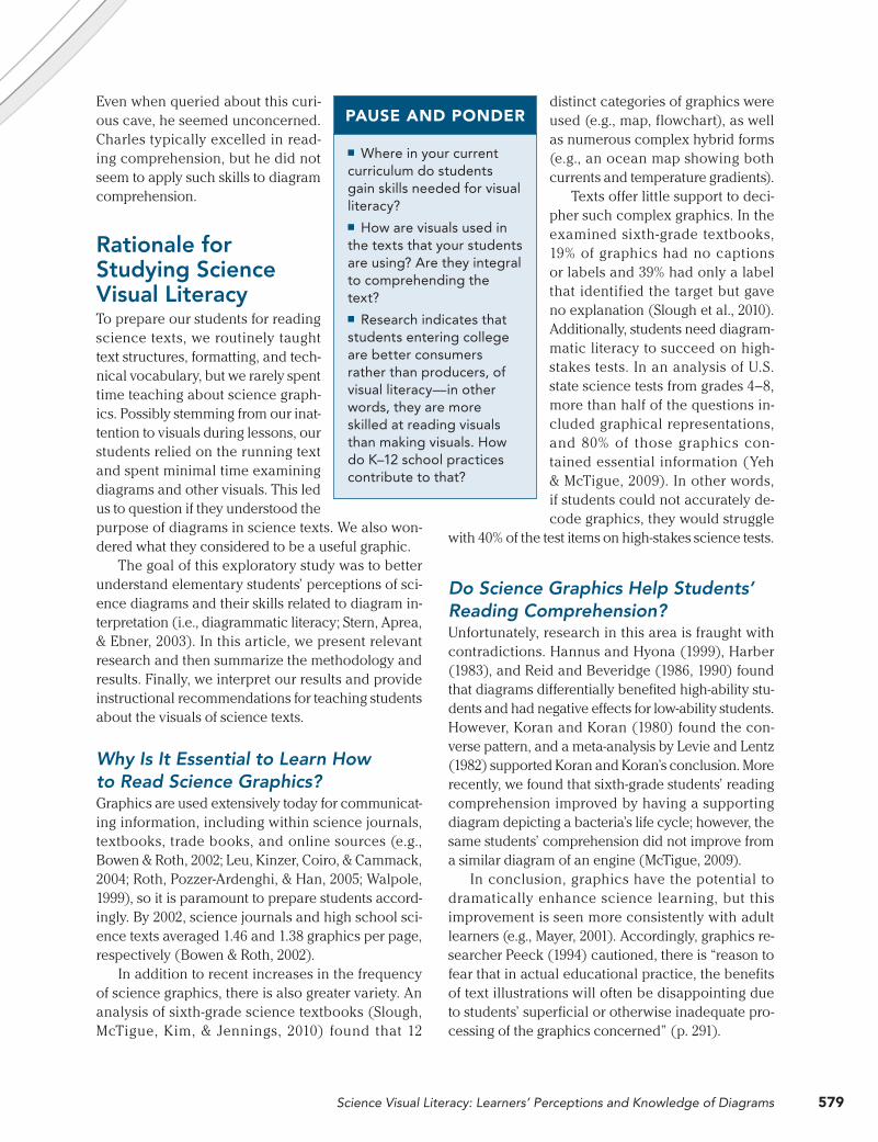
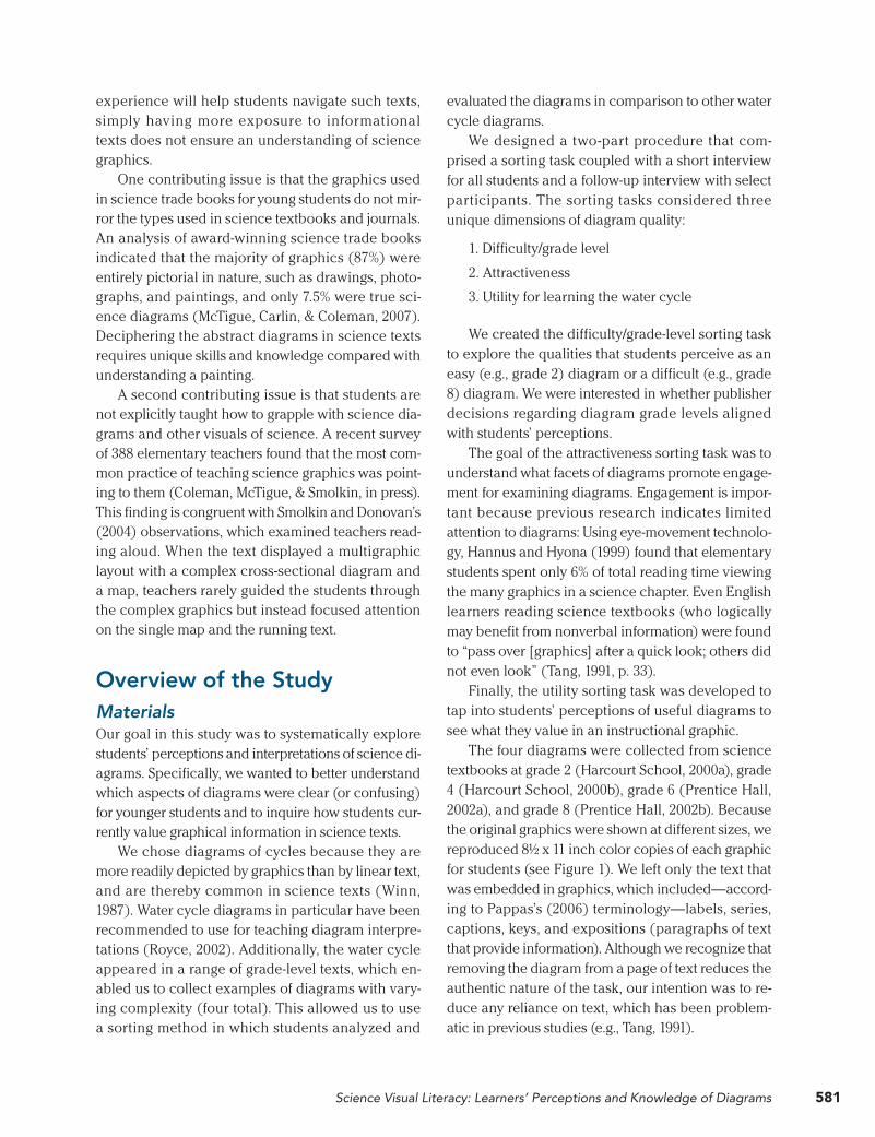
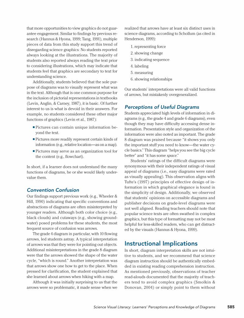
Figure 1 Water Cycle Diagrams in Grades 2, 4, 6, and 8 Textbooks
D. Grade 8 textbook
A. Grade 2 textbook B. Grade 4 textbook
C. Grade 6 textbook
581Science Visual Literacy: Learners’ Perceptions and Knowledge of Diagrams
evaluated the diagrams in comparison to other water cycle diagrams.
We designed a two-part procedure that com-prised a sorting task coupled with a short interview for all students and a follow-up interview with select participants. The sorting tasks considered three unique dimensions of diagram quality:
1. Difficulty/grade level
2. Attractiveness
3. Utility for learning the water cycle
We created the difficulty/grade-level sorting task to explore the qualities that students perceive as an easy (e.g., grade 2) diagram or a difficult (e.g., grade 8) diagram. We were interested in whether publisher decisions regarding diagram grade levels aligned with students’ perceptions.
The goal of the attractiveness sorting task was to understand what facets of diagrams promote engage-ment for examining diagrams. Engagement is impor-tant because previous research indicates limited attention to diagrams: Using eye-movement technolo-gy, Hannus and Hyona (1999) found that elementary students spent only 6% of total reading time viewing the many graphics in a science chapter. Even English learners reading science textbooks (who logically may benefit from nonverbal information) were found to “pass over [graphics] after a quick look; others did not even look” (Tang, 1991, p. 33).
Finally, the utility sorting task was developed to tap into students’ perceptions of useful diagrams to see what they value in an instructional graphic.
The four diagrams were collected from science textbooks at grade 2 (Harcourt School, 2000a), grade 4 (Harcourt School, 2000b), grade 6 (Prentice Hall, 2002a), and grade 8 (Prentice Hall, 2002b). Because the original graphics were shown at different sizes, we reproduced 8! x 11 inch color copies of each graphic for students (see Figure 1). We left only the text that was embedded in graphics, which included—accord-ing to Pappas’s (2006) terminology—labels, series, captions, keys, and expositions (paragraphs of text that provide information). Although we recognize that removing the diagram from a page of text reduces the authentic nature of the task, our intention was to re-duce any reliance on text, which has been problem-atic in previous studies (e.g., Tang, 1991).
experience will help students navigate such texts, simply having more exposure to informational texts does not ensure an understanding of science graphics.
One contributing issue is that the graphics used in science trade books for young students do not mir-ror the types used in science textbooks and journals. An analysis of award-winning science trade books indicated that the majority of graphics (87%) were entirely pictorial in nature, such as drawings, photo-graphs, and paintings, and only 7.5% were true sci-ence diagrams (McTigue, Carlin, & Coleman, 2007). Deciphering the abstract diagrams in science texts requires unique skills and knowledge compared with understanding a painting.
A second contributing issue is that students are not explicitly taught how to grapple with science dia-grams and other visuals of science. A recent survey of 388 elementary teachers found that the most com-mon practice of teaching science graphics was point-ing to them (Coleman, McTigue, & Smolkin, in press). This finding is congruent with Smolkin and Donovan’s (2004) observations, which examined teachers read-ing aloud. When the text displayed a multigraphic layout with a complex cross-sectional diagram and a map, teachers rarely guided the students through the complex graphics but instead focused attention on the single map and the running text.
Overview of the StudyMaterialsOur goal in this study was to systematically explore students’ perceptions and interpretations of science di-agrams. Specifically, we wanted to better understand which aspects of diagrams were clear (or confusing) for younger students and to inquire how students cur-rently value graphical information in science texts.
We chose diagrams of cycles because they are more readily depicted by graphics than by linear text, and are thereby common in science texts (Winn, 1987). Water cycle diagrams in particular have been recommended to use for teaching diagram interpre-tations (Royce, 2002). Additionally, the water cycle appeared in a range of grade-level texts, which en-abled us to collect examples of diagrams with vary-ing complexity (four total). This allowed us to use a sorting method in which students analyzed and
582 The Reading Teacher Vol. 64, No. 8 May 2011
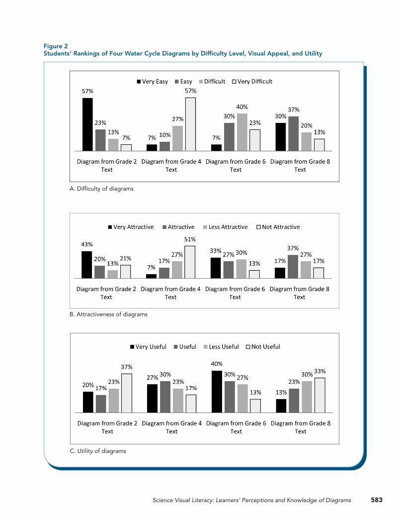
attractive and the grade 4 diagram was considered the least attractive. Regarding utility (see Figure 2C), the grade 6 diagram was considered most useful, whereas the grades 2 and 8 diagrams were consid-ered least helpful.
When considering the ratings in context to each other, it is revealing to note that students considered difficulty and attractiveness to be inversely related: Although the grade 2 diagram was rated most attrac-tive and the easiest to interpret, the grade 4 diagram (with its many arrows) was considered least visually attractive and most difficult. In contrast, students’ rat-ings of the utility were not directly connected with the other ratings. The grade 6 diagram was consid-ered most useful, and this diagram received middle ratings for difficulty of interpretation and attractive-ness. However, although ratings provide insight into students’ overall opinions, these findings are more interpretable by hearing students’ explanations, as is described in the next section.
Major Themes From Student RatingsThree major themes arising from the students’ rat-ings of useful diagrams were the amount of informa-tion, overall organization, and use of conventions. Although we originally intended to analyze findings by age group, these trends transcended age. This is not to say that all developmental levels were the same—both the language used and the depth of understandings increased with age. However, the overall rankings and associated rationales were markedly universal.
Amount of Information. When explaining favor-able ratings about useful diagrams (primarily the grade 4 and 6 diagrams), the majority reported these diagrams as having high levels of information. For ex-ample, a fourth-grade student described the grade 4 diagram as having “lots of words, details, arrows, and information to teach the water cycle to you,” whereas a second-grade student said that the simpler grade 2 diagram “doesn’t have as much stuff to explain it.” In sum, the quantity of text and complexity of the de-sign were equated with information; information was then equated with utility.
Overall Organization. Although the dominant opin-ion was that a lot of information was a critical quality for an effect diagram, a subset of students noted the value of less clutter. A sixth-grade student remarked that the grade 8 diagram provided “just enough
ProceduresWe conducted our interviews in a rural, working-class district in the southwestern United States. The 30 participating students were at a range of develop-mental levels: 10 students each from grade 2, grade 4, and middle school (grades 6–8). The sorting tasks and short interviews were conducted individually with all 30 students. We explained to students that they would be examining four water cycle diagrams. Before viewing the diagrams, they self-rated their knowledge of the water cycle.
During each of the three sorting tasks, the students arranged the diagrams on a table based on only one of the criteria described previously (difficulty, attractive-ness, utility). For example, in the utility sort, the rank-ings were described as very useful, useful, less useful, or not useful for learning about the water cycle. After students performed each sort, we asked students to ex-plain their placement choice and follow-up questions such as “What makes this diagram useful to you?”
To gain further insights about the trends observed during the sorting tasks, we conducted longer follow-up interviews with two students from each grade lev-el (six students total). These occurred on a later date and were also conducted individually. We inquired about students’ practices in using diagrams and their interpretation of the diagrams. The students exam-ined the same four water cycle diagrams while si-multaneously discussing the interviewers’ questions. All of the interviews were audio-recorded and tran-scribed. Using a previous study regarding students’ knowledge of maps as a model (Gerber, Boulton-Lewis, & Bruce, 1995), we analyzed the interview data qualitatively. Throughout the multistep coding and data-analysis process, we noted and discussed prominent themes.
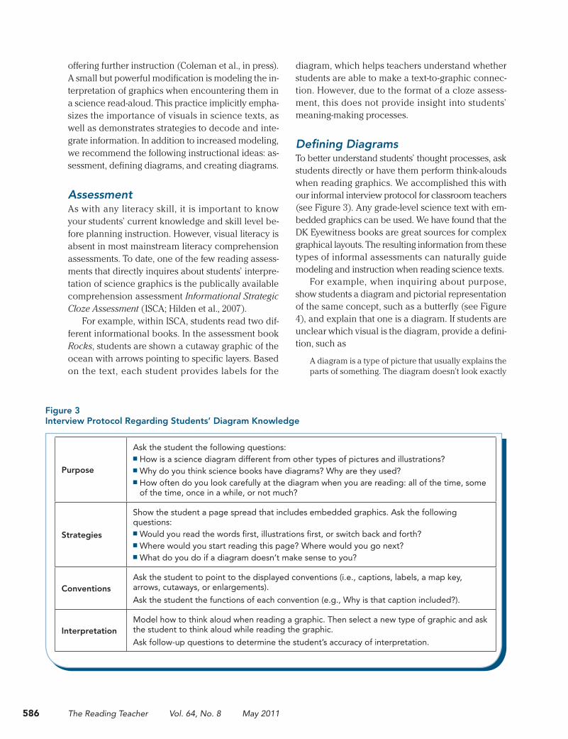
Student Rankings of Science VisualsThe students’ rankings of the four diagrams are sum-marized in bar charts (see Figure 2), with one chart for each rating scale (difficulty, attractiveness, and utility) and with the ratings subdivided by diagram. As shown in Figure 2A, the majority of students (57%) rated the grade 2 diagram as very easy, while 57% of the students rated the grade 4 diagram as very dif-ficult. When considering visual appeal (see Figure 2B), the grade 2 diagram was considered the most
583Science Visual Literacy: Learners’ Perceptions and Knowledge of Diagrams
Figure 2 Students’ Rankings of Four Water Cycle Diagrams by Difficulty Level, Visual Appeal, and Utility
C. Utility of diagrams
A. Difficulty of diagrams
B. Attractiveness of diagrams
584 The Reading Teacher Vol. 64, No. 8 May 2011
students approached a textbook page containing both text and a diagram, five of the six interviewed students reported that they read the words first and only then examined the picture.
Strategy for Use. When questioned as to what to do if a diagram did not make sense to them (i.e., fix-up strategies for diagrams), students struggled with the question. Four students reported having no strat-egies. Two fourth-grade students reported strategies, but they were generic in nature: look at it again or ask a teacher for help.
Limitations of Our StudyBefore discussing our findings, we encourage read-ers to consider several limitations. A major limitation is the small sample size with a large developmental range. This creates the potential for large variation within results, making it difficult to draw finite conclu-sions; however, we consider this exploratory research and were able to consider trends across age groups. Second, although background knowledge of a topic affects interpretation of a diagram on that topic (Lowe, 1993), we did not effectively assess background knowl-edge. Based on work with adult learners, we asked students to self-rate their background knowledge on the water cycle. All students self-rated as highly knowl-edgeable, but that was inaccurate. However, based on the school’s spiraling curriculum, we know that all grades had been introduced to the water cycle.
Finally, structured sorting tasks and interview questions limit the scope of responses. A think-aloud protocol may be more revealing in future research to understand how the students naturally approach diagrams and make meaning.
Findings to Improve Students’ Science Visual LiteracyThree findings are particularly relevant to helping im-prove students’ skills with science texts:
1. Attention to science diagrams
2. Confusion about the conventions of diagrams
3. Perceptions of useful diagrams
Attention to Science DiagramsAlthough graphic use is increasing within science texts and other media, convergent evidence indicates
information to give you an overview of the main parts so that it would be easier to read the book.” Another student lamented that the grade 4 diagram had “a lot of stuff, but doesn’t make much sense.” She noted with some frustration that there was probably a lot of information, but she could not figure it out.
Use of Conventions. Regarding conventions of dia-grams (e.g., labels, arrows), the students frequently considered these features about diagrams as being
most helpful. However, they lacked the vocabulary to name labels, text boxes, arrows, captions, and the like. To circumvent such issues, students typically pointed and used filler words such as “little blips” and “helping things.” In total, students communi-cated that they appreciated “a good title,” “underlining
of words you should know,” “highlighting” (of key-words), “little boxes” (i.e., text boxes), arrows, and “numbers showing order.” Students also preferred diagrams with some explanations instead of simply one-word labels.
Student Uses of DiagramsThe follow-up interviews gave us insight into how stu-dents use diagrams in general when reading science texts. Students’ responses are summarized across grade levels. The main themes revealed are their beliefs about the purpose of diagrams, frequency of use, and strategy for use.
Purpose of Diagrams. Regarding the underlying purpose of illustrations within science texts, all stu-dents described that the prevalent viewpoint was that illustrations added a visual or concrete repre-sentation. One second-grade student stated that “the pictures help the reader know what the text is talking about.” Despite encouragement to think of other rea-sons, none were offered.
Frequency of Use. When asked about regularity of examining science graphics, the students were given these choices about how often they looked at the il-lustrations: always, sometimes, or rarely. All students reported examining diagrams only sometimes or rarely. When we inquired in more detail about how
Students’ opinions on accessible diagrams and publisher decisions on grade-level diagrams were not well aligned.
585Science Visual Literacy: Learners’ Perceptions and Knowledge of Diagrams
realized that arrows have at least six distinct uses in science diagrams, according to Schollum (as cited in Henderson, 1999):
1. representing force
2. showing change
3. indicating sequence
4. labeling
5. measuring
6. showing relationships
Our students’ interpretations were all valid functions of arrows, but mistakenly overgeneralized.
Perceptions of Useful DiagramsStudents appreciated high levels of information in di-agrams (e.g., the grade 4 and grade 6 diagrams), even though they may have difficulty accessing dense in-formation. Presentation style and organization of the information were also noted as important. The grade 8 diagram was praised because “it shows you only the important stuff you need to know—the water cy-cle basics.” This diagram “helps you see the big cycle better” and “it has some space.”
Students’ ratings of the difficult diagrams were synonymous with their independent ratings of visual appeal of diagrams (i.e., easy diagrams were rated as visually appealing). This observation aligns with Tufte’s (1997) principles of effective design of in-formation in which graphical elegance is found in the simplicity of design. Additionally, we observed that students’ opinions on accessible diagrams and publisher decisions on grade-level diagrams were not well aligned. Reading teachers should note that popular science texts are often swathed in complex graphics, but this type of formatting may not be most helpful for less-skilled readers, who can get distract-ed by the visuals (Hannus & Hyona, 1999).
Instructional ImplicationsIn short, diagram interpretation skills are not intui-tive to students, and we recommend that science diagram instruction should be authentically embed-ded in existing reading comprehension instruction. As mentioned previously, observations of teacher read-alouds documented that the majority of teach-ers tend to avoid complex graphics (Smolkin & Donovan, 2004) or simply point to them without
that more opportunities to view graphics do not guar-antee engagement. Similar to findings by previous re-search (Hannus & Hyona, 1999; Tang, 1991), multiple pieces of data from this study support this trend of disregarding science graphics: No students reported always looking at the illustrations. The majority of students also reported always reading the text prior to considering illustrations, which may indicate that students feel that graphics are secondary to text for understanding science.
Additionally, students believed that the sole pur-pose of diagrams was to visually represent what was in the text. Although that is one common purpose for the inclusion of pictorial representations in textbooks (Levin, Anglin, & Carney, 1987), it is basic. Of further interest to us is what is devoid in their answers. For example, no students considered these other major functions of graphics (Levin et al., 1987):
■ Pictures can contain unique information be-yond the text.
■ Pictures more readily represent certain kinds of information (e.g., relative location—as on a map).
■ Pictures may serve as an organization tool for the content (e.g., flowchart).
In short, if a learner does not understand the many functions of diagrams, he or she would likely under-value them.
Convention ConfusionOur findings support previous work (e.g., Wheeler & Hill, 1990) indicating that specific conventions and abstractions of diagrams are often misinterpreted by younger readers. Although both color choice (e.g., black clouds) and cutaways (e.g., showing ground-water) posed problems for these students, the most frequent source of confusion was arrows.
The grade 4 diagram in particular, with 10 flowing arrows, led students astray. A typical interpretation of arrows was that they were for pointing out objects. Additional misinterpretations in the grade 8 diagram were that the arrows showed the shape of the water cycle, “which is round.” Another interpretation was that arrows show one how to get to the place. When pressed for clarification, the student explained that she learned about arrows when hiking with a map.
Although it was initially surprising to us that the arrows were so problematic, it made sense when we
586 The Reading Teacher Vol. 64, No. 8 May 2011
diagram, which helps teachers understand whether students are able to make a text-to-graphic connec-tion. However, due to the format of a cloze assess-ment, this does not provide insight into students’ meaning-making processes.
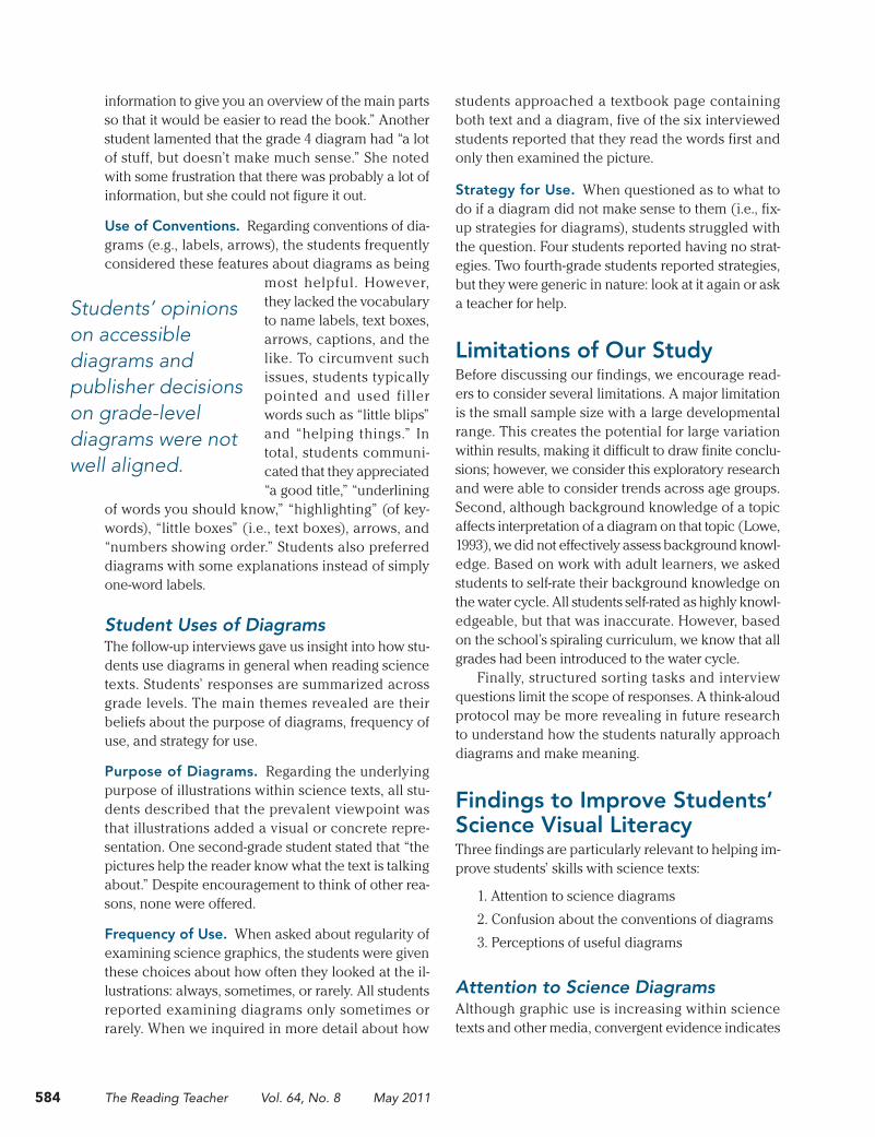
Defining DiagramsTo better understand students’ thought processes, ask students directly or have them perform think-alouds when reading graphics. We accomplished this with our informal interview protocol for classroom teachers (see Figure 3). Any grade-level science text with em-bedded graphics can be used. We have found that the DK Eyewitness books are great sources for complex graphical layouts. The resulting information from these types of informal assessments can naturally guide modeling and instruction when reading science texts.
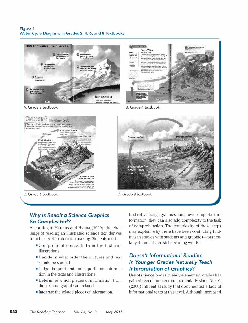
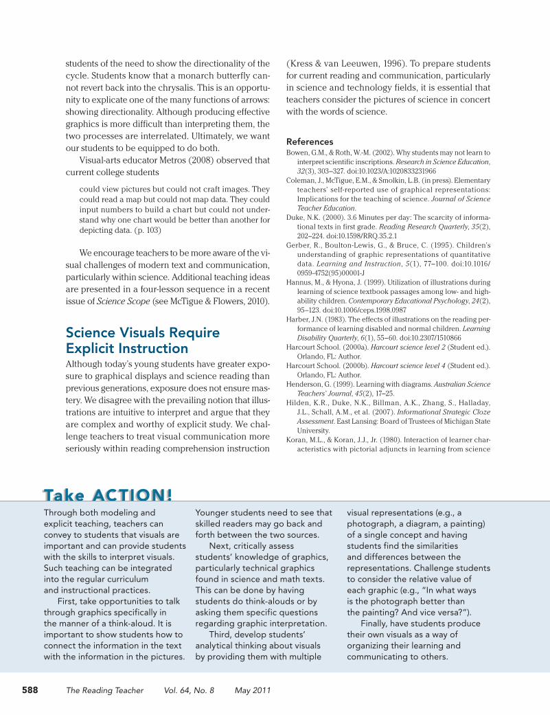
For example, when inquiring about purpose, show students a diagram and pictorial representation of the same concept, such as a butterfly (see Figure 4), and explain that one is a diagram. If students are unclear which visual is the diagram, provide a defini-tion, such as
A diagram is a type of picture that usually explains the parts of something. The diagram doesn’t look exactly
offering further instruction (Coleman et al., in press). A small but powerful modification is modeling the in-terpretation of graphics when encountering them in a science read-aloud. This practice implicitly empha-sizes the importance of visuals in science texts, as well as demonstrates strategies to decode and inte-grate information. In addition to increased modeling, we recommend the following instructional ideas: as-sessment, defining diagrams, and creating diagrams.
AssessmentAs with any literacy skill, it is important to know your students’ current knowledge and skill level be-fore planning instruction. However, visual literacy is absent in most mainstream literacy comprehension assessments. To date, one of the few reading assess-ments that directly inquires about students’ interpre-tation of science graphics is the publically available comprehension assessment Informational Strategic Cloze Assessment (ISCA; Hilden et al., 2007).
For example, within ISCA, students read two dif-ferent informational books. In the assessment book Rocks, students are shown a cutaway graphic of the ocean with arrows pointing to specific layers. Based on the text, each student provides labels for the
Figure 3 Interview Protocol Regarding Students’ Diagram Knowledge
Purpose
Ask the student the following questions:■ How is a science diagram different from other types of pictures and illustrations?■ Why do you think science books have diagrams? Why are they used?■ How often do you look carefully at the diagram when you are reading: all of the time, some
of the time, once in a while, or not much?
Strategies
Show the student a page spread that includes embedded graphics. Ask the following questions:■ Would you read the words first, illustrations first, or switch back and forth? ■ Where would you start reading this page? Where would you go next? ■ What do you do if a diagram doesn’t make sense to you?
ConventionsAsk the student to point to the displayed conventions (i.e., captions, labels, a map key, arrows, cutaways, or enlargements).Ask the student the functions of each convention (e.g., Why is that caption included?).
InterpretationModel how to think aloud when reading a graphic. Then select a new type of graphic and ask the student to think aloud while reading the graphic.Ask follow-up questions to determine the student’s accuracy of interpretation.
587Science Visual Literacy: Learners’ Perceptions and Knowledge of Diagrams
Figure 4 Examples of a Pictorial and Diagrammatic Representation of a Butterfly
Note. The pictorial representation of a butterfly was retrieved from commons.wikimedia.org/wiki/File:Dirce_Beauty_Colobura_dirce.jpg; the diagrammatic representation of a butterfly was retrieved from commons.wikimedia.org/wiki/File:Butterfly_parts.svg.
A. Pictorial representation B. Diagrammatic representation
like the object because it has fewer details. From a dia-gram, you can learn both the names of the parts and how they fit together.
A fundamental understanding that students need to approach science visuals effectively is a sense of their functions. This is an excellent starting point when assessments reveal that students have only vague ideas about the purposes of diagrams. By comparing and contrasting similar, familiar concepts (photographs or drawings) with new concepts (dia-grams), teachers can help students see the relative advantages of diagrams.
Returning again to the butterfly images in Figure 4, teachers can present a photograph (a concrete, known representation) and a diagram (abstract, less familiar representation) pair. By displaying the repre-sentations together, students can brainstorm similari-ties and differences.
Students typically focus on surface-level differ-ences immediately, such as one having words while the other does not. However, after surface-level con-trasts are exhausted, teachers can probe further into the functions of each by challenging students to con-sider, When would you choose to use a photograph? A diagram? Which is better?
Students often state that the picture would be more helpful if you are trying to identify the butter-fly in real life. This is an opportunity to point out to students that, although a photograph depicts a single butterfly, a diagram represents a more abstract idea of a butterfly, which could apply to any butterfly. Therefore, diagrams are better for learning about the anatomy of all kinds of butterflies, and photographs are better for learning about one single butterfly.
Creating DiagramsFor students to grasp the abstract conventions that often distinguish diagrams from pictures, it is essen-tial for students to produce graphics (Moline, 1995; Wheeler & Hill, 1990). Analogous to teaching text structures through genre-based writing, teachers can teach diagrams by having students visually produce genres of graphics (e.g., flowcharts, cutaways, maps).
For example, when studying cutaway diagrams, challenge students to simultaneously show both the internal structure of an apple (e.g., seeds, core) and the external structure (e.g., skin, stem) in a single drawing. It becomes immediately evident as to why illustrators use a cutaway technique (Moline, 1995).
Additionally, when drawing a cycle such as the life cycle of a butterfly, it becomes apparent to
588 The Reading Teacher Vol. 64, No. 8 May 2011
(Kress & van Leeuwen, 1996). To prepare students for current reading and communication, particularly in science and technology fields, it is essential that teachers consider the pictures of science in concert with the words of science.
ReferencesBowen, G.M., & Roth, W.-M. (2002). Why students may not learn to
interpret scientific inscriptions. Research in Science Education, 32(3), 303–327. doi:10.1023/A:1020833231966
Coleman, J., McTigue, E.M., & Smolkin, L.B. (in press). Elementary teachers’ self-reported use of graphical representations: Implications for the teaching of science. Journal of Science Teacher Education.
Duke, N.K. (2000). 3.6 Minutes per day: The scarcity of informa-tional texts in first grade. Reading Research Quarterly, 35(2), 202–224. doi:10.1598/RRQ.35.2.1
Gerber, R., Boulton-Lewis, G., & Bruce, C. (1995). Children’s understanding of graphic representations of quantitative data. Learning and Instruction, 5(1), 77–100. doi:10.1016/0959-4752(95)00001-J
Hannus, M., & Hyona, J. (1999). Utilization of illustrations during learning of science textbook passages among low- and high-ability children. Contemporary Educational Psychology, 24(2), 95–123. doi:10.1006/ceps.1998.0987
Harber, J.N. (1983). The effects of illustrations on the reading per-formance of learning disabled and normal children. Learning Disability Quarterly, 6(1), 55–60. doi:10.2307/1510866
Harcourt School. (2000a). Harcourt science level 2 (Student ed.). Orlando, FL: Author.
Harcourt School. (2000b). Harcourt science level 4 (Student ed.). Orlando, FL: Author.
Henderson, G. (1999). Learning with diagrams. Australian Science Teachers’ Journal, 45(2), 17–25.
Hilden, K.R., Duke, N.K., Billman, A.K., Zhang, S., Halladay, J.L., Schall, A.M., et al. (2007). Informational Strategic Cloze Assessment. East Lansing: Board of Trustees of Michigan State University.
Koran, M.L., & Koran, J.J., Jr. (1980). Interaction of learner char-acteristics with pictorial adjuncts in learning from science
students of the need to show the directionality of the cycle. Students know that a monarch butterfly can-not revert back into the chrysalis. This is an opportu-nity to explicate one of the many functions of arrows: showing directionality. Although producing effective graphics is more difficult than interpreting them, the two processes are interrelated. Ultimately, we want our students to be equipped to do both.
Visual-arts educator Metros (2008) observed that current college students
could view pictures but could not craft images. They could read a map but could not map data. They could input numbers to build a chart but could not under-stand why one chart would be better than another for depicting data. (p. 103)
We encourage teachers to be more aware of the vi-sual challenges of modern text and communication, particularly within science. Additional teaching ideas are presented in a four-lesson sequence in a recent issue of Science Scope (see McTigue & Flowers, 2010).
Science Visuals Require Explicit InstructionAlthough today’s young students have greater expo-sure to graphical displays and science reading than previous generations, exposure does not ensure mas-tery. We disagree with the prevailing notion that illus-trations are intuitive to interpret and argue that they are complex and worthy of explicit study. We chal-lenge teachers to treat visual communication more seriously within reading comprehension instruction
Take ACTION!Through both modeling and explicit teaching, teachers can convey to students that visuals are important and can provide students with the skills to interpret visuals. Such teaching can be integrated into the regular curriculum and instructional practices.
First, take opportunities to talk through graphics specifically in the manner of a think-aloud. It is important to show students how to connect the information in the text with the information in the pictures.
Younger students need to see that skilled readers may go back and forth between the two sources.
Next, critically assess students’ knowledge of graphics, particularly technical graphics found in science and math texts. This can be done by having students do think-alouds or by asking them specific questions regarding graphic interpretation.
Third, develop students’ analytical thinking about visuals by providing them with multiple
visual representations (e.g., a photograph, a diagram, a painting) of a single concept and having students find the similarities and differences between the representations. Challenge students to consider the relative value of each graphic (e.g., “In what ways is the photograph better than the painting? And vice versa?”).
Finally, have students produce their own visuals as a way of organizing their learning and communicating to others.
589Science Visual Literacy: Learners’ Perceptions and Knowledge of Diagrams
scriptive analysis of four sixth-grade science texts. Reading Psychology, 31(3), 301–325.
Smolkin, L.B., & Donovan, C.A. (2004). Improving science in-struction with information books: Understanding multimodal presentations. In W. Saul (Ed.), Crossing borders in literacy and science instruction: Perspectives on theory and practice (pp. 190–208). Arlington, VA: National Science Teachers Association; Newark, DE: International Reading Association.
Stern, E., Aprea, C., & Ebner, H.G. (2003). Improving cross- content transfer in text processing by means of active graphi-cal representation. Learning and Instruction, 13(2), 191–203. doi:10.1016/S0959-4752(02)00020-8
Tang, G.M. (1991). The role and value of graphic representations of knowledge structures in ESL student learning: An ethno-graphic study. TESL Canada Journal, 9(1), 29–41.
Tufte, E.R. (1997). Visual explanations: Images and quantities, evi-dence and narrative. Cheshire, CT: Graphics Press.
Walpole, S. (1999). Changing text s, changing thinking: Comprehension demands of new science textbooks. The Reading Teacher, 52(4), 358–369.
Wheeler, A.E., & Hill, D. (1990). Diagram-ease. Why children mis-interpret diagrams. Science Teacher, 57(5), 58–63.
Winn, W. (1987). Charts, graphs, and diagrams in educational materials. In D.M. Willows & H.A. Houghton (Eds.), The psychology of illustration (Vol. 1, pp. 152–198). New York: Springer-Verlag.
Yeh, Y.Y., & McTigue, E.M. (2009). The frequency, variation, and function of graphical representations within standardized state science tests. School Science and Mathematics, 109(8), 435–449. doi:10.1111/j.1949-8594.2009.tb18291.x
McTigue is the assistant professor of literacy in the Department of Teaching, Learning, and Culture at Texas A&M University, College Station, USA; e-mail [email protected]. Flowers is an elementary school teacher in the Alexandria County Public Schools in Alexandria, Virginia, USA.
text. Journal of Research in Science Teaching, 17(5), 477–483. doi:10.1002/tea.3660170515
Kress, G.R., & van Leeuwen, T. (1996). Reading images: The gram-mar of visual design. Geelong, Victoria: Deakin University Press.
Leu, D.J., Jr., Kinzer, C.K., Coiro, J.L., & Cammack, D.W. (2004). Toward a theory of new literacies emerging from the Internet and other information and communication technologies. In R.B. Ruddell & N.J. Unrau (Eds.), Theoretical models and pro-cesses of reading (5th ed.). Newark, DE: International Reading Association.
Levie, W.H., & Lentz, R. (1982). Effects of text illustrations: A re-view of research. Educational Communication and Technology, 30(4), 195–232.
Levin, J.R., Anglin, G.J., & Carney, R.N. (1987). On empirically validating the functions of pictures in prose. In D.M. Willows & H.A. Houghton (Eds.), The Psychology of Illustration (Vol. 1, pp. 51–86). New York: Springer-Verlag.
Lowe, R.K. (1993). Constructing a mental representation from an abstract technical diagram. Learning and Instruction, 3(3), 157–179. doi:10.1016/0959-4752(93)90002-H
Mayer, R.E. (2001). Multimedia learning. Cambridge: Cambridge University Press.
McTigue, E.M. (2009). Does multimedia learning theory ex-tend to middle school students? Contemporary Educational Psychology, 34(2), 143–153. doi:10.1016/j.cedpsych.2008.12.003
McTigue, E.M., Carlin, B., & Coleman, J. (2007, December). The integration of text and supporting graphics in science trade books. Presented at the annual meeting of the National Reading Conference (NRC), Austin, TX.
McTigue, E.M., & Flowers, A.C. (2010). Illustration inquiry: Visual literacy in science. Science Scope, 33(9), 17–22.
Metros, S.E. (2008). The educator’s role in preparing visu-ally literate learners. Theory Into Practice, 47(2), 102–109. doi:10.1080/00405840801992264
Moline, S. (1995). I see what you mean: Children at work with vi-sual information. York, ME: Stenhouse.
Pappas, C.C. (2006). The information book genre: Its role in in-tegrated science literacy research and practice. Reading Research Quarterly, 41(2), 226–250. doi:10.1598/RRQ.41.2.4
Peeck, J. (1994). Enhancing graphic-effects in instructional texts: Influencing learning activities. In W. Schnotz & W. Kulhavy (Eds.), Comprehension of graphics (pp. 291–301). Amsterdam: North-Holland.
Prentice Hall. (2002a). Science explorer, grade 6: Texas edition (Student ed.). Boston: Author.
Prentice Hall. (2002b). Science explorer, grade 8: Texas edition (Student ed.). Boston: Author.
Reid, D.J., & Beveridge, M. (1986). Effects of text illustration on children’s learning of a school science topic. The British Journal of Educational Psychology, 56(3), 294–303.
Reid, D.J., & Beveridge, M. (1990). Reading illustrated science texts: A micro-computer based investigation of children’s strategies. The British Journal of Educational Psychology, 60(1), 76–87.
Roth, W.-M., Pozzer-Ardenghi, L., & Han, J.H. (2005). Critical graphicacy: Understanding visual representation practices in school science. Dordrecht, Netherlands: Springer-Kluwer.
Royce, T. (2002). Multimodality in the TESOL classroom: Exploring visual-verbal synergy. TESOL Quarterly, 36(2), 191–205. doi:10.2307/3588330
Slough, S.W., McTigue, E.M., Kim, S., & Jennings, S.K. (2010). Science textbooks’ use of graphical representation: A de-
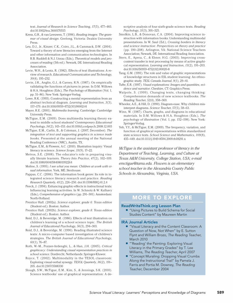
MORE TO EXPLOREReadWriteThink.org Lesson Plan
■ “Using Pictures to Build Schema for Social Studies Content” by Maureen Martin
IRA Journal Articles ■ “Visual Literacy and the Content Classroom: A Question of Now, Not When” by E. Sutton Flynt and William Brozo, The Reading Teacher, March 2010
■ “‘Reading’ the Painting: Exploring Visual Literacy in the Primary Grades” by T. Lee Williams, The Reading Teacher, April 2007
■ “Concept Muraling: Dropping Visual Crumbs Along the Instructional Trail” by Pamela J. Farris and Portia M. Downey, The Reading Teacher, December 2004

Copyright of Reading Teacher is the property of International Reading Association and its content may not becopied or emailed to multiple sites or posted to a listserv without the copyright holder's express writtenpermission. However, users may print, download, or email articles for individual use.
Recommended