Brand Proposal for Charisma
Prepared byFlorence Anyasor
for Now and Forever
The Wedding Design Company

1
Table of Contents
Page
Project Summary ............................................ 5
Concept #1 ..................................................... 6L.O.S ..................................................................... 7
Concept #2 ..................................................... 8L.O.S ..................................................................... 9
Concept #3 .....................................................10L.O.S. .................................................................... 11
2

3

Project Summary
Carmen Johnson Bell is one of the directors of the Miss
Illinois Plus America Pagent. The company that produces the
pagent is called Charisma. She requested that she wanted
three different logos with the colors Turquoise, Silver, White
and Gold. She loves sparkly, pretty and regal things. Since
this company is doing pagents I thought it would be nice
to create a crown for the logo. I designed three different
concepts using a different crown and applied the black &
white version to each one. On the next page of each concept
there is a variety of collateral materials, a mug, shirt, envelope
and a business card, that each have an incorporated design
for the three concepts. The idea started with research,
sketching, illustrating and finalizing the logos. To get inspiration,
I researched crowns in different styles and was able to come
up with three different types of illustrations for the company.
When I looked at them an idea just came to my head on how
I saw the Charisma logo. It began with concept #1 .....
4

Concept #1
Since this is a pagent for plus size females, I decided to create a woman wearing a
tiara and used a big, blocky and stiff san serif for the title. I drew out the head and
scanned it then used the colors in a specific order.I used a turquoise color on the
hair and mouth and added a little bit of gold on the stroke. The tiara was originally
a studed diamond crown in the stock image but I decided to give it a silver gradient
since its the main colors and it was too overdone. As for the title and tagline I want-
ed them to pop out just like the symbol so I changed the color from black to gold
along with the stroke and kept the tagline at a solid color.
5
Invoke Your Inner Beauty
Invoke Your Inner Beauty
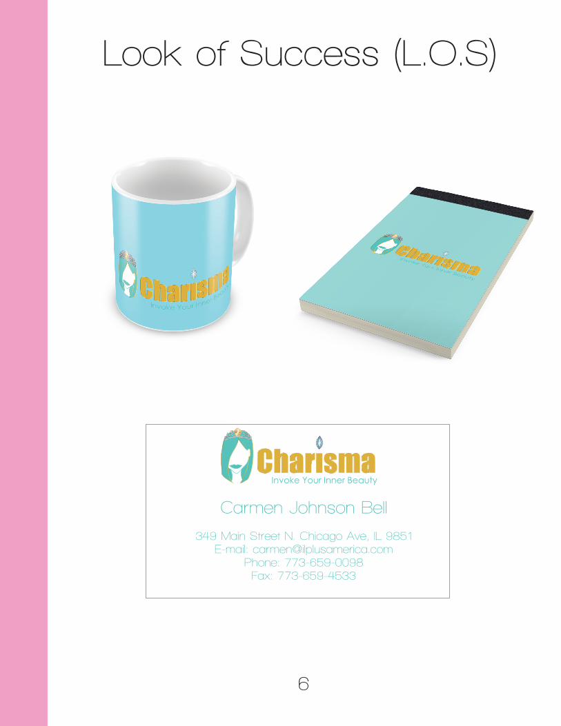
Look of Success (L.O.S)
6
Invoke Your Inner Beauty
Carmen Johnson Bell
349 Main Street N. Chicago Ave, IL 9851E-mail: [email protected]
Phone: 773-659-0098Fax: 773-659-4533

Concept #2
For the second concept I decided to make the crown the main symbol and theme for
the logo design since this company is involved with doing pagents. I also went for a
script font to represent the theme and style of a pagent since it’s related to fashion. To
make it look like a real tiara I added jewels to it with the same requried colors inside. I
also included a golden stroke to the title to make it stand out more like the symbol.
7

Look of Success (L.O.S)
8
Carmen Johnson Bell
349 Main Street N. Chicago Ave, IL 9851E-mail: [email protected]
Phone: 773-659-0098Fax: 773-659-4533
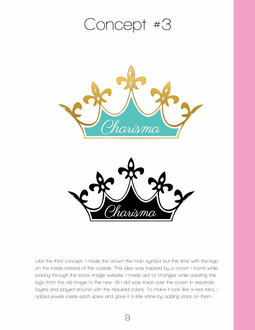
Concept #3
Like the third concept, I made the crown the main symbol but this time with the logo
on the inside instead of the outside. This idea was inspired by a crown I found while
looking through the stock image website. I made alot of changes while creating this
logo from the old image to the new. All I did was trace over the crown in separate
layers and played around with the required colors. To make it look like a real tiara, I
added jewels inside each spike and gave it a little shine by adding stars on them.
9

Look of Success (L.O.S)
10
Carmen Johnson Bell
349 Main Street N. Chicago Ave, IL 9851E-mail: [email protected]
Phone: 773-659-0098Fax: 773-659-4533

123 Main Street Park Forest, IL 60466 E-mail: nowandforeverwedding.com Phone: 312-587-6093 Fax: 312-587-4504
The Wedding Design Company
Recommended