Photoshop Editing
My Magazine To start off I made a rough sketch of
what I wanted my magazine to look like on paper.
I made an idea in my head of what colours and fonts I would need for the conventions of this style of magazine.
Once I had made a full plan of what I wanted to create, I started with a base, covering the main sections and colours that the pages would have.
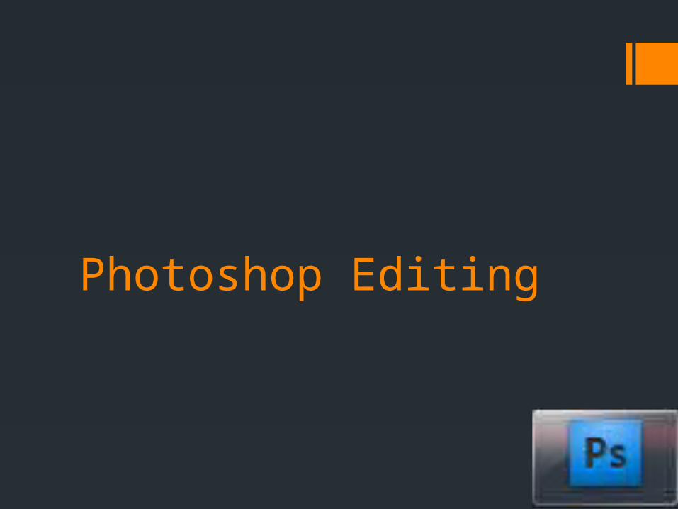
Title Space
Image Involving Main Story
Kicker
Kicker
Main Story Kicker
Kicker
Kicker
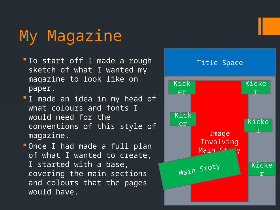
This meant that I had a good idea of how the space was being used on the front cover of my magazine.
Next I had to take some pictures and get a wide variety that would mean that I had flexibility when it came to editing and putting original images into my product.
I tried a few different images in a few different places to see if there was any other placements that suited the style of the music.
Shaping images
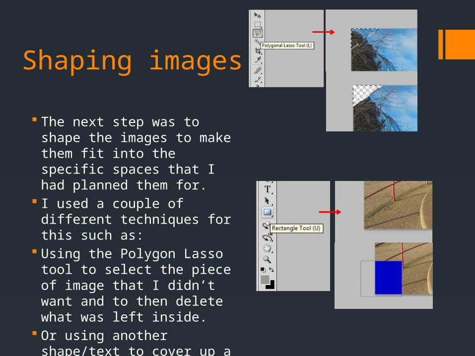
The next step was to shape the images to make them fit into the specific spaces that I had planned them for.
I used a couple of different techniques for this such as:
Using the Polygon Lasso tool to select the piece of image that I didn’t want and to then delete what was left inside.
Or using another shape/text to cover up a section of the image.
Brightness/contrast
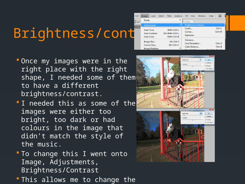
Once my images were in the right place with the right shape, I needed some of them to have a different brightness/contrast.
I needed this as some of the images were either too bright, too dark or had colours in the image that didn’t match the style of the music.
To change this I went onto Image, Adjustments, Brightness/Contrast
This allows me to change the brightness and contrast of the images.
Colour change
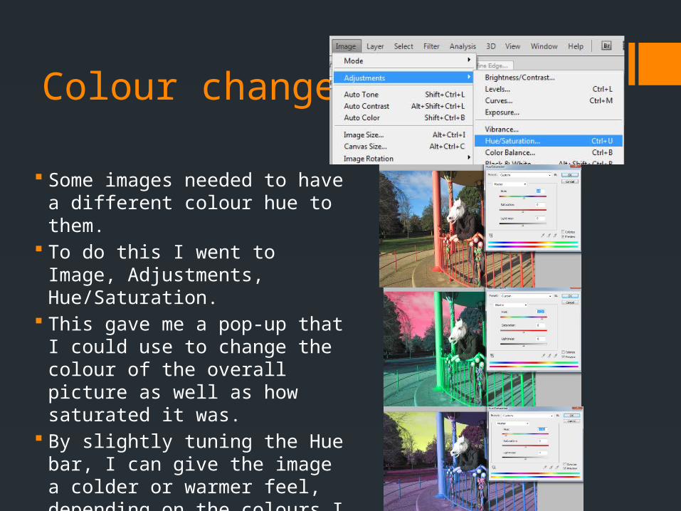
Some images needed to have a different colour hue to them.
To do this I went to Image, Adjustments, Hue/Saturation.
This gave me a pop-up that I could use to change the colour of the overall picture as well as how saturated it was.
By slightly tuning the Hue bar, I can give the image a colder or warmer feel, depending on the colours I chose.
Recommended