
Graphics and Data Visualization in RFirst/last name ([email protected])
Last update: 23 May, 2018
Overview
Graphics in R
• Powerful environment for visualizing scientific data• Integrated graphics and statistics infrastructure• Publication quality graphics• Fully programmable• Highly reproducible• Full LaTeX, Sweave, knitr and R Markdown support.• Vast number of R packages with graphics utilities
Documentation on Graphics in R
• General– Graphics Task Page– R Graph Gallery– R Graphical Manual– Paul Murrell’s book R (Grid) Graphics
• Interactive graphics– rggobi (GGobi)– iplots– Open GL (rgl)
Graphics Environments
• Viewing and savings graphics in R– On-screen graphics– postscript, pdf, svg– jpeg/png/wmf/tiff/. . .
• Four major graphics environments– Low-level infrastructure
∗ R Base Graphics (low- and high-level)∗ grid: Manual, Book
– High-level infrastructure∗ lattice: Manual, Intro, Book∗ ggplot2: Manual, Intro, Book
Base Graphics
Overview
• Important high-level plotting functions
1
– plot: generic x-y plotting– barplot: bar plots– boxplot: box-and-whisker plot– hist: histograms– pie: pie charts– dotchart: cleveland dot plots– image, heatmap, contour, persp: functions to generate image-like plots– qqnorm, qqline, qqplot: distribution comparison plots– pairs, coplot: display of multivariant data
• Help on these functions– ?myfct– ?plot– ?par
Preferred Input Data Objects
• Matrices and data frames• Vectors• Named vectors
Scatter Plots
Basic scatter plots
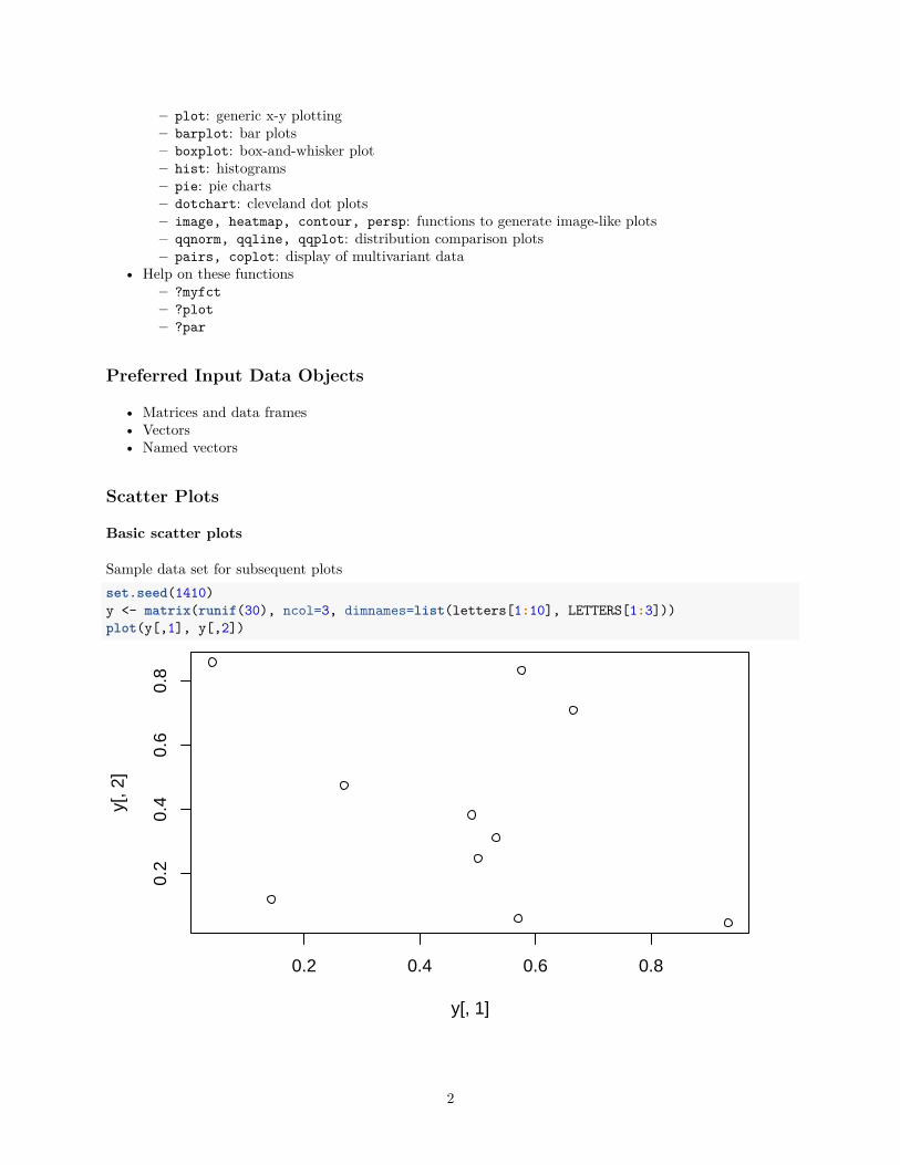
Sample data set for subsequent plotsset.seed(1410)y <- matrix(runif(30), ncol=3, dimnames=list(letters[1:10], LETTERS[1:3]))plot(y[,1], y[,2])
0.2 0.4 0.6 0.8
0.2
0.4
0.6
0.8
y[, 1]
y[, 2
]
2
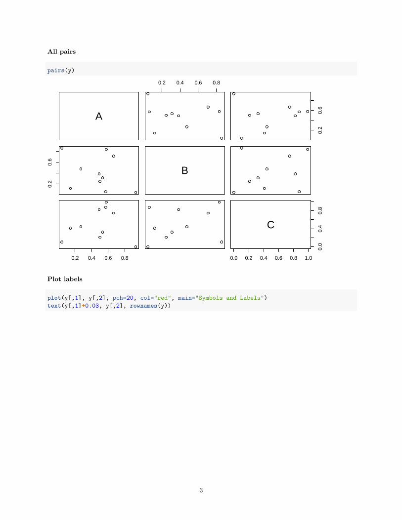
All pairs
pairs(y)
A
0.2 0.4 0.6 0.8
0.2
0.6
0.2
0.6
B
0.2 0.4 0.6 0.8 0.0 0.2 0.4 0.6 0.8 1.0
0.0
0.4
0.8
C
Plot labels
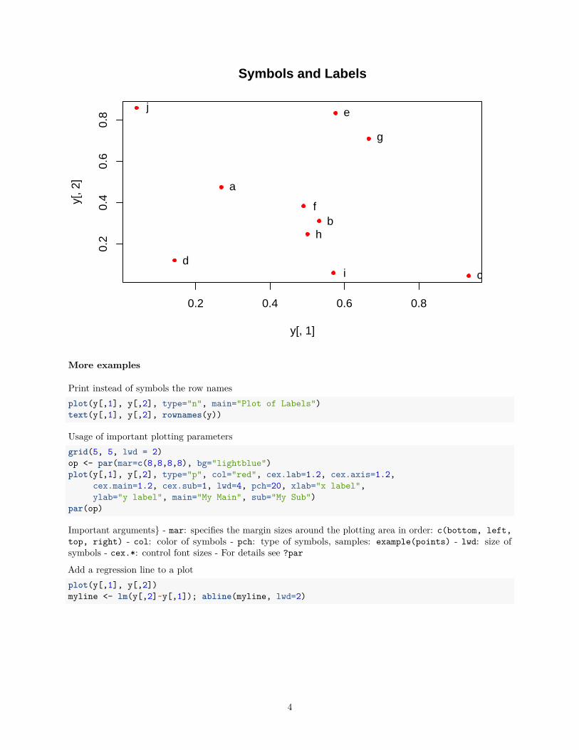
plot(y[,1], y[,2], pch=20, col="red", main="Symbols and Labels")text(y[,1]+0.03, y[,2], rownames(y))
3
0.2 0.4 0.6 0.8
0.2
0.4
0.6
0.8
Symbols and Labels
y[, 1]
y[, 2
]
a
b
cd
e
f
g
h
i
j
More examples
Print instead of symbols the row namesplot(y[,1], y[,2], type="n", main="Plot of Labels")text(y[,1], y[,2], rownames(y))
Usage of important plotting parametersgrid(5, 5, lwd = 2)op <- par(mar=c(8,8,8,8), bg="lightblue")plot(y[,1], y[,2], type="p", col="red", cex.lab=1.2, cex.axis=1.2,
cex.main=1.2, cex.sub=1, lwd=4, pch=20, xlab="x label",ylab="y label", main="My Main", sub="My Sub")
par(op)
Important arguments} - mar: specifies the margin sizes around the plotting area in order: c(bottom, left,top, right) - col: color of symbols - pch: type of symbols, samples: example(points) - lwd: size ofsymbols - cex.*: control font sizes - For details see ?par
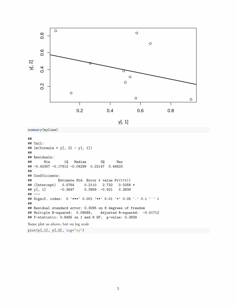
Add a regression line to a plotplot(y[,1], y[,2])myline <- lm(y[,2]~y[,1]); abline(myline, lwd=2)
4
0.2 0.4 0.6 0.8
0.2
0.4
0.6
0.8
y[, 1]
y[, 2
]
summary(myline)
#### Call:## lm(formula = y[, 2] ~ y[, 1])#### Residuals:## Min 1Q Median 3Q Max## -0.40357 -0.17912 -0.04299 0.22147 0.46623#### Coefficients:## Estimate Std. Error t value Pr(>|t|)## (Intercept) 0.5764 0.2110 2.732 0.0258 *## y[, 1] -0.3647 0.3959 -0.921 0.3839## ---## Signif. codes: 0 '***' 0.001 '**' 0.01 '*' 0.05 '.' 0.1 ' ' 1#### Residual standard error: 0.3095 on 8 degrees of freedom## Multiple R-squared: 0.09589, Adjusted R-squared: -0.01712## F-statistic: 0.8485 on 1 and 8 DF, p-value: 0.3839
Same plot as above, but on log scaleplot(y[,1], y[,2], log="xy")
5
0.05 0.10 0.20 0.50 1.00
0.05
0.10
0.20
0.50
y[, 1]
y[, 2
]
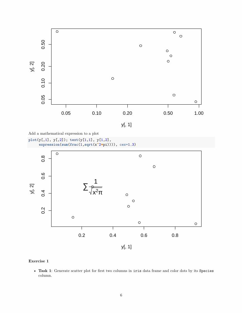
Add a mathematical expression to a plotplot(y[,1], y[,2]); text(y[1,1], y[1,2],
expression(sum(frac(1,sqrt(x^2*pi)))), cex=1.3)
0.2 0.4 0.6 0.8
0.2
0.4
0.6
0.8
y[, 1]
y[, 2
] ∑1
x2π
Exercise 1
• Task 1: Generate scatter plot for first two columns in iris data frame and color dots by its Speciescolumn.
6
• Task 2: Use the xlim/ylim arguments to set limits on the x- and y-axes so that all data points arerestricted to the left bottom quadrant of the plot.
Structure of iris data set:class(iris)
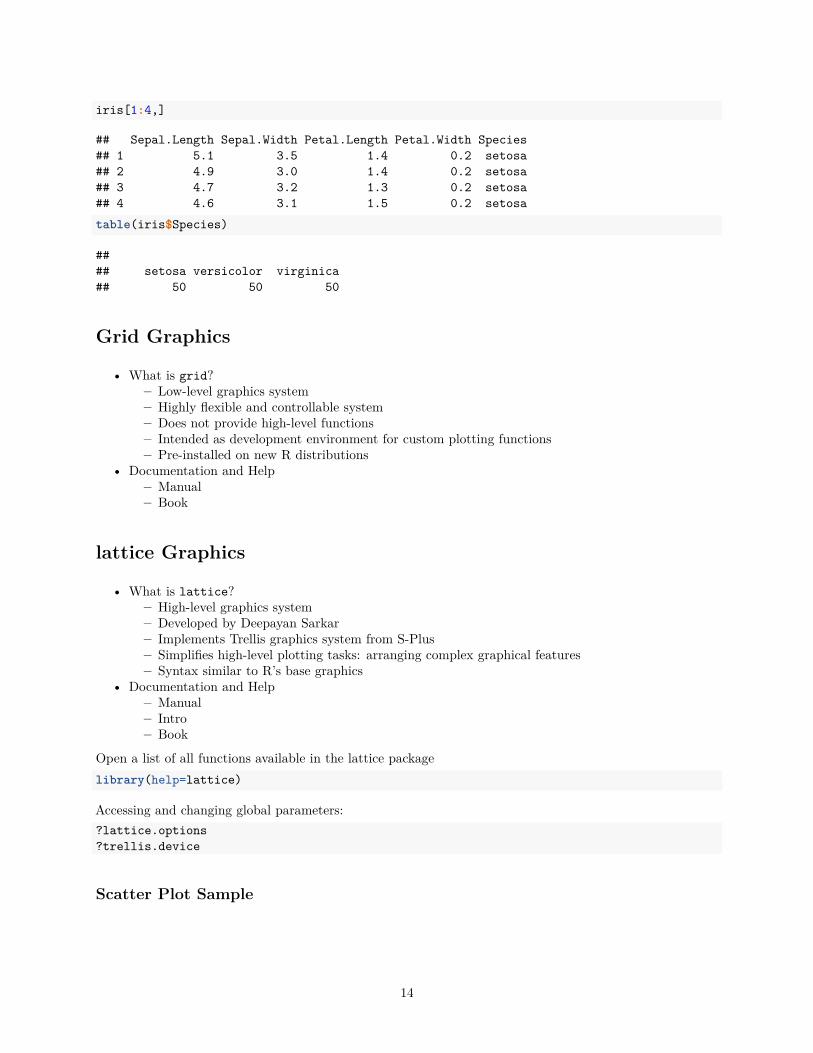
## [1] "data.frame"iris[1:4,]
## Sepal.Length Sepal.Width Petal.Length Petal.Width Species## 1 5.1 3.5 1.4 0.2 setosa## 2 4.9 3.0 1.4 0.2 setosa## 3 4.7 3.2 1.3 0.2 setosa## 4 4.6 3.1 1.5 0.2 setosatable(iris$Species)
#### setosa versicolor virginica## 50 50 50
Line Plots
Single Data Set
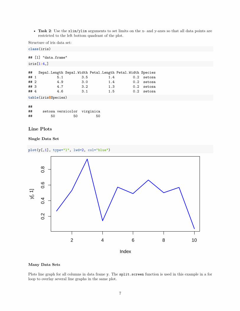
plot(y[,1], type="l", lwd=2, col="blue")
2 4 6 8 10
0.2
0.4
0.6
0.8
Index
y[, 1
]
Many Data Sets
Plots line graph for all columns in data frame y. The split.screen function is used in this example in a forloop to overlay several line graphs in the same plot.
7
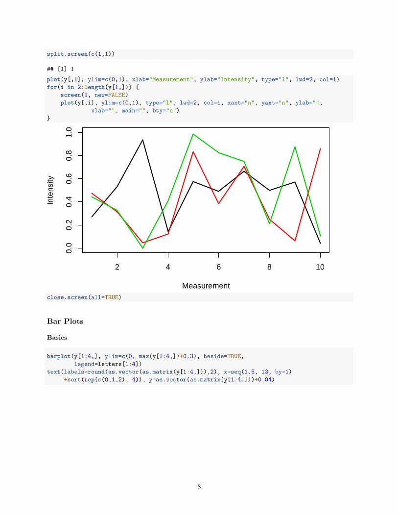
split.screen(c(1,1))
## [1] 1plot(y[,1], ylim=c(0,1), xlab="Measurement", ylab="Intensity", type="l", lwd=2, col=1)for(i in 2:length(y[1,])) {
screen(1, new=FALSE)plot(y[,i], ylim=c(0,1), type="l", lwd=2, col=i, xaxt="n", yaxt="n", ylab="",
xlab="", main="", bty="n")}
2 4 6 8 10
0.0
0.2
0.4
0.6
0.8
1.0
Measurement
Inte
nsity
close.screen(all=TRUE)
Bar Plots
Basics
barplot(y[1:4,], ylim=c(0, max(y[1:4,])+0.3), beside=TRUE,legend=letters[1:4])
text(labels=round(as.vector(as.matrix(y[1:4,])),2), x=seq(1.5, 13, by=1)+sort(rep(c(0,1,2), 4)), y=as.vector(as.matrix(y[1:4,]))+0.04)
8
A B C
abcd
0.0
0.2
0.4
0.6
0.8
1.0
1.2
0.27
0.53
0.93
0.14
0.47
0.31
0.050.12
0.44
0.32
0
0.41
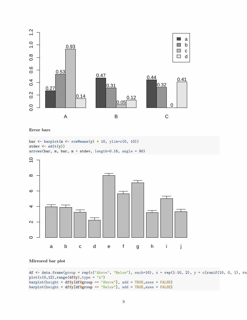
Error bars
bar <- barplot(m <- rowMeans(y) * 10, ylim=c(0, 10))stdev <- sd(t(y))arrows(bar, m, bar, m + stdev, length=0.15, angle = 90)
a b c d e f g h i j
02
46
810
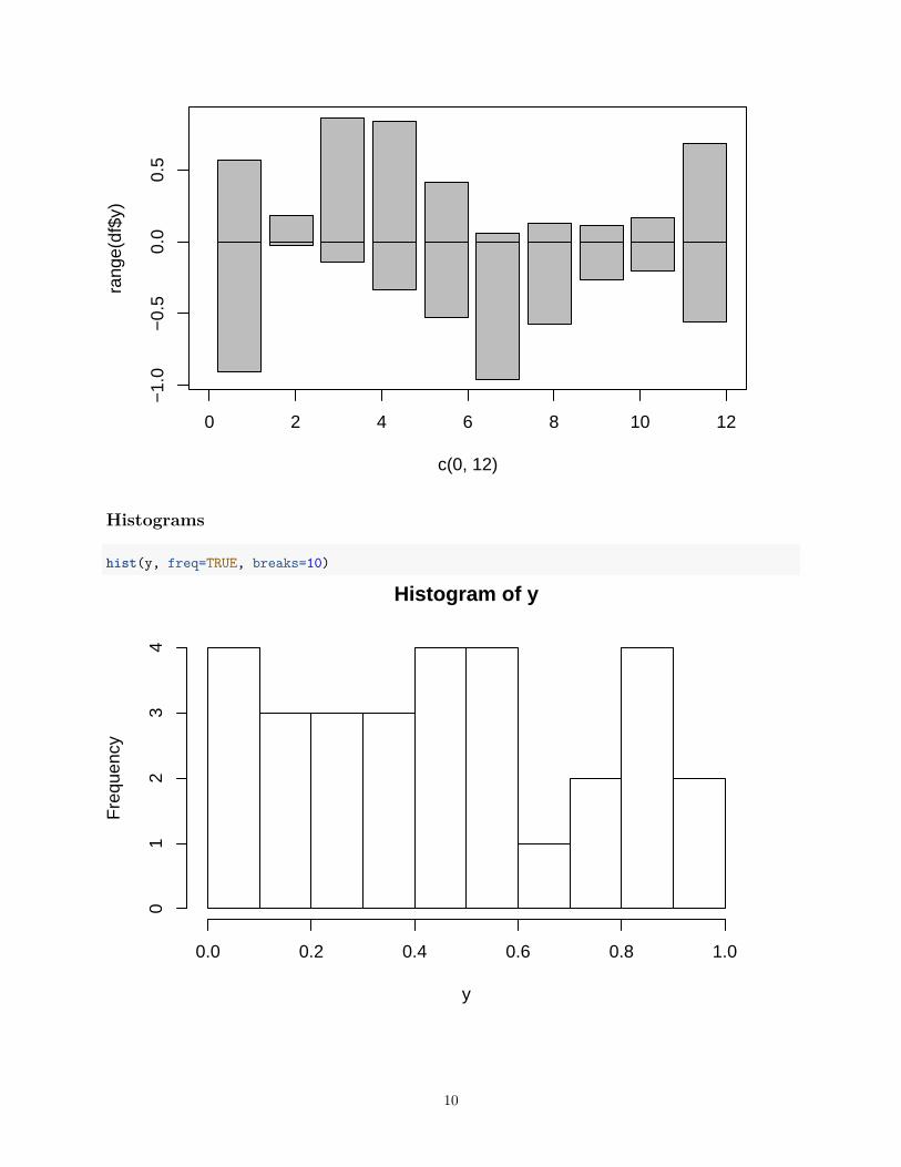
Mirrored bar plot
df <- data.frame(group = rep(c("Above", "Below"), each=10), x = rep(1:10, 2), y = c(runif(10, 0, 1), runif(10, -1, 0)))plot(c(0,12),range(df$y),type = "n")barplot(height = df$y[df$group == "Above"], add = TRUE,axes = FALSE)barplot(height = df$y[df$group == "Below"], add = TRUE,axes = FALSE)
9
0 2 4 6 8 10 12
−1.
0−
0.5
0.0
0.5
c(0, 12)
rang
e(df
$y)
Histograms
hist(y, freq=TRUE, breaks=10)
Histogram of y
y
Fre
quen
cy
0.0 0.2 0.4 0.6 0.8 1.0
01
23
4
10
Density Plots}
plot(density(y), col="red")
0.0 0.5 1.0
0.0
0.2
0.4
0.6
0.8
1.0
density.default(x = y)
N = 30 Bandwidth = 0.136
Den
sity
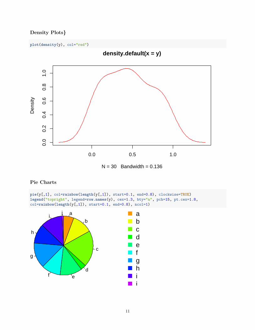
Pie Charts
pie(y[,1], col=rainbow(length(y[,1]), start=0.1, end=0.8), clockwise=TRUE)legend("topright", legend=row.names(y), cex=1.3, bty="n", pch=15, pt.cex=1.8,col=rainbow(length(y[,1]), start=0.1, end=0.8), ncol=1)
a
b
c
def
g
h
ij a
bcdefghij
11
Color Selection Utilities
Default color palette and how to change itpalette()
## [1] "black" "red" "green3" "blue" "cyan" "magenta" "yellow" "gray"palette(rainbow(5, start=0.1, end=0.2))palette()
## [1] "#FF9900" "#FFBF00" "#FFE600" "#F2FF00" "#CCFF00"palette("default")
The gray function allows to select any type of gray shades by providing values from 0 to 1gray(seq(0.1, 1, by= 0.2))
## [1] "#1A1A1A" "#4D4D4D" "#808080" "#B3B3B3" "#E6E6E6"
Color gradients with colorpanel function from gplots librarylibrary(gplots)colorpanel(5, "darkblue", "yellow", "white")
Much more on colors in R see Earl Glynn’s color chart
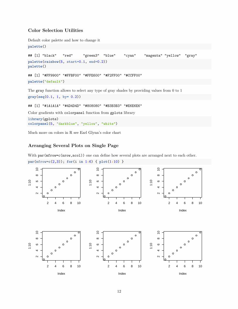
Arranging Several Plots on Single Page
With par(mfrow=c(nrow,ncol)) one can define how several plots are arranged next to each other.par(mfrow=c(2,3)); for(i in 1:6) { plot(1:10) }
2 4 6 8 10
24
68
10
Index
1:10
2 4 6 8 10
24
68
10
Index
1:10
2 4 6 8 10
24
68
10
Index
1:10
2 4 6 8 10
24
68
10
Index
1:10
2 4 6 8 10
24
68
10
Index
1:10
2 4 6 8 10
24
68
10
Index
1:10
12
Arranging Plots with Variable Width
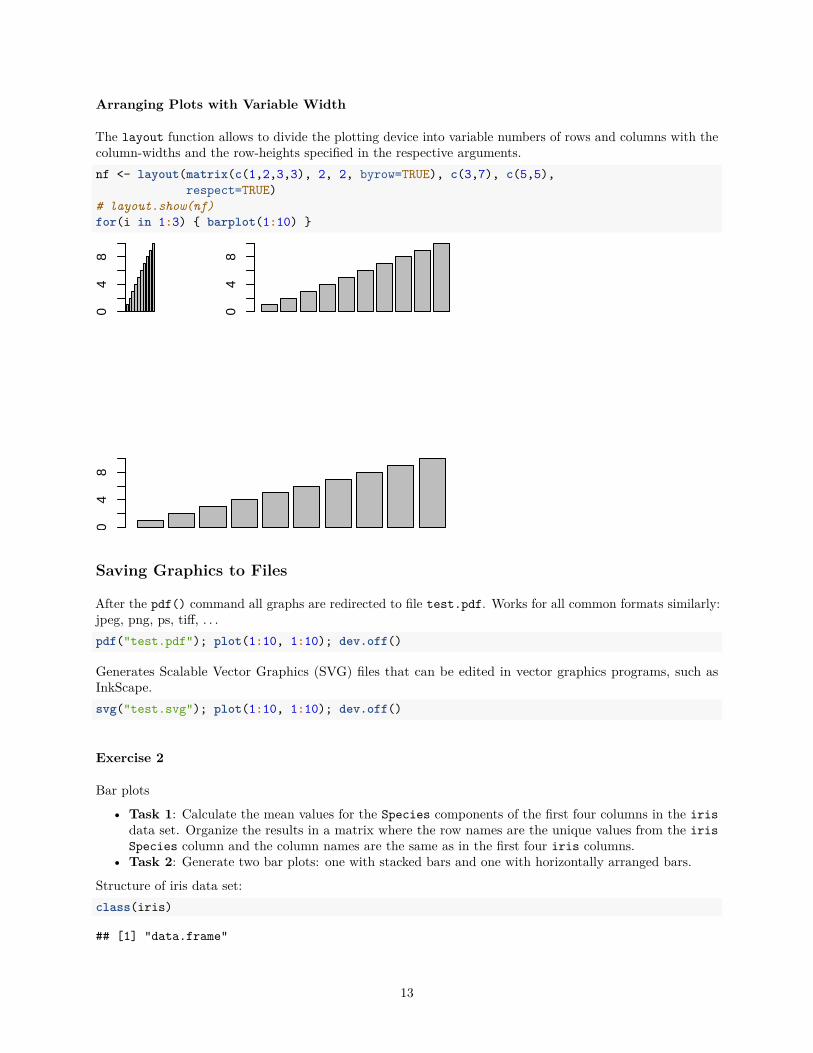
The layout function allows to divide the plotting device into variable numbers of rows and columns with thecolumn-widths and the row-heights specified in the respective arguments.nf <- layout(matrix(c(1,2,3,3), 2, 2, byrow=TRUE), c(3,7), c(5,5),
respect=TRUE)# layout.show(nf)for(i in 1:3) { barplot(1:10) }
04
8
04
8
04
8
Saving Graphics to Files
After the pdf() command all graphs are redirected to file test.pdf. Works for all common formats similarly:jpeg, png, ps, tiff, . . .pdf("test.pdf"); plot(1:10, 1:10); dev.off()
Generates Scalable Vector Graphics (SVG) files that can be edited in vector graphics programs, such asInkScape.svg("test.svg"); plot(1:10, 1:10); dev.off()
Exercise 2
Bar plots
• Task 1: Calculate the mean values for the Species components of the first four columns in the irisdata set. Organize the results in a matrix where the row names are the unique values from the irisSpecies column and the column names are the same as in the first four iris columns.
• Task 2: Generate two bar plots: one with stacked bars and one with horizontally arranged bars.
Structure of iris data set:class(iris)
## [1] "data.frame"
13
iris[1:4,]
## Sepal.Length Sepal.Width Petal.Length Petal.Width Species## 1 5.1 3.5 1.4 0.2 setosa## 2 4.9 3.0 1.4 0.2 setosa## 3 4.7 3.2 1.3 0.2 setosa## 4 4.6 3.1 1.5 0.2 setosatable(iris$Species)
#### setosa versicolor virginica## 50 50 50
Grid Graphics
• What is grid?– Low-level graphics system– Highly flexible and controllable system– Does not provide high-level functions– Intended as development environment for custom plotting functions– Pre-installed on new R distributions
• Documentation and Help– Manual– Book
lattice Graphics
• What is lattice?– High-level graphics system– Developed by Deepayan Sarkar– Implements Trellis graphics system from S-Plus– Simplifies high-level plotting tasks: arranging complex graphical features– Syntax similar to R’s base graphics
• Documentation and Help– Manual– Intro– Book
Open a list of all functions available in the lattice packagelibrary(help=lattice)
Accessing and changing global parameters:?lattice.options?trellis.device
Scatter Plot Sample
14
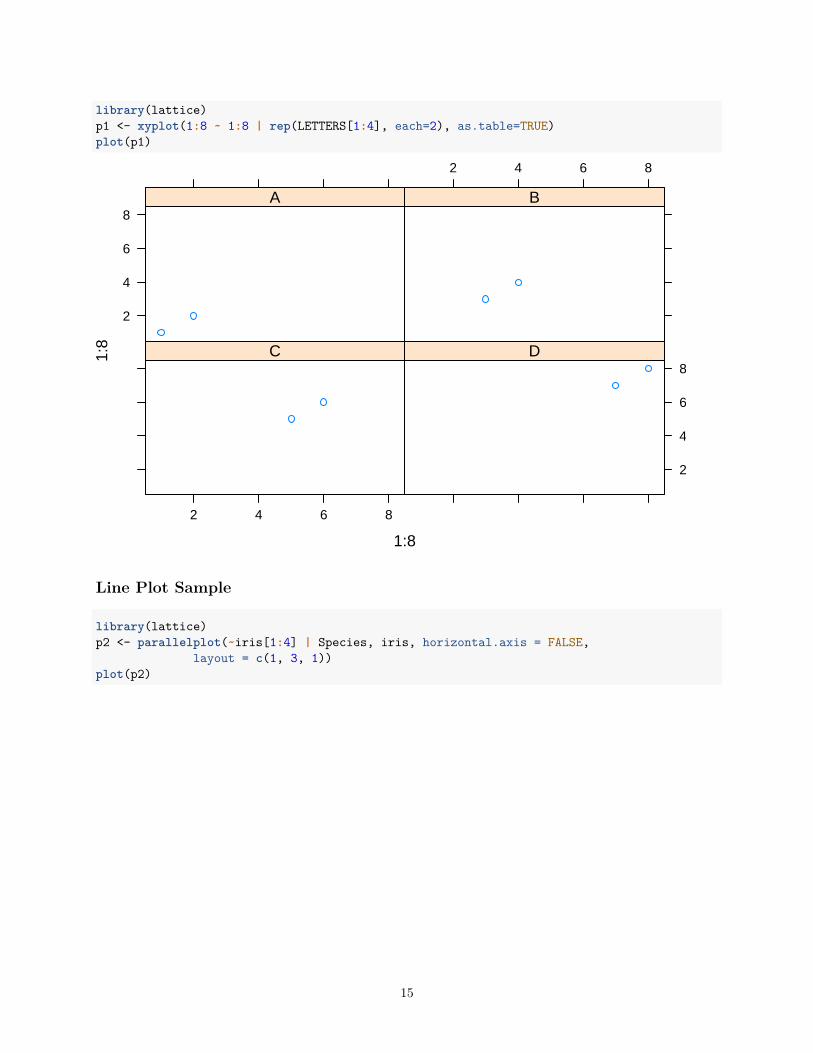
library(lattice)p1 <- xyplot(1:8 ~ 1:8 | rep(LETTERS[1:4], each=2), as.table=TRUE)plot(p1)
1:8
1:8
2
4
6
8A
2 4 6 8
B
2 4 6 8
C
2
4
6
8D
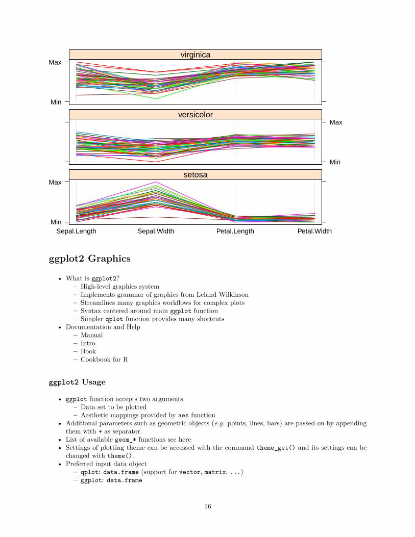
Line Plot Sample
library(lattice)p2 <- parallelplot(~iris[1:4] | Species, iris, horizontal.axis = FALSE,
layout = c(1, 3, 1))plot(p2)
15
Min
Max
Sepal.Length Sepal.Width Petal.Length Petal.Width
setosa
Min
Maxversicolor
Min
Maxvirginica
ggplot2 Graphics
• What is ggplot2?– High-level graphics system– Implements grammar of graphics from Leland Wilkinson– Streamlines many graphics workflows for complex plots– Syntax centered around main ggplot function– Simpler qplot function provides many shortcuts
• Documentation and Help– Manual– Intro– Book– Cookbook for R
ggplot2 Usage
• ggplot function accepts two arguments– Data set to be plotted– Aesthetic mappings provided by aes function
• Additional parameters such as geometric objects (e.g. points, lines, bars) are passed on by appendingthem with + as separator.
• List of available geom_* functions see here• Settings of plotting theme can be accessed with the command theme_get() and its settings can be
changed with theme().• Preferred input data object
– qplot: data.frame (support for vector, matrix, ...)– ggplot: data.frame
16
• Packages with convenience utilities to create expected inputs– plyr– reshape
qplot Function
The syntax of qplot is similar as R’s basic plot function
• Arguments– x: x-coordinates (e.g. col1)– y: y-coordinates (e.g. col2)– data: data.frame or tibble with corresponding column names– xlim, ylim: e.g. xlim=c(0,10)– log: e.g. log="x" or log="xy"– main: main title; see ?plotmath for mathematical formula– xlab, ylab: labels for the x- and y-axes– color, shape, size– ...: many arguments accepted by plot function
qplot: scatter plot basics
Create sample datalibrary(ggplot2)x <- sample(1:10, 10); y <- sample(1:10, 10); cat <- rep(c("A", "B"), 5)
Simple scatter plotqplot(x, y, geom="point")
17
2.5
5.0
7.5
10.0
2.5 5.0 7.5 10.0
x
y
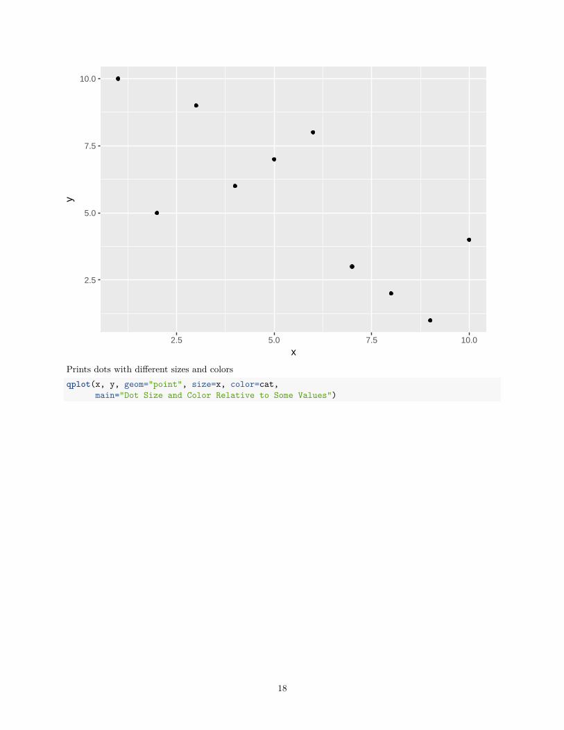
Prints dots with different sizes and colorsqplot(x, y, geom="point", size=x, color=cat,
main="Dot Size and Color Relative to Some Values")
18
2.5
5.0
7.5
10.0
2.5 5.0 7.5 10.0
x
y
x
2.5
5.0
7.5
10.0
cat
A
B
Dot Size and Color Relative to Some Values
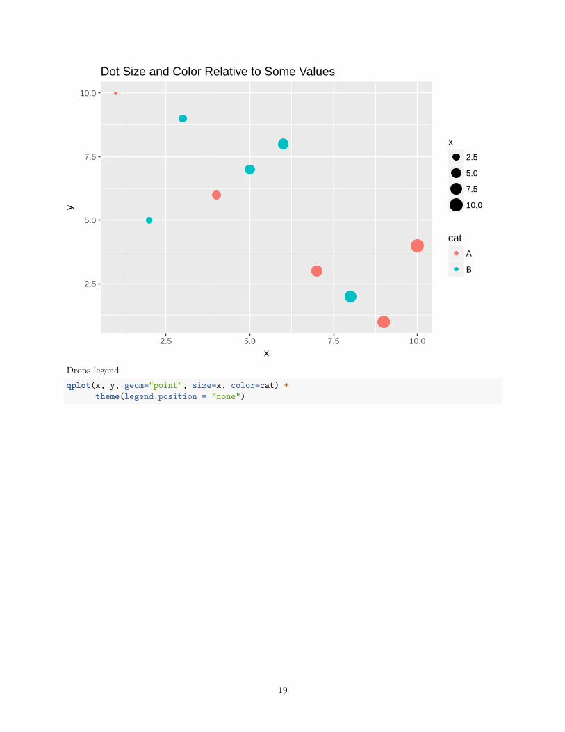
Drops legendqplot(x, y, geom="point", size=x, color=cat) +
theme(legend.position = "none")
19
2.5
5.0
7.5
10.0
2.5 5.0 7.5 10.0
x
y
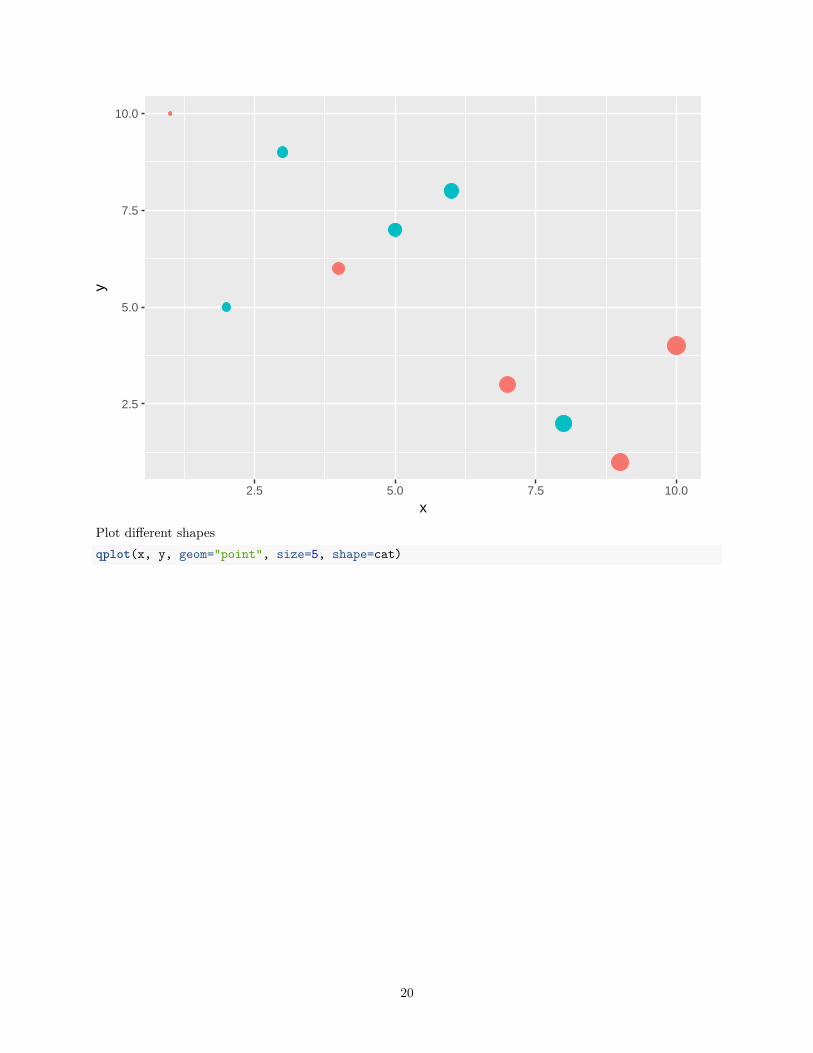
Plot different shapesqplot(x, y, geom="point", size=5, shape=cat)
20
2.5
5.0
7.5
10.0
2.5 5.0 7.5 10.0
x
y
5
5
cat
A
B
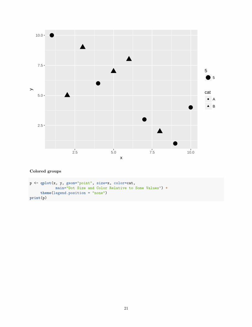
Colored groups
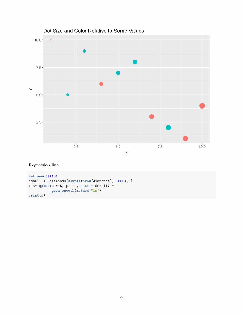
p <- qplot(x, y, geom="point", size=x, color=cat,main="Dot Size and Color Relative to Some Values") +
theme(legend.position = "none")print(p)
21
2.5
5.0
7.5
10.0
2.5 5.0 7.5 10.0
x
yDot Size and Color Relative to Some Values
Regression line
set.seed(1410)dsmall <- diamonds[sample(nrow(diamonds), 1000), ]p <- qplot(carat, price, data = dsmall) +
geom_smooth(method="lm")print(p)
22
0
10000
20000
1 2 3
carat
pric
e
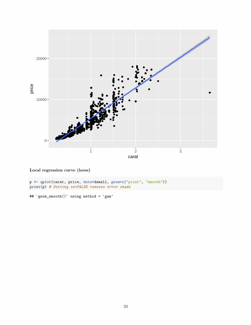
Local regression curve (loess)
p <- qplot(carat, price, data=dsmall, geom=c("point", "smooth"))print(p) # Setting se=FALSE removes error shade
## `geom_smooth()` using method = 'gam'
23
0
5000
10000
15000
1 2 3
carat
pric
e
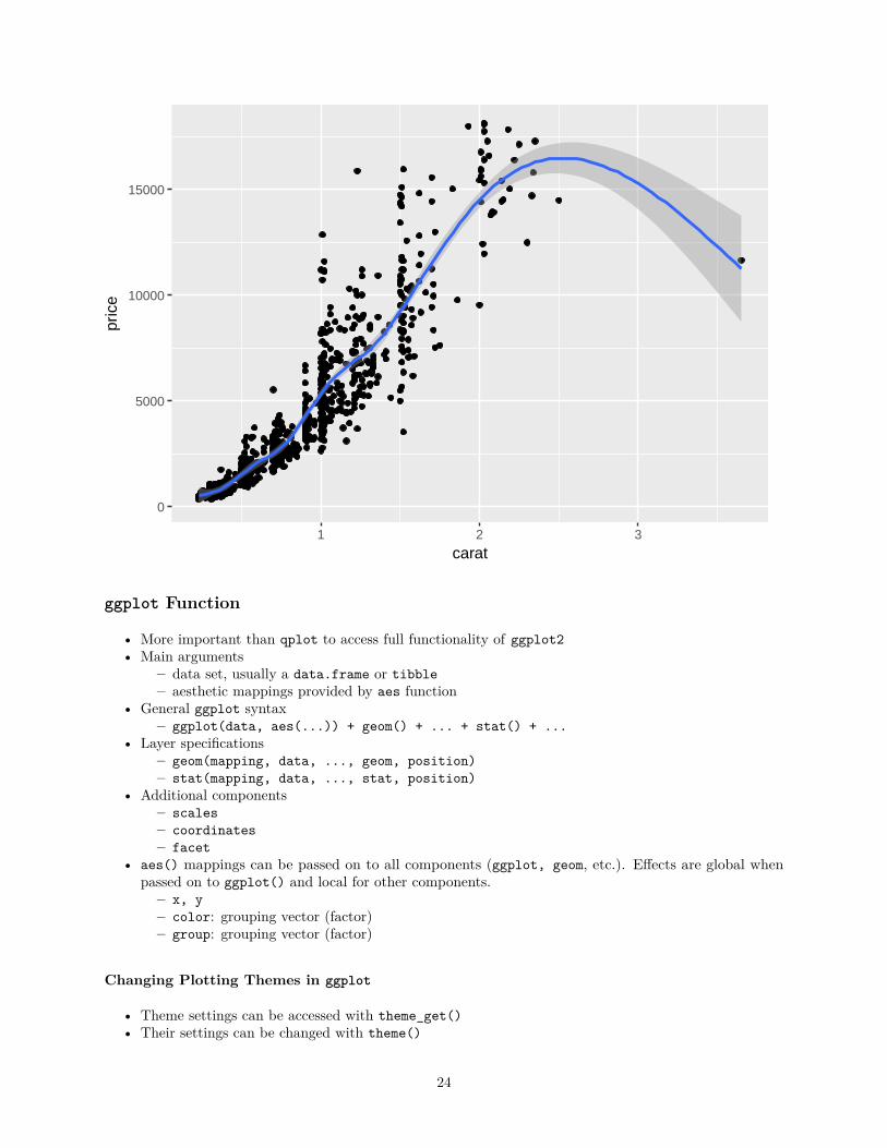
ggplot Function
• More important than qplot to access full functionality of ggplot2• Main arguments
– data set, usually a data.frame or tibble– aesthetic mappings provided by aes function
• General ggplot syntax– ggplot(data, aes(...)) + geom() + ... + stat() + ...
• Layer specifications– geom(mapping, data, ..., geom, position)– stat(mapping, data, ..., stat, position)
• Additional components– scales– coordinates– facet
• aes() mappings can be passed on to all components (ggplot, geom, etc.). Effects are global whenpassed on to ggplot() and local for other components.– x, y– color: grouping vector (factor)– group: grouping vector (factor)
Changing Plotting Themes in ggplot
• Theme settings can be accessed with theme_get()• Their settings can be changed with theme()
24
Example how to change background color to white... + theme(panel.background=element_rect(fill = "white", colour = "black"))
Storing ggplot Specifications
Plots and layers can be stored in variablesp <- ggplot(dsmall, aes(carat, price)) + geom_point()p # or print(p)
Returns information about data and aesthetic mappings followed by each layersummary(p)
Print dots with different sizes and colorsbestfit <- geom_smooth(method = "lm", se = F, color = alpha("steelblue", 0.5), size = 2)p + bestfit # Plot with custom regression line
Syntax to pass on other data setsp %+% diamonds[sample(nrow(diamonds), 100),]
Saves plot stored in variable p to fileggsave(p, file="myplot.pdf")
ggplot: scatter plots
Basic example
set.seed(1410)dsmall <- as.data.frame(diamonds[sample(nrow(diamonds), 1000), ])p <- ggplot(dsmall, aes(carat, price, color=color)) +
geom_point(size=4)print(p)
25
0
5000
10000
15000
1 2 3
carat
pric
e
color
D
E
F
G
H
I
J
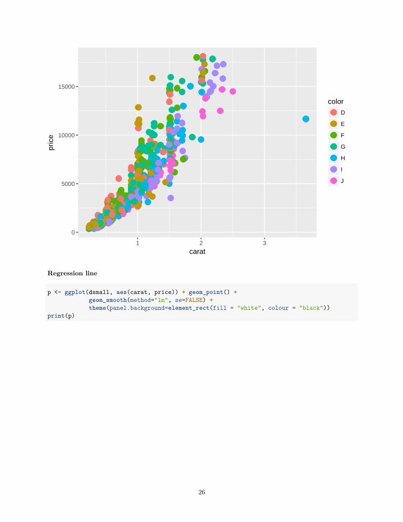
Regression line
p <- ggplot(dsmall, aes(carat, price)) + geom_point() +geom_smooth(method="lm", se=FALSE) +theme(panel.background=element_rect(fill = "white", colour = "black"))
print(p)
26
0
5000
10000
15000
20000
25000
1 2 3
carat
pric
e
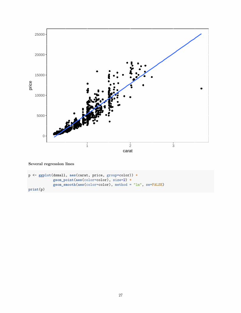
Several regression lines
p <- ggplot(dsmall, aes(carat, price, group=color)) +geom_point(aes(color=color), size=2) +geom_smooth(aes(color=color), method = "lm", se=FALSE)
print(p)
27
0
5000
10000
15000
20000
1 2 3
carat
pric
e
color
D
E
F
G
H
I
J
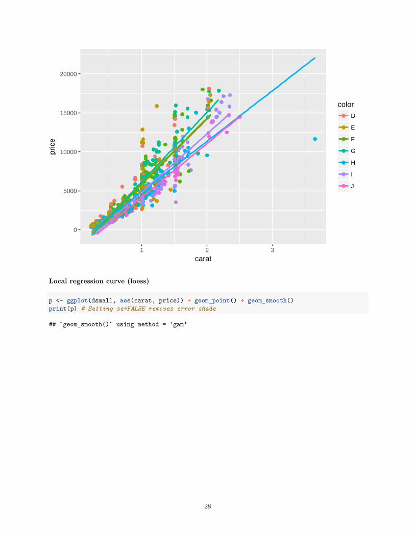
Local regression curve (loess)
p <- ggplot(dsmall, aes(carat, price)) + geom_point() + geom_smooth()print(p) # Setting se=FALSE removes error shade
## `geom_smooth()` using method = 'gam'
28
0
5000
10000
15000
1 2 3
carat
pric
e
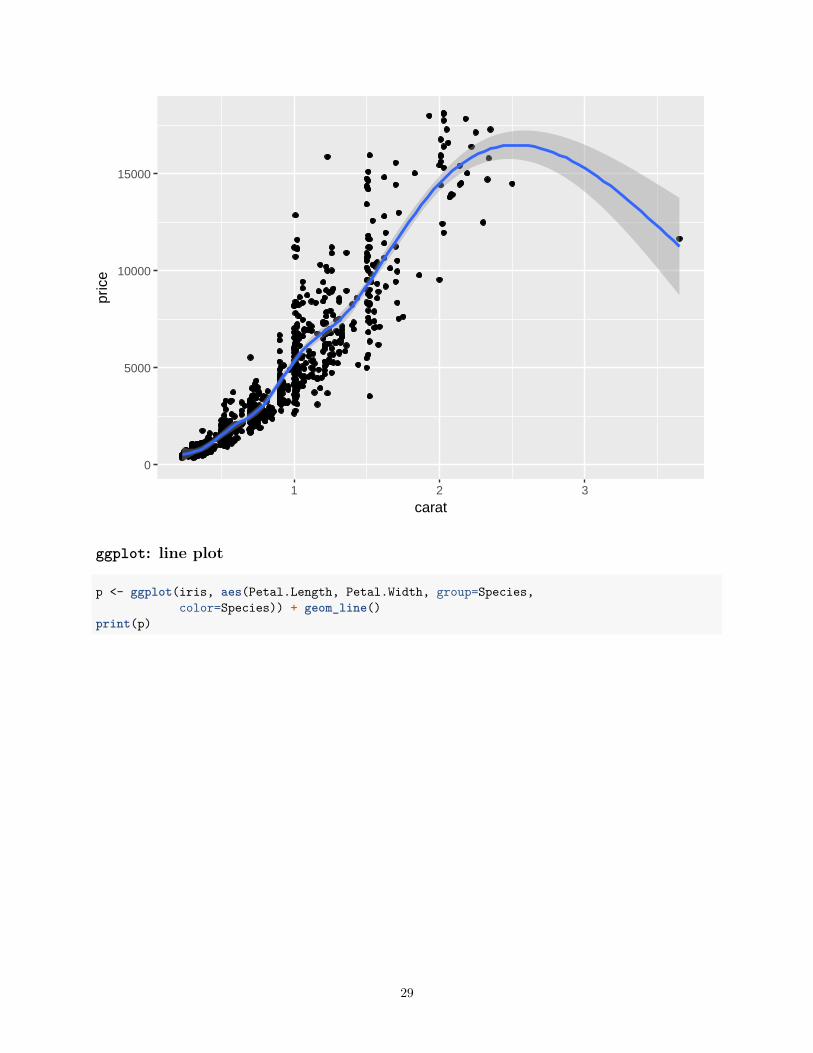
ggplot: line plot
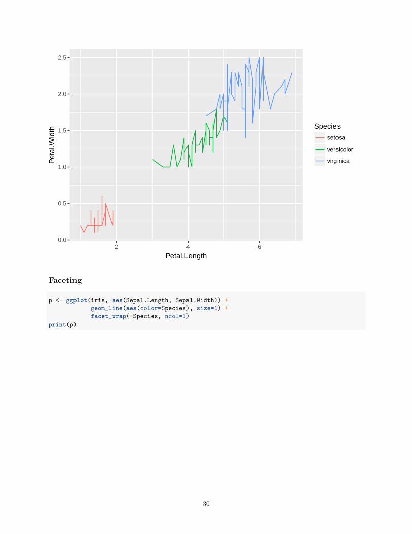
p <- ggplot(iris, aes(Petal.Length, Petal.Width, group=Species,color=Species)) + geom_line()
print(p)
29
0.0
0.5
1.0
1.5
2.0
2.5
2 4 6
Petal.Length
Pet
al.W
idth Species
setosa
versicolor
virginica
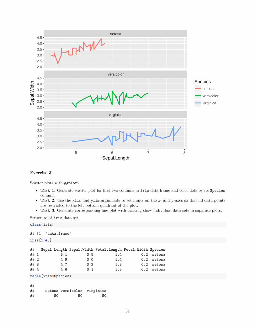
Faceting
p <- ggplot(iris, aes(Sepal.Length, Sepal.Width)) +geom_line(aes(color=Species), size=1) +facet_wrap(~Species, ncol=1)
print(p)
30
virginica
versicolor
setosa
5 6 7 8
2.0
2.5
3.0
3.5
4.0
4.5
2.0
2.5
3.0
3.5
4.0
4.5
2.0
2.5
3.0
3.5
4.0
4.5
Sepal.Length
Sep
al.W
idth Species
setosa
versicolor
virginica
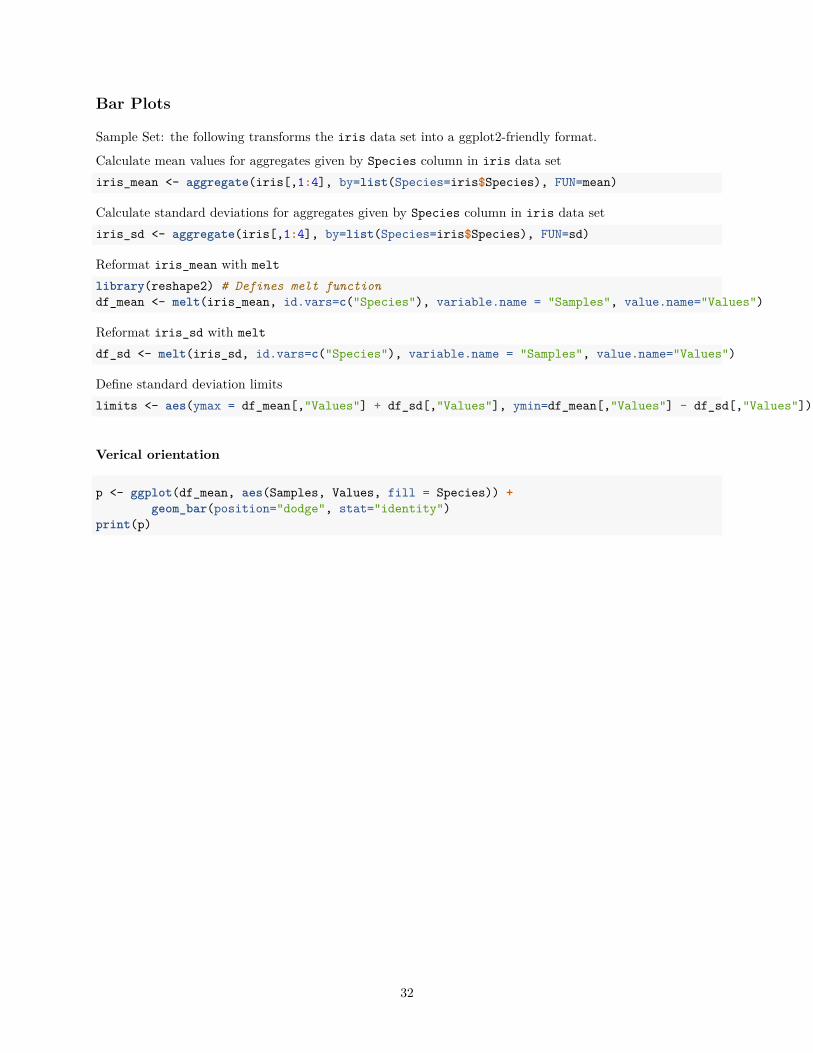
Exercise 3
Scatter plots with ggplot2
• Task 1: Generate scatter plot for first two columns in iris data frame and color dots by its Speciescolumn.
• Task 2: Use the xlim and ylim arguments to set limits on the x- and y-axes so that all data pointsare restricted to the left bottom quadrant of the plot.
• Task 3: Generate corresponding line plot with faceting show individual data sets in saparate plots.
Structure of iris data setclass(iris)
## [1] "data.frame"iris[1:4,]
## Sepal.Length Sepal.Width Petal.Length Petal.Width Species## 1 5.1 3.5 1.4 0.2 setosa## 2 4.9 3.0 1.4 0.2 setosa## 3 4.7 3.2 1.3 0.2 setosa## 4 4.6 3.1 1.5 0.2 setosatable(iris$Species)
#### setosa versicolor virginica## 50 50 50
31
Bar Plots
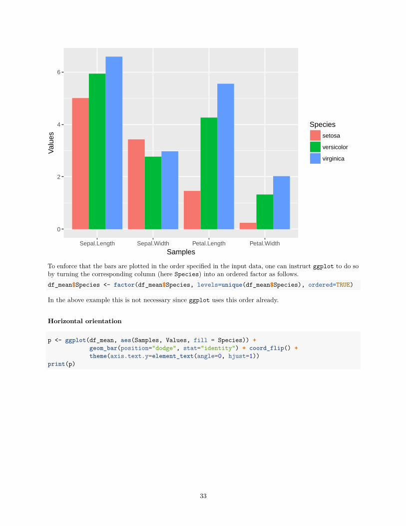
Sample Set: the following transforms the iris data set into a ggplot2-friendly format.
Calculate mean values for aggregates given by Species column in iris data setiris_mean <- aggregate(iris[,1:4], by=list(Species=iris$Species), FUN=mean)
Calculate standard deviations for aggregates given by Species column in iris data setiris_sd <- aggregate(iris[,1:4], by=list(Species=iris$Species), FUN=sd)
Reformat iris_mean with meltlibrary(reshape2) # Defines melt functiondf_mean <- melt(iris_mean, id.vars=c("Species"), variable.name = "Samples", value.name="Values")
Reformat iris_sd with meltdf_sd <- melt(iris_sd, id.vars=c("Species"), variable.name = "Samples", value.name="Values")
Define standard deviation limitslimits <- aes(ymax = df_mean[,"Values"] + df_sd[,"Values"], ymin=df_mean[,"Values"] - df_sd[,"Values"])
Verical orientation
p <- ggplot(df_mean, aes(Samples, Values, fill = Species)) +geom_bar(position="dodge", stat="identity")
print(p)
32
0
2
4
6
Sepal.Length Sepal.Width Petal.Length Petal.Width
Samples
Val
ues
Species
setosa
versicolor
virginica
To enforce that the bars are plotted in the order specified in the input data, one can instruct ggplot to do soby turning the corresponding column (here Species) into an ordered factor as follows.df_mean$Species <- factor(df_mean$Species, levels=unique(df_mean$Species), ordered=TRUE)
In the above example this is not necessary since ggplot uses this order already.
Horizontal orientation
p <- ggplot(df_mean, aes(Samples, Values, fill = Species)) +geom_bar(position="dodge", stat="identity") + coord_flip() +theme(axis.text.y=element_text(angle=0, hjust=1))
print(p)
33
Sepal.Length
Sepal.Width
Petal.Length
Petal.Width
0 2 4 6
Values
Sam
ples
Species
setosa
versicolor
virginica
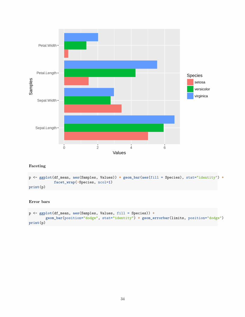
Faceting
p <- ggplot(df_mean, aes(Samples, Values)) + geom_bar(aes(fill = Species), stat="identity") +facet_wrap(~Species, ncol=1)
print(p)
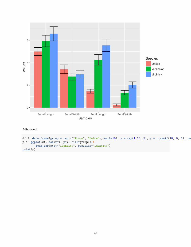
Error bars
p <- ggplot(df_mean, aes(Samples, Values, fill = Species)) +geom_bar(position="dodge", stat="identity") + geom_errorbar(limits, position="dodge")
print(p)
34
0
2
4
6
Sepal.Length Sepal.Width Petal.Length Petal.Width
Samples
Val
ues
Species
setosa
versicolor
virginica
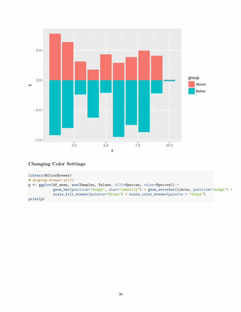
Mirrored
df <- data.frame(group = rep(c("Above", "Below"), each=10), x = rep(1:10, 2), y = c(runif(10, 0, 1), runif(10, -1, 0)))p <- ggplot(df, aes(x=x, y=y, fill=group)) +
geom_bar(stat="identity", position="identity")print(p)
35
−1.0
−0.5
0.0
0.5
2.5 5.0 7.5 10.0
x
y
group
Above
Below
Changing Color Settings
library(RColorBrewer)# display.brewer.all()p <- ggplot(df_mean, aes(Samples, Values, fill=Species, color=Species)) +
geom_bar(position="dodge", stat="identity") + geom_errorbar(limits, position="dodge") +scale_fill_brewer(palette="Blues") + scale_color_brewer(palette = "Greys")
print(p)
36
0
2
4
6
Sepal.Length Sepal.Width Petal.Length Petal.Width
Samples
Val
ues
Species
setosa
versicolor
virginica
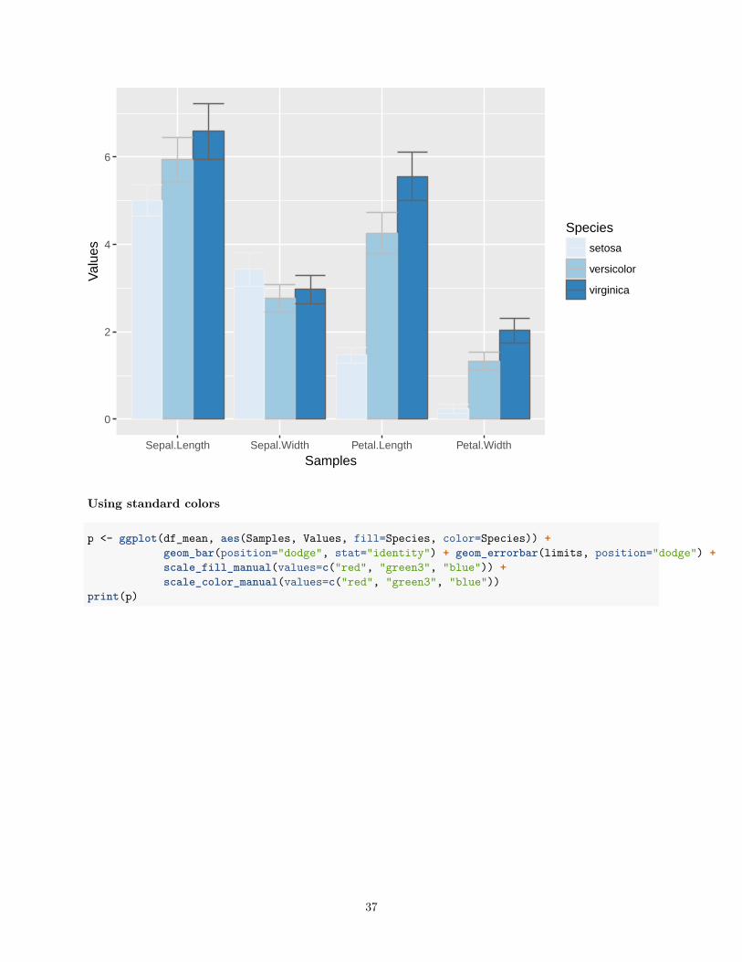
Using standard colors
p <- ggplot(df_mean, aes(Samples, Values, fill=Species, color=Species)) +geom_bar(position="dodge", stat="identity") + geom_errorbar(limits, position="dodge") +scale_fill_manual(values=c("red", "green3", "blue")) +scale_color_manual(values=c("red", "green3", "blue"))
print(p)
37
0
2
4
6
Sepal.Length Sepal.Width Petal.Length Petal.Width
Samples
Val
ues
Species
setosa
versicolor
virginica
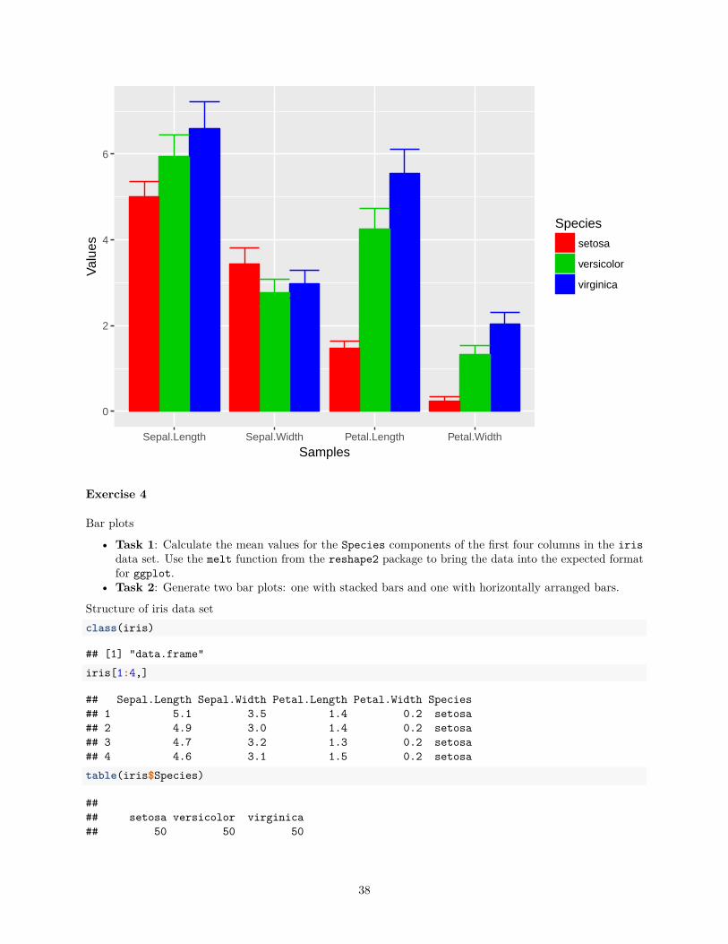
Exercise 4
Bar plots
• Task 1: Calculate the mean values for the Species components of the first four columns in the irisdata set. Use the melt function from the reshape2 package to bring the data into the expected formatfor ggplot.
• Task 2: Generate two bar plots: one with stacked bars and one with horizontally arranged bars.
Structure of iris data setclass(iris)
## [1] "data.frame"iris[1:4,]
## Sepal.Length Sepal.Width Petal.Length Petal.Width Species## 1 5.1 3.5 1.4 0.2 setosa## 2 4.9 3.0 1.4 0.2 setosa## 3 4.7 3.2 1.3 0.2 setosa## 4 4.6 3.1 1.5 0.2 setosatable(iris$Species)
#### setosa versicolor virginica## 50 50 50
38
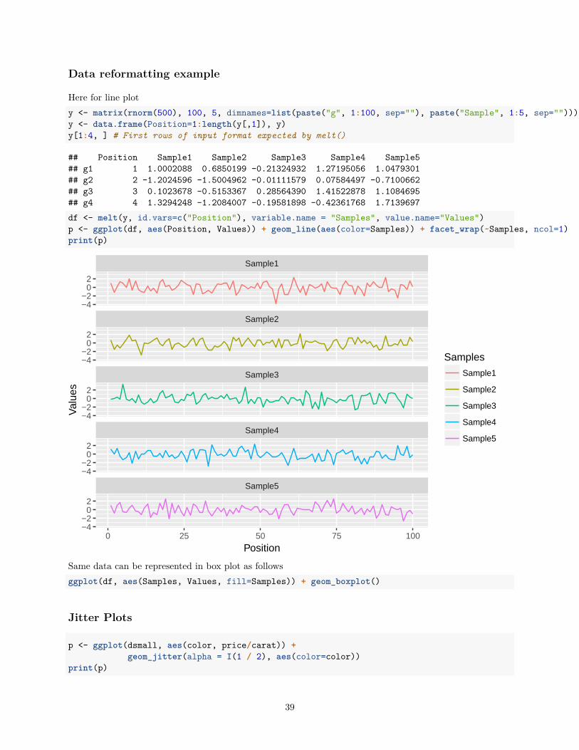
Data reformatting example
Here for line ploty <- matrix(rnorm(500), 100, 5, dimnames=list(paste("g", 1:100, sep=""), paste("Sample", 1:5, sep="")))y <- data.frame(Position=1:length(y[,1]), y)y[1:4, ] # First rows of input format expected by melt()
## Position Sample1 Sample2 Sample3 Sample4 Sample5## g1 1 1.0002088 0.6850199 -0.21324932 1.27195056 1.0479301## g2 2 -1.2024596 -1.5004962 -0.01111579 0.07584497 -0.7100662## g3 3 0.1023678 -0.5153367 0.28564390 1.41522878 1.1084695## g4 4 1.3294248 -1.2084007 -0.19581898 -0.42361768 1.7139697df <- melt(y, id.vars=c("Position"), variable.name = "Samples", value.name="Values")p <- ggplot(df, aes(Position, Values)) + geom_line(aes(color=Samples)) + facet_wrap(~Samples, ncol=1)print(p)
Sample5
Sample4
Sample3
Sample2
Sample1
0 25 50 75 100
−4−2
02
−4−2
02
−4−2
02
−4−2
02
−4−2
02
Position
Val
ues
Samples
Sample1
Sample2
Sample3
Sample4
Sample5
Same data can be represented in box plot as followsggplot(df, aes(Samples, Values, fill=Samples)) + geom_boxplot()
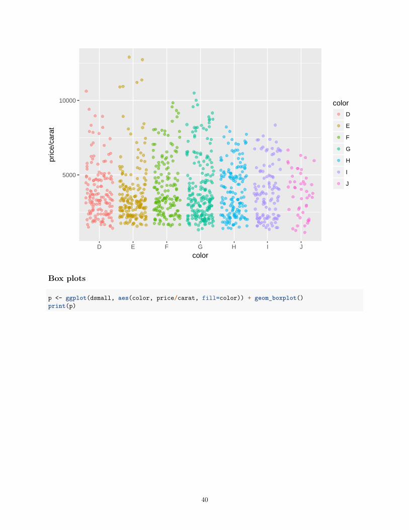
Jitter Plots
p <- ggplot(dsmall, aes(color, price/carat)) +geom_jitter(alpha = I(1 / 2), aes(color=color))
print(p)
39
5000
10000
D E F G H I J
color
pric
e/ca
rat
color
D
E
F
G
H
I
J
Box plots
p <- ggplot(dsmall, aes(color, price/carat, fill=color)) + geom_boxplot()print(p)
40
5000
10000
D E F G H I J
color
pric
e/ca
rat
color
D
E
F
G
H
I
J
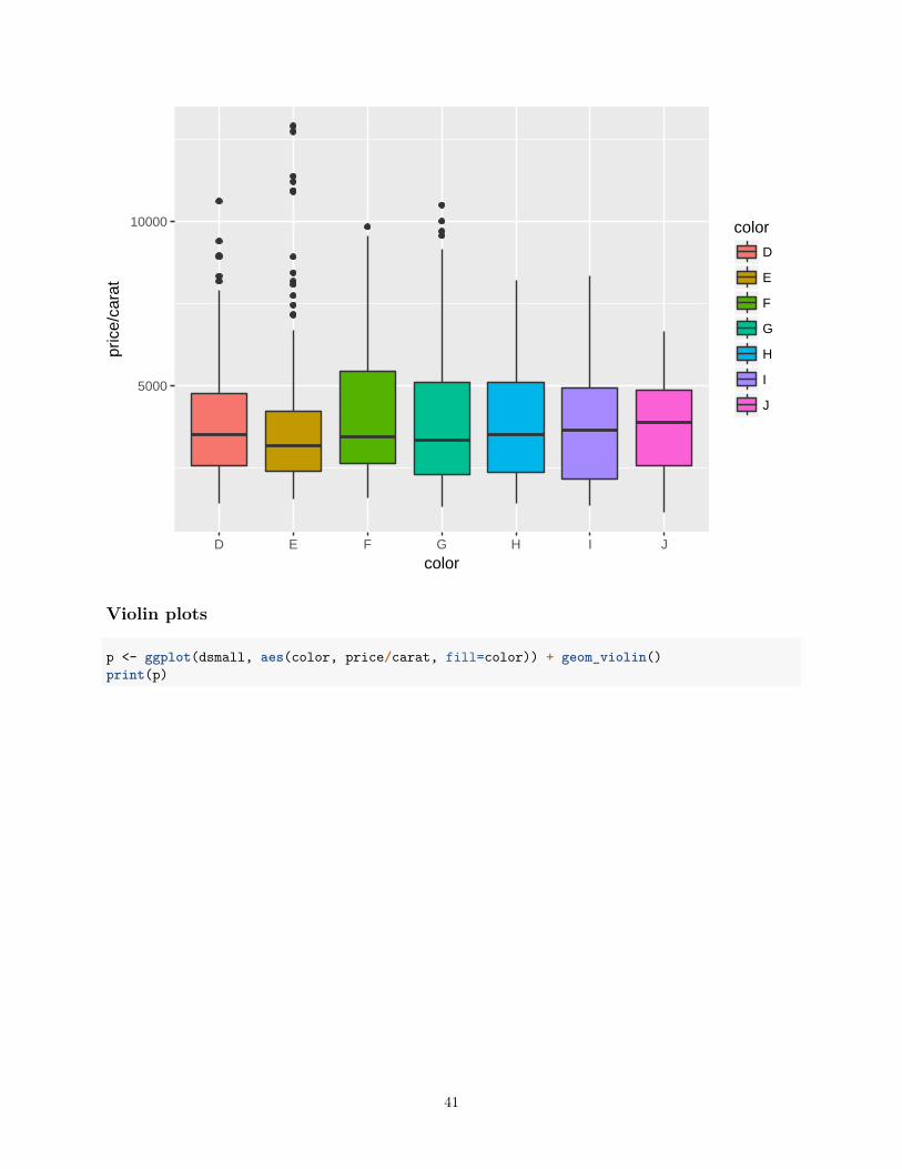
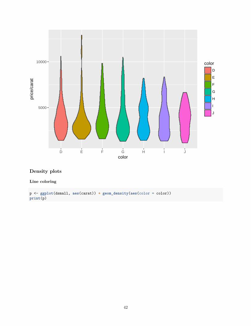
Violin plots
p <- ggplot(dsmall, aes(color, price/carat, fill=color)) + geom_violin()print(p)
41
5000
10000
D E F G H I J
color
pric
e/ca
rat
color
D
E
F
G
H
I
J
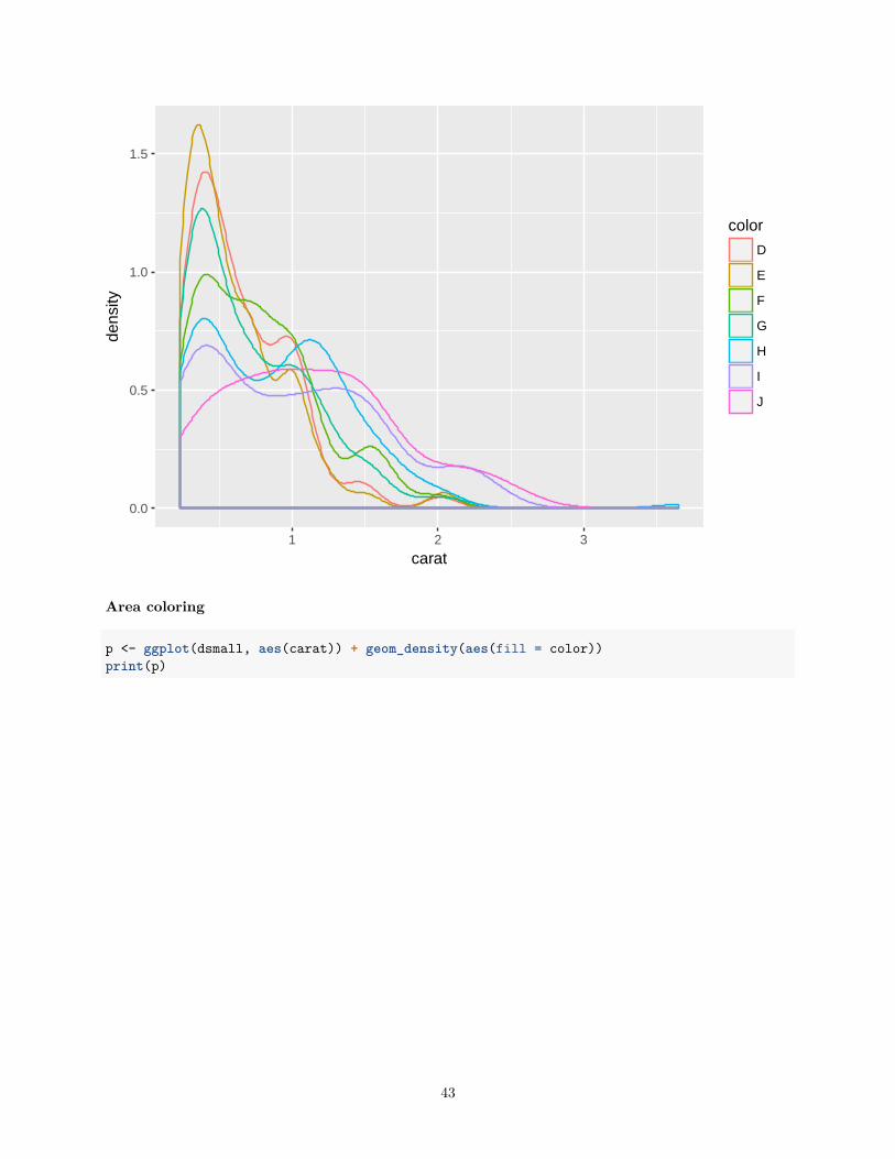
Density plots
Line coloring
p <- ggplot(dsmall, aes(carat)) + geom_density(aes(color = color))print(p)
42
0.0
0.5
1.0
1.5
1 2 3
carat
dens
ity
color
D
E
F
G
H
I
J
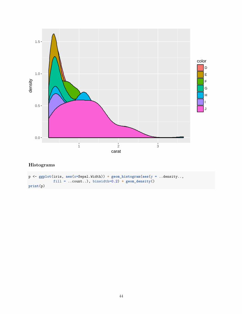
Area coloring
p <- ggplot(dsmall, aes(carat)) + geom_density(aes(fill = color))print(p)
43
0.0
0.5
1.0
1.5
1 2 3
carat
dens
ity
color
D
E
F
G
H
I
J
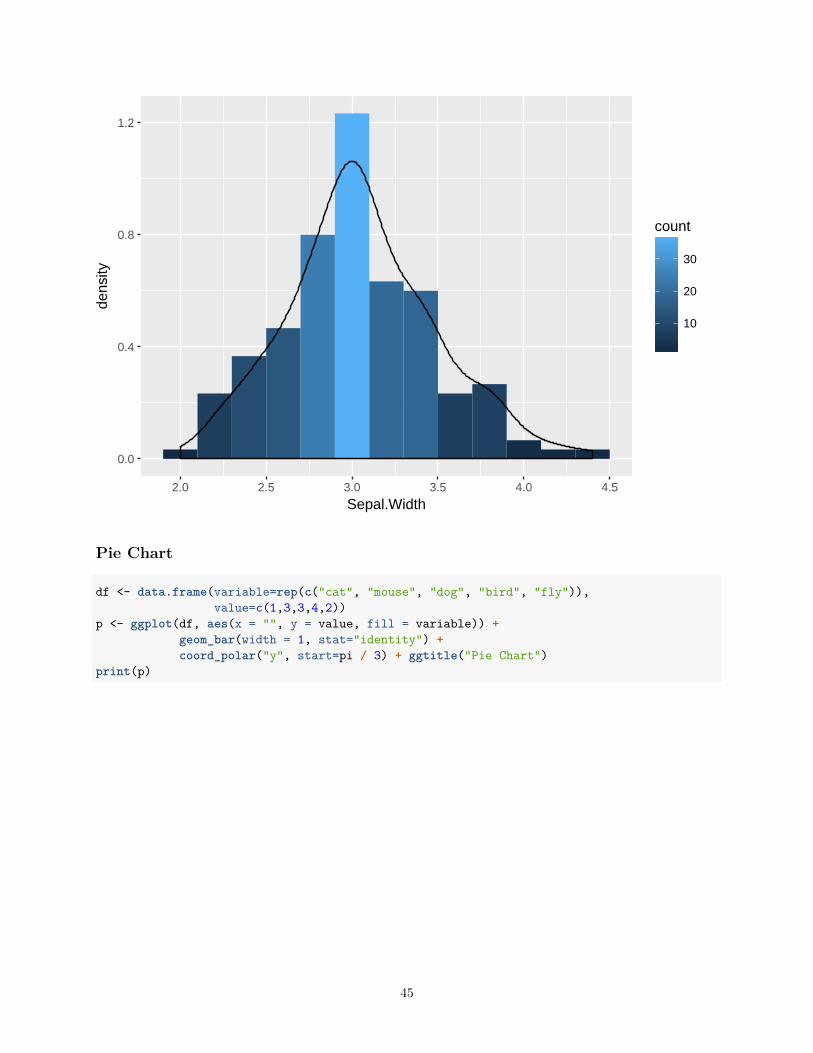
Histograms
p <- ggplot(iris, aes(x=Sepal.Width)) + geom_histogram(aes(y = ..density..,fill = ..count..), binwidth=0.2) + geom_density()
print(p)
44
0.0
0.4
0.8
1.2
2.0 2.5 3.0 3.5 4.0 4.5
Sepal.Width
dens
ity
10
20
30
count
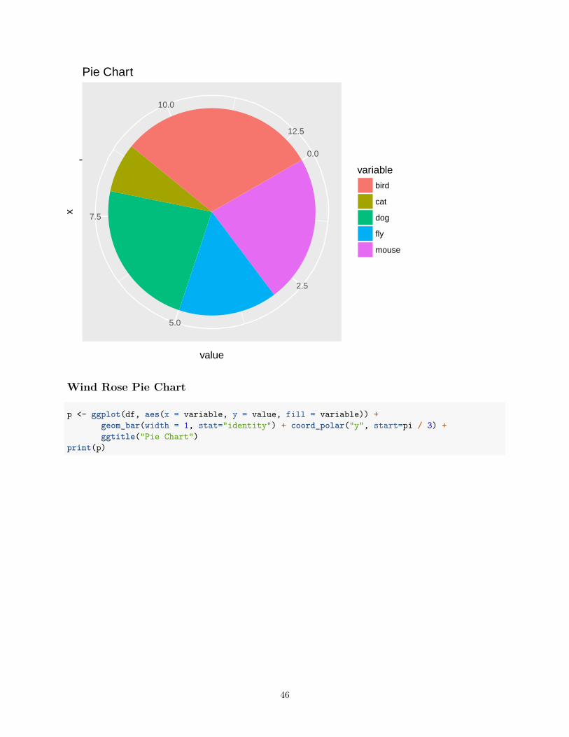
Pie Chart
df <- data.frame(variable=rep(c("cat", "mouse", "dog", "bird", "fly")),value=c(1,3,3,4,2))
p <- ggplot(df, aes(x = "", y = value, fill = variable)) +geom_bar(width = 1, stat="identity") +coord_polar("y", start=pi / 3) + ggtitle("Pie Chart")
print(p)
45
0.0
2.5
5.0
7.5
10.0
12.5
value
x
variable
bird
cat
dog
fly
mouse
Pie Chart
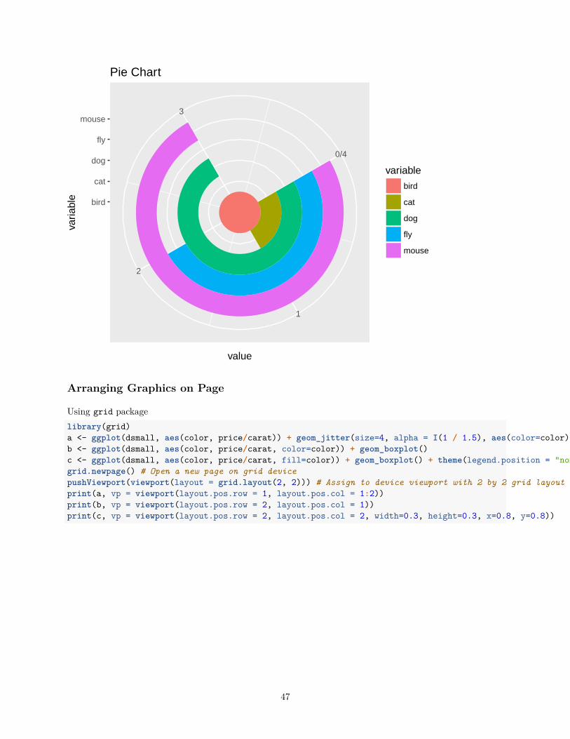
Wind Rose Pie Chart
p <- ggplot(df, aes(x = variable, y = value, fill = variable)) +geom_bar(width = 1, stat="identity") + coord_polar("y", start=pi / 3) +ggtitle("Pie Chart")
print(p)
46
1
2
3
0/4
bird
cat
dog
fly
mouse
value
varia
ble
variable
bird
cat
dog
fly
mouse
Pie Chart
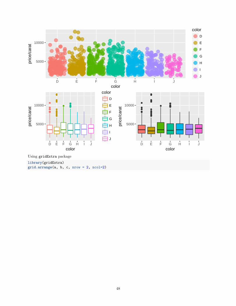
Arranging Graphics on Page
Using grid packagelibrary(grid)a <- ggplot(dsmall, aes(color, price/carat)) + geom_jitter(size=4, alpha = I(1 / 1.5), aes(color=color))b <- ggplot(dsmall, aes(color, price/carat, color=color)) + geom_boxplot()c <- ggplot(dsmall, aes(color, price/carat, fill=color)) + geom_boxplot() + theme(legend.position = "none")grid.newpage() # Open a new page on grid devicepushViewport(viewport(layout = grid.layout(2, 2))) # Assign to device viewport with 2 by 2 grid layoutprint(a, vp = viewport(layout.pos.row = 1, layout.pos.col = 1:2))print(b, vp = viewport(layout.pos.row = 2, layout.pos.col = 1))print(c, vp = viewport(layout.pos.row = 2, layout.pos.col = 2, width=0.3, height=0.3, x=0.8, y=0.8))
47
5000
10000
D E F G H I J
color
pric
e/ca
rat
color
D
E
F
G
H
I
J
5000
10000
D E F G H I J
color
pric
e/ca
rat
color
D
E
F
G
H
I
J
5000
10000
D E F G H I J
color
pric
e/ca
rat
Using gridExtra packagelibrary(gridExtra)grid.arrange(a, b, c, nrow = 2, ncol=2)
48
5000
10000
D E F G H I J
color
pric
e/ca
rat
color
D
E
F
G
H
I
J
5000
10000
D E F G H I J
color
pric
e/ca
rat
color
D
E
F
G
H
I
J
5000
10000
D E F G H I J
color
pric
e/ca
rat
Inserting Graphics into Plots
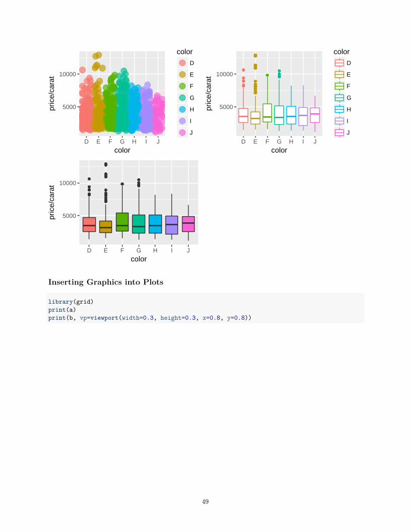
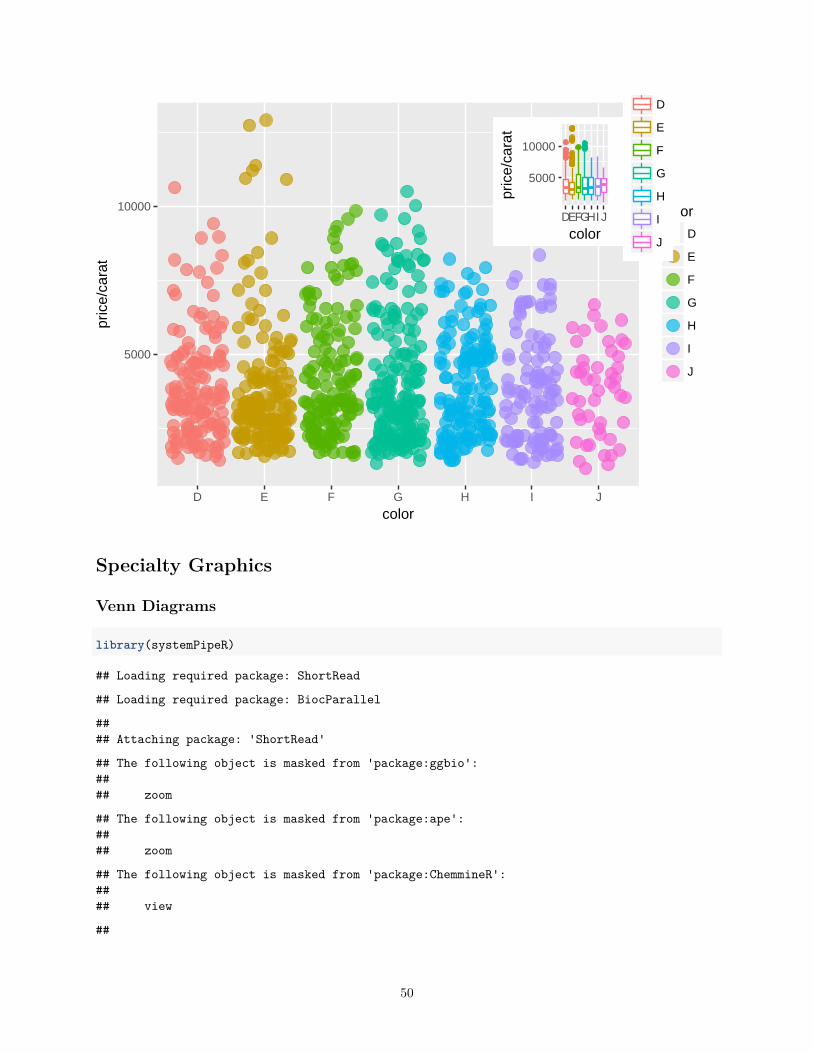
library(grid)print(a)print(b, vp=viewport(width=0.3, height=0.3, x=0.8, y=0.8))
49
5000
10000
D E F G H I J
color
pric
e/ca
rat
color
D
E
F
G
H
I
J
5000
10000
DEFGHI J
color
pric
e/ca
rat
D
E
F
G
H
I
J
Specialty Graphics
Venn Diagrams
library(systemPipeR)
## Loading required package: ShortRead
## Loading required package: BiocParallel
#### Attaching package: 'ShortRead'
## The following object is masked from 'package:ggbio':#### zoom
## The following object is masked from 'package:ape':#### zoom
## The following object is masked from 'package:ChemmineR':#### view
##
50
#### Attaching package: 'systemPipeR'
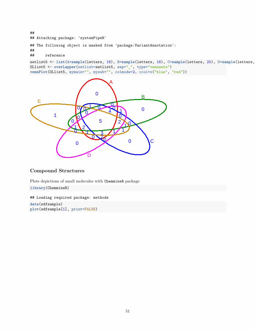
## The following object is masked from 'package:VariantAnnotation':#### referencesetlist5 <- list(A=sample(letters, 18), B=sample(letters, 16), C=sample(letters, 20), D=sample(letters, 22), E=sample(letters, 18))OLlist5 <- overLapper(setlist=setlist5, sep="_", type="vennsets")vennPlot(OLlist5, mymain="", mysub="", colmode=2, ccol=c("blue", "red"))
0
0
00
1
01
0
0
0
1
0
0
10
0 0
0
2
0
1
0
111
40
23
25
A
B
C
D
E
Compound Structures
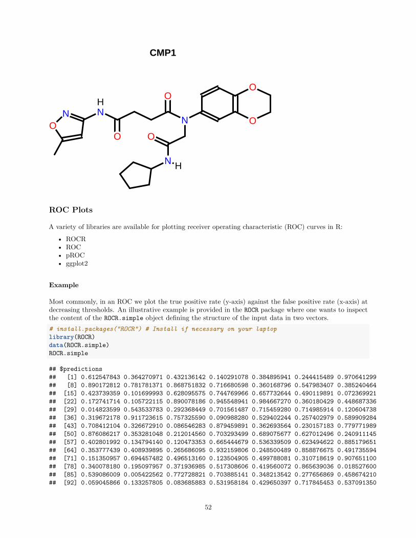
Plots depictions of small molecules with ChemmineR packagelibrary(ChemmineR)
## Loading required package: methodsdata(sdfsample)plot(sdfsample[1], print=FALSE)
51
CMP1
O
O
OO
OO
N
NNN
H
H
ROC Plots
A variety of libraries are available for plotting receiver operating characteristic (ROC) curves in R:
• ROCR• ROC• pROC• ggplot2
Example
Most commonly, in an ROC we plot the true positive rate (y-axis) against the false positive rate (x-axis) atdecreasing thresholds. An illustrative example is provided in the ROCR package where one wants to inspectthe content of the ROCR.simple object defining the structure of the input data in two vectors.# install.packages("ROCR") # Install if necessary on your laptoplibrary(ROCR)data(ROCR.simple)ROCR.simple
## $predictions## [1] 0.612547843 0.364270971 0.432136142 0.140291078 0.384895941 0.244415489 0.970641299## [8] 0.890172812 0.781781371 0.868751832 0.716680598 0.360168796 0.547983407 0.385240464## [15] 0.423739359 0.101699993 0.628095575 0.744769966 0.657732644 0.490119891 0.072369921## [22] 0.172741714 0.105722115 0.890078186 0.945548941 0.984667270 0.360180429 0.448687336## [29] 0.014823599 0.543533783 0.292368449 0.701561487 0.715459280 0.714985914 0.120604738## [36] 0.319672178 0.911723615 0.757325590 0.090988280 0.529402244 0.257402979 0.589909284## [43] 0.708412104 0.326672910 0.086546283 0.879459891 0.362693564 0.230157183 0.779771989## [50] 0.876086217 0.353281048 0.212014560 0.703293499 0.689075677 0.627012496 0.240911145## [57] 0.402801992 0.134794140 0.120473353 0.665444679 0.536339509 0.623494622 0.885179651## [64] 0.353777439 0.408939895 0.265686095 0.932159806 0.248500489 0.858876675 0.491735594## [71] 0.151350957 0.694457482 0.496513160 0.123504905 0.499788081 0.310718619 0.907651100## [78] 0.340078180 0.195097957 0.371936985 0.517308606 0.419560072 0.865639036 0.018527600## [85] 0.539086009 0.005422562 0.772728821 0.703885141 0.348213542 0.277656869 0.458674210## [92] 0.059045866 0.133257805 0.083685883 0.531958184 0.429650397 0.717845453 0.537091350
52
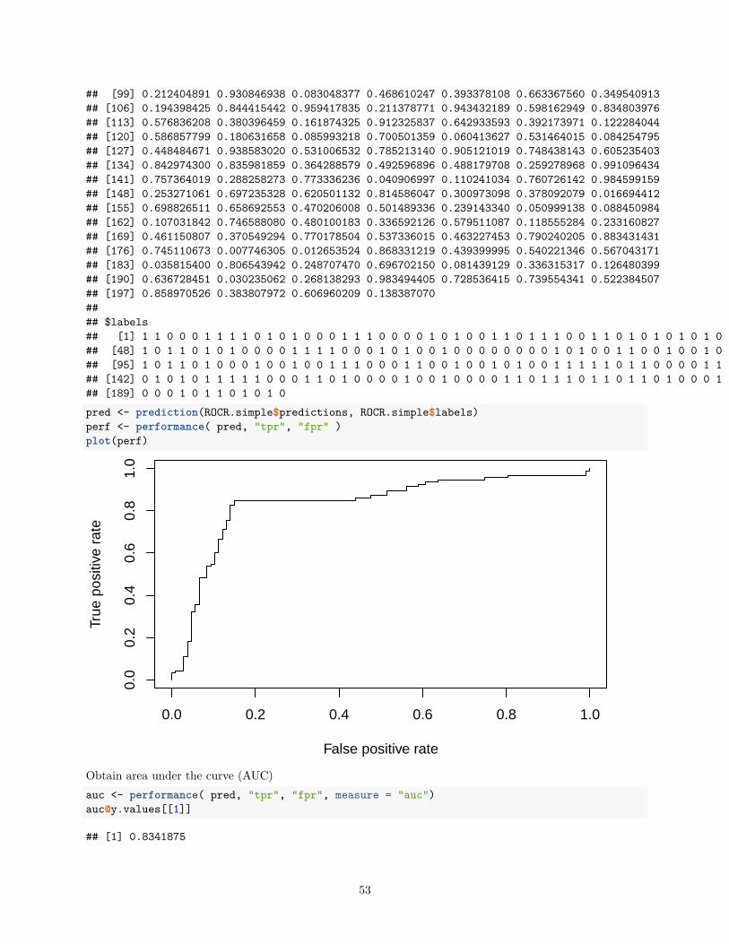
## [99] 0.212404891 0.930846938 0.083048377 0.468610247 0.393378108 0.663367560 0.349540913## [106] 0.194398425 0.844415442 0.959417835 0.211378771 0.943432189 0.598162949 0.834803976## [113] 0.576836208 0.380396459 0.161874325 0.912325837 0.642933593 0.392173971 0.122284044## [120] 0.586857799 0.180631658 0.085993218 0.700501359 0.060413627 0.531464015 0.084254795## [127] 0.448484671 0.938583020 0.531006532 0.785213140 0.905121019 0.748438143 0.605235403## [134] 0.842974300 0.835981859 0.364288579 0.492596896 0.488179708 0.259278968 0.991096434## [141] 0.757364019 0.288258273 0.773336236 0.040906997 0.110241034 0.760726142 0.984599159## [148] 0.253271061 0.697235328 0.620501132 0.814586047 0.300973098 0.378092079 0.016694412## [155] 0.698826511 0.658692553 0.470206008 0.501489336 0.239143340 0.050999138 0.088450984## [162] 0.107031842 0.746588080 0.480100183 0.336592126 0.579511087 0.118555284 0.233160827## [169] 0.461150807 0.370549294 0.770178504 0.537336015 0.463227453 0.790240205 0.883431431## [176] 0.745110673 0.007746305 0.012653524 0.868331219 0.439399995 0.540221346 0.567043171## [183] 0.035815400 0.806543942 0.248707470 0.696702150 0.081439129 0.336315317 0.126480399## [190] 0.636728451 0.030235062 0.268138293 0.983494405 0.728536415 0.739554341 0.522384507## [197] 0.858970526 0.383807972 0.606960209 0.138387070#### $labels## [1] 1 1 0 0 0 1 1 1 1 0 1 0 1 0 0 0 1 1 1 0 0 0 0 1 0 1 0 0 1 1 0 1 1 1 0 0 1 1 0 1 0 1 0 1 0 1 0## [48] 1 0 1 1 0 1 0 1 0 0 0 0 1 1 1 1 0 0 0 1 0 1 0 0 1 0 0 0 0 0 0 0 0 1 0 1 0 0 1 1 0 0 1 0 0 1 0## [95] 1 0 1 1 0 1 0 0 0 1 0 0 1 0 0 1 1 1 0 0 0 1 1 0 0 1 0 0 1 0 1 0 0 1 1 1 1 1 0 1 1 0 0 0 0 1 1## [142] 0 1 0 1 0 1 1 1 1 1 0 0 0 1 1 0 1 0 0 0 0 1 0 0 1 0 0 0 0 1 1 0 1 1 1 0 1 1 0 1 1 0 1 0 0 0 1## [189] 0 0 0 1 0 1 1 0 1 0 1 0pred <- prediction(ROCR.simple$predictions, ROCR.simple$labels)perf <- performance( pred, "tpr", "fpr" )plot(perf)
False positive rate
True
pos
itive
rat
e
0.0 0.2 0.4 0.6 0.8 1.0
0.0
0.2
0.4
0.6
0.8
1.0
Obtain area under the curve (AUC)auc <- performance( pred, "tpr", "fpr", measure = "auc")[email protected][[1]]
## [1] 0.8341875
53
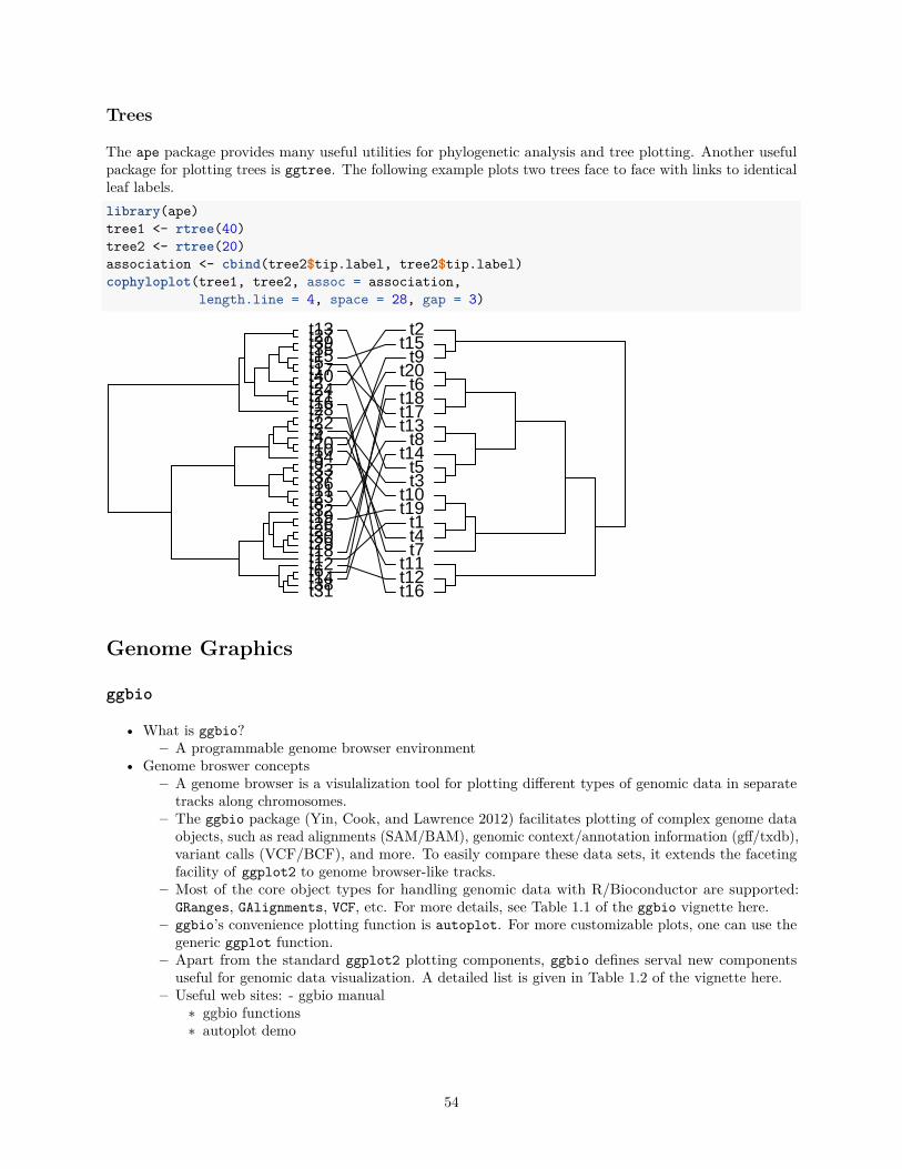
Trees
The ape package provides many useful utilities for phylogenetic analysis and tree plotting. Another usefulpackage for plotting trees is ggtree. The following example plots two trees face to face with links to identicalleaf labels.library(ape)tree1 <- rtree(40)tree2 <- rtree(20)association <- cbind(tree2$tip.label, tree2$tip.label)cophyloplot(tree1, tree2, assoc = association,
length.line = 4, space = 28, gap = 3)
t31t38t14t6t12t1t18t29t30t25t26t19t32t8t23t11t36t37t33t9t34t10t20t4t3t22t7t28t16t21t24t2t40t17t5t15t35t39t27t13
t16t12t11
t7t4t1
t19t10
t3t5
t14t8
t13t17t18
t6t20
t9t15
t2
Genome Graphics
ggbio
• What is ggbio?– A programmable genome browser environment
• Genome broswer concepts– A genome browser is a visulalization tool for plotting different types of genomic data in separate
tracks along chromosomes.– The ggbio package (Yin, Cook, and Lawrence 2012) facilitates plotting of complex genome data
objects, such as read alignments (SAM/BAM), genomic context/annotation information (gff/txdb),variant calls (VCF/BCF), and more. To easily compare these data sets, it extends the facetingfacility of ggplot2 to genome browser-like tracks.
– Most of the core object types for handling genomic data with R/Bioconductor are supported:GRanges, GAlignments, VCF, etc. For more details, see Table 1.1 of the ggbio vignette here.
– ggbio’s convenience plotting function is autoplot. For more customizable plots, one can use thegeneric ggplot function.
– Apart from the standard ggplot2 plotting components, ggbio defines serval new componentsuseful for genomic data visualization. A detailed list is given in Table 1.2 of the vignette here.
– Useful web sites: - ggbio manual∗ ggbio functions∗ autoplot demo
54
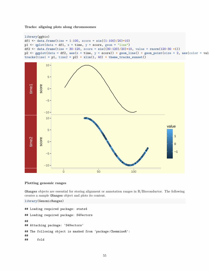
Tracks: aligning plots along chromosomes
library(ggbio)df1 <- data.frame(time = 1:100, score = sin((1:100)/20)*10)p1 <- qplot(data = df1, x = time, y = score, geom = "line")df2 <- data.frame(time = 30:120, score = sin((30:120)/20)*10, value = rnorm(120-30 +1))p2 <- ggplot(data = df2, aes(x = time, y = score)) + geom_line() + geom_point(size = 2, aes(color = value))tracks(time1 = p1, time2 = p2) + xlim(1, 40) + theme_tracks_sunset()
time1
−10
−5
0
5
10
scor
e
time2
−10
−5
0
5
10
scor
e
−1
0
1
value
0 50 100
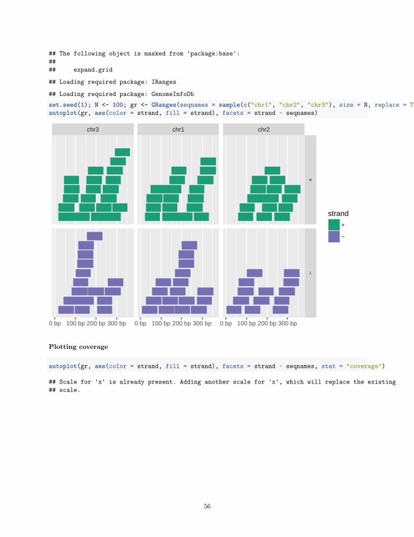
Plotting genomic ranges
GRanges objects are essential for storing alignment or annotation ranges in R/Bioconductor. The followingcreates a sample GRanges object and plots its content.library(GenomicRanges)
## Loading required package: stats4
## Loading required package: S4Vectors
#### Attaching package: 'S4Vectors'
## The following object is masked from 'package:ChemmineR':#### fold
55
## The following object is masked from 'package:base':#### expand.grid
## Loading required package: IRanges
## Loading required package: GenomeInfoDbset.seed(1); N <- 100; gr <- GRanges(seqnames = sample(c("chr1", "chr2", "chr3"), size = N, replace = TRUE), IRanges(start = sample(1:300, size = N, replace = TRUE), width = sample(70:75, size = N,replace = TRUE)), strand = sample(c("+", "-"), size = N, replace = TRUE), value = rnorm(N, 10, 3), score = rnorm(N, 100, 30), sample = sample(c("Normal", "Tumor"), size = N, replace = TRUE), pair = sample(letters, size = N, replace = TRUE))autoplot(gr, aes(color = strand, fill = strand), facets = strand ~ seqnames)
chr3 chr1 chr2
+−
0 bp 100 bp 200 bp 300 bp 0 bp 100 bp 200 bp 300 bp 0 bp 100 bp 200 bp 300 bp
strand
+
−
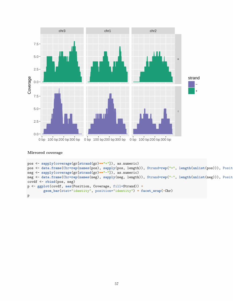
Plotting coverage
autoplot(gr, aes(color = strand, fill = strand), facets = strand ~ seqnames, stat = "coverage")
## Scale for 'x' is already present. Adding another scale for 'x', which will replace the existing## scale.
56
chr3 chr1 chr2
+−
0 bp 100 bp200 bp300 bp 0 bp 100 bp200 bp300 bp 0 bp 100 bp200 bp300 bp
0.0
2.5
5.0
7.5
0.0
2.5
5.0
7.5
Cov
erag
e strand
−
+
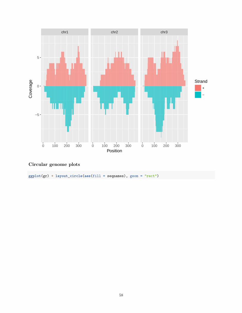
Mirrored coverage
pos <- sapply(coverage(gr[strand(gr)=="+"]), as.numeric)pos <- data.frame(Chr=rep(names(pos), sapply(pos, length)), Strand=rep("+", length(unlist(pos))), Position=unlist(sapply(pos, function(x) 1:length(x))), Coverage=as.numeric(unlist(pos)))neg <- sapply(coverage(gr[strand(gr)=="-"]), as.numeric)neg <- data.frame(Chr=rep(names(neg), sapply(neg, length)), Strand=rep("-", length(unlist(neg))), Position=unlist(sapply(neg, function(x) 1:length(x))), Coverage=-as.numeric(unlist(neg)))covdf <- rbind(pos, neg)p <- ggplot(covdf, aes(Position, Coverage, fill=Strand)) +
geom_bar(stat="identity", position="identity") + facet_wrap(~Chr)p
57
chr1 chr2 chr3
0 100 200 300 0 100 200 300 0 100 200 300
−5
0
5
Position
Cov
erag
e Strand
+
−
Circular genome plots
ggplot(gr) + layout_circle(aes(fill = seqnames), geom = "rect")
58
seqnames
chr3
chr1
chr2
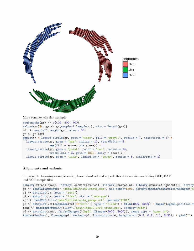
More complex circular exampleseqlengths(gr) <- c(400, 500, 700)values(gr)$to.gr <- gr[sample(1:length(gr), size = length(gr))]idx <- sample(1:length(gr), size = 50)gr <- gr[idx]ggplot() + layout_circle(gr, geom = "ideo", fill = "gray70", radius = 7, trackWidth = 3) +
layout_circle(gr, geom = "bar", radius = 10, trackWidth = 4,aes(fill = score, y = score)) +
layout_circle(gr, geom = "point", color = "red", radius = 14,trackWidth = 3, grid = TRUE, aes(y = score)) +
layout_circle(gr, geom = "link", linked.to = "to.gr", radius = 6, trackWidth = 1)
Alignments and variants
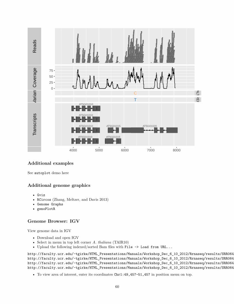
To make the following example work, please download and unpack this data archive containing GFF, BAMand VCF sample files.library(rtracklayer); library(GenomicFeatures); library(Rsamtools); library(GenomicAlignments); library(VariantAnnotation)ga <- readGAlignments("./data/SRR064167.fastq.bam", use.names=TRUE, param=ScanBamParam(which=GRanges("Chr5", IRanges(4000, 8000))))p1 <- autoplot(ga, geom = "rect")p2 <- autoplot(ga, geom = "line", stat = "coverage")vcf <- readVcf(file="data/varianttools_gnsap.vcf", genome="ATH1")p3 <- autoplot(vcf[seqnames(vcf)=="Chr5"], type = "fixed") + xlim(4000, 8000) + theme(legend.position = "none", axis.text.y = element_blank(), axis.ticks.y=element_blank())txdb <- makeTxDbFromGFF(file="./data/TAIR10_GFF3_trunc.gff", format="gff3")p4 <- autoplot(txdb, which=GRanges("Chr5", IRanges(4000, 8000)), names.expr = "gene_id")tracks(Reads=p1, Coverage=p2, Variant=p3, Transcripts=p4, heights = c(0.3, 0.2, 0.1, 0.35)) + ylab("")
59
Rea
dsC
over
age
0
25
50
75
Var
iant C
T
ALT
RE
FTr
ansc
ripts
AT5G01010
AT5G01010
AT5G01010
AT5G01010
AT5G01015
AT5G01015 AT5G01020
4000 5000 6000 7000 8000
Additional examples
See autoplot demo here
Additional genome graphics
• Gviz• RCircos (Zhang, Meltzer, and Davis 2013)• Genome Graphs• genoPlotR
Genome Browser: IGV
View genome data in IGV
• Download and open IGV• Select in menu in top left corner A. thaliana (TAIR10)• Upload the following indexed/sorted Bam files with File -> Load from URL...
http://faculty.ucr.edu/~tgirke/HTML_Presentations/Manuals/Workshop_Dec_6_10_2012/Rrnaseq/results/SRR064154.fastq.bamhttp://faculty.ucr.edu/~tgirke/HTML_Presentations/Manuals/Workshop_Dec_6_10_2012/Rrnaseq/results/SRR064155.fastq.bamhttp://faculty.ucr.edu/~tgirke/HTML_Presentations/Manuals/Workshop_Dec_6_10_2012/Rrnaseq/results/SRR064166.fastq.bamhttp://faculty.ucr.edu/~tgirke/HTML_Presentations/Manuals/Workshop_Dec_6_10_2012/Rrnaseq/results/SRR064167.fastq.bam
• To view area of interest, enter its coordinates Chr1:49,457-51,457 in position menu on top.
60
Create symbolic links
For viewing BAM files in IGV as part of systemPipeR workflows.
• systemPipeR: utilities for building NGS analysis pipelineslibrary("systemPipeR")symLink2bam(sysargs=args, htmldir=c("~/.html/", "somedir/"),
urlbase="http://myserver.edu/~username/",urlfile="IGVurl.txt")
Controlling IGV from R
Open IGV before running the following routine. Alternatively, open IGV from within R with startIGV("lm"). Note this may not work on all systems.library(SRAdb)#startIGV("lm") # opens IGVsock <- IGVsocket()session <- IGVsession(files=myurls,
sessionFile="session.xml",genome="A. thaliana (TAIR10)")
IGVload(sock, session)IGVgoto(sock, 'Chr1:45296-47019')
References
Yin, T, D Cook, and M Lawrence. 2012. “Ggbio: An R Package for Extending the Grammar of Graphics forGenomic Data.” Genome Biol. 13 (8). doi:10.1186/gb-2012-13-8-r77.
Zhang, H, P Meltzer, and S Davis. 2013. “RCircos: An R Package for Circos 2d Track Plots.” BMCBioinformatics 14: 244–44. doi:10.1186/1471-2105-14-244.
61
Recommended