Graphical Inference for Infovis
Hadley Wickham, Dianne Cook, Heike Hofmann, and Andreas Buja
Fig. 1. One of these plots doesn’t belong. These six plots show choropleth maps of cancer deaths in Texas, where darker colors =more deaths. Can you spot which of the six plots is made from a real dataset and not simulated under the null hypothesis of spatialindependence? If so, you’ve provided formal statistical evidence that deaths from cancer have spatial dependence. See Section 8 forthe answer.
Abstract— How do we know if what we see is really there? When visualizing data, how do we avoid falling into the trap of apopheniawhere we see patterns in random noise? Traditionally, infovis has been concerned with discovering new relationships, and statisticswith preventing spurious relationships from being reported. We pull these opposing poles closer with two new techniques for rigorousstatistical inference of visual discoveries. The “Rorschach” helps the analyst calibrate their understanding of uncertainty and the “line-up” provides a protocol for assessing the significance of visual discoveries, protecting against the discovery of spurious structure.
Index Terms—Statistics, visual testing, permutation tests, null hypotheses, data plots.
1 INTRODUCTION
What is the role of statistics in infovis? In this paper we try and an-swer that question by framing the answer as a compromise betweencuriosity and skepticism. Infovis provides tools to uncover new rela-tionships, tools of curiosity, and much research in infovis focuses onmaking the chance of finding relationships as high as possible. On theother hand, most statistical methods provide tools to check whether arelationship really exists: they are tools of skepticism. Most statisticsresearch focuses on making sure to minimize the chance of finding arelationship that does not exist. Neither extreme is good: unfetteredcuriosity results in findings that disappear when others attempt to ver-ify them, while rampant skepticism prevents anything new from beingdiscovered.
Graphical inference bridges these two conflicting drives to providea tool for skepticism that can be applied in a curiosity-driven context.It allows us to uncover new findings, while controlling for apophenia,the innate human ability to see pattern in noise. Graphical inferencehelps us answer the question “Is what we see really there?”
The supporting statistical concepts of graphical inference are devel-oped in [1]. This paper motivates the use of these methods for infovisand shows how they can be used with common graphics to provideusers with a toolkit to avoid false positives. Heuristic formulations ofthese methods have been in use for some time. An early precursoris [2], who evaluated new models for galaxy distribution by gener-ating samples from those models and comparing them to the photo-
• Hadley Wickham is an Assistant Professor of Statistics at Rice University,Email: [email protected].
• Dianne Cook is a Full Professor of Statistics at Iowa State University.• Heike Hofmann is an Associate Professor of Statistics at Iowa State
University.• Andreas Buja is the Liem Sioe Liong/First Pacific Company Professor of
Statistics in The Wharton School at the University of Pennsylvania.
Manuscript received 31 March 2010; accepted 1 August 2010; posted online24 October 2010; mailed on 16 October 2010.For information on obtaining reprints of this article, please sendemail to: [email protected].
graphic plates of actual galaxies. This was a particularly impressiveachievement for its time: models had to be simulated based on tablesof random values and plots drawn by hand. As personal computers be-came available, such examples became more common.[3] comparedcomputer generated Mondrian paintings with paintings by the trueartist, [4] provides 40 pages of null plots, [5] cautions against over-interpreting random visual stimuli, and [6] recommends overlayingnormal probability plots with lines generated from random samples ofthe data. The early visualization system Dataviewer [7] implementedsome of these ideas.
The structure of our paper is as follows. Section 2 revises the basicsof statistical inference and shows how they can be adapted to workvisually. Section 3 describes the two protocols of graphical inference,the Rorschach and the line-up, that we have developed so far. Section 4discusses selected visualizations in terms of their purpose and associ-ated null distributions. The selection includes some traditional statisti-cal graphics and popular information visualization methods. Section 5briefly discusses the power of these graphical tests. Section 8 tells youwhich panel is the real one for all the graphics, and gives you somehints to help you see why. Section 7 summarizes the paper, suggestsdirections for further research, and briefly discusses some of the ethi-cal implications.
2 WHAT IS INFERENCE AND WHY DO WE NEED IT?
The goal of many statistical methods is to perform inference, to drawconclusions about the population that the data sample came from. Thisis why statistics is useful: we don’t want our conclusions to apply onlyto a convenient sample of undergraduates, but to a large fraction ofhumanity. There are two components to statistical inference: testing(is there a difference?) and estimation (how big is the difference?). Inthis paper we focus on testing. For graphics, we want to address thequestion “Is what we see really there?” More precisely, is what we seein a plot of the sample an accurate reflection of the entire population?The rest of this section shows how to answer this question by providinga short refresher of statistical hypothesis testing, and describes howtesting can be adapted to work visually instead of numerically.
Hypothesis testing is perhaps best understood with an analogy to
973
1077-2626/10/$26.00 © 2010 IEEE Published by the IEEE Computer Society
IEEE TRANSACTIONS ON VISUALIZATION AND COMPUTER GRAPHICS, VOL. 16, NO. 6, NOVEMBER/DECEMBER 2010
the criminal justice system. The accused (data set) will be judgedguilty or innocent based on the results of a trial (statistical test). Eachtrial has a defense (advocating for the null hypothesis) and a prosecu-tion (advocating for the alternative hypothesis). On the basis of howevidence (the test statistic) compares to a standard (the p-value), thejudge makes a decision to convict (reject the null) or acquit (fail toreject the null hypothesis).
Unlike the criminal justice system, in the statistical justice system(SJS) evidence is based on the similarity between the accused andknown innocents, using a specific metric defined by the test statistic.The population of innocents, called the null distribution, is generatedby the combination of null hypothesis and test statistic. To determinethe guilt of the accused we compute the proportion of innocents wholook more guilty than the accused. This is the p-value, the probabilitythat the accused would look this guilty if they actually were innocent.
There are two types of mistakes we can make in our decision: wecan acquit a guilty dataset (a type II error, or false negative), or falselyconvict an innocent dataset (a type I error, or false positive). Just asin the criminal justice system, the costs of these two mistakes are notequal and vary based on the severity of the consequences (the risk ofletting a guilty shoplifter go free is not equal to the risk of letting aguilty axe-murderer go free). Typically, as the consequences of ourdecisions become bigger, we want to become more cautious, and re-quire more evidence to convict: an early-stage exploratory analysis isfree to make a few wrong decisions, but it is very important not to ap-prove a possibly dangerous drug after a late-stage clinical trial. It is upto the analyst to calculate and calibrate these costs.
To demonstrate these principles we use a small simulated example,based on an experiment designed to compare the accuracy of conditionone vs. condition two in a usability study. Here, the defense arguesthat there is no difference between the two groups, and the prosecutionargues that they are different. Statistical theory tells us to use the dif-ference of the group means divided by the pooled standard deviationas the measure of guilt (the test statistic), and that under this measurethe population of innocents will have (approximately) a t-distribution.Figure 2 shows this distribution for a sample of 10,000 innocents, aone-side two-sample t-test. The value of the observed test statistic isrepresented as a vertical line on the histogram. Since we have no a-priori notion of whether the difference between groups will be positiveor negative, it is better to compare the accused to the absolute value ofthe innocents, as shown in the bottom plot, a one-sided two-sample t-test. As you can see, there are few innocents (about 3%) who appear asguilty as (or more guilty than) the accused and so the decision wouldbe to convict.
These principles remain the same with visual testing, except for twoaspects: the test statistic, and the mechanism of computing similarity.The test statistic is now a plot of the data, and instead of a mathemati-cal measurement of difference, we use a human judge, or even jury.
Figure 3 illustrates a graphical alternative to the traditional t-test.The accused, a plot of the real data, is hidden among eight innocents,plots of data generated from the null distribution. We need some newterminology to make this description more concise: A null datasetis a sample from the null distribution, i.e. an example of an innocentdataset, and a null plot is a plot of a null dataset, showing what aninnocent might look like. So Figure 3 hides the real plot amongst eightnull plots. Can you spot the suspect? If so, then there is some evidencethat the accused is different from the innocents, and we might move toconvict. (See Section 8 for the solution.)
This example shows the analogy between a traditional numericaltest and a new visual test, but the purpose of this work is not to sup-plant traditional tests. Traditional statistical tests are well studied,well-formulated and work best when data is well-behaved, followinga known distribution in relatively simple scenarios. But as researchersin infovis have no doubt experienced, traditional statistical tests do notcover all of the complexities that arise when exploring data. The ben-efit of visual inference is that it can be used in complex data analysissettings that do not have corresponding numerical tests.
Fig. 2. (Top) Distribution of group means under null-hypothesis (distribu-tion of innocents). Vertical line indicates value of observed test statistic.This is a one-sided two-sample t-test. (Bottom) Distribution of abso-lute value of group means. This is more appropriate comparison for thetwo-sided test, where magnitude of difference is more important thandirection of difference. This is a two-sided two-sample t-test.
Fig. 3. A visual t-test. For each data set, the observations are shownas points and the group means as crosses. The accused is hiddenamongst eight innocents. Can you spot him?
974 IEEE TRANSACTIONS ON VISUALIZATION AND COMPUTER GRAPHICS, VOL. 16, NO. 6, NOVEMBER/DECEMBER 2010
3 PROTOCOLS OF GRAPHICAL INFERENCE
This section introduces two new rigorous protocols for graphical infer-ence: the “Rorschach” and the “line-up”. The Rorschach is a calibra-tor, helping the analyst become accustomed to the vagaries of randomdata, while the line-up provides a simple inferential process to producea valid p-value for a data plot. We describe the protocols and show ex-amples of how they can be used, and refer the reader to [1] for moredetail.
3.1 RorschachThe Rorschach protocol is named after the Rorschach test, in whichsubjects interpret abstract ink blots. The purpose is similar: readersare asked to report what they see in null plots. We use this protocol tocalibrate our vision to the natural variability in plots in which the datais generated from scenarios consistent with the null hypothesis. Ourintuition about variability is often bad, and this protocol allows us toreduce our sensitivity to structure due purely to random variability.
Figure 4 illustrates the Rorschach protocol. These nine histogramssummarize the accuracy at which 500 participants perform nine tasks.What do you see? Does it look like the distribution of accuracies isthe same for all of the tasks? How many of the histograms show aninteresting pattern? Take a moment to study these plots before youcontinue reading.
Fig. 4. Nine histograms summarizing the accuracy at which 500 partici-pants perform nine tasks. What do you see?
It is easy to tell stories about this data: in task 7 accuracy peaksaround 70% and drops off; in task 5, few people are 20-30% accu-rate; in task 9, many people are 60-70% accurate. But these storiesare all misleading. It may come as a surprise, but these results areall simulations from a uniform distribution, that is, the distribution ofaccuracy for all tasks is uniform between 0 and 1. When we displaya histogram of uniform noise, our expectation is that it should be flat.We do not expect it to be perfectly flat (because we know it shouldbe a little different every time), but our intuition substantially under-estimates the true variability in heights from one bar to the next. It isfairly simple to work out the expected variability algebraically (usinga normal approximation): with 10 observations per bin, the bins willhave a standard error of 30%, with 100 observations 19% and 1000,observations 6%. However, working through the math does not givethe visceral effect of seeing plots of null data.
To perform the Rorschach protocol an administrator produces nullplots, shows them to the analyst, and asks them what they see. To keepthe analyst on their toes and avoid the complacency that may arise ifthey know all plots are null plots [8] the administrator might slip ina plot of the real data. For similar reasons, airport x-ray scannersrandomly insert pictures of bags containing guns, knives or bombs.Typically, the administrator and participant will be different people,and neither should know what the real data looks like (a double-blinded scenario). However, with careful handling, it is possible to
self-administer such a test, particularly with appropriate software sup-port, as described in Section 6.
Even when not administrated in a rigorous manner, this protocol isstill useful as a self-teaching tool to help learn which random featureswe might spuriously identify. It is particularly useful when teachingdata analysis, as an important characteristic of a good analyst is theirability to discriminate signal from noise.
3.2 Line-upThe SJS convicts based on difference between the accused and a set ofknown innocents. Traditionally the similarity is measured numerically,and the set of known innocents are described by a probability distri-bution. The line-up protocol adapts this to work visually: an impartialobserver is used to measure similarity with a small set of innocents.
The line-up protocol works like a police line-up: the suspect (teststatistic plot) is hidden in a set of decoys. If the observer, who has notseen the suspect, can pick it out as being noticeably different, there isevidence that it is not innocent. Note that the converse does not applyin the SJS: failing to pick the suspect out does not provide evidencethey are innocent. This is related to the convoluted phraseology ofstatistics: we “fail to reject the null” rather than “accepting the alter-native”.
The basic protocol of the line up is simple:
• Generate n−1 decoys (null data sets).
• Make plots of the decoys, and randomly position a plot of thetrue data.
• Show to an impartial observer. Can they spot the real data?
In practice, we would typically set n = 19, so that if the accused isinnocent, the probability of picking the accused by chance is 1/20 =0.05, the traditional boundary for statistical significance. Comparing20 plots is also reasonably feasible for a human observer. (The use ofsmaller numbers of n in this paper is purely for brevity.) More plotswould yield a smaller p-value, but this needs to be weighed againstincreased viewer fatigue. Another way of generating more precise p-values is to use a jury instead of a judge. If we recruit K jurors andk of them spot the real data, then the combined p-value is P(X ≤ k),where X has a binomial distribution B(K, p = 1/20). It can be as smallas 0.05K if all jurors spot the real data (k = K).
Like the Rorschach, we want the experiment to be double-blind -neither the person showing the plots or the person seeing them shouldknow which is the true plot. The protocol can be self-administered,provided that it is the first time you’ve seen the data. After a firstviewing of the data, a test might still be useful, but it will not be in-ferentially valid because you are likely to have learned some of thefeatures of the data set and are more likely to recognize it. To main-tain inferential validity once you have seen the data, you need to recruitan independent observer.
The following section shows some examples of the line-up in use,with some discussion of how to identify the appropriate null hypoth-esis for a specific type of plot and figure out a method of generatingsamples from the appropriate null distribution.
4 EXAMPLES
To use the line-up protocol, we need to:
• Identify the question the plot is trying to answer.
• Characterize the null-hypothesis (the position of the defense).
• Figure out how to generate null datasets.
This section shows how to approach each of these tasks, and thendemonstrates the process in more detail for two examples. Section 4.1shows a line-up of a tag cloud used to explore the frequency distribu-tion of words in Darwin’s “Origin of Species” and Section 4.2 shows aline-up of a scatterplot used to explore the spatial distribution of threepoint throws in basketball.
975WICKHAM ET AL: GRAPHICAL INFERENCE FOR INFOVIS
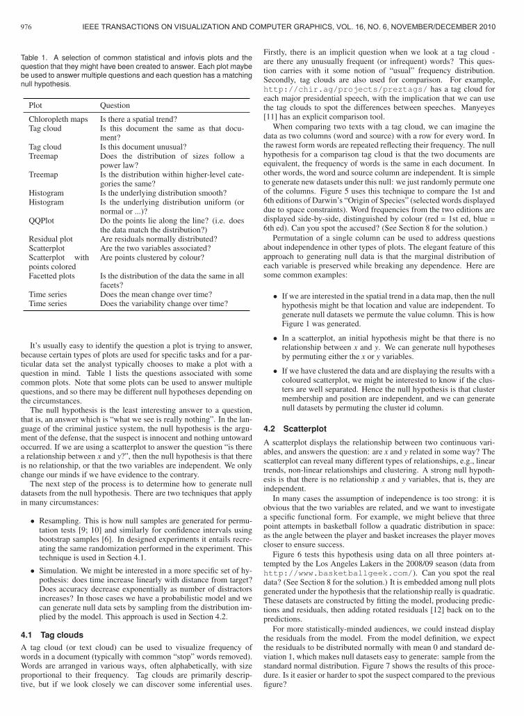
Table 1. A selection of common statistical and infovis plots and thequestion that they might have been created to answer. Each plot maybebe used to answer multiple questions and each question has a matchingnull hypothesis.
Plot Question
Chloropleth maps Is there a spatial trend?Tag cloud Is this document the same as that docu-
ment?Tag cloud Is this document unusual?Treemap Does the distribution of sizes follow a
power law?Treemap Is the distribution within higher-level cate-
gories the same?Histogram Is the underlying distribution smooth?Histogram Is the underlying distribution uniform (or
normal or ...)?QQPlot Do the points lie along the line? (i.e. does
the data match the distribution?)Residual plot Are residuals normally distributed?Scatterplot Are the two variables associated?Scatterplot withpoints colored
Are points clustered by colour?
Facetted plots Is the distribution of the data the same in allfacets?
Time series Does the mean change over time?Time series Does the variability change over time?
It’s usually easy to identify the question a plot is trying to answer,because certain types of plots are used for specific tasks and for a par-ticular data set the analyst typically chooses to make a plot with aquestion in mind. Table 1 lists the questions associated with somecommon plots. Note that some plots can be used to answer multiplequestions, and so there may be different null hypotheses depending onthe circumstances.
The null hypothesis is the least interesting answer to a question,that is, an answer which is “what we see is really nothing”. In the lan-guage of the criminal justice system, the null hypothesis is the argu-ment of the defense, that the suspect is innocent and nothing untowardoccurred. If we are using a scatterplot to answer the question “is therea relationship between x and y?”, then the null hypothesis is that thereis no relationship, or that the two variables are independent. We onlychange our minds if we have evidence to the contrary.
The next step of the process is to determine how to generate nulldatasets from the null hypothesis. There are two techniques that applyin many circumstances:
• Resampling. This is how null samples are generated for permu-tation tests [9; 10] and similarly for confidence intervals usingbootstrap samples [6]. In designed experiments it entails recre-ating the same randomization performed in the experiment. Thistechnique is used in Section 4.1.
• Simulation. We might be interested in a more specific set of hy-pothesis: does time increase linearly with distance from target?Does accuracy decrease exponentially as number of distractorsincreases? In those cases we have a probabilistic model and wecan generate null data sets by sampling from the distribution im-plied by the model. This approach is used in Section 4.2.
4.1 Tag cloudsA tag cloud (or text cloud) can be used to visualize frequency ofwords in a document (typically with common “stop” words removed).Words are arranged in various ways, often alphabetically, with sizeproportional to their frequency. Tag clouds are primarily descrip-tive, but if we look closely we can discover some inferential uses.
Firstly, there is an implicit question when we look at a tag cloud -are there any unusually frequent (or infrequent) words? This ques-tion carries with it some notion of “usual” frequency distribution.Secondly, tag clouds are also used for comparison. For example,http://chir.ag/projects/preztags/ has a tag cloud foreach major presidential speech, with the implication that we can usethe tag clouds to spot the differences between speeches. Manyeyes[11] has an explicit comparison tool.
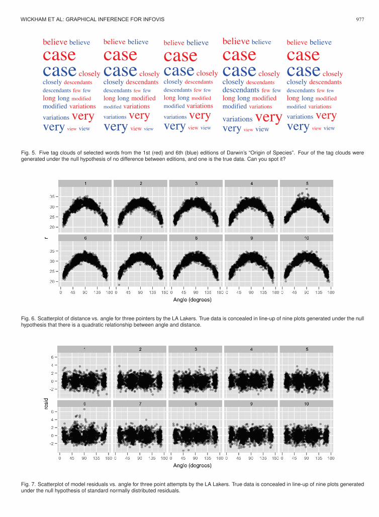
When comparing two texts with a tag cloud, we can imagine thedata as two columns (word and source) with a row for every word. Inthe rawest form words are repeated reflecting their frequency. The nullhypothesis for a comparison tag cloud is that the two documents areequivalent, the frequency of words is the same in each document. Inother words, the word and source column are independent. It is simpleto generate new datasets under this null: we just randomly permute oneof the columns. Figure 5 uses this technique to compare the 1st and6th editions of Darwin’s “Origin of Species” (selected words displayeddue to space constraints). Word frequencies from the two editions aredisplayed side-by-side, distinguished by colour (red = 1st ed, blue =6th ed). Can you spot the accused? (See Section 8 for the solution.)
Permutation of a single column can be used to address questionsabout independence in other types of plots. The elegant feature of thisapproach to generating null data is that the marginal distribution ofeach variable is preserved while breaking any dependence. Here aresome common examples:
• If we are interested in the spatial trend in a data map, then the nullhypothesis might be that location and value are independent. Togenerate null datasets we permute the value column. This is howFigure 1 was generated.
• In a scatterplot, an initial hypothesis might be that there is norelationship between x and y. We can generate null hypothesesby permuting either the x or y variables.
• If we have clustered the data and are displaying the results with acoloured scatterplot, we might be interested to know if the clus-ters are well separated. Hence the null hypothesis is that clustermembership and position are independent, and we can generatenull datasets by permuting the cluster id column.
4.2 Scatterplot
A scatterplot displays the relationship between two continuous vari-ables, and answers the question: are x and y related in some way? Thescatterplot can reveal many different types of relationships, e.g., lineartrends, non-linear relationships and clustering. A strong null hypoth-esis is that there is no relationship x and y variables, that is, they areindependent.
In many cases the assumption of independence is too strong: it isobvious that the two variables are related, and we want to investigatea specific functional form. For example, we might believe that threepoint attempts in basketball follow a quadratic distribution in space:as the angle between the player and basket increases the player movescloser to ensure success.
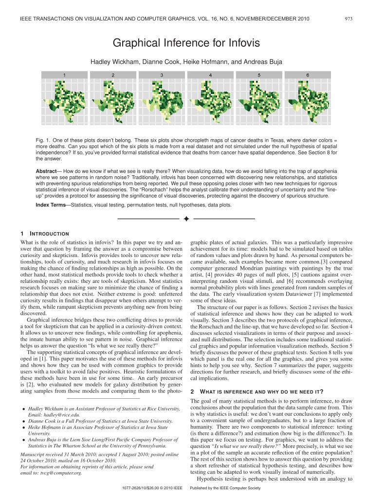
Figure 6 tests this hypothesis using data on all three pointers at-tempted by the Los Angeles Lakers in the 2008/09 season (data fromhttp://www.basketballgeek.com/). Can you spot the realdata? (See Section 8 for the solution.) It is embedded among null plotsgenerated under the hypothesis that the relationship really is quadratic.These datasets are constructed by fitting the model, producing predic-tions and residuals, then adding rotated residuals [12] back on to thepredictions.
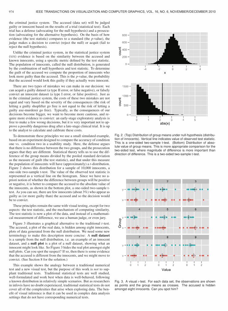
For more statistically-minded audiences, we could instead displaythe residuals from the model. From the model definition, we expectthe residuals to be distributed normally with mean 0 and standard de-viation 1, which makes null datasets easy to generate: sample from thestandard normal distribution. Figure 7 shows the results of this proce-dure. Is it easier or harder to spot the suspect compared to the previousfigure?
976 IEEE TRANSACTIONS ON VISUALIZATION AND COMPUTER GRAPHICS, VOL. 16, NO. 6, NOVEMBER/DECEMBER 2010
believe believe
casecase closelyclosely descendantsdescendants few few
long long modified
modified variations
variations veryvery view view
believe believe
casecase closelyclosely descendantsdescendants few few
long long modifiedmodified variations
variations veryvery view view
believe believe
casecase closelyclosely descendantsdescendants few few
long long modified
modified variations
variations veryvery view view
believe believe
casecase closelyclosely descendantsdescendants few fewlong long modifiedmodified variations
variations veryvery view view
believe believe
casecase closelyclosely descendantsdescendants few few
long long modifiedmodified variations
variations veryvery view view
Fig. 5. Five tag clouds of selected words from the 1st (red) and 6th (blue) editions of Darwin’s “Origin of Species”. Four of the tag clouds weregenerated under the null hypothesis of no difference between editions, and one is the true data. Can you spot it?
Fig. 6. Scatterplot of distance vs. angle for three pointers by the LA Lakers. True data is concealed in line-up of nine plots generated under the nullhypothesis that there is a quadratic relationship between angle and distance.
Fig. 7. Scatterplot of model residuals vs. angle for three point attempts by the LA Lakers. True data is concealed in line-up of nine plots generatedunder the null hypothesis of standard normally distributed residuals.
977WICKHAM ET AL: GRAPHICAL INFERENCE FOR INFOVIS
Figures 6 and 7 both test the same null hypothesis. Which shouldwe use? The next section discusses the issue of power (the probabilityof spotting a real difference) in more detail.
5 POWER
The power of a statistical test is the probability of correctly convictinga guilty data set. The capacity to detect specific structure in plots candepend on many things, including an appropriate choice of plot, whichis where the psychology of perception is very important. Existing re-search [13; 14] provides good suggestions on how to map variables toperceptual properties to maximize the reader’s chances of accuratelyinterpreting structure. For example, we should map our most impor-tant continuous variables to position along a common scale, and to usepre-attentive attributes, such as color, to represent categorical informa-tion like groups.
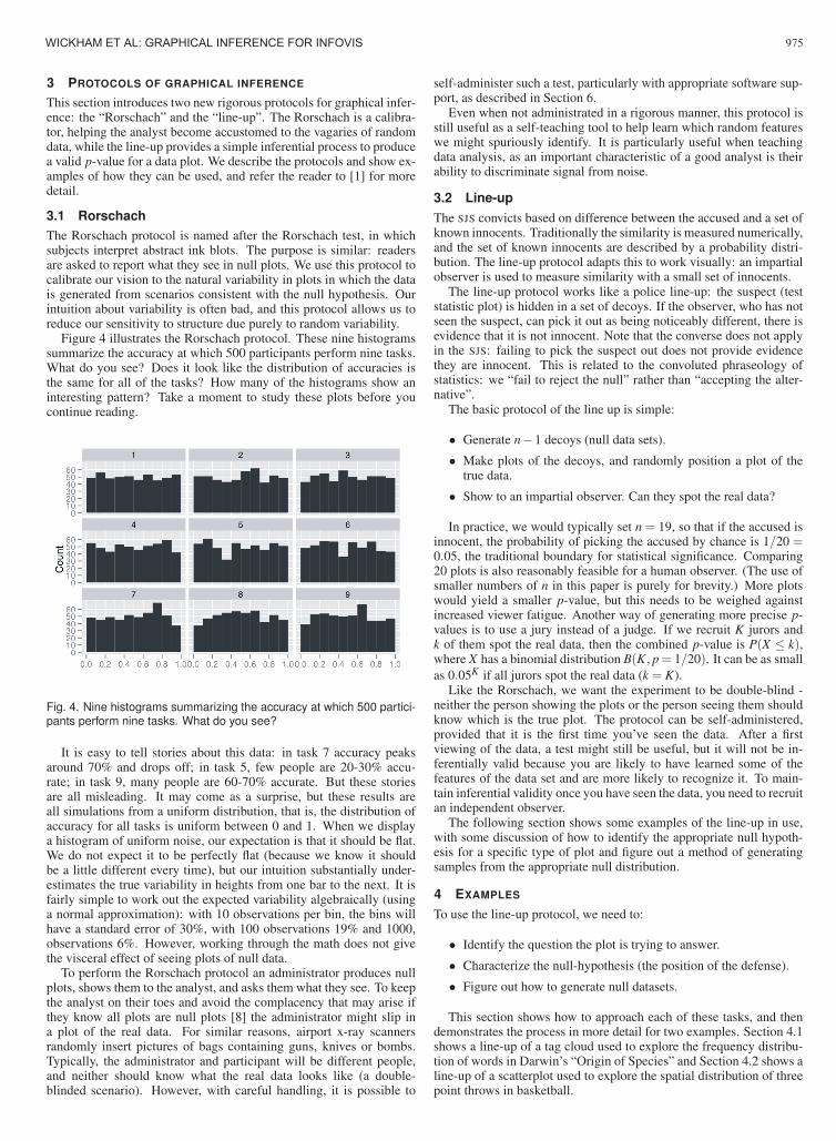
For large datasets, aggregation can make a big difference. Fig-ure 8 displays a line-up for examining the relationship betweenarrival delays and wind direction at Phoenix airport (data fromhttp://stat-computing.org/dataexpo/2009). The topplot is a “natural” and elegant plot of the raw data, mapping wind di-rection to angle and arrival delay to radius. The bottom plot displaysthe same data, but in the much aggregated form of a boxplot. It ismuch easier to spot the plot that is different from the others (panel 4),which, indeed, corresponds to the real data: unusually high delays atPhoenix airport are significantly associated with SW winds. One ofthe reasons making the real data difficult to detect in the first plotisthat focus is on the outliers rather than the “hole” in the SW direction.
6 USE
To semi-automate the protocols we have created anew R [15] package called nullabor, available fromhttp://github.com/hadley/nullabor. It operatessimply. The user specifies how many decoy plots to create, and amechanism to generate null datasets. For the line-up, nullaborgenerates the decoys, labelled with a new .sample variable, appendsthem to the real data set, and randomly chooses a position for theaccused. The Rorschach protocol is similar, but the true data isonly included with small probability. The package is bundled withmethods to generate null datasets from common null hypotheses(independence, specified model, and specified distribution), whilealso allowing the user to add their own.
The following code shows two examples of nullabor in use. Thefirst line specifies the type of plot, in this case a scatterplot for both.The second line specifies the protocol, the line-up, and the mechanismfor generating null datasets: permutation in the first example, and sim-ulation from a model in the second. By default, the line-up will gener-ate a plot with 20 panels, but this can be specified by the n argumentto the lineup function. The third line specifies the grid layout of thedecoys. The position of the true data is encrypted and output to thescreen so that the user can later decrypt the message and learn whichpanel shows the true data.
qplot(radius, angle, data = threept) %+%lineup(permute("response"), threept, n = 9) +facet_wrap(˜ .sample)
qplot(radius, angle, data = threept) %+%lineup(model_null(radius ˜ angle), threept) +facet_wrap(˜ .sample)
This package makes it convenient for R users to administer theprotocols as a normal step in their data analyses. We started with acommand-line user interface because it is what many statisticians aremost comfortable with, but it is not suitable for most analysts. We hopethat others will integrate graphical inference in to their tools, using theopen-source nullabor code to aid implementation.
This package enables the analyst to be the uninvolved observer,making inferentially valid judgements on the structure that is presentin the real data plot by automatically generating a line-up before the
analyst has seen the real data plot. At times the analyst will need toengage the services of an uninvolved observer. Services like AmazonMechanical Turk [16] might be useful here. This problem requires akeen pair of human eyes to evaluate the line-ups, and the Turk offers asupply of workers who might even enjoy this type of task.
7 CONCLUSION
This paper has described two protocols to bring rigorous statistical in-ference to freeform data exploration. Both techniques center aroundidentifying a null hypothesis, which then generates null datasets andnull plots. The Rorschach provides a tool for calibrating our expec-tations of null data, while the line-up brings the techniques of formalstatistical hypothesis testing to visualization.
Graphical inference is important because it helps us to avoid (or atleast calibrate the rate of) false convictions, when we decide a rela-tionship is significant, when it is actually an artifact of our samplingor experimental process. These tools seem particularly important forvisualizations used in the VAST community, because the consequencesof false conviction of data can be so severe for the people involved.
We have provided a reference implementation of these ideas in theR package nullabor. We hope others can build upon this work tomake tools that can be used in a wide variety of analytic settings.
8 SOLUTIONS
These are the solutions to each of the line-ups shown in the paper.
• Figure 1: the real data is in panel 3. The features that might cluethe reader in to this plot being different include spatial clustering,clumps of dark and light, and the prevalence of light polygons inthe south-west edge of the state. In the other plots the dark andlight coloring is scattered throughout the state.
• Figure 3: the real data is in panel 3. Features that the readermight pick up include bigger differences between the means, andfairly consistent but shifted spread from one group to another.
• Figure 5: the real data is second from the right. Hint: look atbelieve, variations, view and very.
• Figure 6: the real data is panel 5. More outliers from center courtgive the data away.
• Figure 7: the real data is panel 6. A few large outliers make thisplot different from the others.
ACKNOWLEDGMENTS
The authors wish to thank Robert Kosara for helpful discussion. Thiswork was partly supported by the National Science Foundation grantDMS0706949. Graphics produced with ggplot2 [17].
REFERENCES
[1] A. Buja, D. Cook, H. Hofmann, M. Lawrence, E.-K. Lee, D. F.Swayne, and H. Wickham, “Statistical inference for exploratorydata analysis and model diagnostics,” Royal Society Philosophi-cal Transactions A, vol. 367, no. 1906, pp. 4361–4383, 2009.
[2] E. L. Scott, C. D. Shane, and M. D. Swanson, “Comparisonof the synthetic and actual distribution of galaxies on a photo-graphic plate,” Astrophysical Journal, vol. 119, pp. 91–112, Jan.1954.
[3] A. M. Noll, “Human or machine: A subjective comparison ofpiet mondrian’s “composition with lines” (1917) and a computer-generated picture,” The Psychological Record, vol. 16, pp. 1–10,1966.
[4] C. Daniel, Applications of Statistics to Industrial Experimenta-tion. Hoboken, NJ: Wiley-Interscience, 1976.
978 IEEE TRANSACTIONS ON VISUALIZATION AND COMPUTER GRAPHICS, VOL. 16, NO. 6, NOVEMBER/DECEMBER 2010
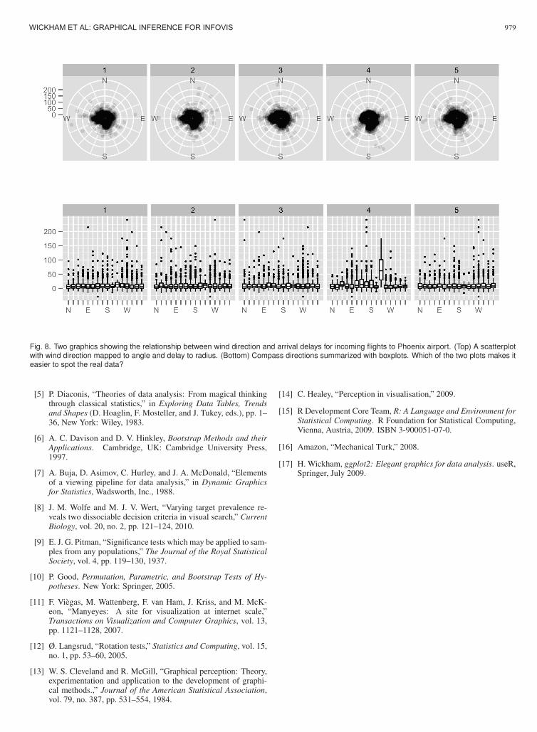
Fig. 8. Two graphics showing the relationship between wind direction and arrival delays for incoming flights to Phoenix airport. (Top) A scatterplotwith wind direction mapped to angle and delay to radius. (Bottom) Compass directions summarized with boxplots. Which of the two plots makes iteasier to spot the real data?
[5] P. Diaconis, “Theories of data analysis: From magical thinkingthrough classical statistics,” in Exploring Data Tables, Trendsand Shapes (D. Hoaglin, F. Mosteller, and J. Tukey, eds.), pp. 1–36, New York: Wiley, 1983.
[6] A. C. Davison and D. V. Hinkley, Bootstrap Methods and theirApplications. Cambridge, UK: Cambridge University Press,1997.
[7] A. Buja, D. Asimov, C. Hurley, and J. A. McDonald, “Elementsof a viewing pipeline for data analysis,” in Dynamic Graphicsfor Statistics, Wadsworth, Inc., 1988.
[8] J. M. Wolfe and M. J. V. Wert, “Varying target prevalence re-veals two dissociable decision criteria in visual search,” CurrentBiology, vol. 20, no. 2, pp. 121–124, 2010.
[9] E. J. G. Pitman, “Significance tests which may be applied to sam-ples from any populations,” The Journal of the Royal StatisticalSociety, vol. 4, pp. 119–130, 1937.
[10] P. Good, Permutation, Parametric, and Bootstrap Tests of Hy-potheses. New York: Springer, 2005.
[11] F. Viegas, M. Wattenberg, F. van Ham, J. Kriss, and M. McK-eon, “Manyeyes: A site for visualization at internet scale,”Transactions on Visualization and Computer Graphics, vol. 13,pp. 1121–1128, 2007.
[12] Ø. Langsrud, “Rotation tests,” Statistics and Computing, vol. 15,no. 1, pp. 53–60, 2005.
[13] W. S. Cleveland and R. McGill, “Graphical perception: Theory,experimentation and application to the development of graphi-cal methods.,” Journal of the American Statistical Association,vol. 79, no. 387, pp. 531–554, 1984.
[14] C. Healey, “Perception in visualisation,” 2009.
[15] R Development Core Team, R: A Language and Environment forStatistical Computing. R Foundation for Statistical Computing,Vienna, Austria, 2009. ISBN 3-900051-07-0.
[16] Amazon, “Mechanical Turk,” 2008.
[17] H. Wickham, ggplot2: Elegant graphics for data analysis. useR,Springer, July 2009.
979WICKHAM ET AL: GRAPHICAL INFERENCE FOR INFOVIS
Recommended