Dott Brand GuidelinesJanuary 2021
Meet the Dott brand
Logo design elements
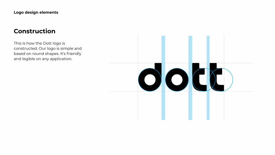
Construction
This is how the Dott logo is constructed. Our logo is simple and based on round shapes. It’s friendly and legible on any application.
Logo design elements
Logo design elements
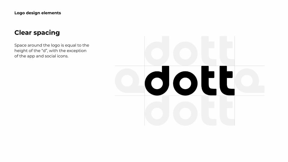
Clear spacing
Space around the logo is equal to the height of the “d”, with the exception of the app and social icons.
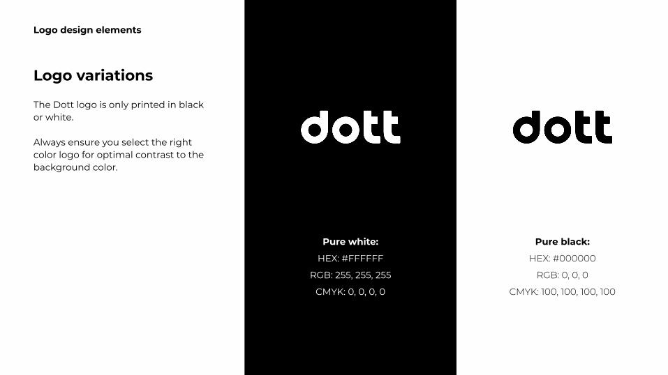
Logo variations
The Dott logo is only printed in black or white.
Always ensure you select the right color logo for optimal contrast to the background color.
Logo design elements
Pure white:
HEX: #FFFFFF
RGB: 255, 255, 255
CMYK: 0, 0, 0, 0
Pure black:
Logo design elements
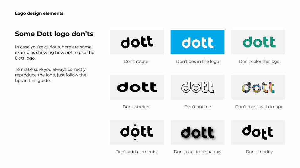
Some Dott logo don’ts
In case you’re curious, here are some examples showing how not to use the Dott logo.
To make sure you always correctly reproduce the logo, just follow the tips in this guide.
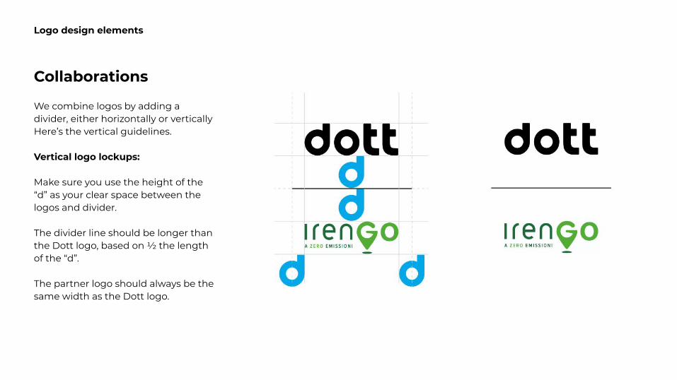
Collaborations
We combine logos by adding a divider, either horizontally or vertically Here’s the vertical guidelines.
Vertical logo lockups:
Make sure you use the height of the “d” as your clear space between the logos and divider.
The divider line should be longer than the Dott logo, based on ½ the length of the “d”.
The partner logo should always be the same width as the Dott logo.
Logo design elements
Collaborations
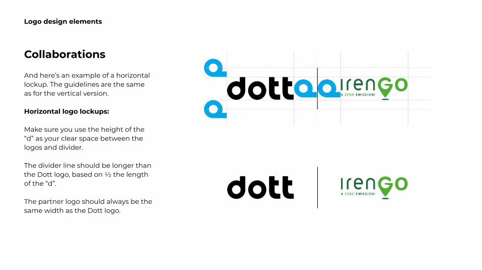
And here’s an example of a horizontal lockup. The guidelines are the same as for the vertical version.
Horizontal logo lockups:
Make sure you use the height of the “d” as your clear space between the logos and divider.
The divider line should be longer than the Dott logo, based on ½ the length of the “d”.
The partner logo should always be the same width as the Dott logo.
Logo design elements
Color palette
Color palette
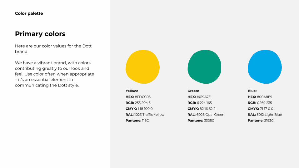
Primary colors
Here are our color values for the Dott brand.
We have a vibrant brand, with colors contributing greatly to our look and feel. Use color often when appropriate – it’s an essential element in communicating the Dott style.
Yellow:
HEX: #FDCC05
RGB: 253 204 5
CMYK: 1 18 100 0
RAL: 1023 Traffic Yellow
Pantone: 116C
Green:
HEX: #019A7E
RGB: 6 224 165
CMYK: 82 16 62 2
RAL: 6026 Opal Green
Pantone: 3305C
Blue:
HEX: #00A8E9
RGB: 0 169 235
CMYK: 71 17 0 0
RAL: 5012 Light Blue
Pantone: 2193C
Color palette
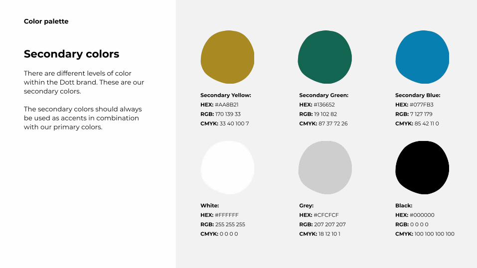
Secondary colors
There are different levels of color within the Dott brand. These are our secondary colors.
The secondary colors should always be used as accents in combination with our primary colors.
Secondary Yellow:
HEX: #AA8B21
RGB: 170 139 33
CMYK: 33 40 100 7
Secondary Green:
HEX: #136652
RGB: 19 102 82
CMYK: 87 37 72 26
Secondary Blue:
HEX: #077FB3
RGB: 7 127 179
CMYK: 85 42 11 0
White:
HEX: #FFFFFF
RGB: 255 255 255
CMYK: 0 0 0 0
Grey:
HEX: #CFCFCF
RGB: 207 207 207
CMYK: 18 12 10 1
Black:
HEX: #000000
RGB: 0 0 0 0
CMYK: 100 100 100 100
Illustration style
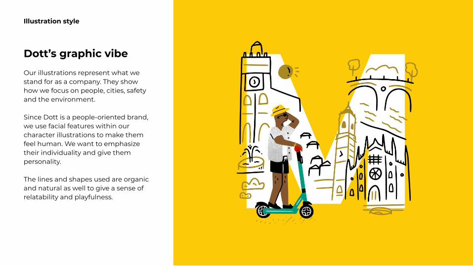
Illustration style
Dott’s graphic vibe
Our illustrations represent what we stand for as a company. They show how we focus on people, cities, safety and the environment.
Since Dott is a people-oriented brand, we use facial features within our character illustrations to make them feel human. We want to emphasize their individuality and give them personality.
The lines and shapes used are organic and natural as well to give a sense of relatability and playfulness.
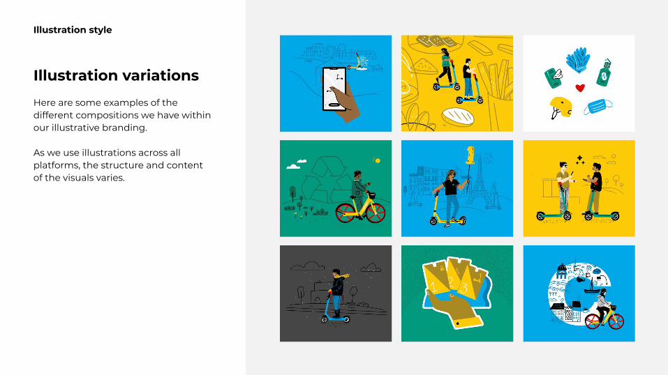
Illustration style
Illustration variations
Here are some examples of the different compositions we have within our illustrative branding.
As we use illustrations across all platforms, the structure and content of the visuals varies.

Thanks so much!
Recommended