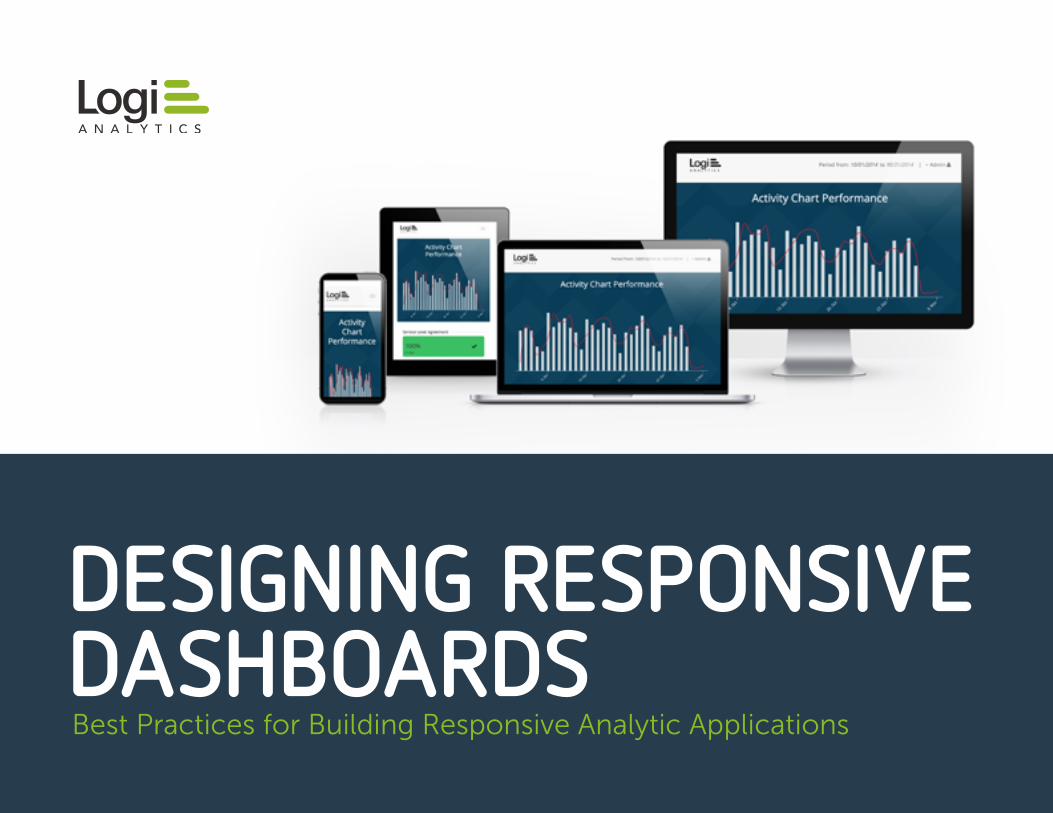
DESIGNING RESPONSIVE DASHBOARDSBest Practices for Building Responsive Analytic Applications
Responsive Design and Embedded Analytics ...............................................1
6 Principles and Best Practices ....................................................................... 2
Tools of the Trade............................................................................................... 6
Benefits of An Analytics Development Platform ........................................11
About Logi Analytics ........................................................................................ 13
CONTENTS
1
RESPONSIVE DESIGN
A N D
EMBEDDED ANALYTICS
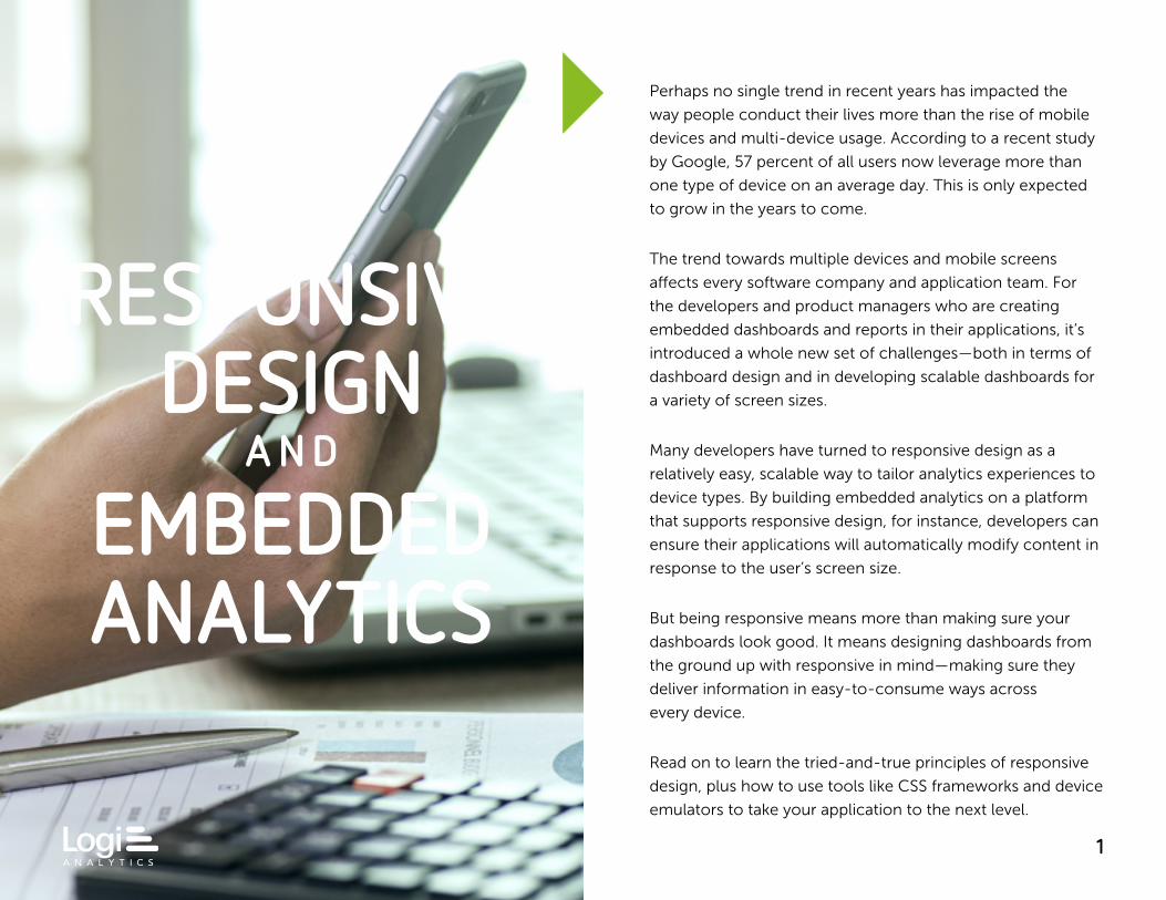
Perhaps no single trend in recent years has impacted the
way people conduct their lives more than the rise of mobile
devices and multi-device usage. According to a recent study
by Google, 57 percent of all users now leverage more than
one type of device on an average day. This is only expected
to grow in the years to come.
The trend towards multiple devices and mobile screens
affects every software company and application team. For
the developers and product managers who are creating
embedded dashboards and reports in their applications, it’s
introduced a whole new set of challenges—both in terms of
dashboard design and in developing scalable dashboards for
a variety of screen sizes.
Many developers have turned to responsive design as a
relatively easy, scalable way to tailor analytics experiences to
device types. By building embedded analytics on a platform
that supports responsive design, for instance, developers can
ensure their applications will automatically modify content in
response to the user’s screen size.
But being responsive means more than making sure your
dashboards look good. It means designing dashboards from
the ground up with responsive in mind—making sure they
deliver information in easy-to-consume ways across
every device.
Read on to learn the tried-and-true principles of responsive
design, plus how to use tools like CSS frameworks and device
emulators to take your application to the next level.
2
6PRINCIPLES
A N D
BEST PRACTICES
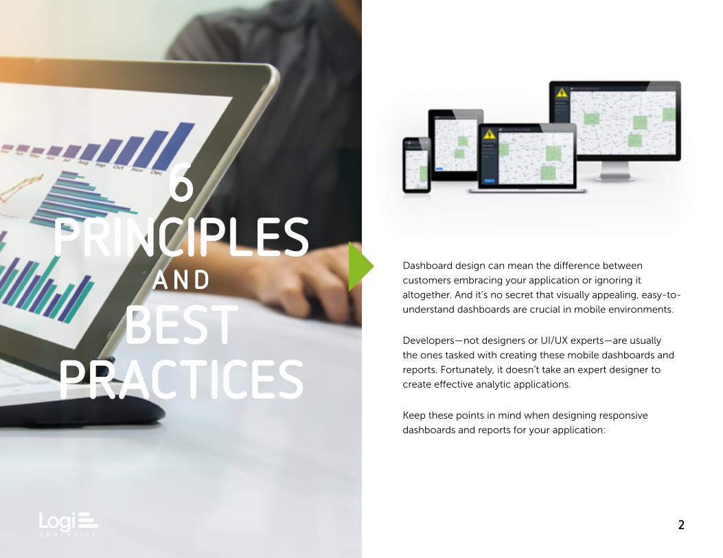
Dashboard design can mean the difference between
customers embracing your application or ignoring it
altogether. And it’s no secret that visually appealing, easy-to-
understand dashboards are crucial in mobile environments.
Developers—not designers or UI/UX experts—are usually
the ones tasked with creating these mobile dashboards and
reports. Fortunately, it doesn’t take an expert designer to
create effective analytic applications.
Keep these points in mind when designing responsive
dashboards and reports for your application:
3
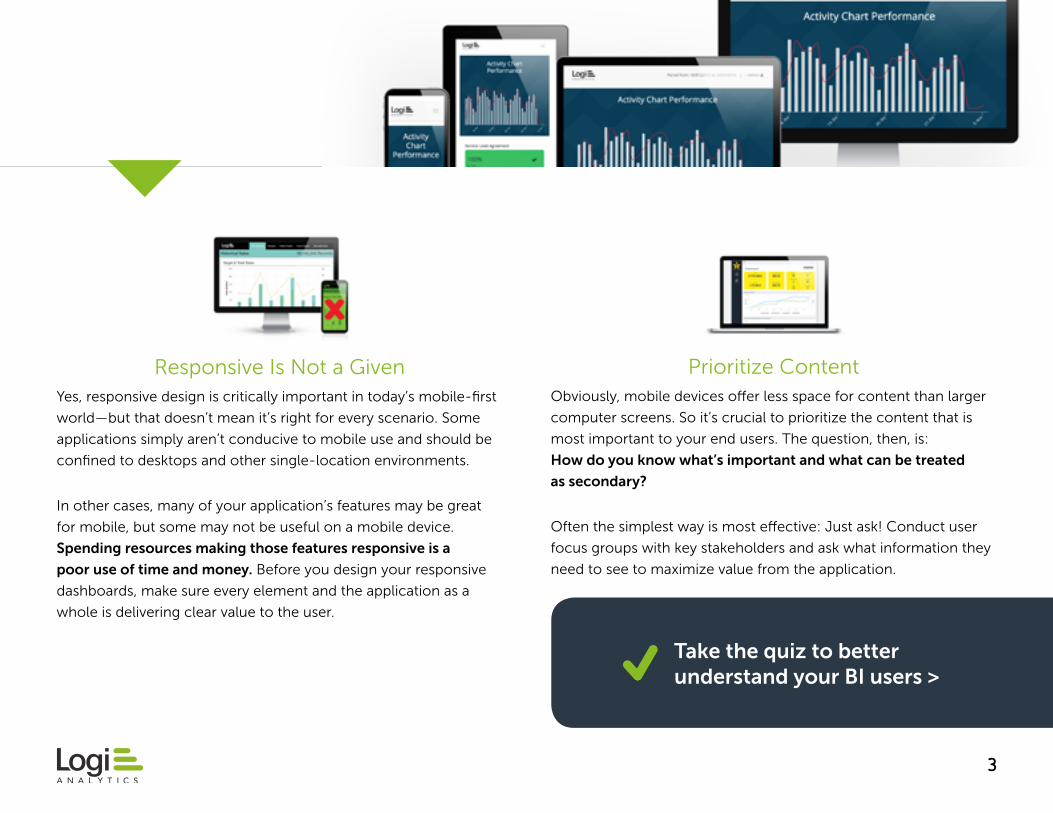
Responsive Is Not a GivenYes, responsive design is critically important in today’s mobile-first
world—but that doesn’t mean it’s right for every scenario. Some
applications simply aren’t conducive to mobile use and should be
confined to desktops and other single-location environments.
In other cases, many of your application’s features may be great
for mobile, but some may not be useful on a mobile device.
Spending resources making those features responsive is a
poor use of time and money. Before you design your responsive
dashboards, make sure every element and the application as a
whole is delivering clear value to the user.
Prioritize Content Obviously, mobile devices offer less space for content than larger
computer screens. So it’s crucial to prioritize the content that is
most important to your end users. The question, then, is:
How do you know what’s important and what can be treated
as secondary?
Often the simplest way is most effective: Just ask! Conduct user
focus groups with key stakeholders and ask what information they
need to see to maximize value from the application.
Take the quiz to better understand your BI users >
4
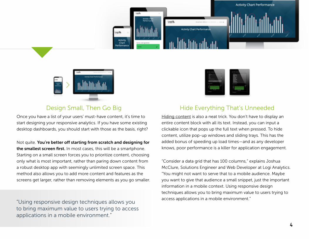
Design Small, Then Go BigOnce you have a list of your users’ must-have content, it’s time to
start designing your responsive analytics. If you have some existing
desktop dashboards, you should start with those as the basis, right?
Not quite. You’re better off starting from scratch and designing for
the smallest screen first. In most cases, this will be a smartphone.
Starting on a small screen forces you to prioritize content, choosing
only what is most important, rather than paring down content from
a robust desktop app with seemingly unlimited screen space. This
method also allows you to add more content and features as the
screens get larger, rather than removing elements as you go smaller.
Hide Everything That’s UnneededHiding content is also a neat trick. You don’t have to display an
entire content block with all its text. Instead, you can input a
clickable icon that pops up the full text when pressed. To hide
content, utilize pop-up windows and sliding trays. This has the
added bonus of speeding up load times—and as any developer
knows, poor performance is a killer for application engagement.
“Consider a data grid that has 100 columns,” explains Joshua
McClure, Solutions Engineer and Web Developer at Logi Analytics.
“You might not want to serve that to a mobile audience. Maybe
you want to give that audience a small snippet, just the important
information in a mobile context. Using responsive design
techniques allows you to bring maximum value to users trying to
access applications in a mobile environment.”“Using responsive design techniques allows you to bring maximum value to users trying to access applications in a mobile environment.”
Responsive Is Not a Given Prioritize Content Design Small, Then Go Big
Hide Everything That’s Unneeded Everything Is Relative Negative Space Is Positive
Bootstrap Foundation by Zurb Materialize Skeleton
5
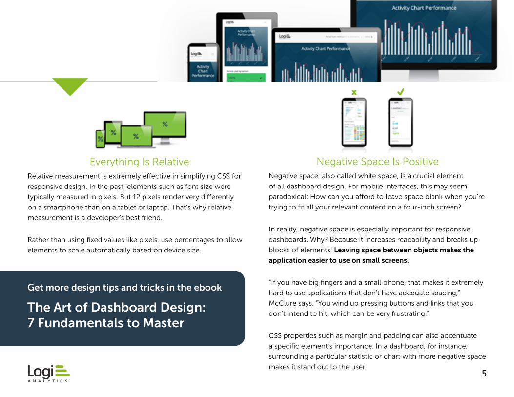
Everything Is RelativeRelative measurement is extremely effective in simplifying CSS for
responsive design. In the past, elements such as font size were
typically measured in pixels. But 12 pixels render very differently
on a smartphone than on a tablet or laptop. That’s why relative
measurement is a developer’s best friend.
Rather than using fixed values like pixels, use percentages to allow
elements to scale automatically based on device size.
Negative Space Is PositiveNegative space, also called white space, is a crucial element
of all dashboard design. For mobile interfaces, this may seem
paradoxical: How can you afford to leave space blank when you’re
trying to fit all your relevant content on a four-inch screen?
In reality, negative space is especially important for responsive
dashboards. Why? Because it increases readability and breaks up
blocks of elements. Leaving space between objects makes the
application easier to use on small screens.
“If you have big fingers and a small phone, that makes it extremely
hard to use applications that don’t have adequate spacing,”
McClure says. “You wind up pressing buttons and links that you
don’t intend to hit, which can be very frustrating.”
CSS properties such as margin and padding can also accentuate
a specific element’s importance. In a dashboard, for instance,
surrounding a particular statistic or chart with more negative space
makes it stand out to the user.
Get more design tips and tricks in the ebook
The Art of Dashboard Design: 7 Fundamentals to Master
6
TOOLS O F T H E
TRADEDevelopers can leverage a number of tools, many of
which are available for free, to help build responsive
analytic applications.
Try these six tools to help get your responsive analytic
application off the ground.
7
CSS FRAMEWORKS
Bootstrap is an open-source framework created in 2011 by a
small team at Twitter. Since then, it has become wildly popular
with developers: Bootstrap’s usage has grown by more than
1,000 percent since 2013. It is designed to provide front-end
interface pieces that are simple to use out of the box. Bootstrap
is also updated continuously, so its users are always working with
the most recent, most fully featured version (Bootstrap 4
is coming soon).
Bootstrap makes it easier to design applications quickly, since it
does not require developers to code all the components from
scratch, as many other tools do. And Bootstrap has a huge
community of users, making it simple to find answers online and
giving you access to a number of custom themes.
Similar to Bootstrap, Foundation offers a robust set of tools and
components that make it easy to build a responsive application.
Foundation is built on REMs, rather than pixels, which makes it
handy for responsive design projects. Among its most attractive
features are its many templates, which allow developers to build
applications faster. Additionally, Foundation gives developers a
little more room for customization than other frameworks.
“Bootstrap and Foundation both offer a complete user interface
that enables front-end design for building applications,” McClure
says. “They are built to be entirely responsive and have a mobile-
first design approach, meaning the mobile view has been
carefully considered.”
8
CSS FRAMEWORKS
The primary difference between Materialize and the two
aforementioned frameworks is the fact that it’s based on
Google’s material design. It is also a completely responsive
framework that provides clean design and a host of options.
Materialize is built on Sass and includes CSS that makes it easy
to embed responsive images—including dashboards—and give
pages a fresh look.
“Materialize is great if you are looking for a modern look and feel
without having to put in a huge effort,” McClure explains.
Skeleton is extremely lightweight, designed to get developers up
and running on a project with the lowest possible barrier to entry.
It includes just a few hundred lines of code and functions as a
“starter kit” with only the most essential elements, such as tables
and forms. While it may not have as many bells and whistles as
some frameworks, it makes it easy to get a development project
off the ground.
“If you want to scale down, cut down on bloat, and make sure your
app is really streamlined, Skeleton will give you a stripped-down
basic framework,” McClure says. “Skeleton only has the essential
components, so if you are looking to implement your own styling
and customizations, this is a framework that functions more of a
baseline that can then be built upon.”
9
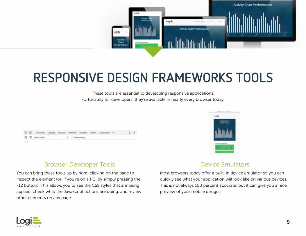
RESPONSIVE DESIGN FRAMEWORKS TOOLS
Browser Developer ToolsYou can bring these tools up by right-clicking on the page to
inspect the element (or, if you’re on a PC, by simply pressing the
F12 button). This allows you to see the CSS styles that are being
applied, check what the JavaScript actions are doing, and review
other elements on any page.
Device EmulatorsMost browsers today offer a built-in device emulator so you can
quickly see what your application will look like on various devices.
This is not always 100 percent accurate, but it can give you a nice
preview of your mobile design.
These tools are essential to developing responsive applications.
Fortunately for developers, they’re available in nearly every browser today.
10
WHAT ABOUT WIREFRAMES? If you’re building a new dashboard or report from scratch and want to wow your audience, you might need a little something more than
the tools listed above. New designs require mockups, and for remote employees—or for those pesky approval processes where seemingly
everyone in the company has to sign off—wireframe tools can be extremely useful.
These are just some of the solutions that allow you to connect with globally dispersed team members and share wireframes and
mockups virtually:
Balsamiq Axure SwordSoft Adobe Illustrator
11
BENEFITS O F A N
ANALYTICS DEVELOPMENT
PLATFORM
The number of open-source dashboard design tools
on the market today may give you the impression that
analytics can be built entirely in house. And sometimes
they can—but only to a point.
If your application requirements go beyond very
basic capabilities (anything other than a couple static
dashboards without much interactivity), a more scalable
approach will involve a third party. Many software
companies are deciding to partner with an analytics
development platform, which gives them both the
freedom to code and customize every element in the
application as well as the solid foundation and scalability
of an analytics expert.
12
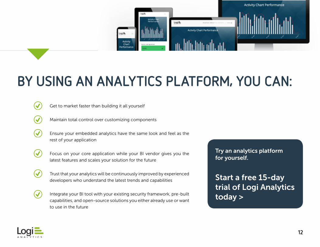
BY USING AN ANALYTICS PLATFORM, YOU CAN:
Get to market faster than building it all yourself
Maintain total control over customizing components
Ensure your embedded analytics have the same look and feel as the
rest of your application
Focus on your core application while your BI vendor gives you the
latest features and scales your solution for the future
Trust that your analytics will be continuously improved by experienced
developers who understand the latest trends and capabilities
Integrate your BI tool with your existing security framework, pre-built
capabilities, and open-source solutions you either already use or want
to use in the future
Try an analytics platform for yourself.
Start a free 15-day trial of Logi Analytics today >

1313
ABOUT LOGI ANALYTICS The Logi Analytics development platform empowers companies to embed analytics into the fabric of their organizations and products—enabling anyone to analyze data, share insights, and make informed decisions.
“With the Logi platform, everything works and looks great right away,” McClure explains. “But it’s also great for developers who want to scale it and make it more than what it already is.”
Logi works with a variety of web languages, including the big three—HTML, CSS, and JavaScript—and many others. Developers can leverage the tools they already use today to customize Logi. For instance, if you have a JavaScript file you already like, you can use it in Logi Studio without any special setup or knowledge.
More than 1,800 customers worldwide rely on Logi Analytics. The company is headquartered in McLean, Virginia. Learn more at LogiAnalytics.com.
Recommended