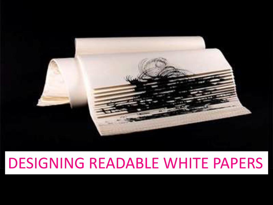
DESIGNING READABLE WHITE PAPERS
#1 rule of document design:
UNDERSTAND YOUR READERS
• They’re busy.• They don’t care about you or your ideas
(or even if they do, they won’t necessarily take the time to read something that looks difficult.
• They will skim.
AND DESIGN ACCORDINGLY
GENERAL STRATEGIES• Create a clear visual hierarchy.• Chunk into bite-size pieces – use white
space.• Use meaningful headings.• Use clear topic sentences to facilitate
skimming.• Be as concise as possible while still being
persuasive.
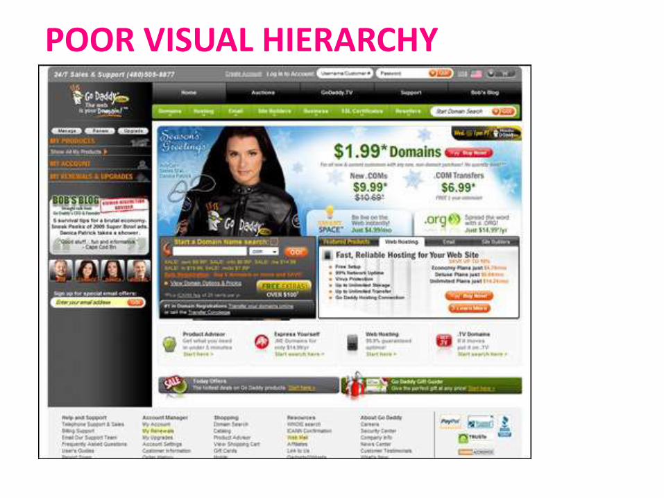
POOR VISUAL HIERARCHY
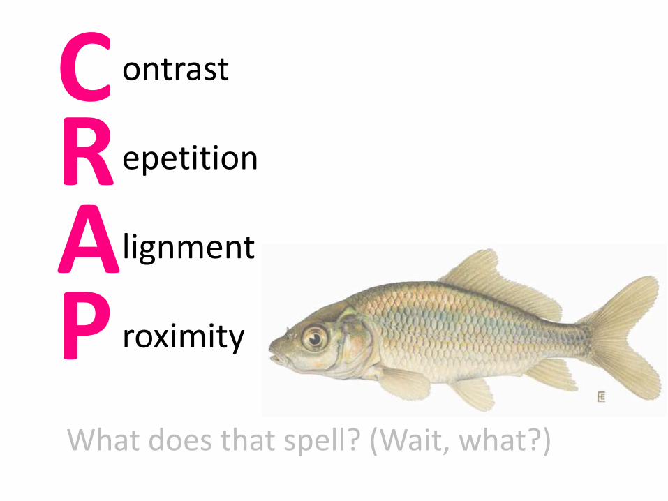
ontrast
epetition
lignment
roximity
C
AR
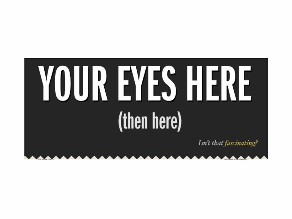
PWhat does that spell? (Wait, what?)
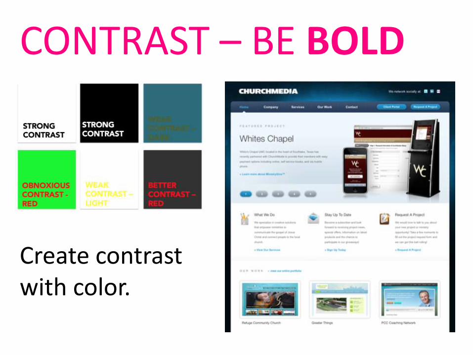
Create contrast with color.
CONTRAST – BE BOLD
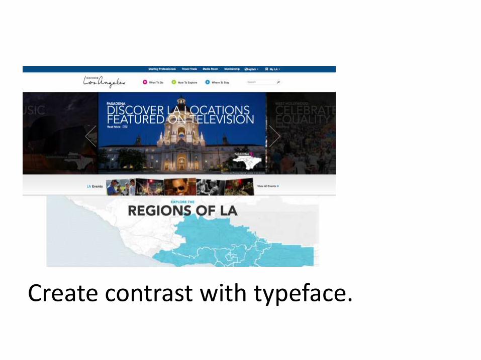
Create contrast with typeface.
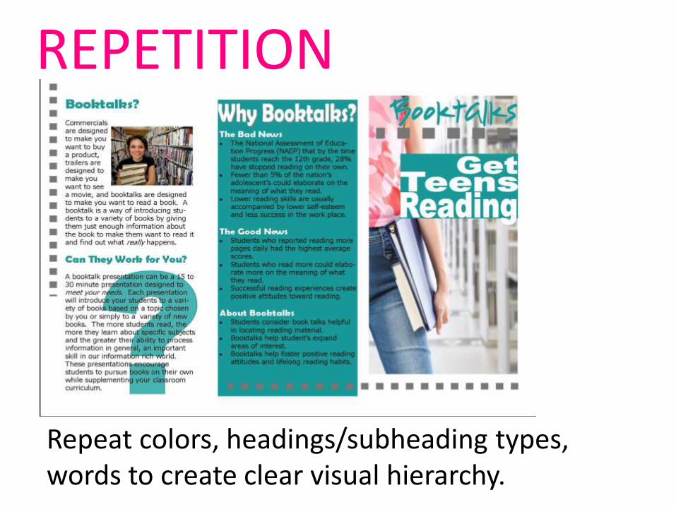
Repeat colors, headings/subheading types, words to create clear visual hierarchy.
REPETITION
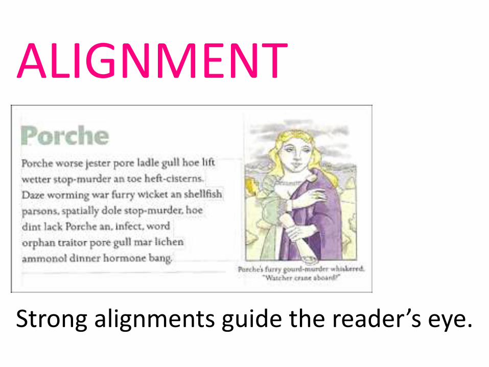
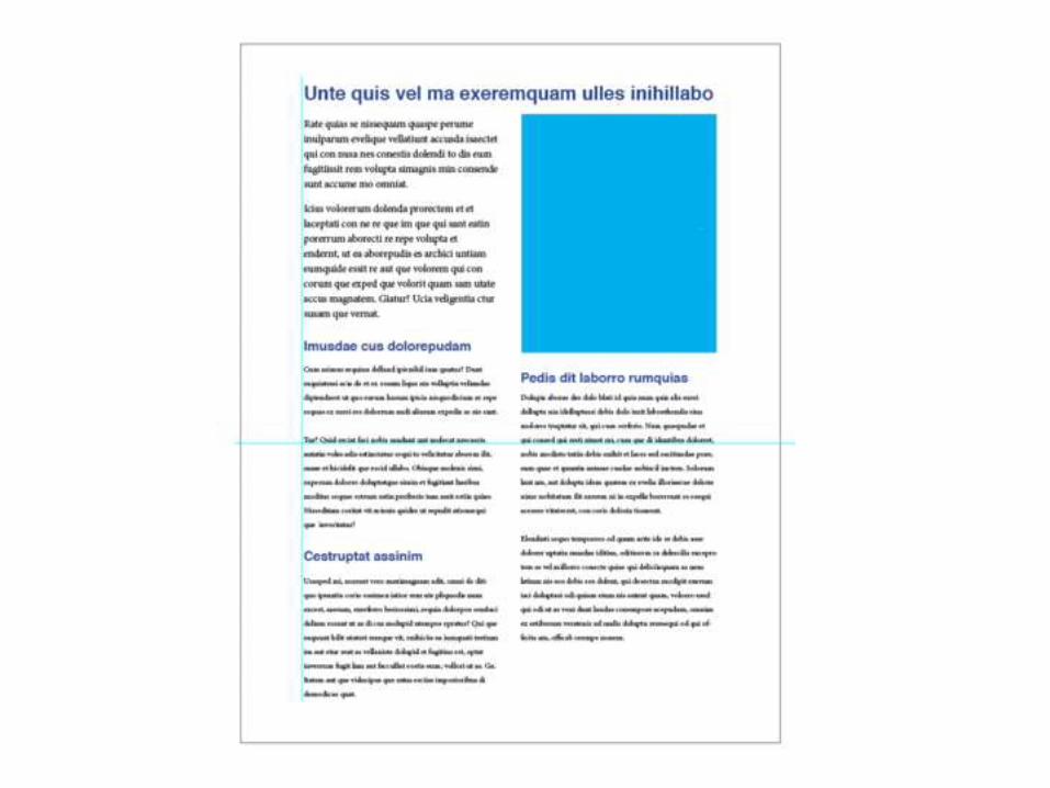
ALIGNMENT
Strong alignments guide the reader’s eye.
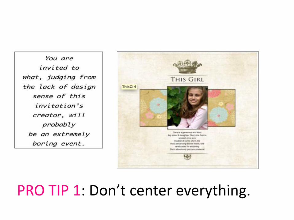
PRO TIP 1: Don’t center everything.
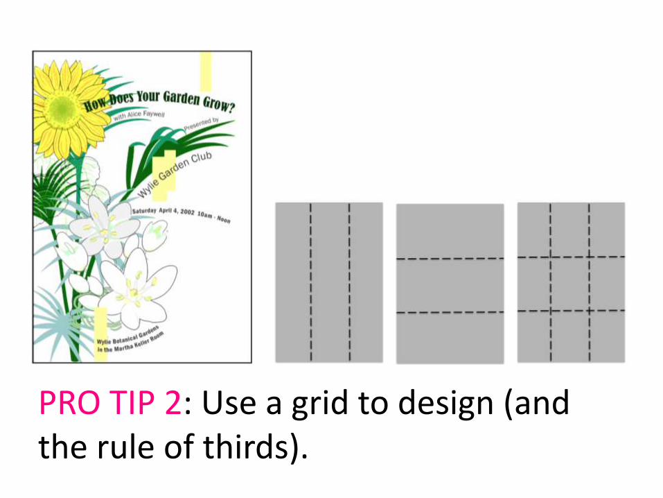
PRO TIP 2: Use a grid to design (and the rule of thirds).
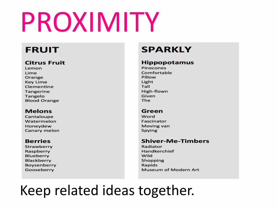
PROXIMITY
Keep related ideas together.

Someone failed to consider proximity…
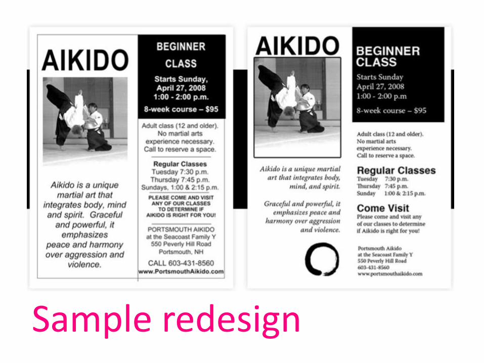
Sample redesign
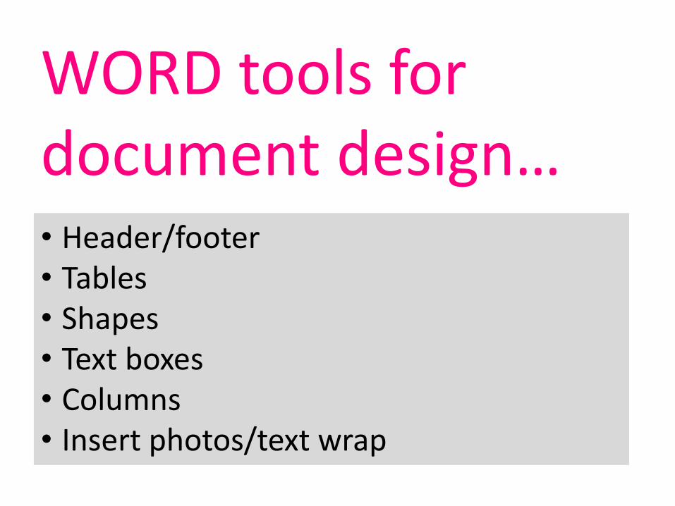
WORD tools for document design…• Header/footer• Tables• Shapes• Text boxes• Columns• Insert photos/text wrap
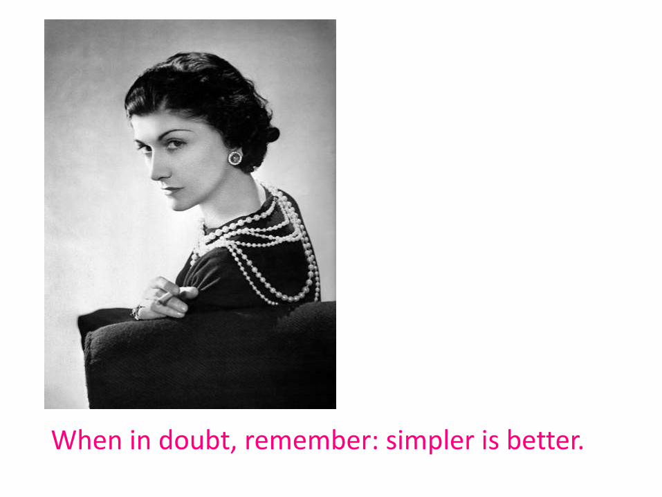
When in doubt, remember: simpler is better.
Recommended