Data Visualization Principles:Interaction, Filtering,
AggregationCSC444

What if there’s too much data?
• Sometimes you can’t present all the data in a single plot
• Interaction: let the user drive what aspect of the data is being displayed
• Filtering: Selectively hide some of the data points
• Aggregation: Show visual representations of subsets of the data

Focus+Context
When showing a limited view, try to hint at what is not being shown.

Demos: NYT Interactive charts
http://www.nytimes.com/interactive/2014/06/05/upshot/how-the-recession-reshaped-the-economy-in-255-charts.html?
abt=0002&abg=0
http://www.nytimes.com/interactive/2014/09/19/nyregion/stop-and-frisk-map.html
http://www.nytimes.com/interactive/2014/upshot/buy-rent-calculator.html?abt=0002&abg=0

INTERACTION

Fundamental idea• Interpret the state of elements in the UI as a clause
in a query. As UI changes, update result set
Willett et al., TVCG 2007 (*)

Focus+Context for Pan & Zoom
Focus
Context
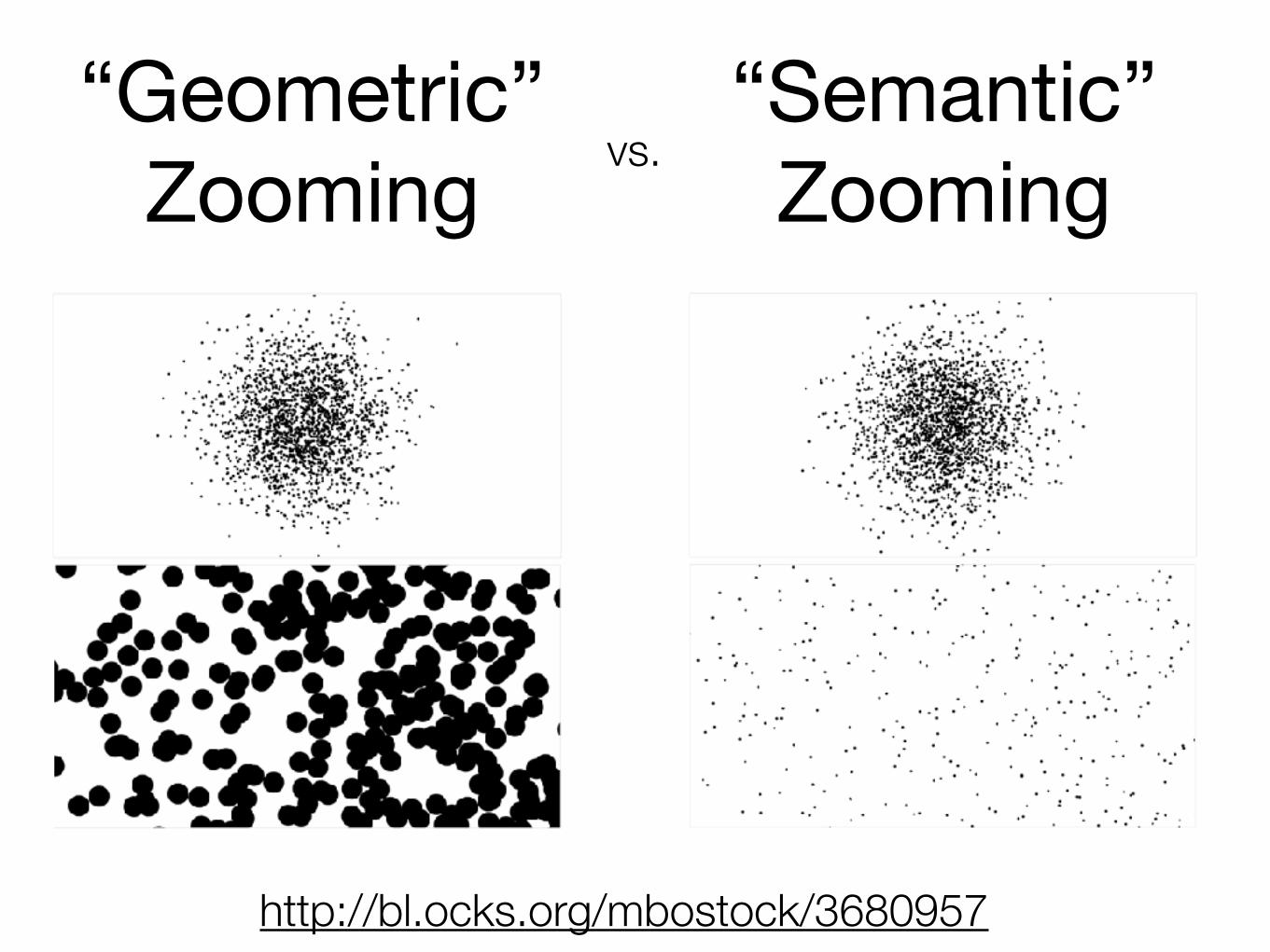
“Semantic” Zooming
http://bl.ocks.org/mbostock/3680957
“Geometric” Zooming vs.

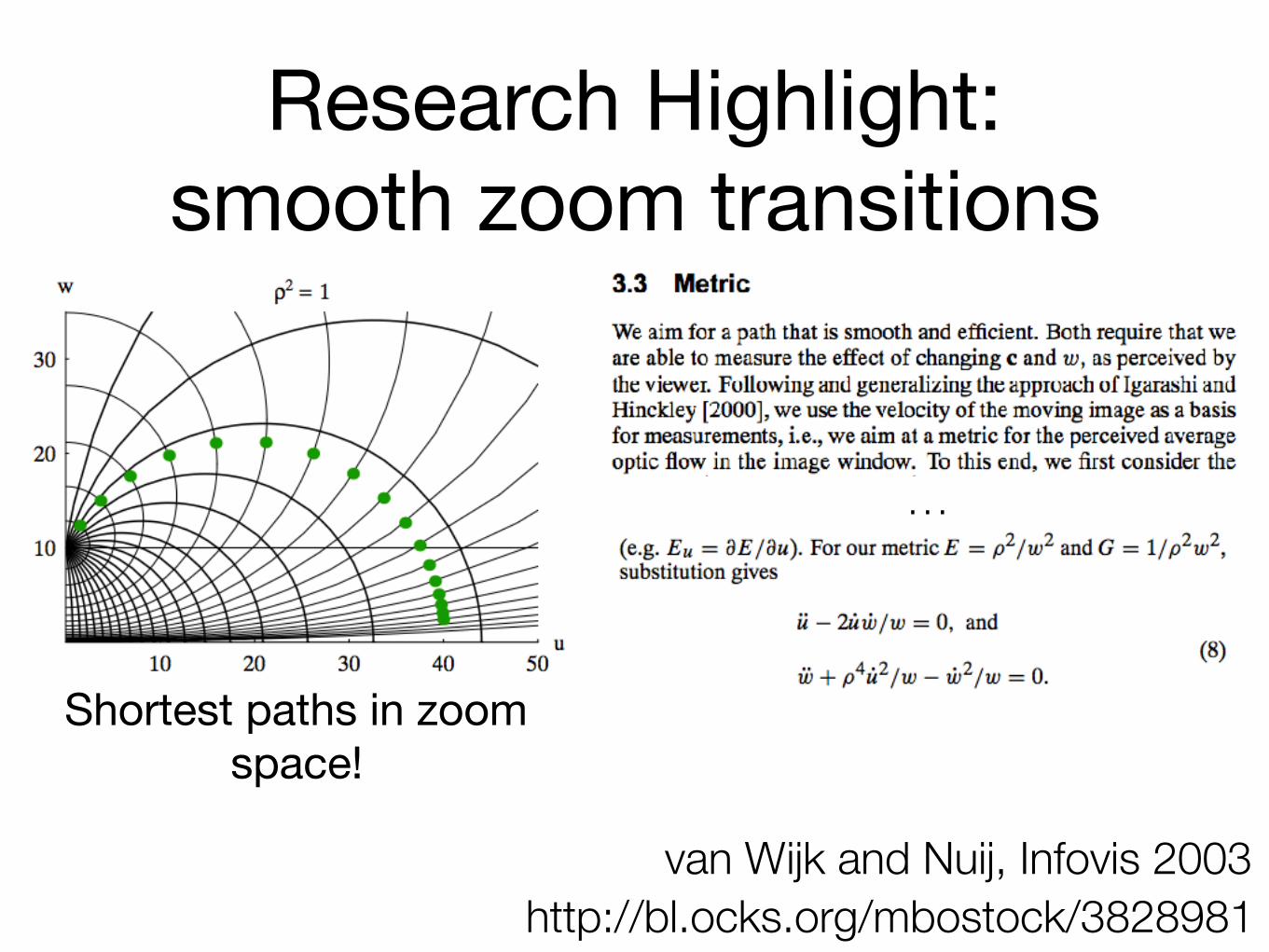
Smooth Zoom transitions(research highlight)
• What’s the “best” way to go from one zoomed view to another?
• Differential equations to the rescue!
http://bl.ocks.org/mbostock/3828981van Wijk and Nuij, Infovis 2003

Research Highlight: smooth zoom transitions
http://bl.ocks.org/mbostock/3828981van Wijk and Nuij, Infovis 2003
Research Highlight: smooth zoom transitions
http://bl.ocks.org/mbostock/3828981van Wijk and Nuij, Infovis 2003
Shortest paths in zoom space!
…

FILTERING

Fundamental idea• Choose a rule, hide elements that don’t match that
rule
• the more complex the rule, the better you will be able to find patterns in the data. More focus
• the more complex the rule, the less transparent it is, so user doesn’t know what the filtering is doing. Less context

• Case in point: do not hide outliers!
• Fancy outlier detection considered harmful
Schutz, CC BY-SA 3.0

Brushing, linked views• Filtering + Interaction
• Show more than one view of the same data
• Users drag “brushes”: regions of each view, which are interpreted directly as queries
• No additional UI!
http://bl.ocks.org/mbostock/4063663

AGGREGATION

Fundamental idea• If there’s too much data, replace individual data
points with representation of subsets
http://square.github.io/crossfilter/

Data Cubes: aggregate by collapsing attributes
Multiscale Visualization using Data Cubes, Stolte et al., Infovis 2002

Data Cubes: aggregate by collapsing attributes
Multiscale Visualization using Data Cubes, Stolte et al., Infovis 2002

Data Cubes: aggregate by collapsing attributes
• recent: data cubes specifically designed for vis:
• Bostock et al.’s Crossfilter (http://square.github.io/crossfilter/)
• Liu et al.’s Immens (http://vis.stanford.edu/papers/immens)
• Lins et al.’s Nanocubes (http://nanocubes.net/)
• Filtering + Aggregation + Interaction
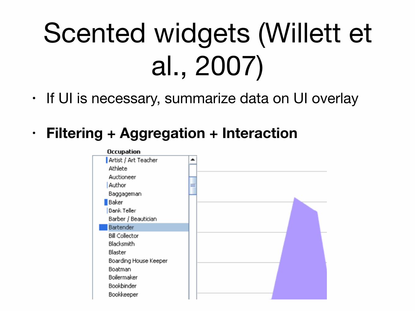
Scented widgets (Willett et al., 2007)
• If UI is necessary, summarize data on UI overlay
• Filtering + Aggregation + Interaction

Research Questions• “Torture your data enough, and it’ll tell you
anything”, Ronald Coase
• (http://tylervigen.com/)
• Statistics has tools to mitigate this problem
• Interaction is much less well-studied!

Shneiderman’s “Visual information seeking mantra”
Overview first, zoom and filter,
then details-on-demand

Demos
http://square.github.io/crossfilter/http://cscheid.net/static/mlb-hall-of-fame-voting/
http://www.nytimes.com/interactive/dining/new-york-health-department-restaurant-ratings-map.html
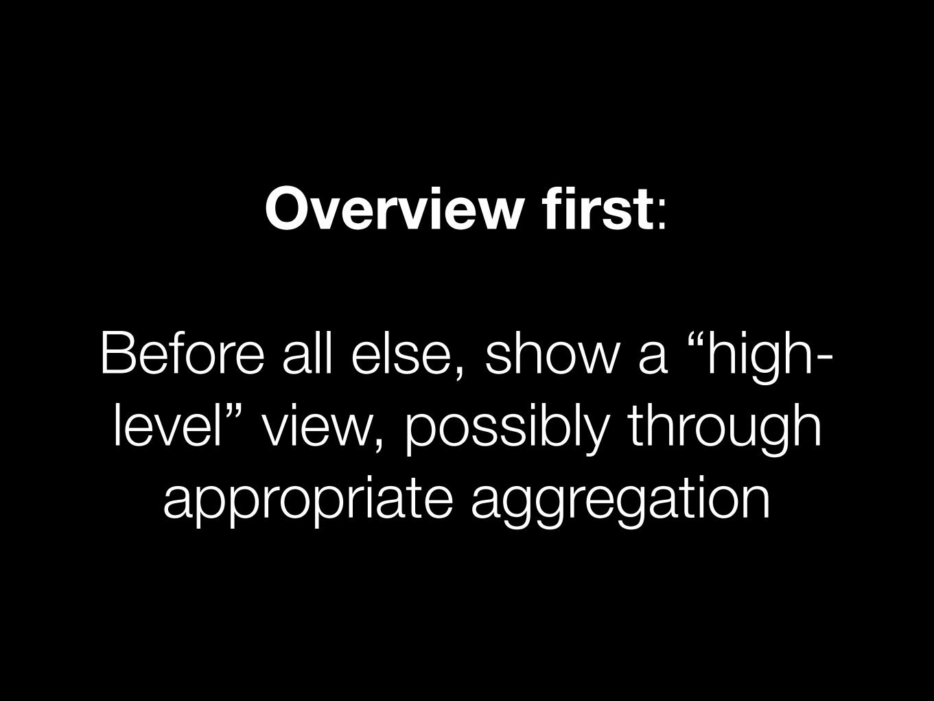
Overview first:
Before all else, show a “high-level” view, possibly through
appropriate aggregation

Zoom and Filter:
Use interaction to create user-specified views

Details on Demand:
Individual points or attributes should be available, but only
as requested
Recommended