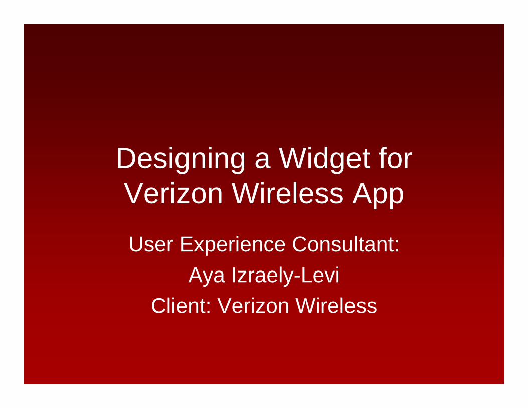
Designing a Widget for Verizon Wireless AppUser Experience Consultant:
Aya Izraely-LeviClient: Verizon Wireless
Outline
• MyVerizon• The Data Meter• Android Widget• Design Process
– Designing for understanding• Operating in a large corporation and
impact on decision making and bottom line design

MyVerizonSelf Serve Model
All images in this presentation are prototypes and are not actual screens of the final product

Basic Flow and Interactions
• Overview panel carousel• Optimized for reviewing
status and taking action

Initial RequirementsBusiness: No more only unlimited data packages
Legal: Notifications to users before overage
UX: Help users understand their data
usage
The Data Meter

Concept
On click
Widget launches the app in appropriate context: Data Usage Overview Panel
Usage Details Data Packages
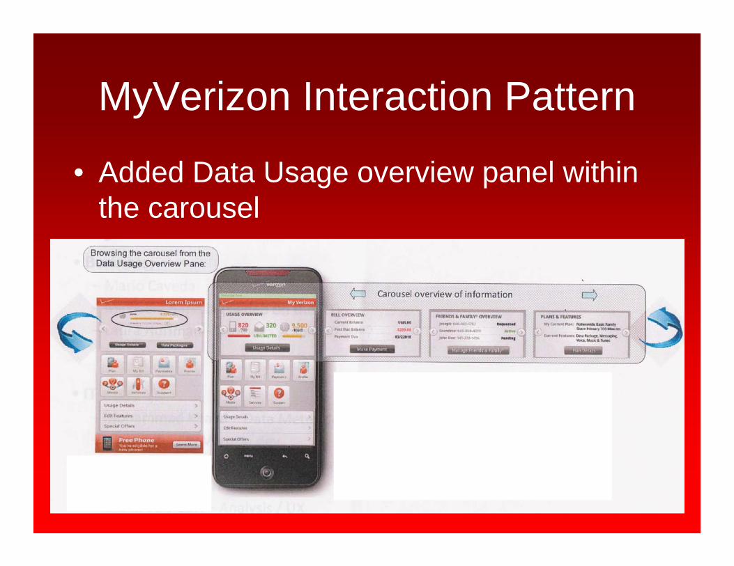
MyVerizon Interaction Pattern
• Added Data Usage overview panel within the carousel

Android WidgetA widget can display an app's most timely or relevant
information at a glance on a user's home screen. Impact: Immediate dynamic info on top level
1x4
2x4
2x2

Designing for Understanding
• Richard Soul Wurman:“Making information understandable”
• Edward Tufte:“Help the viewer think about the information
rather than the design”

Why is it Hard to Understand Data Usage?
• Unlike minutes: Not in direct proportion to usage time
• Download –unlike- Upload• WiFi or network ?• Verizon related activities? • Apps run in the background?• Not to mention roaming
Visualizations that support understanding the above were designed in additional pages of the app

Widget Specs
Goal: Communicate status
• Usage– Info: Usage / allowance– Color
• As of (date)

Designing a 4x1 Widget - 1
All images in this presentation are prototypes and are not actual screens of the final product

Designing a 4x1 Widget - 1Branding people
are happy
White on Yellow: Legibility issues
Click to refresh indication
On high usage: becomes a big red blob
Handle to encourage a click

Designing a 4x1 Widget - 2

Designing a 4x1 Widget - 2Data icon: Branding people not as happy
Status color is being reinforced
Shorter text + date (mm/dd/yy)
Increased size of usage info

Lets Compare: 1,2,and 3
1
2
3

Lets Compare: 1,2,and 3
Note the time stamp in addition to the date
2 images too much: Verizon Wireless branding with the data icon
1
2
3

4x1 Vs. 1x1• Afforded more details to be displayed and an
indication to click to update• Users recognized the 4x1 as a different element
than app– New technology – users are still learning, single cell
images on screen are recognized as apps– Even our graphic designers produced these app icons
as widget designs

Boxed into the 1x1 Cell
Minimizing the specs

Boxed into the 1x1 Cell
Minimizing the specs
Temporary No color direction

Boxed into the 1x1 Cell
Minimizing the specs
Temporary No color direction
Final Design

Widget Design - Lessons Learned• Carefully consider buttons on widget: For our 1x1 – none, respect the
minimal tapping space required and define buttons
• Make it Simple! Display the most important element and make sure it’s clearly displayed
• Provide Visual design that supports the details In our case: Color and Size supported the numerical info
• Think about the next step after the click: What’s the user’s context? Sending the user to the default app landing page or a specific context in the app?
• Test, Test & Test the design for all use cases: So many devices/sizes/resolutions…The proof is in the puddingWe had to test that digits fit into the widget and be legible in all usage scenarios

Within a Large Corporation: Lots of Voices and Agendas
• What units we talk? To be consistent with the corp or clearer to user in this context?
• 3G widget is updated only upon click (only 4G is real time)Not what would be expected of a widget Even upon click data is synched and therefore updated only 3 times a day
• Why would users use a data meter for 3G where currently all plans are unlimited?
• Temporary “No colors” direction: When corp do not want to communicate a red-light to users
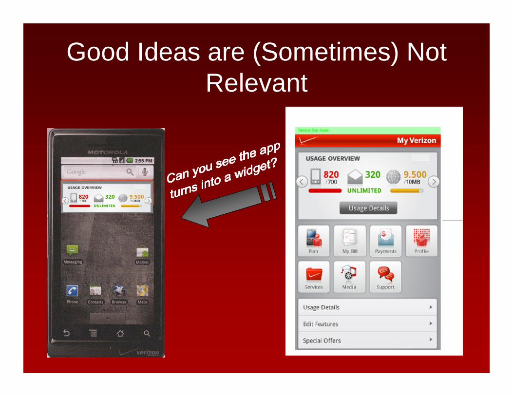
Good Ideas are (Sometimes) Not Relevant

Thank you ~~
Thanks to the Verizon Wireless Dev and Marketing Product teams and RGA for the visual design
Recommended