http://poloclub.gatech.edu/cse6242CSE6242 / CX4242: Data & Visual Analytics
Common visualization Issues &how to fix them
Duen Horng (Polo) Chau Associate ProfessorAssociate Director, MS AnalyticsMachine Learning Area Leader, College of Computing Georgia Tech
Partly based on materials by Professors Guy Lebanon, Jeffrey Heer, John Stasko, Christos Faloutsos

�2
Student of Edward Tufte
http://a.co/6BhlPfZ

Also Highly Recommended:

�4
Bar Charts

�4
The color scheme reminds you of what?
Bar Charts

�5
Better than Christmas(Use color brewer to find good color schemes)

�6
Company Profits

�6
Don’t show profits in red!!Think carefully about your color choices.
Company Profits

�7

�8

�8
Misleading Bar Charts

�9
Vertical axis of bar charts should start at 0, almost always

�10

�10
Disorienting color bars

�11
Use gradation

�12

�12
Avoid Tilted or Rotated Labels

�13
Bars Can be Horizontal

�13
Bars Can be Horizontal
When labels are hard to read, try horizontal layout. Don’t settle for the default.

�14http://www.apple.com/imac/performance/
�15
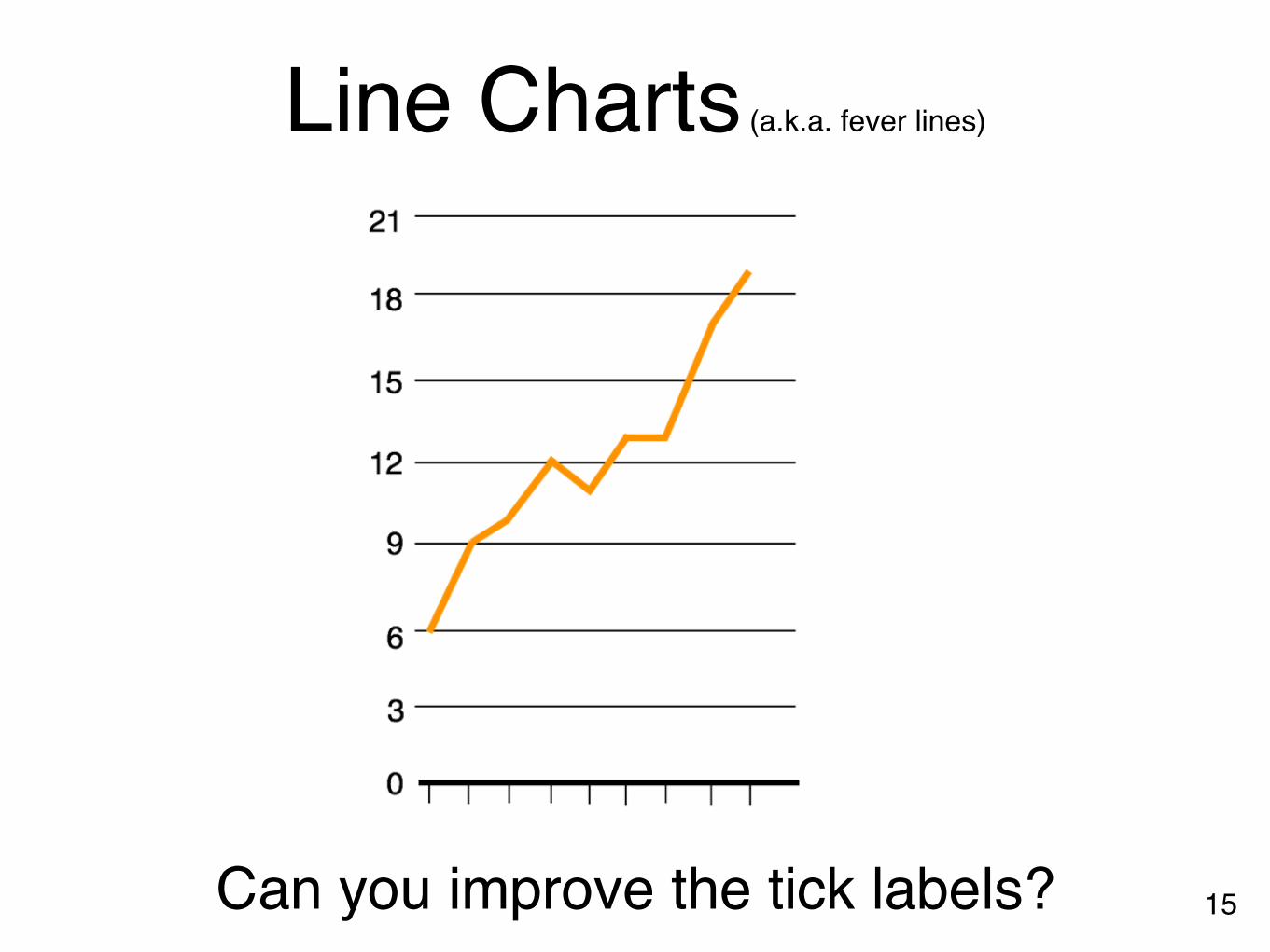
Line Charts (a.k.a. fever lines)
Can you improve the tick labels?

�16
Use ticks at common intervals (e.g., 2, 5, 10, etc.)

�17
Note y-axis does not need to start at 0. Why not as bad as in the case of bar chart?
Too flat or too steep?Too flat obscuresthe message
Too exaggerated overstates the trend

�18
Rule of Thumb

�19
Multiple Patterned Lines in one chart

�20
Better? Note the “double encoding” of line width and brightness.
What if you have many lines you want to show?

�21
“Small Multiple” - Edward Tufte Better than overlapping (sometimes)
“a series or grid of small similar graphics or charts, allowing them to be easily compared”

�22
What can you improve?
Tables Name Data Data Data
Company A 0.0 0.0 0.0
Company B 0.0 0.0 0.0
Company C 0.0 0.0 0.0
Company D 0.0 0.0 0.0

What’s the problem with making everything
bold or italic?

https://youtu.be/1E9pKU_N15A

“Everyone is special” ➞ “No one is”https://youtu.be/1E9pKU_N15A

When everyone is special, no one is!
�25
Name Data Data Data
Company A 0.0 0.0 0.0
Company B 0.0 0.0 0.0
Company C 0.0 0.0 0.0
Company D 0.0 0.0 0.0

�26
Name Data Data Data Data Data Data
Company A 0.0 0.0 0.0 0.0 0.0 0.0
Company B 0.0 0.0 0.0 0.0 0.0 0.0
Company C 0.0 0.0 0.0 0.0 0.0 0.0
Company D 0.0 0.0 0.0 0.0 0.0 0.0
Company E 0.0 0.0 0.0 0.0 0.0 0.0
Company F 0.0 0.0 0.0 0.0 0.0 0.0
Company G 0.0 0.0 0.0 0.0 0.0 0.0
Company H 0.0 0.0 0.0 0.0 0.0 0.0

�26
A lot of “chart junk”. Low “data to ink” ratio (Edward Tufte)
Name Data Data Data Data Data Data
Company A 0.0 0.0 0.0 0.0 0.0 0.0
Company B 0.0 0.0 0.0 0.0 0.0 0.0
Company C 0.0 0.0 0.0 0.0 0.0 0.0
Company D 0.0 0.0 0.0 0.0 0.0 0.0
Company E 0.0 0.0 0.0 0.0 0.0 0.0
Company F 0.0 0.0 0.0 0.0 0.0 0.0
Company G 0.0 0.0 0.0 0.0 0.0 0.0
Company H 0.0 0.0 0.0 0.0 0.0 0.0

�27Higher “data to ink” ratio
Name Data Data Data Data Data Data
Company A 0.0 0.0 0.0 12.0 0.0 0.0
Company B 0.0 0.0 0.0 11.0 0.0 0.0
Company C 0.0 0.0 0.0 10.0 0.0 0.0
Company D 0.0 0.0 0.0 9.0 0.0 0.0
Company E 0.0 0.0 0.0 8.0 0.0 0.0
Company F 0.0 0.0 0.0 7.0 0.0 0.0
Company G 0.0 0.0 0.0 6.0 0.0 0.0
Company H 0.0 0.0 0.0 5.0 0.0 0.0
Company I 0.0 0.0 0.0 4.0 0.0 0.0
Company J 0.0 0.0 0.0 3.0 0.0 0.0
Company K 0.0 0.0 0.0 2.0 0.0 0.0
Company L 0.0 0.0 0.0 1.0 0.0 0.0

�28
Problems?
Name Data
Company A 1000
Company B 900
Company C 80
Company D 7
Name Data
Company A 10.82
Company B 9.49
Company C 8
Company D 7.4

�29
Name Data
Company A 10.8
Company B 9.5
Company C 8.0
Company D 7.4
Name Data
Company A 10.82
Company B 9.49
Company C 8
Company D 7.4

Beautiful Publication-quality LaTeX Tables
https://tex.stackexchange.com/questions/112343/beautiful-table-samplesShort guide: https://www.inf.ethz.ch/personal/markusp/teaching/guides/guide-tables.pdf
Long guide: http://cpansearch.perl.org/src/LIMAONE/LaTeX-Table-v1.0.6/examples/examples.pdf�30

�31
The Dreaded Pie Charts
Why people like to use pie charts?

�32http://www.wired.com/2008/02/macworlds-iphon/

�33http://flowingdata.com/2012/06/15/what-3-d-pie-charts-are-good-for/

�34http://wonkette.com/412361/all-193-of-republicans-support-palin-romney-and-huckabee

�35

�36http://infosthetics.com/archives/2008/09/funniest_pie_chart_ever.html

Log scale instead of linear scale Include numbers from different orders of magnitude
�37

�38
Example
log-log

�39
Example“log” also works well for time
The yield curve of Treasury bills, notes and bonds

In-class Exercise.Applying what you have just learned.
�40

�41Can you improve its visual design?
A brief description that outlines what the data shows
HEADLINE OF THE CHART

�42Which is better?
A brief description that outlines what the data shows
Headline of the chart
8
6
0
4
2
Town A Town B Town C Town D
A brief description that outlines what the data shows
HEADLINE OF THE CHART
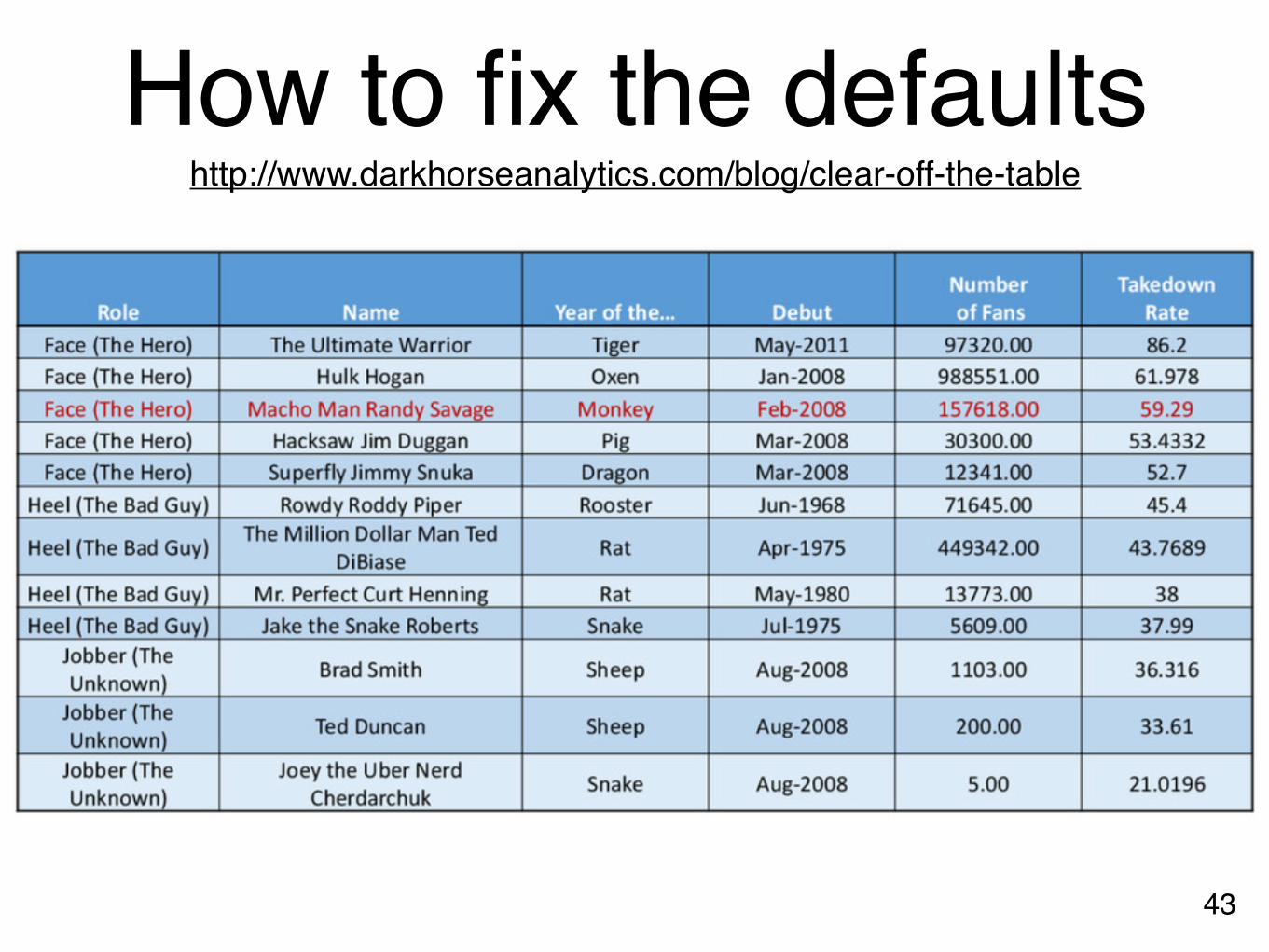
How to fix the defaults
�43
http://www.darkhorseanalytics.com/blog/clear-off-the-table

How to fix the defaults
�43
http://www.darkhorseanalytics.com/blog/clear-off-the-table
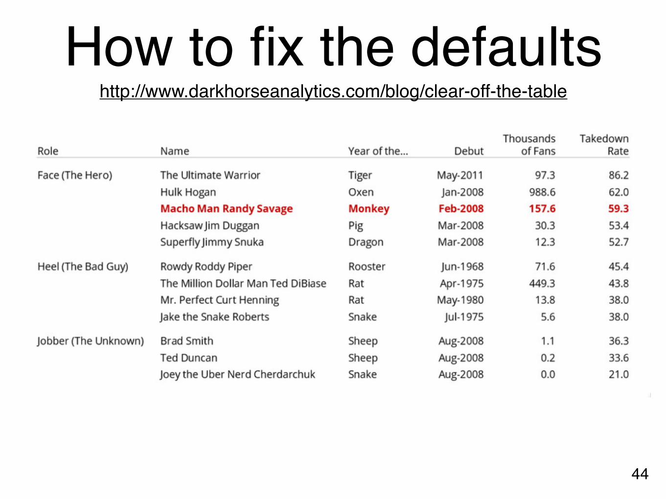
How to fix the defaults
�44
http://www.darkhorseanalytics.com/blog/clear-off-the-table

How to fix the defaults
�44
http://www.darkhorseanalytics.com/blog/clear-off-the-table

Practitioners’ GuideColors: start with black & white, then add colors, carefully
Forces you to focus on content and layout
Fonts: sans-serif generally easier to read
(On Mac: Helvetica is great start)
Animation: start with no animation, then add meaningful ones
�45

Practitioners’ Guide: Use Pictures and Videos
“Pictures” include tables, diagrams, charts, etc.• Pictures often more succinct & memorable• People like pictures and love movies
�46
And show them ASAP! Once people fall asleep, it’s hard to wake them up!
If you have good stuff, show them now.

�47
Example

�48
Example

�49
Example

Practitioners’ Guide: Additional Tips for Researchers
Crown-jewel pictures are important
• Overview of what readers is going to get — cut to the chase (don’t tease!)
• People skim and look at “interesting” things first
• Reviewers are busy and sleepy 😴 (read 5-10 papers per conference) — it’s refreshing to read an interesting paper
How to do it?• Use your most impressive figure
• Can be similar to another shown later
�50

Figures should be self-containedWhy?• Don’t make people go back
and forth between text & figure• Bad figures means bad first
impression (reject!)How to fix?• Succinctly describe your main
(take-away) messages
�51

�52http://www.cs.cmu.edu/~dchau/polonium_sdm2011.pdf
Example

More generally, how to write “good” papers?
�53http://faculty.washington.edu/wobbrock/pubs/Wobbrock-2015.pdf
http://approximatelycorrect.com/2018/01/29/heuristics-technical-scientific-writing-machine-learning-perspective/

Use legible fonts.
�54

For printed materials, print them out and check!Rule of thumb: about 7 lines of text on a slide.
�55
If people can’t see it, they won’t appreciate it.

Redesign figures for presentation
Designing for print is different from designing for the screen
• Resolution (which is higher?)• Levels of details (people mostly want a few
“take-away” messages from your talk)
�56

�57
Example
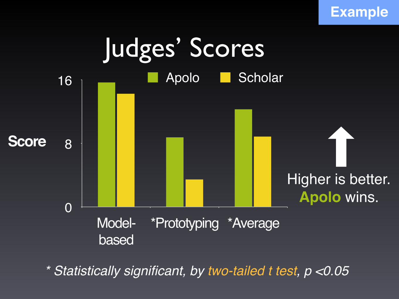
Higher is better.Apolo wins.
* Statistically significant, by two-tailed t test, p <0.05
Judges’ Scores
0
8
16
Model-based
*Prototyping *Average
Apolo Scholar
Score
Example

Great Work destroyed by Poor Presentation
Bad color schemesBad, tiny fontsToo much animationToo much data
�59
100 times faster!
http://www.youtube.com/watch?v=lpvgfmEU2Ck&feature=player_embeddedDon McMillan: Life After Death by PowerPoint
can you read this?
Recommended