MMA 100Foundations of Digital Graphic Design Clare Ultimo
• The importance of Framing • Design Principles Review• Class Workshop> Illustrator & Photoshop
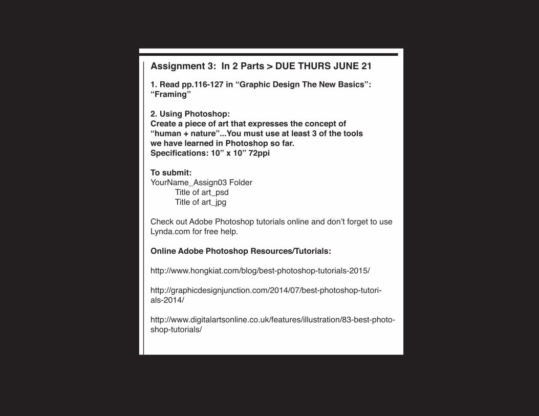
Assignment 3: In 2 Parts > DUE THURS JUNE 21
1. Read pp.116-127 in “Graphic Design The New Basics”: “Framing”
2. Using Photoshop:Create a piece of art that expresses the concept of “human + nature”...You must use at least 3 of the tools we have learned in Photoshop so far.Specifications: 10” x 10” 72ppi
To submit:YourName_Assign03 Folder Title of art_psd Title of art_jpg
Check out Adobe Photoshop tutorials online and don’t forget to use Lynda.com for free help.
Online Adobe Photoshop Resources/Tutorials:
http://www.hongkiat.com/blog/best-photoshop-tutorials-2015/
http://graphicdesignjunction.com/2014/07/best-photoshop-tutori-als-2014/
http://www.digitalartsonline.co.uk/features/illustration/83-best-photo-shop-tutorials/
Prof. Clare Ultimo
Please note: ALL EMAIL SUBJECT LINES MUST SAY: MMA100
Borough of Manhattan Community CollegeThe City University of New YorkDepartment of Media Arts and Technology
MMA 100 Foundations of Digital Graphic Design Summer 2018
Class Materials:www.ultimobook.com/bmcc/mma100
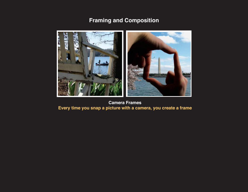
Camera FramesEvery time you snap a picture with a camera, you create a frame
Framing and Composition
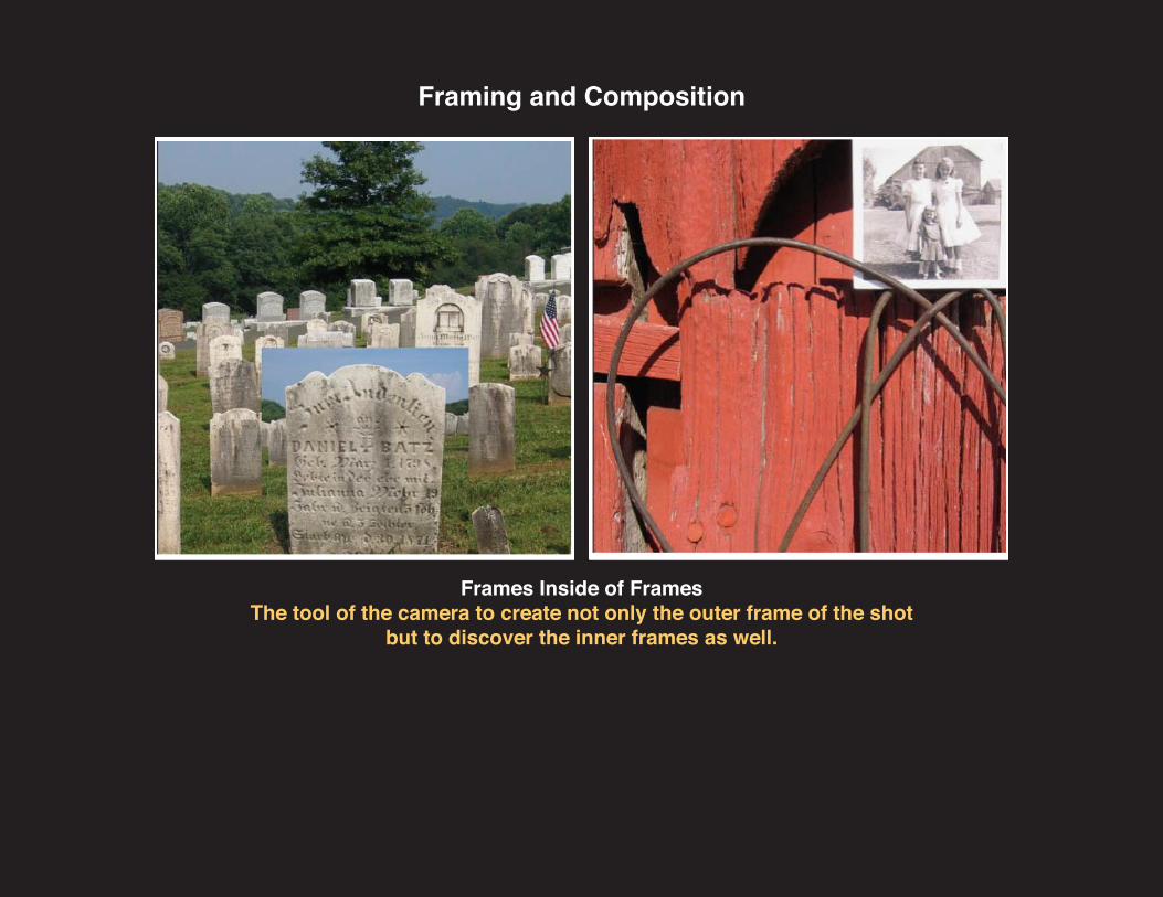
Frames Inside of FramesThe tool of the camera to create not only the outer frame of the shot
but to discover the inner frames as well.
Framing and Composition
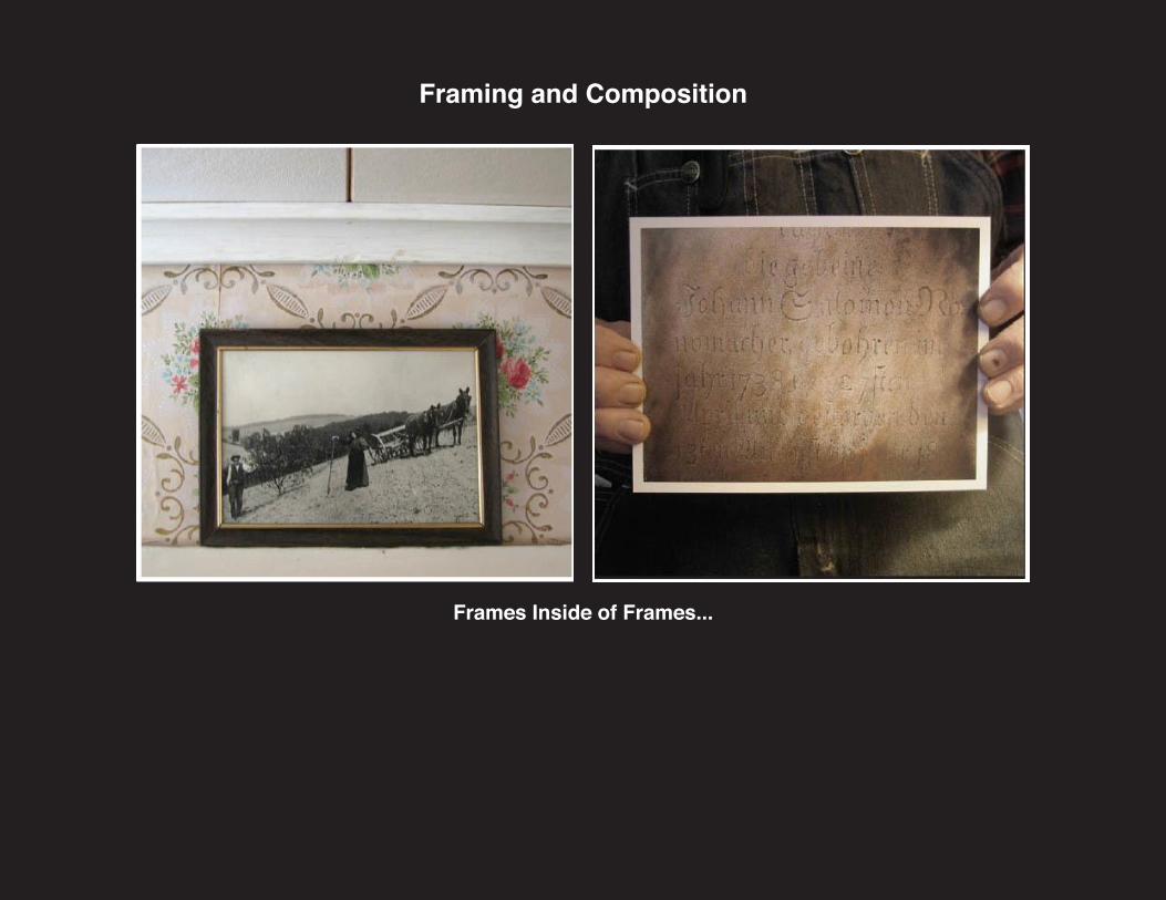
Frames Inside of Frames...
Framing and Composition
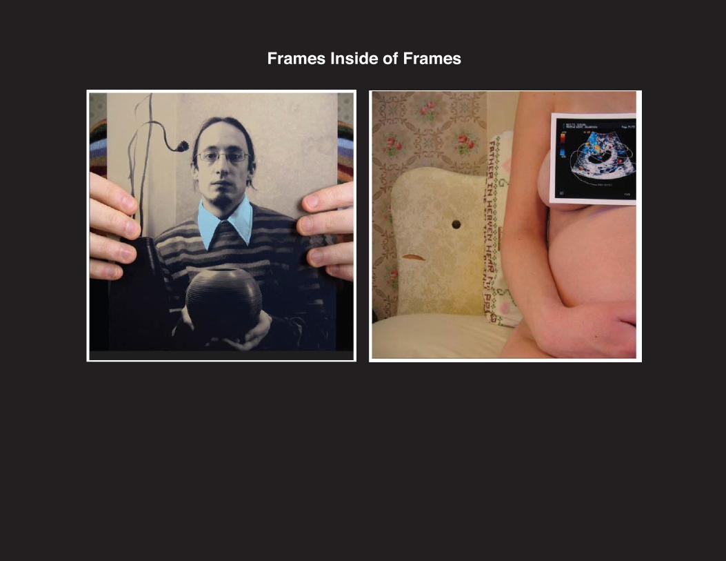
Frames Inside of Frames
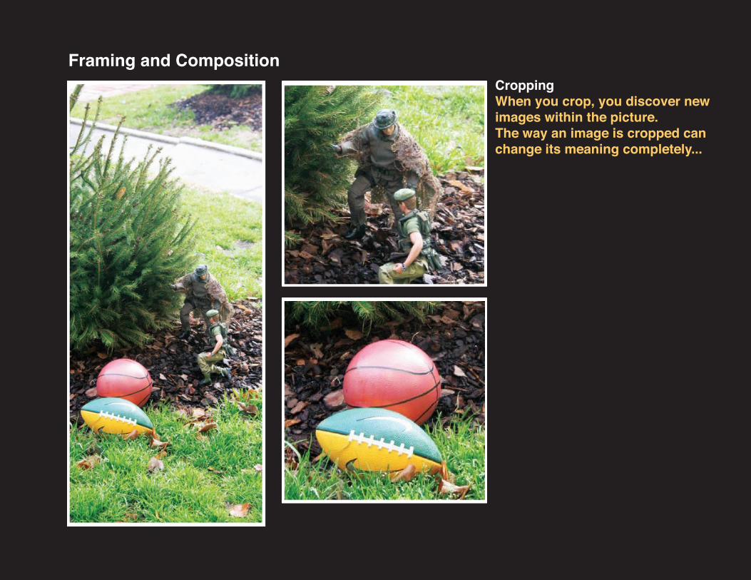
CroppingWhen you crop, you discover new images within the picture.The way an image is cropped can change its meaning completely...
Framing and Composition
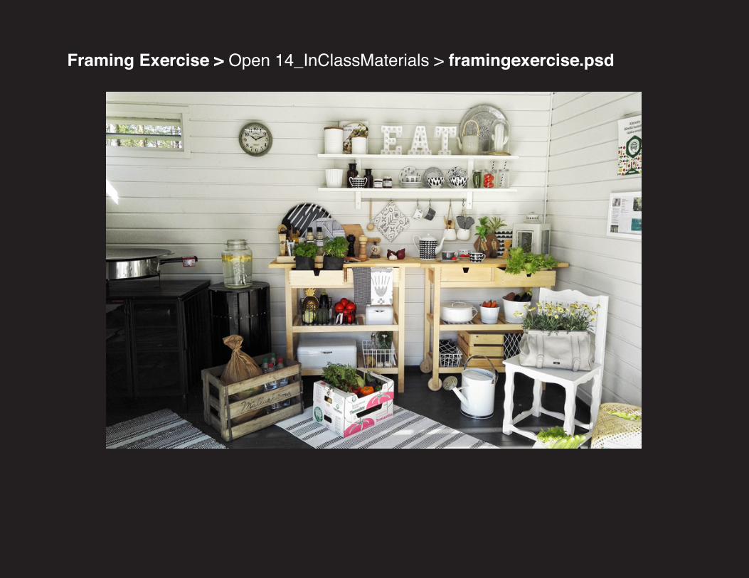
Framing Exercise > Open 14_InClassMaterials > framingexercise.psd
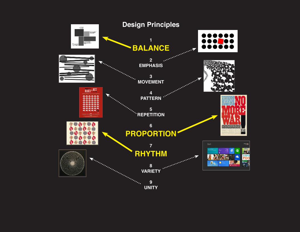
Design Principles
1
BALANCE2
EMPHASIS
3MOVEMENT
4PATTERN
5REPETITION
6
PROPORTION7
RHYTHM8
VARIETY
9UNITY
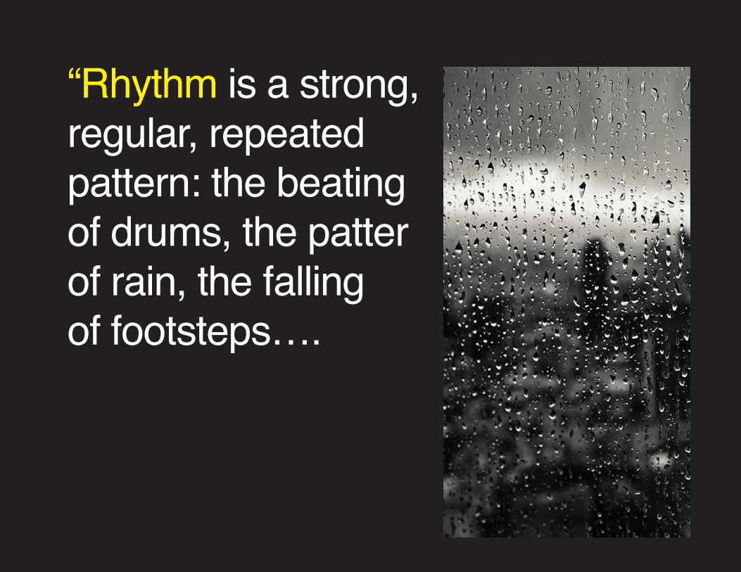
“Rhythm is a strong, regular, repeated pattern: the beating of drums, the patter of rain, the falling of footsteps….
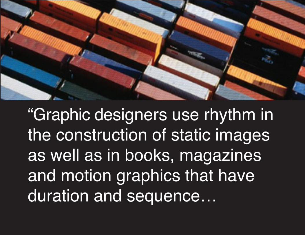
“Graphic designers use rhythm in the construction of static images as well as in books, magazines and motion graphics that have duration and sequence…
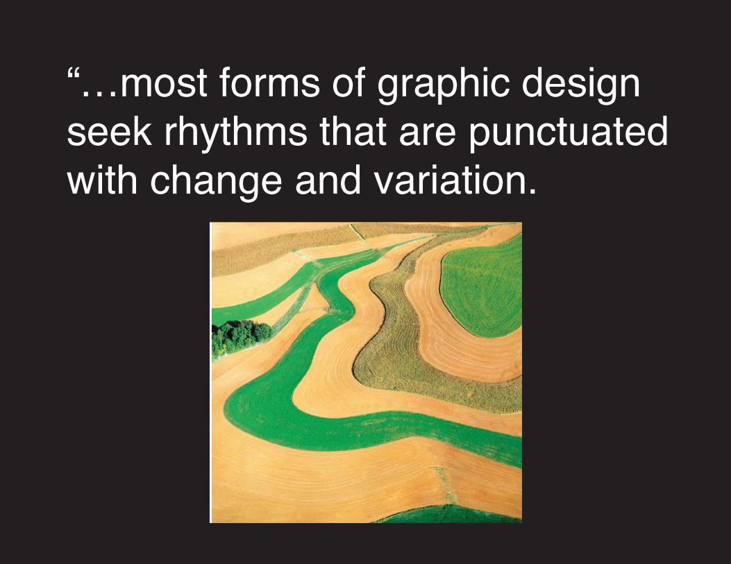
“…most forms of graphic design seek rhythms that are punctuated with change and variation.
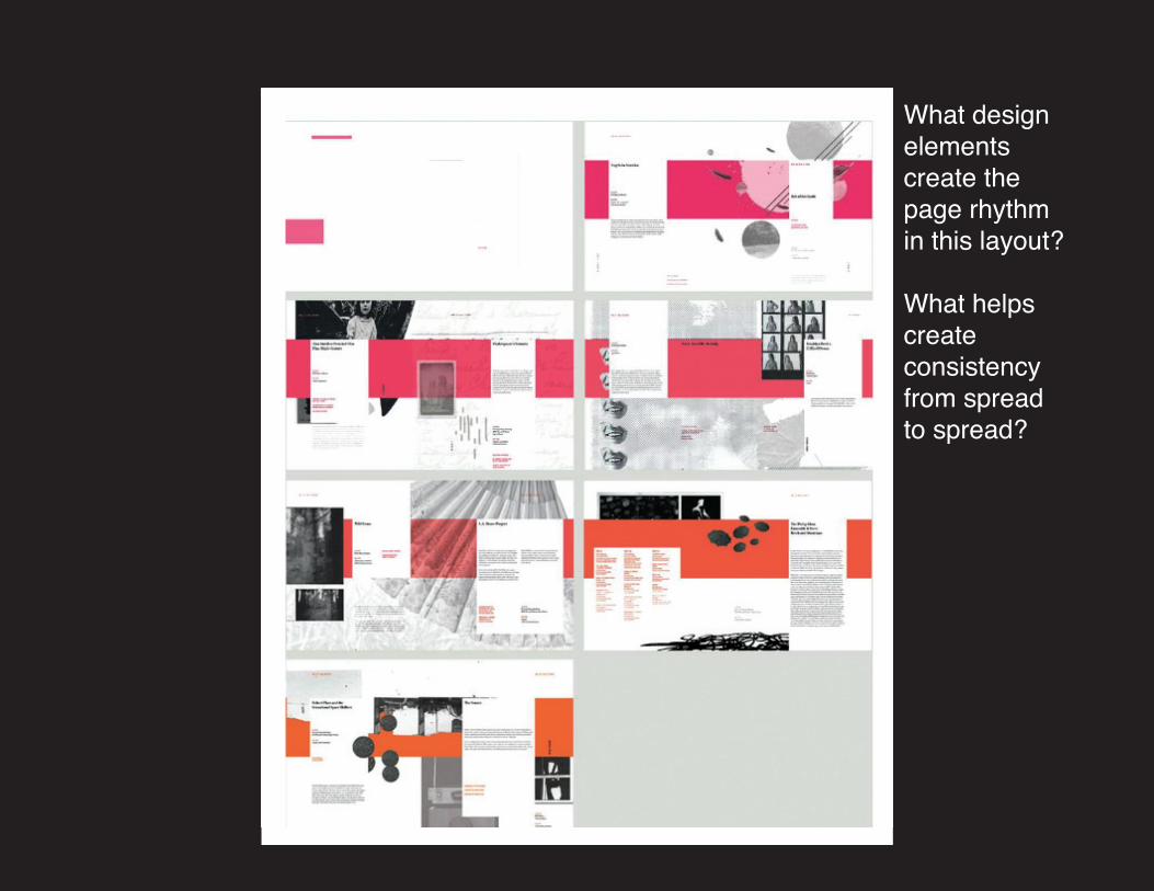
What design elements create the page rhythmin this layout?
What helps create consistency from spread to spread?
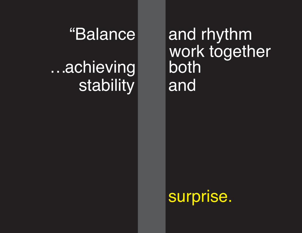
“Balance and rhythm work together
…achieving bothstability
surprise.
and
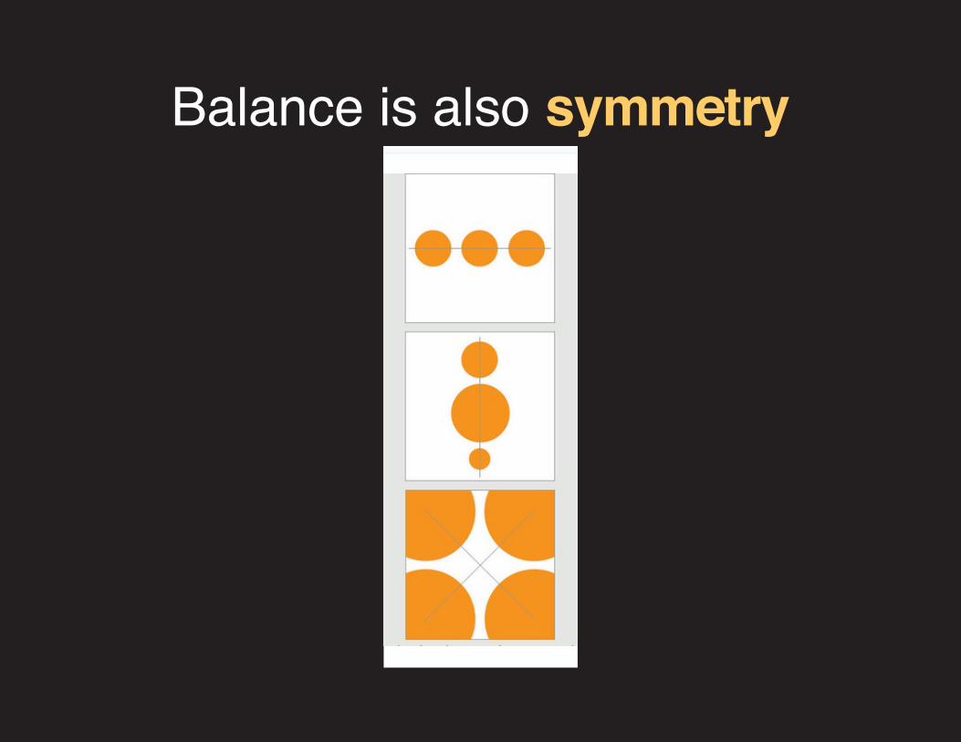
Balance is also symmetry
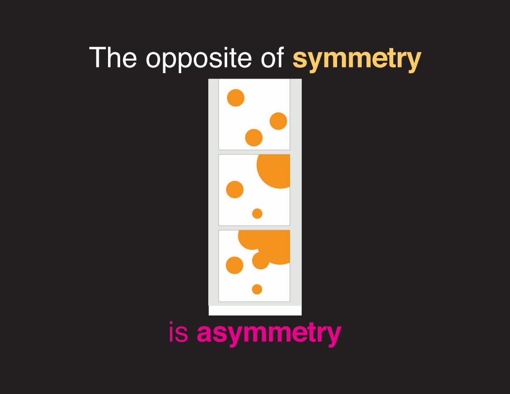
The opposite of symmetry
is asymmetry
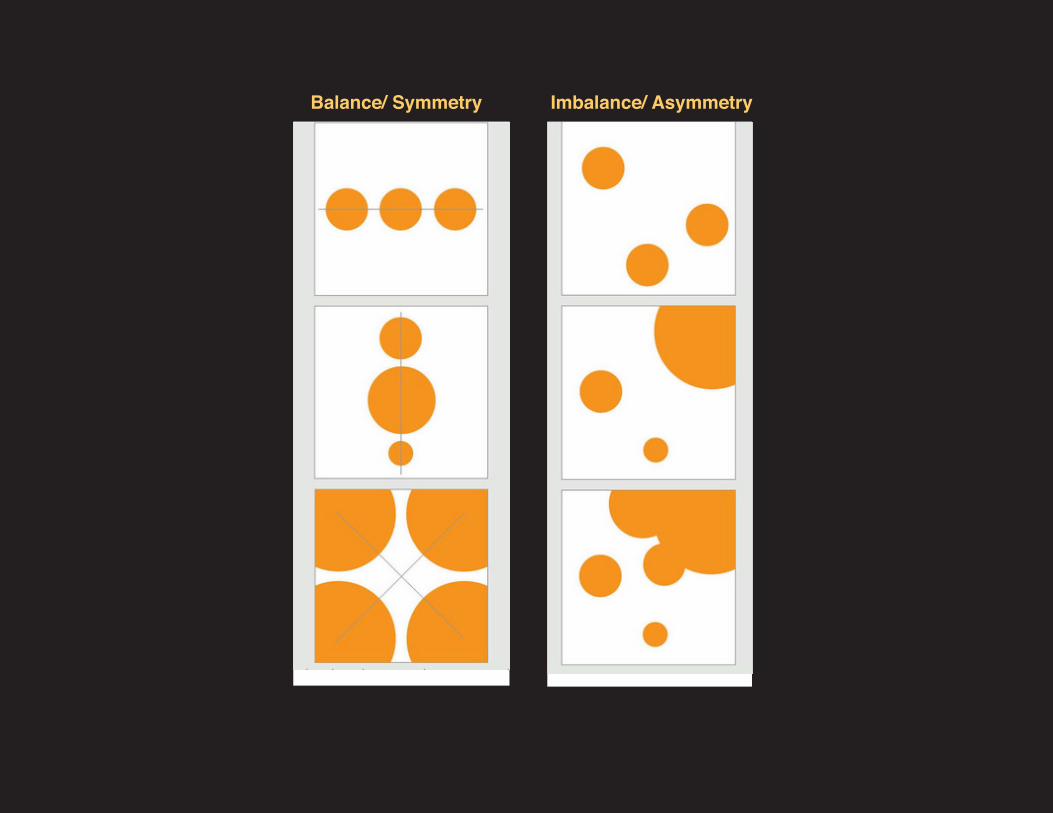
Imbalance/ AsymmetryBalance/ Symmetry
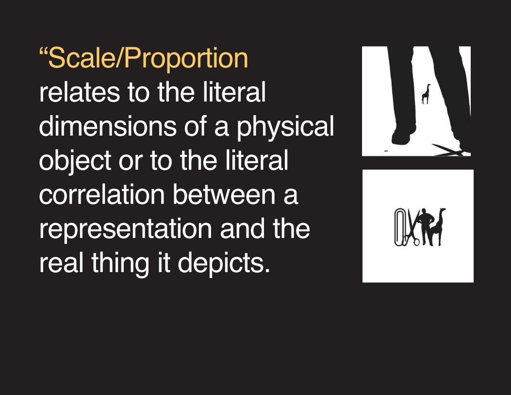
“Scale/Proportion relates to the literal dimensions of a physical object or to the literal correlation between a representation and the real thing it depicts.
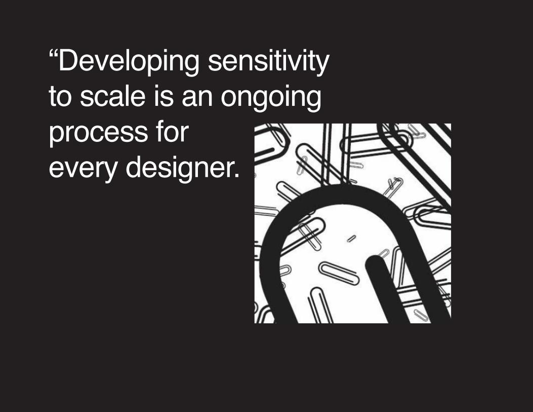
“Developing sensitivity to scale is an ongoing process for every designer.
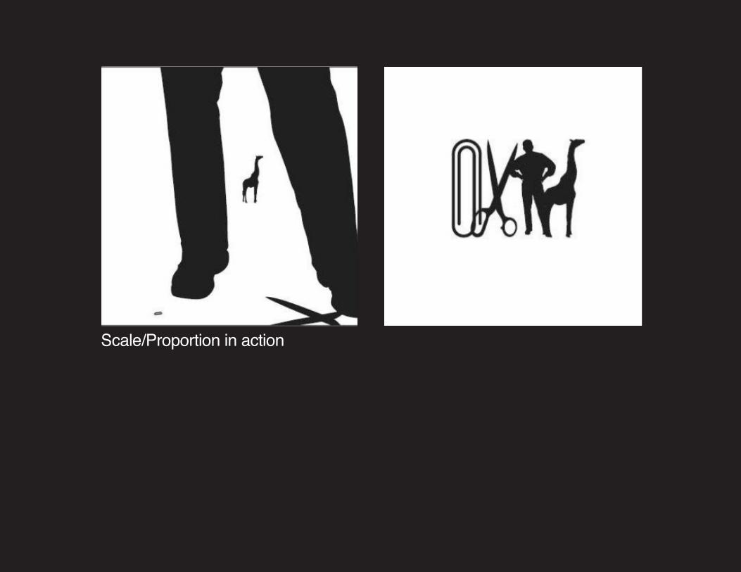
Scale/Proportion in action
Workshop>Completing previous class projects
For materials download & see>ClassAssigmentArt_01
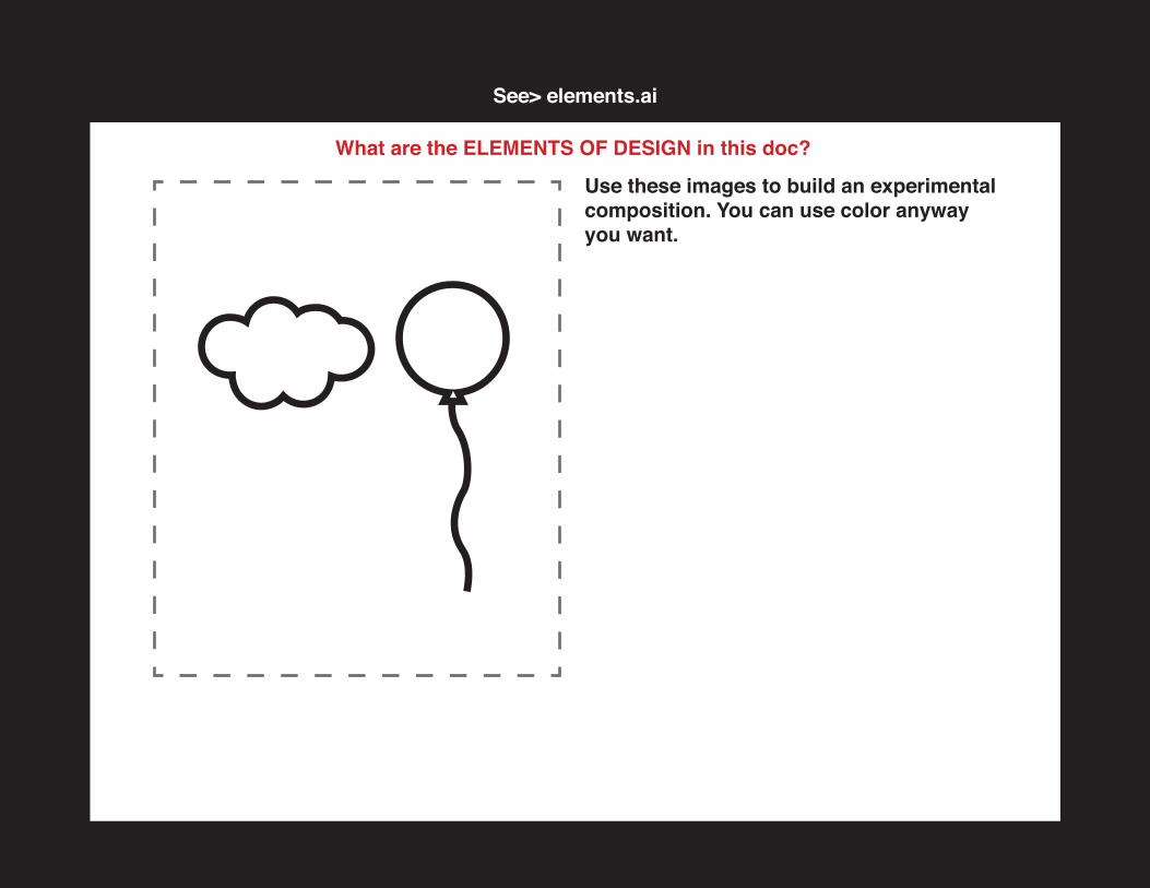
See> elements.ai
What are the ELEMENTS OF DESIGN in this doc?
Use these images to build an experimental composition. You can use color anyway you want.
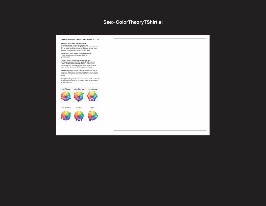
See> ColorTheoryTShirt.ai
Working with Color Theory: TShirt Design: 10” x 10”
Primary Colors: Red, yellow and blueIn traditional color theory (used in paint and pigments), primary colors are the 3 pigment colors that can not be mixed or formed by any combination of other colors. All other colors are derived from these 3 hues.
Secondary Colors: Green, orange and purple. These are the colors formed by mixing the primary colors.
Tertiary Colors: Yellow-orange, red-orange, red-purple, blue-purple, blue-green & yellow-greenThese are the colors formed by mixing a primary and a secondary color. That’s why the hue is a two word name, such as blue-green, red-violet, and yellow-orange
Analogous colors are any three colors which are side by side on a 12 part color wheel, such as yellow-green, yellow, and yellow-orange. Usually one of the three colors predomi-nates.
Complementary colors are any two colors which are directly opposite each other, such as red and green and red-purple and yellow-green..
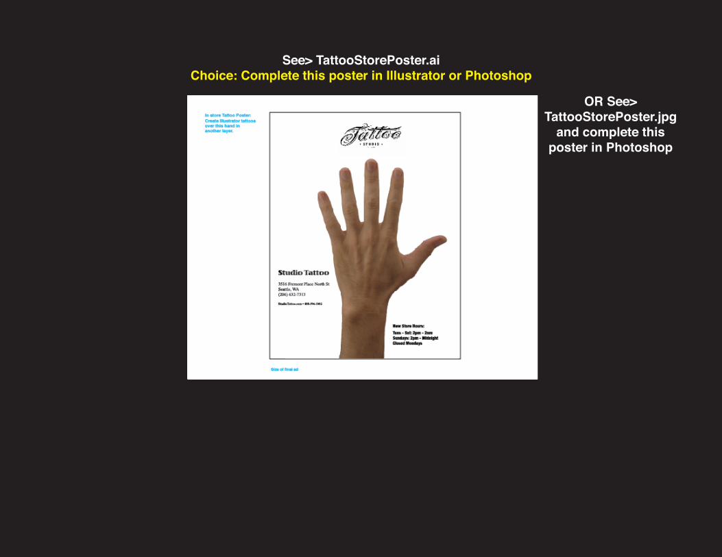
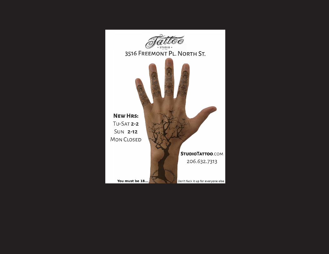
See> TattooStorePoster.aiChoice: Complete this poster in Illustrator or Photoshop
OR See> TattooStorePoster.jpg
and complete this poster in Photoshop
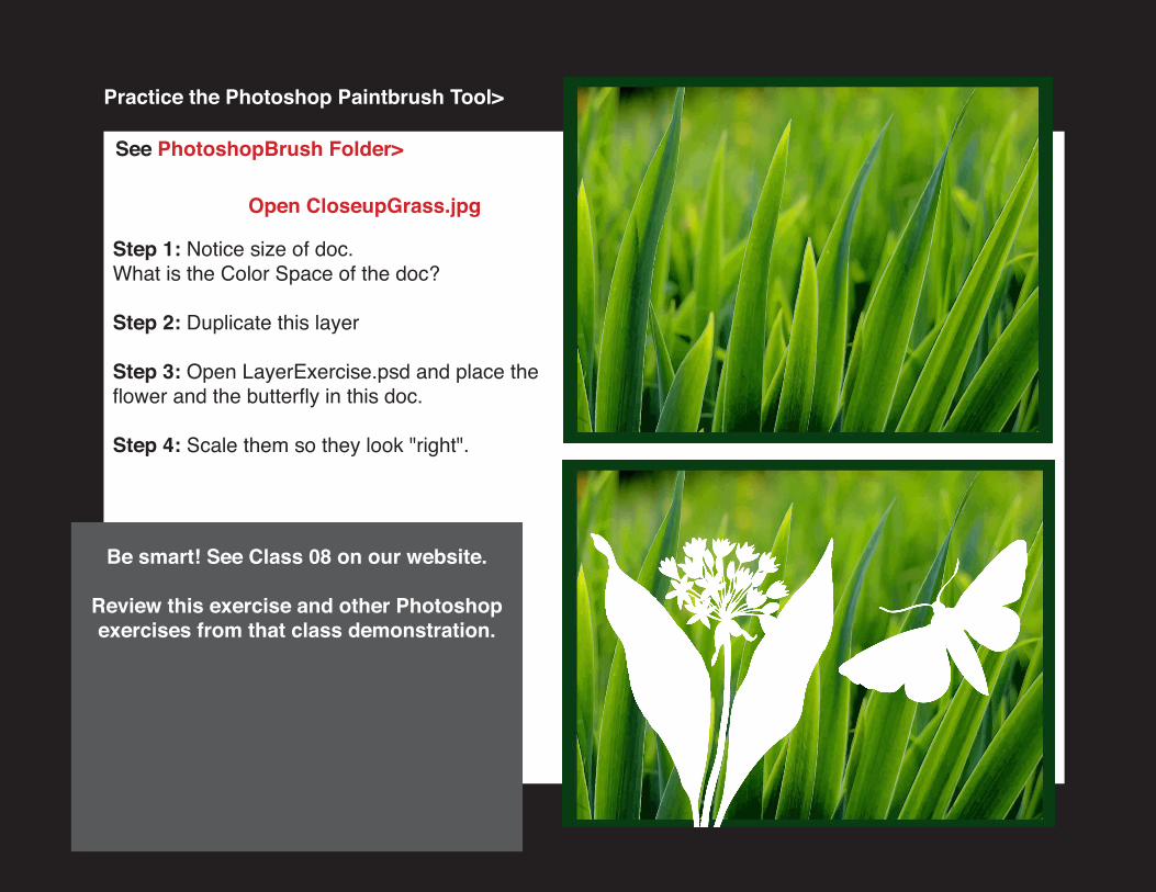
Step 1: Notice size of doc. What is the Color Space of the doc?
Step 2: Duplicate this layer Step 3: Open LayerExercise.psd and place the flower and the butterfly in this doc.
Step 4: Scale them so they look "right".
Open CloseupGrass.jpg
Practice the Photoshop Paintbrush Tool>
See PhotoshopBrush Folder>
Be smart! See Class 08 on our website.
Review this exercise and other Photoshop exercises from that class demonstration.
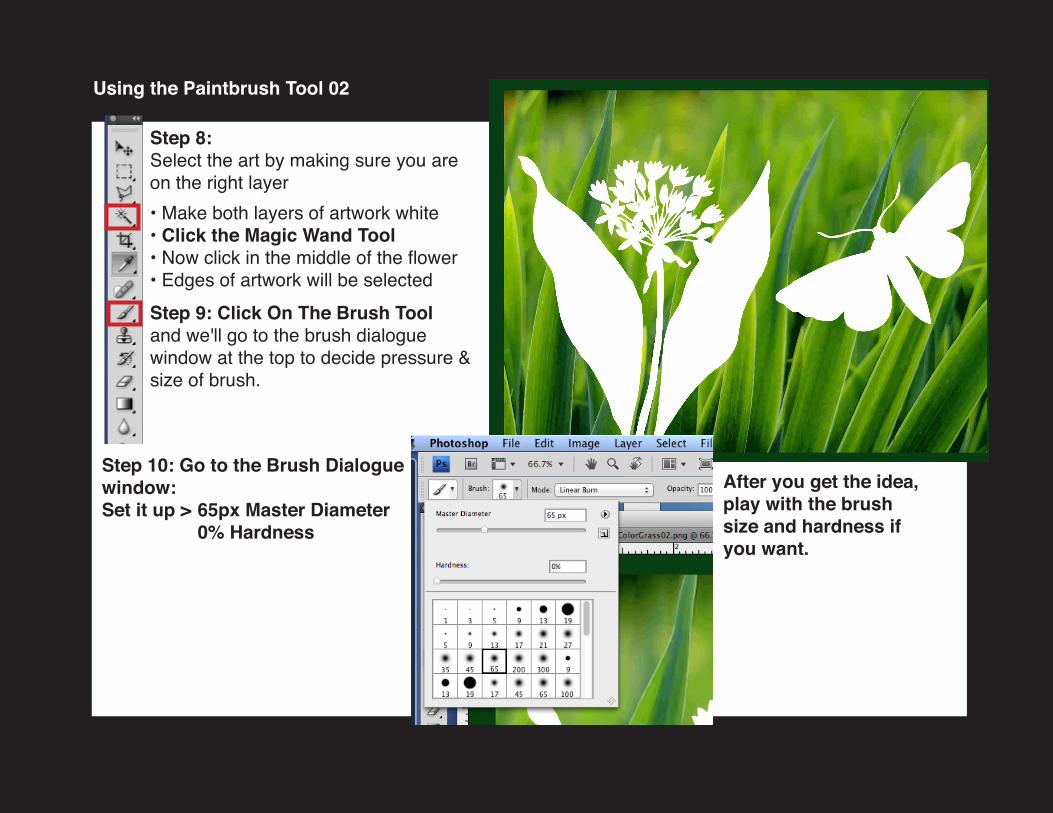
Step 8: Select the art by making sure you are on the right layer • Make both layers of artwork white• Click the Magic Wand Tool• Now click in the middle of the flower• Edges of artwork will be selected Step 9: Click On The Brush Tool and we'll go to the brush dialogue window at the top to decide pressure & size of brush.
Using the Paintbrush Tool 02
After you get the idea, play with the brush size and hardness if you want.
Step 10: Go to the Brush Dialogue window:Set it up > 65px Master Diameter 0% Hardness
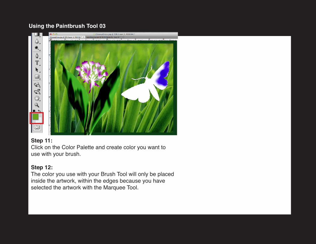
Step 11: Click on the Color Palette and create color you want to use with your brush.
Step 12: The color you use with your Brush Tool will only be placed inside the artwork, within the edges because you have selected the artwork with the Marquee Tool.
Using the Paintbrush Tool 03
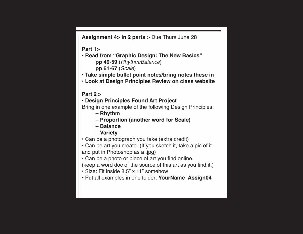
Assignment 4> in 2 parts > Due Thurs June 28
Part 1>• Read from “Graphic Design: The New Basics” pp 49-59 (Rhythm/Balance) pp 61-67 (Scale) • Take simple bullet point notes/bring notes these in• Look at Design Principles Review on class website
Part 2 >• Design Principles Found Art ProjectBring in one example of the following Design Principles: – Rhythm – Proportion (another word for Scale) – Balance – Variety • Can be a photograph you take (extra credit)• Can be art you create. (If you sketch it, take a pic of it and put in Photoshop as a .jpg)• Can be a photo or piece of art you find online.(keep a word doc of the source of this art as you find it.)• Size: Fit inside 8.5” x 11” somehow • Put all examples in one folder: YourName_Assign04
Prof. Clare Ultimo
Please note: ALL EMAIL SUBJECT LINES MUST SAY: MMA100
Borough of Manhattan Community CollegeThe City University of New YorkDepartment of Media Arts and Technology
MMA 100 Foundations of Digital Graphic Design Summer 2018
Class Materials:www.ultimobook.com/bmcc/mma100
Recommended