
M A K E Y O U R M E S S A G E I N V I T I N G
CHAPTER
7
FORMAT
2
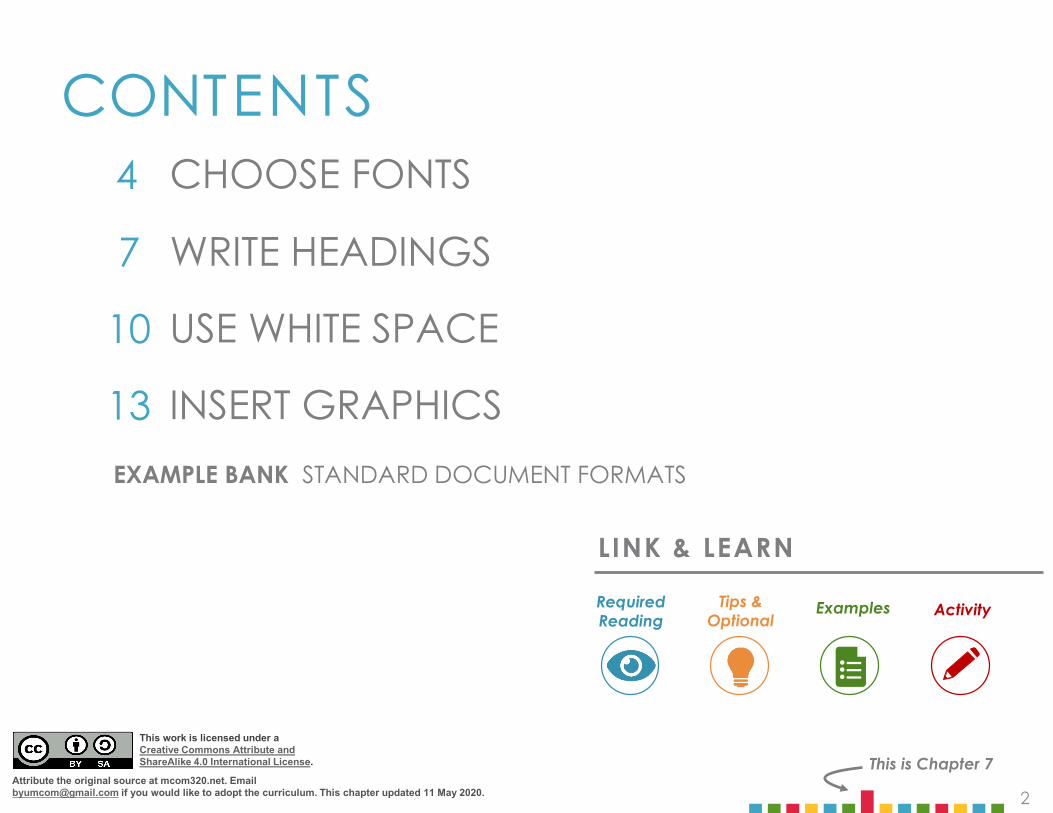
CONTENTS
This is Chapter 7
4
7 WRITE HEADINGS
10 USE WHITE SPACE
13 INSERT GRAPHICS
CHOOSE FONTS
LINK & LEARN
ExamplesRequiredReading
Tips & Optional Activity
EXAMPLE BANK STANDARD DOCUMENT FORMATS
This work is licensed under aCreative Commons Attribute and ShareAlike 4.0 International License.
Attribute the original source at mcom320.net. Email [email protected] if you would like to adopt the curriculum. This chapter updated 11 May 2020.
33
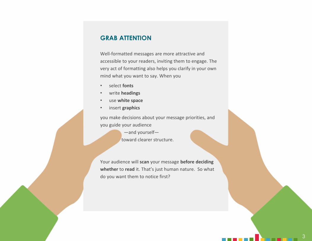
GRAB ATTENTION
Well-formatted messages are more attractive and accessible to your readers, inviting them to engage. The very act of formatting also helps you clarify in your own mind what you want to say. When you
• select fonts• write headings• use white space• insert graphics
you make decisions about your message priorities, and you guide your audience
—and yourself—toward clearer structure.
Your audience will scan your message before decidingwhether to read it. That’s just human nature. So what do you want them to notice first?
4
SECTION ONE
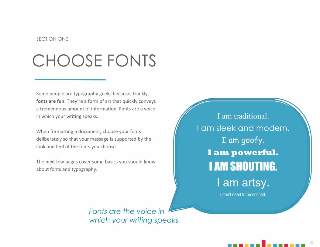
Some people are typography geeks because, frankly, fonts are fun. They’re a form of art that quickly conveys a tremendous amount of information. Fonts are a voice in which your writing speaks.
When formatting a document, choose your fonts deliberately so that your message is supported by the look and feel of the fonts you choose.
The next few pages cover some basics you should know about fonts and typography.
CHOOSE FONTS
Fonts are the voice in which your writing speaks.
I am traditional.I am sleek and modern.
I am goofy.I am powerful.
I AM SHOUTING.I am artsy.
I don’t need to be noticed.

5
STROKE
TYPOGRAPHY BASICS
KERNINGKerning is the space between letters. The best kerning is achieved when spacing looks even. Kerning is most often adjusted with large headings or titles. Body copy is rarely kerned.
TYP O GRA P HY
YES
NO
TYPOGRAPHY
SERIF VS. SANS SERIFFonts are generally classed as either “serif” or“sans serif.” Serifs are the widened feet at the end of font strokes. Sans serifs don’t have those widened ends.
serif sans serif
TypographyLight BoldRegular
TYPOGRAPHY ANATOMY
TypographyBaseline
Median
Ascender
Descender
x-height
FIG
URE
6.1

6
HOW TO CHOOSE FONTSReaders scan for titles and headings first, so those elements need to stand out.
Generally, choose two different fonts: one for title/headings, and one for body text. A rule of thumb is to choose a serif font for one and a sans serif font for the other. Some reliable pairings are shown in Figure 6.2.
Go to fontpair.co to experiment with a range of free Google fonts in tandem. Remember, if you are sharing a copy of your document in editable form, your recipient’s device may not display unusual fonts. If you save and share your work in PDF, your fonts will be consistent.
Choose fonts that‣ Convey the right impression for your document‣ Look good on multiple screen sizes‣ Are large and dark enough for your audience to read easily‣ Are deliberate, distinct, and bold
Remember, the population is aging. Choose a font size that will be easily readable by your audience.
HelveticaGaramond
Century GothicCentury
Bebas neueHelvetica Light
ArialGeorgia
AvenirBell MT
BaskervilleHelvetica Neue
FIG
URE
6.2
Choose fonts for 3-4 levels of text: headings, subheadings, body text &
annotations.
SAFE-BET FONT PAIRINGS
LEVELS EXAMPLES
HeadingsSUBHEADINGSbody text
GaramondHELVETICAHelvetica
HEADINGSsubheadingsbody textannotations
Bebas neueBebas neue
Helvetica LightGaramond (italic)
FONTS FOR HEADINGS

7
SECTION TWO
Our brains are attuned to information hierarchy. “What should I pay attention to first? What can I ignore until later?” Give your reader some help by using headings in messages longer than three or four paragraphs.
Because you’ve spent time planning and organizing your document, writing headings won’t be hard.
The stylized document in Figure 7.3 shows a title and headings that coordinate in color and size. Make sure your headings are also parallel grammatically and that they indicate useful content. For instance: “Why buy from us?” is a clearer heading than simply “Why?”
WRITE HEADINGS
FIG
URE
7.3
The Facts of Life
Birds
Bees
Babies
7

8
BE CONSISTENTBe sure to write and format headings consistently throughout your document, and make sure same-level headings are grammatically parallel.
Save yourself some time by learning and using “styles formatting” tools for titles, headings, and body text. When you apply styles to your headings, you can easily generate an outline or change the style or color of all your headings with one click. Here’s how it’s done in Google Docs: Working with Heading Styles. (Word, Pages, and other text editors have similar capabilities.)
PLACE EMPHASISWhen you need to emphasize part of your text, do it properly. Back when everyone wrote on typewriters, the only tools for emphasis were capitalization and underlining, but all-caps now looks like SHOUTING,and underlining interrupts the descending strokes of letters. Instead, use size, italics, grayscale, bolding, or colors to make your point.
FIG
URE
6.4
NO
Hiring three new project managers for the next fiscal year will benefit our department in the following three ways.
Project Cycle TimeBlah blah blah
Resource Management is improvedBlah blah blah
Budget ReductionBlah blah blah
Hiring three new project managers for the next fiscal year will benefit our department in the following three ways.
Shorten Project Cycle TimeBlah blah blah
Improve Resource ManagementBlah blah blah
Reduce the Overall BudgetBlah blah blah
YES
NO
ALL CAPS FEELS LIKE SHOUTING.
Underlining interrupts the descending strokes of letters, so avoid using it.
Don’t use TWO forms of emphasis at once. Just choose the right one.
YES
Size draws the eye.
Italics emphasizes key words.
Grayscale provides contrast.
Bolding catches attention.
Colors please the reader.
Italics emphasize key words.
Write Grammatically Parallel Headings
Place Emphasis Skillfully
provides contrast.
9
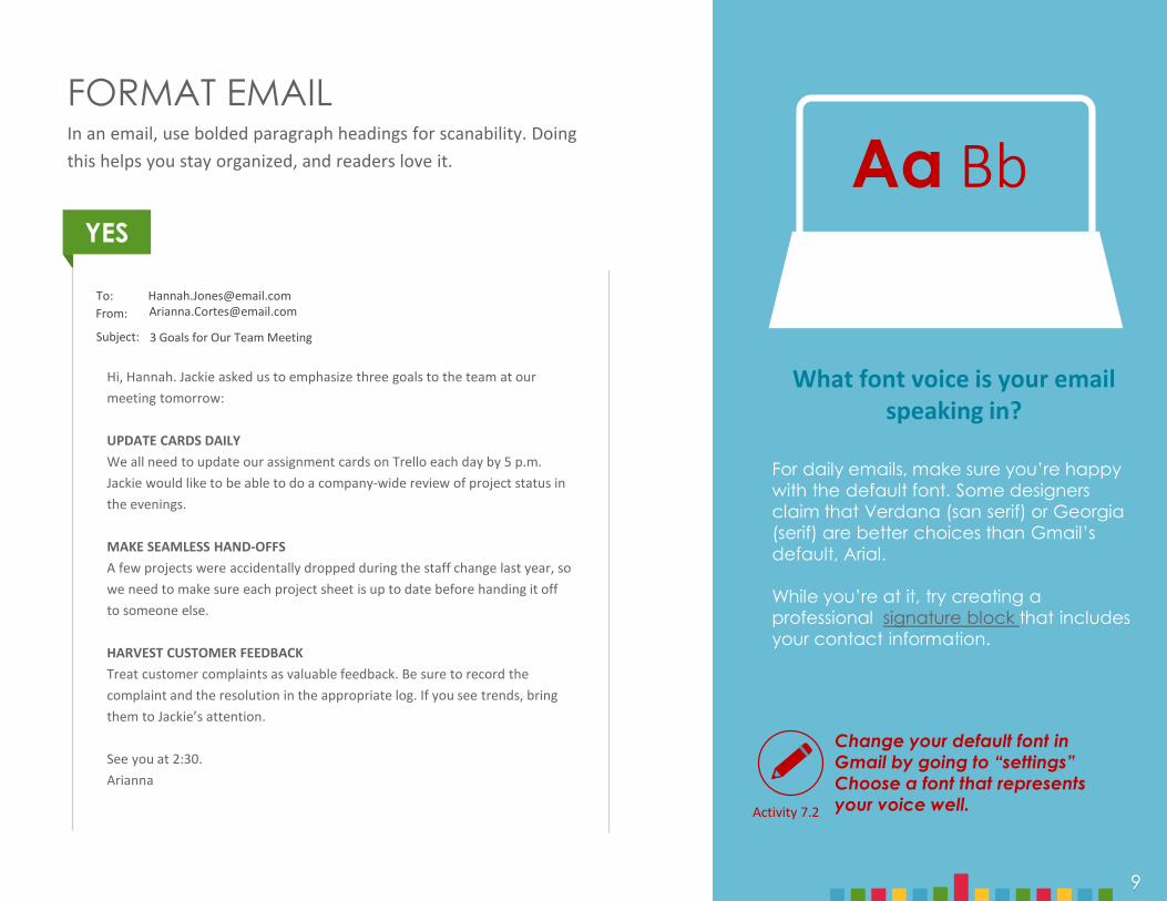
FORMAT EMAILIn an email, use bolded paragraph headings for scanability. Doing this helps you stay organized, and readers love it.
YES
Change your default font in Gmail by going to “settings” Choose a font that represents your voice well.
Aa Bb
Hi, Hannah. Jackie asked us to emphasize three goals to the team at our meeting tomorrow:
UPDATE CARDS DAILYWe all need to update our assignment cards on Trello each day by 5 p.m. Jackie would like to be able to do a company-wide review of project status in the evenings.
MAKE SEAMLESS HAND-OFFSA few projects were accidentally dropped during the staff change last year, so we need to make sure each project sheet is up to date before handing it off to someone else.
HARVEST CUSTOMER FEEDBACKTreat customer complaints as valuable feedback. Be sure to record the complaint and the resolution in the appropriate log. If you see trends, bring them to Jackie’s attention.
See you at 2:30. Arianna
To:From:
Subject:
[email protected]@email.com
3 Goals for Our Team Meeting
Activity 7.2
What font voice is your email speaking in?
For daily emails, make sure you’re happy with the default font. Some designers claim that Verdana (san serif) or Georgia (serif) are better choices than Gmail’s default, Arial.
While you’re at it, try creating a professional signature block that includes your contact information.
9

10
SECTION THREE
White space is, of course, just space. But like silence, it is remarkably powerful. A page full of black text with small margins feels daunting and unappealing to a reader, as The Onion so astutely reported: Nation Shudders at Large Block of Uninterrupted Text. Don’t make that mistake. Build plenty of white space into your document to enhance readability, direct attention, and lighten the feel of the page.
The next pages demonstrate some practical formatting tips for using space well.
USE WHITE SPACE
Visual simplicity invites your reader’s attention.
11
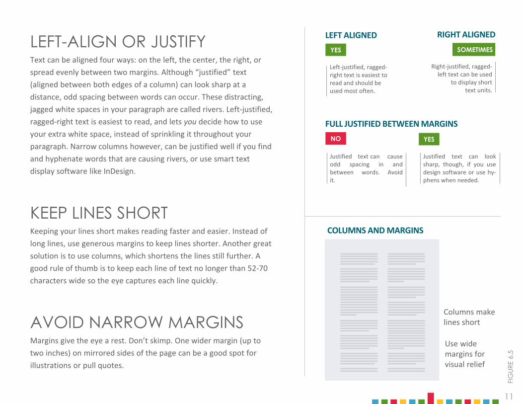
LEFT-ALIGN OR JUSTIFYText can be aligned four ways: on the left, the center, the right, or spread evenly between two margins. Although “justified” text (aligned between both edges of a column) can look sharp at a distance, odd spacing between words can occur. These distracting, jagged white spaces in your paragraph are called rivers. Left-justified, ragged-right text is easiest to read, and lets you decide how to use your extra white space, instead of sprinkling it throughout your paragraph. Narrow columns however, can be justified well if you find and hyphenate words that are causing rivers, or use smart text display software like InDesign.
KEEP LINES SHORTKeeping your lines short makes reading faster and easier. Instead of long lines, use generous margins to keep lines shorter. Another great solution is to use columns, which shortens the lines still further. A good rule of thumb is to keep each line of text no longer than 52-70 characters wide so the eye captures each line quickly.
AVOID NARROW MARGINSMargins give the eye a rest. Don’t skimp. One wider margin (up to two inches) on mirrored sides of the page can be a good spot for illustrations or pull quotes.
LEFT ALIGNED
Left-justified, ragged-right text is easiest to read and should be used most often.
YES
Justified text can causeodd spacing in andbetween words. Avoidit.
YESNO
Justified text can looksharp, though, if you usedesign software or use hy-phens when needed.
FULL JUSTIFIED BETWEEN MARGINS
Columns make lines short
Use wide margins for visual relief
COLUMNS AND MARGINS
FIG
URE
6.5
RIGHT ALIGNED
Right-justified, ragged-left text can be used
to display shorttext units.
SOMETIMES

12
USE 1.15 LINE SPACINGAS YOUR DEFAULTYou’re probably familiar with “single spaced” and “double spaced.” (You in high school: “Does my five-page essay have to be single spaced or double spaced?”) But the optimal vertical distance between lines for most documents is not 1, but about 1.15 (this spacing is called leading). This little bit of extra space gives the document a lighter look.
Single spacing is acceptable, but do not double space your text for any business document unless your boss is a retired high school English teacher. It looks unfinished, undesigned, and unprofessional.
Don’t indent. Indenting the first line of each paragraph by five spaces is another typewriter holdover. Instead, leave an extra line between paragraphs and make all paragraphs begin flush with the left margin.
WRITE SHORT PARAGRAPHSParagraph breaks are the breath of reading. Don’t force your reader to go on for too long without a refreshing break. Paragraph length can be a formatting as well as a content decision. When writing text in columns, use very short paragraphs.
1.15Leading is the amount of vertical space between lines of text. You probably know it as spacing.
0.7Leading is the amount of vertical space between lines of text. You probably know it as spacing.
2.0
Leading is the amount of vertical
space between lines of text. You
probably know it as spacing.
To keep your paragraphs shorter, use links liberally.
FIG
URE
6.6
CHOOSE YOUR LINE SPACING
YES
NO
NO
13
SECTION FOUR
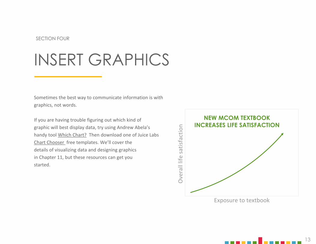
Sometimes the best way to communicate information is withgraphics, not words.
If you are having trouble figuring out which kind ofgraphic will best display data, try using Andrew Abela’shandy tool Which Chart? Then download one of Juice LabsChart Chooser free templates. We’ll cover thedetails of visualizing data and designing graphicsin Chapter 11, but these resources can get youstarted.
INSERT GRAPHICS
NEW MCOM TEXTBOOKINCREASES LIFE SATISFACTION
Ove
rall
life
satis
fact
ion
Exposure to textbook

14
TO COMMUNICATEABOUT . . .
Sequence People Location Data Trend Topic Action or concept
TRY A… Timeline, Flowchart
Photo,Org Chart
Map, Diagram, Floorplan
Table, Chart Line Chart, Bubble Chart
Infographic (Canva)
Icon(The Noun
Project)
CHOOSING A GRAPHIC
FIG
URE
6.7
2015
2016
2017
2014
TOPIC
= 6 students
Kitchen
Living Room Bedroom
Bedroom

15
POSITIONNext, position graphics strategically so that the reader’s eye can quickly identify and locate the information you want to convey. When you insert a graphic, make sure you label it clearly and cite its source (citations are usually written in a small font at the bottom right).
INTERPRETFinally, know that inserting a graphic is not enough. You must interpret the meaning of your graphic for your readers. Help them see how your graphic adds to your argument. Move them from “What?” through “So What?” to “Now What?”
ANCHORAnchor graphics to the text by writing a clear reference in the body of your document. Give readers a context for what they are about to see and a reason to care about it.
ANCHOR YOUR GRAPHICSDon’t just sprinkle graphics throughout your document, anchor, position, and interpret them. Figure 7.8 demonstrates how to do all three.
FIG
URE
7.8
MEN’S HAIR LENGTH IS GROWINGThe most significant data comes from the measured length of men’s hair from the crown to the tips. Figure 1 shows those measures and an obvious trend toward longer hair.
The findings show that in the year 2012, hair length at Berkeley was five times the hair length at BYU. Years 2013 and 2014 saw an increase in that difference, reaching a maximum for the five years of more than 10 times the length of hair at BYU. Years 2015 and 2016 show the difference decreasing only slightly to a little more than six times the BYU hair length, with length at both universities remaining unchanged.
Not only do the findings support the premise that hair length of males at Berkeley is significantly longer, the findings also show a consistent difference; that is, for the five years of the study, hair length of men at Berkeley was always longer than that of men at BYU. Despite these differences, the data shows a key similarity in the growing trend of longer hair, relatively speaking.
Years
25
20
15
10
5
0
2012 2013 2014 2015 2016
U.C. Berkeley Men
BYU Men
Inch
es fr
om C
row
n
Male Hair Length Growing Slowly in Utah
Source: < CGT-Studies.com/hairlength/byuberk.html > May 2017
15

16
Business relies heavily on email, but printed business letters and reports are still used. In fact, as more communication becomes digital, the power and durability of a printed document makes it stand out.
Click through the links to the right to see examples of standard formatting and get some design ideas.
EXAMPLE BANK
STANDARD DOCUMENT FORMATS
TRADITIONAL LETTERS
PROPOSALS
WHITE PAPERS
REPORTS
Need to type a memo? Standard Memo Format
IN CONCLUSIONFormatting a great-looking document takes time and practice, but the pay off is increased reader access . . . and increased credibility.
The next time you write a paper or create a handout, practice choosing fonts, writing headings, using white space, and inserting graphics.
LEARN MORE
(Bol
d ci
tatio
ns a
re re
fere
nced
in th
e ch
apte
r tex
t.)
Abela, A. “Chart Suggestions—A Thought-Starter.” The Extreme Presentation Method, September 6, 2006. http://img.labnol.org/di/choosing_a_good_chart2.pdf, accessed February 2017.
ARTICLES
BOOKS
Kapterev, Alexei. “Which typeface should I use?” LinkedIn SlideShare, February 8, 2016. http://www.slideshare.net/thecroaker/which-typeface-should-i-use/, accessed February 2017.
Gaertner-Johnston, Lynn. “Write Better Executive Summaries.” Business Writing Blog, May 29, 2013. http://www.businesswritingblog.com/business_writing/2013/05/write-better-executive-summaries.html, accessed February 2017.
“Nation Shudders At Large Block Of Uninterrupted Text.” The Onion, March 9, 2010. http://www.theonion.com/article/nation-shudders-at-large-block-of-uninterrupted-te-16932, accessed February 2017.
Strizver, Ilene. “Pull Quotes.” Fonts.com. https://www.fonts.com/content/learning/fyti/typographic-tips/pull-quotes, accessed February 2017.
Catmull, Ed.Creativity, Inc: Overcoming the Unseen Forces that Stand in the Way of True Inspiration. New York: Random House, 2014
Hagen, Rebecca, and Kim Golombisky. White Space is Not Your Enemy: A Beginner’s Guide to Communicating Visually through Graphic, Web, & Multimedia Design. Burlington: Focal Press, 2013.
Kosslyn, Stephen M. Graph Design for the Eye and Mind. New York: Oxford University Press, 2006.
Tufte, Edward R. Envisioning Information. Graphics Press, 1990.
Poole, Alex. “Which Are More Legible: Serif or Sans Serif Typefaces?” Alex Poole Blog, February 17, 2008. http://alexpoole.info/blog/which-are-more-legible-serif-or-sans-serif-typefaces/, accessed Februrary 2017.
LEARN MORE
(Bol
d ci
tatio
ns a
re re
fere
nced
in th
e ch
apte
r tex
t.)
WEBSITES
Canva. “Choosing the Right Font.” https://www.canva.com/design/DAB0nI1UHN0/4EPCm3m456_SQZqdVx_4Dw/edit, accessed February 2017.
Canva. “Infographics.” https://www.canva.com/create/infographics/, accessed February 2017.
CorporateIpsum. “Home.” http://www.cipsum.com/, accessed February 2017.
Google Support. “Add a title, heading, or table of contents in a document.” https://support.google.com/docs/answer/116338?co=GENIE.Platform%3DDesktop&hl=en, accessed October 2017.
JuiceBox. “Chart Chooser.” http://labs.juiceanalytics.com/chartchooser/index.html, accessed February 2017.
The Noun Project. “Home.” https://thenounproject.com/, accessed February 2017.
Purdue Online Writing Lab. “Introduction to Grant Writing.” https://owl.purdue.edu/owl/subject_specific_writing/professional_technical_writing/grant_writing/index.html, accessed April 2020.
Purdue Online Writing Lab. “White Paper: Purpose and Audience.” https://owl.purdue.edu/owl/subject_specific_writing/professional_technical_writing/white_papers/index.html, accessed April 2020.
Purdue Online Writing Lab. “Writing the Basic Business Letter.” https://owl.purdue.edu/owl/subject_specific_writing/professional_technical_writing/basic_business_letters/index.html, accessed April 2020.
Typeconnection. “Home.” http://www.typeconnection.com/, accessed February 2017.
VIDEOS
Butterick’s Practical Typography. “Home.” http://practicaltypography.com/, accessed February 2017.
Brown University Computer Education. “Google Docs: Working with Heading Styles,” YouTube, published February 9, 2012. https://www.youtube.com/watch?v=q58KRXwg93E&feature=youtu.be, accessed October 2017.
Recommended


![[MC-NBFS]: .NET Binary Format: SOAP Data Structure · This specification defines the .NET Binary Format: SOAP Data Structure, which is a new format built by extending the format described](https://img.pdfslide.us/doc/110x75/5f02e6437e708231d406906c/mc-nbfs-net-binary-format-soap-data-structure-this-specification-defines-the.jpg)


![[MS-NRBF]: .NET Remoting: Binary Format Data Structure€¦ · The .NET Remoting: Binary Format Data Structure defines a set of structures that represent object graph or method invocation](https://img.pdfslide.us/doc/110x75/5fff9ca16d7c817c2567e3af/ms-nrbf-net-remoting-binary-format-data-structure-the-net-remoting-binary.jpg)


![[MC-NBFX]: .NET Binary Format: XML Data Structure](https://img.pdfslide.us/doc/110x75/618999f545f2bd1677255a08/mc-nbfx-net-binary-format-xml-data-structure.jpg)

