7/17/2019 15 Aturan Tipografi
http://slidepdf.com/reader/full/15-aturan-tipografi 1/16
1 5ATU
TIPO
GRAPHY
R A N
Oleh : Tiva Piola

7/17/2019 15 Aturan Tipografi
http://slidepdf.com/reader/full/15-aturan-tipografi 2/16
T
IP
OG
R
AP
H

7/17/2019 15 Aturan Tipografi
http://slidepdf.com/reader/full/15-aturan-tipografi 3/16
1 5ATU
TIPO
GRAPHY
R A N 1 5 A t u r
a n T i p o g r a p h y
7/17/2019 15 Aturan Tipografi
http://slidepdf.com/reader/full/15-aturan-tipografi 4/16
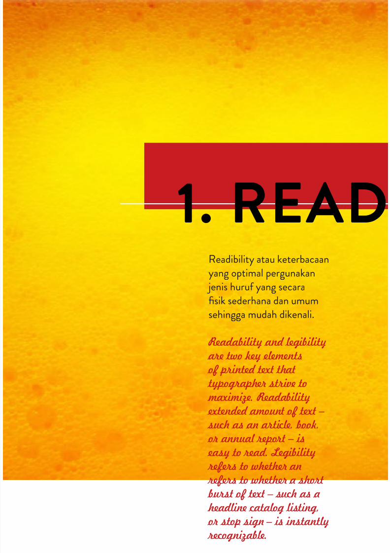
Readibility atau keterbacaanyang optimal pergunakan
jenis huruf yang secarafisik sederhana dan umumsehingga mudah dikenali.
Readability and legibility are two key elements of printed text that
typographer strive to maximize. Readability extended amount of text – such as an article, book, or annual report – is easy to read. Legibility refers to whether an
refers to whether a short burst of text – such as a headline catalog listing, or stop sign – is instantly recognizable.
1. READ

7/17/2019 15 Aturan Tipografi
http://slidepdf.com/reader/full/15-aturan-tipografi 5/16
IBILITY
1 5 A t u r
a n T i p o g r a p h y
1-
2
7/17/2019 15 Aturan Tipografi
http://slidepdf.com/reader/full/15-aturan-tipografi 6/16
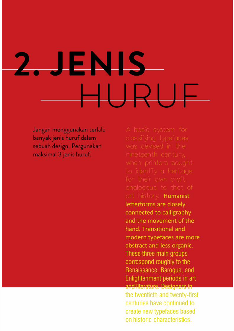
2. JENIS
HURUF Jangan menggunakan terlalubanyak jenis huruf dalamsebuah design. Pergunakanmaksimal 3 jenis huruf.
A basic system for
classifying typefaceswas devised in thenineteenth century,when printers sought
to identify a heritagefor their own craftanalogous to that ofart history. Humanist
leerforms are closely
connected to calligraphy
and the movement of the
hand. Transional andmodern typefaces are more
abstract and less organic.
These three main groups
correspond roughly to the
Renaissance, Baroque, and
Enlightenment periods in art
and literature. Designers in the twentieth and twenty-first
centuries have continued to
create new typefaces based
on historic characteristics.
7/17/2019 15 Aturan Tipografi
http://slidepdf.com/reader/full/15-aturan-tipografi 7/16
3. TYPE
FAMILY
1 5 A t u r
a n T i p o g r a p h y
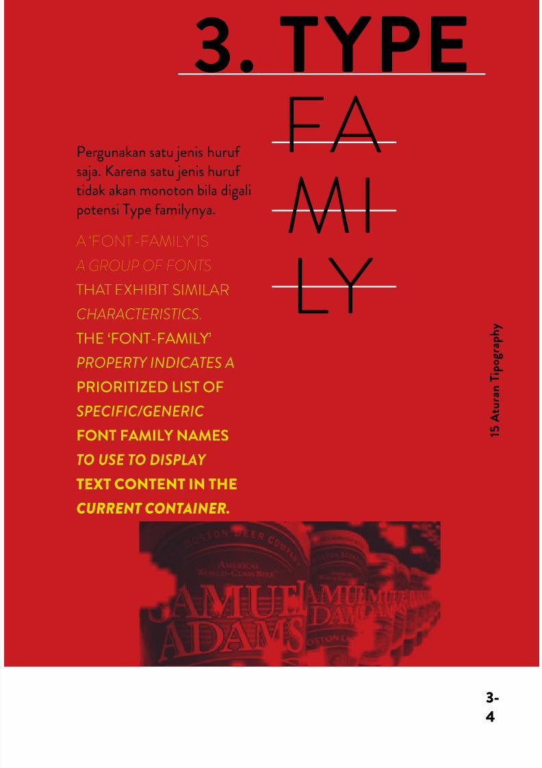
Pergunakan satu jenis hurufsaja. Karena satu jenis huruftidak akan monoton bila digalipotensi Type familynya.
A ‘FONT-FAMILY’ IS
A GROUP OF FONTS
THAT EXHIBIT SIMILAR
CHARACTERISTICS.
THE ‘FONT-FAMILY’
PROPERTY INDICATES A
PRIORITIZED LIST OF
SPECIFIC/GENERIC
FONT FAMILY NAMES
TO USE TO DISPLAY
TEXT CONTENT IN THE
CURRENT CONTAINER.
3-
4
7/17/2019 15 Aturan Tipografi
http://slidepdf.com/reader/full/15-aturan-tipografi 8/16
4.HIERARKIMembedakan dan memberi
penekanan pada informasipergunakan Point Size yangberbeda sesuai dengan hirarkidan prioritas informasinya.
point size of the fontdescribed the size (height) of
the metal body on which the
typeface’s characters were
cast
When a
point size of
a font is specified, the font is
scaled so that its em square has
a side length of that particular
length in points.
7/17/2019 15 Aturan Tipografi
http://slidepdf.com/reader/full/15-aturan-tipografi 9/16
5.CO LO
UM
Jangan membuat kolomuntuk Body Text terlalupanjang, karena akan
melelahkan mata. Panjangkolom ideal maksimal 10 cm.
Paragraph breaks set a rhythm for the reader. The breaks have arelationship with the column of text as well as the page margins.A break may be introduced as an indentation, as a space or both.
The over all page feel will be influenced by your choice.
1 5 A t u r
a n T i p o g r a p h y
5-
6
7/17/2019 15 Aturan Tipografi
http://slidepdf.com/reader/full/15-aturan-tipografi 10/16
6.POINT
SIZE
7.INFOR
MATION
Point Size untuk Body Text jangan terlalu kecil karenasulit dibaca ataupun terlalubesar karena makan ruang.Idealnya adalah 9 sampai 12
point, walaupun bisa dibuat 8sampai 15 point tergantungkebutuhan.
Hindari pemakaian jenishuruf yang hampir sama,karena masyarakat umumbelum tentu dapat menangkapperbedaannya.
HELVETICA CALIBRI
Footnotes and endnotes are set smaller
than body text. The difference in size is
usually about two points, but this can
vary depending on the size, style and
legibility of the main text. Even though
they’re smaller, footnotes and endnotes
should still remain at a readable size.
Point Size - 7 Pt
Point Size - 8 PtPoint Size - 9 PtPoint Size - 11 PtPoint Size - 13 PtPoint Size - 14 Pt
7/17/2019 15 Aturan Tipografi
http://slidepdf.com/reader/full/15-aturan-tipografi 11/16
8.KER-NINGKerning atau jarak antarhuruf yang terlalu dekat atauterlalu jauh akan mengganggukenyamanan membaca.Temukan jarak ideal sesuaidengan kenyamanan dan
kebutuhan.
kerning (less commonly mortising) is theprocess of adjusting the spacing betweencharacters in a proportional font
kerning (less commonly
mortising) is the process ofadjusting the spacing betweencharacters in a proportionalfont
1 5 A t u r
a n T i p o g r a p h y
7-
8
7/17/2019 15 Aturan Tipografi
http://slidepdf.com/reader/full/15-aturan-tipografi 12/16
9.UP
PERCASETeks Yang Ditulis DenganHuruf Kapital Atau UpperCase Semua Akan Lebih SulitDibaca Dari Pada PemakaianKombinasi Upper Case DanLower Case.
SMALL CAPS AREUPPERCASE (CAPITAL)LETTERS THAT ARE ABOUTTHE SIZE OF NORMALLOWERCASE LETTERS INANY GIVEN TYPEFACE.
small caps are less intrusive when
all uppercase appears withinnormal text or can be used forspecial emphasis. computerprograms can generate small capsfor a any typeface,
But Those Are Not The SameAs True Small Caps. True Small
Caps Have Line Weights That AreProportionallyCorrect For The Typeface, WhichMe And That They Can Be UsedWithin A Body Of Copy WithoutLooking Noticeably Wrong.
Leading atau jarak antar
baris yang terlalu dekat atauterlalu jauh akan mengganggukenyamanan membaca.Temukan jarak ideal sesuaidengan kenyamanan dankebutuhan.
Leading atau jarak antarbaris yang terlalu dekat atauterlalu jauh akan mengganggukenyamanan membaca.Temukan jarak ideal sesuaidengan kenyamanan dankebutuhan.
10.lEAD-
ING
7/17/2019 15 Aturan Tipografi
http://slidepdf.com/reader/full/15-aturan-tipografi 13/16
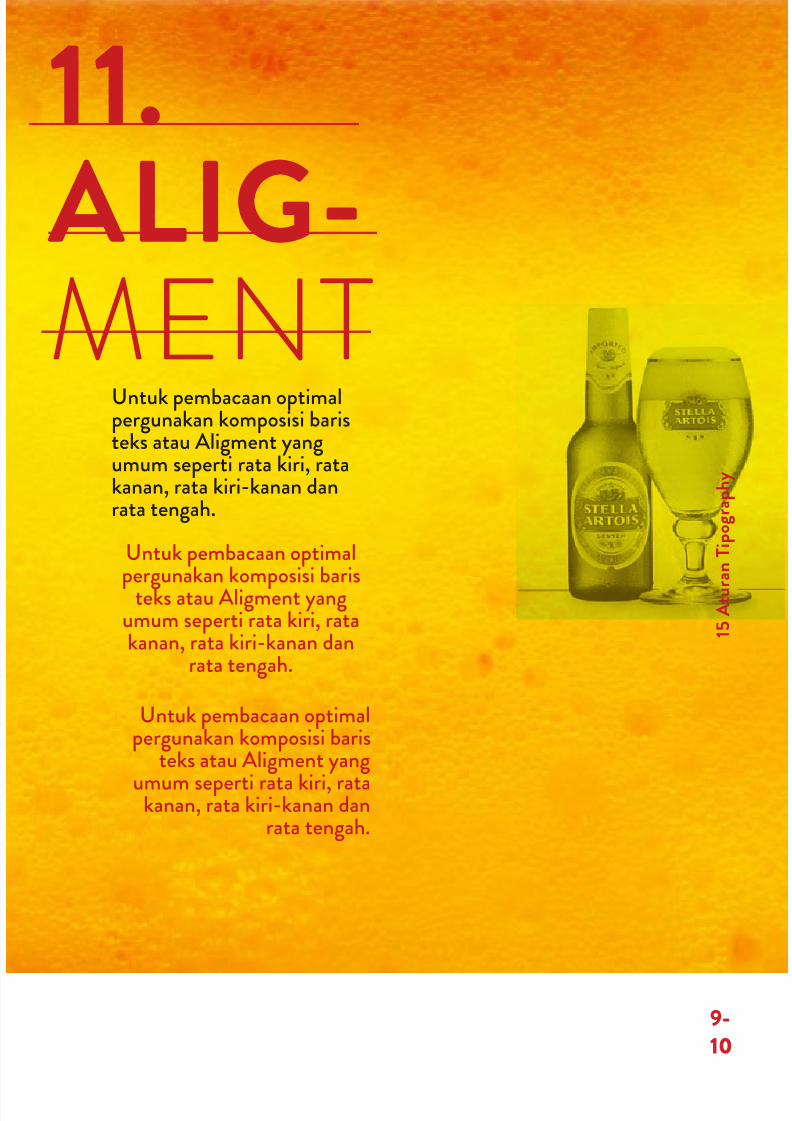
11.
ALIG-
MENTUntuk pembacaan optimalpergunakan komposisi baristeks atau Aligment yangumum seperti rata kiri, ratakanan, rata kiri-kanan danrata tengah.
Untuk pembacaan optimal
pergunakan komposisi baristeks atau Aligment yangumum seperti rata kiri, ratakanan, rata kiri-kanan dan
rata tengah.
Untuk pembacaan optimalpergunakan komposisi baris
teks atau Aligment yang
umum seperti rata kiri, ratakanan, rata kiri-kanan dan
rata tengah.
1 5 A t u r
a n T i p o g r a p h y
9-
10

7/17/2019 15 Aturan Tipografi
http://slidepdf.com/reader/full/15-aturan-tipografi 14/16
12. C O N
DENSEDE X P A N
DED14.
K O
T RWA
Huruf yang terlalu rampingatau Condensed dan terlalu
lebar atau Expanded akanmengganggu kenyamananmembaca. Jadi pergunakanuntuk kebutuhan yang khusus.
Untuk kemudahan baca atauReadibility apabila bekerjadengan warna, pastikan adakontras warna yang cukupantara teks dengan Background.
CONDENSED
u m̂ k a ba
7/17/2019 15 Aturan Tipografi
http://slidepdf.com/reader/full/15-aturan-tipografi 15/16
13. B A S E
L I N E
N -
SNA 15. BACK-
GROUND
Jaga integritas ketikan denganmengatur huruf dan kata padaBase Line atau garis dasar.
Jaga integritas ket-
ikan dengan mengatur huruf
Jaga integritas ketikan denganmengatur huruf
Untuk kemudahan baca atau
Readibility apabila bekerjadengan warna, pastikan adakontras warna yang cukupantara teks dengan Background.
1 5 A t u r
a n T i p o g r a p h y
11-
12
7/17/2019 15 Aturan Tipografi
http://slidepdf.com/reader/full/15-aturan-tipografi 16/16
15 ATURAN TIPOGRAPHY
Recommended