Embed Size (px)
Citation preview
Zoomable User Interfaces as a Medium forSlide Show Presentations
Lance Good, Benjamin B. BedersonHuman Computer Interaction Lab
University of MarylandCollege Park, MD 20742 USA
+1 301 405 2764Email: {goodness, bederson}@cs.umd.edu
Corresponding author (current address to be published as footnote):
Lance Good
Xerox PARC
3333 Coyote Hill Road
Palo Alto, CA 94304
+1 650 812 4661
+1 650 812 4890
Running title: CounterPoint: Zoomable Presentations
Financial support: This work has been funded primarily by DARPA’s Command Post of the Future project.
ABSTRACT
In this paper, we propose Zoomable User Interfaces as an alternative presentation medium to address several
common presentation problems. Zoomable User Interfaces offer new techniques for managing multiple versions of
a presentation, providing interactive presentation navigation, and distinguishing levels of detail. These zoomable
presentations may also offer several cognitive benefits over their commercial slide show counterparts. We also
introduce CounterPoint, a tool to simplify the creation and delivery of zoomable presentations. We discuss the
techniques we have used to make authoring and navigation manageable in the multidimensional space. Lastly, we
present some of the visualization principles we have compiled for designing these types of presentations.

Keywords
Presentations, Jazz, PowerPoint, spatial hypertext, Zoomable User Interfaces (ZUIs).
INTRODUCTION
Zoomable User Interfaces (ZUIs) have recently emerged as an alternative to traditional techniques for visualizing
information. ZUIs display information on an infinitely large two-dimensional plane. They allow users to change
their view of this plane through panning and zooming to access more information than can typically be displayed on
a single screen.
A fundamental characteristic of these types of zooming and panning operations in ZUIs is that they are animated.
These types of animations give a sense of physical movement by mimicking such physical acts as sliding a paper on
a table (panning), looking at a paper more closely for detail (zooming in), or holding a paper at a distance for more
context (zooming out) [5]. ZUIs have been used in such settings as visualizing histories [16], authoring children’s
stories [11], traversing file system hierarchies [5], and image browsing [3]. Yet another application of ZUIs with
which we have experimented and that we discuss here is the slide show presentation.
Most current commercial slide show presentation tools consist of a linearly ordered set of "slides" that can be shown
in sequence to an audience. There are also special mechanisms for moving back and forth in the sequence, jumping
to a slide out of order (based on its title), and authoring hyperlinks in advance from any one slide to another.
Through our experience, we have found that zooming presentations naturally address several common problems
with these presentation tools. These problems include: navigating to slides outside of a direct linear sequence
during presentation delivery, maintaining multiple versions of very similar presentations, and differentiating levels
of detail in presentation content. Although we are aware of workarounds in current tools to solve these problems,
we believe the zooming paradigm offers more elegant solutions (Figures 1 and 2).
Zoomable User Interfaces address these problems in several ways. First, because it stores presentations in a single
contiguous space, a ZUI can help make jumping out of a linear presentation sequence possible through animated
spatial navigation. Second, ZUIs potentially support multiple presentation versions by allowing multiple paths
through a single zoomable space. These multiple paths are possible since navigation is not directly tied to the
presentation content. Third, ZUIs intrinsically provide for differentiated levels of detail by allowing information to
be displayed at varying zoom levels.
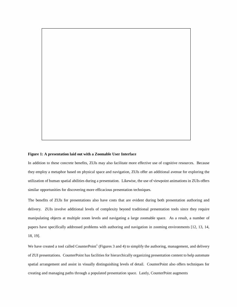
Figure 1: A presentation laid out with a Zoomable User Interface
In addition to these concrete benefits, ZUIs may also facilitate more effective use of cognitive resources. Because
they employ a metaphor based on physical space and navigation, ZUIs offer an additional avenue for exploring the
utilization of human spatial abilities during a presentation. Likewise, the use of viewpoint animations in ZUIs offers
similar opportunities for discovering more efficacious presentation techniques.
The benefits of ZUIs for presentations also have costs that are evident during both presentation authoring and
delivery. ZUIs involve additional levels of complexity beyond traditional presentation tools since they require
manipulating objects at multiple zoom levels and navigating a large zoomable space. As a result, a number of
papers have specifically addressed problems with authoring and navigation in zooming environments [12, 13, 14,
18, 19].
We have created a tool called CounterPoint1 (Figures 3 and 4) to simplify the authoring, management, and delivery
of ZUI presentations. CounterPoint has facilities for hierarchically organizing presentation content to help automate
spatial arrangement and assist in visually distinguishing levels of detail. CounterPoint also offers techniques for
creating and managing paths through a populated presentation space. Lastly, CounterPoint augments
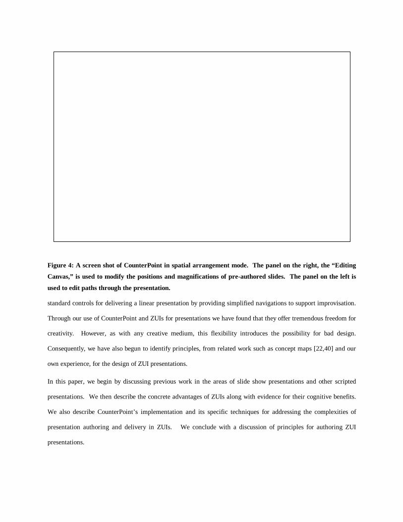
Figure 4: A screen shot of CounterPoint in spatial arrangement mode. The panel on the right, the “Editing
Canvas,” is used to modify the positions and magnifications of pre-authored slides. The panel on the left is
used to edit paths through the presentation.
standard controls for delivering a linear presentation by providing simplified navigations to support improvisation.
Through our use of CounterPoint and ZUIs for presentations we have found that they offer tremendous freedom for
creativity. However, as with any creative medium, this flexibility introduces the possibility for bad design.
Consequently, we have also begun to identify principles, from related work such as concept maps [22,40] and our
own experience, for the design of ZUI presentations.
In this paper, we begin by discussing previous work in the areas of slide show presentations and other scripted
presentations. We then describe the concrete advantages of ZUIs along with evidence for their cognitive benefits.
We also describe CounterPoint’s implementation and its specific techniques for addressing the complexities of
presentation authoring and delivery in ZUIs. We conclude with a discussion of principles for authoring ZUI
presentations.
PREVIOUS WORK
This work came out of many years of ongoing research into ZUIs and the actual use of ZUIs for presentations. As
such, it builds primarily on the results and experiences gained from both the Jazz [6] and Pad++ [5] systems.
Naturally, this work also borrows heavily from concepts in Microsoft PowerPoint [23] and similar commercial
presentation software. These commercial tools provide a software interface for mimicking physical presentation
media such as 35mm slides or overhead transparencies. A primary extension many of these tools add to this
physical metaphor is the transition animation. Nevertheless, these animations usually provide little insight into the
underlying content and are mainly used for visual effect.
Several systems have also addressed problems with these commercial tools. The Palette system [26] allows
presenters to deliver a presentation using a barcode reader with paper copies of slides. This technique makes it
possible to combine slides from multiple presentation files using only the paper representations and also to
improvise slide orderings at presentation-time. While this type of a tangible interface has several desirable
properties, it also requires users to manage both the physical and virtual representations of their slides. This
technique also only assists with slide management and does not help in content tasks such as distinguishing levels of
detail.
Another tool suggested for improving slide show presentations is Hyper Mochi Sheet [38]. Hyper Mochi Sheet
employs a multi-focus distortion-oriented view to display a hypertext network. During a presentation, the system
automatically resizes nodes in the network based on the presenter’s current focus. While the multi-focus views
allow it to show both an overview and detail, its dynamic nature makes it harder for the presenter to predict. Thus
we feel it is less desirable for presentations where layouts and object sizes are often parameters of primary concern.
World Wide Web-style hypertext has also been proposed as an alternative to commercial presentation tools. A
practical application of hypertext as a presentation media was Moore’s use in teaching an undergraduate Computer
Science course [25]. Moore found that this use of traditional hypertext facilitated better hierarchical organization
than commercial tools and also allowed for better interconnection of related material. Nevertheless, the hyperlinks
used by web-style hypertext (also found in several commercial tools) require an author to create them prior to giving
the presentation. As a result, the presenter must anticipate all potential branches that might be required during a
presentation. In addition, this type of hypertext may suffer from the traditional hypertext problem of audience
disorientation.
Because a major component of our work involves authoring paths through a zoomable space, our work also builds
on ideas found in several hypertext tools for authoring scripted presentation paths. One such tool was VIKI, a
spatial hypertext tool for supporting emergent structure during authoring [35]. The particularly relevant application
of VIKI was its use in gathering and organizing content for educational presentation on the web [35]. Here
preexisting web content and annotations were combined to create directed paths through collections of related
information. Authoring ZUI presentations is similar to authoring in VIKI in that it involves spatially structuring
information. However, because they are displayed to the audience, the structures created in ZUI presentations are an
end in themselves rather than just a representation of the author's current understanding. Moreover, paths in ZUIs
are animated traversals through the author's explicitly defined spatial layouts whereas in VIKI the spatial layout
defined the path itself [35].
Some of the earliest work in scripted hypertext paths was Zellweger's Scripted Documents [42, 43]. Scripted
Documents allowed the author to define timed traversals through a collection of documents with specifiable actions
performed at each stop in the traversal. The "Audio-visual presentation" application of scripts described in
Zellweger’s earlier work [42] closely resembles our use of scripted paths in ZUI presentations.
Trigg's Guided Tours and Tabletops also defined a hypertext path authoring and navigation tool [39]. This system
provided tools for creating a collection of "tabletops," each of which contained a spatial arrangement of hypertext
documents. An author could then define arbitrary paths through these tabletops with any number of available
branches at each point in the path.
Paths in ZUIs resemble Trigg's paths in that they can combine both scripted and dynamic components. However,
the dynamic changes available on a scripted path in a ZUI presentation do not have to be specified when the path is
created. In addition, while both systems allow for navigation through collections of spatially arranged objects, ZUIs
present data in a single continuous space whereas Guided Tours supports sets of disjoint spatial arrangements.
CONCRETE BENEFITS OF ZUI PRESENTATIONS
ZUIs offer a number of concrete advantages over traditional slide show presentations. Below we discuss the novel
affordances of ZUIs for some common presentation authoring and navigation challenges. We distinguish these
concrete benefits from the later cognitive benefits because they offer motivation for the use of ZUIs in the
presentation setting without requiring experimental validation.
Simple Navigation for Improvisation
One of the fundamental tradeoffs in the design of a presentation tool is providing support for rehearsed scripting
versus presentation-time improvisation. Too much control can require needless attention from the presenter for
interface adjustments. Too little control restricts the presenter from quickly returning to previous slides following
audience feedback or smoothly jumping past less important content for time constraints.
Current presentation tools provide adequate support for controlling rehearsed scripts. However, the controls for
improvisation, including linear forward and backward controls and popup menus, are often inefficient or visually
unappealing. The one additional control that some presentation tools offer for more dynamic presentations is web-
style hyperlinking. Nonetheless, the author must predefine these links, requiring the author to predict all required
presentation-time improvisations.
Instead, ZUIs can potentially balance the need for both scripting and improvisation by allowing spatial navigation in
addition to the standard presentation controls for traversing a scripted path. These navigational controls allow a
presenter to navigate between arbitrary points in the presentation via zooming and panning. Of course,
unconstrained navigation in multidimensional environments can be extremely difficult so this is one of the actions
we address in our implementation of CounterPoint.
Decoupled Paths and Content
We have also informally found that a common presentation authoring task is to modify existing presentations for
new audiences or different time constraints. In this situation, current presentation tools encourage presenters to
create different presentations for different situations because of the coupling between the presentation content and
the presentation path2. This duplication of data across multiple presentations not only requires unnecessary storage
space but also leads to data synchronization problems when the presentation content is modified. These same issues
also arise when an author wants to duplicate a slide within a single presentation.
While storage space may seem insignificant in the age of terabyte disks, this space becomes more important in the
presence of limited bandwidth networks. In fact, anecdotal evidence suggests that PowerPoint presentation files are
a significant cause of congestion on Defense Department networks [30]. Alternately, from our use of ZUIs, we have
found that the clear distinction between content and paths encourages a different presentation management strategy.
Our early use suggests that presenters may find it useful to organize larger collections of related information in a
single presentation space, authoring customized paths through the space as needed for a given audience. This
strategy will also facilitate the repetition of slides on a presentation path without actually duplicating the content.
One drawback to this decoupling is that it can be confusing or misleading for the audience. If content appears in a
presentation space but does not occur on the presentation path, the audience may construct incongruent
interpretations of the presented structure. In the future, we intend to address this problem by fading out content that
does not appear on the current presentation path.
A second drawback to this approach is that presentation files no longer correspond to a single presentation. This
undermines the use of the presentation file as a historical archive. Instead, CounterPoint allows presentation authors
to name the different paths within a presentation to serve this archival purpose.
Hierarchical Support
One of the fundamental structures used in the presentation setting is the hierarchy. Hierarchies are a natural format
for organizing data as they allow topics to be recursively subdivided into increasingly smaller units of information.
In fact, current presentation tools often offer support for hierarchical bulleted outlines within slides, though they do
not extend these hierarchical organizations to the slides themselves.
We have also found that though hierarchical language often metaphorically refers to spatial objects, trees for
example, the depiction of these hierarchies often approaches linearity. These linear representations can be observed
in the previously mentioned outline editors or in many other hierarchical authoring systems.
ZUIs facilitate a more spatial portrayal of hierarchies. Instead of depicting hierarchy levels through indentation, as
is frequently done, ZUIs can present hierarchies in a format that more closely approximates a 2D representation of a
tree (for example, see [16].) Alternately, ZUIs allow for visually distinguishing hierarchy levels by placing them at
varying levels of scale or magnification. This change in magnification can naturally vary with the level of the
hierarchy.
Creative Control
Because they support the arrangement of presentation content in a two and half dimensional space, ZUIs offer an
additional degree of creative freedom over current presentation tools. Additionally, unlike other novel user interface
approaches such as Hyper Mochi Sheet [38], ZUIs also support deterministic control over presentation layouts and
transitions. This type of direct control ensures predictability, which authors are likely to expect for presentations.

Figure 5: An example of a concept map taken from Robinson et al. [34].
COGNITIVE BENEFITS OF ZUI PRESENTATIONS
Although we have yet to empirically evaluate ZUI presentations, we believe that these presentations will have
several cognitive benefits over traditional presentations. Of course, since we have not experimentally verified the
benefits of spatial layout and zooming specifically for slide show presentations, we do not know for certain that the
evidence we present from other domains will apply to the presentation setting. Nevertheless, four people in our lab
have used ZUIs for about 10 public presentations, and a combination of their experience and informal audience
reactions to actual zooming presentations offer some validation of our intuitions.
We are also aware that individual differences may affect the cognitive utility of zooming presentations. Indeed,
animations [15] and spatial arrangements [1], two elements of ZUIs, have been shown to support greater recall in
users with low spatial abilities than in users with high spatial abilities. Fortunately these studies give some further
evidence that animations and spatial arrangements do not negatively impact recall in users with high spatial abilities.
Likewise, research into concept maps (see Figure 5), also called knowledge or node-link maps, suggests that
subjects with low verbal ability may benefit more from a spatial display than from text [31]. Here again the type of
display did not adversely affect the high verbal ability students. With these caveats in mind, we list below some
potential cognitive benefits of ZUI presentations and supporting evidence from related tasks.
Dual Encoding in Memory
The most frequent use of a presentation tool occurs in combination with a presenter’s oral discourse. Hence, the
audience receives, usually simultaneously, visual input from the presentation tool and verbal input from the
presenter. Therefore, an interesting question is whether humans learn differently from these two streams of data.
Psychological hypotheses suggest that human memory does encode spatial information distinctly from verbal
information (for example, see [2,29] and discussions in [1,34]). As a result, a presentation tool may exercise a larger
portion of the memory resources of the audience if it employs a spatial, visual display in combination with the
verbal discourse.
Robinson et al. performed research into this phenomenon by comparing graphic organizers and concept maps with
linear lists and outlines [34]. Graphic organizers and concept maps are simply graphical layouts of information, for
example tables and flowcharts (see Figure 5). This research suggests that the information in the graphic organizers
and content maps is encoded more spatially than the information in linear lists and outlines.
In an earlier study, Robinson et al. also investigated the benefits of adjunct displays in a setting more comparable to
that of presentations [33]. Here subjects were shown different visual displays while a related text was presented
aurally. As in the other study, graphic organizers and concept maps facilitated a more spatial encoding of the
information than the textual displays.
The spatial organization of data in ZUIs, though unconstrained, lends itself to structures similar to graphic
organizers and concept maps. As a result, ZUI presentations are likely to allow for spatial memory encoding of the
presentation data. Combining this spatial data with the conceptual encoding of the oral discourse may both reinforce
this conceptual data and help reduce the audience’ verbal load, ultimately increasing the retention of the presentation
content.
The animated transitions in ZUI presentations may also benefit from another type of dual-encoding redundancy.
Research has shown that animations accompanied by explanatory audio can improve understanding of abstract
concepts over static graphics combined with explanatory audio [21]. This animation-audio combination also leads
to better long-term retention than its static counterpart [21]. Because slide show style presentations almost always
combine audio with the visual display, they may benefit significantly from animation.
Meaningful Spatial Structure
Research also suggests that, in certain situations, the memory for data and the spatial location of that data are
correlated (summarized in [9]). For presentations, this implies that more meaningful spatial layouts may increase
the retention of the underlying presentation content. As a result, one potential advantage of ZUIs over previous
presentation tools is the ability to spatially organize data in two dimensions at different magnifications. This spatial
layout may provide the audience with an additional attribute or memory pathway with which to recall the
presentation content.
A related advantage of CounterPoint is that the structure or logical organization of the presentation can be
incorporated into the spatial layout of the data. Then, because CounterPoint slide transitions animate through the
space, this structure is itself revealed to the audience during the normal course of the presentation. Revealing the
structure of a presentation in this manner exhibits a design principle similar to what Norman calls "visibility" [27].
Likewise, Thüring et al. suggest that presenting a hypertext document's structure to the audience is a necessary
component "for reducing the mental effort of comprehension" [37]. Rivlin et al. offer a similar sentiment [32].
This visual communication of structure has the potential to allow the audience to better understand the high-level
concepts of a presentation and properly fit them into their own mental frameworks. Restated, the audience may be
better able to incorporate the new knowledge with existing knowledge.
Landmarks
A well-known problem in traditional hypertext that we have heard about anecdotally for slide show presentations is
disorientation. Disorientation in traditional hypertext has been described as the point “when readers do not know
where they are, how they got there, or where to go next” [37]. For presentations, this generally translates to the
point when the audience does not know how the current slide relates to higher-level points.
Needless to say, the development of orientation knowledge is a complex psychological phenomenon. However, one
theory proposes landmarks as a fundamental component in this development [9]. That is, we know where we are in
the larger space based on salient or memorable objects in our local surroundings.
One possible implementation of landmarks in the presentation setting is including such cues on every presentation
slide. For instance, each slide could contain a thumbnail representation of important surrounding slides. This
approach has several drawbacks, the most significant of which is reducing the amount of screen real estate available
for actual data. As a result, we have not explored this solution in current ZUI presentations. Instead, the solution
that we have adopted is to rely on spatial slide transitions. Because ZUI transitions provide animated traversals in a
2D space they can naturally reveal neighboring information including memorable landmarks.
Improved Overview Support
Spatial, hierarchical overviews of hypermedia networks have been demonstrated to improve recall of overview titles
when compared to both hypermedia with linear overviews and hypermedia without overviews [8]. This suggests
that displaying a more overt and meaningful spatial overview during a presentation may increase the memorability
and possibly the comprehensibility, of high-level presentation concepts. Similarly, overviews have been shown to
improve the understanding of concept maps (see Figure 5) over several disconnected views in subjects with low
spatial abilities [40]. Consequently, including these spatial overviews in the presentation may improve the
comprehension of presentation material in certain individuals.
Overviews are intrinsic to ZUIs. One of the previously mentioned capabilities of ZUIs is the ability to zoom out to
get more context. As a result, it is always possible in a ZUI to zoom out so that all presentation data, or localized
subsets of that data, are in view. Whether these overviews convey meaningful information, of course, depends on
the structure of the presentation. Nevertheless, this overview visualization capability exists at arbitrary
magnifications in the presentation without any additional effort or input from the presenter.
Here again, we had the option of making the overview persistent, that is, visible on all slides at all times. However,
we again have not explored this as a design alternative because of the screen real estate it would sacrifice. In
addition, such an overview could be a continual distraction in the context of a presentation.
Incrementally Revealing Content
One problem mentioned in the use of concept maps (see Figure 5), a specific type of spatial display, is map shock
[7]. Map shock occurs when map-readers feel overwhelmed, confused, or unmotivated by the size or complexity of
a map. To solve this problem, map content can be incrementally revealed to help make information seem less
intimidating.
An early technique used for incrementally revealing content is the stacked map [40]. Stacked maps divide a large or
complex concept map into smaller cross-referenced maps. One study compared these stacked maps to un-
segmented whole maps to determine if they improve comprehension of map content [40]. The results of this study
suggest that the utility of different map formats may depend on subjects’ individual differences. Subjects with low
spatial abilities performed better with whole maps while subjects with high spatial abilities performed better with
stacked maps.
A more recent technique, applicable to computer-based displays, that tries to address some of thelimitations of
stacked maps is using animation to incrementally reveal map content. Here, the map presents a subset of the map
content and incrementally animates more details into the display. A recent study compared these animated maps
against plain text, animated text, and static maps [7]. The results of this study indicate that animated maps may
facilitate better recall of high-level points than the other three displays.
Because they use animations, ZUIs can similarly mediate between stacked and whole map displays by incrementally
revealing content. Meaningful chunks of presentation content can be arranged at different spatial locations to
achieve an effect similar to disjoint, stacked concept maps. Then, spatial animations can be used to navigate
between these disjoint maps in the 2D space. And because they support zooming, ZUIs can display overviews of the
collection of stacked maps to support whole-map displays.
Presentation Progress
Another inadequacy of current presentation software tools is that they provide no inherent notion of presentation
progress for the audience. One common technique presenters use to compensate for this deficiency is to add text
specifying, “Slide n of N.” However, such a display does not indicate more localized progress, such as the number
of slides remaining in the current topic.
In contrast, if the various pieces of CounterPoint's spatial metaphor function properly, such as overviews and
landmarks, a sense of presentation progress may naturally follow. However, ZUIs can also provide a more explicit
indicator of progress by visually altering visited slides. This concept builds on the concept of visited hyperlinks in a
web browser. In our own use of ZUIs, we have found the combination of these implicit and explicit progress
indicators generally effective at conveying progress.
Animated Slide Transitions
Although animated transitions are included in several current presentation tools, these transitions are mainly used for
visual effect and usually do not attempt to give any insight into the underlying data. Moreover, our experience is
that the most commonly employed transition is the most basic, where one slide instantaneously replaces another. As
a result, these transitions do not help an audience relate the source to its destination.
As already mentioned, ZUI presentations implement slide transitions as animated viewpoint navigations through a
presentation space. As such, these animations are able to display the changing spatial context as the system
transitions from one point in the 2D space to another. Although the actual benefits of viewpoint animation still
require further investigation, initial research indicates that these animations are beneficial for learning spatial
organizations and data relations [4]. This study further suggests that viewpoint animations allow for a more
constant understanding of object positions and relationships than viewpoint transitions without animation. Research
also indicates that animation may improve long-term understanding of various kinds of presented material [15, 21].
This improvement was most profoundly observed in those with low spatial abilities [15].
One of the biggest risks associated with animations is the time consumed by presenting extra intermediate frames
during a transition. However, research also indicates that the extra time spent on animation does not result in longer
task completion times [4], which relates directly to comprehension time.
Of course, animated transitions also pose more subjective risks as well. For instance, some users may find these
animations distracting or otherwise undesirable. However, there is some evidence to suggest a subjective preference
for animated systems over non-animated systems [10]. Since user preference is a recognized quantitative measure
of software usability [36], these preferences require further study to determine their importance, both in general and
specifically for presentations.
It is also important to note that there are a number of different types of animations (see [4] for a partial listing) that
can make comparisons difficult across tasks. Similarly, whether a system’s animation is automated or manually
controlled can affect its cognitive utility. Therefore, these differences must be considered when comparing these
results from other animated systems to our setting of animated slide show presentations.
Sense of Semantic Distance
A specific type of slide transition is one in which the presentation shifts from one topic to another. In this case, two
adjacent slides may contain no semantic relationship though positioned in close proximity in presentation sequence.
Here the presenter must bear the burden of orienting the audience to the context change. While this context switch
seems a natural responsibility for the presenter, this switch is likely to be reinforced by a well-designed visual aid.
One type of visual depiction to which a ZUI’s spatial layout lends itself is indicating the semantic difference
between two slides by their separation in the virtual presentation space. Transitions between these two slides are
able to portray this virtual separation through the distance traveled in the CounterPoint transition animations.
A similar example of this concept explored in hypermedia is the “warp coefficient” suggested by Kaplan and
Moulthrop [20]. Here a number is associated with each link on a hypermedia page to indicate the semantic
difference between the content of the current page and the link’s destination page.
IMPLEMENTATION OF COUNTERPOINT
The inspiration for CounterPoint came from designing a number of zoomable presentations in existing zoomable
authoring tools. The use of these tools for creating zoomable presentations can be likened to using a drawing
program to create standard slide presentations. A drawing program offers relatively unlimited creative freedom but
is not optimized for common presentation authoring tasks. With that in mind, we have designed CounterPoint to
simplify or automate many common presentation tasks in a zoomable environment. CounterPoint is built on top of
Jazz [6], a Java toolkit for building ZUIs, and is available for download.
In building CounterPoint, we also wanted to take advantage of existing presentation tools. Although there are
currently a handful of commercial slide show presentation tools available, the tool that clearly dominates the market
is Microsoft PowerPoint [23]. Therefore, to have the greatest potential impact on presentation authors, we chose
to create CounterPoint as a plug-in to PowerPoint. This connection to PowerPoint not only allows for compatibility
with existing PowerPoint content, but also reduces the functionality needed in CounterPoint.
CounterPoint uses Visual Basic's COM hooks into PowerPoint to add a toolbar button and manipulate slide content.
Because the majority of CounterPoint is built on top of Jazz in Java, one of the Visual Basic application's primary
responsibilities is to start a Java application when its toolbar button has been pressed. Its other major responsibility
is to start a TCP/IP client by which it will communicate with this Java application.
Similarly, the first responsibility of the Java application is to create a TCP/IP server to communicate with the Visual
Basic component. Once a connection has been established, the PowerPoint slide contents are transmitted to
CounterPoint. For both efficiency and convenience reasons, the slide contents are not transmitted via the TCP/IP
connection but are passed instead via the Windows clipboard.
This transfer of PowerPoint slide contents is possible because PowerPoint uses the Windows metafile format (i.e.
files with a list of drawing commands) for posting to the clipboard, rather than something similar to their proprietary
file format. However, this metafile format also has positive performance implications for our application since
Windows provides native support for metafile rendering.
Consequently, a third component of our application is implemented in Windows native code for managing and
rendering Windows metafiles. Our Java code uses the Java Native Interface (JNI) to communicate with the native
code and to switch between native and Java rendering as appropriate.
The CounterPoint portion of the presentation data, such as slide border colorings, spatial layout parameters, and path
orderings, are currently stored in a custom XML file residing in the same directory as the PowerPoint file. Because
the format is XML, the file can be manually edited in a text editor in cases where the CounterPoint data has become
out of sync with the PowerPoint presentation or for finer grain control over certain parameters.
AUTHORING IN COUNTERPOINT
Starting in PowerPoint
The model we have envisioned for using CounterPoint begins in PowerPoint. An author begins by creating slides in
PowerPoint in much the same manner as if the slides were actually to be used in PowerPoint. The author can use
almost any of the available PowerPoint tools for creating presentation content. One of the primary sets of
PowerPoint features that is currently unsupported in CounterPoint is slide transitions. CounterPoint's animated
navigation transitions are meant to replace any of the slide transitions in PowerPoint. Still, there are some
transitions within slides, such as incrementally revealing slide content that we intend to support in future versions of
CounterPoint.
We made an early decision not to try to replicate the functionality of PowerPoint in CounterPoint and to allow
manipulations only at the slide level. While we feel that this was the best short-term solution, our long-term ideal
for CounterPoint is to migrate the functionality of PowerPoint into CounterPoint (or vice-versa) for a finer
granularity of control.
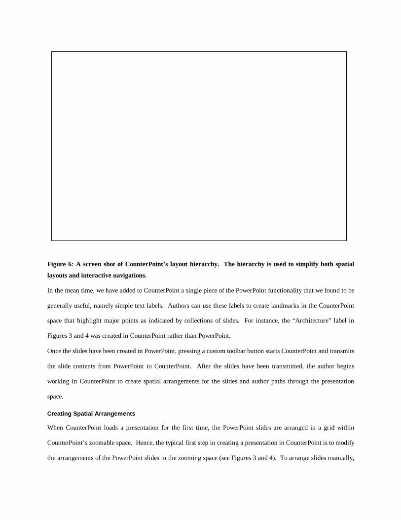
Figure 6: A screen shot of CounterPoint’s layout hierarchy. The hierarchy is used to simplify both spatial
layouts and interactive navigations.
In the mean time, we have added to CounterPoint a single piece of the PowerPoint functionality that we found to be
generally useful, namely simple text labels. Authors can use these labels to create landmarks in the CounterPoint
space that highlight major points as indicated by collections of slides. For instance, the “Architecture” label in
Figures 3 and 4 was created in CounterPoint rather than PowerPoint.
Once the slides have been created in PowerPoint, pressing a custom toolbar button starts CounterPoint and transmits
the slide contents from PowerPoint to CounterPoint. After the slides have been transmitted, the author begins
working in CounterPoint to create spatial arrangements for the slides and author paths through the presentation
space.
Creating Spatial Arrangements
When CounterPoint loads a presentation for the first time, the PowerPoint slides are arranged in a grid within
CounterPoint’s zoomable space. Hence, the typical first step in creating a presentation in CounterPoint is to modify
the arrangements of the PowerPoint slides in the zooming space (see Figures 3 and 4). To arrange slides manually,
we use simple tools for manipulating objects in this space similar to those found in PowerPoint, drawing programs,
and previous zoomable demo programs (e.g., PadDraw [5] and Jazz HiNote [6]).
We also provide a hierarchy editor (Figure 6) for automating these arrangements. Using this editor, the author can
organize the presentation contents into a semantically meaningful hierarchy. Then, for each parent in the hierarchy,
the author can apply a modifiable layout template to spatially arrange the parent’s children according to the template
format. Currently, we provide layout templates corresponding to geometric shapes, such as lines, ellipses, arcs, and
rectangles. For example, the slides that are children of the label “Use” in Figure 6 can be automatically arranged
using an ellipse layout to achieve this effect.
Creating Scripted Paths
The next step in the authoring process is to create paths through the presentation space. When CounterPoint loads a
presentation for the first time, a single default path is automatically generated that visits each of the PowerPoint
slides. In general, these paths are composed of two types of components. The first, more obvious type is the actual
PowerPoint slide, which is inserted on a path to animate the slide to full screen size. These slides are inserted into
the path using a simple scrolling list of thumbnails. Each slide can also be inserted multiple times in a single path.
The second type of path component is a view of a particular region of the zoomable space. These views are the
more interesting path component as they allow the author to include views containing multiple slides and the
structure of the presentation. Views are useful for showing an overview of the entire presentation or focused
overviews of particular subsections of the presentation.
The current mechanism used to create these types of views is similar to taking a picture or creating a screen
snapshot. First, the author navigates to the particular region of space to be added to the path. The author then
presses the camera toolbar button (Figures 3 and 4) and a new component, represented by a thumbnail image of the
view, is added to the path. These thumbnails are actually implemented as live views onto the presentation space so
that modifications to the zoomable space are reflected in the thumbnail.
While a one-dimensional representation of the current path is available in standard editing mode (see Figures 3 and
4), CounterPoint also provides a two-dimensional path editor that mimics the functionality of PowerPoint’s slide
sorter. We believe that this will allow for the transfer of pre-existing PowerPoint skills since the concepts of path
editing and slide sorting are so similar.

Figure 7: A screen shot of CounterPoint in presentation mode. Here, the presenter can alter pre-scripted
traversals using various presentation-time interactions. Black borders indicate slides already visited during
the presentation. This screen shot also represents a typical local overview in CounterPoint.
Some indication of the current path is also available while spatially arranging slides. When the mouse is positioned
over a slide on the editing canvas, the system displays arrows indicating the locations reachable from the slide in the
current path. While this feedback is not intended as a primary path-editing interface, it does give some coupling
between the two tasks.
Multiple paths are currently managed using the simple list component in the upper-left corner of Figures 3 and 4.
Selecting a path’s name in the list loads that path for editing or for starting a slide show. Currently, when a new path
is added to this list, it is initialized with all the PowerPoint slides. However, we also plan to include more
sophisticated algorithms for creating a new path such as a depth first search of the layout hierarchy (see Figure 6).
DELIVERING PRESENTATIONS IN COUNTERPOINT
Perhaps the most interesting and novel interactions occur in CounterPoint’s presentation mode (Figure 7). The
default behavior of sequentially stepping through one of the author’s predefined paths is still available. This default
behavior is achieved with the standard PowerPoint controls of left mouse button, the space bar, the page down key,
or right arrow key on the keyboard.
However, CounterPoint offers two modifications to this standard interaction for improvisation. First, the presenter
can press the up arrow key to navigate up the previously defined hierarchy. This zooms out enough to get an
overview of a semantically meaningful group of slides. If the layout hierarchy has not been defined, pressing the up
arrow key zooms out to give an overview of the entire space.
A second interaction allows a presenter to dynamically navigate to various interesting locations in the presentation.
However, before navigating to a target location, the presenter must navigate to an overview where the location is
visible. This is typically achieved by zooming out using the up arrow key. For immediate access to a PowerPoint
slide, right clicking on the slide animates the view to that location. We have found that other than slides, views of
sub-trees in the layout hierarchy (such as that seen in Figure 6) and views explicitly added to the path during
authoring are also targets for navigations. As a result, CounterPoint offers shortcuts for navigating to these
locations. When the presenter moves the mouse within the bounds of either a sub tree or view, the bounds of the
target view highlight. Right clicking within these highlighted bounds navigates to that location.
In cases where a presenter alters the presentation path using one of these dynamic navigations, the system attempts
to pick an appropriate point in the path from which to resume. In cases where the target appears in multiple places
on the path, CounterPoint picks the path entry closest to the point at which the presenter deviated from the path. If
the slide does not appear at all in the current path, the system does not try to infer a new path entry but rather
resumes from the point at which the presenter deviated from the path.
One other traditional hypertext element that we have added to CounterPoint to improve usability is visited colorings.
CounterPoint provides modifiable slide border colorings to indicate which slides have been visited during a
presentation. We have found these colorings to be useful both for the presenter and the audience for providing
feedback as to which slides the presenter has visited and to give a sense of the overall progress of the presentation.
PRINCIPLES FOR AUTHORING ZUI PRESENTATIONS
Although CounterPoint’s freeform 2D space essentially offers an unlimited variety of information layouts, we
believe that some layouts are more desirable than others. During our use of CounterPoint, we have identified a few
common principles that generally result in effective presentations.

Figure 8: A presentation using hierarchy and clustering. This presentation depicts a sampling of the
vertebrates, a sub-tree in the animal classification hierarchy. The sub-trees representing the different classes
of vertebrates are then clustered according to whether the classes are warm or cold-blooded.
We have also found evidence for these intuited design principles in the research of spatial adjunct displays such as
concept maps (see Figure 5). Spatial adjunct displays also include other diagrams, such as tables, flowcharts, or
hierarchies, traditionally, used to supplement texts. We believe that these diagrams are comparable to ZUI
presentations because they involve the arrangement of information “chunks” or “nodes” on a 2D surface. These
displays further parallel CounterPoint presentations in that they are intended to supplement a verbal source.
Visual Chunking
One of the problems mentioned in the design of concept maps is map shock. This occurs when the intended
audience is overwhelmed by the size or complexity of a visual display. Based on common presentation guidelines
(e.g. referenced in [30]) and our own informal experience, this also seems to be a problem in presentations.
Consequently, our first principle for CounterPoint layout is to create visual chunks.
Naturally, the corollary to this principle is determining the size of a chunk. In WWW page design, using larger
chunks, or breadth, has frequently been emphasized over using smaller chunks, or depth (see [41] for example.)
However, this is partly due to the latencies inherent on the WWW. Menu selection also tends to favor breadth over
depth although Norman suggests that the optimal chunk size often lies in the range of three to twelve [28]. A
common recommended chunk size among PowerPoint users seems to be seven (for instance, see [30]). This also
coincides with the human capability for perceiving seven plus or minus two items [24]. Since this also seems
compatible with our own experience in CounterPoint, we expect seven plus or minus two will be a reasonable
guideline for CounterPoint chunks as well.
Spatial Configuration
Once the presentation has been segmented into meaningful chunks, the next step is to arrange these chunks in space.
This issue has also been considered in the design of concept maps. Lambiotte et al. proposed using “gestalt”
perceptual principles for the layout of concept maps to distinguish symmetry, similarity, continuation, parallelism,
and information gaps [22]. Wiegmann et al. performed a study comparing concept maps designed with these gestalt
principles to more randomly arranged concept maps [40]. The results of the study suggest that subjects using the
gestalt maps had both better recall and understanding of the presented material.
We believe these gestalt principles can improve the design of ZUI presentations as well. Specifically, Lambiotte et
al. proposed several common layouts including hierarchies, chains, and clusters that we have found useful in ZUI
presentations. An example of hierarchy and clustering applied to a ZUI presentation can be seen in Figure 8. We
recommend that authors of ZUI presentations use meaningful layouts that adhere to these gestalt principles
whenever possible.
Balancing Area and Scale
A final consideration in the design of ZUI presentations is the extent to which the use of area and scale are balanced.
For instance, the presentation on the left in Figure 9 shows a ZUI presentation that spans a large area but essentially
ignores scale. In contrast, the presentation on the right in Figure 9 demonstrates a more balanced use of area and
scale.
To some extent, this tradeoff between area and scale is one of aesthetics and depends largely on the presentation
content. However, as studied by Hornbaek et. al. [17], multi-scale representations of visual data leads to faster
navigation.
Figure 9: The presentation on the left uses only the 2D space and puts all slides at the same magnification.
The presentation on the right also uses the zooming dimension by reducing the magnification of slides by
50% at each level in the hierarchy. This technique of combining area and scale often facilitates more
meaningful overviews.
CONCLUSION
In this paper, we present ZUIs as an alternative medium for slide show presentations. ZUI presentations enable
spatial navigations, paths, and distinguished levels of detail with multi-scale 2D spatial arrangements. ZUIs also
allow for the replacement of the slide transition with animated viewpoint traversals through the multi-scale 2D
space.
We have also suggested several potential cognitive advantages of ZUI presentations over more traditional slide show
presentations. However, future empirical studies are needed to verify these psychological advantages.
Based on our experience authoring zoomable presentations in freehand tools, we have designed and built a zooming
presentation tool called CounterPoint. CounterPoint offers solutions to common presentation authoring and delivery
challenges in ZUIs.
Lastly, we offer a set of principles for zooming presentations. These principles suggest dividing the content into
visual chunks, arranging these chunks according to gestalt perceptual principles, and balancing area and scale.
FUTURE WORK
Our primary future work lies in empirically validating the cognitive advantages of zoomable 2D spaces for slide
presentations. We also intend to evaluate CounterPoint’s usability for various presentation authoring tasks.
Our future development work will mainly focus on enhancing our tools for authoring spatial arrangements. We also
intend to design a set of zoomable and projector-friendly layout templates to further automate the creation of
zooming presentations. Finally, we plan to create improved tools for awareness and navigation in our zoomable 2D
workspace.
ACKNOWLEDGMENTS
We would like to thank Allison Druin and Maria Jump for their early work on CounterPoint, and all the members of
the Jazz team for helping with our use of it.
REFERENCES
1. Allen, B. (1998). Information Space Representation in Interactive Systems: Relationship to Spatial Abilities. In Proceedings
of International Conference on Digital Libraries (DL 98)ACM Press, pp. 1-10.
2. Baddeley, A. D., & Hitch, G. J. (1974). Working Memory. G. Bower (Eds.),Recent Advances in Learning and Motivation
(Vol. 8, pp. 47-90). New York: Academic Press.
3. Bederson, B. B. (2001). Quantum Treemaps and Bubblemaps for a Zoomable Image Browser.In Proceedings of User
Interface and Software Technology (UIST 2001)ACM Press, p. in press.
4. Bederson, B. B., & Boltman, A. (1999). Does Animation Help Users Build Mental Maps of Spatial Information?In
Proceedings of Information Visualization Symposium (InfoVis 99)New York: IEEE, pp. 28-35.
5. Bederson, B. B., Hollan, J. D., Perlin, K., Meyer, J., Bacon, D., & Furnas, G. W. (1996). Pad++: A Zoomable Graphical
Sketchpad for Exploring Alternate Interface Physics.Journal of Visual Languages and Computing, 7, pp. 3-31.
6. Bederson, B. B., Meyer, J., & Good, L. (2000). Jazz: An Extensible Zoomable User Interface Graphics Toolkit in Java.In
Proceedings of User Interface and Software Technology (UIST 2000)ACM Press, pp. 171-180.
7. Blankenship, J., & Dansereau, D. (2000). The Effect of Animated Node-Link Displays on Information Recall.Journal of
Experimental Education, 68(4), pp. 293-308.
8. Dee-Lucas, D. (1996). Effects of Overview Structure on Study Strategies and Text Representations for Instructional
Hypertext. Britt, Rouet, & Perfetti (Eds.),Hypertext and Cognition(pp. 73-106). Erlbaum.
9. Dillon, A., McKnight, C., & Richardson, J. (1993). Space - The Final Chapter or Why Physical Representations Are Not

Semantic Intentions. C. McKnight, A. Dillon, & J. Richardson (Eds.),Hypertext - A Psychological Perspective. London:
Ellis Horwood.
10. Donskoy, M., & Kaptelinin, V. (1997). Window Navigation With and Without Animation: A Comparison of Scroll Bars,
Zoom, and Fisheye View.In Proceedings of Extended Abstracts of Human Factors in Computing Systems (CHI 97)ACM
Press, pp. 279-280.
11. Druin, A., Stewart, J., Proft, D., Bederson, B. B., & Hollan, J. D. (1997). KidPad: A Design Collaboration Between
Children, Technologists, and Educators.In Proceedings of Human Factors in Computing Systems (CHI 97)ACM Press, pp.
463-470.
12. Furnas, G., & Zhange, X. (2000). Illusions of Infinity: Feedback for Infinite Worlds.In Proceedings of User Interface and
Software Technology (UIST 2000)ACM Press, pp. 237-238.
13. Furnas, G. W., & Bederson, B. B. (1995). Space-Scale Diagrams: Understanding Multiscale Interfaces.In Proceedings of
Human Factors in Computing Systems (CHI 95)ACM Press, pp. 234-241.
14. Furnas, G. W., & Zhang, X. (1998). MuSE: A Multiscale Editor.In Proceedings of User Interface and Software Technology
(UIST 98)ACM Press, pp. 107-116.
15. Hays, T. A. (1996). Spatial Abilities and the Effects of Computer Animation on Short-Term and Long-Term
Comprehension.Journal of Educational Computing Research, 14(2), pp. 139-155.
16. Hightower, R. R., Ring, L., Helfman, J., Bederson, B. B., & Hollan, J. D. (1998). Graphical Multiscale Web Histories: A
Study of PadPrints.In Proceedings of ACM Conference on Hypertext (Hypertext 98)ACM Press, pp. 58-65.
17. Hornbaek, K., Bederson, B. B., & Plaisant, C.(2001).Navigation Patterns and Usability of Overview+Detail
and Zoomable User Interfaces for Maps. Tech Report HCIL-2001-11, University of Maryland, Human-Computer
Interaction Lab, College Park, MD USA.
18. Igarashi, T., & Hinckley, K. (2000). Speed-dependent automatic zooming for browsing large documents.In Proceedings of
User Interface Software and Technology (UIST 2000)ACM Press, pp. 139-148.
19. Jul, S., & Furnas, G. W. (1998). Critical Zones in Desert Fog: Aids to Multiscale Navigation.In Proceedings of User
Interface and Software Technology (UIST 98)ACM Press, pp. 97-106.
20. Kaplan, N., & Moulthrop, S. (1994). Where No Mind Has Gone Before: Ontological Design for Virtual Spaces.In
Proceedings of ACM European Conference on Hypermedia Technology (ACM European Conference on Hypermedia
Technology)ACM Press, pp. 206-216.
21. Lai, S. (2000). Increasing Associative Learning of Abstract Concepts Through Audiovisual Redundancy.Journal of
Educational Computing Research, 23(3), pp. 275-289.
22. Lambiotte, J., Dansereau, D., Cross, D., & Reynolds, S. (1989). Multirelational Semantic Maps.Educational Psychology
Review, 1(4), pp. 331-367.
23. Microsoft. PowerPoint (2001). http://www.microsoft.com/office/powerpoint.
24. Miller, G. (1956). The Magical Number Seven, Plus or Minus Two: Some Limits on Our Capacity for Processing
Information.Psychological Review, 63, pp. 81-97.
25. Moore, T. (1995). Active Use of Hypertext to Aid Learning and Classroom Instruction.In Proceedings of Technical
Symposium on Computer Science Education (SIGCSE)ACM Press, pp. 297-301.
26. Nelson, L., Ichimura, S., Pedersen, E., & Adams, L. (1999). Palette: A Paper Interface for Giving Presentations.In
Proceedings of Human Factors in Computing Systems (CHI 99)ACM Press, pp. 354-361.
27. Norman, D. A. (1988).The Psychology of Everyday Things. BasicBooks.
28. Norman, K. (1991).The Psychology of Menu Selection: Designing Cognitive Control at the Human/Computer Interface.
Ablex Publishing Corp.
29. Paivio, A. (1986).Mental Representation: A Dual Coding Approach. New York: Oxford University Press.
30. Parker, I. (2001). Absolute PowerPoint: Can a software package edit our thoughts. 76-87.
31. Patterson, M., Dansereau, D., & Wiegmann, D. (1993). Receiving Information During a Cooperative Episode: Effects of
Communication Aids and Verbal Ability.Learning and Individual Differences, 5(1), pp. 1-11.
32. Rivlin, E., Botafogo, R., & Shneiderman, B. (1994). Navigating in Hyperspace: Designing a Structure-Based Toolbox.
Communications of the ACM, 37(2), pp. 87-96.
33. Robinson, D., Katayama, A., & Fan, A. (1996). Evidence for Conjoint Retention of Information Encoded From Spatial

Adjunct Displays.Contemporary Educational Psychology, 21, pp. 221-239.
34. Robinson, D., Robinson, S., & Katayama, A. (1999). When Words Are Represented in Memory Like Pictures: Evidence for
Spatial Encoding of Study Matierals.Contemporary Educational Psychology, 24, pp. 38-54.
35. Shipman, F., Furuta, R., & Marshall, C. (1997). Generating Web-Based Presentations in Spatial Hypertext.In Proceedings
of Intelligent User Interfaces (IUI 97)ACM Press, pp. 71-78.
36. Shneiderman, B. (1997).Designing the User Interface: Strategies for Effective Human-Computer Interaction, 3rd Edition.
Massachusetts: Addison-Wesley.
37. Thüring, M., Hannemann, J., & Haake, J. (1995). Hypermedia and Cognition: Designing for Comprehension.
Communications of the ACM, 38(8), pp. 57-66.
38. Toyoda, M., & Shibayama, E. (1999). Hyper Mochi Sheet: A Predictive Focusing Interface for Navigating and Editing
Nested Networks Through a Multi-Focus Distortion-Oriented View.In Proceedings of Human Factors in Computing
Systems (CHI 99)ACM Press, pp. 504-511.
39. Trigg, R. (1988). Guided Tours and Tabletops: Tools for Communicating in a Hypertext Environment.ACM Transactions
on Office Information Systems, 6(4), pp. 398-414.
40. Wiegman, D., Dansereau, D., McCagg, E., Rewey, K., & Pitre, U. (1992). Effects of Knowledge Map Characteristics on
Information Processing.Contemporary Educational Psychology, 17, pp. 136-155.
41. Zaphiris, P., & Mtei, L. Depth vs. Breadth in the Arrangement of Web Links (1997). http://otal.umd.edu/SHORE/bs04.
42. Zellweger, P. (1988). Active Paths Through Multimedia Documents.In Proceedings of International Conference on
Electronic Publishing, Document Manipulation and TypographyACM Press, pp. 19-34.
43. Zellweger, P. (1989). A Hypermedia Path Mechanism.In Proceedings of Hypertext (Hypertext 89)ACM Press, pp. 1-14.

Footnotes:
Footnote 1: CounterPoint is available for download at:http://www.cs.umd.edu/hcil/counterpoint
Footnote 2: We should note that although PowerPoint™ [22] technically allows for the decoupling of presentation
content and path through the “Slide Show→ Custom Shows…” menu, the interface is very primitive. Moreover,
these custom shows do not offer the same features, such as independently modifiable transitions, available in the
primary slide show.
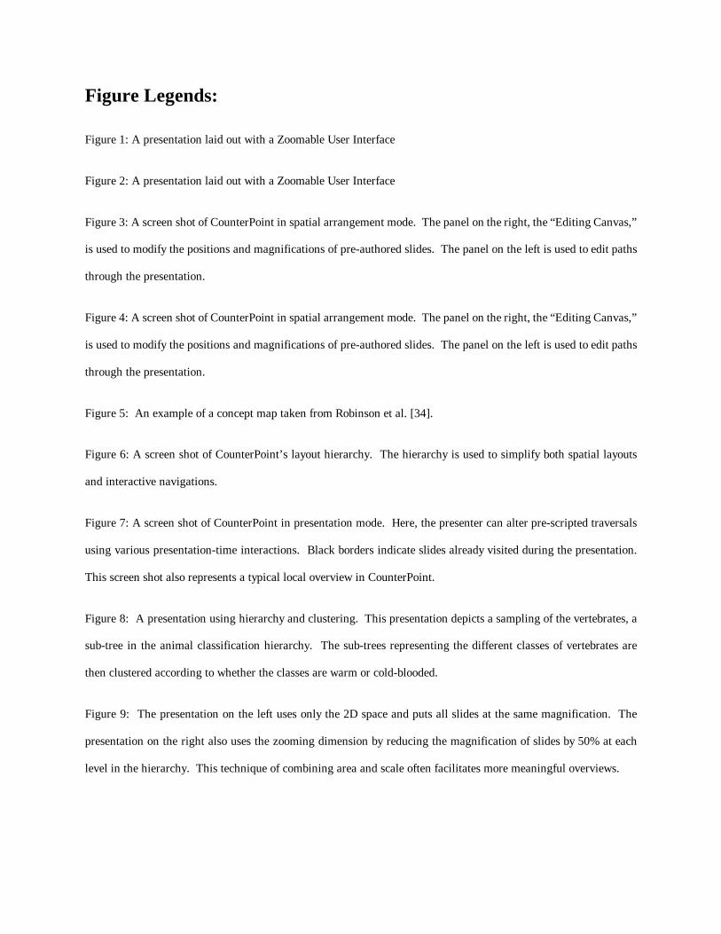
Figure Legends:
Figure 1: A presentation laid out with a Zoomable User Interface
Figure 2: A presentation laid out with a Zoomable User Interface
Figure 3: A screen shot of CounterPoint in spatial arrangement mode. The panel on the right, the “Editing Canvas,”
is used to modify the positions and magnifications of pre-authored slides. The panel on the left is used to edit paths
through the presentation.
Figure 4: A screen shot of CounterPoint in spatial arrangement mode. The panel on the right, the “Editing Canvas,”
is used to modify the positions and magnifications of pre-authored slides. The panel on the left is used to edit paths
through the presentation.
Figure 5: An example of a concept map taken from Robinson et al. [34].
Figure 6: A screen shot of CounterPoint’s layout hierarchy. The hierarchy is used to simplify both spatial layouts
and interactive navigations.
Figure 7: A screen shot of CounterPoint in presentation mode. Here, the presenter can alter pre-scripted traversals
using various presentation-time interactions. Black borders indicate slides already visited during the presentation.
This screen shot also represents a typical local overview in CounterPoint.
Figure 8: A presentation using hierarchy and clustering. This presentation depicts a sampling of the vertebrates, a
sub-tree in the animal classification hierarchy. The sub-trees representing the different classes of vertebrates are
then clustered according to whether the classes are warm or cold-blooded.
Figure 9: The presentation on the left uses only the 2D space and puts all slides at the same magnification. The
presentation on the right also uses the zooming dimension by reducing the magnification of slides by 50% at each
level in the hierarchy. This technique of combining area and scale often facilitates more meaningful overviews.