Embed Size (px)
Citation preview
WRA 210 – SS2014
RWD1 : CSS Media Queries
Responsive?
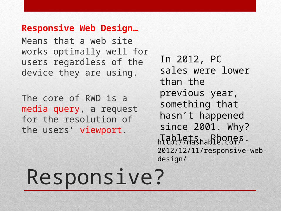
Responsive Web Design…
Means that a web site works optimally well for users regardless of the device they are using.
The core of RWD is a media query, a request for the resolution of the users’ viewport.
http://mashable.com/2012/12/11/responsive-web-design/
In 2012, PC sales were lower than the previous year, something that hasn’t happened since 2001. Why? Tablets. Phones.
Viewport?
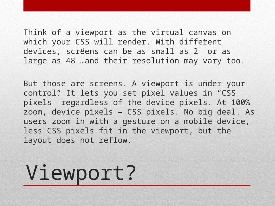
Think of a viewport as the virtual canvas on which your CSS will render. With different devices, screens can be as small as 2” or as large as 48”…and their resolution may vary too.
But those are screens. A viewport is under your control. It lets you set pixel values in “CSS pixels” regardless of the device pixels. At 100% zoom, device pixels = CSS pixels. No big deal. As users zoom in with a gesture on a mobile device, less CSS pixels fit in the viewport, but the layout does not reflow.
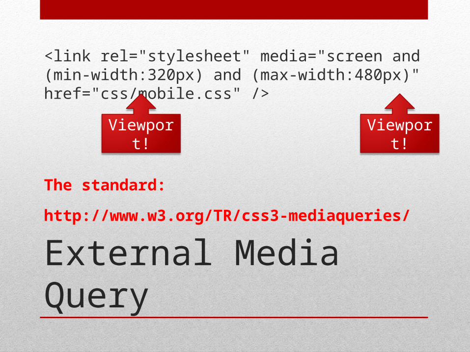
External Media Query
<link rel="stylesheet" media="screen and (min-width:320px) and (max-width:480px)" href="css/mobile.css" />
The standard:
http://www.w3.org/TR/css3-mediaqueries/
Viewport!Viewport!
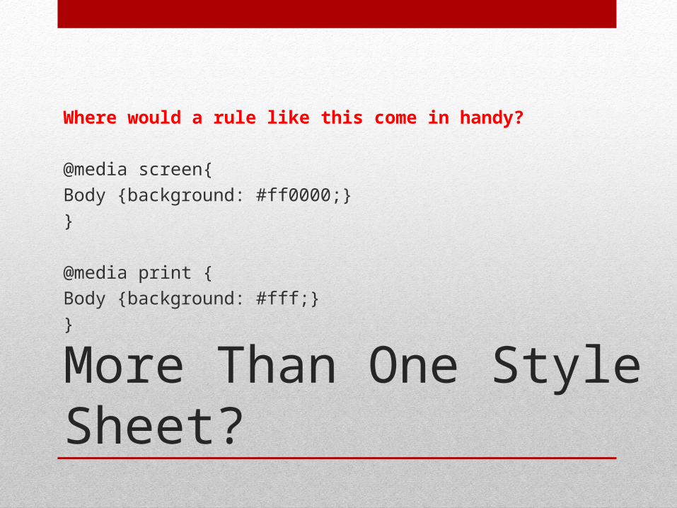
More Than One Style Sheet?
Where would a rule like this come in handy?
@media screen{
Body {background: #ff0000;}
}
@media print {
Body {background: #fff;}
}
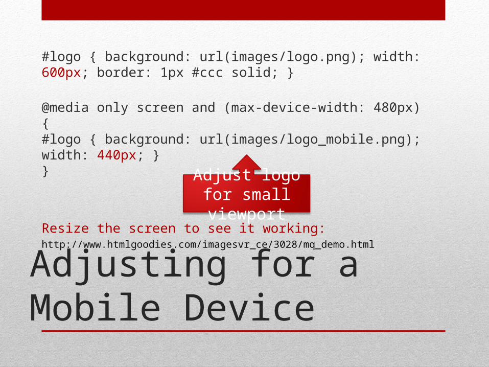
Adjusting for a Mobile Device
#logo { background: url(images/logo.png); width: 600px; border: 1px #ccc solid; }
@media only screen and (max-device-width: 480px) {#logo { background: url(images/logo_mobile.png); width: 440px; }}
Resize the screen to see it working:http://www.htmlgoodies.com/imagesvr_ce/3028/mq_demo.html
Adjust logo for small viewport
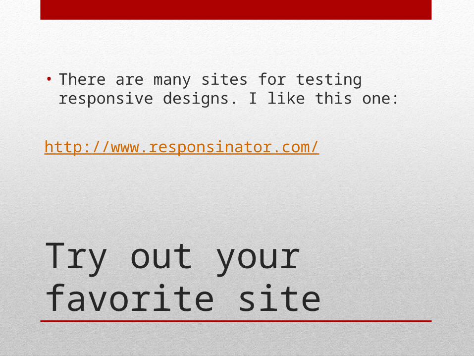
Try out your favorite site
• There are many sites for testing responsive designs. I like this one:
http://www.responsinator.com/
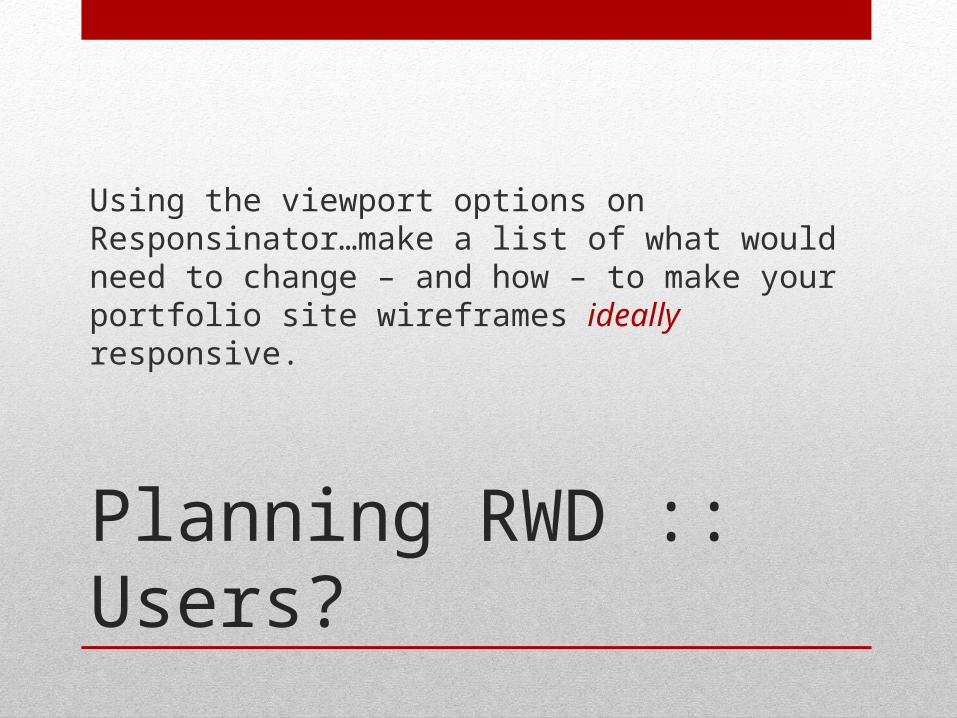
Planning RWD :: Users?
Using the viewport options on Responsinator…make a list of what would need to change – and how – to make your portfolio site wireframes ideally responsive.
Responsive Themes?
• Why do I need to know about media calls if I can just use a responsive theme in a CMS?
• Have a look: http://responsinator.com/?url=billhd.com
• If I don’t know how to change them, I’m stuck with the “responses” I am given by the theme designer…