Embed Size (px)
Citation preview
World Consumption Comparison Project:
Creating Your Charts Rubric and Instructions
2012-13
Introduction• In Chapter 7 your have been reading about American consumption
patterns and how it affects the rest of the world. • In this project, you will compare 10 (including the US) countries by
using statistical data on:• population• GDP (purchase power parity)• GDP per capita (PPP)• refined petroleum products consumption• internet users• physician density • all data can be found on the CIA.GOV website.
• Make a spreadsheet and charts/graphs based on each category of data research from the CIA website
• Analyze the data and determining solutions to some of these global issues
Step 1
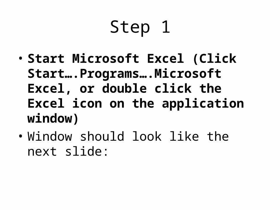
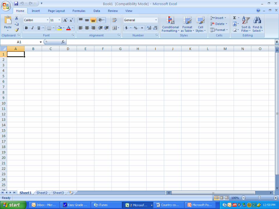
• Start Microsoft Excel (Click Start….Programs….Microsoft Excel, or double click the Excel icon on the application window)
• Window should look like the next slide:
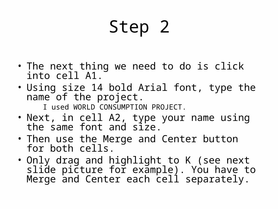
Step 2 • The next thing we need to do is click into cell A1.• Using size 14 bold Arial font, type the name of the
project. I used WORLD CONSUMPTION PROJECT.
• Next, in cell A2, type your name using the same font and size.
• Then use the Merge and Center button for both cells.• Only drag and highlight to K (see next slide picture for
example). You have to Merge and Center each cell separately.
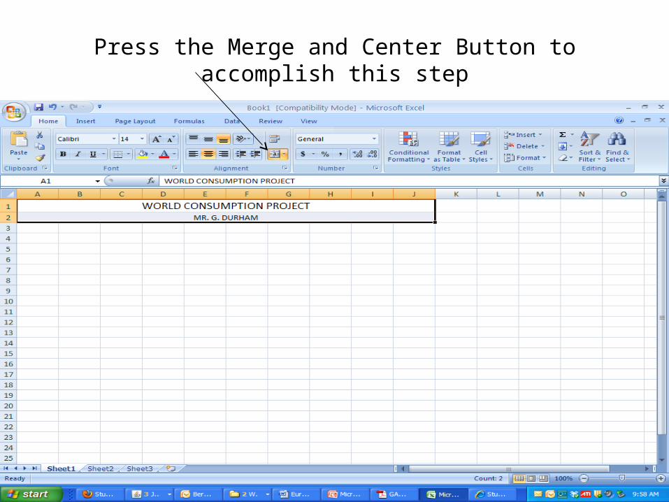
Press the Merge and Center Button to accomplish this step
Step 3
• Next, Enter the word Data in cell A4, using bold 12 Arial font underlined.
• Skip a cell and go to cell A6 and begin entering your Graph headings as seen below.
• Go to cell C4 and enter the heading Countries. • Merge and Center the heading by highlighting cells C4-I4 and hitting the Merge and Center button.
• Start at cell B5 and Type in your country headings. Everyone should have United States, and 9 other countries (you can decide – pick 4 developing countries, and 5 developed countries
Step 4• Begin to enter your data from your information sheets• When you are finished entering your data, put a
border around your spreadsheet.• Tighten up your spreadsheet by checking for spelling
errors, etc.• When entering data make sure that you adjust the
style to numbers, for this will make a big deal when you begin to graph
• Let’s save our work right now – save as World Consumption Comparison Project – Mine would be like this:
WCC Project GD 1st Hour
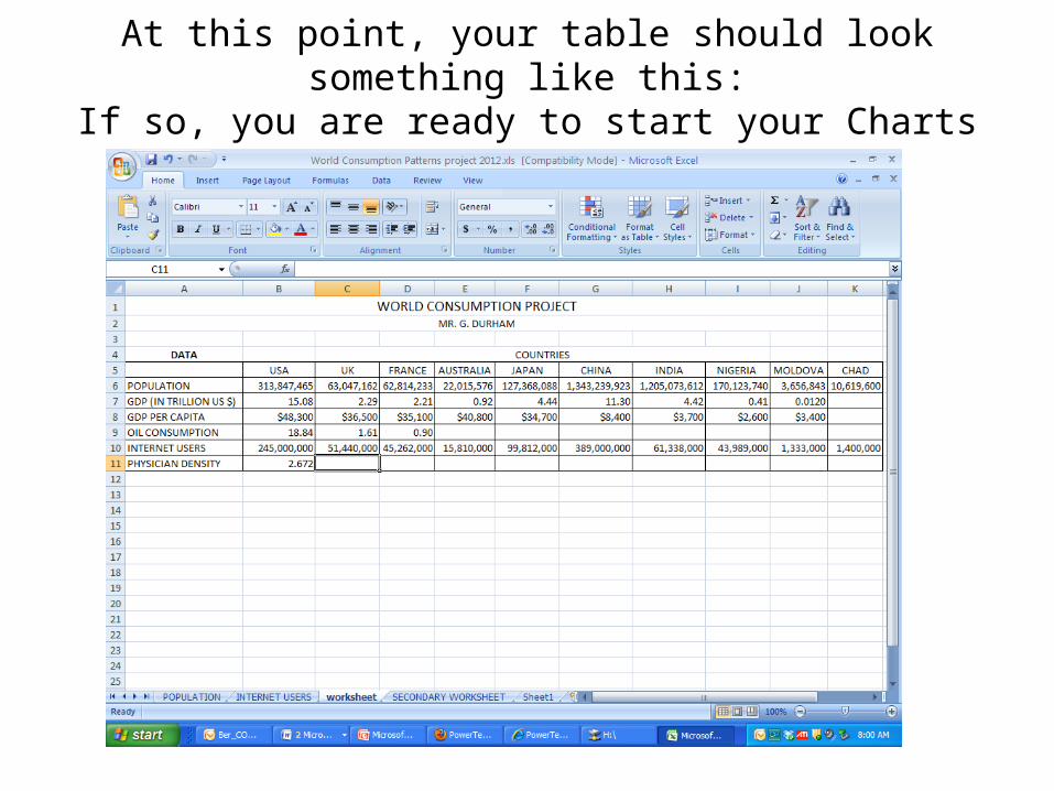
At this point, your table should look something like this:If so, you are ready to start your Charts and Graphs
Making Charts and Graphs
• After your spreadsheet is complete, you can then start making individual graphs.
• First you need to start a new spreadsheet by going to Sheet 2 at the bottom.
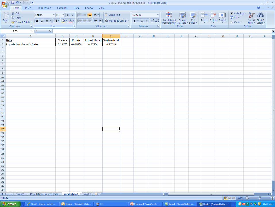
• Copy one of the categories information by highlighting the entire row from Sheet 1 and paste it onto Sheet 2
• It should look like the next slide:
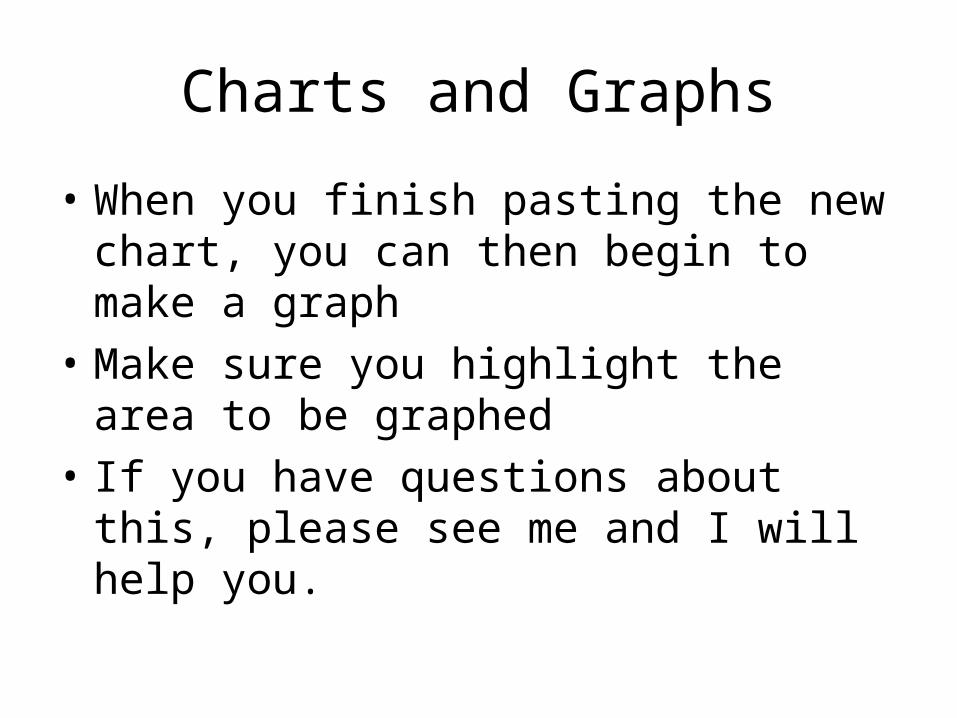
Charts and Graphs
• When you finish pasting the new chart, you can then begin to make a graph
• Make sure you highlight the area to be graphed
• If you have questions about this, please see me and I will help you.
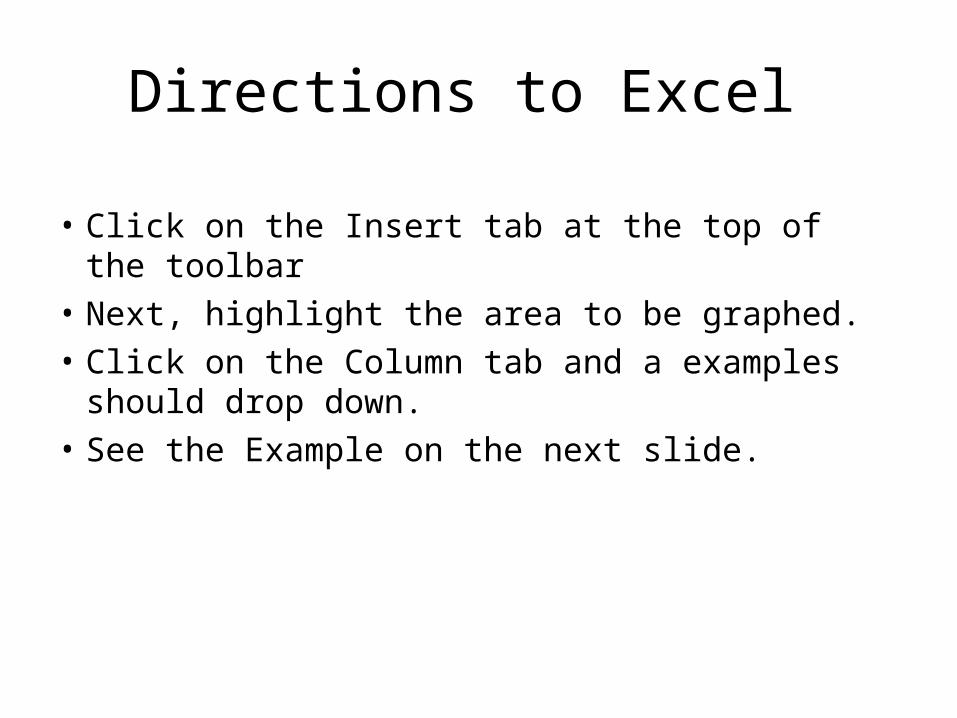
Directions to Excel
• Click on the Insert tab at the top of the toolbar• Next, highlight the area to be graphed. • Click on the Column tab and a examples
should drop down. • See the Example on the next slide.
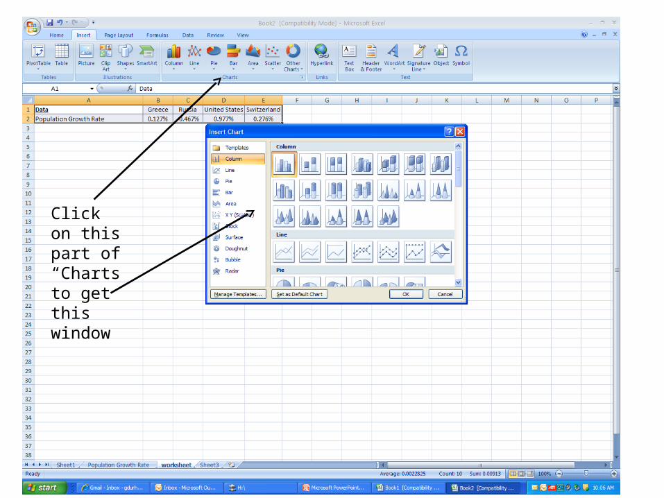
Click on this part of “Charts to get this window
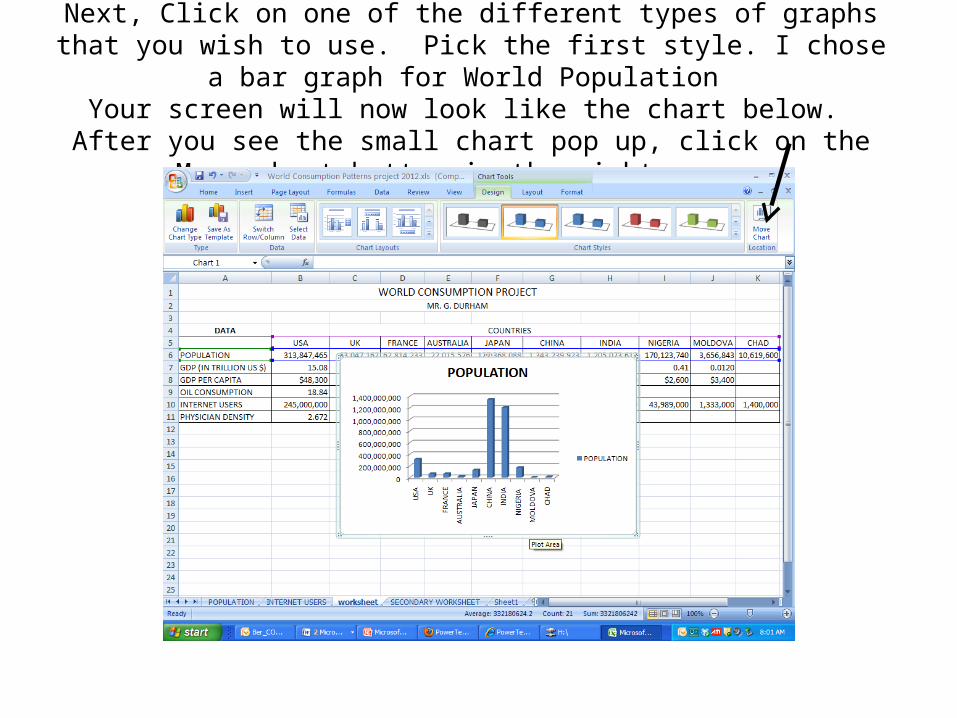
Next, Click on one of the different types of graphs that you wish to use. Pick the first style. I chose a bar graph for World Population
Your screen will now look like the chart below. After you see the small chart pop up, click on the Move chart button in the right corner
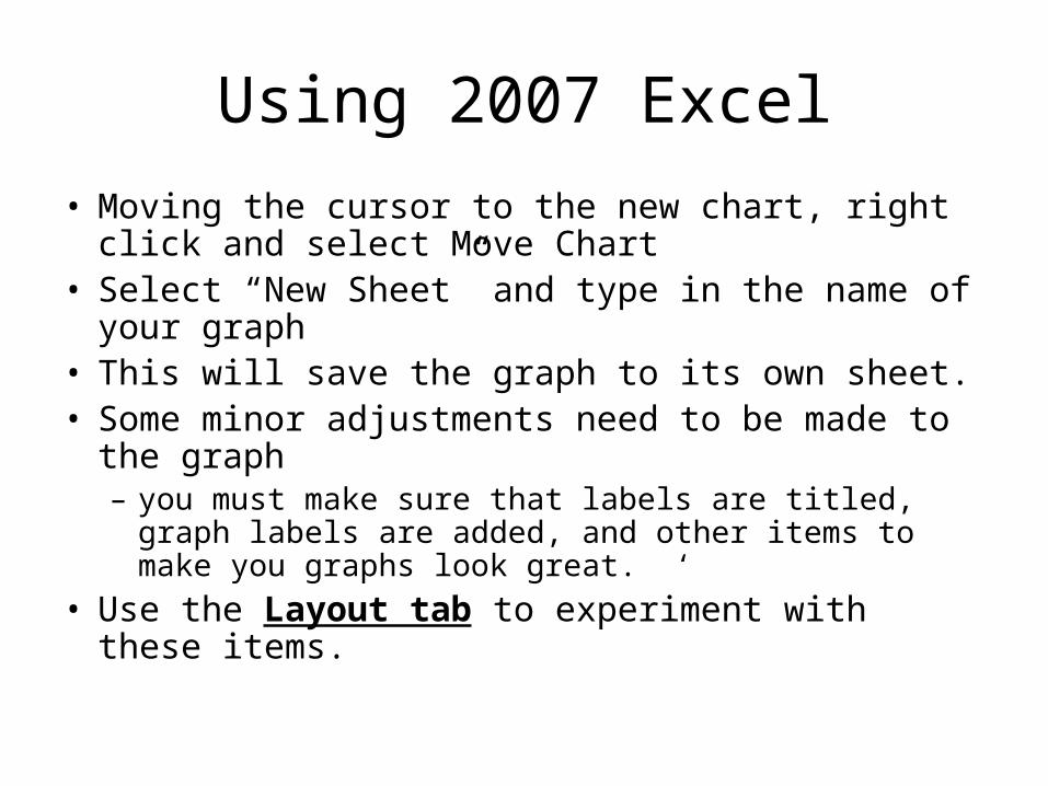
Using 2007 Excel
• Moving the cursor to the new chart, right click and select Move Chart
• Select “New Sheet” and type in the name of your graph
• This will save the graph to its own sheet.• Some minor adjustments need to be made to the
graph – you must make sure that labels are titled, graph labels are
added, and other items to make you graphs look great. ‘• Use the Layout tab to experiment with these items.
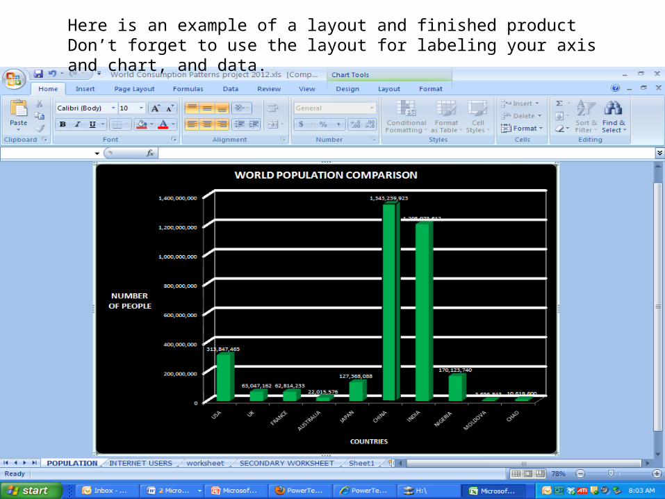
Here is an example of a layout and finished productDon’t forget to use the layout for labeling your axis and chart, and data.
Last Items• Don’t forget to save your work on a consistent basis.
Always save to your H drive.• You must make 3 graphs on Excel – pick any 3 that
you did not make by hand• You can use either a bar graph or a column graph• When you complete your graphs, paste the charts in
Powerpoint.• If you have any questions, feel free to ask. • You will have plenty of time to get this done, but
don’t wait until the last minute!!
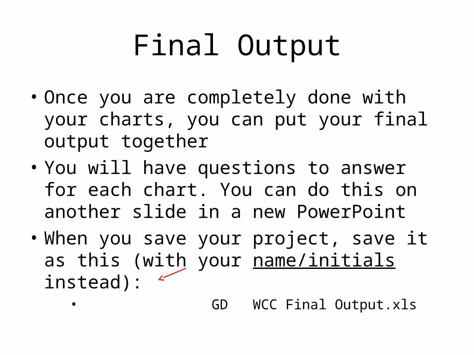
Final Output
• Once you are completely done with your charts, you can put your final output together
• You will have questions to answer for each chart. You can do this on another slide in a new PowerPoint
• When you save your project, save it as this (with your name/initials instead):
• GD WCC Final Output.xls
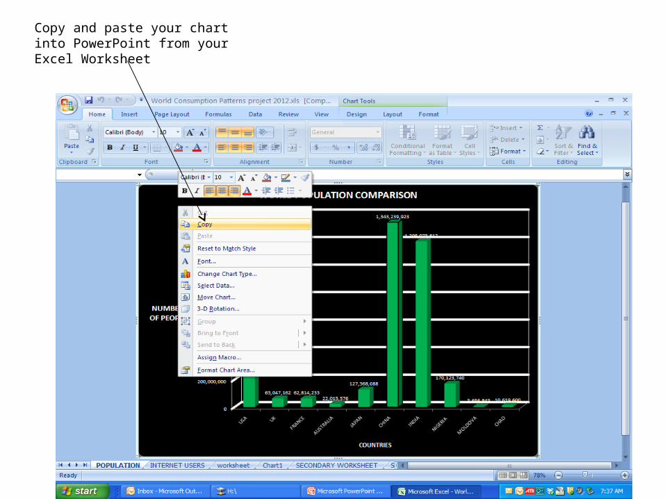
Copy and paste your chart into PowerPoint from your Excel Worksheet
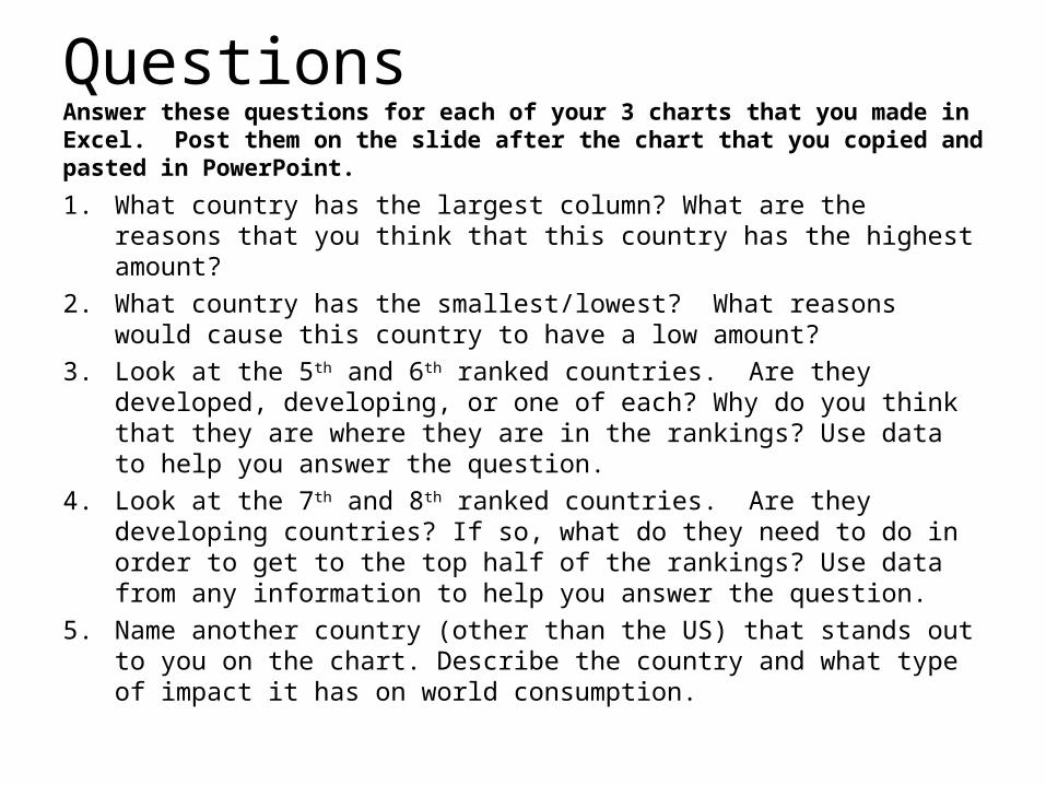
QuestionsAnswer these questions for each of your 3 charts that you made in Excel. Post them on the slide after the chart that you copied and pasted in PowerPoint.
1. What country has the largest column? What are the reasons that you think that this country has the highest amount?
2. What country has the smallest/lowest? What reasons would cause this country to have a low amount?
3. Look at the 5th and 6th ranked countries. Are they developed, developing, or one of each? Why do you think that they are where they are in the rankings? Use data to help you answer the question.
4. Look at the 7th and 8th ranked countries. Are they developing countries? If so, what do they need to do in order to get to the top half of the rankings? Use data from any information to help you answer the question.
5. Name another country (other than the US) that stands out to you on the chart. Describe the country and what type of impact it has on world consumption.
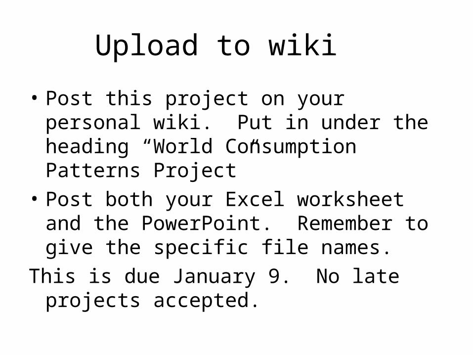
Upload to wiki
• Post this project on your personal wiki. Put in under the heading “World Consumption Patterns Project”
• Post both your Excel worksheet and the PowerPoint. Remember to give the specific file names.
This is due January 9. No late projects accepted.