Embed Size (px)
Citation preview

International Development ISSN 1470-2320
Working Paper Series 2019
No.19-194
Regional Inequalities in African Political
Economy: Theory, Conceptualization and Measurement, and Political Effects
Professor Catherine Boone and Dr. Rebecca Simson
Published: March 2019
Department of International Development
London School of Economics and Political Science
Houghton Street Tel: +44 (020) 7955 7425/6252
London Fax: +44 (020) 7955-6844
WC2A 2AE UK Email: [email protected]
Website: www.lse.ac.uk/InternationalDevelopment
1
Regional Inequalities in African Political Economy:
Theory, Conceptualization and Measurement, and Political Effects
Prof. Catherine Boone
LSE, Government and International Development
and
Dr. Rebecca Simson
LSE, Economic History
11 March 2019
Introduction
There is growing recognition in the economics literature that African countries are
characterized by very large economic disparities across subnational regions.1 Milanovic (2003:13)
and Okojie and Shimeles (2006) argued in the early 2000s that disparities in regional GNP per capita
in African countries are much more extreme than they were previously thought to be, given the
supposedly-leveling effects of low levels of economic development and the predominance of
smallholder agriculture in most African countries' national employment profiles. This finding has
potentially significant implications for political scientists and political economists interested in Africa.
Large bodies of work in both fields show that stark regional inequalities are associated with
distinctive sets of political and economic challenges. In countries as diverse as Argentina, Spain,
Germany, and China, regionalized competition exerts a pull on the overall character of national
politics, development trajectories, and patterns of policy competition. World-wide, economic
inequality across subnational regions is strongly associated with core-periphery tensions, tensions
between wealth-generating and stagnant regions, problems of national integration (including high
political salience of ethnic and regional identities) and tensions arising from divergent regional policy
1 Kanbur and Venables 2005, Brown and Langer 2009, Okoje and Shimeles 2006, UNRISD 2010, Shimeles and
Nabassaga 2017.

2
preferences. In global studies and studies of non-African countries, under-provision of public goods,
politicized regional cleavages, chronic grievances around exclusion of regionally-concentrated
groups, weak programmatic politics, the prevalence of accountability-eroding electoral clientelism,
and civil conflict in the form of fights over territory are socio-political ills that all have been
attributed, at least in part, to high levels of spatial inequality. Given that both regional inequality and
these forms of politics are widely prevalent in Africa, it is likely that there are relationships between
the two in Africa, just as there are in other parts of the world.
In African countries, the lack of systematic and reliable empirical data at subnational levels of
aggregation for Africa, including GDP data at the subnational level, has made it difficult to explore
possible links between spatial inequalities and political dynamics. Political scientists since the early
1990s have tended to ignore spatial inequalities altogether, and to attribute the prevalence and
predominance of clientelism over programmatic politics, and the high salience of ethno-regional
identities, to ethnic heterogeneity. Influential writers such as Easterly and Levine (1997), Horowitz,
and van de Walle, as well as a new generation of scholars focused on voting and elections in the
multiparty era, have identified ethnicity as both an overwhelmingly determinant force in African
politics and an ideological force that is orthogonal to economic and regional interests. Political
scientists who have brought behavioralist theories and methods to the study of African politics and
elections have taken ethnicity as an attribute of individuals that is placeless and institutionless, and as
a force that neutralizes programmatic economic or other policy interests at the individual (and thus
group) level. In this work, ethnicity may produce a territorial or regional effect when individuals who
share an ethnic culture or ideology are spatially-clustered, but the assumption would be that the spatial
clustering is an expression of ideological or cultural preference, not an economic policy preference or
an institutional effect. Spatially-variant social-structures and institutions are not factored into the
political analysis as shapers of identity/preferences, preference aggregation, or collective action
(except perhaps for some literature on urban political behavior; see Resnick 2014 and LeBas 2011).
This paper attempts to open space for an analysis that considers the ways in which spatial
inequalities may shape political dynamics in African countries. It does so by examining the empirical
literature on spatial inequality in an effort to support the argument that (a.) this is indeed a significant
3
structural feature of African economies, (b.) cross- and sub-national variation can be described in
some roughly consistent ways, and (c.) existing data sources allow for some plausible and meaningful
cross- and sub-national comparisons in the structure and extent of spatial inequality in African
countries.
The ultimate goal is to consider spatial inequality -- in particular, cross-national variation in
its extent and structure -- as a predictor or explanation of outcomes of interest to political science: i.e.,
to explore the ways in which subnational inequality may map onto and shape territorial cleavages and
the unequal distribution of bargaining power at the national level, visible in patterns of electoral
competition, development policy disputes, land use politics, and civil conflict within African
countries. The overarching intuition is that patterns of spatial inequality -- which vary across
countries in their character and severity -- are of considerable policy and political salience, even
though they are very poorly understood in the academic and policy literatures. Yet to test these ideas,
we must first grapple with challenges of describing spatial inequality within countries in ways that are
amenable to comparative and cross-national analysis.
The paper is organized as follows. Part I reviews the findings of existing studies based on
GDP (and proxies) and household consumption (and proxies) data on the existence and magnitude of
different forms of inequality in Africa, compared to other parts of the world and across and within
African countries, and the issue of change over time. We focus on studies based on data assembled
by the World Bank, and consider these alongside studies of nightlight density (satellite data). Part II
uses five different inequality datasets to explore issues of data comparability and measurement. Part
III follows Rogers (2016: 26-34) in using different inequality measures to describe variation in the
structure of inequality across African countries. Part IV using the same types of data to explore the
possibility of capturing structure and variation in patterns of regional inequality within African
countries, and discusses whether and how this type of analysis might be used to extend the
contemporary political science literature on the comparative political economy of spatial inequalities
to Africa.
The conclusion summarizes the findings and discusses why it could be important to extend
political science literature on the comparative political economy of spatial inequalities to Africa. The
4
paper includes Appendices 1 and 2, which contain elaborations on some of the discussions of data and
some of the descriptive statistics presented in the main text.
I. Inequality in Africa
Four striking facts about inequality in African countries are that (a.) overall income inequality
is very high by world standards, (b.) spatial inequalities -- i.e. across subnational regions -- account
for a large share of inequality in Africa,2 (c.) marked variations in levels of economic development
and well-being are visible not only across the urban-rural distinction but also across rural regions of
African countries, and (d.) high levels of both interpersonal inequality and spatial inequality are
persistent features of African economies, going back as far as the existing econometric data can
reach.3 The next sections take up each of these in turn.
Throughout this paper we will distinguish between interpersonal income inequality (‘income
inequality’) between all individuals or households with in a geographic unit -- always a country in the
present analysis -- and spatial inequality, which measures the variation in average incomes across
subnational geographic units.
a. Income Inequality in Africa: Global and cross-national comparisons (interpersonal inequality
Ginis)
Econometric studies on cross-regional and cross-national inequality have produced the now
widely-accepted finding that Africa is either the most unequal or one of the most unequal regions of
the world (possibly second to Latin America), with very high levels of both interpersonal income
inequality and inequality across subnational regions.4 Perhaps this should not be surprising. Cross-
national studies show that on average, low-income developing countries are characterized by higher
2 Shimeles and Nagassaga (2017: 13) on the spatial inequality component of overall (income) inequality. See
also Kanbur and Venables 2005: 11; Okojie and Shimeles 2006; WB 2010: 4; Lessmann 2013; Mveyenge 2015,
Beegle et al 2016 (with consumption data). 3 Milanovic 2003 makes this point for interpersonal income inequality (but not spatial). 4 See Kanbur and Venables 2005, Okoje and Shimeles 2006:3, 10; Brown and Langer 2009, UNRISD 2010,
Hakura and Dietrich 2015. The measure chosen affects the country rankings. Jirasevetakul and Langer 2017: 9
found that by the Gini index of HH consumption expenditure for 2008, Africa (including North Africa) was the
world's most unequal macroregion, with a Gini of 67% compared to 52% for Latin America and the Caribbean.

5
levels of interpersonal inequality and higher levels of cross-regional inequality than the OECD
countries.5 And in general, today's aggregate data show that high shares of the population in
agriculture, high levels of natural resource dependence, and low population densities6 are associated
with higher levels of income inequality and inequality across subnational units (even if high
population share in agriculture had been thought to predict low inequality). Earlier work also shows
that countries with more open economies, more vast and varied physical terrain, and weaker states
have higher levels of regional inequality.7 Given these generic factors, many or most African
countries present "perfect storm"-type confluences of factors that reinforce each other to predict high
levels of interpersonal and inter-regional inequality.
This shows up starkly in the data. By national Gini coefficients, Africa is one of the world's
most unequal regions. By the World Bank's Povcalnet data, seven of the world’s ten most unequal
countries are in Africa (Beegle et al. 2016:129), and the average country Gini for Africa, at 0.43, is
well above that for Asia (0.36).8 Shimeles and Nabassaga 2017 show that even taking into account
"level of development" as captured by GDP per capita, African countries exhibit higher inequality
than other parts of the world, including Latin America (12), much higher than it is in France,
Germany, the UK, or for the African average, higher than the Gini for the US (World Bank WDI
2016). Citing ECA 2004 data on income inequality, Okojie and Shimeles (2006:3-4) write that
"income inequality is indeed considerably higher than had been thought initially in SSA."
National-level (overall) income Gini coefficients also show strong variation across African
countries. Gini coefficients for African countries from the World Bank's Povcalnet dataset is
presented in Appendix 1, Table A. There is high inequality in southern Africa, relatively low
5 See Lessmann 2013: 11, UNRISD 2010: 84. 6 Okoje and Shimeles 2006: 19. 7 UNRISD 2010: 70-2, 82-83. Okoje and Shimeles report that some studies showed that trade liberalization
decreased income inequality in the urban areas but increased it in the rural areas. See (Okoje and Shimeles,
2006: p. 20 on Zimbabwe). On a range of possible determinants, see Lessman and Seidel 2015: 24-27. 8 Gini of consumption, simple average, authors’ calculation from Global Consumption and Income Project
(Lahoti, Jayadev and Reddy, 2016). See also see also Okojie and Shimeles 2006:3-4; Beegle et al. 2016: 122.
Africa’s Gini estimates, which rest largely on household consumption rather than income data, are likely to
understate inequality, relative to countries that report Ginis based on income data (Beegle et al. 2016; Alvaredo
2018).

6
inequality in west Africa, particularly the Sahelian region, and mixed patterns in the east (Beegle et al,
2016: 124). Many have pointed to historical causes of these regional patterns, with higher inequality
in the former settler colonies than in those where agricultural production remained in the hands of
African smallholders (Bowden et al. 2010). Level of economic development in general is also
positively correlated with higher Gini coefficients. Shimeles and Nagassaga 2017 also show that this
relationship holds even when Africa's 10 most unequal countries are removed from the sample.
Hakura and Deitrich (2015: 58, Figure 3.5, drawing from Solt 2014) produce a similar finding on the
basis of IMF data for 1995 to 2014: in Africa, the highest real GDP per capita (by log) countries have
the highest (log) Gini index scores.
The pattern of stark inequality in income or consumption is also visible in the DHS survey-
based asset inequality data. Shimeles and Nagassaga examine asset-inequality data for 44 African
countries over two decades and report that average asset-based Ginis are in the 40-45% range, which
"could easily imply that the top 1% owned 35-40% of household assets and amenities in Africa"
(2017:17).
Although both the Povcalnet DHS (consumption) data and the asset ownership data are
subject to problems of data quality, measurement, and cross-national comparability,9 they provide
consistent evidence of high levels of income inequality in Africa, measured at the national level, as
well as evidence of considerable cross-country variation.
b. Spatial inequality in Africa
African countries also score very high by world standards in terms of levels of spatial
inequality -- i.e. inequality across subnational regions.10 Within African countries, spatial inequalities
(differences across regions and urban-rural differences) account for a large share of overall inequality
(World Bank 2016: 4; Beegle et al, 2016). This shows up in studies using nightlight data, studies
9 See Jerven 2013 on data quality problems. 10See Hakura and Dietrich 2015, drawing on Solt 2014. In general, we would expect some relationship between
interpersonal and spatial inequality. Empirical results for a global sample of countries suggest that these forms
of inequality are only weakly correlated, however. Some unequal countries exhibit no sharp geographic income
fissures and vice versa (Rogers, 2015).
7
using the DHS consumption data, studies using the asset data, studies using nightlight data, and
studies based on national accounts data.
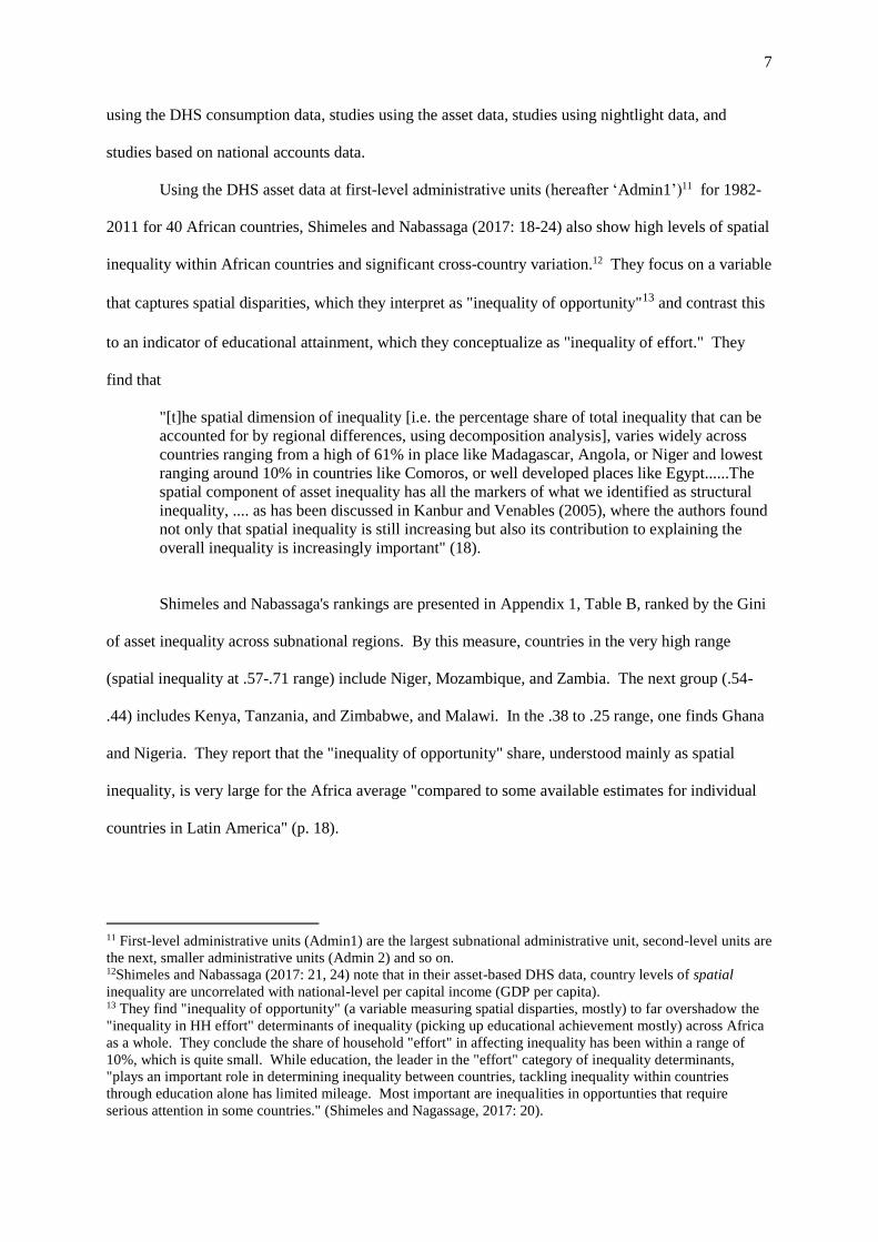
Using the DHS asset data at first-level administrative units (hereafter ‘Admin1’)11 for 1982-
2011 for 40 African countries, Shimeles and Nabassaga (2017: 18-24) also show high levels of spatial
inequality within African countries and significant cross-country variation.12 They focus on a variable
that captures spatial disparities, which they interpret as "inequality of opportunity"13 and contrast this
to an indicator of educational attainment, which they conceptualize as "inequality of effort." They
find that
"[t]he spatial dimension of inequality [i.e. the percentage share of total inequality that can be
accounted for by regional differences, using decomposition analysis], varies widely across
countries ranging from a high of 61% in place like Madagascar, Angola, or Niger and lowest
ranging around 10% in countries like Comoros, or well developed places like Egypt......The
spatial component of asset inequality has all the markers of what we identified as structural
inequality, .... as has been discussed in Kanbur and Venables (2005), where the authors found
not only that spatial inequality is still increasing but also its contribution to explaining the
overall inequality is increasingly important" (18).
Shimeles and Nabassaga's rankings are presented in Appendix 1, Table B, ranked by the Gini
of asset inequality across subnational regions. By this measure, countries in the very high range
(spatial inequality at .57-.71 range) include Niger, Mozambique, and Zambia. The next group (.54-
.44) includes Kenya, Tanzania, and Zimbabwe, and Malawi. In the .38 to .25 range, one finds Ghana
and Nigeria. They report that the "inequality of opportunity" share, understood mainly as spatial
inequality, is very large for the Africa average "compared to some available estimates for individual
countries in Latin America" (p. 18).
11 First-level administrative units (Admin1) are the largest subnational administrative unit, second-level units are
the next, smaller administrative units (Admin 2) and so on. 12Shimeles and Nabassaga (2017: 21, 24) note that in their asset-based DHS data, country levels of spatial
inequality are uncorrelated with national-level per capital income (GDP per capita). 13 They find "inequality of opportunity" (a variable measuring spatial disparties, mostly) to far overshadow the
"inequality in HH effort" determinants of inequality (picking up educational achievement mostly) across Africa
as a whole. They conclude the share of household "effort" in affecting inequality has been within a range of
10%, which is quite small. While education, the leader in the "effort" category of inequality determinants,
"plays an important role in determining inequality between countries, tackling inequality within countries
through education alone has limited mileage. Most important are inequalities in opportunties that require
serious attention in some countries." (Shimeles and Nagassage, 2017: 20).
8
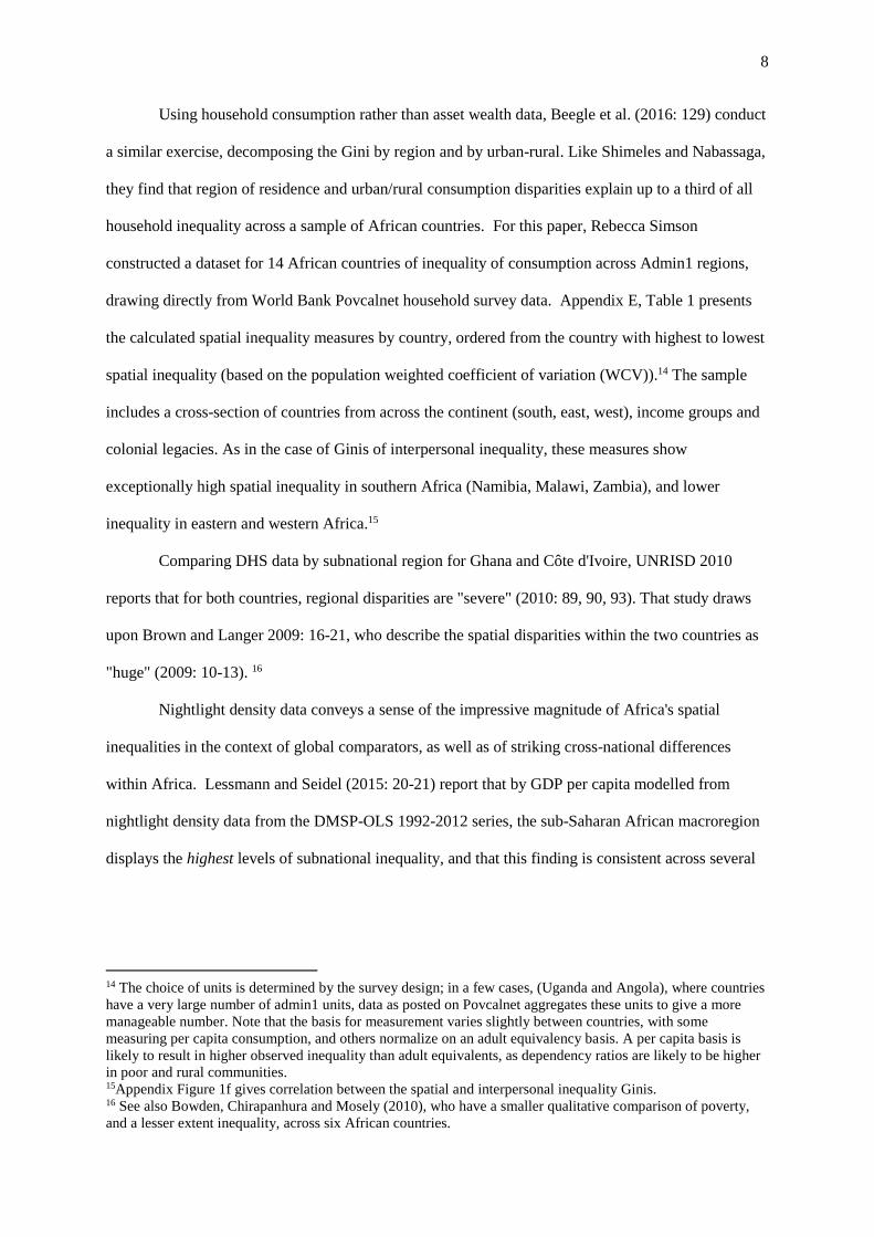
Using household consumption rather than asset wealth data, Beegle et al. (2016: 129) conduct
a similar exercise, decomposing the Gini by region and by urban-rural. Like Shimeles and Nabassaga,
they find that region of residence and urban/rural consumption disparities explain up to a third of all
household inequality across a sample of African countries. For this paper, Rebecca Simson
constructed a dataset for 14 African countries of inequality of consumption across Admin1 regions,
drawing directly from World Bank Povcalnet household survey data. Appendix E, Table 1 presents
the calculated spatial inequality measures by country, ordered from the country with highest to lowest
spatial inequality (based on the population weighted coefficient of variation (WCV)).14 The sample
includes a cross-section of countries from across the continent (south, east, west), income groups and
colonial legacies. As in the case of Ginis of interpersonal inequality, these measures show
exceptionally high spatial inequality in southern Africa (Namibia, Malawi, Zambia), and lower
inequality in eastern and western Africa.15
Comparing DHS data by subnational region for Ghana and Côte d'Ivoire, UNRISD 2010
reports that for both countries, regional disparities are "severe" (2010: 89, 90, 93). That study draws
upon Brown and Langer 2009: 16-21, who describe the spatial disparities within the two countries as
"huge" (2009: 10-13). 16
Nightlight density data conveys a sense of the impressive magnitude of Africa's spatial
inequalities in the context of global comparators, as well as of striking cross-national differences
within Africa. Lessmann and Seidel (2015: 20-21) report that by GDP per capita modelled from
nightlight density data from the DMSP-OLS 1992-2012 series, the sub-Saharan African macroregion
displays the highest levels of subnational inequality, and that this finding is consistent across several
14 The choice of units is determined by the survey design; in a few cases, (Uganda and Angola), where countries
have a very large number of admin1 units, data as posted on Povcalnet aggregates these units to give a more
manageable number. Note that the basis for measurement varies slightly between countries, with some
measuring per capita consumption, and others normalize on an adult equivalency basis. A per capita basis is
likely to result in higher observed inequality than adult equivalents, as dependency ratios are likely to be higher
in poor and rural communities. 15Appendix Figure 1f gives correlation between the spatial and interpersonal inequality Ginis. 16 See also Bowden, Chirapanhura and Mosely (2010), who have a smaller qualitative comparison of poverty,
and a lesser extent inequality, across six African countries.

9
different inequality measures (CV, WCV, and regional inequality Gini).17 Figure 1 reports 2010 data
from Lessmann and Seidel (2017).18
Figure 1: Spatial Inequality in African countries compared to other countries clustered by
world region (data derived from nightlight density, CV at Admin1, 2010)
Source: Data from Lessmann and Seidel, 2017.
Figure 2: Spatial Inequality in sub-Saharan Africa only (data derived from nightlight density,
CV at Admin1, 2010)
17 Other studies that use nightlights to measure spatial inequality across the entire globe are Nordhaus and Chen,
Alesina, Michaelapolous and Papiannou, 2016; Lessmann and Seidel 2017. These are discussed below. 18 Rather than using Admin1 units as the geographic unit of analysis, Alesina et al. (2016) also present
inequality measures using 2.5 x 2.5 degree grid cells. Their result is in Appendix X.
0
0.05
0.1
0.15
0.2
0.25
0.3
0.35
0.4
Tuva
lu
Pal
au
Ind
on
esia
Mya
nm
ar
Mal
aysi
a
Vie
tnam
Jap
an
Geo
rgia
Uzb
ekis
tan
Aze
rbai
jan
Mo
ldo
va
Ukr
ain
e
Esto
nia
Au
stri
a
Serb
ia
Irel
and
Net
her
lan
ds
Un
ited
Kin
gdo
m
Cyp
rus
Ital
y
Luxe
mb
ou
rg
Bel
aru
s
An
tigu
a an
d B
arb
ud
a
Co
lom
bia
Uru
guay
Arg
enti
na
Mex
ico
Gu
atem
ala
Hai
ti
Bel
ize
Trin
idad
an
d T
ob
ago
Co
sta
Ric
a
Yem
en
, Rep
.
Alg
eria
Tun
isia
Sau
di A
rab
ia
Qat
ar
Can
ada
Pak
ista
n
Bh
uta
n
Ban
glad
esh
Nig
er
Zim
bab
we
Ken
ya
Mau
rita
nia
Co
ngo
, Dem
. Rep
.
Uga
nd
a
An
gola
Lib
eria
Equ
ato
rial
Gu
inea
Ch
ad
Gab
on
Mo
zam
biq
ue
Leso
tho
Cam
ero
on
Sou
th S
ud
an
East Asia Europe & C. Asia LAC MENA NA S. Asia Sub-Saharan Africa
CV
in 'p
red
icte
d' r
egio
nal
GD
P p
.c.

10
Lessmann and Seidel (2017) reports average coefficients of variation in predicted GDP per
capita at subnational level for 1992-2012. This data (using 2010 results)19 show very high CVs
(unweighted for population) for Mali, Guinea-Bissau, Niger, Ethiopia, Zimbabwe and Sierra Leone
(ranging from .29 to .38). Botswana at 0.24, South Africa at .18 and Zambia at .17 are in a second
tier. Lower unweighted CVs are found in West Africa -- Cameroon, Côte d'Ivoire, Burkina Faso,
Ghana, Malawi, Mozambique, and Namibia -- in the .10 to .16 range. Using the population-weighted
CV (WCV), instead, the landlocked Sahelian countries show lower spatial inequality than the coastal
countries. The WCV also generates relatively low levels of spatial inequality for Namibia and South
Africa compared to other African countries. Yet overall, the Africa numbers are indeed high.20
Unweighted CVs for three non-African countries with strong regional inequalities provide good
comparisons: Spain (.08), Argentina (.15), and Brazil (.17) (2010).
19 The country rank orders remain broadly stable over time. 20 Mveyange (2015) analyzed nightlight density data for 1992-2012 in an attempt to proxy for regional
income in the absence (or weakness) of income data at this geographic scale. He calculates regional inequality
indices across countries (p. 6) defining "region" as a subnational unit (p. 7). Mveyange (2015: 22, 23) appears to
find that inequality between subnational regions is higher than inequality within regions, although he does not
present the data needed to replicate this finding. However we remain unsure as to whether this finding holds
within countries (N=32), as opposed to across an overall sample of approximately 750 subnational regions in 32
countries (N=750). Mveyange is interested in "regional inequality" because it is associated with civil conflict
and because of the policy implications of better knowledge of this phenomenon, and sets his work in the context
of other studies that have tried to use income data and night light data to measure national income and to
conduct cross national income comparisons. See pp. 2-3. He also considers inequality across "sub-continental
divisions" of Africa -- coastal vs. landlocked, mineral rich vs. mineral poor, etc. (p. 6-7).
0
0.05
0.1
0.15
0.2
0.25
0.3
0.35
0.4
Mal
i
Gu
inea
-Bis
sau
Nig
er
Eth
iop
ia
Gu
inea
Zim
bab
we
Sier
ra L
eon
e
Gam
bia
, Th
e
Ken
ya
Ben
in
Cen
tral
Afr
ican
Rep
ub
lic
Mau
rita
nia
Mau
riti
us
Co
ngo
, Rep
.
Co
ngo
, Dem
. Rep
.
Sen
egal
Bo
tsw
ana
Uga
nd
a
Tan
zan
ia
Erit
rea
An
gola
Bu
run
di
Sud
an
Lib
eria
Som
alia
Sou
th A
fric
a
Equ
ato
rial
Gu
inea
Nig
eria
Zam
bia
Ch
ad
Togo
Gh
ana
Gab
on
Rw
and
a
Bu
rkin
a Fa
so
Mo
zam
biq
ue
Mad
agas
car
Cô
te d
'Ivo
ire
Leso
tho
Nam
ibia
Mal
awi
Cam
ero
on
Cab
o V
erd
e
Co
mo
ros
Sou
th S
ud
an
Swaz
ilan
d
São
To
mé
an
d P
rin
cip
e
CV
in 'p
red
icte
d' r
egio
nal
GD
P p
.c.

11
Rather than using Admin1 units as the geographic unit of analysis, Alesina et al. (2016) also
present inequality measures using 2.5 x 2.5 degree grid cells. Calculating unweighted regional Ginis
across these grid cells using night light intensity, they give the following country rankings (Figure 3),
with large, sparsely populated and arid countries, such as Sudan, Niger and Namibia, towards the top
of the ranking, and Senegal, Swaziland and Rwanda at the bottom.
Figure 3. Spatial inequality in Sub-Saharan Africa: Unweighted Gini of night light intensity,
across 2.5x2.5 degree grid cell, 2012, Africa only (Alesina et al, 2016)
There have been scattered attempts to use national accounts data to measure spatial inequality
within African countries, where it is available at the subnational level. Gennaioli, La Porta, De Silanes
and Schleifer (2014) have used regional GDP per capita to examine subnational inequality.21 Table 1
presents their findings for the seven sub-Saharan African countries included in their sample, and
select comparators from other continents known for their high spatial inequality.22 Both types of data
point to high levels of inequality across Admin1 regions in Africa. Several of the African countries
rival or exceed the high-inequality comparators. Kenya exhibits the largest income range within the
African sample, with income in the richest region (Nairobi) 6.7 times larger than in the poorest, and a
21 In a large-N dataset that includes data for only four African countries, Novotny (2007), using a Theil index,
finds exceptionally high spatial inequality in South Africa and, to a lesser extent, Niger, but below global
average inequality in Madagascar and Senegal. 22 Across the board, the spatial inequality estimates for Africa (across Admin1 regions) based on national
accounts data are higher than the estimates produced by Lessmann and Seidel, which is based on luminosity
data. Lessmann and Seidel’s luminosity-derived data appear to compress the observed income range within
countries, thus apparently underestimating spatial inequality in African (and other) countries. Lessmann and
Seidel suggest that their results better correct for price level differences within countries, and thus are more
accurate assessments of GDP differences, although this stands to be tested (2017: 128-9).
00.10.20.30.40.50.60.70.80.9
1
Sud
anN
iger
Nam
ibia
Bo
tsw
ana
Som
alia
Mal
iC
entr
al A
fric
an R
epu
blic
Mad
agas
car
Gu
ine
a-B
issa
uC
had
Gab
on
Mo
zam
biq
ue
Nig
eria
An
gola
Gu
ine
aZi
mb
abw
eM
auri
tan
iaEt
hio
pia
Sier
ra L
eon
eLi
be
ria
Co
ngo
, Rep
.Za
mb
iaB
urk
ina
Faso
Erit
rea
Uga
nd
aK
enya
Leso
tho
Sou
th A
fric
aC
amer
oo
nTa
nza
nia
Togo
Ben
inC
ôte
d'Iv
oir
eG
amb
ia, T
he
Cab
o V
erd
eEq
uat
ori
al G
uin
eaB
uru
nd
iG
han
aC
om
oro
sM
alaw
iM
auri
tiu
sSe
neg
alSw
azila
nd
Rw
and
a
Gin
i of
regi
on
al n
igh
t lig
ht
inte
nsi
ty

12
CV of 0.9, putting it on par with Indonesia, which is known for extreme spatial inequality.
Mozambique and Tanzania likewise show considerable income ranges (max/min ratios of 4.8 and
3.6), roughly in line with those of Malaysia. The variation is less extreme in the three middle income
African countries, South Africa, Lesotho and (perhaps surprisingly) Nigeria. (However this dataset
uses very large subnational units for South Africa and Nigeria, which lowers the observed range).23
Table 1. GDP per capita (US$) across Admin1 administrative units, summary statistics, Ranked
by CV
Country year mean median min max sd CV max/min
max/min
excl.
capital
# admin
units
Kenya 2005 1,765 1,182 669 4,472 1,581 0.9 6.7 2.7 5
Mozambique 2009 768 562 423 2,033 498 0.6 4.8 2.7 10
Tanzania 2010 1,125 1,072 727 2,615 431 0.4 3.6 2.0 20
Benin 2005 1,171 1,280 600 1,542 409 0.3 2.6 2.6 6
Nigeria 2008 1,929 1,916 1,149 2,736 659 0.3 2.4 2.4 4
Lesotho 2000 923 845 675 1,228 230 0.2 1.8 1.7 6
South Africa 2010 6,692 6,509 5,173 8,659 1,131 0.2 1.7 1.3 8
Indonesia 2010 4,103 2,968 934 16,115 3,914 1.0 17.2 17.2 26
Argentina 2005 10,179 8,403 3,704 28,358 7,311 0.7 7.7 7.1 24
Malaysia 2010 11,086 10,422 4,098 20,500 4,736 0.4 5.0 5.0 12
United
Kingdom 2010 30,926 29,175 25,630 47,274 6,295 0.2 1.8 1.3 10
Spain 2010 25,854 24,229 18,919 39,722 5,238 0.2 2.1 2.1 50
Source: Calculated from: Gennaioli et al. 2014.
c. Urban-rural inequality; inequality across and within rural regions
In African countries as in developing countries in general, rural poverty is far greater than
urban poverty and "rural areas almost universally lag far behind urban areas" by all measures
(Kakwani and Soares 2005: 28-29).24 In a study of 15 African countries for which HH data were
available, Kakwani and Soares (2005: 28-29) found that the percentage of poor persons in rural
locations was from 2-4 times greater than it was in urban locations for almost all countries. Their
23 For the countries in Africa, however, much of the range in the Gennaioli et al. data is driven by the capital
city. If the capital is excluded, the max/min ratio falls substantially in Kenya, Mozambique and Tanzania
(Dodoma?) and relative to the non-African comparators. Although the sample is highly imbalanced, the simple
average CV for the seven Sub-Saharan African countries is considerably higher than the global average, but on
par with Latin America and East Asia. 24 See also Sahn and Stifel 2003 and Sahn and Stifel 2000.

13
finding held across East, West, the Horn, and Southern African countries, and across landlocked,
coastal, and oil-exporting countries.
High levels of variation have been found to exist within and across rural regions within
almost all countries. Using DHS asset-based measures of HH wealth for 24 countries that are
available back to 1984, Sahn and Stifel find that asset, health, and education inequality "tends to be
worse in the rural areas than in the urban areas" (2003:587). In their sample of 12 African countries,
inequality (by DHS asset-based and capabilities-based measures) was persistently higher across rural
populations than it was for urban populations (Table 2). They find that "inter-rural differences are
large" (2003: 593, n.24). Analyzing data for the mid-1980s to 2000, they also find that changes over
time in rural well-being "differ dramatically across rural areas" (593, n.25) "are often highly
regionalized" (593).25
Table 2: Urban-rural asset inequality, Sahn and Stifel 2003: 588 (reproduced in Okojie and
Shimeles (2006: v)
Appendix 1, Table E presents spatial inequality measures across the rural populations of each
Admin1 region for Kenya, Namibia and Tanzania (population weighted, in Column 12). In these three
cases, although the population-weighted spatial inequality levels drop considerably when the urban
areas of each Admin1 (as defined by national statistical offices) are excluded (see Col. 6), they remain
25 Studies from other parts of the world also show high levels of heterogeneity in how different rural regions are
affected by (i.e., "respond to," or are hurt or benefit from) growth that is registered at the national level, in
increases in GDP per capita, for example. When countries are growing, some rural regions do benefit, while
other fall behind. Studies also show a strong correlation between urban-rural inequality and regional inequality,
suggesting that spatially uneven levels of urbanization -- presumably including and perhaps especially the
[non?] growth of secondary and tertiary cities -- is one of the drivers of regional inequalities (Beegle et al.
2016: 130).

14
substantial, suggesting that an important share of the observed inequality results from intra-rural
inequality, rather than urban-rural inequality.
(d.) Persistence and change over time
What about changes over time in both income (interpersonal) and spatial inequality?
Milanovic (2003:11) argued that high interpersonal inequality in Africa compared to the rest of the
world "is not a recent phenomenon" -- it dates back to at least the 1950s, when early data are
available. Bigsten has speculated that precolonial inequality was likely “held down both by the
limited economic differentiation and by the reasonably good access to land in most regions” (Bigsten
2016: 2). He suspects that inequality then increased sharply in the colonial era with the introduction of
enclave economies in agriculture and mining, which saddled independent Africa with high inequality
in the 1960s. Limited structural transformation of African economies has resulted in a persistence in
these high levels of inequality. Atkinson calculated that top income shares across Anglophone Africa
for the late colonial period and found that inequality in East Africa rivalled or exceeded those in the
United Kingdom, while the levels were lower in West Africa, although some countries saw modest
falls in top income shares after independence (Atkinson 2015a & b).
Given this, could there be a possible Kuznet's-type U-shaped relationship between economic
development and interpersonal inequality? Such a model would suggest that inequality is high at the
early stages of structural transformation, but that as development progresses over time, inequality falls
as growth and income diffuse across persons and space. Either "backward regions" catch up, or
individuals migrate to higher-income regions, lessening inequalities in regional GDP per capita over
time.26 The jury is out on this issue. Writing in 2006, Okojie and Shimeles (2006: 10-11, 18) argued
that "there is not much consensus on [income inequality] trends over time, with different studies
showing mixed outcomes by country or hampered by data and measurement problems." A decade
later, Shimeles and Nagassaga (2017:13) write that "recent studies (Fosu 2014, Bigsten 2015)
26 See Brown and Langer 2009:3. See also Lessmann and Seidel 2015: 17 on adaptation of Kuznet's model,
originally designed to speak to the question of interpersonal inequality, to regional inequality. Comparing WCV
in a large cross-national data set, Lessmann and Seidel (2015: 30), do detect a Kuznet's-type pattern (with the
twist that inequality increases again after the inverted-U pattern is completed -- ie., the N-shaped curve).
15
documented that [income] inequality trends across countries in Africa did not seem to level off and no
patterns emerged either with respect to [Africa's] recent economic resurgence or any other
improvements in the level of human development." Milanovic (2003:13) likewise did not see any
evidence of Kuznets-type effects.
Like income inequality, spatial inequalities are found to be persistent over time (Kanbur and
Venables 2005; Okojie and Shimeles 2006; Mveyange 2015, Shimeles and Nagassaga 2017). Some
studies detect a fall in interregional inequality the early post colonial period (1965-1975), followed by
a rise in the 1980s and 1990s. UNRISD (2010) describes this pattern for Côte d'Ivoire and Ghana.27
They attribute the fall in the early postcolonial years to regional compensation mechanisms and
targeted investment in "lagging regions," and the rise in the 1980s and 1990s to the suppression of
these efforts under World Bank and IMF-sponsored Structural Adjustment Programs (combined with
an emphasis under the SAPs on investment in extractive sectors) (UNRISD 2010:90, 93).28 The rise
in spatial inequality in the 1990s is also detected by others (Ostby et al, 1990; Mveyange 2015;
Lessmann and Seidel 2017; Milanovic 2003: 9-12). Some recent studies describe spatial
(subnational) inequality as peaking around 2000 and then leveling-off or falling (Mveyange 2015,
Shimeles and Nabassaga, 2017: 13; Jirasavetakul and Lacher 2017).29 See also the Milanovic 2014
data in Table 1, which compares Ginis for the 1990s and 2000s. Of the 19 countries for which there
are observations for both the 1990s and the 2000s, 8 show a rising Gini, 10 show a decline in the Gini,
and one shows no change.
II. Spatial Inequality: Issues of conceptualization and measurement
Studies reviewed in Part I establish that in Africa, both interpersonal inequality and spatial
inequality are high by world standards. Theory leads us to expect that these inequalities will produce
27 In Ghana, for example, the income gap between North and South doubled over the 1990s, measured by DHS
and LSMS data (Brown and Langer 2009: 13). This pattern, of falling inequalities in the three decades following
WWII followed by an upturn in inequality in the 1980s, is mirrored in the interpersonal inequality trend across
most regions of the world (Milanovic 2016).27 28 On just such a process in E. Europe and Latin America, see Grigore Pop-Elches, PUP, 2009. For Côte
d'Ivoire, see also Azam 2001, 2008 and Boone, 2007. 29 Mveyange (2015) found that intra-regional income inequality, measured by nightlight density within
subnational Admin. 2 units peaked around 2005 and then decreased slightly thereafter.
16
political effects in African countries, as they do in countries around the world. Following Beramendi
(2007, 2012), Beramendi and Rogers (2015), and Rogers (2106), we should be able to use structure
and variation in the forms of inequality at the cross-national and subnational levels to develop and test
hypotheses about such political effects. This is indeed the goal here. Yet some conceptual and
operational ground-clearing on the "independent variable" side of the equation is required. Rogers
highlights the fact that "interregional measures of inequality are nearly absent in political science
research" (2016: 31), and this is true in the extreme for Africa, where the conceptual and
methodological terrain remains largely unexplored (or dormant since the 1980s).
For African countries as for countries anywhere in the world, interpersonal inequality and
interregional inequality (here, inequality across Admin1 regions) are captured in different types of
data, and in different measures. This creates analytic possibilities for capturing cross-national and
subnational variation in the structure of inequality.
For the spatial inequality indicators, there is a distinction between measures that capture
regional GDP per capita and measures that capture average regional household incomes, even when
these are based on the same underlying data (Rogers 2016: 34 inter alia; Pinkovskiy and Sala-i-Martin
2016, Deaton 2005, Anand and Segal 2008). GDP measures capture aggregate levels of economic
activity and productivity, which reflect regional endowment, economic structure, and level of
development. In a general way, GDP per capita "should" reflect economic opportunities available to
residents of the region, but as the concepts of "growth without development," growth that is not pro-
poor, and "jobless growth" suggest, this is not always the case.30 Income (household consumption +
30 Indeed, GDP per capita captures many sources and flows of income not returned to households -- retained
earnings of firms; tax income that is not returned to HH in the form of transfers and social services; wasteful
spending on military expenditures, tourism, or corruption that produces little in measurable HH income or
measurable well-being; production that is more likely to become part of the income of the rich, who are
systematically underpresented in HH survey-based income measures and whose income is sysetmatically likely
to be underreported. (See Anand and Segal 2008: 69; Pinkovskiy and Sala-i-Martin 2016: 585; Michaelopolous
and Papaiouannou, "Spatial Patterns of Dev.," 2017: 9 inter alia.) Pinkovskiy and Sala-i-Martin 2016: 585
discuss the larger debate over development indicators that has long pitted GDP per capita indicators generated in
national accounts against HH survey-based measures, especially the DHS surveys. They argue that the
nightlight data (ie. DMSP-OLD 1992-2012) is much more like national accounts data and better at estimating
GDP per capita growth than it is at estimating income per capita growth based on consumption data such as the
HH-level DHS consumption data collected by the World Bank in Povcalnet. At the national level, the nightlight
data tracks GDP per capita growth "extremely well" (p. 585). See also Michaelopolous and Papaiouannou,
"Spatial Patterns of Dev.," 2017: 8 for the rural areas of Africa.
17
savings) measures are a more direct measure of well-being (ie., households' consumption): they aim
to capture the purchasing and saving power of individuals and households, and with good data, they
may be calculated either before or after taxes and social transfers, or both. The two types of measures
-- GDP per capita and HH income remain distinct: when there is growth in GDP per capita, the
income Gini may move up or down. How growth and income distribution interact is an important
political issue.31
Where data is good and plentiful, aggregate GDP and personal or household income measures
can be constructed from the national accounts, and at different geographic scales of analysis. The
default strategy for political scientists who study inequality politics in the developed work is to use
national accounts data to measure both GDP per capita and income (Beramendi (2012), Beramendi
and Rogers, and Rogers (2016), Gennaioli et al. (2014)). Beramendi (2012) and Rogers (2016)
leverage comparisons of national income inequality, GDP per capita by region, and disposable
household income by region in analyses of the political economy of taxation and redistribution. For
studying Africa, the challenge is that the necessary disaggregated national income data is available for
only a few countries. This is what drives Africa-focused analysts (and scholars and policy-analysts
working on other data-poor regions of the world) to search for proxies.
Nightlight data generates a proxy for GDP per capita, which can be calculated at the Admin1
level, as was done in the Alesina et al. (2016) and Lessmann and Seidel (2017) studies discussed
above. DHS and household budget survey data, also discussed above, offer a proxy for income, based
either on self-reported HH consumption levels or HH asset ownership. Consumption data from
household budget surveys can be used to create national income Ginis (as in the Milanovic dataset) to
produce a "average consumption level" (Beegle et al. 2016), and DHS asset data can be aggregated
31 Melissa Rogers (2016: 33-4) takes this a step further in pointing to the distinction across different measures of
inequality in GDP per capita (all based on the same underlying data). She describes "three different notions of
inequality or "three different inequality concepts:" the region-adjusted Gini coefficient, the coefficient of
variation (CoV) across regions (Admin1), and the pop-weighted CoV. The region-adjusted Gini coefficient
(ADGINI), or the Gini coefficient of regional income, is a measure of relative deprivation. "Zero" connotes
even development across regions; 1 connotes extreme inequality or "uneven development" across regions. The
CoV and CoVW capture dispersion across Admin1 regions. She argues that the ADGINI contains more
meaningful information about relative deprivation of regions, and is more sensitive to changes in the upper and
lower tails of the distribution than the two other measures" (p. 34). For her, the ADGINI captures aspects of
regional inequality that may become salient at the national political level.

18
and averaged at the Admin1 level to produce "average asset ownership" level (Shimeles and
Nabassaga 2018). For a fuller discussion of these different types of data, see Appendix 2.
Table 3 presents five different inequality datasets that contain data for African countries.32 In
this section, we use these to examine four types of measurement issue in the data: (a.) the correlations/
substitutability between indicators of spatial inequality; (b.) use of different inequality measures; (c.)
using population weights; and (d.) number of subnational units and one aspect of the MAUP problem.
(In the next section, we use some of this data to explore structure and variation in types of inequality
across and within African countries.) Listed first in Table 3 is Gennaioli et al. (2014), which uses
national accounts data to measure inequalities in regional GDP per capita at Admin1 level. Their
dataset includes only 7 African countries. Second is Lessmann and Seidel 2017 which uses
transformed nightlight data, and third is Alesina et al. 2016, which uses untransformed nightlight data.
Fourth is the DHS asset data by Shimeles and Nabassaga (2018). Fifth is the dataset using household
budget surveys to calculate average household consumption across Admin1 units for 14 countries,
constructed by Rebecca Simson for this paper.33 The datasets utilize different inequality measures
(Gini, CV, Theil), either weighted or unweighted by the population of the subnational units. The five
studies also employ different types of subnational units, including first and second-level
administrative units, ethnic homelands, and politically-neutral grid cells.
Table 3. Recent spatial inequality studies with medium-n country samples
Dataset Measure Inequality
measure
Units of
analysis
Data source Sample
size
Years
Gennaioli, La Porta,
De Silanes and
Shleifer (2014)
‘Growth in regions,’
GDP per
capita
(collected
CV Administrative,
level 1, but
harmonized w.
internal
Natl
accounts
82
countries
(7 in Sub-
1800-2012
(various
years)
32 Works that compare similar datasets for related purposes are Pinkovskiy and Sala-i-Martin 2016 and Anand
and Segal 2008. 33 As reported in Appendix 2, Table 1, the sources are: Zambia: 2015 Living Conditions Monitoring Survey
Report; Namibia: Namibia Household income and Expenditure Survey Report 2015/16; Rwanda: The evolution
of poverty in Rwanda from 2000 to 2011: Results from the household surveys (EICV) (2012); Malawi:
Integrated Household Survey 2010/11: Household Socio-Economic Characteristics Report (2012); Uganda:
Uganda National Household Survey 2016/17 Report; Burkina Faso: Enquête Multisectorielle Continue 2014
[dataset]; Cameroon: Troisieme Enquete Camerounaise Aupres des Menages: Tendances, profil et déterminants
de la pauvreté au Cameroun entre 2001-2007 (2008); Tanzania: Household Budget Survey 2010/11 [dataset];
Kenya: Integrated Household Budget Survey 2015/16 [dataset]; Mali: World Bank, Geography of Poverty
(2015); Ghana: Ghana Living Standard Survey Round 6: Main Report (2015); Angola: Inquérito Integrado
Sobre o Bem-Estar da População, vol 2 (2011); Cote d’Ivoire: Enquête Niveau de Vie des Ménages 2015:
Rapport définitif; Ethiopia: Household Consumption and Expenditure Survey 2010/11 Report.
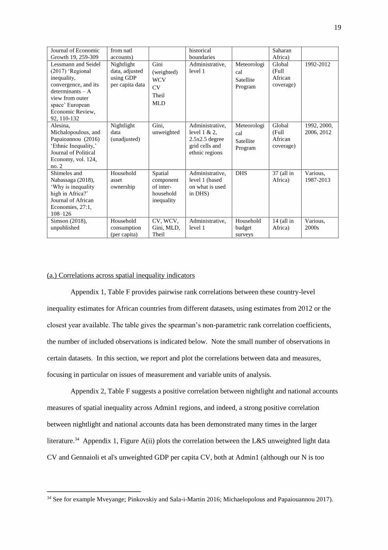
19
Journal of Economic
Growth 19, 259-309
from natl
accounts)
historical
boundaries
Saharan
Africa)
Lessmann and Seidel
(2017) ‘Regional
inequality,
convergence, and its
determinants – A
view from outer
space’ European
Economic Review,
92, 110-132
Nightlight
data, adjusted
using GDP
per capita data
Gini
(weighted)
WCV
CV
Theil
MLD
Administrative,
level 1
Meteorologi
cal
Satellite
Program
Global
(Full
African
coverage)
1992-2012
Alesina,
Michalopoulous, and
Papaioannou (2016)
‘Ethnic Inequality,’
Journal of Political
Economy, vol. 124,
no. 2
Nightlight
data
(unadjusted)
Gini,
unweighted
Administrative,
level 1 & 2,
2.5x2.5 degree
grid cells and
ethnic regions
Meteorologi
cal
Satellite
Program
Global
(Full
African
coverage)
1992, 2000,
2006, 2012
Shimeles and
Nabassaga (2018),
‘Why is inequality
high in Africa?’
Journal of African
Economies, 27:1,
108–126
Household
asset
ownership
Spatial
component
of inter-
household
inequality
Administrative,
level 1 (based
on what is used
in DHS)
DHS 37 (all in
Africa)
Various,
1987-2013
Simson (2018),
unpublished
Household
consumption
(per capita)
CV, WCV,
Gini, MLD,
Theil
Administrative,
level 1
Household
budget
surveys
14 (all in
Africa)
Various,
2000s
(a.) Correlations across spatial inequality indicators
Appendix 1, Table F provides pairwise rank correlations between these country-level
inequality estimates for African countries from different datasets, using estimates from 2012 or the
closest year available. The table gives the spearman’s non-parametric rank correlation coefficients,
the number of included observations is indicated below. Note the small number of observations in
certain datasets. In this section, we report and plot the correlations between data and measures,
focusing in particular on issues of measurement and variable units of analysis.
Appendix 2, Table F suggests a positive correlation between nightlight and national accounts
measures of spatial inequality across Admin1 regions, and indeed, a strong positive correlation
between nightlight and national accounts data has been demonstrated many times in the larger
literature.34 Appendix 1, Figure A(ii) plots the correlation between the L&S unweighted light data
CV and Gennaioli et al's unweighted GDP per capita CV, both at Admin1 (although our N is too
34 See for example Mveyange; Pinkovskiy and Sala-i-Martin 2016; Michaelopolous and Papaiouannou 2017).

20
small to produce a statistically significant result). South Africa appears as an outlier in Figure 1(b),
with the national accounts average GDP per capita measure suggesting far less regional inequality
than the population-unweighted night-light based measure. This may be because the national accounts
data does a good job at picking up commercial agriculture's contribution to GDP, while the night light
data does not -- it underestimates economic activity in agricultural regions. These biases would affect
the indicators for all African countries, but the effects may be greater in South Africa, given its
population and economic structure. South Africa would be less of an outlier if we used the
population-weighted version of the night-light measure.
Figure 4 plots Simson's weighted consumption-based inequality measures for Admin1 units
against Lessmann and Seidel’s weighted nightlight CV for Admin1. If these two indicators and
measures tapped into the same kind of inequality and were comparable in terms of accuracy, they
would be highly correlated. However, there is no significant statistical correlation between the two,
as reported in Appendix 1, Table F. The same holds if we compare unweighted inequalities measures
(see Appendix).35
Figure 4. Consumption versus Nightlights (weighted CV of regional inequality at Admin1 as
measured by consumption data (Simson 2018) and transformed nightlight data (L&S 2017).
35 Why are these two measures uncorrelated? There is the theoretical possibility that the two can diverge, as
discussed above, given that they are measuring different things (aggregate economic output divided by
population, vs. household consumption based on survey data), and we return to this argument below. Lack or
correlation could also be related to measurement error: the sample size is small (14 countries, biased toward
east and southern Africa); we are using weighted measures, which will dilute the spatial effect; and the quality
of the data may be poor; and both measures are imperfect proxies for the phenomenon we are trying to measure.
Lack of correlation could also signal the presence of some pattern in the data that we have not controlled for,
perhaps relating of overall level of economic development, urbanization, distribution of economic activity, or
country size.

21
Household surveys do remain the most commonly used source of data for measuring welfare
and interpersonal inequality in developing countries. (See discussion in Appendix 2.) Yet the
consumption and asset data do not provide strict proxies for each other. This shows up in Appendix
1, Table F -- there is no statistically significant correlation between the two measures. 36
(b.) Inequality measures
The type of inequality measure (or index) may also shape the country rankings (on this, see
Rogers 2016: 33-4). Frequently used inequality measures include the Coefficient of Variation (CV),
Gini index, Theil index and Mean Logarithmic Deviation (MLD).37 These measures can be weighted
36 (see also Appendix 1, Figure B(i)). This could be because the asset index built by Shimeles and Nabassaga is
based on ten household assets or characteristics, several of which are closely correlated (for instance, they
measure whether a household has access to electricity, as well as whether it owns electricity-dependent assets
such as a television or refrigerator). This limits the observable income variation at both the top or bottom of the
distribution. A large segment of the population may own none of the included assets, which washes out any
variation in income within this group. Similarly, in richer countries, rich HH may own each of the designated
assets, and thus the measure captures none of the income variability at the top. However, there is a strong
correlation between Shimeles and Nabassaga's (2016) spatial component of the asset wealth Gini at Admin1 and
(L&S's unweighted CV for Admin1). There is a high levels of statistical significance and correlation
coefficients ranging from .38 (L&S) to .53 (for Alesina et al's grid cell Admin1). This is plotted in Appendix 1,
Figure A(iv)). The correlation disappears in the weighted nightlight data. 37 The CV is a simple measure of dispersion (standard deviation divided by mean), while the Gini, Theil and
MLD are sensitive to the deviation from the mean, and seek, in different ways, to measure the average distance
between all units of analysis. These measures, therefore, have different sensitivities to deviations at the top,
Angola
Burkina Faso
Cameroon
Côte d'Ivoire
Ethiopia
Ghana
Kenya
Malawi
Mali
NamibiaRwanda
Tanzania
Uganda
Zambia.2
.3.4
.5.6
WC
V o
f con
sum
ption
, A
dm
in1, m
ixed
ye
ars
, S
imso
n
0 .1 .2 .3 .4WCV nightlights, Admin1, 2012, Lessmann and Seidel

22
according to the population of each subnational unit, or left unweighted, treating each region as if it
were analogous to a single person.
If we select the consumption-based measures generated by Simson and consider population-
weighted measures only, the choice of measure (as opposed to the choice of data or unit of analysis),
appears to have a relatively minor impact on the ranking of African countries by their degree/level of
spatial inequality. Table 4 ranks the 14 countries included in the consumption-based inequality
sample from most to least unequal (1-14), using different measures. The rankings do not change
markedly across the weighted measures, although a few countries are sensitive to certain
measurement differences. Rwanda’s high spatial inequality for instance, which driven largely by the
consumption gap between the capital city and the rest, is sensitive to the weight given to dispersion at
the top of the distribution, and thus falls in the rankings when using a Gini, while Kenya shows the
opposite tendency. Whether to weight units by population or not has a larger influence the observed
level of inequality and cross-country rankings. In Table 4, the rankings change more radically when
using an unweighted coefficient of variation.38
Table 4. Consumption based inequality sample: Country inequality rankings (across Admin1)
using different inequality measures (indices)
Inequality ranking (1 = most unequal, 14 = most equal)
weighted unweighted
WCV Theil Gini MLD CV
Zambia 1 1 1 1 2
Namibia 2 2 2 2 3
Rwanda 3 4 8 4 1
Malawi 4 3 3 3 4
middle or bottom of the distribution. The Gini is more sensitive to shifts towards the middle of the distribution
than the top and bottom (Alvaredo et al, 2017: 27), while Theil is more sensitive to changes at the top of the
distribution, and MLD to deviations at the bottom. Where data is available at both household and regional level,
these measures also allow the decomposition of inequality into its within- and between-region components. The
Theil index, furthermore, has the added advantage that it can be decomposed by spatial unit of analysis, to show
which regions are driving the deviations. Consequently, several authors have argued that Theil indices are
particularly well-suited to studying spatial inequality (Novotny 2007, Galbraith 2012). 38 To further explore the relationship between the night light-based and consumption-based measures
in Admin1 regions, and inequality across Admin1 regions, Appendix Table D considers alternative
measures of Admin1 living standards for three countries. (Note that these alternative measures are
drawn from considerably larger census samples than the household budget surveys.) Our expectation
is that schooling and health measures should be more closely correlated in income/consumption
measures than the GDP per capita proxy, based in arguments laid out above. This is indeed the case
for Kenya and Namibia (but not Tanzania).

23
Uganda 5 6 5 6 5
Burkina Faso 6 5 4 5 7
Cameroon 7 7 7 7 9
Tanzania 8 9 10 9 11
Kenya 9 8 6 8 13
Mali 10 10 11 11 10
Ghana 11 11 12 12 6
Angola 12 12 9 10 8
Cote d’Ivoire 13 13 13 13 12
Ethiopia 14 14 14 14 14
Source: see Appendix 1, Table E.
(c.) Population weights
The effect of population weights is also evident in Figure 5, which compares Lessmann and
Seidel’s (2017) luminosity-based spatial inequality rankings for sub-Saharan African countries, using
a weighted and unweighted CV across Admin1 regions. For a subset of countries, the ranking changes
markedly. The large, sparsely populated countries, such as Mali and Niger, tend to exhibit higher
spatial inequality on unweighted measures, owing to disparities between the small populations in
geographically vast and arid regions and the rest of the country.39 In the weighted measure, the
regional inequality in Mali and Niger appears far less extreme. In the weighted CV, the presence of
population-heavy regions that are outliers -- ie., with less or more nightlight per capita than the
average -- pull countries above the line of equality (CAR, Uganda, Mauritania). The unweighted
measure emphasizes territory, while the other emphasizes population, and it is precisely the interplay
between the two that shapes challenges of government, representation, and political mobilization.
Figure 5. Correlation between spatial inequality measures by country, weighted and unweighted
CVs, L&S 2010, Sub-Saharan Africa (R2 = 0.34) (against 45° line)
39 The magnitude of the difference across the unweighted and weighted measures may be amenable to some
substantive interpretation. Economic theory would predict outmigration from poor regions that would produce,
over time, convergence in the weighted measures (but not the unweighted ones). The large sub-national
difference in the weighted measures is an anomaly for standard theory's expections about labor mobility within
the national unit. It hints at the presence of impediments to internal migration.
24
Source: Lessmann and Seidel 2017.
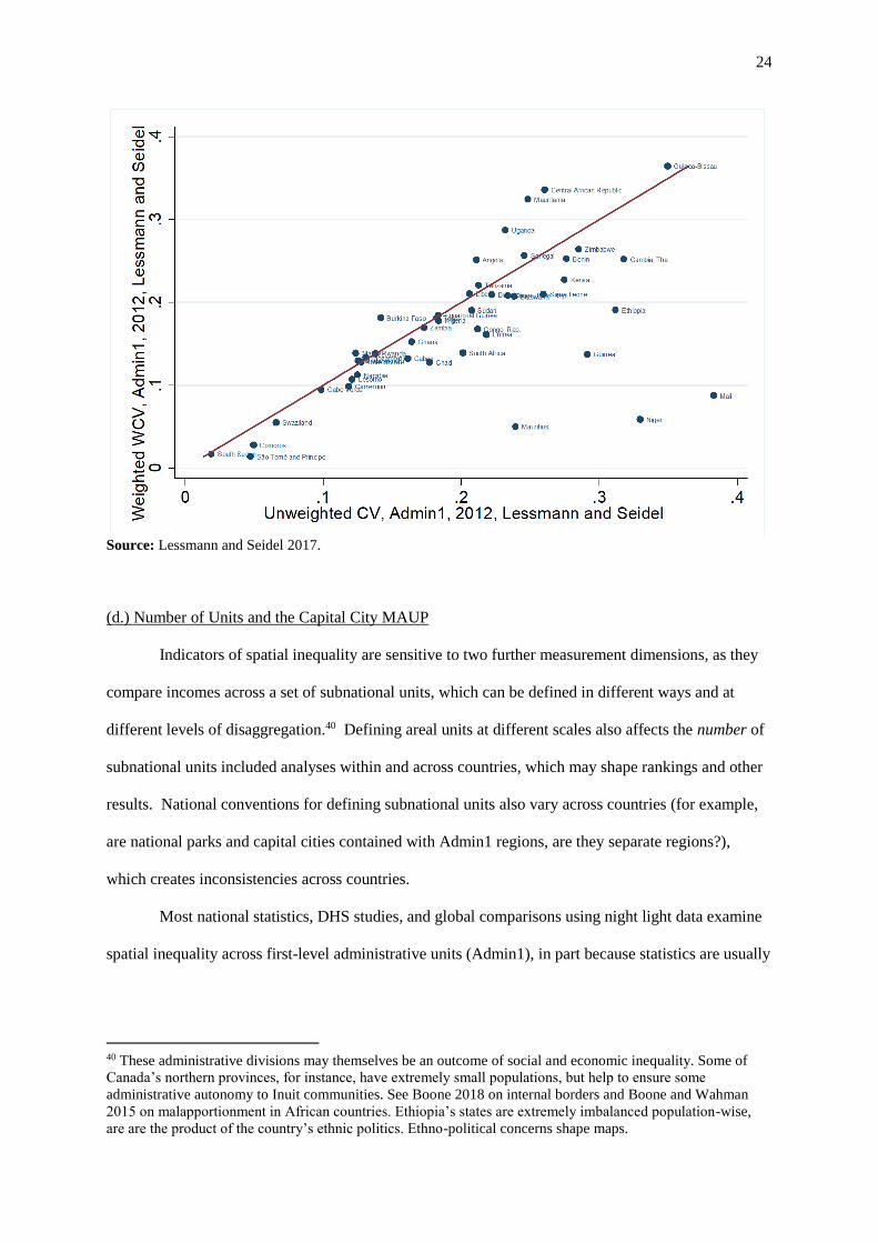
(d.) Number of Units and the Capital City MAUP
Indicators of spatial inequality are sensitive to two further measurement dimensions, as they
compare incomes across a set of subnational units, which can be defined in different ways and at
different levels of disaggregation.40 Defining areal units at different scales also affects the number of
subnational units included analyses within and across countries, which may shape rankings and other
results. National conventions for defining subnational units also vary across countries (for example,
are national parks and capital cities contained with Admin1 regions, are they separate regions?),
which creates inconsistencies across countries.
Most national statistics, DHS studies, and global comparisons using night light data examine
spatial inequality across first-level administrative units (Admin1), in part because statistics are usually
40 These administrative divisions may themselves be an outcome of social and economic inequality. Some of
Canada’s northern provinces, for instance, have extremely small populations, but help to ensure some
administrative autonomy to Inuit communities. See Boone 2018 on internal borders and Boone and Wahman
2015 on malapportionment in African countries. Ethiopia’s states are extremely imbalanced population-wise,
are are the product of the country’s ethnic politics. Ethno-political concerns shape maps.

25
aggregated at this level.41 Where possible, some also seek to use more granular second-level
administrative units (Admin2). Other studies have pioneered the use of politically-neutral borders for
purposes of measuring spatial inequality, primarily grid cells which divide the world into a web of
squares or equal size (Nordhaus, 2006). This has the advantage of applying a consistent geographic
unit across countries, but the disadvantage that it will by construction register higher inequality in
larger countries. Alternatively, Alesina et al. (2016) subdivide countries into ethnic ‘homelands’
based on geographic ethnic segregation.
A major measurement challenge is that inequality measures are sensitive to the number of
subnational units in a given country (see Novotny 2007 for a good discussion). Calculating a weighted
Gini across Kenya’s 8 historical provinces for instance, will give a lower score than if we used the 47
current counties; the same is true for Uganda, as shown in Table 5. Consequently, Kenya’s
constitutional change in 2010, which abolished the provinces and introduced counties as admin 1
units, thus meant that Kenya jumped in the spatial inequality ranking (see Table 5) , despite no actual
change in the spatial distribution of income.
Table 5. Spatial inequality in Kenya and Uganda using alternative subnational divisions
Country
Year of
survey
# subnatl
units WCV Theil
Gini
(spatial) CV
Kenya (province) 2015/16 8 0.33 0.04 0.16 0.42
Kenya (county) 2015/16 47 0.37 0.06 0.20 0.31
Uganda (region) 2016 5 0.40 0.06 0.19 0.58
Uganda (district
groups) 2016 16 0.42 0.07 0.21 0.47
Kenya (Capital
merged with Kiambu) 2015/16 46 0.35 0.06 0.20 0.29
Sources: see Appendix 1, Table E.
When using unweighted measures however, the effect of increasing the number of
subnational units is ambiguous. Normally, increasing the number of units will accentuate differences.
If, however, much of the variation in incomes is driven by one or a few extreme outliers, then
increasing the number of units of analysis may lower the observed level of spatial inequality. Kenya’s
41 However, the political significance of these units may differ across countries. In federal states, such as the
USA, the state-level is usually the first-level administrative unit, and holds considerable political autonomy,
while administrative units in a unitary state may hold less political relevance.

26
constitutional change created more first-level administrative units, but the richest region, Nairobi,
remained intact. This has the effect of diluting the Nairobi effect, which now only counts for one data
point among 47, rather than one among 8; consequently, the CV falls from .42 to .31 (Table 7).
However, the WCV increases from .33 to .37, thus registering the weight of this population-heavy
region in the national score.
The importance of subnational units can also be demonstrated by using Alesina et al’s (2016)
large dataset. Using nightlight data and unweighted spatial Ginis (which will accentuate differences
more than a weighted one) from this source, Figure 6 compares African country rankings by
inequality using different spatial units. The correlation between spatial inequality across
administrative units 1 & 2 (unweighted Gini) is strong (R2 = 0.6), although the shift to admin 2 units
universally increases the observed inequality. The correlation with 2.5 x 2.5 degree grid cells (Figure
7) is weaker (R2 = 0.25). As the number of grid cells is directly determined by the land area of a
country (N = 50 in Sudan, for eg.), larger countries will contain more subnational units, and thus on
average exhibit higher levels of inequality (Figure 8). (The correlation coefficients and significance
levels are reported in Appendix 1, Table F).
Figure 6. Correlation between unweighted night-light based spatial Ginis by country using
admin 1 and admin 2 units, 2012 (R2 = 0.6) (against 45° line)

27
Source: Alesina et al. 2016.
Figure 7. Correlation between unweighted night-light based spatial Ginis by country,
comparing Admin1 and 2.5 x 2.5 degree grid cells, 2012 (R2 = 0.25) (against 45° line)
Source: Alesina et al. 2016.
Figure 8. Correlation beween spatial Ginis by grid cell, and log of country area, 2012 (R2 = 0.46)

28
Source: Alesina et al. 2016; World Development Indicators 2018.
To tackle the problem of unit number, Lee and Rogers, building on Boschler (2010),
proposed an adjusted inequality measure that corrects for unequal numbers of subnational unit. Spieza
(2003: 3) proposes an alternative adjusted territorial Gini index, that divides the Gini by its maximum
value in a country. Novotny (2007) applies a simpler method, by dividing each country into the same
number of subnational units, but his study is limited to 46 countries, only four of which are in
Africa.42 However, the examples in Table 5 (p. 25, above) suggest that the number of units problem
has a marginal rather than radical effect on rankings, at least when using weighted measures.
Including some sensitivity analyses that set some upper and lower bounds to the spatial inequality
measures may also offer sufficient assurances that main results are not driven by subnational division
differences.
It is not merely the number of subnational units that influence the measured level of spatial
inequality. How subnational borders are drawn may also matter. Here the geographer's Modifiable
Areal Unit Problem (MAUP) is inescapable. As urban-rural income gaps often account for a big
42 See Lessmann and Seidel 2015 for their method(s) of dealing with heterogeneity in n. of subnational units.

29
share of spatial inequality, boundary divisions that separate urban metropolises from the surrounding
rural areas will give a higher observed level of inequality, than if these cities are amalgamated with
the surrounding areas. This led Novotny to conclude:
“the manner of partition into regions matters, and, therefore, in order to make a regional inequality measure
comparable, some basic principles of the socio-geographical regionalization have to be respected. In
particular, the regions within a unit which are being analysed should be contiguous and roughly comparable
according to the area size. In addition, the essentially functional nature of a socio-geographical region should
be taken into account, assuming the settlement centres (cities or metropolitan regions) should not, for
instance, be separated from their surrounding peripheries.” (p.566).
Administrative divisions (Admin1) do not necessarily respect these rules. The cases of
Zambia and Rwanda offer a useful comparison. Rwanda’s Kigali province neatly follows the borders
of the urban metropolis; in Zambia in contrast, Lusaka is grouped with a large surrounding rural area,
which lowers the average light per capita (Figure 9). All else being equal, Rwanda’s admin1 borders
will record higher inequality. These idiosyncratic, country-specific border choices are difficult to
correct for, although this may be possible by excluding capital cities and other main urban areas, or by
constructing hypothetical, alternative administrative units, that, for instance, group the capital with a
bordering rural region, that allow us to introduce some confidence intervals. (Appendix 1, Table D
tests these capital city border demarcations, using the cases of Kenya and Rwanda.)
Figure 9. Night light map of Rwanda and Zambia, showing Admin 1 borders.
Rwanda Zambia
Source: Database of Global Administrative Areas (GADM) 2018, (version 2.8) <https://gadm.org/index.html>
(28 December 2018).
30
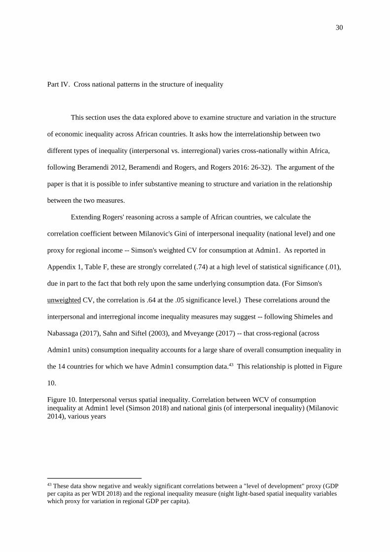
Part IV. Cross national patterns in the structure of inequality
This section uses the data explored above to examine structure and variation in the structure
of economic inequality across African countries. It asks how the interrelationship between two
different types of inequality (interpersonal vs. interregional) varies cross-nationally within Africa,
following Beramendi 2012, Beramendi and Rogers, and Rogers 2016: 26-32). The argument of the
paper is that it is possible to infer substantive meaning to structure and variation in the relationship
between the two measures.
Extending Rogers' reasoning across a sample of African countries, we calculate the
correlation coefficient between Milanovic's Gini of interpersonal inequality (national level) and one
proxy for regional income -- Simson's weighted CV for consumption at Admin1. As reported in
Appendix 1, Table F, these are strongly correlated (.74) at a high level of statistical significance (.01),
due in part to the fact that both rely upon the same underlying consumption data. (For Simson's
unweighted CV, the correlation is .64 at the .05 significance level.) These correlations around the
interpersonal and interregional income inequality measures may suggest -- following Shimeles and
Nabassaga (2017), Sahn and Siftel (2003), and Mveyange (2017) -- that cross-regional (across
Admin1 units) consumption inequality accounts for a large share of overall consumption inequality in
the 14 countries for which we have Admin1 consumption data.43 This relationship is plotted in Figure
10.
Figure 10. Interpersonal versus spatial inequality. Correlation between WCV of consumption
inequality at Admin1 level (Simson 2018) and national ginis (of interpersonal inequality) (Milanovic
2014), various years
43 These data show negative and weakly significant correlations between a "level of development" proxy (GDP
per capita as per WDI 2018) and the regional inequality measure (night light-based spatial inequality variables
which proxy for variation in regional GDP per capita).
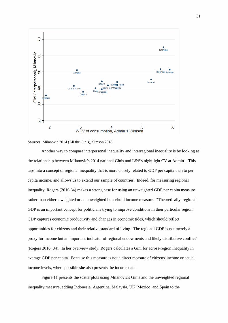
31
Sources: Milanovic 2014 (All the Ginis), Simson 2018.
Another way to compare interpersonal inequality and interregional inequality is by looking at
the relationship between Milanovic's 2014 national Ginis and L&S's nightlight CV at Admin1. This
taps into a concept of regional inequality that is more closely related to GDP per capita than to per
capita income, and allows us to extend our sample of countries. Indeed, for measuring regional
inequality, Rogers (2016:34) makes a strong case for using an unweighted GDP per capita measure
rather than either a weighted or an unweighted household income measure. "Theoretically, regional
GDP is an important concept for politicians trying to improve conditions in their particular region.
GDP captures economic productivity and changes in economic tides, which should reflect
opportunities for citizens and their relative standard of living. The regional GDP is not merely a
proxy for income but an important indicator of regional endowments and likely distributive conflict"
(Rogers 2016: 34). In her overview study, Rogers calculates a Gini for across-region inequality in
average GDP per capita. Because this measure is not a direct measure of citizens' income or actual
income levels, where possible she also presents the income data.
Figure 11 presents the scatterplots using Milanovic's Ginis and the unweighted regional
inequality measure, adding Indonesia, Argentina, Malaysia, UK, Mexico, and Spain to the
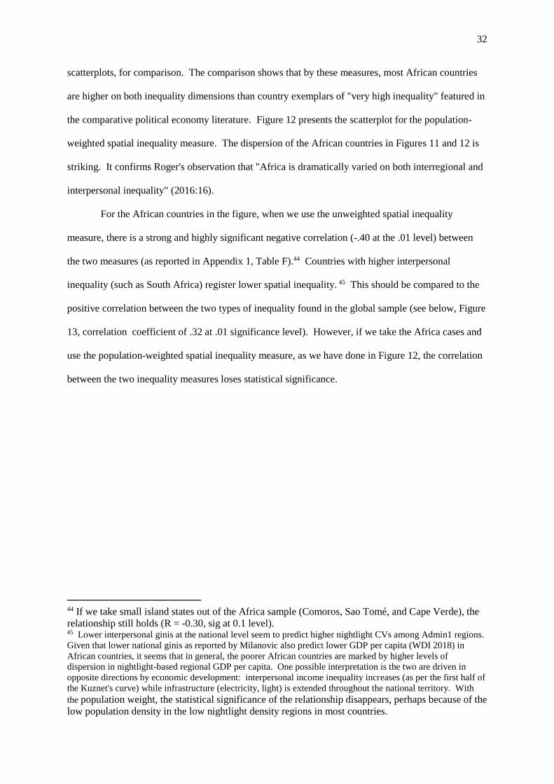
32
scatterplots, for comparison. The comparison shows that by these measures, most African countries
are higher on both inequality dimensions than country exemplars of "very high inequality" featured in
the comparative political economy literature. Figure 12 presents the scatterplot for the population-
weighted spatial inequality measure. The dispersion of the African countries in Figures 11 and 12 is
striking. It confirms Roger's observation that "Africa is dramatically varied on both interregional and
interpersonal inequality" (2016:16).
For the African countries in the figure, when we use the unweighted spatial inequality
measure, there is a strong and highly significant negative correlation (-.40 at the .01 level) between
the two measures (as reported in Appendix 1, Table F).44 Countries with higher interpersonal
inequality (such as South Africa) register lower spatial inequality. 45 This should be compared to the
positive correlation between the two types of inequality found in the global sample (see below, Figure
13, correlation coefficient of .32 at .01 significance level). However, if we take the Africa cases and
use the population-weighted spatial inequality measure, as we have done in Figure 12, the correlation
between the two inequality measures loses statistical significance.
44 If we take small island states out of the Africa sample (Comoros, Sao Tomé, and Cape Verde), the
relationship still holds (R = -0.30, sig at 0.1 level). 45 Lower interpersonal ginis at the national level seem to predict higher nightlight CVs among Admin1 regions.
Given that lower national ginis as reported by Milanovic also predict lower GDP per capita (WDI 2018) in
African countries, it seems that in general, the poorer African countries are marked by higher levels of
dispersion in nightlight-based regional GDP per capita. One possible interpretation is the two are driven in
opposite directions by economic development: interpersonal income inequality increases (as per the first half of
the Kuznet's curve) while infrastructure (electricity, light) is extended throughout the national territory. With
the population weight, the statistical significance of the relationship disappears, perhaps because of the
low population density in the low nightlight density regions in most countries.

33
Figure 11. Correlation between interpersonal (Milanovic Gini) and spatial inequality 2012 (Lessmann
and Seidel) unweighted coefficient of variation, including other high inequality comparators.
Sources: Milanovic (All the ginis) 2014; Lessmann and Seidel 2017.
Discussing her own global data set, Rogers writes that "the weak association between these
indicators of inequality suggests that countries often deviate in their patterns of inequality -- these
indicators represent distinct distributional conflicts within a nation" (2016: 27). This inference may
hold for African countries as well -- we would expect these differences to find expression in different
kinds of societal mobilization, and expect different types of state efforts to manage different kinds of
societal tensions.
Following Rogers and applying her analytic strategy to our own data for the African
countries,46 we can imagine four quadrants in the cartesian space that is depicted in Figure 11. Doing
this, we see countries with
-- countries with high interpersonal and relatively low interregional inequality (South Africa,
Namibia, Lesotho, Zambia, Rwanda, and South Africa),
46 If we had the L&S Gini (unweighted) for Admin1 nightlight, rather than the CV, we could bring this even
more in line with Rogers 2016: 26-31.
34
-- relatively low interpersonal and low interregional economic inequality (Ghana, Cameroon,
Côte d'Ivoire),
-- high interpersonal and high spatial inequality (CAR and Botswana), and
-- the low interpersonal but high spatial inequality countries (Uganda, Sudan before partition,
Ethiopia, Benin, Tanzania47).48
At opposite extremes of Figure 11, one does recognize countries pulled by different kinds of
distributional tensions. There are countries whose politics are dominated by class-like tensions around
interpersonal income distribution (South Africa), and countries in which interregional tensions run
very high and define a dominant line of political cleavage (Uganda, Sudan, Ethiopia). Cameroon is a
case in which the overall spatial distribution of economic activity appears fairly even, perhaps
generating some insight into why the highly skewed distribution of political power, which deprives
the economically developed West of political voice, is so intensely and vigorously contested by
parties and organized civil society in the West (and met by state repression).
If we use the population weighted data instead, some countries migrate to different cells in
this typological space. See Figure 12. This leads to different, perhaps refined, political inferences.
Niger and Mali, two large and sparsely populated countries, flip to the left side of the Cartesian space
and the apparent significance of spatial or territorial inequality drops. South Africa, a large country
that is heavily urbanized, also moves to the left (ie., the apparent significance of spatial inequality
drops). For the Sahelian countries, both battling insurgencies since the 1990s in the arid and sparsely
populated zones, the population-weighted data seem to erase valuable information about the
distribution of political power across space. Armed rebels in difficult-to-govern zones, even if they
are relatively few in number, can have a huge impact on national politics. The rebels control territory
but not large populations -- in this kind of situation, there is an inverse relationship between power
over territory and power over population. For South Africa, by contrast, using the population weight
seems to help us understand better the spatial distribution of political power. In a highly urbanized
47 Mainland Tanzania has a relatively large number of subnational units (21); this may work to inflate the CV at
Admin1 observed in the cross national comparisons. 48 Rogers 2016: 31 writes that "Africa is dramatically varied on both interregional and interpersonal inequality.
... Take three examples: Sudan prior to partition (high interregional, low interpersonal), South Africa (high
interregional, high interpersonal), Namibia or Zimbabwe (extremely high interpersonal, low interregional
inequality)."

35
country that is an electoral democracy, political power comes from control over voters in populous,
urbanized regions, not from control over large sparsely-populated spaces (although deliberate
electoral malapportionment offsets the population advantage in South Africa, as in the US). This
contrast underscores the effect of information about cross-national or even subnational differences in
types of political power, regime type, and structure of political institutions on the inferences we draw
from this data.
Figure 12. Milanovic Gini of Interpersonal Inequality vs. Lessmann & Seidel 2012, using weighted
CV
Sources: Milanovic (All the ginis) 2014; Lessmann and Seidel 2017.
Stepping back, we see in both Figure 11 and Figure 12 a cloud of data points around the
middle of the 2x2 space, at a comparatively high level of both spatial and interpersonal inequality by
global standards. This reinforces the argument in Section 1, above, that many African countries are
marked by both high interpersonal inequality and high interregional inequality. Yet this analysis in
this section has shown that there is some striking variation across African countries in the structure
and dynamics of inequality. Based on a smaller sample of African countries, Rogers argued that "the
dynamics do not appear to be regionally characterized but instead driven by level of development and
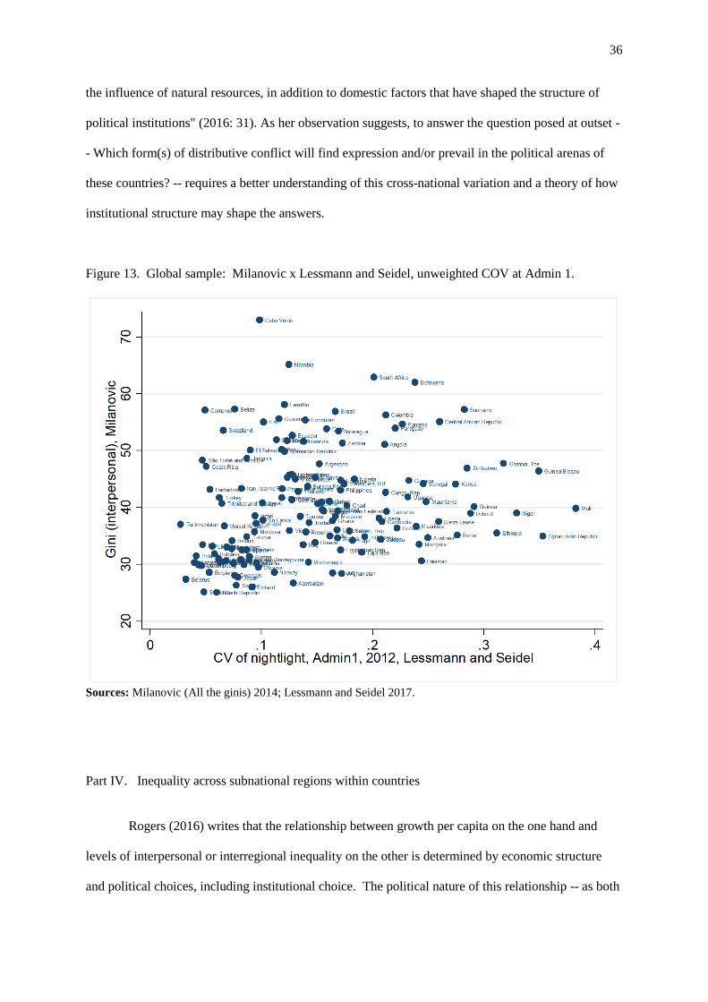
36
the influence of natural resources, in addition to domestic factors that have shaped the structure of
political institutions" (2016: 31). As her observation suggests, to answer the question posed at outset -
- Which form(s) of distributive conflict will find expression and/or prevail in the political arenas of
these countries? -- requires a better understanding of this cross-national variation and a theory of how
institutional structure may shape the answers.
Figure 13. Global sample: Milanovic x Lessmann and Seidel, unweighted COV at Admin 1.
Sources: Milanovic (All the ginis) 2014; Lessmann and Seidel 2017.
Part IV. Inequality across subnational regions within countries
Rogers (2016) writes that the relationship between growth per capita on the one hand and
levels of interpersonal or interregional inequality on the other is determined by economic structure
and political choices, including institutional choice. The political nature of this relationship -- as both

37
a driver of politics and as an effect of policy and constitutional design -- resonates in the UNRISD
flagship report for Africa for 2010, which argued that the regional concentration of poverty (i.e.,
concentration within certain subnational regions) was one of the most difficult challenges facing
countries in sub-Saharan Africa. Whether, and to what extent, government policy targets
interregional inequality, interpersonal inequality, both, or neither is an eminently political outcome.
This is especially true because in a practical sense, governments often face a choice (trade-off) over
which of these inequalities to tackle (as stressed by Rogers 2016 and Beramendi 2012). This trade-off
can drive not only the types of politics that are normally categorized as redistributive or social
policies, but also growth policies writ large, given that these often have spatially- and socially-uneven
effects that are obvious in African (and other) countries.
This section uses the data explored above to examine structure and variation in economic
inequality within African countries. The night light intensity data and the consumption data offer
ways of measuring and comparing the relative wealth of regions within a country. This kind of
analysis also provides additional information about cross-national variation in inequality structure and
dynamics.
In a series of country-level figures presented below, we move to the country level to compare
Lessmann and Seidel’s night light-based proxy for GDP per capita for Admin1 regions with Simson's
survey-based average consumption per capita for the same geographical units. Results are presented
for eight countries for which it was possible to match Admin1 regions across datasets.49 Note that the
nightlight proxy for regional GDP per capita is in US$; the scale varies from one figure to another.
49 The consumption data are presented in Appendix 2, Table 1. Sources are: Zimbabwe: Zimbabwe National
Statistics Agency, Poverty, income consumption and expenditure survey 2011/12 report, Harare 2013; Zambia:
2015 Living Conditions Monitoring Survey Report; Namibia: Namibia Household income and Expenditure
Survey Report 2015/16; Rwanda: The evolution of poverty in Rwanda from 2000 to 2011: Results from the
household surveys (EICV) (2012); Malawi: Integrated Household Survey 2010/11: Household Socio-Economic
Characteristics Report (2012); Uganda: Uganda National Household Survey 2016/17 Report; Burkina Faso:
Enquête Multisectorielle Continue 2014 [dataset]; Cameroon: Troisieme Enquete Camerounaise Aupres des
Menages: Tendances, profil et déterminants de la pauvreté au Cameroun entre 2001-2007 (2008); Tanzania:
Household Budget Survey 2010/11 [dataset]; Kenya: Integrated Household Budget Survey 2015/16 [dataset];
Mali: World Bank, Geography of Poverty (2015); Ghana: Ghana Living Standard Survey Round 6: Main Report
(2015); Angola: Inquérito Integrado Sobre o Bem-Estar da População, vol 2 (2011); Cote d’Ivoire: Enquête
Niveau de Vie des Ménages 2015: Rapport définitif; Ethiopia: Household Consumption and Expenditure Survey
2010/11 Report.

38
The regional GDP per capita for Kampala region in Uganda of about $1,600 does not even appear on
the Namibia scale, the lower limit of which is $5,000.
These countries are highlighted in Figure 14: Namibia, Zambia, Kenya, Tanzania, Uganda,
Ethiopia, Mali, Zimbabwe.
Figure 14. Correlation between interpersonal (Milanovic Gini) and spatial inequality 2012 (Lessmann
and Seidel) unweighted coefficient of variation, including other high inequality comparators.
Sources: Milanovic (All the ginis) 2014; Lessmann and Seidel 2017.
These plots reveal cross-country variation in the extent and structure of regional inequality
within countries: there is variation in (a.) the level of correlation between the two measures, (b.) how
much dispersion, unimodality, or multipolarity there is across regions, with and without the region
containing the capital city, (c.) the magnitude of the gaps between regions or clusters, and (d.) the
presence of outliers other than the expected outlier, which is the capital-city region.
For five of the eight countries, the correlation between the two inequality measures is very
strong and highly statistically significant. For Ethiopia, Uganda, Zimbabwe, and Zambia, and Kenya
39
at the level of the former provinces,50 the coefficient of correlation (r) is above 0.8 and significant at
the .01 level (L&S 2010 data does not cover the new Admin1 regions created in Kenya in 2013).
Strong correlations suggest that (a.) the dispersion in regional patterns of economic development is
reflected in cross-regional variation in living standards, (b.) put differently, where you live is a good
predictor of your living standards; (c.) at the Admin1 level, nightlight per capital is a good proxy for
average consumption in these countries. For Tanzania, Mali, and Namibia, the correlations are
weaker and not statistically significant, perhaps reflecting in part more extreme unevenness in both
population distributions and urban settlement patterns in these countries. In this analysis, no
substantive meaning is attributed to the relationship between nightlight and consumption -- rather, for
now, these are taken as two distinct but in general, broadly complementary measures of regional
wealth/economic development. As argued above, the types/sources of errors in the two indicators are
likely to be very different, so where the two are strongly correlated and thus give a fairly consistent
regional ranking, confidence is enhanced.
For all eight countries, the consumption per capita data shows much greater range than the
night light-based GDP per capita predictions, and the discussion which follows emphasizes this aspect
of the scatterplots. Namibia, Uganda, Zambia, and Zimbabwe (Figures 15 a-d) display highest
dispersion in levels of consumption across Admin1 regions. Kenya and TZ fall in the middle of the
range. The lowest dispersion in consumption levels is recorded in Mali and Ethiopia.51 All these
countries are marked by "uneven development," but the unevenness -- measured by both the gap
between the capital city region and the rest, and by the gaps between the regions that are, with only a
few exceptions, predominantly or overwhelmingly rural -- is most extreme in Namibia, Uganda,
Zimbabwe, and Zambia. The discussion of the eight cases will focus on this source of variation.
50 Uganda’s first level administrative units are at the district level. To give a manageable number of
administrative units, districts have been grouped into sub-regions, using the groupings from (with the addition
of Wakiso): Uganda Bureau of Statistics (2018), Uganda National Household Survey 2016/17 report, p.4.In
Uganda, Wakiso district encircles Kampala; it could be considered part of a Kampala "region." 51 See also the max/min ratios in Appendix 2, Table 1, Col. 5.

40
Figure 15: Scatter plots comparing predicted GDP per capita (based on adjusted night light intensity),
with consumption per capita, across Admin1 units (Pearson’s correlation coefficient (R) reported.)
(a)
Namibia 2012 (R = 0.42)
(b)
Uganda52 2016 and 2012 (R =0.89***)
Sources: Predicted GDP per capita: Lessmann and Seidel 2017; Consumption, see Appendix 1, Table E.
***p < .01 **p < .05 *p < .10.
(c)
Zambia (2012 and 2015)53 (R = 0.96***)
(d)
Zimbabwe 2012 (R = 0.97***)
Sources: Predicted GDP per capita: Lessmann and Seidel 2017; Consumption, see Appendix 1, Table E.
***p < .01 **p < .05 *p < .10.
The Namibia case is set apart from the others by the relatively high level of nightlight-proxied
GDP per capita in all regions, and the great dispersion/diffusion in nightlight across Admin1 regions
(Figure 15a).54 The observed pattern suggests a very high level of infrastructure development in
Namibia (compared to other African countries), combined with very high concentration of the rural
population in the poorest but still relatively well-lit regions of the N. and NE, along Namibia's border
52 Uganda’s predicted GDP per capita by district has been aggregated up into the 16 district groupings used in
the household survey, Lake Albert and Victoria excluded (weighted using 2002 population census). 53 Consumption per capita measured in 2015, predicted GDP per capita in 2012. 54 The correlation coefficient is .41 but is not statistically significant.

41
with Angola (all on the left [low av. consumption] side of Figure 15a).55 The wealthiest rural regions
of Namibia are in the S., where population density is low, and have average consumption levels that
are four times what they are in Namibia's poorest regions. By the national Gini coefficient (Milanovic
data), Namibia is one of the most unequal countries in the world.
In Uganda, Kampala and the region surrounding it, Wakiso, register average consumption
levels that are five times the levels prevailing in the poorest regions of the north. Yet the gap between
the south-central and southwestern regions and the north is also very large -- consumption levels are
the double of what they are in the north (and probably higher given that this measure underestimates
consumption in wealthier regions). There does not appear to be a large wealth gap between the rural
south-center and southwestern regions.
Zimbabwe also has a north-south divide. Removing the two main cities from the picture, the
regions of the north are about 50% richer than those of the south, measured by consumption. The
rural south is less well lit; the nightlight per capita measure we are using here probably attenuates our
perception of this relative deprivation given that the south is also less populous. Bulawayo, the
country's second city, is the "capital" of the south. This makes Zimbabwe's geopolitical structure bi-
polar.
In the distribution of wealth in Zambia, Lusaka and the Copperbelt dominate, with
consumption levels 3-4 times those of the poorest regions by our measure. However the other line-of-
rail Admin1 regions, Central and Southern, appear to have consumption levels twice those of the
poorest regions. Western is as poor as Luapula and Northern, by these measures.
Although mainland Tanzania's statistically significant correlation of 0.76 is driven by one
outlier, Dar es Salaam (Figures 16a and b), the data do capture considerable variability in
consumption per capita across the rural areas at Admin1.56
55 See Government of Namibia [John Mendelsohn], Central Bureau of Statistics, An Atlas of Namibia's
Population, Windhoek, 2010, p. 35. 56Without Dar, the coefficient falls to .2 and is not significant.

42
Figure 16: Tanzania: Scatter plots comparing predicted GDP per capita (based on adjusted night light
intensity), with consumption per capita, across Admin1 units
(a)
Tanzania (Mainland) 2011 (R = 0.76***).
(b)
Tanzania (Mainland), Excluding Dar es Salaam,
2011 (R = 0.20)
Sources: Predicted GDP per capita: Lessmann and Seidel 2017; Consumption, see Appendix 1, Table E.
***p < .01 **p < .05 *p < .10.
As for Kenya (Figure 17). at the level of the former provinces57 there is a very strong
dispersion in the wealth indicators, even if we take Nairobi out of the picture. Using the alternative
measure of GDP per Admin1 provided by Bundervoet et al. for the post-2013 period (when the
number of Admin1 units went from 8 to 47), the very large wealth gaps across the new Kenyan
counties are evident.
57 In figure 17(b), we plot data at county-level rather than provincial level (which increases the number of
subnational units from 8 to 47) against an alternative source of nightlight-predicted GDP per capita at Admin1,
Bundervoet et al. (2015). In a study of growth and estimated GDP across subnational regions in Kenya and
Rwanda, Bundervoet et al. used a method of adjusting night light data to proxy for GDP per capita that differs in
important respects from that of Lessmann and Seidel: they adjusted the measures to take better account of the
(hitherto underestimated) share of agriculture in regional GDP. As depicted in Figure 3(j), this gives a highly
significant (.01) correlation between county-level predicted GDP and the authors' consumption data (coefficient
of R = 0.65).

43
Figure 17: Kenya: Scatter plots comparing predicted GDP per capita (based on adjusted night light
intensity), with consumption per capita, across Admin1 units
(a)
Kenya (former province-level) 2016 and 2012 (R =
0.91*)
(b)
Kenya (county-level) 2015 (R = 0.65*)
(c) Kenya (county-level) 2015/16 – expanded view of bottom left quadrant
Sources: Predicted GDP per capita, provincial level: Lessmann and Seidel 2017; Predicted GDP per capita, county level,
Bundervoet et al. 2015; Consumption, see Appendix 1, Table E.
In Ethiopia and Mali, the dispersion in the consumption scores is less stark. In Ethiopia
(Figure 18), Addis is the capital and the wealthy regions of Haran and Dire Dawa are chartered cities.
The wealth gap between these cities and the other regions of the country is less extreme than those
observed in the countries discussed above. Across these other regions, consumption in the wealthiest
is about 50% higher than it is in the poorest -- about the same spread observed across the macro-
regions of Zimbabwe.
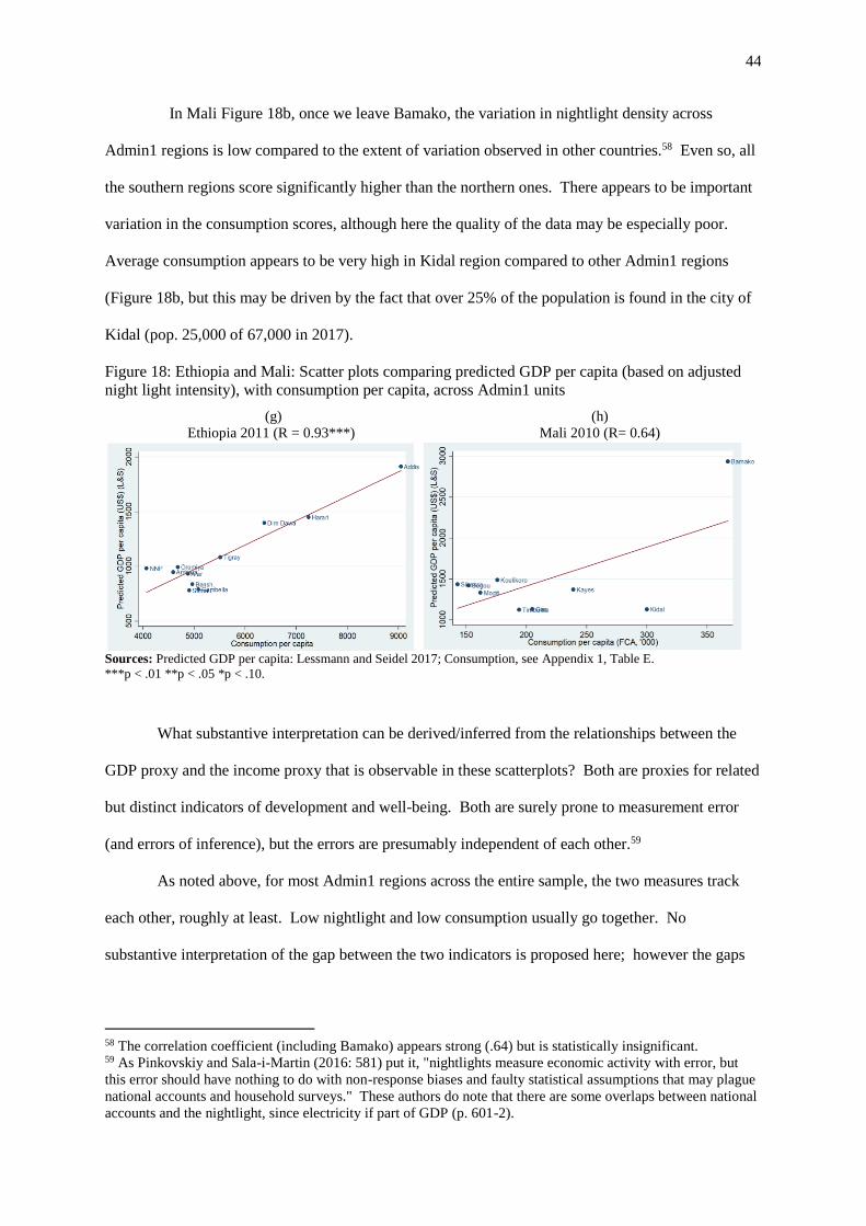
44
In Mali Figure 18b, once we leave Bamako, the variation in nightlight density across
Admin1 regions is low compared to the extent of variation observed in other countries.58 Even so, all
the southern regions score significantly higher than the northern ones. There appears to be important
variation in the consumption scores, although here the quality of the data may be especially poor.
Average consumption appears to be very high in Kidal region compared to other Admin1 regions
(Figure 18b, but this may be driven by the fact that over 25% of the population is found in the city of
Kidal (pop. 25,000 of 67,000 in 2017).
Figure 18: Ethiopia and Mali: Scatter plots comparing predicted GDP per capita (based on adjusted
night light intensity), with consumption per capita, across Admin1 units
(g)
Ethiopia 2011 (R = 0.93***)
(h)
Mali 2010 (R= 0.64)
Sources: Predicted GDP per capita: Lessmann and Seidel 2017; Consumption, see Appendix 1, Table E.
***p < .01 **p < .05 *p < .10.
What substantive interpretation can be derived/inferred from the relationships between the
GDP proxy and the income proxy that is observable in these scatterplots? Both are proxies for related
but distinct indicators of development and well-being. Both are surely prone to measurement error
(and errors of inference), but the errors are presumably independent of each other.59
As noted above, for most Admin1 regions across the entire sample, the two measures track
each other, roughly at least. Low nightlight and low consumption usually go together. No
substantive interpretation of the gap between the two indicators is proposed here; however the gaps
58 The correlation coefficient (including Bamako) appears strong (.64) but is statistically insignificant. 59 As Pinkovskiy and Sala-i-Martin (2016: 581) put it, "nightlights measure economic activity with error, but
this error should have nothing to do with non-response biases and faulty statistical assumptions that may plague
national accounts and household surveys." These authors do note that there are some overlaps between national
accounts and the nightlight, since electricity if part of GDP (p. 601-2).

45
may be explainable in terms of particular or idiosyncratic factors on a country-by-country or region-
by-region basis.
The variation across Admin1 regions in terms of average nightlight and consumption, even
once we exclude regions containing capital cities, is striking. This gives substance to the argument in
Part 1 about the extent of spatial inequality across the "rural areas" [ie., excluding regions containing
capital cities] of African countries and also provides grounds for proposing ways to conceptualize
variation in the structure of difference across predominantly rural or "upcountry" regions, and
speculating about the political implications thereof. All countries in the sample except Ethiopia and
Mali (if we exclude Kidal) have some rural Admin1 regions that are, by the consumption data, on
average at least "twice as wealthy" as other Admin1's. The spread is even greater than this in
Namibia and Kenya. This suggests that the gap in living standards in these African countries is not
only an urban-rural reality, but also a rural-rural reality.
If we could view the data on geographic poverty maps, we would see that poverty is clustered
in contiguous Admin1's (ie., subnational macro-regions or "natural regions") in some countries. In
Uganda, the poorest Admin1 regions are all in the northern half of the country. In Namibia, the
poorest are clustered in the north. In Kenya, the poorest Admin1 regions are all in the far north. In
Zimbabwe, the poorest Admin1's are clustered in the south. In Ethiopia, the poorest regions are on
the eastern and western peripheries of the country. In Mali, the poorest regions are in the north. In
Tanzania, the poorest regions are on the country's southern and western periphery.
These figures and maps may provide a backdrop for analyzing how relationships between
population, territory, and uneven development shape contestation over the distribution/use of political
power. The poorest regions have not lead opposition politics on their own (except perhaps for the
insurgency in northern Uganda, but it did not contest control of the national center). Relatively
wealthy Admin1 regions dominate (Ethiopia, Tigray; Kenya, Central) or are epicenters of
opposition/dissident politics in Tanzania (Manyara, Arusha), Uganda (Central I and II), Zambia
(Southern), Kenya (Mombasa/Coast + Nyanza). In Ethiopia, opposition comes from Oromia, which
is not relatively wealthy but is not the poorest. In Zimbabwe, Bulawayo, the country's second most
important urban center, is the "capital" of the poorest region of the country (the southern Admin1's of
46
Matabeleland N, Matabeleland S, Masvingo, Manicaland), all of which voted en bloc for the
opposition MDC in the first round of the 2008 national elections. (Could eventually color-code the
dots by macro-region.)
Conclusion
In comparing across subnational units at the Admin1 level, nightlight-based proxies for GDP
per capita and survey-based average consumption data, taken together, provide ways of describing
structure and variation in spatial inequality across and within African countries. Yet as we have
shown above, comparisons are sensitive to the source of data, definition of spatial units, and type of
inequality to be measured. Country rankings (and rankings of subnational regions within one
country) are sensitive to the choice of data type and indicator, especially to the decision to use
population weights for the cross-regional inequality measures. Different measures sometimes
generate different region-by-region rankings and depictions of the magnitude of disparities. Attempts
to circumvent the statistical deficiencies of survey and national accounts data in Africa by using night
light intensity provide a useful handle on cross- and sub-national comparisons, especially when
combined with consumption data, but they do not remove all ambiguity of meaning or all the
problems that affect the consumption and asset data that have been conventionally used for within-
country comparisons in Africa. Systematic cross-national comparisons of inequality levels within
Africa, along with reliable measures of the precise direction and inflection points of trends over time,
remain elusive. Triangulating across measures does offer strategies for generating different types of
knowledge about inequality patterns, and for enhancing the robustness of descriptions and
comparisons.
This means that for causally-motivated statistical analysis of inequality-driven political
dynamics at either the national or cross national level, the challenges remain. Admin1 units are
probably too large (and too few per country), and these inequality measures are too indirect, range too
widely across countries (nightlight-based GDP per capita estimates for the richest rural regions of
Kenya and Uganda are less than half of what they are for the poorest of the poor rural regions of
Namibia), and in the case of the consumption data, too imprecise or difficult-to-compare cross-

47
nationally. These challenges are compounded by difficulties of conceptualization and measurement
on the "outcome" side of the equation.
For descriptive inference, however, the possibilities are considerable, and these open new
paths for understanding political dynamics in African countries. Our analyses reveal both structure
and variation in inequality patterns across and within African countries. While the predominantly
rural districts of African countries are almost all poor, there is substantial variation in levels of wealth
and economic development across predominantly rural districts in all countries. For many African
countries, inequality in average consumption levels across Admin1 regions appears to account for a
predominant share of interpersonal or household consumption inequality as measured in the national
income Gini, but for some, the opposite appears to be the case.60
These subnational patterns have not been leveraged analytically in the existing African
politics literature. Yet African countries' spatial inequalities appear to be at least as stark as those in
the textbook cases of high spatial inequality in the comparative political economy literature (Spain,
USA, Mexico, Argentina). Structure and variation in Africa is also isomorphic to the structural
economic relations (between interpersonal and interregional inequality) that have been found to
underlie dimensionality in preference space in a large comparative political economy literature that
examines regional representation and competition, collective action and preference-aggregation
problems, and national policy-making dynamics in territorially-divided OECD and middle-income
countries (Bolton and Roland 1997; Beramendi 2007, 2011; Rogers 2017, Gibson 2004).61
For some political science questions, the most important data have to do with wealth (well-
being, opportunity) ratios within countries, along with how patterns of advantage and disadvantage
and distributed in space. Stewart, Brown, and Mancini (2005) and Schakel (2011: 639) echo this
point, arguing that the measures of relative advantage/disadvantage within countries are most relevant
60 There is also evidence to suggest that rural Admin1 and Admin2 units are themselves marked by higher levels
of inequality than we have previously supposed. We have not mobilized the nighlight and consumption data at
the Admin1 level that we would need to explore this for this working paper. 61 However one could say that these axes of cross- and within-region inequality are the backbone of a long
tradition of work on rural Kenya, epitomized by Berman and Lonsdale 1992, Oucho 2002, Kanyinga 2009, and
Lynch 2011. See also Dozon 1985 and Kim, 2018.
48
for "territorial cleavages" studies of political dynamics.62 Yet in pursuing this line of analysis,
answers to some of the most critical questions will hinge on how territorial inequalities interact with
subnational and national institutional structure to shape politics around issues that that have strong
distributive and redistributive implications and effects ( as emphasized by Beramendi 2012 and
Rogers 2016).
For the study of the political dynamics of territorial or spatial inequality in Africa, moving
forward would require advances on two fronts. One involves extending this type of CPE analysis to
forms of distributive and redistributive policies that are salient in African countries (including land
policy). Another involves analysis of the relationship between the spatial inequalities described here
at the Admin1 level and other institutions of government/national administration and political
representation. Such undertakings could help link earlier studies of uneven development and its
political causes and effects in Africa to newer comparative political economy literatures on territorial
politics. It would also contribute to generalizing and/or deepening work on spatial inequality and
territorial dynamics in Africa as sketched out by Azam 2001, 2008; Kraxberger 2005; Boone 2014,
for example.
62 This intuition is consistent with Ostby et al.'s (2009) study of territorial conflict in Africa: it relies on a within-
country Regional Relative Deprivation (RRD) measure. It is based upon DHS HH asset data for 22 African
countries, 1986-2004. see Lessmann 2013: 8 n. 5, which discusses their measure and formula for calculating.

49
Reference List
Alesina, A., S. Michalopoulous, and E. Papaioannou. 2014. "Ethnic Inequality," unpublished paper October
2014 (see an earlier version at NBER Working paper 18512, November 2012).
Alesina, A., S. Michalopoulous, and E. Papaioannou, 2016, “Ethnic Inequality,” J. of Political Economy 124/2:
428-88.
Alvaredo, Facundo, Lucas Chancel, Thomas Piketty, Emmanuel Saez, and Gabriel Zucman. 2017. “World
Inequality Report 2018.” World Inequality Lab, 2017.
Anand, Sudhir and and Paul Segal. 2008. What do we know about global income inequality?
American Economic Association, 46/1 (March): 57-94.
Anselin, L. 1988. Spatial Econometrics: Methods and Models. (Dorddrecht: Kluwer Academic Publishers).
Arriola, Leonardo. 2013. Multiethnic Coalitions in Africa: Business Financing of Opposition Elections
(Cambridge U. Press).
Atkinson, A. B. 2015a. “Top Incomes in East Africa Before and After Independence”, WID.world Working
Paper, 2015/2
Atkinson, A. B. 2015b. “The Distribution of Top Incomes in Former British West Africa”, WID.world Working
Paper, 2015/3.
Atkinson, A.B., 2015c. Inequality: what can be done?, Cambridge and London: Harvard University Press.
Azam, Jean Paul. 2001. "The Redistributive State and Conflicts in Africa," Journal of Peace Research 38/4
(2001): 429-444.
Azam, Jean Paul. 2008. "The Political Geography of Redistribution," in B. Ndulu et al., The Polit. Econ. of
Economic Growth in Africa, 1960-2000 (Cambridge U. Press,), pp. 225-248
Beegle, Kathleen, Luc Christiaensen, Andrew Dabalen, and Isis Gaddis. 2016. “Poverty in a Rising Africa.”
Washington D.C.: World Bank.
Beramendi, Pablo. 2007. "Inequality and the Territorial Fragmentation of Solidarity," International
Organization 61 (Fall): 783-820.
Beramendi, Pablo. 2014. The Political Geography of Inequality: Regions and Redistribution, Cambridge
University Press, 2104.
Beramendi, Pablo and Melissa Rogers. 2015. "Geography, Capacity and Inequality." A draft paper presented at
the 22nd International Conference of Europeanists, Paris, 26 July.
Boone, Catherine. 2003. Political Topographies of the African State: Territorial Authority and
Institutional Choice (Cambridge University Press).
Boone, Catherine. 2007. "Africa's New Territorial Politics: Regionalism and the Open Economy in Côte
d'Ivoire," African Studies Review, vol. 50, n. 1 (April 2007): 59-81.
Boone, Catherine and Michael Wahman. 2015. "Designing Electoral Institutions in Africa: Malapportionment
and Rural Bias," Electoral Studies 40: 335-346.
Boone, Catherine Kostadis Papaiouannou. 2017. "Night Light Density and Wealth in Africa," LSE, unpub. ms.,
April.
Bourguignon, François. 2015. "Appraising Income Inequality Databases in Latin America." J. Econ. Inequality.
13: 557-578.

50
Bowden, Sue, Blessing Chiripanhura, and Paul Mosley. 2008. "Measuring and explaining poverty in six African
countries: A long‐period approach." Journal of International Development: The Journal of the Development
Studies Association 20, 8: 1049-1079.
Brown, Graham and Arnim Langer. 2009. Spatial and Ethnic Inequalities and Development: Country
Experiences. Geneva: UNRISD (April).
Bundervoet, Tom Laban Maiyo and Apurva Sanghi. 2015 ‘Bright Lights, Big Cities: Measuring National and
Subnational Economic Growth in Africa from Outer Space, with an Application to Kenya and Rwanda,’ World
Bank Policy Research Working Paper 7461
Chen, Xi and William Nordhaus. 2011. “Using luminosity data as a proxy for economic statistics. Proceedings
of the National Academy of Sciences” 108, 21: 8589–8594.
Chen, Xi and William Nordhaus. 2015. ‘A sharper image? Estimates of the precision of nighttime lights as a
proxy for economic statistics’, Journal of Economic Geography 15: 217–246.
Deaton, Angus. 2005. Measuring Poverty in a Growing World (or measuring growth in a poor
world). Review of Economics and Statistics, vol. 87/1 (February):1-19.
Easterly, William and Ross Levine. 1997. “Africa's growth tragedy: policies and ethnic divisions”, Quarterly
Journal of Economics, November: 1203-50.
Ebener, S., C. Murray, A. Tandon, and C. C. Elvidge. 2005. From wealth to health: modelling the distribution of
income per capita at the sub-national level using night-time light imagery. International Journal of Health
Geographics 4(1).
Elvidge, C., K. Baugh, S. Anderson, P. Sutton, and T. Ghosh .2012. “The night light development index (nldi):
a spatially explicit measure of human development from satellite data.” Social Geography 7(1).
Erickson, Lennart and Dietrich Vollrath. 2004. Dimensions of Land Inequality and Economic Development,
IMF Working paper WP/04/158. Washington DC: International Monetary Fund. ( Land-holding Ginis, p. 4,
15.)
Ferreira, Francisco H. G., Nora Lustig, and Daniel Teles. 2015. “Appraising Cross-National Income Inequality
Databases: An Introduction.” The Journal of Economic Inequality 13, 4: 497–526.
Galbraith, James. Inequality and Instability: A Study of the World Economy Just before the Great Crisis. New
York: Oxford University Press, 2012.
Gennaioli, Nicola, Rafael La Porta, Florencio De Silanes and Andrei Shleifer. 2014. “Growth in regions,”
Journal of Economic Growth 19, 259-309
Gennaioli, Nicola, and Ilia Rainer. 2007. “The Modern Impact of Precolonial Centralization in Africa,” Journal
of Economic Growth, 12, 3: 185-234.
Gibson, E. 2004
Hakura and Deitrich, Inequality in SSA, IMF 2015
Harttgen, Kenneth, Stephan Klasen, and Sebastian Vollmer. 2013. “An African Growth Miracle? Or: What Do
Asset Indices Tell Us about Trends in Economic Performance?” Review of Income and Wealth 59, no. SUPPL1.
Henderson, J. V., A. Storeygard and D. Weil. 2012. “Measuring Growth from Outer Space”, American
Economic Review, 102(2), pp.994-1028.
Henderson, Vernon, Adam Storeygard, and David N. Weil. 2011. "A Bright Idea for Measuring Economic
Growth," American Economic Review, 101/3: 194-99.
51
Jerven, Morten. 2013. Poor Numbers: How we are Misled by African Development Statistics and What to do
about it. Ithaca, NY: Cornell U. Press.
Kakwani, Nanak and Fabio Veras Soares. 2005. "Conditional cash trasfers in African countries," International
Poverty Research Center (IPC) and UNDP, Working paper #9, Brazilia, Brazil, IPC and UNDP (November).
Kanbur, R. and Anthony Venables. 2005. Spatial Inequality and Development. UNU-WIDER, Sept.
Kim, Sukkoo. 2008. “Spatial Inequality and Economic Development: Theories, Facts, and Policies.
Commission on Growth and Development,” Working Paper No. 16. Washington, DC: The World Bank.
Lahoti, Rahul, Arjun Jayadev, and Sanjay Reddy. 2016 "The global consumption and income project (GCIP):
An overview." Journal of Globalization and Development 7, 1: 61-108.
Lee, Dong-wook, and Melissa Rogers. “Measuring Regional Inequality for Political Research Claremont
Institute for Economic Policy Studies,” unpublished manuscript.
Lessmann, Christian. 2013. Regional Inequality and Internal Conflict. Ludwig-Maxillian University Center
for Econ. Studies and the Ifo Institute, CESifo Working Paper n. 4112 (Feb.)
Lessman and Seidel 2015. “Regional Inequality, Convergence, and Its Determinants: A View from Outer
Space”, CESifo Working Paper No. 5322
Lessmann, Christian, and André Seidel. 2017. “Regional Inequality, Convergence, and Its Determinants: A
View from Outer Space.” European Economic Review 92: 110–32.
Mellander, Charlotta, José Lobo, Kevin Stolarick, and Zara Matheson. 2015. "Night-time light data: A good
proxy measure for economic activity?." PloS one 10, 10: e0139779.
Michalopoulos, Stelio. and Elias Papaioannou. 2013. "Precolonial Ethnic Institutions and Contemporary
African Development, " Econometrica 81, 1: 113-152.
Michalopoulous, S. 2012. "The Origins of Ethnic Diversity," American Economic Review 102/4: 1508-1539
(see on land inequality)
Michalopoulos, S. and Elias Papaioannou. 2017. "Spatial Patterns of Development: A Meso Approach," NBER
Working paper 24088, November.
Milanovic, Branko. 2014. “Description of All the Ginis Dataset,” Washington D.C.: World Bank.
Mozaffar, Shaheen, James Scarritt, and Glen Galaich. 2003 “Electoral Institutions, Ethnopolitical Cleavages,
and Party Systems in Africa's Emerging Democracies”, American Political Science Review, 97, 3: 379-91.
Mveyange, Anthony. 2015. "Night lights and regional income inequality in Africa." United Nations University
WIDER Working Paper Series 2015/85. (under review)
Novotny, Josef. 2007. On the measurement of regional inequality: Does the spatial dimension of income
inequality matter? Annals of Regional Science, 41/3: 563-580.
Okojie, Christiana and Adebe Shimeles. 2006. Inequality in Sub-Saharan Africa: A Synthesis of recent
research." Overseas Development Institute (ODI), Feb.
Ostby, G.R. Nordas and J.K. Rod. 2009. Regional Inequalities and Civil Conflict in Sub-Saharan Africa."
International Studies Quarterly 53/21: 301-324.
Papaioannou, Elias. 2013. “National institutions and subnational development in Africa.” The Quarterly Journal
of Economics 129(1), 151–213.
52
Persson, Torsten and Guido Tabellino. 1996. "Federal Fiscal Constitutions: Risk Sharing and Redistribution," J.
of Political Economy, 104/5: 979-1009.
Pinkovskiy, M., & Sala-i-Martin, X. 2016. “Lights, Camera… Income! Illuminating the National Accounts-
Household Surveys Debate”, The Quarterly Journal of Economics, 131(2), 579-631.
Schakel, Arjan H. "Congruence between regional and national elections," Comparative Political Studies, 46/5
(2011): 631-662..
Shimeles, Adebe and Tiguene Nabassaga. 2017. Why is inequality high in Africa? ADB Office of the Chief
Economist, African Development Bank Working Paper No. 246. January.
Shimeles, Abebe, and Tiguene Nabassaga. 2018. “Why Is Inequality High in Africa?” Journal of African
Economies 27/1: 108–26.
Simson, Rebecca. 2018. “Mapping recent inequality trends in developing countries”, LSE International
Inequalities Instiute Working Paper no.24.
Solt, F. 2014. The Standardized World Income Inequality Database, v.14. Washington DC: IMF.
http://hdl.handle.net/1902.1/11992.
Solt, Frederik. 2015. “On the assessment and use of cross-national inequality datasets”, Journal of Economic
Inequality 13: 683-691.
Spiezia, Vincenzo. 2003. “Measuring regional economies”, OECD Statistics Brief (October)
Statistics South Africa. 2011. “Gross Domestic Product: Annual estimates 2002 – 2010; Regional estimates
2002 – 2010” Statistical release P0441.
Stein and Rokkan 1967
Stewart, F. 2000. "Crisis Prevention: Tackling Horizontal Inequalities," Oxford Development Studies 28/3: 245-
262.
Stewart, Frances, Graham Brown, and Luca Mancini, "Why horizontal inequalities matter: Some implications
for measuremnet," Oxford Univeristy, Centre for Research on Inequality, Human Security and Ethnicity
(CRISE), CRISE Working Paper No. 19 June 2005.
Storeygard, Adam, Vernon Henderson and David N. Weil (2012). Measuring economic growth from outer
space. American Economic Review 102(2): 994-1028.
UNRISD, United Nations Research Inst. for Social Development. 2010. Flagship Report: Combating Poverty
and Inequality, Geneva.
van de Walle, Nicolas. ____
World Bank, Africa Research Newsletter, Feb. 2016
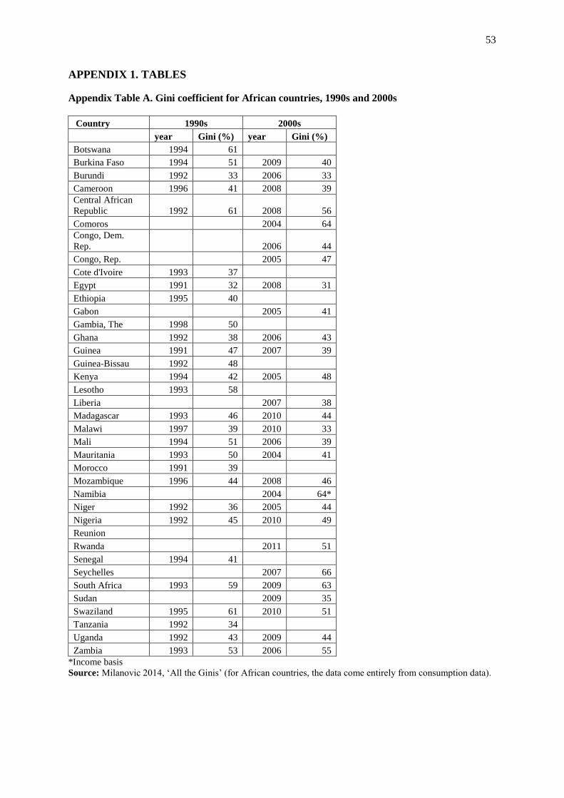
53
APPENDIX 1. TABLES
Appendix Table A. Gini coefficient for African countries, 1990s and 2000s
Country 1990s 2000s
year Gini (%) year Gini (%)
Botswana 1994 61
Burkina Faso 1994 51 2009 40
Burundi 1992 33 2006 33
Cameroon 1996 41 2008 39
Central African
Republic 1992 61 2008 56
Comoros 2004 64
Congo, Dem.
Rep. 2006 44
Congo, Rep. 2005 47
Cote d'Ivoire 1993 37
Egypt 1991 32 2008 31
Ethiopia 1995 40
Gabon 2005 41
Gambia, The 1998 50
Ghana 1992 38 2006 43
Guinea 1991 47 2007 39
Guinea-Bissau 1992 48
Kenya 1994 42 2005 48
Lesotho 1993 58
Liberia 2007 38
Madagascar 1993 46 2010 44
Malawi 1997 39 2010 33
Mali 1994 51 2006 39
Mauritania 1993 50 2004 41
Morocco 1991 39
Mozambique 1996 44 2008 46
Namibia 2004 64*
Niger 1992 36 2005 44
Nigeria 1992 45 2010 49
Reunion
Rwanda 2011 51
Senegal 1994 41
Seychelles 2007 66
South Africa 1993 59 2009 63
Sudan 2009 35
Swaziland 1995 61 2010 51
Tanzania 1992 34
Uganda 1992 43 2009 44
Zambia 1993 53 2006 55
*Income basis
Source: Milanovic 2014, ‘All the Ginis’ (for African countries, the data come entirely from consumption data).
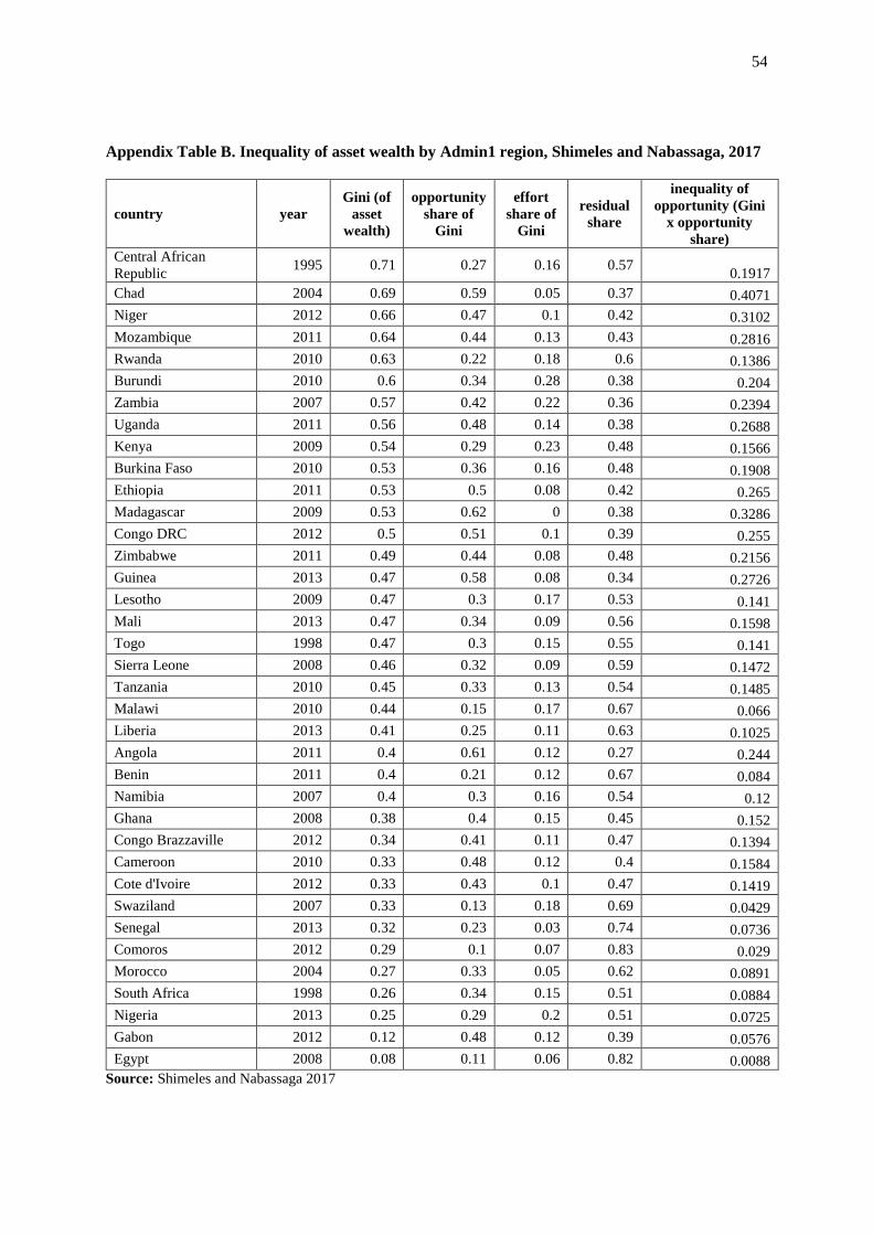
54
Appendix Table B. Inequality of asset wealth by Admin1 region, Shimeles and Nabassaga, 2017
country year
Gini (of
asset
wealth)
opportunity
share of
Gini
effort
share of
Gini
residual
share
inequality of
opportunity (Gini
x opportunity
share)
Central African
Republic 1995 0.71 0.27 0.16 0.57
0.1917
Chad 2004 0.69 0.59 0.05 0.37 0.4071
Niger 2012 0.66 0.47 0.1 0.42 0.3102
Mozambique 2011 0.64 0.44 0.13 0.43 0.2816
Rwanda 2010 0.63 0.22 0.18 0.6 0.1386
Burundi 2010 0.6 0.34 0.28 0.38 0.204
Zambia 2007 0.57 0.42 0.22 0.36 0.2394
Uganda 2011 0.56 0.48 0.14 0.38 0.2688
Kenya 2009 0.54 0.29 0.23 0.48 0.1566
Burkina Faso 2010 0.53 0.36 0.16 0.48 0.1908
Ethiopia 2011 0.53 0.5 0.08 0.42 0.265
Madagascar 2009 0.53 0.62 0 0.38 0.3286
Congo DRC 2012 0.5 0.51 0.1 0.39 0.255
Zimbabwe 2011 0.49 0.44 0.08 0.48 0.2156
Guinea 2013 0.47 0.58 0.08 0.34 0.2726
Lesotho 2009 0.47 0.3 0.17 0.53 0.141
Mali 2013 0.47 0.34 0.09 0.56 0.1598
Togo 1998 0.47 0.3 0.15 0.55 0.141
Sierra Leone 2008 0.46 0.32 0.09 0.59 0.1472
Tanzania 2010 0.45 0.33 0.13 0.54 0.1485
Malawi 2010 0.44 0.15 0.17 0.67 0.066
Liberia 2013 0.41 0.25 0.11 0.63 0.1025
Angola 2011 0.4 0.61 0.12 0.27 0.244
Benin 2011 0.4 0.21 0.12 0.67 0.084
Namibia 2007 0.4 0.3 0.16 0.54 0.12
Ghana 2008 0.38 0.4 0.15 0.45 0.152
Congo Brazzaville 2012 0.34 0.41 0.11 0.47 0.1394
Cameroon 2010 0.33 0.48 0.12 0.4 0.1584
Cote d'Ivoire 2012 0.33 0.43 0.1 0.47 0.1419
Swaziland 2007 0.33 0.13 0.18 0.69 0.0429
Senegal 2013 0.32 0.23 0.03 0.74 0.0736
Comoros 2012 0.29 0.1 0.07 0.83 0.029
Morocco 2004 0.27 0.33 0.05 0.62 0.0891
South Africa 1998 0.26 0.34 0.15 0.51 0.0884
Nigeria 2013 0.25 0.29 0.2 0.51 0.0725
Gabon 2012 0.12 0.48 0.12 0.39 0.0576
Egypt 2008 0.08 0.11 0.06 0.82 0.0088
Source: Shimeles and Nabassaga 2017

55
Appendix Table C. Spatial inequality using hypothetical borders, where capital city is merged
with a neighboring region
This table presents the results of tests of capital city border demarcations, using the cases of Kenya
and Rwanda. Using new hypothetical divisions, where Nairobi is merged with neighboring Kiambu
county, and Kigali with the northern province, we calculate a battery of spatial inequality measures. In
the Kenyan case this only a marginal impact on the results, with a slightly lower CV and WCV. For
Rwanda however, with only five provinces and an extremely high consumption gap between the
capital and the rest, this adjustment has a large impact on the country’s ranking, with the WCV falling
from 0.56 to 0.34, which would put Rwanda towards the middle rather than top of the African
rankings.
Table C. Spatial inequality using hypothetical borders, where capital city is merged with a
neighboring region
Country
Year of
survey
# subnatl
units WCV Theil
Gini
(spatial) CV
Kenya (county) 2015/16 47 0.37 0.06 0.20 0.31
Kenya (Capital
merged with Kiambu) 2015/16 46 0.35 0.06 0.20 0.29
Rwanda 2010/11 5 0.56 0.11 0.19 0.67
Rwanda (Capital
merged with north
prov.) 2010/11 4 0.34 0.05 0.16 0.38
Sources: see Appendix Table 1.
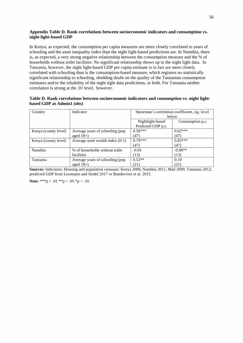
56
Appendix Table D. Rank correlations between socioeconomic indicators and consumption vs.
night light-based GDP
In Kenya, as expected, the consumption per capita measures are more closely correlated to years of
schooling and the asset inequality index than the night light-based predictions are. In Namibia, there
is, as expected, a very strong negative relationship between the consumption measure and the % of
households without toilet facilities. No significant relationship shows up in the night light data. In
Tanzania, however, the night light-based GDP per capita estimate is in fact are more closely
correlated with schooling than is the consumption-based measure, which registers no statistically
significant relationship to schooling, shedding doubt on the quality of the Tanzanian consumption
estimates and/or the reliability of the night tight data predictions, or both. For Tanzania neither
correlation is strong at the .01 level, however.
Table D. Rank correlations between socioeconomic indicators and consumption vs. night light-
based GDP at Admin1 (obs)
Country Indicator Spearman’s correlation coefficient, sig. level
below
Nightlight-based
Predicted GDP p.c.
Consumption p.c.
Kenya (county level) Average years of schooling (pop
aged 18+)
0.50***
(47)
0.62***
(47)
Kenya (county level) Average asset wealth index (0-1) 0.79***
(47)
0.83***
(47)
Namibia % of households without toilet
facilities
-0.05
(13)
-0.88**
(13)
Tanzania Average years of schooling (pop
aged 18+)
0.53**
(21)
0.19
(21)
Sources: Indicators: Housing and population censuses: Kenya 2009, Namibia 2011, Mali 2009, Tanzania 2012;
predicted GDP from Lessmann and Seidel 2017 or Bundervoet et al. 2015.
Note: ***p < .01 **p < .05 *p < .10.

57
APPENDIX 2. Sources of spatial inequality data
Four types of data provide the most common basis for studies of inequality in Africa:
consumption per capita, measured by household budget surveys; average household asset ownership,
also measured by household surveys (including the Demographic and Health Survey (DHS));
subnational GDP estimates from national accounts; and nightlight density per capita, measured using
satellite imagery. The first two seek to measure inequality of household living standards, measuring
consumption or asset ownership net of any taxation or transfers (whether public transfers or private
remittances). The last two, in contrast, seek to measure inequality in the level of production per capita,
before any taxation or transfers and irrespective of who that income accrues to. These two types of
inequality are closely correlated in the OECD countries (Rogers 2016:30, even though there are
significant variations in the patterns of interrelationship within this group; sa Beramendi 2012). The
are less correlated in African countries. As noted above, Rogers (2016) makes the case that for the
study of territorial politics, the regional (Admin1) GDP per capita proxies could tap into a more
politically-salient dimension of national life.63
Measures of inequality in consumption draw on data from household budget surveys. These
same surveys are the basis for the World Bank’s povcalnet, from which much of the data on
interpersonal inequality in Table 1 is drawn. These surveys typically collect data about the weekly,
monthly or annual consumption habits of a representative sample of households across the country,
calculated into a per capita or per adult equivalent consumption measure. These consumption levels
can be averaged by region of residence (e.g., Admin1) to allow measurement of spatial inequality.
However, the available surveys are often limited in sample size, irregularly conducted, and vary in
methodology, which limits the confidence in comparisons across space and time (Ferreira et al. 2015;
Beegle et al, 2016). In particular, idiosyncratic differences in survey coverage, questionnaire design
and method of collecting and cleaning the data can bias the results. Some surveys collect consumption
data through household diaries, in which respondents record all consumption, while others are based
on recall (Simson 2018, Appendix 2). Some surveys impute a rental cost for owner-occupier homes
while others do not. Another major methodological question is whether to correct for price level
differences within the country, i.e., should consumption in the capital be corrected if the prices for
goods are higher there than they are in rural areas? To the extent that these measurement choices have
asymmetric effects on regional consumption measures, they will influence the observed level of
spatial (and interpersonal) inequality, limiting the robustness of country comparisons. Household
surveys have also come under scrutiny for their tendency to underestimate top incomes, as rich
households often opt out of surveys or underreport their income or consumption (Atkinson 2015c;
Alvaredo 2018).
Despite these weaknesses, household surveys remain the most commonly used source of data
for measuring welfare and interpersonal inequality in developing countries. And although the surveys
have large potential for methodological variations, most African household surveys are undertaken
with the involvement of the World Bank, which provides at least some level of uniformity in
approach, and survey quality has been improving over time. Furthermore, at a coarser, broad-brush
level, these inequality estimates show consistency with other developmental measures. Relative to
income per capita, countries with high Ginis have lower life expectancy and educational outcomes,64
and country rankings are at least broadly consistent with historical factors that are thought to
influence inequality. Within Africa, it is predominantly southern African countries that top the
inequality charts, with South Africa and Namibia at the very peak, two countries with settler and
apartheid legacies.
63 Secessionist movements for instance, are often fueled by popular resentment on the part of residents in richer
regions of redistribution from rich to poor areas (Sambanis and Milanovic 2011). In cases where the poorest
regions are sites of conflict, inequality in living standards (income and proxy measures of income) may be the
more salient political fissure. 64 Tested using World Development Indicators (2018) data for 2010.
58
As an alternative to consumption-based measures, Sahn and Stifel (2003) and Shimeles and
Nabassaga (2018), among others, have measured inequality in household asset ownership, collected
from these same household budget surveys or smaller demographic and health surveys. These proxies
for household welfare suffer from fewer methodological inconsistencies than consumption, as the list
of assets is fixed and the reporting of, for instance, household car ownership is simpler to record and
verify than an estimate of the household’s monthly spending on transport. However, this has the
disadvantage that the choice of assets – and the list is usually quite short - may distort the inequality
comparisons over time and space. Shimeles and Nabassaga build an index based on ten household
assets or characteristics, several of which are closely correlated (for instance, they measure whether a
household has access to electricity, as well as whether it owns electricity-dependent assets such as a
television or refrigerator). This limits the observable income variation at both the top or bottom of the
distribution. A large segment of the population may own none of the included assets, which washes
out any variation in income within this group. Similarly, in richer countries, rich HH may own each of
the designated assets, and thus the measure captures none of the income variability at the top.
As a result, the correlation between consumption-based and asset-based inequality is weak or
negative, meaning that they are not interchangeable for each other (Appendix Figure 2a).
Furthermore, the strong correlation between asset-based Ginis and GDP per capita (Appendix Figure
2b) suggests that the choice of assets may be biasing results, with less observed asset variability in
countries at a higher level of development.65
Measures of subnational GDP per capita provide another way of conceptualizing spatial
inequality, but few African governments produce national accounts at the subnational level, as
evidenced by the small African sample included in the Gennaioli et al. (2014) dataset. Researchers
have therefore had to rely on proxies for the intensity of economic activity. Night light intensity,
divided by the population of the subnational unit, has offered one popular proxy for income per
capita. This data has the advantage that it is collected at the global level using a consistent
measurement method, and can be estimated for any part of the world, any choice of subnational
boundary and for any given year since 1992. Night light density measures have been found to offer a
reasonably strong proxies for the intensity of economic activity at local level (Henderson et al., 2012),
growth (Chen and Nordhaus, 2011), wealth (Ebener et al., 2005) and public goods provision
(Papaioannou, 2013; Michalopoulos & Papaioannou, 2013). Using various adjustment techniques,
they have also been used to estimate poverty and human development (Pinkovskiy and Sala-i Martin
2016; Elvidge et al., 2012). The night light data also comes in two forms. The earlier generation of
night light data - DMSP-OLS available since 1992 – is comparatively coarse and top and bottom
censored, so that differentiation between light intensity at very high or very low values is washed out.
Consequently, the relationship between light intensity and GDP is skewed, and many authors employ
econometric techniques to correct for this lack of nonlinearity (Michalopoulos & Papaioannou, 2017:
10). Starting in 2011, new sensors have generated a finer resolution data (known as VIIRS), which
ameliorates many of the problems of the earlier DMSP-OLS data, including the relatively restrictive
65 Appendix Figure B(i) shows the relationship between asset-based and consumption based Gini coefficients at
the national level (weak at -.2 and not statistically significant). However, dividing the space into quadrants
generates some insights. Seeing the largest number of countries in the upper left quadrant suggests that for most
countries in this sample, the asset inequality Gini is higher than consumption inequality Gini. The asset index
picks up more inequality. The position of South Africa in the lower right quadrant (high consumption Gini, low
asset Gini) suggests that this relatively wealthy and urbanized country is an outlier -- the two indices generate
extreme opposite readings for South Africa. Gabon in the lower left quadrant of Figure 2(a) (for low income and
low asset inequality) suggests the great extent to which these measures really do compress inequality (they do
not see the upper end of the income distribution). Appendix Figure B(ii) plots the strong negative and
statistically significant correlation between S&N's asset-based Gini and GDP per capita. They may be
negatively correlated because the nature of assets chosen in the asset wealth index used by S&N biases the
inequality measure downward for richer countries. The ginis of consumption in contrast, tend to show higher
inequality in Africa’s richer countries (South Africa, Botswana, Namibia) -- these ginis are positively (and
statistically significantly) correlated with GDP per capita within Africa alone.

59
top and bottom-coding. So far we know of no published studies that have developed country-level
spatial inequality measures using the newer night light data.
Albeit based on the first generation of coarser light data, some studies have stressed that night
lights are a less reliable proxy at more granular geographic units (such as neighborhoods and in cross-
border studies), and an imperfect measure of incomes, as we have stressed above (Mellander et al.
2015; Michaelopolous and Papaiouanou 2017; Pinkovskiy and Sala-i-Martin 2016). In a global
dataset, Lessmann and Seidel (2017: 114) find that region-level light intensity per capita explains
roughly 35% of the variation in between-region GDP per capita (as measured by Gennaioli et al).
Mveyange (2015) calculates a correlation coefficient of 0.57 when comparing light intensity per
capita and GDP per capita within grid cell across Africa (using G-Econ grid cell GDP estimates). For
Africa, the, the correlations are strong, even though nightlight density is a weaker proxy for regional
GDP per capita in agricultural regions than it is in industrial or service economies, for obvious
reasons.66 Overall, night light data may seems to provide an adequate proxy for rough level of
development and GNP per capita of geographic regions of Africa such as Admin1 and Admin2
regions.
Two recent studies authors have used night light data to estimate cross-country differences in
within-country spatial inequality, Alesina et al. 2016 and Lessmann and Seidel 2017). L&S model a
relationship between regional night light and GDP, to generate predicted regional GDP per capita
estimates in US$.67 This puts additional demands on the night light data to adequately measure
within-country regional differences in night light intensity in a way that is comparable across
countries. Given the well-recognized problem of nonlinear relationships between night light and GDP
(Michalopoulos & Papaioannou, 2017: 10), this raises risks of biased estimates. In richer countries,
where the light intensity will be underestimated in those cells affected by top coding, income
discrepancies between the richest and poorer regions are likely to be understated, and consequently
the inequality estimates will be biased downwards. The same problem may be affecting countries at
the poorest end of the income spectrum. This may bias the inequality results downwards at both ends
of the income spectrum, relative to countries at the middle.
In South Africa for instance, one of the few sub-Saharan African countries to produce
subnational GDP estimates, there is a considerable discrepancy between the different GDP per capita
measures, with a GDP per capita max/min ratio of 2.6 when using national accounts data (Statistics
South Africa 2011) versus 1.7 when using Lessmann and Seidel’s nightlight-based predicted
estimates. It appears therefore that the light-based data is prone to downward bias in the observed
spatial inequality compared to national accounts-based GDP measures, perhaps especially so for the
relatively richer African countries.
The night light-based measures for WCV across Admin1 record low to moderate spatial
inequality in Namibia, Zambia and Rwanda, which have unusually high inequality when using
consumption-based measures (although for Rwanda at least, these results are highly sensitive to high
consumption in the capital city).
Night light may offer a strong proxy for local economic activity and allow reliable rankings
of subnational regions by income. (See below.) This is indeed how nightlight based measures have,
in general, been used by other scholars. As expected, the night light measure appears to track GDP
per capita at the subnational level more closely than it tracks income or consumption per capita at the
66 One of the problems with luminosity-based measures when used in African countries is that the satellite
equipment used through 2012 (the _______ data) record almost no light at all across the poorest rural regions
(Chen and Nordhaus, 2015). In these countries, the rural light intensity contrasts strongly with the few urban
areas, possibly amplifying the light discrepancy in the poorest countries. 67 They use the data from Gennaioli et al. 2014 to generate an out-of-sample estimation of GDP per capita based
on night light intensity per capita, as well as anchoring the regional estimates to national GDP per capita.
60
subnational level, consistent with the findings and arguments of Pinkovskiy and Sala-i-Martin 2016.68
The nightlight based measure may be a good proxy for measuring the size of a cross-regional gap in
GDP per K within one country, but it does not seem appropriate for measuring the size of a cross-
regional income gap in one country with a cross-regional income gap in another (as in the Kenya-
Namibia comparison above). However, we are not aware of any such use of the NL measure in the
literature.69
The correlations in Appendix Table 2 tell us something about how night light measures relate
to each other across studies and as we move across different geographic scales of analysis. Appendix
Figure 1(a) plots the positive and highly significant correlation (0.43) between Lessmann and Seidel’s
unweighted CV at Admin1 (2012) and Alesina et al.'s unweighted Gini across Admin1 regions
(2012). Appendix Table 2 shows that Alesina et al's nightlight based measures are highly significantly
correlated at different geographic scales: Admin1 and Admin2 are highly significantly correlated with
a coefficient of 0.8; Grid cells and Admin. 2 are highly significantly correlated with a coefficient of
.38, and grid cells and Admin1 are correlated at the .05 significance level (coefficient = .32).
68 Meanwhile, Michaelopolous and Papaioannou ("Spatial Patterns of Development," 2017), argue that for GDP
per capita itself, the nightlight based measures seem better for measuring subnational (within country) inequality
than inequality across countries. 69 This issue becomes relevant when contemplating using the Admin1 spatial inequality measures in a manner
analogous to the subnational inequality measures employed by Beramendi, Beramendi and Rogers, and Rogers.