Embed Size (px)
Citation preview

48 November 2005
The Wings of the Crane
report & photography by Luigi Vallero
50 Years ofLufthansa
Design
“You are what you show, and what you show revealswhat you are”—Otl Aicher, 1962
49
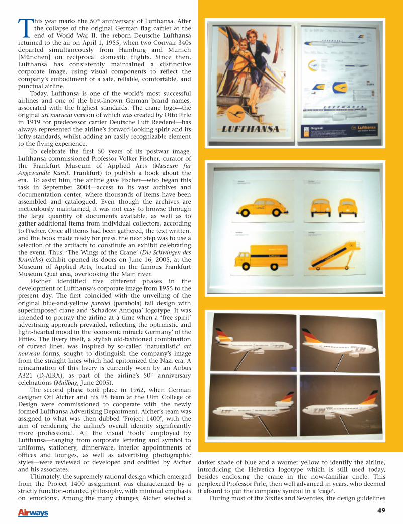
This year marks the 50th anniversary of Lufthansa. Afterthe collapse of the original German flag carrier at theend of World War II, the reborn Deutsche Lufthansa
returned to the air on April 1, 1955, when two Convair 340sdeparted simultaneously from Hamburg and Munich[München] on reciprocal domestic flights. Since then,Lufthansa has consistently maintained a distinctivecorporate image, using visual components to reflect thecompany’s embodiment of a safe, reliable, comfortable, andpunctual airline.
Today, Lufthansa is one of the world’s most successfulairlines and one of the best-known German brand names,associated with the highest standards. The crane logo—theoriginal art nouveau version of which was created by Otto Firlein 1919 for predecessor carrier Deutsche Luft Reederei—hasalways represented the airline’s forward-looking spirit and itslofty standards, whilst adding an easily recognizable elementto the flying experience.
To celebrate the first 50 years of its postwar image,Lufthansa commissioned Professor Volker Fischer, curator ofthe Frankfurt Museum of Applied Arts (Museum fürAngewandte Kunst, Frankfurt) to publish a book about theera. To assist him, the airline gave Fischer—who began thistask in September 2004—access to its vast archives anddocumentation center, where thousands of items have beenassembled and catalogued. Even though the archives aremeticulously maintained, it was not easy to browse throughthe large quantity of documents available, as well as togather additional items from individual collectors, accordingto Fischer. Once all items had been gathered, the text written,and the book made ready for press, the next step was to use aselection of the artifacts to constitute an exhibit celebratingthe event. Thus, ‘The Wings of the Crane’ (Die Schwingen desKranichs) exhibit opened its doors on June 16, 2005, at theMuseum of Applied Arts, located in the famous FrankfurtMuseum Quai area, overlooking the Main river.
Fischer identified five different phases in thedevelopment of Lufthansa’s corporate image from 1955 to thepresent day. The first coincided with the unveiling of theoriginal blue-and-yellow parabel (parabola) tail design withsuperimposed crane and ‘Schadow Antiqua’ logotype. It wasintended to portray the airline at a time when a ‘free spirit’advertising approach prevailed, reflecting the optimistic andlight-hearted mood in the ‘economic miracle Germany’ of theFifties. The livery itself, a stylish old-fashioned combinationof curved lines, was inspired by so-called ‘naturalistic’ artnouveau forms, sought to distinguish the company’s imagefrom the straight lines which had epitomized the Nazi era. Areincarnation of this livery is currently worn by an AirbusA321 (D-AIRX), as part of the airline’s 50th anniversarycelebrations (Mailbag, June 2005).
The second phase took place in 1962, when Germandesigner Otl Aicher and his E5 team at the Ulm College ofDesign were commissioned to cooperate with the newlyformed Lufthansa Advertising Department. Aicher’s team wasassigned to what was then dubbed ‘Project 1400’, with theaim of rendering the airline’s overall identity significantlymore professional. All the visual ‘tools’ employed byLufthansa—ranging from corporate lettering and symbol touniforms, stationery, dinnerware, interior appointments ofoffices and lounges, as well as advertising photographicstyles—were reviewed or developed and codified by Aicherand his associates.
Ultimately, the supremely rational design which emergedfrom the Project 1400 assignment was characterized by astrictly function-oriented philosophy, with minimal emphasison ‘emotions’. Among the many changes, Aicher selected a
darker shade of blue and a warmer yellow to identify the airline,introducing the Helvetica logotype which is still used today,besides enclosing the crane in the now-familiar circle. Thisperplexed Professor Firle, then well advanced in years, who deemedit absurd to put the company symbol in a ‘cage’.
During most of the Sixties and Seventies, the design guidelines
50 November 2005
of Aicher and E5 were closely followed and furtherimplemented in-house by Lufthansa’s own Corporate DesignDepartment. But at the beginning of the Eighties, marketresearch revealed that the company was perceived as anelitist, purely business airline, with mediocre service levels.Recognizing a need to devise a new look, Lufthansa embarkedon the third phase. In 1986, the Swiss agency Zintzmeyer &Lux was appointed for this task. In contrast to Aicher, whohad selected the cool blue tone to represent the company,Zintzmeyer felt that yellow, supported by silver and gray, wasthe color that really distinguished Lufthansa from thecompetition, and came up with many livery changeproposals based on this combination of hues. In 1989, a finaldecision was taken on the design, which focuses on the lookwhich—notwithstanding minor revisions—is still in usetoday. It retains Lufthansa’s traditional company colors ofyellow and blue, enhanced by gray and silver tones. The samecolors, in different patterns and combinations, were used tocomplement the aircraft cabins.
The mid-Nineties saw the fourth phase of corporatedesign development, to reflect the airline’s recent revision ofits service orientation, having changed from a state-ownedcarrier to that a fully-privatized airline in 1997. Frog Designwas chosen to spruce up the airline’s image by designing newcounters and lounges as well as reviewing cabin layouts andseating. The process followed the motto of HarmutHesslinger, the head of the design company: ‘form followsemotion’, as opposed to the functionalist ‘form followsfunction’ approach.
To recreate the emotional aspects of air travel, FrogDesign used a style known as ‘retro-futurism’, introducingelements inspired by the corrugated sheet-metal fuselage skinof the Junkers Ju 52/3m, as well as using more conventionaland rounded forms in aircraft seats for all classes of service, aswell as in counters and lounge and office design.
Starting in 2004, the fifth phase saw the introduction ofa new business class seat by Priestman Goode, which can beeasily converted into a comfortable 2m (6.5ft) bed (BusinessFlyer, April 2005). The project can also be defined as arefinement of the work carried out by Frog Design, withthe use of more natural materials, including woodsand leather, in order to enhance passengers’ emotional andtactile experiences.
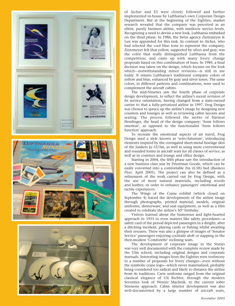
The Wings of the Crane exhibit (which closed onSeptember 4) traced the developments of the airline imagethrough photographs, printed material, models, originaluniforms, dinnerware, and seat equipment, as well as a filmcreated to celebrate the airline’s 50th birthday.
Visitors learned about the humorous and light-heartedapproach in 1955 to even matters like safety procedures—asafety card of the period depicted passengers in a dinghy, aftera ditching incident, playing cards or fishing whilst awaitingtheir rescuers. There was also a glimpse of images of ‘SenatorService’ passengers enjoying cocktails aloft or napping in thethen-modern ‘Comforette’ reclining seats.
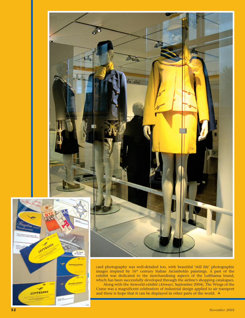
The development of corporate image in the Sixtieswas very well documented with the complete review made bythe Ulm school, including original designs and corporatemanuals. Interesting images from the Eighties were testimonyto a number of proposals for livery changes—even withoutthe symbolic crane logo—which never materialized, probablybeing considered too radical and likely to distance the airlinefrom its traditions. Crew uniforms ranged from the originalclassical elegance of Uli Richter, through the modernSeventies look of Werner Machnik, to the current soberStrenesse approach. Cabin interior development was alsowell-documented by a large number of aircraft seats,
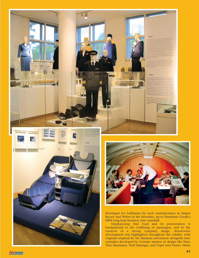
51
developed for Lufthansa by such manufacturers as KeiperRecaro and Weber in the Seventies, up to Priestman Goode’s2004 long-haul business class standard.
Emphasizing that food and its presentation isfundamental to the wellbeing of passengers, and to thecreation of a strong company image, dinnerwaredevelopment was highlighted throughout the exhibit, withoriginals inspired by the Bauhaus movement alongside laterexamples developed by German masters of design like HansTheo Baumann, Wolf Karnagel, and Topel und Pauser. Menu
52 November 2005
card photography was well-detailed too, with beautiful ‘still life’ photographicimages inspired by 16th century Italian Arcimboldo paintings. A part of theexhibit was dedicated to the merchandising aspects of the Lufthansa brand,which has been successfully developed through the airline’s shopping catalogues.
Along with the Airworld exhibit (Airways, September 2004), The Wings of theCrane was a magnificent celebration of industrial design applied to air transportand there is hope that it can be displayed in other parts of the world. (