Embed Size (px)
Citation preview

WHATCOM COUNTY URBAN GROWTH AREA REVIEW
Background Research on Selected Economic, Demographic, and Housing Trends
November 8, 2013
Prepared by: BERK
ECONOMIC, DEMOGRAPHIC, AND HOUSING TRENDS
November 8, 2013 2
I. INTRODUCTION
Whatcom County, in coordination with the cities in Whatcom County, is engaged in a multi‐year project to update the Whatcom County Comprehensive Plan and conduct an urban growth area (UGA) review by 2016, as required by the Washington State Growth Management Act (GMA). In order to support this effort and inform discussions about alternative growth scenarios, Whatcom County has requested consultant services to provide additional background research on selected economic, demographic and housing trends. This technical memo summarizes key findings from research into the following topic areas:
The influence of Canadian consumers on the Whatcom County housing, retail, and commercial real estate
markets.
Broad housing market trends and housing preferences, both nationally and locally.
Migration patterns to and from Whatcom County in recent years.
II. CANADIAN INFLUENCE ON WHATCOM REAL ESTATE MARKETS
Whatcom County shares a border and five major border crossings with Canada including the Peace Arch
(Blaine/Surrey; Interstate 5), Pacific Highway (Blaine/Surrey; State Route 543), Sumas/Huntingdon (State Route 9
to Abbotsford), Lynden/Aldergrove (State Route 539), and Point Roberts (Tyee Drive to Tsawwassen) Crossings.
The first four crossings combined have had an annual average of just over four million vehicle crossings into
Whatcom County in the ten year period between 2001 and 20111. The number of Canadians crossing into
Washington through these five crossings has increased steadily over the past six years. In the first three months of
2013, 3.6 million persons crossed from Canada to Whatcom County, 10% more southbound entries than over the
same period in 20122.
Exhibit 1 Border Crossings between Canada and Whatcom County
Source: Washington State Department of Transportation, 2013.
1 Whatcom Council of Governments, 2013.
2Western Washington University, Center for Economic and Business Research, 2013.

ECONOMIC, DEMOGRAPHIC, AND HOUSING TRENDS
November 8, 2013 3
MARKET DRIVERS
Several market drivers stimulate Canadian travel to and investment in the United States, for both retail goods and
real estate:
The Canadian dollar has steadily gotten stronger relative to the US dollar throughout much of the last decade;
Cheaper retail prices for certain goods such as gas and dairy products, as well as product selection, attract
Canadian consumers to shop in the U.S.;
Canadian residents will pick up internet shopping purchases at U.S. addresses in Whatcom County to save on
shipping costs and sales taxes;
Higher real estate prices in major Canadian metropolitan areas have made Whatcom County real estate
attractive for both vacation and investment purposes; and
Over the long term, population growth in southwest British Columbia, at the Whatcom County border, will
continue to generate demand for goods, services, housing, and recreation in Whatcom County.
Each of these drivers is discussed in greater detail below.
Effect of the Exchange Rate on Border Crossings
Exhibit 2 Cascade Gateway Passenger Vehicles by US‐Canadian Residence, with Exchange Rate, 1997‐2012
Source: International Mobility and Trade Corridor Program, 2013
Note: The Cascade Gateway consists of the four border crossings shown in Exhibit 1.
The chart above tracks vehicle border crossings compared to the relative strength of the Canadian dollar to
the U.S dollar. The chart shows that Canadian vehicle crossings increase the stronger the Canadian dollar gets.
In the summer of 2013, the International Mobility & Trade Corridor Program (IMTC) conducted a passenger intercept survey of Canadians crossing the border into the U.S. The survey found that the top three purposes of Canadian’s trips into the U.S. were shopping (31%), gas (21%), and recreation (19%).

ECONOMIC, DEMOGRAPHIC, AND HOUSING TRENDS
November 8, 2013 4
Retail Prices Attracting Canadian Shoppers
Increased Canadian consumption of U.S. goods is evidenced by the sales tax generation in Bellingham, where per
capita taxable retail sales (TRS) is about double that of the State (see Exhibit 3). In 2012, the Center for Economic
and Business Research (CEBR) hosted a roundtable discussion for a border policy research group, in which they
called area businesses, including Wal‐Mart, Costco, Target, and Fred Meyer and learned that up to 50% of retail
sales in some of these store locations were from purchases made by Canadians.
A recent passenger vehicle intercept survey by the International Mobility and Trade Corridor Program (IMTC) in
July of 2013 found significant increases in the number of Canadians crossing the border for shopping purposes.
Approximately 45% of interviewees indicated shopping as their primary purpose for crossing the border (30.5% for
general shopping, 14.3% for gas purchases). This more than doubled the 19% of interviewees who crossed the
border for shopping in 2007, the last time the survey study was conducted. The survey also found that the purpose
of “picking up mail” rose from 2% in 2007 to 7% in 2013. This is likely due to increases in online shopping and
Canadians shipping purchases to U.S. addresses to save on shipping costs.
Exhibit 3 Taxable Retail Sales per Capita, 2012
Source: Washington Department of Revenue, 2013; Office of Financial Management, 2013. Note: County totals include sales in both incorporated cities and unincorporated areas.
Bellingham has the highest total ($1.5B) and per capita ($18,410) TRS for cities in Whatcom County.
Burlington, in Skagit County, has very high TRS per capita ($78,993) due to its small population and
concentration of destination retailers in the city.
$0
$10,000
$20,000
$30,000
$40,000
$50,000
$60,000
$70,000
$80,000
$90,000
Burlington Bellingham Blaine Sumas Lynden FerndaleSkagitCounty
WhatcomCounty
SnohomishCounty
WashingtonState
Per Capita Taxable Retail Sales $78,993 $18,410 $14,810 $9,892 $8,996 $7,256 $11,856 $9,692 $9,230 $9,252
2012 Taxable Retail Sales (Millions) $666 $1,498 $70 $14 $111 $86 $1,398 $1,972 $6,673 $63,080
2012 Population 8,435 81,360 4,760 1,399 12,340 11,830 117,950 203,500 722,900 6,817,770
TRS per Capita (2012 $)

ECONOMIC, DEMOGRAPHIC, AND HOUSING TRENDS
November 8, 2013 5
Gasoline is Cheaper in the United States
Gasoline is one good frequently purchased by Canadian visitors to the United States. The difference in gas prices
between Seattle, Bellingham, and Vancouver, BC is shown in the exhibits below.
Exhibit 4 Average Gas Price Comparison between Seattle and Vancouver, BC, September 2012‐13
Source: Gas Buddy, 2013.
Note: Records of Bellingham’s monthly gas prices were not available in this format, so Seattle was used instead.
Exhibit 5 Monthly Average Gas Price per Gallon in Bellingham, Seattle, and Vancouver, BC, 2013
Source: Gas Buddy, 2013. All prices converted to US dollars per gallon.
Exhibit 4 shows that gas trends $0.75 to $1.50 more expensive per gallon in Vancouver, BC than in Seattle,
WA.
$0.00
$1.00
$2.00
$3.00
$4.00
$5.00
$6.00
Bellingham98225
Bellingham98226
Seattle Vancouver Bellingham98225
Bellingham98226
Seattle Vancouver Bellingham98225
Bellingham98226
Seattle Vancouver
March 2013 June 2013 September 2013
ECONOMIC, DEMOGRAPHIC, AND HOUSING TRENDS
November 8, 2013 6
Exhibit 5 shows that over the course of 2013, gas prices in Bellingham are within $0.10, plus or minus, of the
gas prices in Seattle, and between $1.50 and $1.89 cheaper than gas sold in Vancouver, BC.
One of the major reasons that gas is more expensive in Canada is that it is more highly taxed than in
Washington State. Canadians pay almost $0.40 per liter3 ($1.51 per gallon) in taxes on top of the retail price of
the gas. In comparison, purchasers in Washington State are taxed about $0.376 per gallon4, a discrepancy
($1.13) that accounts for the majority of the difference between gas prices in Canada in Washington State.
Dairy Prices are Cheaper in the United States
Another good that is disproportionately more expensive in Canada than the United States is milk. Dairy prices in
Canada are more expensive than in the United States. This is primarily due to government subsidies for U.S. dairy
farmers that allow for lower dairy prices in the U.S., coupled with Canada’s “dairy supply management” program,
which rather than subsidizing Canadian dairy farmers, limits milk production and keeps dairy imports out to
increase consumer milk prices5. CEBR research in 2012 reported that the Bellingham Costco sells more dairy
products than any other Costco location in the U.S. and is in the top five for gas sales.
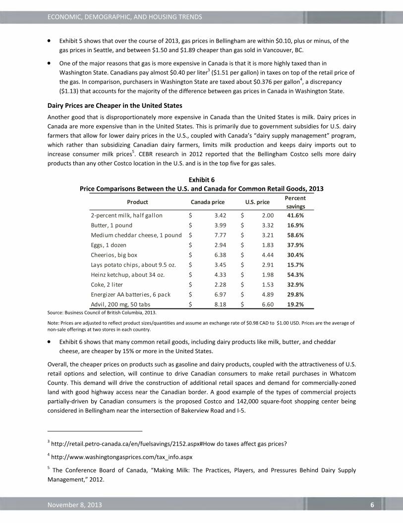
Exhibit 6 Price Comparisons Between the U.S. and Canada for Common Retail Goods, 2013
Source: Business Council of British Columbia, 2013.
Note: Prices are adjusted to reflect product sizes/quantities and assume an exchange rate of $0.98 CAD to $1.00 USD. Prices are the average of non‐sale offerings at two stores in each country.
Exhibit 6 shows that many common retail goods, including dairy products like milk, butter, and cheddar
cheese, are cheaper by 15% or more in the United States.
Overall, the cheaper prices on products such as gasoline and dairy products, coupled with the attractiveness of U.S.
retail options and selection, will continue to drive Canadian consumers to make retail purchases in Whatcom
County. This demand will drive the construction of additional retail spaces and demand for commercially‐zoned
land with good highway access near the Canadian border. A good example of the types of commercial projects
partially‐driven by Canadian consumers is the proposed Costco and 142,000 square‐foot shopping center being
considered in Bellingham near the intersection of Bakerview Road and I‐5.
3 http://retail.petro‐canada.ca/en/fuelsavings/2152.aspx#How do taxes affect gas prices?
4 http://www.washingtongasprices.com/tax_info.aspx
5 The Conference Board of Canada, “Making Milk: The Practices, Players, and Pressures Behind Dairy Supply
Management,” 2012.
Product Canada price U.S. pricePercent
savings
2‐percent milk, half gallon $ 3.42 $ 2.00 41.6%
Butter, 1 pound $ 3.99 $ 3.32 16.9%
Medium cheddar cheese, 1 pound $ 7.77 $ 3.21 58.6%
Eggs, 1 dozen $ 2.94 $ 1.83 37.9%
Cheerios, big box $ 6.38 $ 4.44 30.4%
Lays potato chips, about 9.5 oz. $ 3.45 $ 2.91 15.7%
Heinz ketchup, about 34 oz. $ 4.33 $ 1.98 54.3%
Coke, 2 l iter $ 2.28 $ 1.53 32.9%
Energizer AA batteries, 6 pack $ 6.97 $ 4.89 29.8%
Advil, 200 mg, 50 tabs $ 8.18 $ 6.60 19.2%

ECONOMIC, DEMOGRAPHIC, AND HOUSING TRENDS
November 8, 2013 7
Canadian Air Travel Through US Airports
Beyond traditional retail goods like dairy products and gasoline, Canadians are increasingly making travel
arrangements that have them flying out of the Bellingham International Airport. About 62% of the Bellingham
International Airport’s flyers are from Canada6, again, because Canadian taxes make flying out of Bellingham
economical. In 2012, Bellingham International Airport had over 570,000 enplaned passengers and has experienced
rapid growth in enplanements in recent years partially due to demand from Canadian travelers. To keep pace with
demand, a few airlines, notably Allegiant, have expanded their departures from Bellingham to a variety of
attractive vacation destinations.
Exhibit 7 Airlines with Routes Out of Bellingham International Airport
Airlines Destinations
Alaska Airlines Honolulu
Las Vegas
Seasonal: Kahului
Horizon Air Seattle/Tacoma
Seasonal: Portland, OR
Allegiant Air Honolulu, Kahului, Las Vegas,
Los Angeles, Oakland, San Diego
Phoenix/Mesa, Reno/Tahoe,
Seasonal: Palm Springs
Frontier Airlines Seasonal: Denver
Real Estate Prices Attracting Investors
An additional market driver that is bringing Canadians into the United States, are the affordable real estate prices.
The average attached dwelling unit (namely condominiums, duplexes, and town homes) in Vancouver runs about
$573,259 (with a median price of $511,000) and the average detached home (or single family dwelling unit) runs
about $1,104,896 (with a median price of $856,000)7—far exceeding the $250,000‐$350,000 price tag of a
comparable single family home in Whatcom County. Exhibit 8 shows that in 2011 the average price of a detached
single family home in Whatcom County was $282,421, and the median price was $248,444. Exhibit 9 shows
condominiums with a lower average price of $209,519, and a median price of $165,000.
The Canadian‐U.S. sales price discrepancy peaked in 2010 when the Canadian Harmonized Sales Tax, which
instituted a 12% sales tax on home purchases, went into effect. This tax was repealed by voters in 2011, and is no
longer a major factor driving Canadian investment in Whatcom County— however it does show the effect that
Canadian taxes and market conditions can have on Whatcom markets.
6 Canadian Airports Council, “Cross Border Shopping of Air Travel a National Phenomenon,” March 20, 2012.
7 Real Estate Board of Greater Vancouver, “MLS HPI, Average, and Median Home Prices Over a Year,” September
2011. These figures are in Canadian dollars. In 2012, the average exchange rate for CAD to $1 US was $0.999.

ECONOMIC, DEMOGRAPHIC, AND HOUSING TRENDS
November 8, 2013 8
Exhibit 8 Single Family Home Sales in Whatcom County, 2000‐2011
Source: Whatcom County Real Estate Research Report, 2012.
Exhibit 9 Condominium Sales in Whatcom County, 2000‐2011
Source: Whatcom County Real Estate Research Report, 2012.
Year
Number
Sold
Average
Price
Median
Price
2000 2,911 $167,038 $144,500
2001 3,190 $174,903 $151,050
2002 3,574 $181,949 $159,900
2003 4,213 $200,916 $174,000
2004 4,454 $236,604 $212,325
2005 4,316 $288,277 $259,900
2006 3,341 $324,852 $283,000
2007 3,142 $340,448 $290,725
2008 2,312 $323,172 $278,533
2009 2,204 $301,124 $259,900
2010 2,014 $291,985 $255,000
2011 1,990 $282,421 $248,444
Year No. Sold Average Median
2000
2001
2002
2003
2004
2005
2006
2007
2008
2009
2010
2011
342
363
449
570
701
825
835
832
526
372
357
283
$118,457
$124,663
$125,034
$137,473
$170,526
$204,602
$225,149
$228,296
$227,750
$206,968
$224,439
$209,519
$107,000
$112,500
$110,000
$124,000
$150,000
$184,800
$202,000
$200,000
$198,000
$189,000
$189,900
$165,000

ECONOMIC, DEMOGRAPHIC, AND HOUSING TRENDS
November 8, 2013 9
Exhibit 10 Single Family Housing Units Sold in Whatcom County by Price and Type, 2009‐2011
Source: Whatcom County Real Estate Research Report, 2012.
The distribution of recent home sales by price and type, shown in Exhibit 10, shows that 78% of homes
purchased in Whatcom County between 2009 and 2011 were less than $350,000.
Long‐term Population Growth in British Columbia
Southwest British Columbia, including greater Vancouver and the Fraser Valley, is the most populated region of
British Columbia. Since 2000, the Southwest region population has grown by over 442,000 to 2,805,577 in 2012.
This represents an annual average growth rate of 1.4%, the fastest growth rate of any region in British Columbia.
This growth trajectory is predicted to continue as the Southwest region is projected to grow at an annual average
rate of 1.2% and grow by over 1,000,000 people by 2036.8
TYPES OF CANADIAN REAL ESTATE INVESTORS
The previous section described some of the major drivers of Canadian travel and investment in Whatcom County.
These factors all influence real estate demand in the Whatcom County market. There are four major categories of
foreign investment in Whatcom County real estate:
1. Vacation Home Investors
2. Urban Residential Income Property Investors
3. Commercial Real Estate Investors
4. Agricultural Land Purchases
Vacation Home Investors
Canadians have long been venturing into Whatcom County to purchase vacation homes in waterfront communities
such as Blaine, Birch Bay, and Semiahmoo. Depending on economic conditions and other market factors, the type
of housing product being demanded has fluctuated. In the past, highly desirable, upper‐end, waterfront property
8 BCStats (central statistical agency of the Province of British Columbia). Official population estimates and
projections, 2013.
New Existing Total New Existing Total New Existing Total
$1,000,001 and over 0 19 19 0 15 15 0 10 10
$750,001‐1,000,000 1 39 40 0 25 25 0 24 24
$501,000‐750,000 9 123 132 1 101 102 1 108 109
$451,000‐500,000 6 68 74 2 57 59 1 56 57
$401,000‐450,000 7 71 78 7 84 91 6 78 84
$351,000‐400,000 27 141 168 12 143 155 12 126 138
$326,000‐350,000 12 93 105 10 97 107 11 82 93
$300,000‐325,000 14 121 135 10 97 107 14 93 107
$276,000‐300,000 22 181 203 21 153 174 22 124 146
$250,000‐275,000 17 219 236 30 179 209 37 152 189
$226,000‐250,000 34 210 244 24 224 248 27 201 228
$201,000‐225,000 43 219 262 33 205 238 27 194 221
$176,000‐200,000 17 189 206 17 168 185 3 178 181
$151,000‐175,000 2 107 109 2 129 131 4 151 155
$150,000 and under 3 183 186 1 167 168 0 248 248
Total 214 1,983 2,197 170 1,844 2,014 165 1,825 1,990
Price Range
2009 2010 2011

ECONOMIC, DEMOGRAPHIC, AND HOUSING TRENDS
November 8, 2013 10
was in demand but in recent years, Canadian demand for vacation homes has veered toward a preference for
more affordable units seen as good investments. According to Mike Kent, a real estate agent and Whatcom County
real estate expert, many homes over $500,000 are on the market for less than their replacement price and homes
that would have once fetched $1 million are selling in the range of $600,000 to $700,000. The types of housing
characteristics currently in demand include:
Single family homes or condos, under $300,000,
Smaller homes, in the 1,600‐1,800 sf range, on ¼ acre lots (zoned to allow 4 units per acre), and
Nearby resort amenities, as well as retail amenities such as U.S. big box stores.
Many Canadian vacation home investors are buying in cash, using the equity from their homes in Canada, and
looking to take advantage of the U.S. housing market slowdown, which dropped U.S home prices significantly.
These vacation home investors are purchasing condos and other single‐family homes to be a “home base” for
vacation and shopping trips, and a source of seasonal vacation rental income. For example, in Birch Bay Village,
which has 950 homes, there are usually only 2‐3 available to rent year‐round. The rest are periodically used by
owners throughout the year.
Prices for these kinds of modest vacation homes have remained relatively steady, because Canadian purchases
have supported the local market and mitigated the price drops seen across the U.S. housing market in recent
years.
According to Kent, the biggest competitor to the Whatcom County real estate market, for Canadians looking for a
second home, is Phoenix or Palm Springs.
Urban Residential Income Property Investors
Some Canadian investors are seeking properties in urban communities rather than waterfront vacation homes.
Some of these investors are viewing condos and homes as potential income investments to be rented year‐round,
while others are using these homes for personal use during shopping trips and other U.S. travel.
After U.S. housing prices dropped during the 2007‐09 U.S. recession, a significant amount of below‐market‐value
property was on the market through a combination of short‐sale, real estate‐owned or bank‐owned sales, and
foreclosure auctions. This created an opportunity for Canadian investors to purchase property under market value,
in hopes that a market rebound in the U.S. would generate long‐term profits. On top of that, low vacancy rates
(Windermere Property Management in Bellingham has vacancy rates below 2% for all categories of residential
units) are making it easy to rent these units—allowing Canadian buyers to hold investments until the market
rebounds.
Doug Wight, owner of Windermere Property Management, says that because vacancy rates are low for all
categories of housing units (condominiums, apartments, single family homes, townhomes, and other), Canadian
investors are purchasing all types of units. Rather than unit type, these investors are looking at two main
purchasing criteria: location and price per square foot. Popular locations in the County include the urban areas
(primarily Bellingham, but also Lynden and Blaine), areas close to Interstate 5, and the traditional vacation areas of
Birch Bay and Blaine’s Semiahmoo neighborhood.
Commercial Real Estate Investors
Canadians also play a significant role investing in commercial property in Whatcom County. In recent years there
have been several large purchases of commercial property by Chinese investors with Canadian ties. These foreign
investors have taken a patient approach and are generally holding their investments and not starting any
redevelopment efforts.

ECONOMIC, DEMOGRAPHIC, AND HOUSING TRENDS
November 8, 2013 11
At this point, it is unclear what the impact of foreign investment will be on the commercial real estate market in
Whatcom County. On one hand, foreign investors with large equity reserves can afford to hold property for a long
period and not redevelop their holdings until optimal market conditions return. On the other hand, foreign
investors with ample equity can afford to develop larger scale projects that can have transformative effects on
local commercial markets. These investors can afford to assemble larger parcels of land and make significant
infrastructure investments if necessary.
IMPLICATIONS FOR LONG‐RANGE PLANNING
The influence of Canadian real estate purchases and retail spending is worth considering when developing long‐
term plans for growth in Whatcom County. Canadian retail spending in the U.S. will lead to additional demand for
commercial land and Canadian investors will contribute to residential demand in Whatcom County.
In Vacation Communities
According to Mike Kent, Canadian demand for Whatcom County real estate has increased in recent years, but he
does not see a constraint in the land supply in the communities of Birch Bay and Blaine. Indeed, according to
Whatcom County Planning Staff9, several large planned developments that were in foreclosure as a result of the
U.S. recession have been bought and are under consideration for development again. Three of these projects are
in Birch Bay and another is in Semiahmoo:
The Waterslides in Birch Bay. This project is 15 acres and the new owner plans to expand to include
residential (primarily multifamily) development and include some commercial‐retail space.
The Sealinks at Birch Bay. This project included a plan to build 150‐200 multifamily units, and the new owner
has interest in moving forward with those existing development plans.
Horizons in Birch Bay. This project currently includes approximately 70 single‐family residential plots, with the
potential for additional development.
Along with these previously foreclosed projects moving forward, the reopening of the Semiahmoo Resort is a
positive development that will shore up demand for additional waterfront development and Canadian investment.
The balance of developable land in Birch Bay and Blaine provides a decent amount of supply in the long term.
In Bellingham and other Urban Communities
In the urban markets, particularly Bellingham, the current low vacancy rates indicate possible unmet demand for
multifamily units. This issue is discussed in greater detail in the next section.
As discussed earlier, retail demand from Canadian consumers is partially supporting large‐format retail centers in
Whatcom County. Commercial land near the border with good highway access will continue to be in high demand
due to the Canadian influence. In addition to retail demand, Canadian travelers will also support other types of
commercial development such as hotels and lodging. Several new hotels have been recently constructed or are
planned in the north part of Bellingham. These hotels will cater to corporate and business clients in Bellingham as
well as leisure travelers, including Canadians.
9 Conversation with Amy Keenan, Senior Planner, Whatcom County Planning and Development Services,
September 19, 2013.

ECONOMIC, DEMOGRAPHIC, AND HOUSING TRENDS
November 8, 2013 12
III. HOUSING TRENDS AND PREFERENCES
NATIONAL TRENDS: STATE OF THE NATION’S HOUSING REPORT 2013
This section includes a summary of national housing trends summarized from The State of the Nation’s Housing
2013 report, which is researched and organized by the Joint Center for Housing Studies of Harvard University.
While the report focuses on the overall United States housing market, many trends have implications for the
Whatcom County market.
Housing markets are recovering but there are many changes that indicate the future may not look like the past.
There is a significant projected increase in seniors, who will demand different housing types and home locations,
but limited financial resources restricts their options.
Real incomes are stagnant and debt (mortgage, student loan) is high. This may limit homeownership opportunities,
especially as interest rates inevitably increase. Young adults will find it hard to move into home ownership due to
low wages, rising home prices, and student loan debt. Minority and foreign born households are on the rise and
will also affect the nature of housing demand in the next twenty years.
Overall State of the Housing Market
A long awaited housing recovery started to take place in 2012 with rising home prices, and declining vacancy
rates and rising rents in the rental market. Key indicators include:
o Existing home sales climbed to their highest since 2007;
o New home sales had their first year‐over‐year increase since the downturn began;
o Single family starts increased by 24% over 2011 levels;
o Multifamily starts climbed for the second year in a row and increased by 37.7% in 2012;
o Residential construction made its first positive contribution to GDP in seven years.
Multiple factors have contributed to rising housing prices, including steady employment growth and record
low mortgage rates. Low mortgage interest rates have made owning a home more affordable on a monthly
basis than at any time except the 1970s.
Metro areas with the strongest house price appreciation had relatively strong employment growth and very
low inventories of homes for sale.
Given the depth of the housing market downturn, there are several challenges to strong and sustainable
demand. Jobs and income are taking longer to rebound than in previous cycles and many homeowners still
owe more on their mortgages than their homes are worth.
Rental Market
Rents rose 2.7% from April 2012 to April 2013 slightly outpacing inflation as measured by the consumer price
index.
Across the country, approximately 186,000 rental units (both multi‐family and single family) were constructed
in 2012.
A typical new unsubsidized apartment completed in 2013 had an asking rent of $1,185; a potential renter
would need an annual income of more than $47,000 to make the monthly payment no more than 30% of their
income.
As of early 2013, renters make up 35% of all households. Renters are more likely to be young, low‐income,
minority, and living in single‐person households.

ECONOMIC, DEMOGRAPHIC, AND HOUSING TRENDS
November 8, 2013 13
Conversion of single‐family homes from the owner to the rental market has contributed significantly more
than new construction to the expansion of the rental inventory. Much of this conversion was driven by the
housing market downturn and foreclosure crisis that resulted in excess housing supply and more demand for
rental housing. Between 2007 and 2011, on net 2.4 million homes switched from owner‐occupied to renter‐
occupied.
Senior Housing
With the baby boomers now reaching 65 years of age, the number of senior households will surge in 2013‐
2023. This will bring a significant shift in the nature of demand for housing and home improvements.
These older households are projected to increase by 9.8 million. Most of this growth will reflect the aging of
existing households rather than the creation of new households. The amount of seniors age 65 and over will
increase by 1.2 to 1.6 million annually through the end of the decade.
In the past, home equity helped seniors prepare for retirement by helping to reduce monthly housing costs or
eliminate them if their mortgage was paid off. Equity could also be tapped to pay for medical and other costs
if needed. Seniors who owned their homes could downsize and use the sale proceeds to pay for other
expenses.
o However, today more Americans are carrying mortgage debt later into life. Between 1989 and 2010, the
share of home owners aged 60‐69 with mortgage debt rose from 32% to 60%.
While many older Americans want to age in place, without sufficient savings and access to services, they may
not be able to do so. Needs will change over time and meeting those needs will require modifications to
existing homes, and expansion of transportation networks and supportive services. Expansions of senior
support services will require both public and private sector initiatives.
Young Adults
Young adults will take longer to set up their own households, and the transition to home ownership will be
more difficult.
Real Incomes among households under age 35 are back down to 1990s levels.
Many young adults living on their own have still not formed independent households. As unemployment rates
rose, the number of young adults living independently went down, even though the population under 35
grew.
Young households are more mobile, with 52.7% under the age of 25 changing residences in 2011.
Student Loan Debt
o According to the Federal Reserve Bank of New York, the number of young adults under 30 with
outstanding student loan debt increased by 39% between the start of 2005 and the end of 2012, with the
average amount rising from $13,300 to $21,400.
o Student loan debt also affects older populations’ ability to meet their mortgage obligations.
The increase in outstanding student loan debt was even larger for those in their 30s. The number of
borrowers increased by 76%, and average debt climbed from $20,000 to $29,400
38% of the $600 billion of outstanding student loans in 2005‐2012 was held by householders in their
40s.

ECONOMIC, DEMOGRAPHIC, AND HOUSING TRENDS
November 8, 2013 14
Minority Households
Between 2013 and 2023, seven out of ten net new households nationwide are projected to be minority
households. Minorities will make up an even larger portion of first time homebuyers.
Minorities will have fewer resources to draw on to pay home purchase down payments, or additional upfront
rental costs like first and last month rent, and a security deposit. Among renters aged 25‐34 in 2010, the
median net worth (total assets less debt and liabilities), was the following for each race: $1,400 for blacks;
$4,400 for Hispanics; and $6,500 for whites.
The children of minority immigrants are adding to the echo‐boom population (aged 15‐24 in 2010) and have
lifted the minority share of this population to 43.4%.
Immigrant Households
The number of foreign born households rose nearly 400,000 annually in the years 2001‐2007, accounting for
30% of overall household growth.
Beginning in 2008, the number of incoming immigrants started to decrease. By 2009 and 2010, the number of
foreign born households had experienced a net decline. But, with the US economy gaining strength,
immigration may begin to increase again.
Stagnant Incomes
Real income, adjusted for inflation, has declined or stayed flat for many households.
o As mentioned earlier, incomes among households under age 35 are back down to 1990s levels.
o The recession had an even bigger impact on those between the ages of 35 and 54, whose incomes are
now lower than in 1971. Even in their prime earning years, those in this age group are making less than in
1971. When this group starts to hit retirement age, it may be difficult for them to stop working.
o 45‐54 year olds have seen their real median incomes fall 6% from what they made 10 years ago.
The magnitude of decline also varies based on race and ethnicity. While real incomes for all groups fell over
the last ten years, the median income for black households declined the most, twice as much as whites.
Slide in Homeownership
The national homeownership rate fell for the eighth straight year in 2012, from 66.1% to 65.4%. This shift is
driven by 1.1 million additional renters, and also a net loss of 161,000 homeowners in 2012.
For each 10 year age group between 25 and 54, the share of households owning homes is at its lowest point
since data collection began in 1976. The only reason that homeownership is as high as it is, is because
households over 65 have the highest homeownership rates on record and are an even larger share of the
current population.
The Effect of Current Housing Costs on Low‐income Households
17.9% of all US households devote more than half of their income to housing.
The total number of households paying more than half their incomes for housing grew by 6.7 million from
2001 to 2011, an increase of 49%.
Improving the energy efficiency of homes would slow the increase of housing cost burden.

ECONOMIC, DEMOGRAPHIC, AND HOUSING TRENDS
November 8, 2013 15
There are not many low income housing opportunities available. Due to competition from higher income
renters and the declining condition of affordable housing units, for every 100 extremely low income renters,
there are only 30 units of affordable and adequate housing available. In addition, the affordable housing
inventory has been declining in recent years. Since 2001, 12.8% of low‐cost rental inventory was permanently
lost.
ELDERLY HOUSING PREFERENCES
This section outlines findings from additional research into elderly housing preferences, augmenting the trends
reported above from the State of the Nation’s Housing report.
Aging in Place
The 2010 AARP Home and Community Preferences survey, which polled adults aged 45 and older, showed that
approximately 86% of total respondents indicated a preference for remaining in their current homes as long as
possible. The percentage of respondents indicating this preference was higher (88%) for the 65+ age group.10
In addition to evaluating preference to remain in their own homes, the AARP survey polled respondents about
their preference to remain in their current local community. 85% of respondents indicated a preference for
remaining in their communities as long as possible, though follow‐up questions indicated that this choice is
partially motivated by being unable to afford moving. Follow‐up questions indicated that younger respondents
(under 65) were more likely to remain in their communities because of affordability issues than older respondents
(65 and older). (AARP, 2010)
Housing Type Preferences and Home Ownership Rates
A study conducted in 2010 by MetLife Mature Market Insurance and the National Association of Home Builders
using data from the 2009 American Housing Survey indicated that households over the age of 55 showed a strong
preference for single‐family home ownership, accounting for 71% of households in this age group. In comparison,
households under 55 displayed a lower percentage of single‐family ownership (54%).11
Home ownership rates for the senior population have traditionally been high, often 80% or higher, according to
the Joint Center for Housing Studies at Harvard University.12 In 2000, nearly 75% of the nation’s seniors lived in
conventional housing (as opposed to age‐restricted communities, supported housing, or nursing homes),
consistent with the group’s general strong preference for aging in place. However, the recent economic downturn
and housing crisis have led to decreased home values for many seniors. Many seniors also experience a decreased
ability to pay for the costs associated with home ownership as they age, and the proportion of renters that are 65
or older has increased in recent years. According to a JCHS study, while Baby Boomers are generally wealthier than
their generational predecessors, the proportion of senior renters is projected to continue increasing as seniors
seek housing options that are more affordable and require less maintenance commitment.13
10 American Association of Retired Persons. 2010. Home and Community Preferences of the 45+ Population.
Prepared by Teresa A. Keenan, Ph.D. Washington, DC.
11 MetLife Mature Market Institute and the National Association of Home Builders. 2011. Housing Trends Update
for the 55+ Market – New Insights from the American Housing Survey. New York, NY.
12 Joint Center for Housing Studies of Harvard University. 2000. Housing America’s Seniors. Cambridge, MA.
13 Joint Center for Housing Studies of Harvard University. 2011. America’s Rental Housing – Meeting Challenges,
Building on Opportunities. Cambridge, MA.

ECONOMIC, DEMOGRAPHIC, AND HOUSING TRENDS
November 8, 2013 16
Proximity to Family, Friends, and Work
While seniors are less likely to relocate than their younger counterparts, some senior migration does occur for a
variety of reasons. Proximity to family and friends is one of the most commonly cited reasons for moving among
seniors, and it was also highly ranked as a criterion for choosing a new home. Proximity to work, while not as
highly ranked among respondents over age 65, was a significant factor for those aged 55‐64.14 This may become a
larger factor in the future as more seniors delay retirement, enter semi‐retirement, or choose to pursue new
careers.
WHATCOM COUNTY HOUSING MARKET TRENDS
Housing trends in Whatcom County are similar to overall national housing trends. This section outlines the
following indicators:
Relatively high housing prices and low housing affordability in Whatcom County compared to other
Washington Counties.
Multifamily housing demand measured by building permits and apartment rent trends.
Housing Prices and Affordability
Housing affordability is generally determined by comparing the cost of housing in a selected area to income levels
in the same area. Exhibit 11 shows trends in median home prices in selected Washington counties to highlight the
relatively higher prices of housing in Whatcom County.
14 MetLife Mature Market Institute, 2011

ECONOMIC, DEMOGRAPHIC, AND HOUSING TRENDS
November 8, 2013 17
Exhibit 11 First Quarter Median Home Prices for Selected Washington Counties, 2007 ‐ 2010
Source: Whatcom County Real Estate Research Report 2012, and BERK, 2013.
Median home prices have declined across Washington since the housing market crash in 2007. In Whatcom
County, the median home price has dropped from $289,900 in 2007 to $232,800 in 2012.
Over the past five years, compared to other counties, Whatcom County median home prices have been
relatively high. Currently, median home prices are about the same as Snohomish County and only trail prices
in King County.
When income levels are factored in, housing affordability in Whatcom County starts to approach levels in King
County. The Whatcom County Real Estate Research Report includes a section on Whatcom County Affordability
that calculates an affordability index to measure housing affordability among different counties.15 Trends in the
housing affordability index for first time homebuyers, shown in Exhibit 12, highlight Whatcom County’s relatively
low housing affordability. The exhibit shows that it has been more challenging to become a first‐time homebuyer
in Whatcom County than in metropolitan Seattle during the last two years.
15 Crellin, Glenn E., Runstad Center for Real Estate Studies, University of Washington. 2012. Whatcom County
Affordability. Included in 2012 Whatcom County Real Estate Research Report.
$150,000
$200,000
$250,000
$300,000
$350,000
$400,000
$450,000
$500,000
2007 2008 2009 2010 2011 2012
StatewideAverage
King
Snohomish
Whatcom
Thurston
Skagit
Pierce
Clark
Benton
Spokane
ECONOMIC, DEMOGRAPHIC, AND HOUSING TRENDS
November 8, 2013 18
Exhibit 12 First‐time Buyer Affordability First Quarters, 1999‐2012
Source: Whatcom County Real Estate Research Report, 2012.
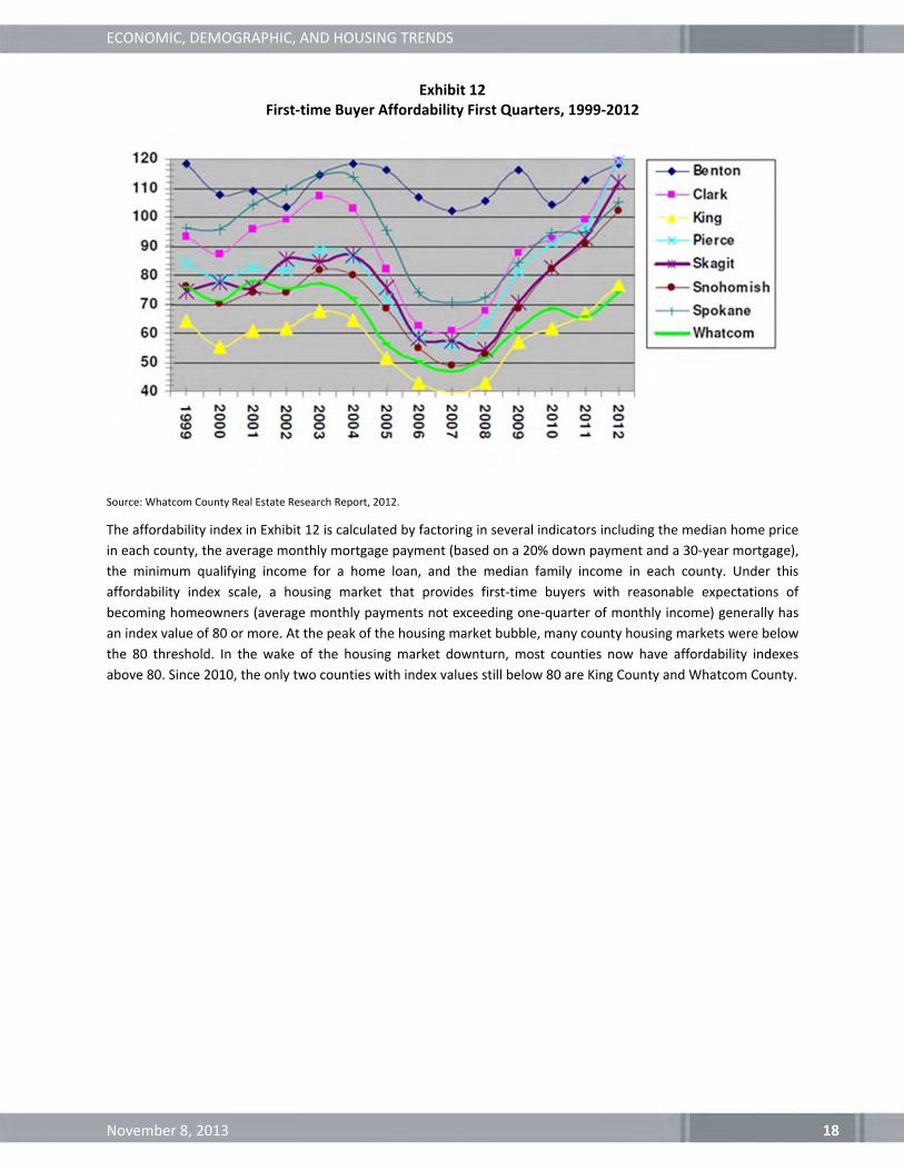
The affordability index in Exhibit 12 is calculated by factoring in several indicators including the median home price
in each county, the average monthly mortgage payment (based on a 20% down payment and a 30‐year mortgage),
the minimum qualifying income for a home loan, and the median family income in each county. Under this
affordability index scale, a housing market that provides first‐time buyers with reasonable expectations of
becoming homeowners (average monthly payments not exceeding one‐quarter of monthly income) generally has
an index value of 80 or more. At the peak of the housing market bubble, many county housing markets were below
the 80 threshold. In the wake of the housing market downturn, most counties now have affordability indexes
above 80. Since 2010, the only two counties with index values still below 80 are King County and Whatcom County.

ECONOMIC, DEMOGRAPHIC, AND HOUSING TRENDS
November 8, 2013 19
Multifamily Housing Market Trends
Several of the national trends highlighted earlier suggest growing demand for multifamily housing as demographic
and economic forces drive more households to live in urban areas in smaller, less expensive, housing options. In
Whatcom County, this effect is being seen most prominently in Bellingham. Exhibit 13 shows the percentage of
total housing units that are multifamily units in each Whatcom County city. Bellingham has the highest percentage
of multifamily units and has seen this share increase from 43% in 2000 to 47% in 2013. Most other cities in
Whatcom County have multifamily percentages between 20% and 30% and have seen multifamily concentrations
remain flat or increase slightly. Sumas has seen the greatest increase in multifamily share from 24% in 2000 to 29%
in 2013. Ferndale (24% to 22%) and Nooksack (10% to 9%) were the only cities to see a decline in multifamily
percentage. These data indicate that multifamily demand is growing in the Bellingham market but has not yet
spread to any of the smaller cities in the County.
Exhibit 13 Percentage of Total Housing Units that are Multi‐Family Units, 2000‐2013
Source: Washington Office of Financial Management, Small Area Estimates Program, 2013.
0%
5%
10%
15%
20%
25%
30%
35%
40%
45%
50%
2000 2001 2002 2003 2004 2005 2006 2007 2008 2009 2010 2011 2012 2013
Bellingham
Sumas
Blaine
Everson
Lynden
Ferndale
Nooksack

ECONOMIC, DEMOGRAPHIC, AND HOUSING TRENDS
November 8, 2013 20
Exhibit 14 Whatcom County Apartment Vacancy Rate and Average Rent, 2000‐2012
Source: Whatcom County Real Estate Research Report 2012, Dupre + Scott Apartment Advisors, Inc. (through 9/06), and
Washington Center for Real Estate Research (beginning 3/07)
Trends in apartment vacancy rates and average rents are additional indicators of multifamily housing demand.
Exhibit 14 shows these trends in Whatcom County, but it is worth noting that the majority, if not all, apartments
sampled to generate these data are located in Bellingham.
Since 2000, average apartment rents have steadily increased, with little fluctuation or volatility.
In contrast, vacancy rates have fluctuated more, ranging from close to 1% in 2012 to over 6% in 2003. The
trend line shown in the chart shows that overall, vacancy rates have been decreasing as rents have increased.
Apartment vacancy rates are currently at an all‐time low. Overall, the decreasing vacancy rates, despite
gradually increasing average rents, indicates growing demand for apartments.
IMPLICATIONS FOR LONG‐RANGE PLANNING
Due to effects of the Great Recession, there are prolonged consequences that have resulted in long‐term changes
to the overall American housing market. The data suggests that although there will still be strong demand for
single family housing, there may be a need for more multi‐family and rental housing units based on the needs of
senior, young adult, and minority households. Senior households are increasing as the baby boom generation ages,
and despite a desire to age in place, many senior households may not have the financial ability to do so due to low
home equity, high mortgage debt, and high medical costs. Young adults, many of whom were seriously affected by
the Great Recession, will take longer to transition to home ownership due to low net wealth, student loan debt,
and stagnant incomes. The data suggest that minority households may have challenges in building up the
resources for home purchase down payments or upfront rental costs (first/last month rent and security deposits)
for higher value rentals. These households will have less money to devote to housing, and the trends suggest that
they will look for smaller housing units at lower costs.
In Whatcom County, housing prices are relatively high compared to other Washington counties, and affordability is
a challenge, particularly for younger households and first‐time homebuyers. This challenge may be one of the
$0
$200
$400
$600
$800
$1,000
$1,200
$1,400
0.0%
1.0%
2.0%
3.0%
4.0%
5.0%
6.0%
Spring 2000
Fall 2000
Spring 2001
Fall 2001
Spring 2002
Fall 2002
Spring 2003
Fall 2003
Spring 2004
Fall 2004
Spring 2005
Fall 2005
Spring 2006
Fall 2006
Spring 2007
Fall 2007
Spring 2008
Fall 2008
Spring 2009
Fall 2009
Spring 2010
Fall 2010
Spring 2011
Fall 2011
Spring 2012
Average
Rent in Dollars
Vacan
cy Rate Percentage
Average Rent
Vacancy Rate
Vacancy Rate Trendline

ECONOMIC, DEMOGRAPHIC, AND HOUSING TRENDS
November 8, 2013 21
factors driving demand for multifamily housing in Bellingham and affordable single‐family housing in other areas of
the county. Trends in multifamily building and the apartment market indicate steady demand for multifamily
housing in Bellingham.
ECONOMIC, DEMOGRAPHIC, AND HOUSING TRENDS
November 8, 2013 22
APPENDIX A ‐ WHATCOM COUNTY MIGRATION PATTERNS
As discussed in the July 22, 2013 Phase I Technical Report on population and employment projections, migration is
one of the key components of population change in a community. This appendix provides additional information
on the states and counties where people are moving to and from Whatcom County. Population moving into
Whatcom are referred to as inbound, and population moving out of Whatcom are referred to as outbound. The
combined effect of inbound and outbound flows is referred to as net migration.
The data in this section is collected from the Census Flows Mapper, which is a web mapping application that
utilizes data from the 2006‐2010 American Community Survey to estimate 5‐year annual average migration flows.
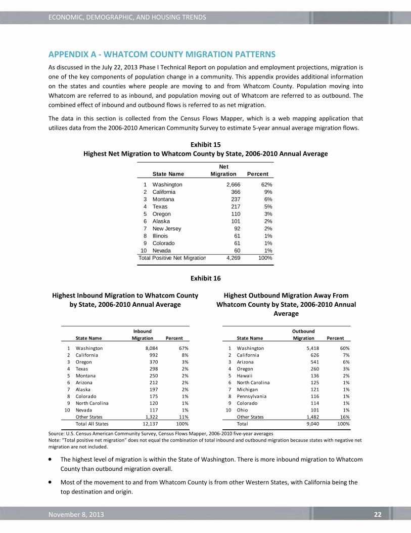
Exhibit 15 Highest Net Migration to Whatcom County by State, 2006‐2010 Annual Average
Exhibit 16
Highest Inbound Migration to Whatcom County by State, 2006‐2010 Annual Average
Highest Outbound Migration Away From Whatcom County by State, 2006‐2010 Annual
Average
Source: U.S. Census American Community Survey, Census Flows Mapper, 2006‐2010 five‐year averages Note: “Total positive net migration” does not equal the combination of total inbound and outbound migration because states with negative net migration are not included.
The highest level of migration is within the State of Washington. There is more inbound migration to Whatcom
County than outbound migration overall.
Most of the movement to and from Whatcom County is from other Western States, with California being the
top destination and origin.
State NameNet
Migration Percent
1 Washington 2,666 62%2 California 366 9%3 Montana 237 6%4 Texas 217 5%5 Oregon 110 3%6 Alaska 101 2%7 New Jersey 92 2%8 Illinois 61 1%9 Colorado 61 1%
10 Nevada 60 1%Total Positive Net Migration 4,269 100%
State Name
Inbound
Migration Percent
1 Washington 8,084 67%
2 California 992 8%
3 Oregon 370 3%
4 Texas 298 2%
5 Montana 250 2%
6 Arizona 212 2%
7 Alaska 197 2%
8 Colorado 175 1%
9 North Carolina 120 1%
10 Nevada 117 1%
Other States 1,322 11%
Total All States 12,137 100%
State Name
Outbound
Migration Percent
1 Washington 5,418 60%
2 California 626 7%
3 Arizona 541 6%
4 Oregon 260 3%
5 Hawaii 136 2%
6 North Carolina 125 1%
7 Michigan 121 1%
8 Pennsylvania 116 1%
9 Colorado 114 1%
10 Ohio 101 1%
Other States 1,482 16%
Total 9,040 100%

ECONOMIC, DEMOGRAPHIC, AND HOUSING TRENDS
November 8, 2013 23
Exhibit 17 Highest Net Migration to Whatcom County by County, 2006‐2010 Annual Average
Exhibit 18
Highest Inbound Migration to Whatcom by County, 2006‐2010 Annual Average
Highest Outbound Migration to Whatcom by County, 2006‐2010 Annual Average
Source: U.S. Census American Community Survey, Census Flows Mapper, 2006‐2010 five‐year averages Note: “Total positive net migration” does not equal the combination of total inbound and outbound migration because states with negative net migration are not included.
Most net migration is coming from other Washington counties, which comprise the top six net migration
counties.
County State
Net
Migration Percent
1 King County Washington 1,229 18%
2 Snohomish County Washington 528 8%
3 Island County Washington 340 5%
4 Kitsap County Washington 318 5%
5 Pierce County Washington 251 4%
6 Thurston County Washington 248 4%
7 San Diego County California 172 3%
8 Los Angeles County California 135 2%
9 Bergen County New Jersey 107 2%
10 Spokane County Washington 104 2%
Total Positive Net Migration 6,848 100%
County State
Inbound
Migration Percent
1 King County Washington 2,882 24%
2 Snohomish County Washington 1,295 11%
3 Pierce County Washington 522 4%
4 Skagit County Washington 476 4%
5 Island County Washington 411 3%
6 Thurston County Washington 391 3%
7 Kitsap County Washington 350 3%
8 Spokane County Washington 342 3%
9 Clark County Washington 218 2%
10 San Diego County California 211 2%
Other Counties 5,039 42%
Total All Counties 12,137 100%
County State
Outbound
Migration Percent
1 King County Washington 1,653 18%
2 Snohomish County Washington 767 8%
3 Skagit County Washington 559 6%
4 Whitman County Washington 358 4%
5 Yakima County Washington 357 4%
6 Maricopa County Arizona 278 3%
7 Pierce County Washington 271 3%
8 Spokane County Washington 238 3%
9 Grant County Washington 177 2%
10 Thurston County Washington 143 2%
Other Counties 4,239 47%
Total All Counties 9,040 100%

ECONOMIC, DEMOGRAPHIC, AND HOUSING TRENDS
November 8, 2013 24
Exhibit 19 Highest Net Migration by County (Excluding Washington State Counties),
2006‐2010 Annual Average
Exhibit 20
Highest Inbound Migration to Whatcom by County (Excluding Washington State Counties),
2006‐2010 Annual Average
Highest Outbound Migration Away from Whatcom County (Excluding Washington State
Counties), 2006‐2010 Annual Average
Source: U.S. Census American Community Survey, Census Flows Mapper, 2006‐2010 five‐year averages Note: “Total positive net migration” does not equal the combination of total inbound and outbound migration because states with negative net migration are not included.
When excluding Washington Counties, highest inbound migration is from San Diego County and Los Angeles
County in California.
When excluding Washington Counties, highest outbound migration is to Maricopa County and Navajo County
in Arizona.
County State
Net
Migration Percent
San Diego County California 172 3%
Los Angeles County California 135 2%
Bergen County New Jersey 107 2%
Lane County Oregon 98 1%
Hill County Texas 97 1%
Coryell County Texas 94 1%
Missoula County Montana 85 1%
Deschutes County Oregon 73 1%
Anchorage Municipality Alaska 71 1%
Santa Barbara County California 67 1%
Total Positive Net Migration 6,848 100%
County State
Inbound
Migration Percent
San Diego County California 211 5%
Los Angeles County California 172 4%
Maricopa County Arizona 146 4%
Anchorage Municipality Alaska 118 3%
Lane County Oregon 112 3%
Bergen County New Jersey 107 3%
Hill County Texas 97 2%
Coryell County Texas 94 2%
Clark County Nevada 90 2%
Buncombe County North Carolina 90 2%
Other non WA Counties 2,816 69%
Total All non WA Counties 4,053 100%
County State
Outbound
Migration Percent
Maricopa County Arizona 278 8%
Navajo County Arizona 118 3%
Oakland County Michigan 110 3%
Multnomah County Oregon 106 3%
San Joaquin County California 101 3%
Maui County Hawaii 91 3%
Forsyth County North Carolina 88 2%
Garland County Arkansas 79 2%
Riverside County California 76 2%
Sarasota County Florida 76 2%
Other Non WA Counties 2,499 69%
Total All non WA Counties 3,622 100%

ECONOMIC, DEMOGRAPHIC, AND HOUSING TRENDS
November 8, 2013 25
Migration by Age
Five‐year annual average migration flows are also available by age category, although some data are suppressed
when sample sizes are too small.
Exhibit 21 Whatcom County Migration by Age Group, 2006‐2010 Annual Average
Source: U.S. Census American Community Survey, Census Flows Mapper, 2006‐2010 five‐year averages Note: Totals do not add exactly due to data suppression in cases with insufficient sample sizes.
The largest source of inbound migration is the 18‐24 age group. This migration pattern is partially due to the
presence of Western Washington University and other higher education institutions in Whatcom County.
Most other age groups have comparable levels of inbound and outbound migration.
The 65 and over age group has slightly higher inbound migration so on a net basis, migration is contributing to
an increase in senior population in Whatcom County.
‐1,000 0 1,000 2,000 3,000 4,000 5,000 6,000 7,000 8,000 9,000
Inbound
Outbound
Net 0‐17
18‐24
35‐49
50‐64
65+
Age Inbound Outbound Net
0‐17 666 730 ‐104
18‐24 5,575 2,081 3,110
25‐34 1332 1343 ‐120
35‐49 686 864 ‐226
50‐64 757 628 ‐182
65+ 430 265 63
Total 9,446 5,911 2,541

ECONOMIC, DEMOGRAPHIC, AND HOUSING TRENDS
November 8, 2013 26
Exhibit 22 Top Origins/Destinations for Whatcom County Migration in the 65+ Age Group
Source: U.S. Census American Community Survey, Census Flows Mapper, 2006‐2010 five‐year averages
Outside of Washington, the most popular destination for Whatcom County residents age 65 and over is
Nevada (13% of outbound 65+ migration).
Outside of Washington, the state contributing most inbound 65 and over migration to Whatcom County is
California (31% of inbound 65+ migration).
State Percent State Percent
Washington 61% Washington 73%
California 31% Nevada 13%
Alaska 3% Arizona 7%
Oregon 3% California 4%
Idaho 2% Oregon 3%
Top Inbound Origins Top Outbound Destinations