Embed Size (px)
DESCRIPTION
Â
Citation preview
Architectural Graphics
By: Ben Weston
Professor: Jerry Lum

ContentsSpiral Stairs
Malevich Study
Paper Planes
Intersected Shapes
Interior Studies
Iterative Design
Sol Duc Case Study
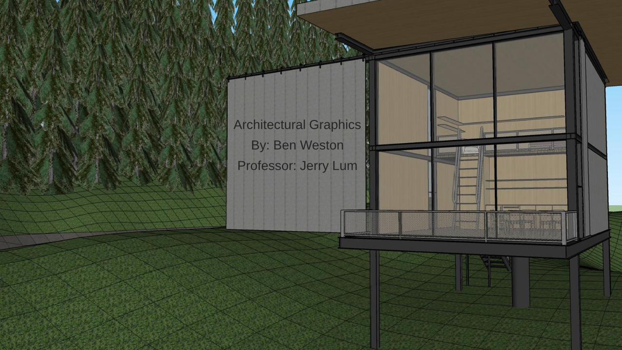
Spiral Stairs

Spiral Stairs
Spiral Stairs ProcessAs I was absent for the first week, this project was my introduction to SketchUp. I familiarized myself with the basic controls, shapes, and commands. I quickly learned as I tried to make my stairs into a proper design than SketchUp did not accommodate warped surfaces, which I was trying to make. As such I simply made due with working in strait lines. This created a preposterously thin connection from the central column to the tread, so I set about making an additional support. I drew a triangle on the central column and had it follow a line I drew through the tread. I then manually trimmed it down, creating the visible triangles on the surface of the tread. I also used the follow-me tool to create the bannister. I then experimented with different textures. To create the final look, I hid all lines.

Spiral Stairs ReflectionsStrengths:
◦ Hiding lines created a much smoother, more organic form
◦ Contrast of texture from dark wood to bright metal makes the detail stand out
Weaknesses:
◦ The tread is unbelievably narrow near the central post. Even with additional support structure is lacking
◦ My inexperience with SketchUp led to a lot of mistakes and setbacks, as well as spending substantial time trying to do impossible things. These difficulties made me more adverse to taking risks later on
Discoveries:
◦ Pretty much everything. I went into this project more or less blind to the rules of SketchUp.

Malevich Study

Malevich Study

Malevich Study ProcessI traced a number of the primary shapes of the painting. After examination of Russian Constructivist architecture, specifically Chernikov’s Hammer and Sickle, I decided to go with a complex of structures connected by elevated walkways. I began the process of rounding many of the sharper corners, carving the structures down, opening spaces in them, rearranging some of them to better locations. Most heights were inserted manually. Much of my time was spent working on rounding the edges to make the structures more natural. I also experimented with shadows, aligning the primary walkway with the sunset on the equinoxes. As the work was based on an abstract work, much of what I created was abstract in intent. The large scale of the project reminded me of similar constructs in the Arabic Gulf region, specifically the NYU: Abu Dhabi campus, so I created a desert set and left the surfaces white.

Malevich Study ReflectionsStrengths:◦ Not adhering rigidly to the initial volumes. The shapes I took from the painting were all rigid and
boxy. Cutting them into organic shapes strengthened the appearance of the work
◦ The research I did into Russian Constructivist architecture was essential to the final product
Weaknesses:◦ No structure
◦ Overly abstract. Many volumes feel too thin for the structure’s side
◦ The amount of time I spent working on shaping the volumes left little time for details on the exterior
Discoveries:◦ Push/Pull as tool for refinement of a form, rather than initial creation of the volume
◦ Shadows. I worked a long time on choosing the right alignment for the building, and learned a lot about how the shadows from one volume affected others.
◦ Rotate. I familiarized myself on rotating volumes
◦ Guidelines and Inference. I began to use guidelines extensively when rotating volumes and detailing glass, as well as frequent inference to those guides

Paper Planes

Paper Planes

Paper Planes ProcessPast the basic process of folding the plane, I arranged several of them into tight formations, made the formations into groups, and repeated the process, making a large aerial array. I also began to experiment with sandbox, specifically the smooth and detail tools

Paper Planes ReflectionStrengths:
◦ The overall formation is a group. Each large formation is a group, and is actually the same formation, once again a group, copied four times, each containing four planes. I like the number four
Weaknesses:
◦ While orderly, the formation lacks a certain dramatic touch. It is overly simple.
Discoveries:
◦ Grouping Groups. Helped a lot.
◦ Sandbox. Specifically how to use the smooth and add detail tools.

Intersecting Shapes

Intersecting Shapes

Intersecting Shapes

Intersecting Shapes
Intersecting Shapes
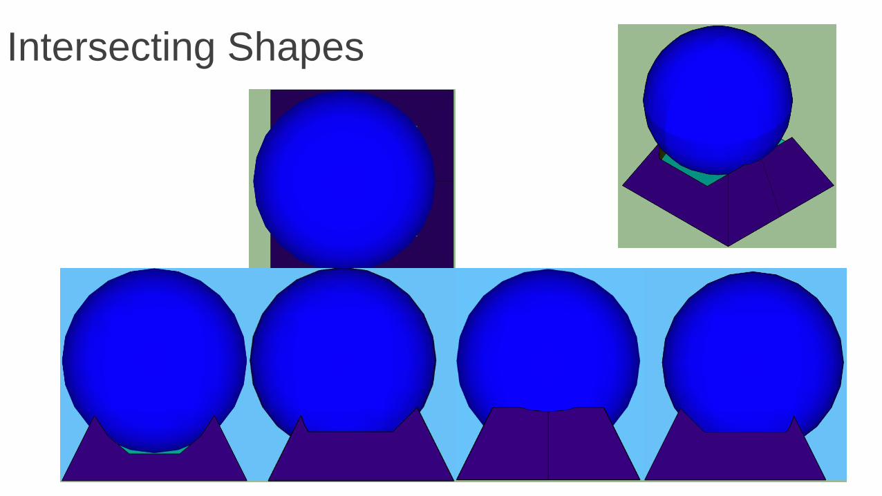
Intersecting Shapes ProcessAfter creating the shapes, each as assigned a color, to more easily track which shapes were intersected with each other. Most of the work was done in x-ray to delete unnecessary interior lines, or to get a better idea of what the new shape was. Most of the shapes are intersections of two shapes. One, the pyramidal base with a sphere resting on it, is an intersection of four, as I used a shape that had already been intersected with another in its creation. Another, the four-sided pyramid with the octagonal base, is the product of the base octagon and the cylinder after the cylinder was intersected with the pyramid.

Intersecting Shapes ReflectionsStrengths:
◦ Products squared. The results I obtained from 3+ objects proved to me some of the most interesting.
◦ Coding. Without the colors I would have no idea what I did.
Weaknesses:
◦ Some shapes simply didn’t go anywhere or were disappointing in the end. Very hit-or-miss
◦ While the colors were chosen to stand out against each other, the end result is somewhat childish
Discoveries:
◦ Intersect. I really wish I knew about how to work this when I was doing my staircase and Malevich projects. It could have saved me so much time.
◦ Unexpected results. The end result of the aforementioned octagon-pyramid-cylinder intersection had the unanticipated effect of making each pyramidal face on the final project slightly asymmetrical

Interior Studies

Interior Studies
Above: Delightfully Mysterious
Top Right: Sophisticated, chic, and
meditative
Bottom Right: Warm, beckoning, and
intimate

Interior Studies ProcessAfter various experiments with different rooms, I began to focus on the windows themselves, seeing the different aesthetics I could create with a single, base window frame. I changed the size, shape, and texture of the base frame, placing the different windows into different volumes. This project was substantially weaker than I hoped, and I could not make a satisfactorily ethereal and airy space, so it doesn’t exist.

Interior Studies ReflectionStrengths:
◦ Window Frame. The window I made in this project was one of the few good things about it. I Used it in the Sol Duc Cabin
Weaknesses:
◦ Incomplete. I wasn’t able to work out all the problems I ran into with this project. I failed to prioritize during the week this was assigned and ran out of time.
Discoveries:
◦ Textures. The textures provide by SketchUp are quite limited, and it is best to go to 3d Warehouse if you really care about how something looks

Iterative Design
Iterative Design Process and ReflectionsI tried to take things as out of context as possible. As such, I have a 5-legged gazebo, a box and cylinder upon it, and a door.
Strengths:
◦ I didn’t let anyone else’s obsession with bridges interfere with my design
Weaknesses:
◦ It makes no sense
Discoveries:
◦ There are many different ways to look at something. If it is at all ambiguous, it WILL be taken out of context

Sol Duc Case Study

Sol Duc Case Study
Perspective View

Sol Duc Case Study
Elevations

Sol Duc Case StudyClockwise from right:
Longitudinal Section
First Floor Plan
Loft Plan
Roof Plan

Sol Duc Case Study
Perspectives
Sol Duc Case Study
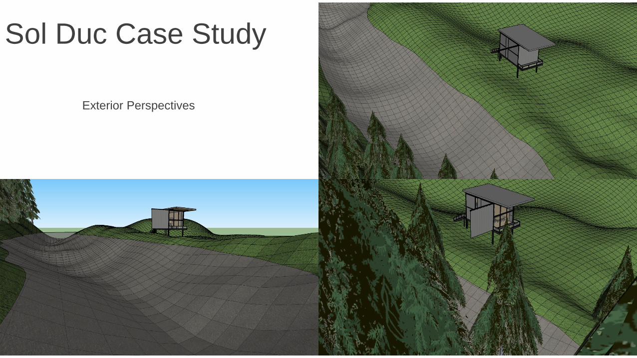
Exterior Perspectives

Sol Duc Case Study ProcessI stared this project with the basics, creating the shell of the building, the basic shape of the interior walls, and the loft floor. Details were added as I reached that point; the loft floor turned into 2x4s, window holes cut, pathways for the frame cut, furniture placed, windows (the same frame from the window study) placed and scaled, and so on. I drew upon 3D-Warehouse for much of the furniture. Doing so also provided me with many textures that greatly improved the visuals of the cabin. As the cabin sits in its landscape on stilts, it is not stamped. Instead the stilts and the sides of the exterior stairs sit belowground. It can therefore be moved around the landscape.

Sol Duc Landscape ProcessThe initial shape of the landscape was created during my first experiments with Sandbox. I placed large, transparent planes in the landscape to create the flat parts of the river, intersecting them to create a divide. I used the drape tool to create the stream connecting them, manually drawing a surface over the line to create the water. I placed the first rows of trees on the wooded areas. On the west side of the landscape, I copied the trees to create a deeper forest. The riverbed and the rest of the terrain are different textures.

Sol Duc ReflectionsStrengths:◦ Attention to detail. I spent a lot of time trying to replicate the cabin as closely as I could based on
what was visible in the pictures of the actual structure
◦ Realistic. In comparison to my earlier works, and mainly due to this being a case study, the cabin actually feels like a real, livable space
◦ Consistency. Many of the texture I used in the cabin came from objects I found in 3D Warehouse. I often went back and changed old textures when I found a new one that better suited the space
Weaknesses:◦ Lost Progress. On several occasions, I lost hours worth of work. While this slowed me down, it also
made me more thoughtful about how I should approach the design
◦ Size. 23 megabytes. My frame rate was painfully slow and sometimes the program would freeze for minutes
Discoveries:◦ Camera control. While making the animations, I found several modes of camera control I didn’t
know about before. This allowed me to improve the quality of my pictures substantially

Student Learning Outcomes
SLO 1: Create accurate drawings that communicate simple architectural design intentions.
4
Apply graphic conventions and standards appropriately 4
Relate each drawing within a set to each other to fully describe significant aspects of a design from the general to the specific
4
Demonstrate a correspondence between the design intentions to be communicated and the graphic representations produced to communicate them
3
Produce drawing that are readable and meaningful to others 4
SLO 2: Analyze the specific intentions communicated by analog and digital modes of graphic communication.
4
Identify the intended message(s) behind the graphic communication, whether produced by analog or digital means
4
Assess the integrity of the message(s) – identify the strengths and weaknesses of the represented intentions
4
Assess the efficacy of the related graphic representation(s) 4
Propose enhancements to what is being graphically communicated
4

Student Learning Outcomes
SLO 3: Apply use of scales, line quality, graphic conventions, and drawing systems and techniques.
N/A
Create clear and appropriately ordered hierarchies of visual information
4
Compose elements of a drawing in a clear organized manner that relates visual information on each drawing and between sets of related drawings
4
SLO 4: Demonstrate an understanding of the purposes of various architectural graphic techniques.
4
Identify the similarities and differences between: 4
Orthographic projections: plan, section, elevations, and details 4
Paraline drawing: isometric and oblique 4
Perspective drawing: 1-, 2- and 3-point 4
Compare and contrast the graphic systems describe directly above
4
Demonstrate an integrated use of analog and digital tools in the process of developing a set of design intentions
4