Embed Size (px)
Citation preview
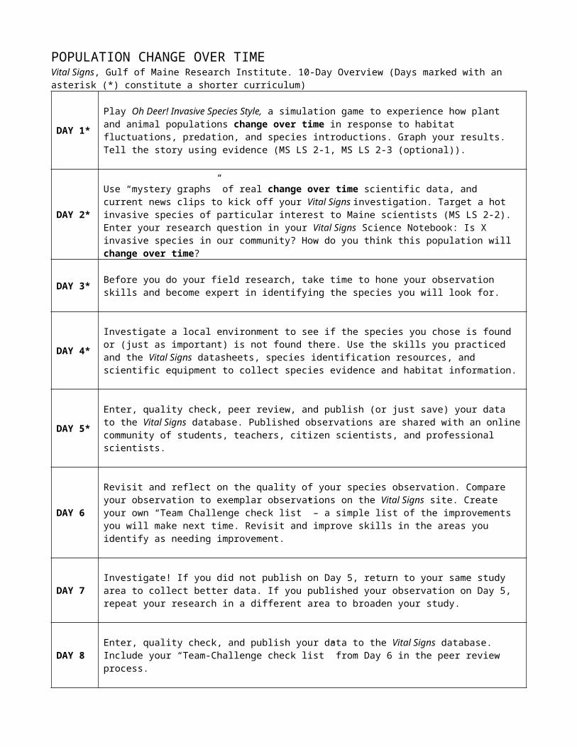
POPULATION CHANGE OVER TIMEVital Signs, Gulf of Maine Research Institute. 10-Day Overview (Days marked with an asterisk (*) constitute a shorter curriculum)
DAY 1*Play Oh Deer! Invasive Species Style, a simulation game to experience how plant and animal populations change over time in response to habitat fluctuations, predation, and species introductions. Graph your results. Tell the story using evidence (MS LS 2-1, MS LS 2-3 (optional)).
DAY 2*Use “mystery graphs” of real change over time scientific data, and current news clips to kick off your Vital Signs investigation. Target a hot invasive species of particular interest to Maine scientists (MS LS 2-2).Enter your research question in your Vital Signs Science Notebook: Is X invasive species in our community? How do you think this population will change over time?
DAY 3* Before you do your field research, take time to hone your observation skills and become expert in identifying the species you will look for.
DAY 4*Investigate a local environment to see if the species you chose is found or (just as important) is not found there. Use the skills you practiced and the Vital Signs datasheets, species identification resources, and scientific equipment to collect species evidence and habitat information.
DAY 5*Enter, quality check, peer review, and publish (or just save) your data to the Vital Signs database. Published observations are shared with an online community of students, teachers, citizen scientists, and professional scientists.
DAY 6Revisit and reflect on the quality of your species observation. Compare your observation to exemplar observations on the Vital Signs site. Create your own “Team Challenge check list” – a simple list of the improvements you will make next time. Revisit and improve skills in the areas you identify as needing improvement.
DAY 7Investigate! If you did not publish on Day 5, return to your same study area to collect better data. If you published your observation on Day 5, repeat your research in a different area to broaden your study.
DAY 8 Enter, quality check, and publish your data to the Vital Signs database. Include your “Team-Challenge check list” from Day 6 in the peer review process.
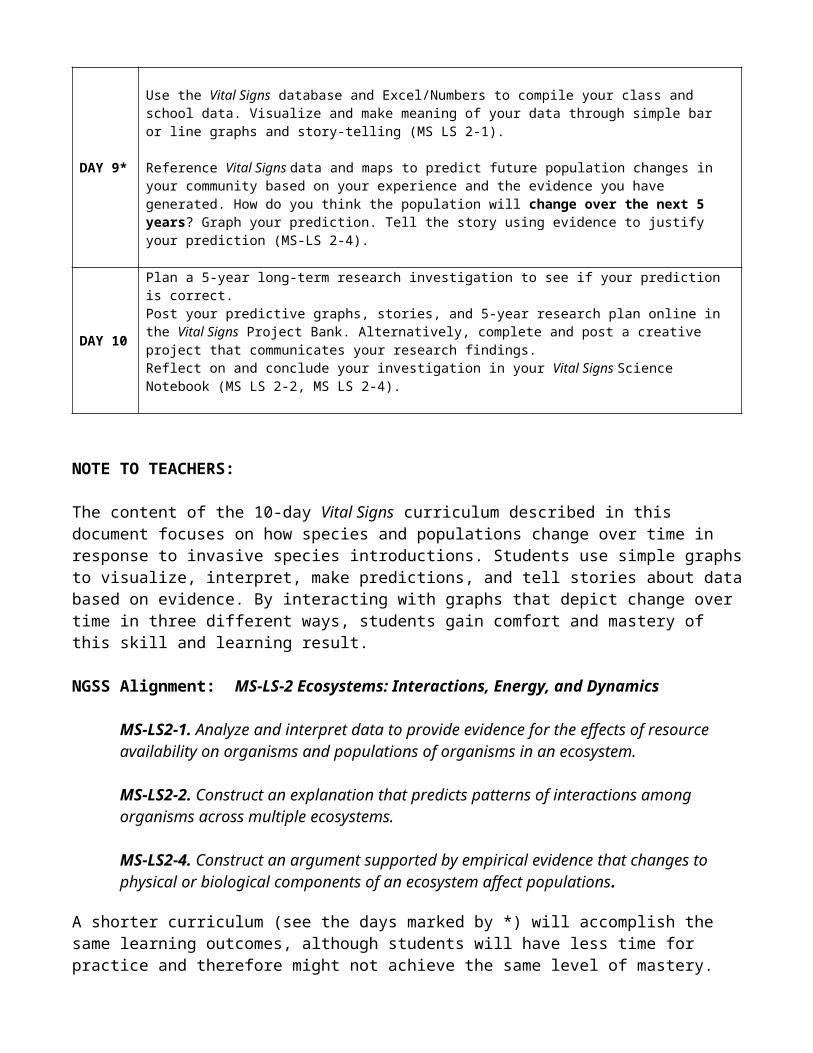
DAY 9*
Use the Vital Signs database and Excel/Numbers to compile your class and school data. Visualize and make meaning of your data through simple bar or line graphs and story-telling (MS LS 2-1).
Reference Vital Signs data and maps to predict future population changes in your community based on your experience and the evidence you have generated. How do you think the population will change over the next 5 years? Graph your prediction. Tell the story using evidence to justify your prediction (MS-LS 2-4).
DAY 10
Plan a 5-year long-term research investigation to see if your prediction is correct.Post your predictive graphs, stories, and 5-year research plan online in the Vital Signs Project Bank. Alternatively, complete and post a creative project that communicates your research findings.Reflect on and conclude your investigation in your Vital Signs Science Notebook (MS LS 2-2, MS LS 2-4).
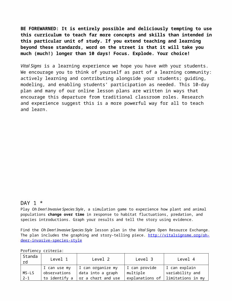
NOTE TO TEACHERS:
The content of the 10-day Vital Signs curriculum described in this document focuses on how species and populations change over time in response to invasive species introductions. Students use simple graphs to visualize, interpret, make predictions, and tell stories about data based on evidence. By interacting with graphs that depict change over time in three different ways, students gain comfort and mastery of this skill and learning result.
NGSS Alignment: MS-LS-2 Ecosystems: Interactions, Energy, and Dynamics
MS-LS2-1. Analyze and interpret data to provide evidence for the effects of resource availability on organisms and populations of organisms in an ecosystem.
MS-LS2-2. Construct an explanation that predicts patterns of interactions among organisms across multiple ecosystems.
MS-LS2-4. Construct an argument supported by empirical evidence that changes to physical or biological components of an ecosystem affect populations.
A shorter curriculum (see the days marked by *) will accomplish the same learning outcomes, although students will have less time for practice and therefore might not achieve the same level of mastery.
BE FOREWARNED: It is entirely possible and deliciously tempting to use this curriculum to teach far more concepts and skills than intended in this particular unit of study. If you extend teaching and learning beyond these standards, word on the street is that it will take you much (much!) longer than 10 days! Focus. Explode. Your choice!
Vital Signs is a learning experience we hope you have with your students. We encourage you to think of yourself as part of a learning community: actively learning and contributing alongside your students; guiding, modeling, and enabling students’ participation as needed. This 10-day plan and many of our online lesson plans are written in ways that encourage this departure from traditional classroom roles. Research and experience suggest this is a more powerful way for all to teach and learn.
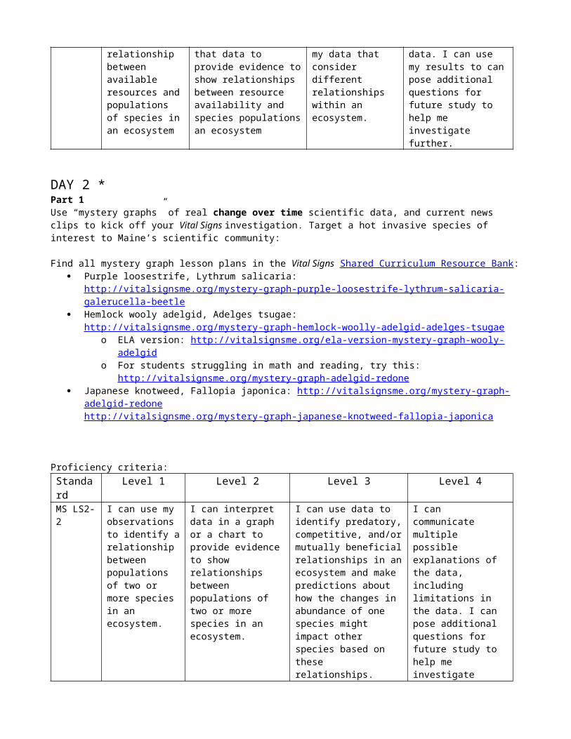
DAY 1 *
Play Oh Deer! Invasive Species Style, a simulation game to experience how plant and animal populations change over time in response to habitat fluctuations, predation, and species introductions. Graph your results and tell the story using evidence.
Find the Oh Deer! Invasive Species Style lesson plan in the Vital Signs Open Resource Exchange. The plan includes the graphing and story-telling piece. http://vitalsignsme.org/oh-deer-invasive-species-style
Profiency criteria:Standard Level 1 Level 2 Level 3 Level 4
MS-LS 2-1
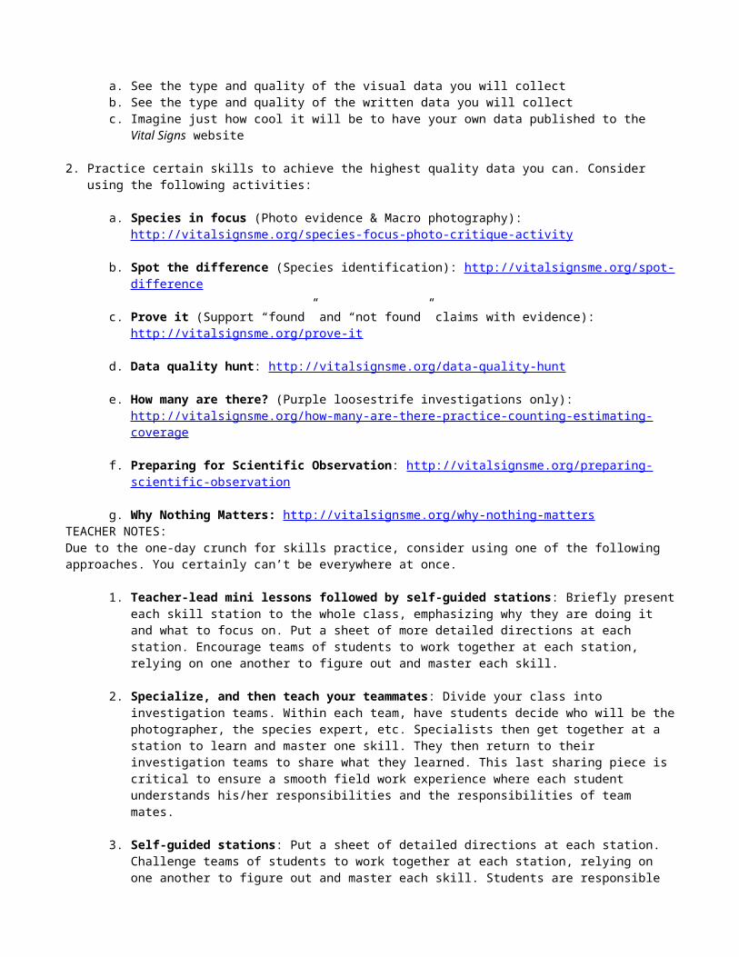
I can use my observations to identify a relationship between available resources and populations of species in an ecosystem
I can organize my data into a graph or a chart and use that data to provide evidence to show relationships between resource availability and species populations an ecosystem
I can provide multiple explanations of my data that consider different relationships within an ecosystem.
I can explain variability and limitations in my data. I can use my results to can pose additional questions for future study to help me investigate further.
DAY 2 *Part 1Use “mystery graphs” of real change over time scientific data, and current news clips to kick off your Vital Signs investigation. Target a hot invasive species of interest to Maine’s scientific community:
Find all mystery graph lesson plans in the Vital Signs Shared Curriculum Resource Bank: Purple loosestrife, Lythrum salicaria:
http://vitalsignsme.org/mystery-graph-purple-loosestrife-lythrum-salicaria-galerucella-beetle Hemlock wooly adelgid, Adelges tsugae:
http://vitalsignsme.org/mystery-graph-hemlock-woolly-adelgid-adelges-tsugae o ELA version: http://vitalsignsme.org/ela-version-mystery-graph-wooly-adelgid o For students struggling in math and reading, try this: http://vitalsignsme.org/mystery-graph-
adelgid-redone Japanese knotweed, Fallopia japonica: http://vitalsignsme.org/mystery-graph-adelgid-redone
http://vitalsignsme.org/mystery-graph-japanese-knotweed-fallopia-japonica
Proficiency criteria:Standard
Level 1 Level 2 Level 3 Level 4
MS LS2-2
I can use my observations to identify a relationship between populations of two or more species in an ecosystem.
I can interpret data in a graph or a chart to provide evidence to show relationships between populations of two or more species in an ecosystem.
I can use data to identify predatory, competitive, and/or mutually beneficial relationships in an ecosystem and make predictions about how the changes in abundance of one species might impact other species based on these relationships.
I can communicate multiple possible explanations of the data, including limitations in the data. I can pose additional questions for future study to help me investigate further.
Part 2Scientists here in Maine are concerned about invasive species, and want to know where they are (and are not) in order to learn from and manage them most effectively. As citizen scientists, we can help by looking in our communities and reporting to scientists what we find via the Vital Signs website.
1. Ask your research question:
Is X species in our community? How do you think this population will change over time?
2. Make predictions:
a. Reference the appropriate Vital Signs species card for more information about its habitat, reproduction, and spread: http://vitalsignsme.org/species-identification-resources
b. Look at the Vital Signs map of X species observations:Go to Explore Data: http://vitalsignsme.org/explore/map Do an Advanced Search for:
All Vital Signs data Keyword: “SPECIES NAME”
c. Based on where you are in relation to where X species has been “Found” and “Not Found,” make a prediction about whether you think X species is in your community or not.
3. Enter your research question and prediction in your Vital Signs Science Notebooks.
TEACHER NOTE: For how to guide students’ use of the online Vital Signs Science Notebook, see: http://vitalsignsme.org/vital-signs-science-notebook
DAY 3 *In order for scientists and citizen scientists to publish their data to the Vital Signs database, it has to be of a certain quality to ensure its usefulness. Before you do your field research, take time to hone observation skills and become expert in identifying the species you will look for.
1. Look at one of Vital Signs’ Best all around species observations (http://vitalsignsme.org/best-observations). This page lists exemplary species observations recognized for their quality evidence, insightful field notes, detailed sketches, crisp photography, and careful habitat measurements. While browsing these observations ask students to:
a. See the type and quality of the visual data you will collectb. See the type and quality of the written data you will collectc. Imagine just how cool it will be to have your own data published to the Vital Signs website
2. Practice certain skills to achieve the highest quality data you can. Consider using the following activities:
a. Species in focus (Photo evidence & Macro photography): http://vitalsignsme.org/species-focus-photo-critique-activity
b. Spot the difference (Species identification): http://vitalsignsme.org/spot-difference
c. Prove it (Support “found” and “not found” claims with evidence): http://vitalsignsme.org/prove-it
d. Data quality hunt: http://vitalsignsme.org/data-quality-hunt
e. How many are there? (Purple loosestrife investigations only): http://vitalsignsme.org/how-many-are-there-practice-counting-estimating-coverage

f. Preparing for Scientific Observation: http://vitalsignsme.org/preparing-scientific-observation
g. Why Nothing Matters: http://vitalsignsme.org/why-nothing-matters TEACHER NOTES:Due to the one-day crunch for skills practice, consider using one of the following approaches. You certainly can’t be everywhere at once.
1. Teacher-lead mini lessons followed by self-guided stations: Briefly present each skill station to the whole class, emphasizing why they are doing it and what to focus on. Put a sheet of more detailed directions at each station. Encourage teams of students to work together at each station, relying on one another to figure out and master each skill.
2. Specialize, and then teach your teammates: Divide your class into investigation teams. Within each team, have students decide who will be the photographer, the species expert, etc. Specialists then get together at a station to learn and master one skill. They then return to their investigation teams to share what they learned. This last sharing piece is critical to ensure a smooth field work experience where each student understands his/her responsibilities and the responsibilities of team mates.
3. Self-guided stations: Put a sheet of detailed directions at each station. Challenge teams of students to work together at each station, relying on one another to figure out and master each skill. Students are responsible for making sure that each member of their team is comfortable with the skills.
4. Guest-guided stations: If it’s possible, involve others from your school and/or community to oversee stations and to share their expertise, passion, or enthusiasm with students: the art teacher to help with photography, the language arts teacher to help craft solid evidence statements, a local naturalist or gardener to help with species characteristics, an administrator who enjoys friendly (or intense) competition…. Prep your guests well before class starts.
5. Snack and Chat station: Consider adding a snack and chat station so students can process the new information they learn throughout this experience.
Have students carry a datasheet with them to each station. This will help them become familiar with the datasheets and where each skill will come in handy. In addition – or alternatively – put a datasheet at each station and highlight the place(s) on the datasheet where they will use the skill.
DAY 4 *Investigate a local environment to see if the species you chose is found or (just as important) is not found there. Use the skills you practiced and the Vital Signs datasheets, species identification resources, and scientific equipment to collect species evidence and habitat information.
TEACHERS: In preparation for your field work:
1. Set up your investigation on the Vital Signs website, and create usernames and passwords for each student team (http://vitalsignsme.org/how-teachers-set-investigations-their-students )
2. Gather the materials you need for your field work: Vital Signs Species & Habitat datasheets: http://vitalsignsme.org/field-work-resources Vital Signs species identification resources: http://vitalsignsme.org/species-identification-resources Sampling methods:
Purple loosestrifeQuadrat (User-placed): http://vitalsignsme.org/sites/default/files/content/method_quadrat_user_092709.pdf If you find purple loosestrife, make sure to do a stem count or a percent cover estimate
Hemlock woolly adelgidHemlock woolly adelgid sampling method: http://vitalsignsme.org/field-work-resources
Japanese knotweedQuadrat (User-placed): http://vitalsignsme.org/sites/default/files/content/method_quadrat_user_092709.pdf If you find Japanese knotweed, measure its height. Record the height measurement in your field notes or written evidence so you can later compare it to the mystery graph.
DAY 5 *Enter, quality check, and publish (or just save) your data to the Vital Signs database. Published observations are shared with an online community of students, teachers, citizen scientists, and professional scientists.
1. Add your observations to the Vital Signs database: Go to http://vitalsignsme.org Log in Go to your “My Vital Signs” page Select from your list of “Unfinished observations” Carefully and thoughtfully transcribe the written information from your paper datasheet to the online
datasheet. Where prompted, upload photos from your camera to the online datasheet.
2. Before clicking “Publish,” do a Quality Check (required!) of another team’s species observation. http://vitalsignsme.org/sites/default/files/content/DataEntry_QualityAssuranceChecklist_1009.pdf
3. Before clicking “Publish,” do a Peer Review (if you have time) of another team’s species observation. http://vitalsignsme.org/sites/default/files/content/DataEntry_PeerReviewQuestionaire_1009.pdf
4. Depending on the outcome of the Quality Check and Peer Review processes, decide as a team whether or not your observation is ready to make public.
5. If you decide to publish, keep an eye on the Vital Signs home page and celebrate as you see your observations appear!
6. If you decide NOT to publish, make a list of what information is missing or needs improvement, and what you would do differently next time.
DAY 6Revisit and reflect on the quality of your species observation. Compare your observation to exemplar observations on the Vital Signs site. Create your own “Team Challenge check list” – a simple list of the improvements you will make next time. Revisit and improve skills in the areas you identify as needing improvement.
1. Compare your species observation with a Best of Vital Signs observation:
a. On one computer, go to the Best of Vital Signs page: http://vitalsignsme.org/best-vs. This page lists exemplary species observations recognized for their quality evidence, insightful field notes, detailed sketches, crisp photography, and careful habitat measurements.
b. On a second computer, go to your own species observation
NOTE: If you do not have 2 computers available, print out an observation to make the comparing easier.
2. Ask yourself: What would I need to do to my observation for it to make the Best of Vital Signs page?
3. Make a list of improvements you could make.
NOTE: It’s often difficult to be critical of your own work. Challenge yourself to find at least 5 things you could do differently. If you cannot find 5 ways to improve, ask someone else to take a look and make suggestions.
4. From this list of improvements, create a “Team Challenge check list” of the 5 or more things you will do on your next investigation to achieve a “Best of” quality observation.
5. Take time to revisit and practice skills that will help you meet your Team Challenges (photography, evidence-building, species identification, percent cover estimates, etc.).
DAY 7
Investigate! If you did not publish on Day 5, return to your same study area to collect better data. If you published your observation on Day 5, repeat your research in a different area to broaden your study.
DAY 8
Enter, quality check, peer review, and publish your data to the Vital Signs database. Include your “Team Challenge check list” from Day 6 in the peer review process.
DAY 9 *
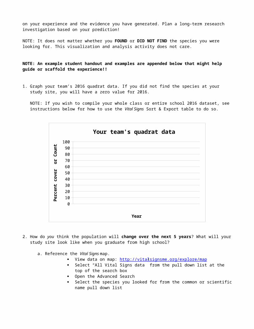
Visualize and make meaning of your data through simple bar or line graphs and story-telling. Reference Vital Signs data and maps to predict future population changes based on your experience and the evidence you have generated. Plan a long-term research investigation based on your prediction!
NOTE: It does not matter whether you FOUND or DID NOT FIND the species you were looking for. This visualization and analysis activity does not care.
NOTE: An example student handout and examples are appended below that might help guide or scaffold the experience!!
1. Graph your team’s 2016 quadrat data. If you did not find the species at your study site, you will have a zero value for 2016.
NOTE: If you wish to compile your whole class or entire school 2016 dataset, see instructions below for how to use the Vital Signs Sort & Export table to do so.
0102030405060708090
100
Your team's quadrat data
Year
Perc
ent c
over
or C
ount
2. How do you think the population will change over the next 5 years? What will your study site look like when you graduate from high school?
a. Reference the Vital Signs map. View data on map: http://vitalsignsme.org/explore/map Select “All Vital Signs data” from the pull down list at the top of the search box Open the Advanced Search Select the species you looked for from the common or scientific name pull down list
NOTE: If you are doing a hemlock woolly adelgid study, please also use the Google Earth layer, Hemlock Woolly Adelgid in Maine 2016: http://vitalsignsme.org/hemlock-woolly-adelgid-maine-2010
3. Based on the map, your knowledge of how populations change through time, knowledge of the species, and
the evidence you gathered during your investigation, predict future population changes at your study site.
4. Graph your 5-year prediction!
ADDITIONAL NOTES:If you predict that you will find the species at your study site by 2020, you may need to learn about how the species in question travels and reproduces (finding this information on the species identification card may do the trick). You may want to include in your story how the species was introduced.
If you predict that you will not find the species at your study site by 2020, a graph with all zero/ not found values is a great story! Do not avoid it. Focus your story on why the species wasn’t able to take hold year after year.
5. Tell the story (just like you did with the Oh Deer! Invasive Species Style and Mystery Graph activities) of how your study site will change over the next 5 years. Use a table, annotated graph, or drawings to tell the story.
Using data from your whole class or entire school
0102030405060708090
100
Your school's study site data (average)
Year
Perc
ent c
over
or C
ount
To compile your class or school “Count” or “Coverage” data, use the Vital Signs Sort & Export table. Follow these steps:
Go to http://vitalsignsme.org/explore/export Log in Select “My team’s data” from the pull down list in the gray bar at the top of the search box Select the data groups you wish to view:
o Species Observationso Species Analysis
Click the “Export data” link that is above the table on the right hand side When prompted, open the dataset in Numbers/ Excel Delete or hide all columns except:
o Common name o Count of Individuals or Coverage
Average the Count of Individuals or Coverage data to get just one value for 2016 to graph. Until we fix up our database export, this involves a few steps:
o If you are using Count data, use the highest number in the range (“1-10” range becomes “10”). Type this single number in a new column to the right of the range.
Common name Count of individuals Count (highest in range)Purple loosestrife 1-10 10
o If you are using Coverage data, select the largest fraction in the range and then convert it to a percent ( “½ to ¾” covered “ ¾ ” 75)
Common name Coverage Coverage (highest) Percent coveragePurple loosestrife ½ to ¾ ¾ 75
TEACHER NOTE: Depending on your learning goals, you may want to (1) make these conversions for students ahead of time to save time and avoid distraction, (2) give students a conversion cheat-sheet, or (3) use it as an opportunity to learn how to make conversions and analysis-ready datasets.
Average the “Count” or “Percent coverage” column Graph the average (make sure to add the word “Average” to your Y axis label)
Proficiency Criteria:
Standard
Level 1 Level 2 Level 3 Level 4
MS-LS-2-4
I can form a prediction of how a change in an ecosystem might impact the population of a different species.
I can support my prediction using evidence from observations that I made and data that I collected.
I can identify patterns in populations and use those patterns to explain the connection between the prediction that I made and the evidence that supports it.
I can consider alternative predictions and provide evidence to explain why I think that mine is the most likely to happen. I can design a plan to test my prediction.
DAY 101. Discuss or plan out the type of study you would do over the next 5 years to see if your prediction is correct or
not. Consider:a. What is your research question?b. What data will you collect? c. What methods and equipment will you use? d. How often will you collect data?e. Will you be happy?f. ….
2. Post your predictive graphs, stories, and 5-year research plan online in the Vital Signs Project Bank. (Alternatively, complete and post a creative project that communicates your research findings)
To post your predictive graphs and stories online in the Vital Signs Project Bank:
Go to the Vital Signs Project Bank: http://vitalsignsme.org/project-bank Log in Click “Post my project” As prompted, fill in the information that will help others find your project
o Select Project Type: “Research reports” Browse and upload your graph & graph story Click “Save” Celebrate!
TEACHER NOTES: Have individual teams post their graphs under their team usernames, or compile all graphs into one document and post together under a teacher username.
Do not post documents to the Project Bank with the full name of anyone under age 13.
3. Reflect on and conclude your investigation in your Vital Signs Science Notebook.
TEACHER NOTE: For how to guide students’ use of the online Vital Signs Science Notebook, see: http://vitalsignsme.org/vital-signs-science-notebook
4. Post your Science Notebook to the Project Bank. Here’s how::
Log in Go to your “My Vital Signs” page Open your Science Notebook Use the “Print to PDF” link at the bottom of the Science Notebook page Save the PDF to your computer Follow the instructions above for how to post a file to the Project Bank
o Select Project Type: “Science Notebooks”
NOTE: Do not post documents to the Project Bank with the full name of anyone under age 13.Phew! Congratulations.

APPENDIX
DAY 9EXAMPLE STUDENT GUIDEMaking meaning from data and predicting into the future (based on evidence!)
1. Our team username is:
2. We looked for:
3. Our research question is: (How is the population of X species changing through time)
4. Our hypothesis was:
GRAPHING YOUR TEAM’S DATA
5. Find your team’s species observation on the VS site (Explore Data > My Team’s Data)(My Vital Signs > Species Observation History)
Our published observation shows (CIRCLE):
a. Found / Not Found
b. Confirmed / Questioned by species expert
c. How many were at our study site: 0, 1-10, 10-20, 20-50, 50+
6. A graph of our 2016 species data is on the GRAPH & TABLE STORY PAGE below (scroll down!)
GRAPHING WHAT YOU THINK WILL HAPPEN IN THE FUTURE (based on evidence!)
7. We know that biodiversity, presence of invasive species, species vectors, land use, and resource availability all influence where species are, and how species populations may change through time.
Our published observation also shows:
a. Biodiversity count:
b. Evidence of vectors:
8. Find other observations in your town or area nearby your study site(Explore Data > View data on map OR Sort & export data > Advanced search for “your town”)(Explore Data > View data on map OR Sort & export data > “My school’s data”)
Other observations in the area show:
a. Invasive species found nearby (How many? Which ones?)
b. Invasive species not found nearby

c. Land use nearby (check site photos, map satellite view, field notes)
d. Evidence of vectors nearby (Sort & export > turn “Habitat Analysis” data group on)
9. Based on our findings from Steps 7 & 8, we predict the species population will change from 2016 – 2020 as indicated on the GRAPH & TABLE STORY PAGE below:
GRAPH AND TABLE STORY
0102030405060708090
100
Your team's quadrat data
Year
Perc
ent c
over
or C
ount
YEAR What's happening/ what's your prediction?
Why? What’s your evidence/ scientific reason?
2016
2017
2018
2019
2020
What would you investigate next year to test your prediction?
DAY 9 Examples of filled out student guides (Thank you Ellen Baily and Megan McOsker!)
1. My team name is The Twinkies.
2. I looked for: Phragamites australis
3. My research question was, “How is the population of this species changing through time?”
4. My hypothesis was: This species is pretty thick in this quadrat. My hypothesis is that it will not continue to grow here because it is already using a lot of natural resources. The environment won’t be able to handle much more.
5. My published observation shows:found/not found: FOUNDconfirmed/questioned by species expert not yet reviewedhow many were in my quadrat 50+
6. Graph – next page.
7. My published observation may also show:biodiversity count: 2 different speciesevidence of vectors?: paved road, dirt road, walking trail, people, quite a few
buses
8. Other observations in the area show that:invasive species present in the area:
Japanese Barberry (Berberis thungbergii)Japanese Knotweed (Fallopia japonica)
land use:several school buses (parking area)edge of a parking lot for a schoolroute 1A is nearbypossible polluted area for these plantssoil quality probably not that great
9. Graph of predictions – next page
What would you investigate next year to test your prediction?
I would investigate the exact same area and re-count the plants. I would also investigate other invasive species in the quadrat to see if they have overtaken the area. If so, then I would adjust my predictions, by lowering the numbers of the European common reed.
I would also see if there were any environmentalists in the area who were planning on yanking out any of the invasive species. If so, they might come to our school and totally yank out the European common reed. Of course, that would drastically change my predictions!

GRAPH AND TABLE STORY
Phragmites australisMy Team's Quadrat Data
0
10
20
30
40
50
60
70
Year 2010 Year 2011 Year 2012 Year 2013 year 2014
Year
Coun
t in
Qua
drat
YEAR What's happening/ what's your prediction? Why? What’s your evidence/ scientific reason?2010 Currently there are 50+ European common
reed in this quadrat. I carefully counted the species.
2011I predict 60 plants in this area next year.
There are already a lot of this species here, yet I still see some room for invasion, so I predict 60 plants by next year.
2012I predict 65 plants for the year 2012. I predict there will still be some room for growth,
so I think it will go up to 65 plants.
2013 I predict the plant numbers will go back to 60 for the year 2013.
In my opinion, this quadrat cannot handle any more than 60 healthy European common weed, so I think the number will go back to 60.
2014 I predict the plant numbers will remain at 60 for 2014.
I think 60 plants is where this area will balance out, barring any other intervention. I don’t foresee any intervention at this point, so stand by my prediction of a balance of 60 plants.
![GMRI, INC., Defendant. v. UNITED STATES EQUAL EMPLOYMENT ... · "Shredding the Document." Hiatt's chorus in that song is: "I'm shredding the document/I'm keeping my mouth shut."[1]](https://img.pdfslide.us/doc/110x75/5f0c31ac7e708231d4343426/gmri-inc-defendant-v-united-states-equal-employment-shredding-the.jpg)


![[XLS] · Web viewPopulation (000) (000) % total DEATHS UNPOP DIVISION 98 REV I. Communicable diseases, maternal and perinatal conditions and nutritional deficiencies Tuberculosis](https://img.pdfslide.us/doc/110x75/5b01aeed7f8b9a65618e0161/xls-viewpopulation-000-000-total-deaths-unpop-division-98-rev-i-communicable.jpg)
![[Title]livrepository.liverpool.ac.uk/3026396/1/CAZ-AVI ELF... · Web viewPopulation Pharmacokinetic Modelling of Ceftazidime and Avibactam in the Plasma and Epithelial Lining Fluid](https://img.pdfslide.us/doc/110x75/6129ef60efa644383f40ccd2/title-elf-web-view-population-pharmacokinetic-modelling-of-ceftazidime-and.jpg)