Embed Size (px)
Citation preview

Advert 2Mock-up of screen Print
First Concept: The idea I’m going for for advert 2 is an athlete using wave with an inspirational quote that I spent way too long thinking of next to them. The athlete would be at a running track wearing traditional athletic gear whilst holding the can, promoting the idea that wave is for all people across different ages/genders/demographics
Mise en Scene: regarding mise en scene I want the model to be the centre of attention whilst not drawing away the fact that they are at a running field to promote the idea that they are an athlete. Although pictured above as quite bright, I’m not yet sure whether I want to stick to the bright colour scheme of wave for the whole advert or to go with a darker/more gritty vibe to fit with the style of athletics. The phrase “Ride the wave to success” will be situated above the stand so it looks like it is spectating the athlete, written in Harlow solid to fit with the 80s style of Wave
(Travis Tapsell suggested I rotate the phrase in order to make it look more like it is sitting on the stand, a minor change but will make it look more aesthetically pleasing)
Ride the wave to success
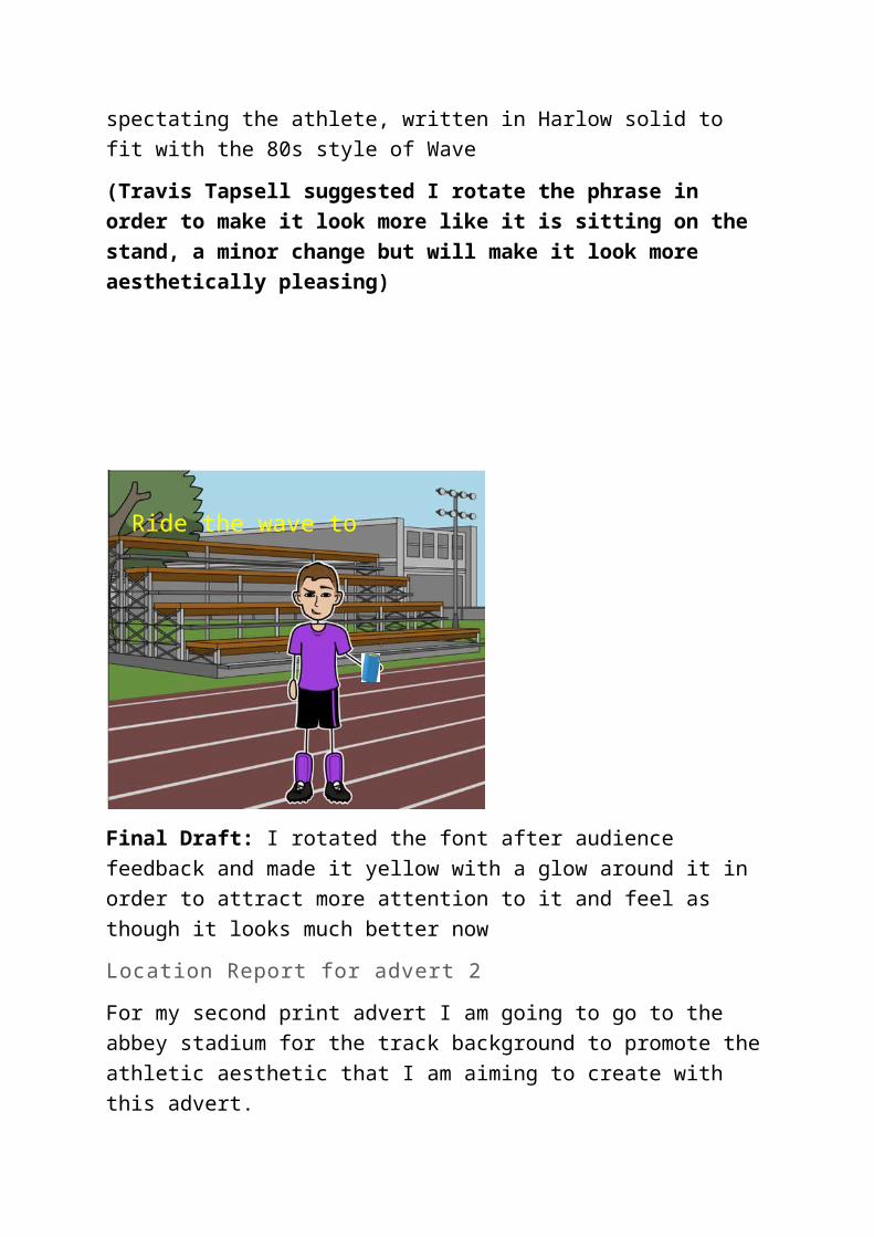
Final Draft: I rotated the font after audience feedback and made it yellow with a glow around it in order to attract more attention to it and feel as though it looks much better now
Location Report for advert 2
For my second print advert I am going to go to the abbey stadium for the track background to promote the athletic aesthetic that I am aiming to create with this advert.
I will need permission from the abbey stadium in order to take photos on their premises
Ride the wave to success

Final Shot for advert 2
Adjustments: When it came to taking the photo I decided that my original idea wouldn’t really turn out as well as I planned so instead opted for a different layout of the shot. In this new design the model looks stronger with his stance, whilst also showing off the product well and allowing space for the slogan on the right.
Final Edit for advert 2

In the end I changed the hue of the image to a dark blue with low saturation to give the idea of a sporty advert, connoting ideas of masculinity within the sporting industry. I also increased the saturation and brightness of the can to make it stand out as the key focal point of the advert. I then added the McDonalds/Olympic logos to improve the legitimacy of the advert and also included social media links at the bottom to show that wave is also online in case audiences want further information.
Audience feedback: Matt Luxton said he’d like to see more of the can, as it isn’t obvious enough what product I am presenting however he enjoys the sporting aspect of this advert.
Final Final Edit

For my final final edit I changed the Olympic logo to one more fitting of the brand by getting rid of the McDonalds logo and then added in the word “Wave” in the empty space to make it look like more is going on


![[PPT]Chapter 5: Other Corporate Levies - Pearson Educationwps.prenhall.com/wps/media/objects/9604/9834626/ppt_corp/... · Web viewAdjustments to taxable income other then ACE adjustment](https://img.pdfslide.us/doc/110x75/5b06cf707f8b9ac33f8d5581/pptchapter-5-other-corporate-levies-pearson-viewadjustments-to-taxable-income.jpg)